


One of the Poland’s first speciality coffee roastery got a little bit rusty. It’s time for a new chapter.In late 2020 we partnered with Coffee Proficiency to work on the new visual identity for the brand. One of the oldest roastery in the Poland’s market needed a fresh, new look – one that will emphasise innovation and uniqueness that were always in the core of the brand but now got a bit dusty. The brand is on the market since 2010 and from the start it have never undergone any major changes in the visual communication.
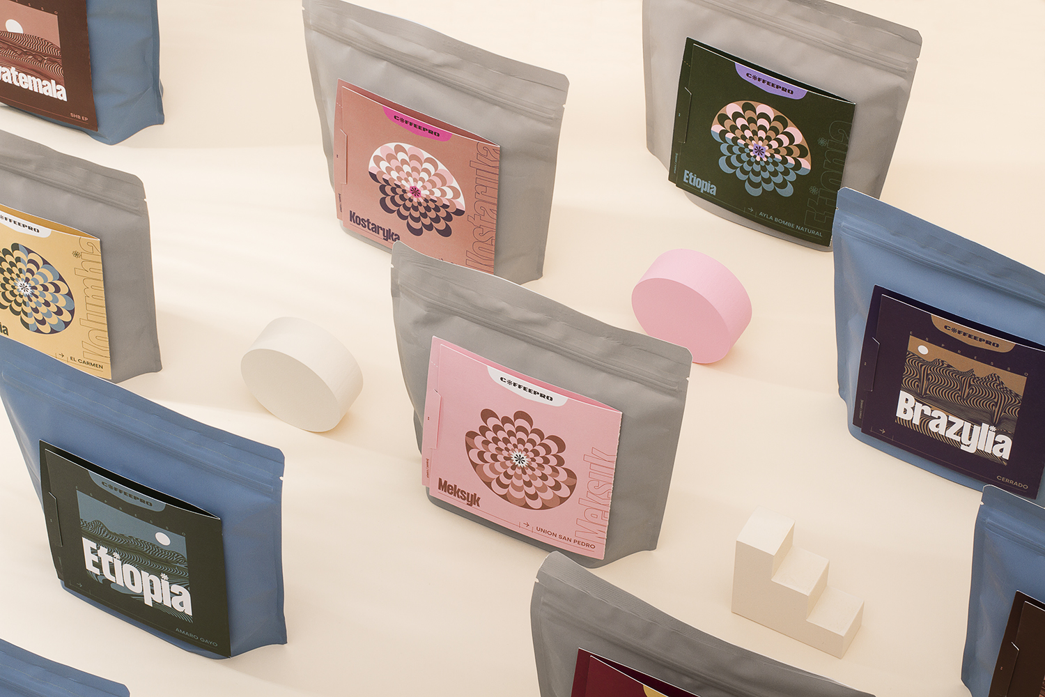
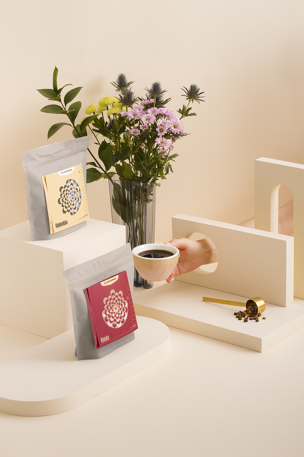
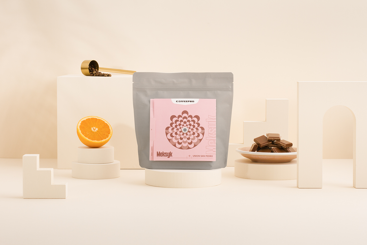
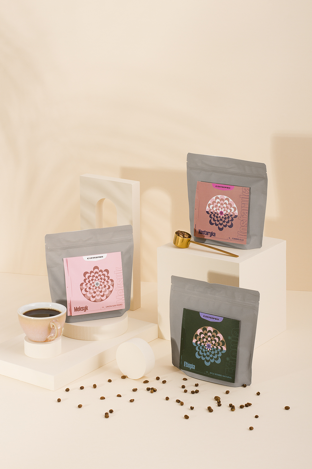
We created a completely new, colorful and bold visual language based on the Polish design tradition with references to coffee origins and sharing knowledge of the craft. A modern color palette and geometric shapes with negative space now became the brands world. Simple but not easy. The graphic style targets the audience that includes young and creative generation Z but also it had to resonate with white collars who likes great coffee. We wanted the brand to became more feminine in comparison to other coffee roasters on the market which often presents as strong in the tone of graphic voice.
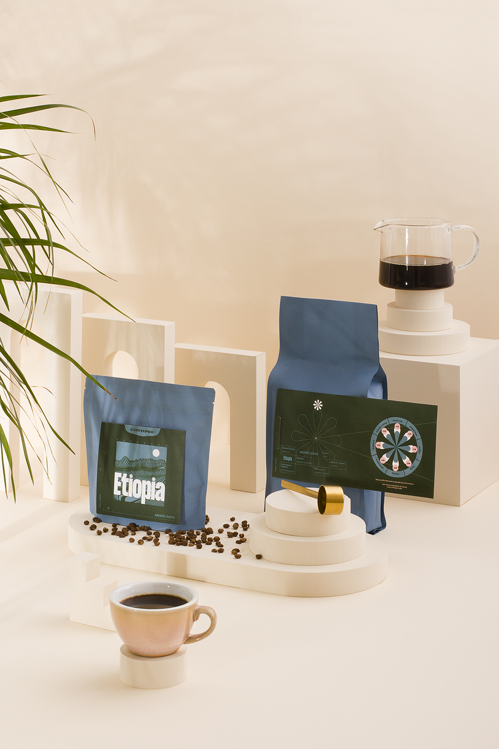
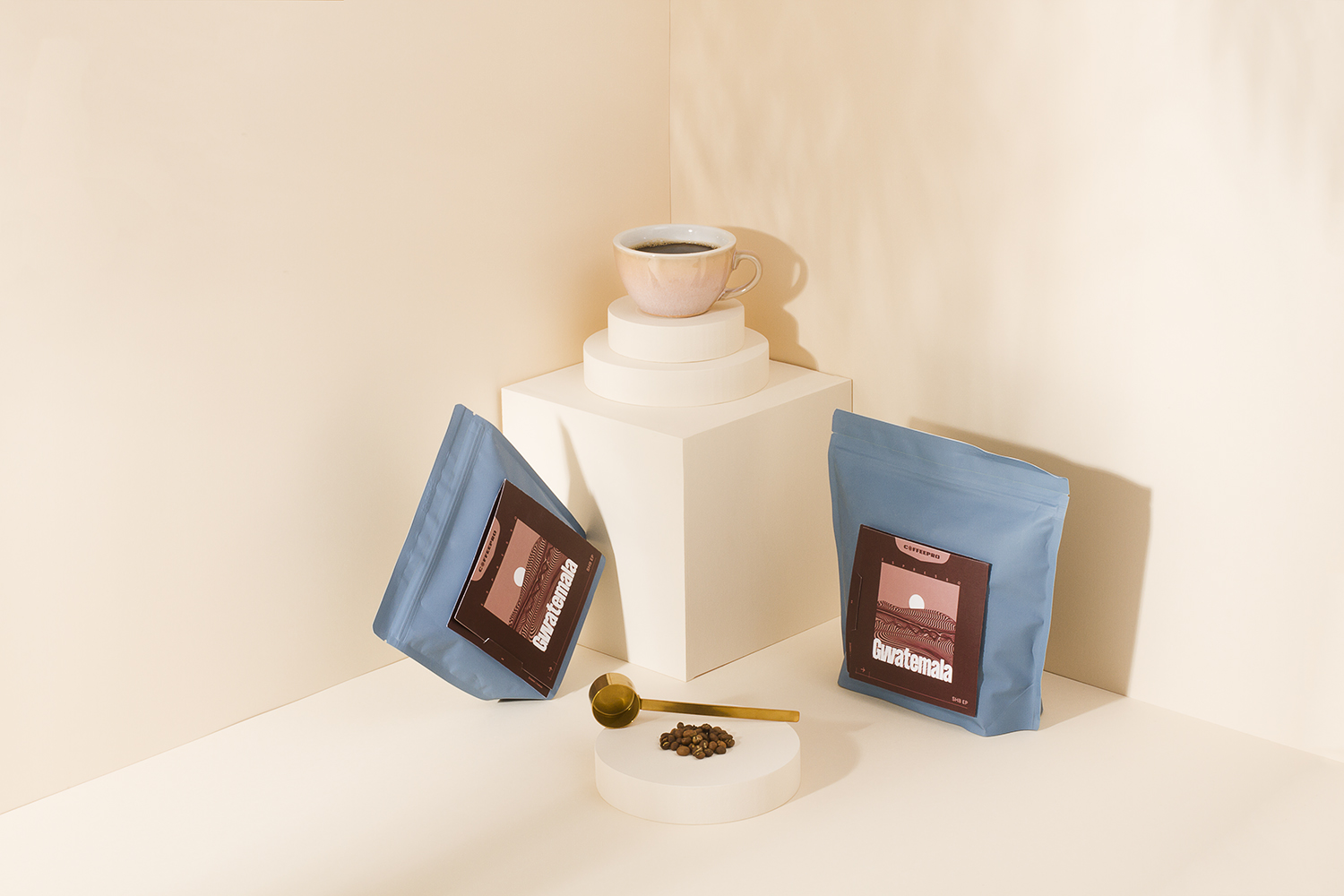
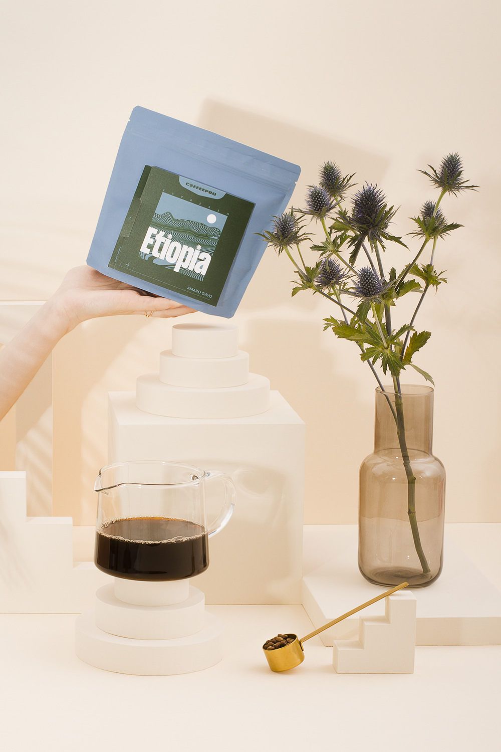
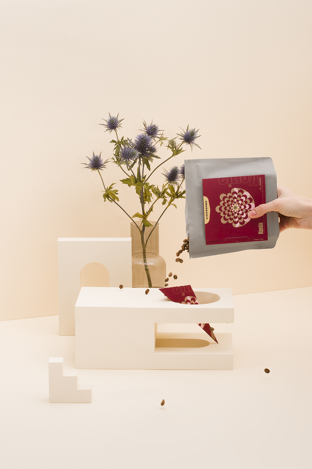
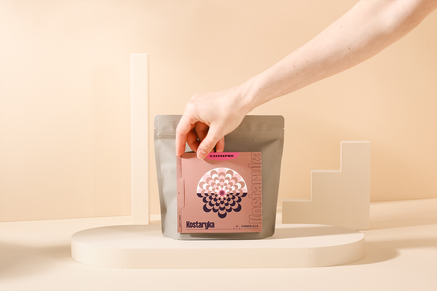
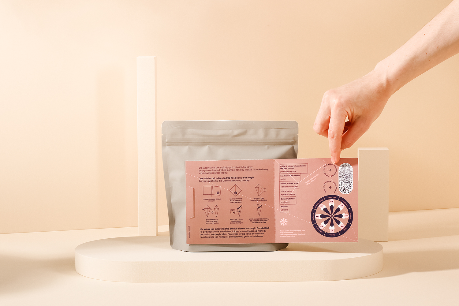
A very interesting thing of the old packaging was a special card added to the label containing all the important information about the coffee: taste profile, production region, altitude, bean characteristic. We wanted to keep this feature but make it better.
Less waste and eco-friendly policies are very important to Coffeepro. That’s why we use zero emission packaging and special paper with potato starch. But can we do more?
We figured out the alternative use for the label. Now it can become a tool for all the beginners to help them measure exactly the right amount of coffee and also guide them for the perfect grind. You don’t have to throw it out. The design proccess took a while but we figured out a way to measure the exact proportion (18g of coffee per 300 ml of water) for the cup of coffee without a scale. You can now use the label as a learning instrument or collectible cards gathering all the information about your favourite coffee.
CREDIT
- Agency/Creative: Illcat.studio
- Article Title: Coffeepro Rebranding Based on Polish Traditions Created by Illcat.studio
- Organisation/Entity: Freelance, Published Commercial Design
- Project Type: Packaging
- Project Status: Published
- Agency/Creative Country: Poland
- Market Region: Europe
- Project Deliverables: Brand World, Branding, Packaging Design, Rebranding, Research
- Format: Bag
- Substrate: Plastic


