


The Challenge
Coffee Circle is an in-house project by Artlife Branding Studio, created to design a premium coffee brand that feels personal, warm, and ritualistic. The challenge was to craft a visual identity and packaging system that stands out while celebrating the morning coffee experience and the craft behind every cup.
Our Approach
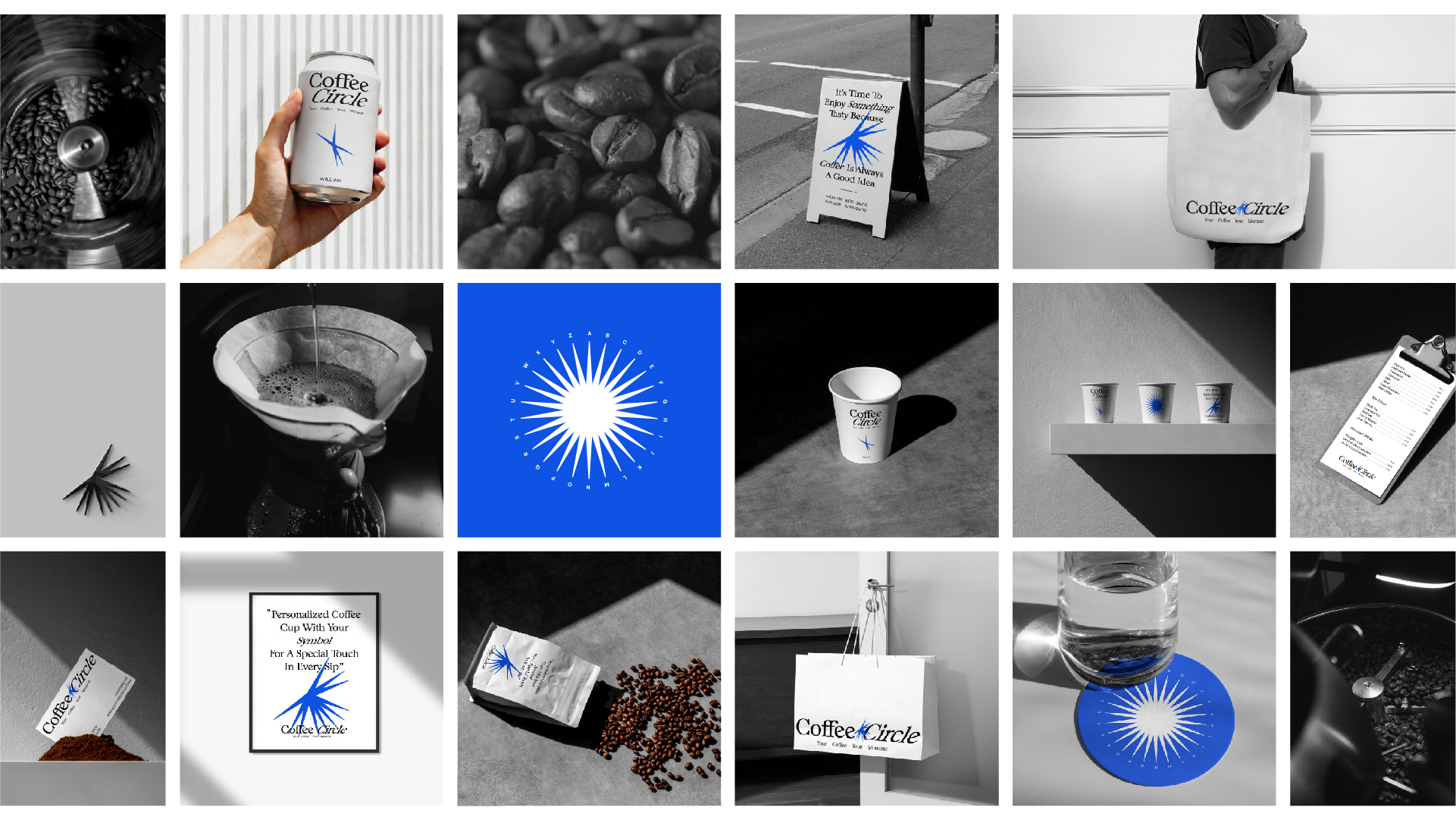
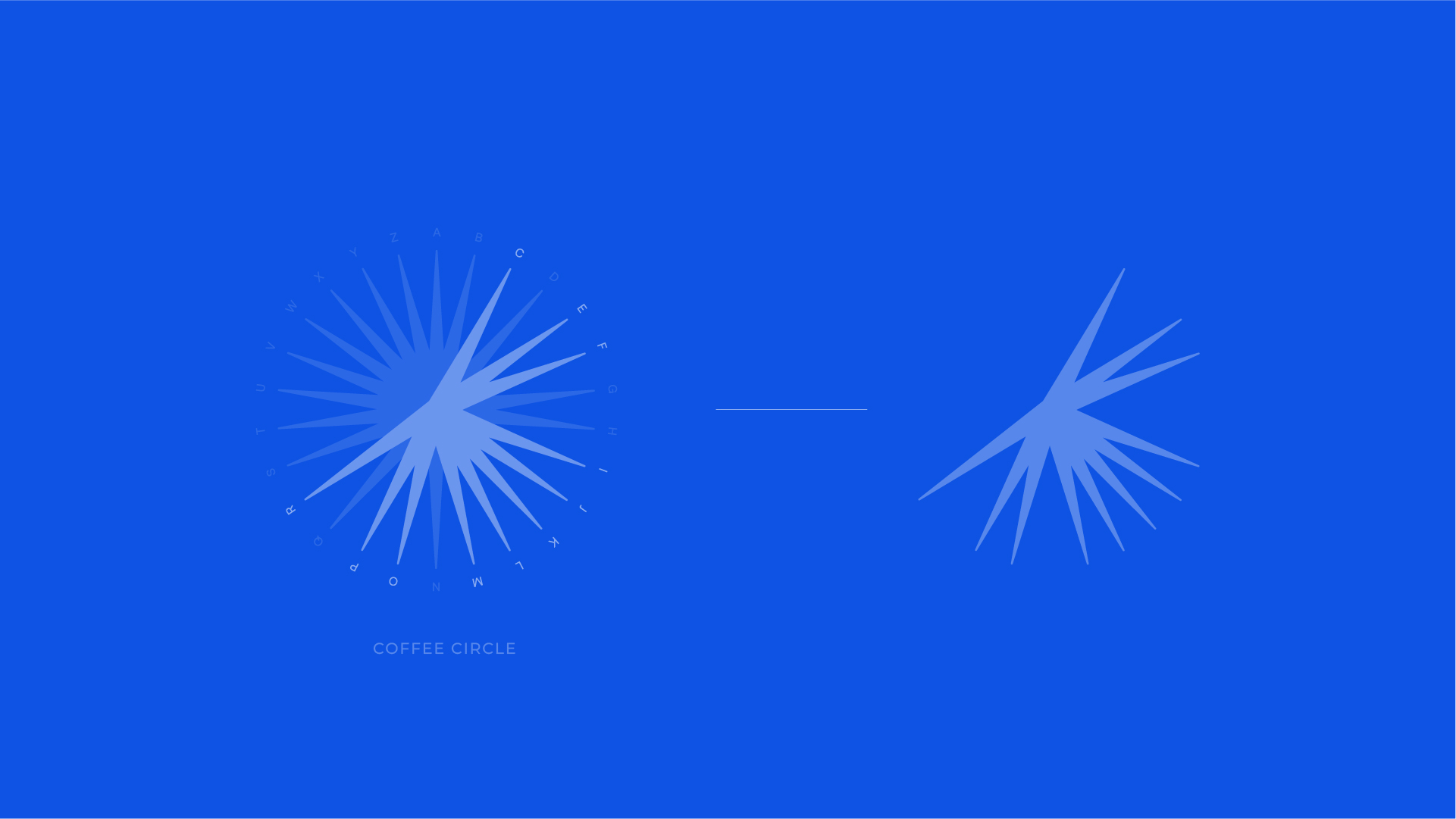
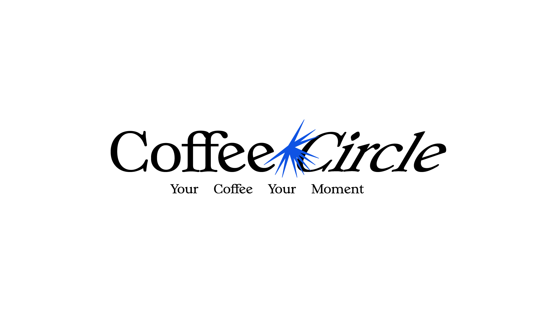
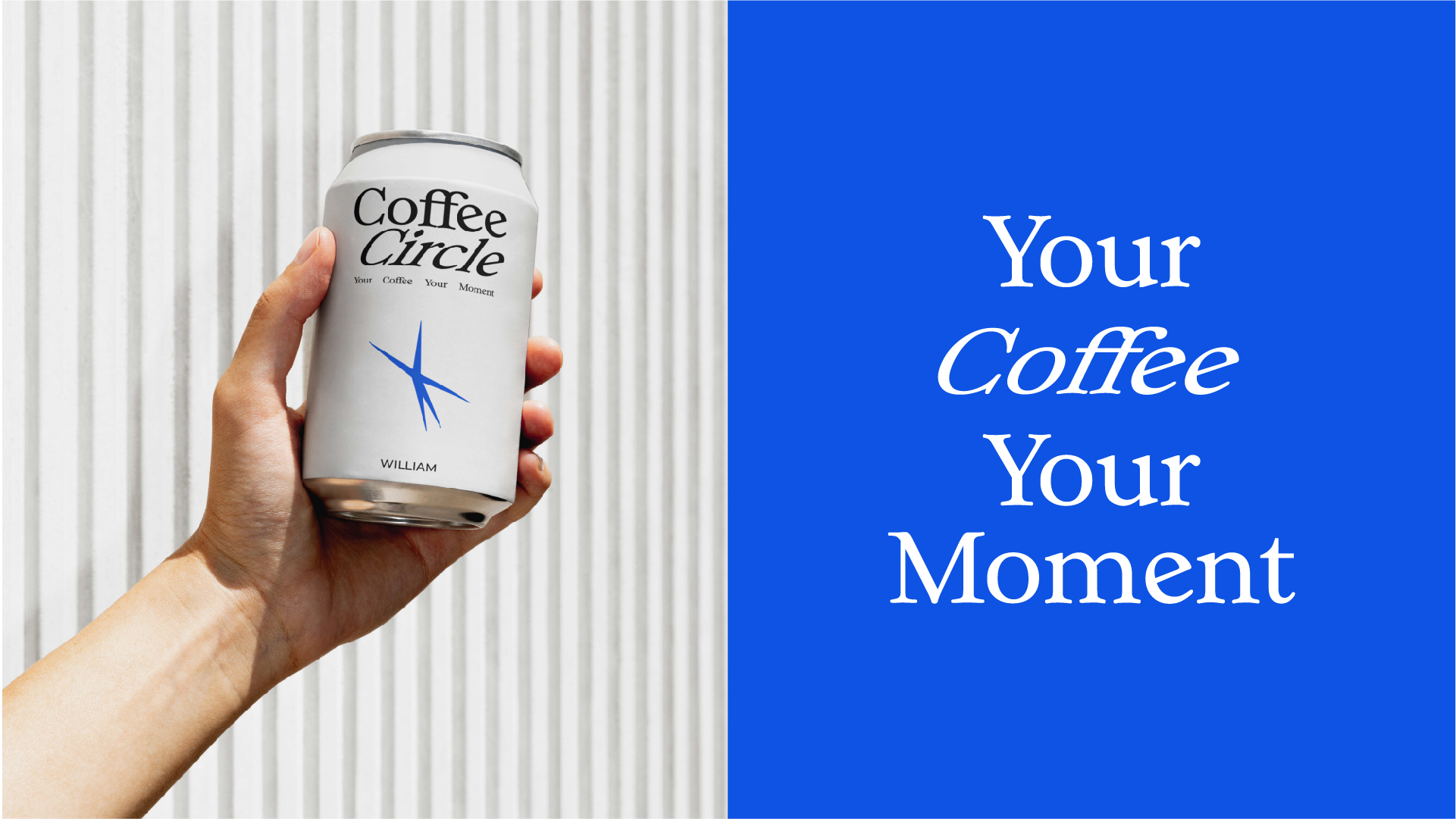
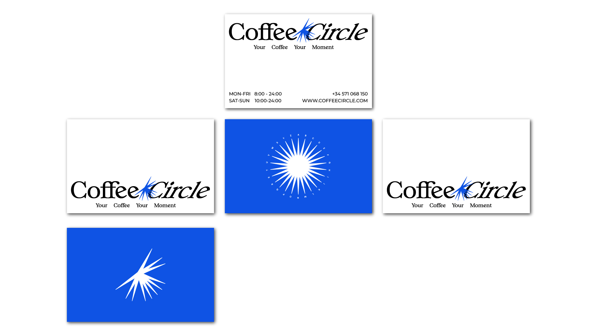
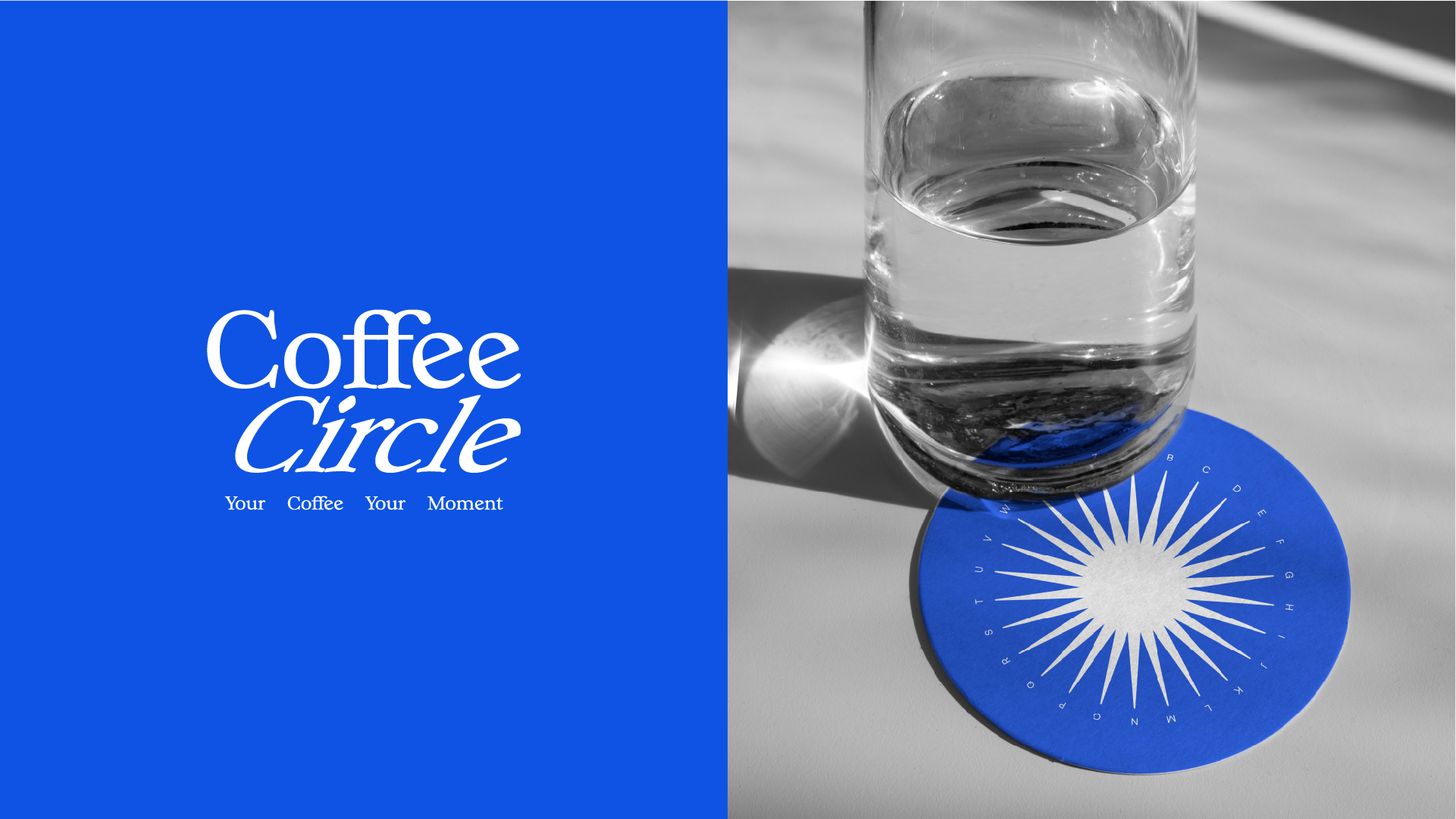
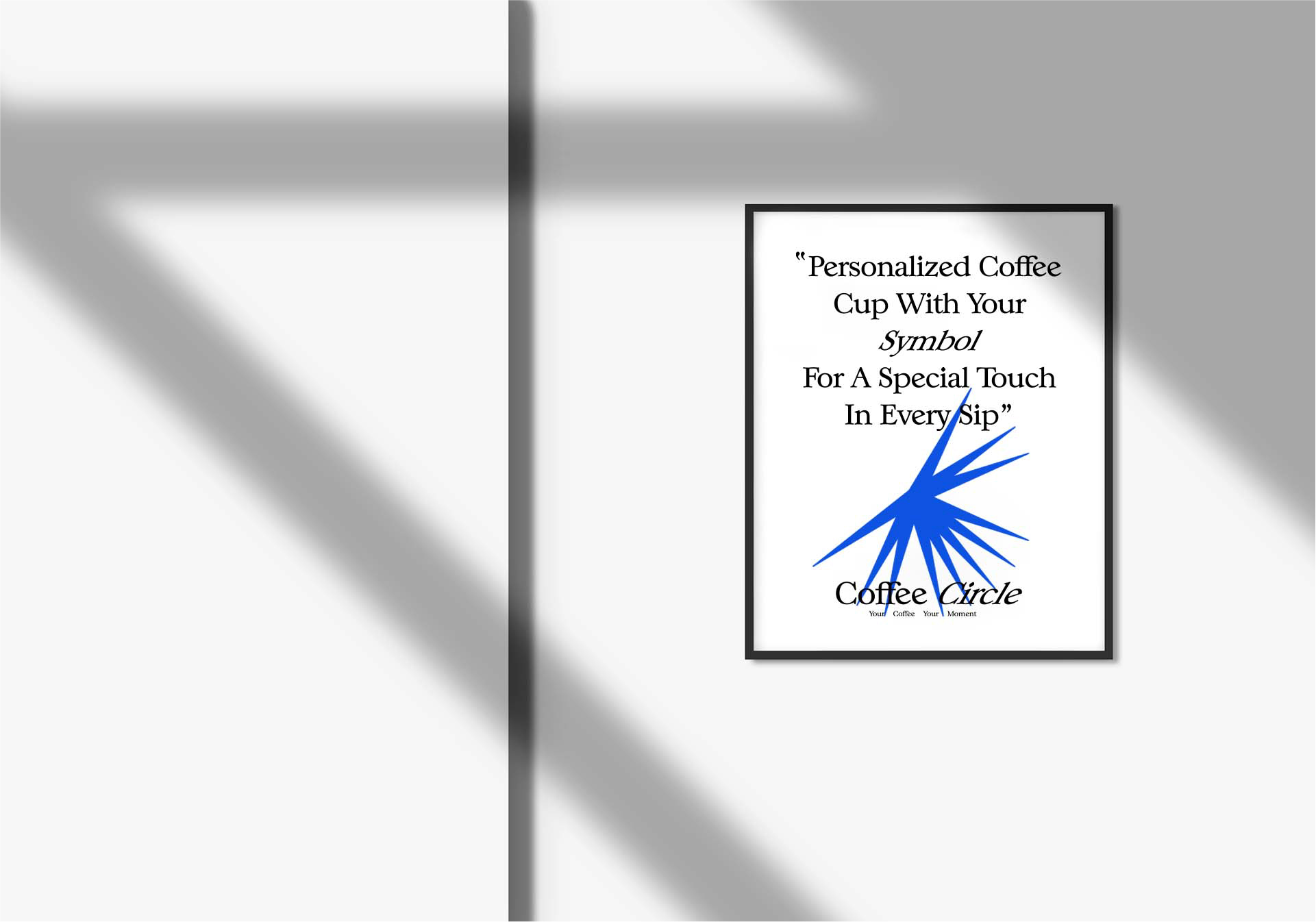
At the heart of Coffee Circle is the circle motif, inspired by the brand name and the sun. In the logo, the letters of “Coffee Circle” are fully highlighted, making the brand name immediately recognizable and central to the design. The surrounding letters or elements are present but subtly rendered, forming nodes that represent sunlight, morning energy, and the rhythm of daily coffee rituals.
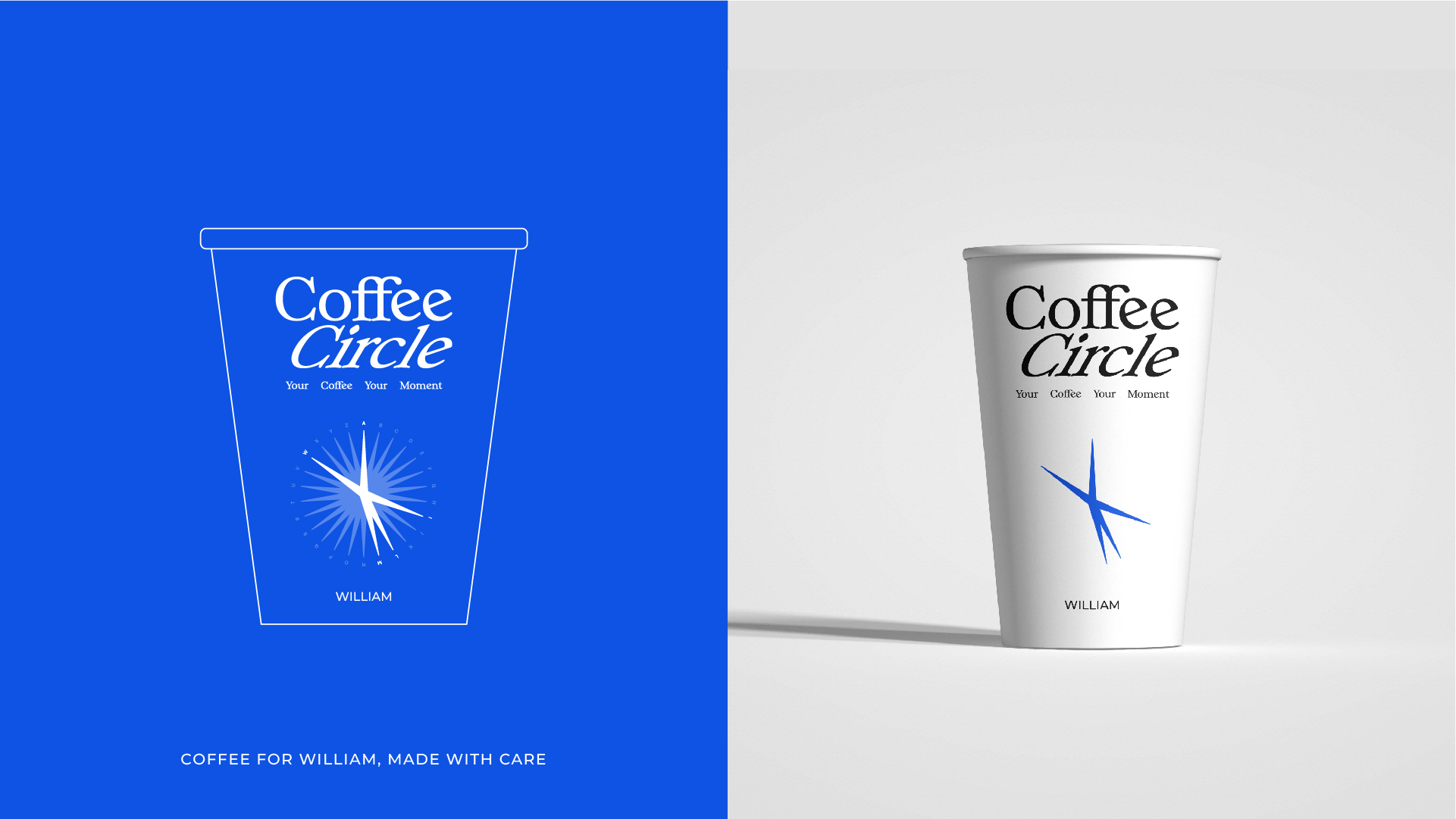
For example, imagine the name “William” each letter in the name could be fully highlighted to form the central circle, while additional letters around it form subtle nodes. This creates a personal signature effect, where the highlighted letters tell the story of the brand, and the surrounding nodes evoke the warmth and movement of sunlight in the morning.
This design makes the logo bold yet poetic, visually connecting the brand to the ritual of coffee and the start of each day.
The Result
Coffee Circle became a brand identity that feels premium yet approachable, minimal yet full of personality. The circular alphabet system with highlighted brand letters and surrounding nodes creates a visual story of ritual, sunlight, and craft, making the design both functional and poetic.
Design Highlights
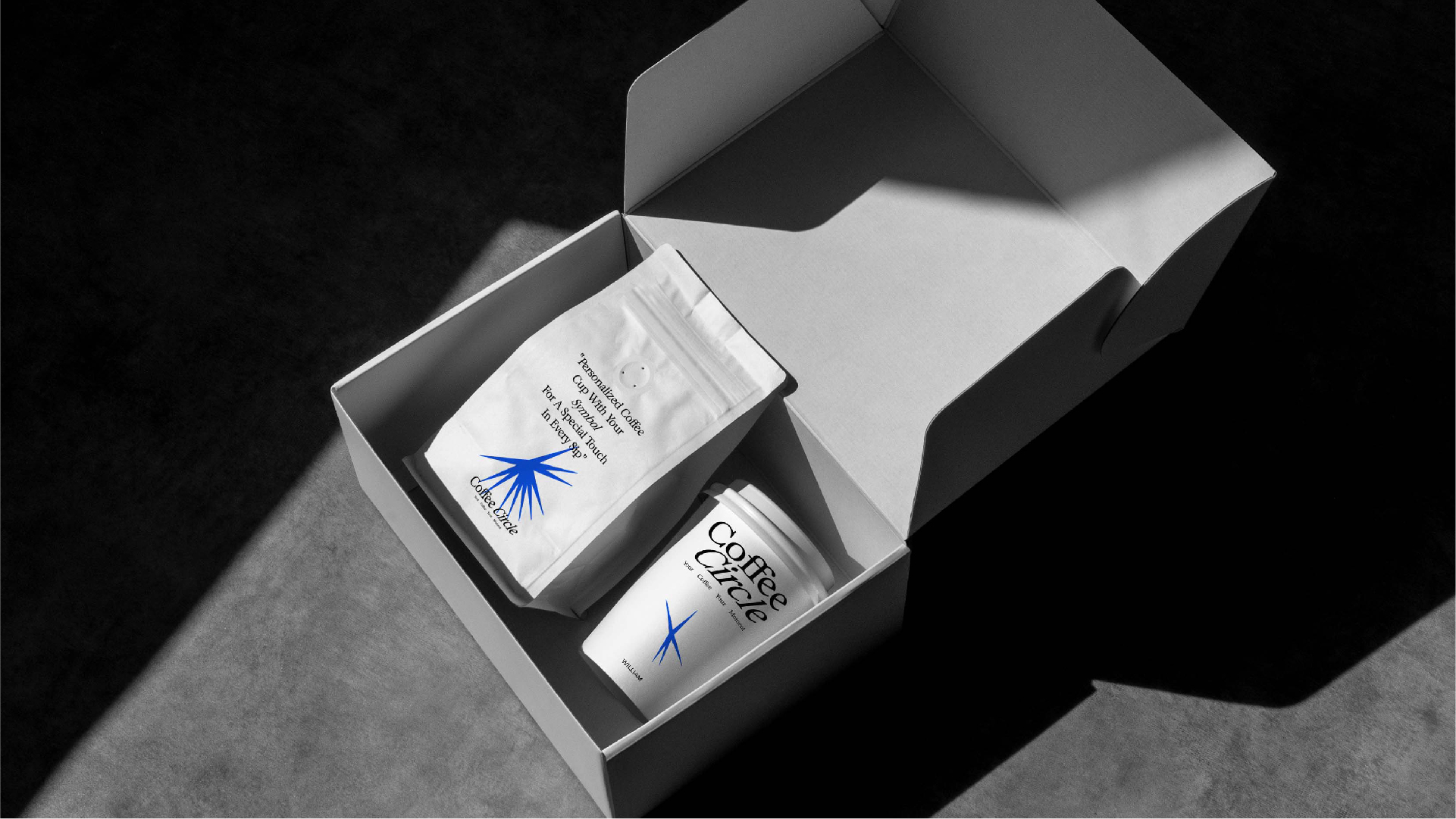
Circle & Nodes: The full brand name “Coffee Circle” is highlighted at the centre. Surrounding letters form subtle nodes, echoing sunlight, morning energy, and rhythm. Example: A name like “William” could be highlighted similarly — central letters bold, peripheral letters forming a soft circular node system. Colour Palette: Warm browns and creams reflect roasted coffee and natural textures. Golden highlights evoke sunlight and morning vitality. Typography: Clean, modern fonts complement the circular motif. Subtle geometric touches echo the alphabet nodes.
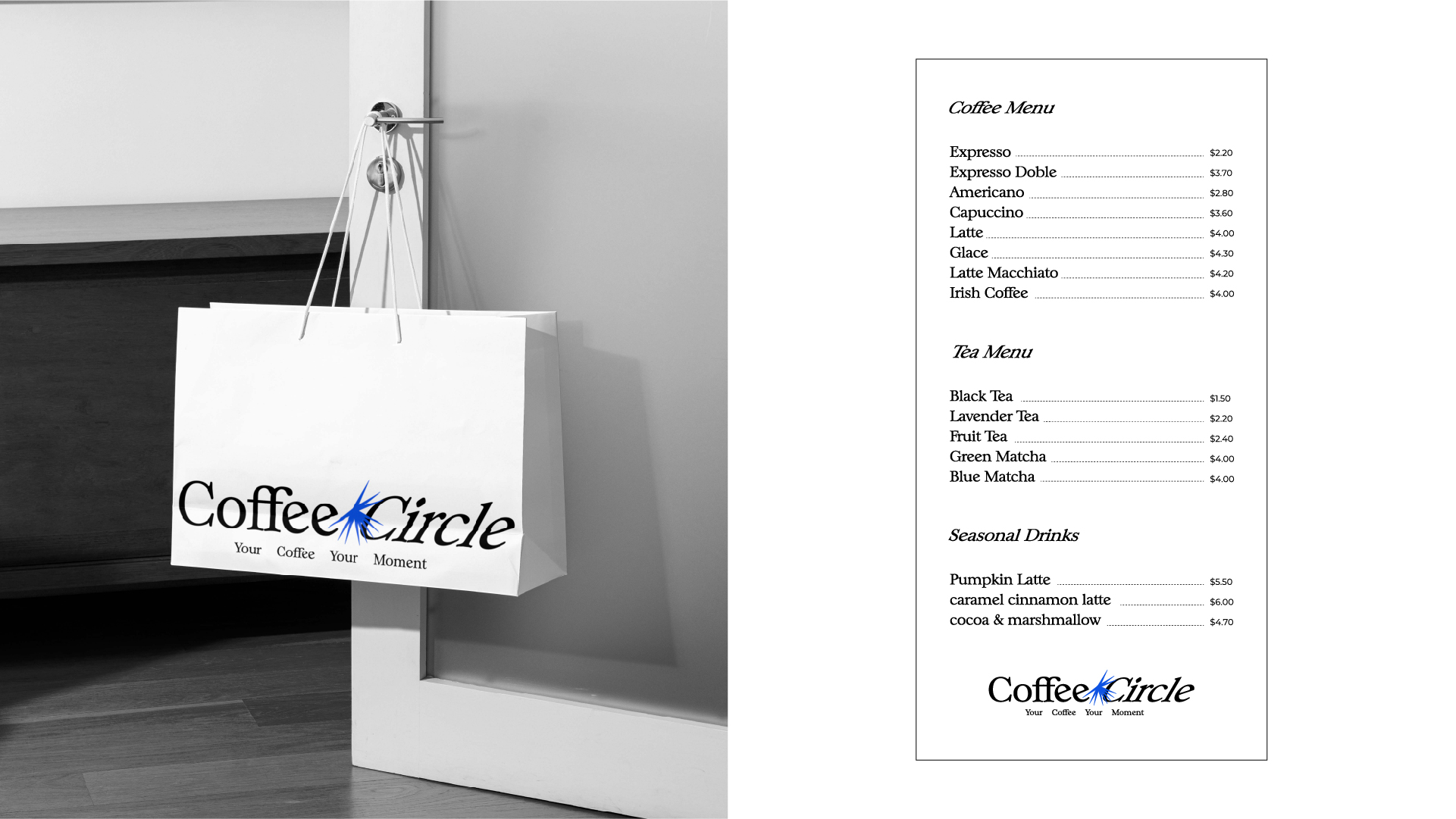
Visual Identity
The packaging and identity emphasise clarity, warmth, and ritual-inspired design. Circular graphics, tactile finishes, and highlighted letters make Coffee Circle both approachable and distinct, turning every cup into a mindful morning experience.
CREDIT
- Agency/Creative: Artlife Branding Studio
- Article Title: Coffee Circle: Crafted Around Your Morning Ritual
- Organisation/Entity: In-House
- Project Type: Identity
- Project Status: Published
- Agency/Creative Country: India
- Agency/Creative City: Rajkot
- Market Region: Global
- Project Deliverables: Art Direction, Brand Design, Brand Guidelines, Brand Identity, Brand Redesign, Creative Direction, GIF Animation, Graphic Design, Logo Design
- Industry: Food/Beverage
- Keywords: Brand Identity, Revitalise, Minimalist Design, Visual Identity, Logo Design, Typography, Color Palette, Product Branding, Creative Direction, In-House Project, Packaging Design, Coffee Brand, Minimalist Design, Visual Identity, Typography, Product Branding
-
Credits:
Creative Director: Dhaval Vaghela


