


Codeli has been in the market for more than 50 years and today, having a new team at the forefront of business, it thinks modernity and technology in all deliveries. And they need, more than ever, to translate this into all points of contact with their end customers.
Redesigning is always very challenging, especially when the company already has a long life and a well-structured and constructed positioning. Therefore, as a strategic choice, I mentored some essences of the brand – such as the color blue – and, connecting every detail of the new identity with its strengths, it still brought new elements that would translate the technological and innovative look they are looking for today.
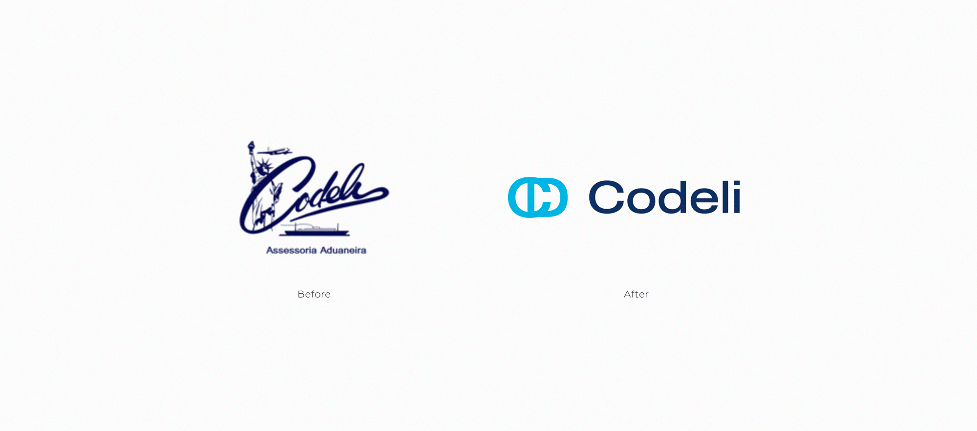
Its partners understood the need to redesign based on questions about their professional attitudes, coming from partners and customers, and from then on, they contacted me in search of a unique, remarkable and special change. The project presented and defended was bold, since before they had a calligraphic typography and elements related to logistics that made up the logo. At briefing meetings, it was decided that it would no longer be necessary to assume these elements and all project participants gave me carte blanche to develop the new identity as I understood that this new phase should be.
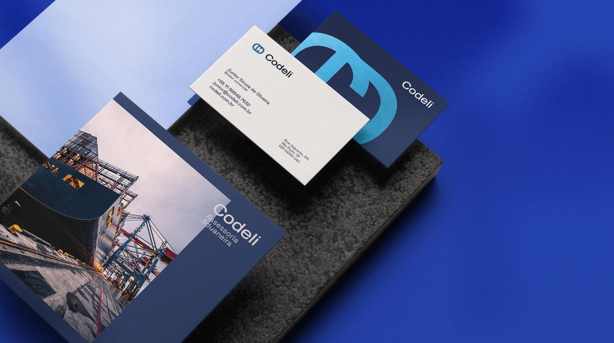
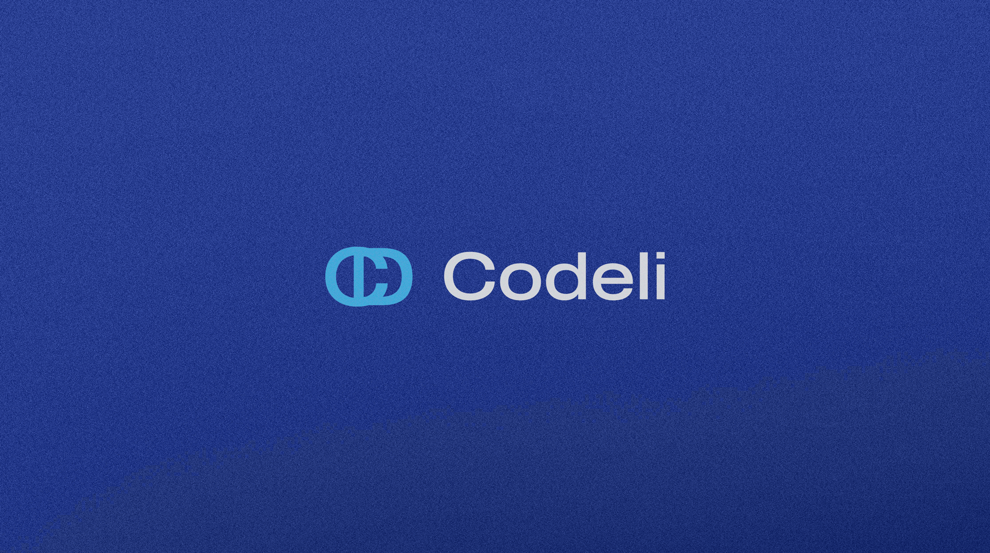
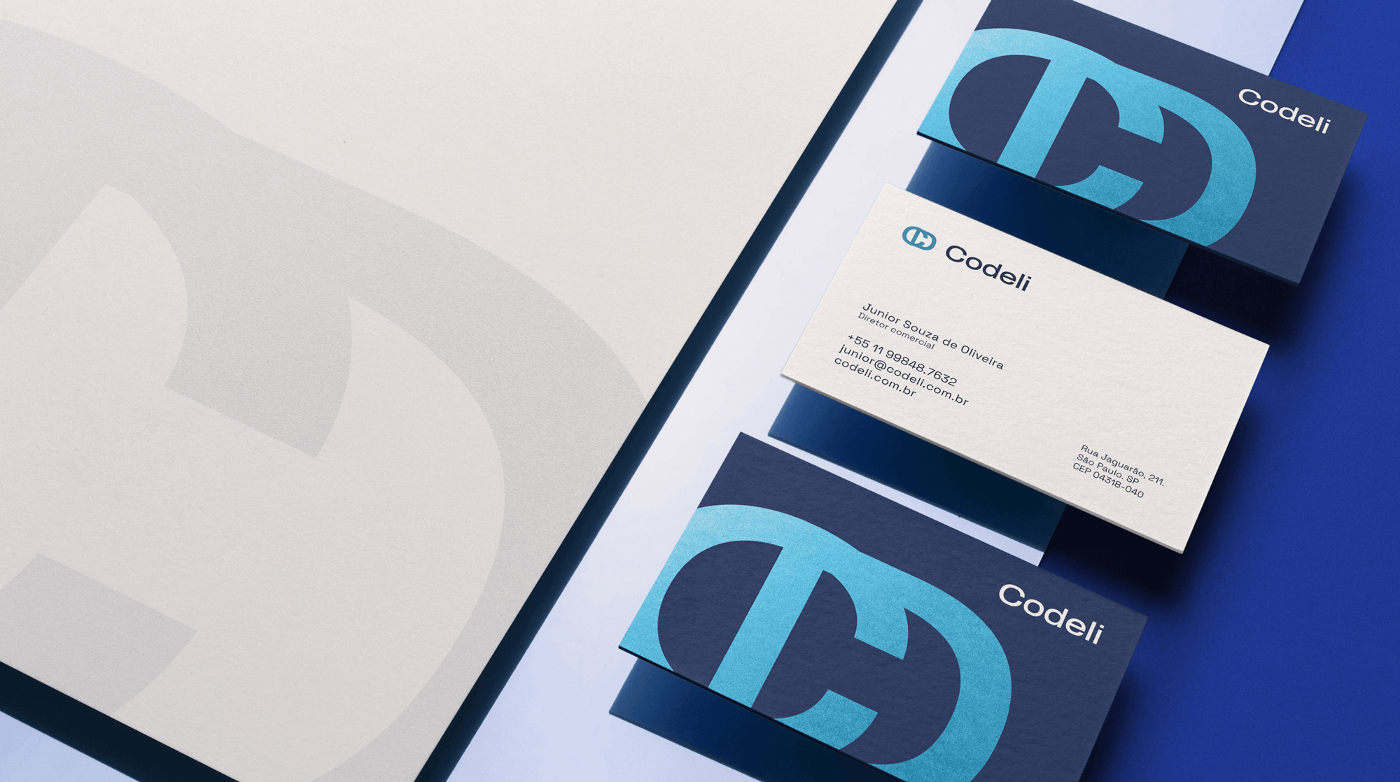
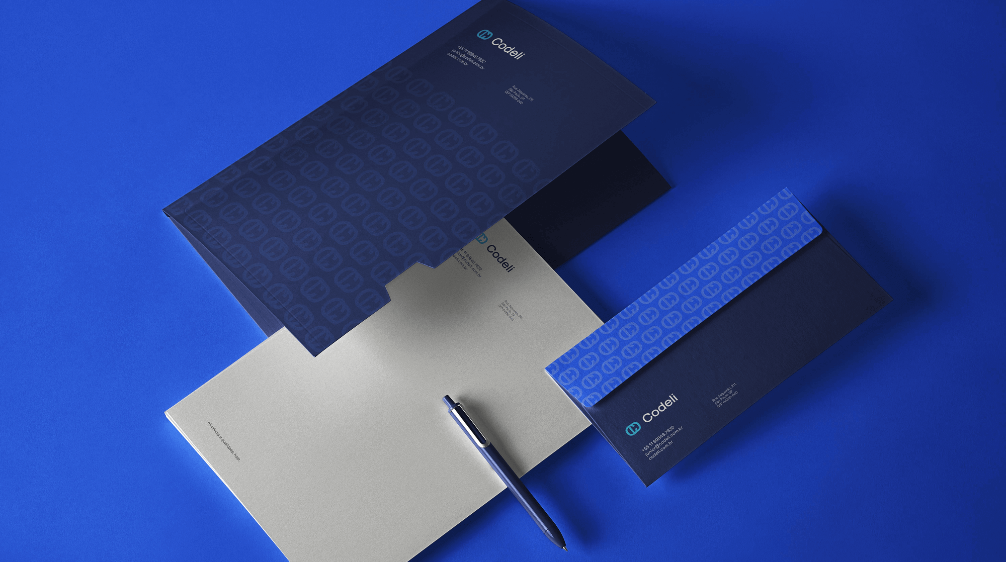
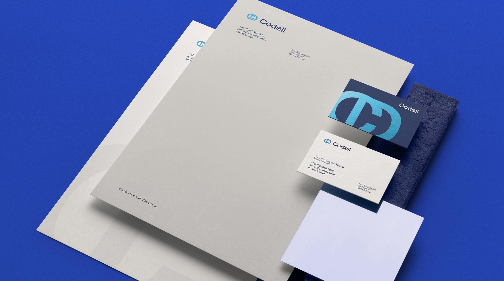
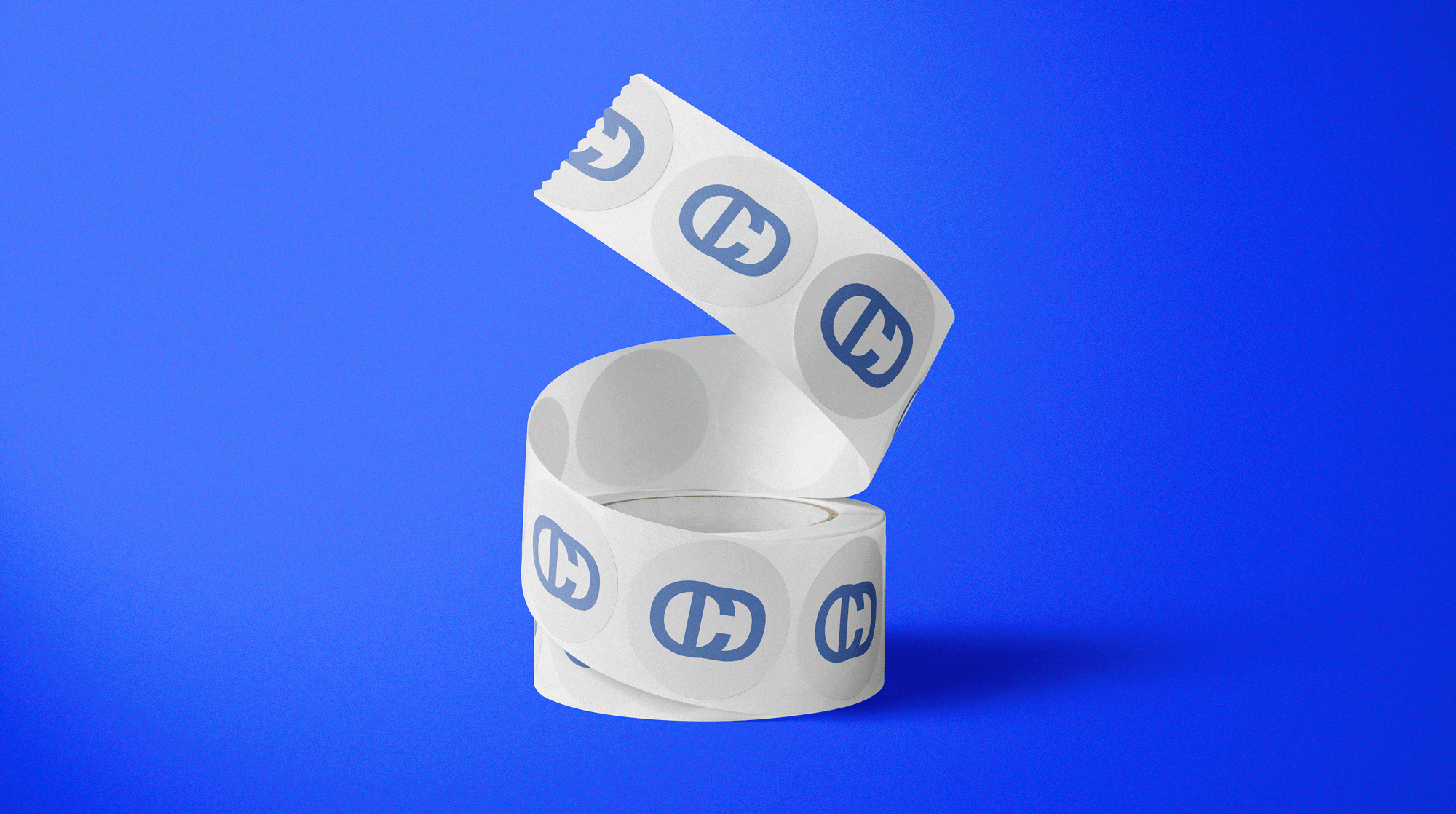
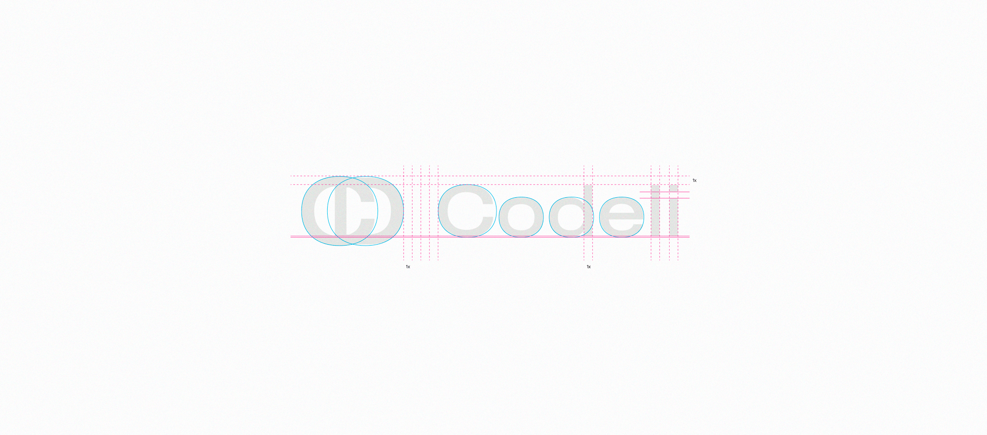
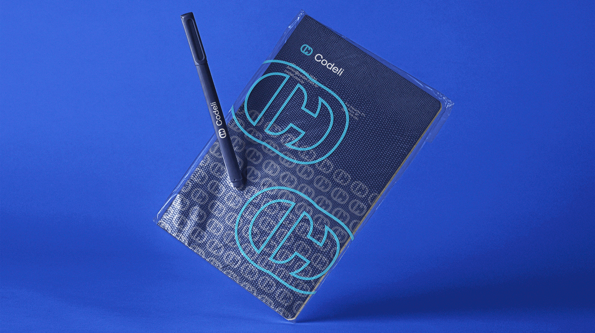
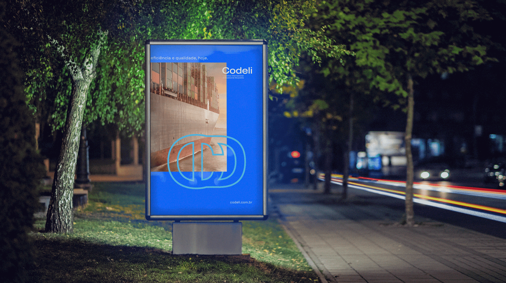
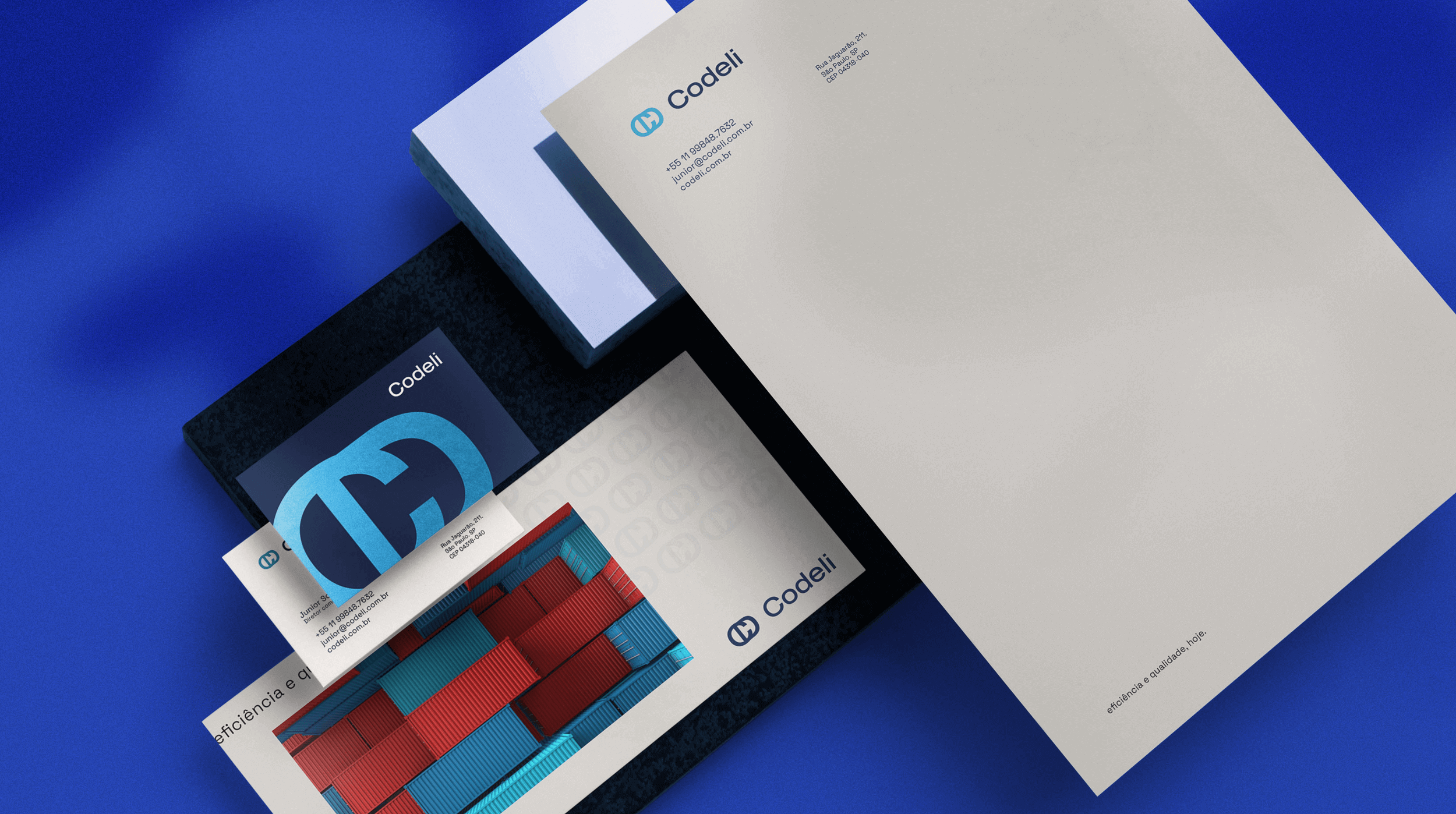
The biggest challenge was to create a symbol that told a little about the history of the company, that referred to everything they will be from now on, and that, finally, still gave an air of a modern and young company. Therefore, the brand was built from the oval shapes of the typographic characters, generating perfect symmetry and a unique beauty to the logo. Your visual identity needed to be clean and objective, so I brought a light layout that could complement your new striking symbol. The expansion to their stationery materials needed to illustrate the modernity and technology that they will embrace with all their might from now on. And then the new Codeli was born, strong, unique and emblematic.
CREDIT
- Agency/Creative: Barbara Design
- Article Title: Codeli Logistics Company Redesign by Barbara Design
- Organisation/Entity: Freelance, Published Commercial Design
- Project Type: Identity
- Agency/Creative Country: Brazil
- Market Region: South America
- Project Deliverables: Brand Creation, Brand Identity, Brand Strategy, Brand World, Branding, Graphic Design, Identity System, Rebranding
- Industry: Technology
- Keywords: logistics brand, redesign, logo design, logistics logo, logo, visual identity


