Join us on a tasty design journey full of fun, colours and dairy freshness. Meet Miil. Exclusive dairy range designed for Rohlík e-supermarket. Launched in spring 2021 in the Czechia and Slovakia, Hungary and Austria.
Great quality products deserve great packaging design. In most cases of dairy category, this would include blue and white colours, cows, meadows and jugs with splashes of milk… But is there a way to deliver the same quality cues, needed for the sake of the category, and still be original and bring some added value? Cocoon was given this challenge already in the brief. And we were happy to accept it with a big YES. In case of Miil, the extra value that won us the tender and made the client go for it were the stirring positive emotions, entertaining and engaging information you cannot normally find on dairy products.
The four main aspects we intend to emphasize to describe the concept are the logo, fun facts, product shots and colours.
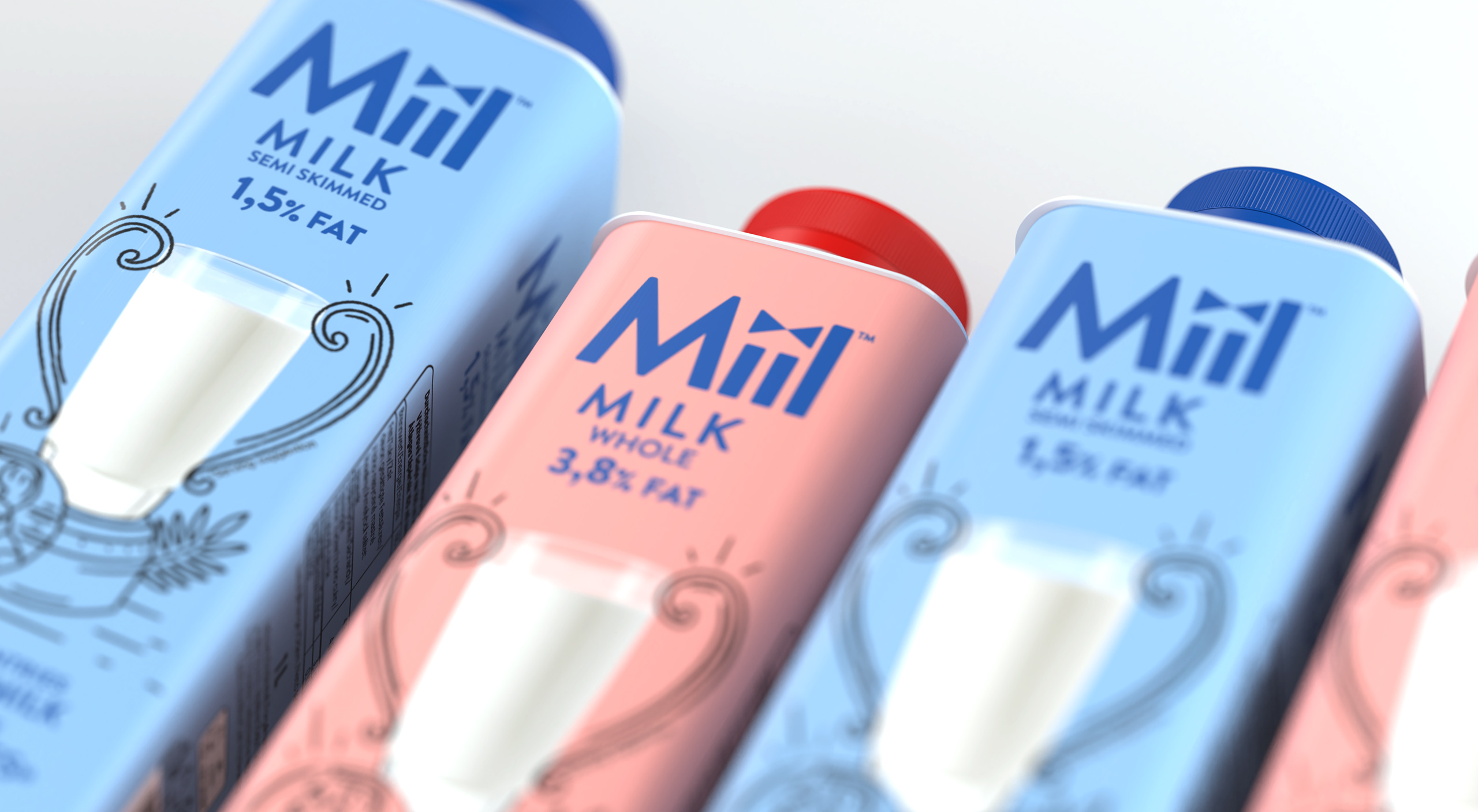
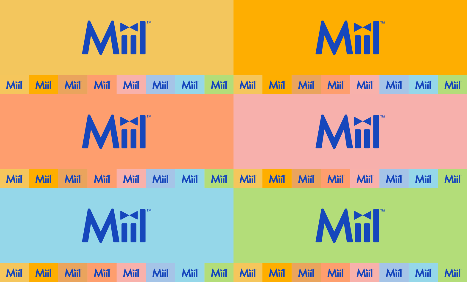
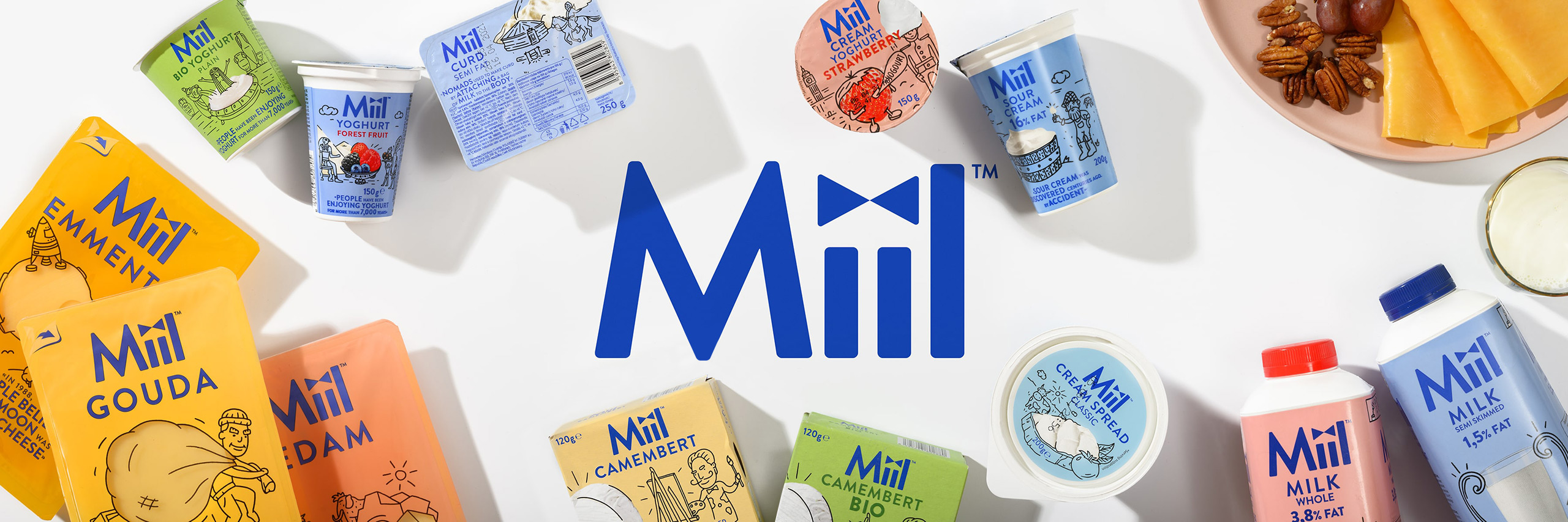
The logo of Miil uses vibrant blue. Category-relevant, yet in a striking and confident tone. The double dot on the unique double ii turned into the symbol of a bowtie. It makes Miil a modern cool smart guy “educating” with the fun facts.
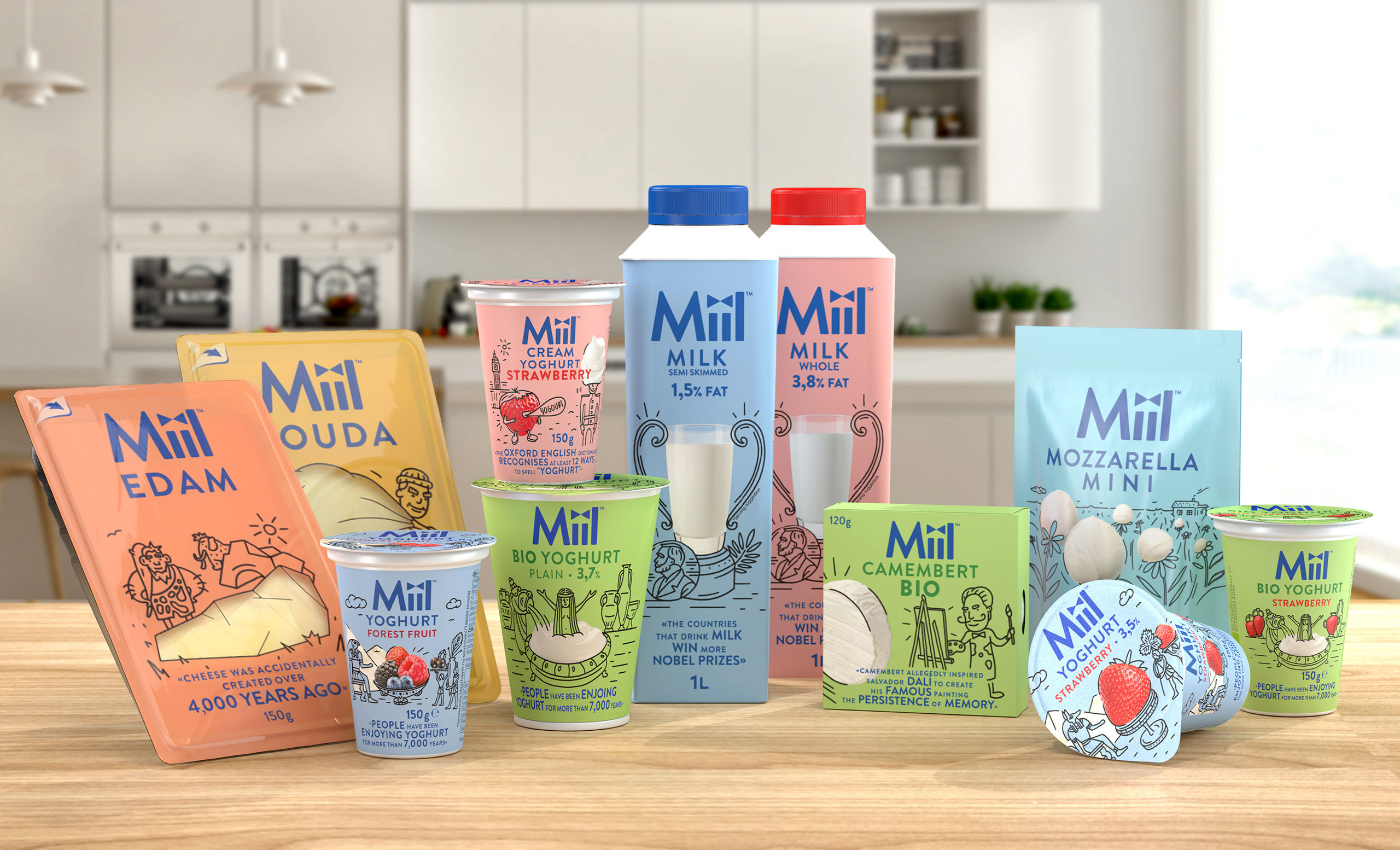
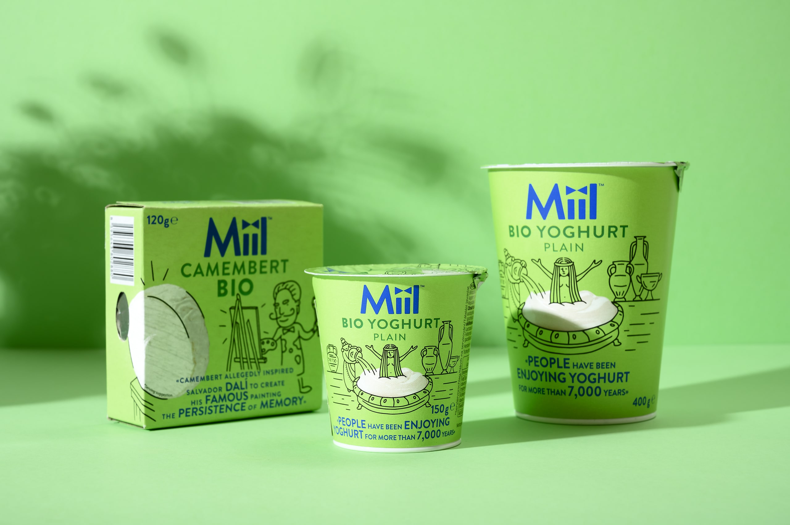
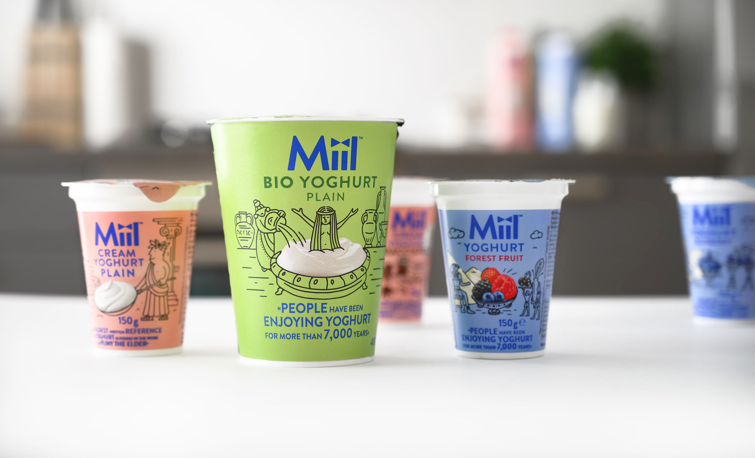
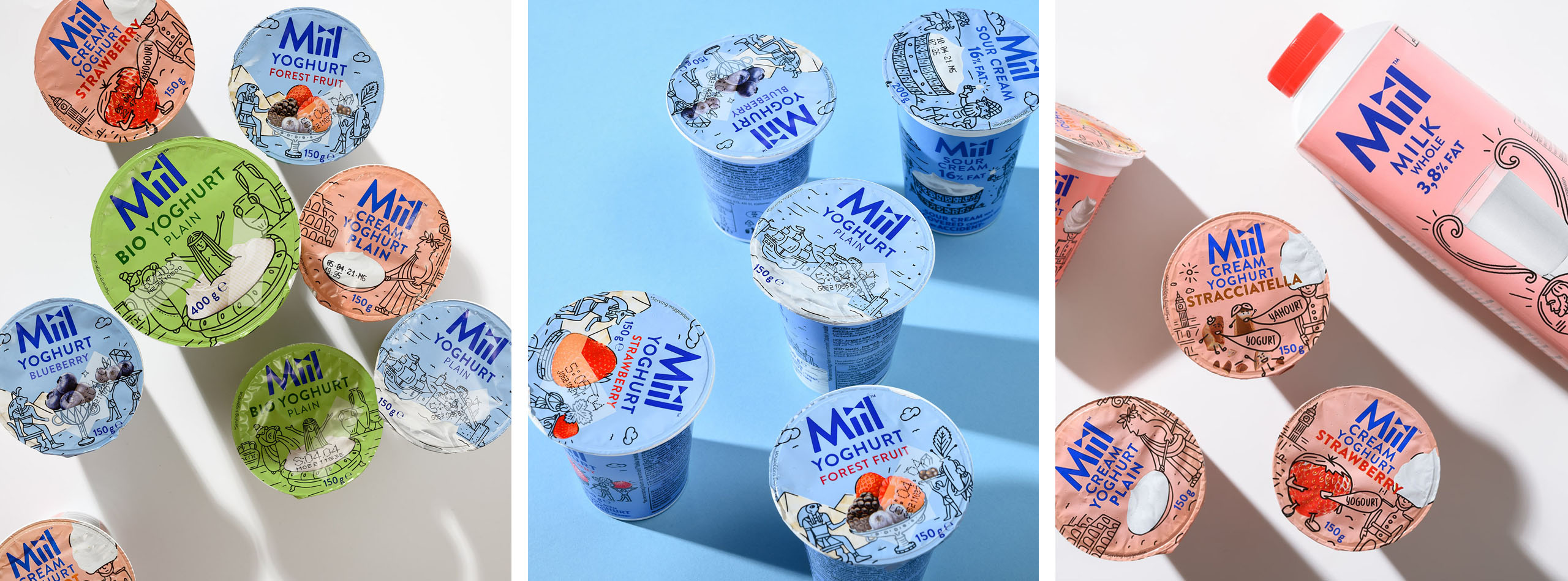
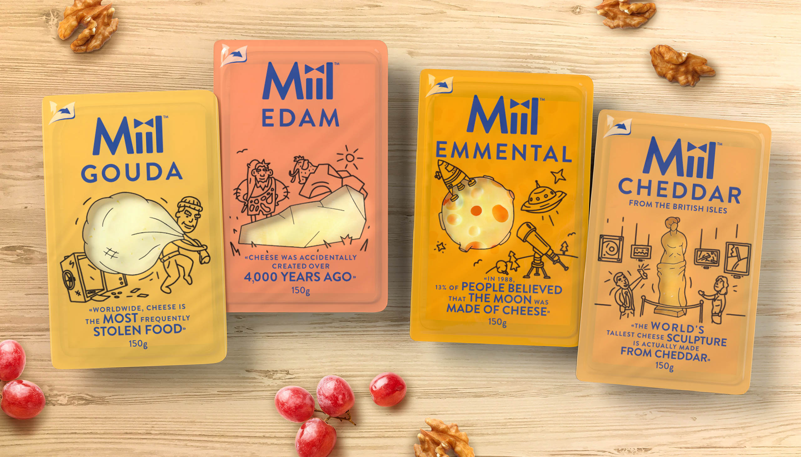
Fun facts are not only fun to read, but they are laid out in an interesting typographical way making it an important design tool as well. Each fun fact is illustrated by a simple doodle black sketch, originally drawn for the occasion. It adds to the entertaining aspect and to the overall design uniqueness. The simple black line style works in great contrast with the flat basing colours, yet does not overweigh the whole impression of each pack. It reminds us of simple textbooks, in which we used to learn not only by words, but also using imagery.
The colour palette of the range consists of pastel, yet very fresh shades. It makes the portfolio stand out (especially in your fridge), but also helps navigate through it. Green for organic, blue for core, pink for flavour… It is not the most typical palette for the category, rather another way of disrupting a bit, and gaining the brand-voice of its own.
Last but not least are the product shots. These are intentionally dominant and display the product in its purity and in a very straightforward way. They are incorporated into the illustrations, because the fun facts simply spin all around them. The display of products (also using transparent windows on cheeses for instance) was a very important task. Being transparent and honest with consumers is a value embedded in the brand and Rohlík as such. As well as allowing consumers to simply enjoy what they can in their daily and dairy lives.
The portfolio of Miil is broad. From milk to cheese, yoghurt, creams, organic line and spreads. We were looking for a concept that would connect the selection, but also help consumers diversify and orient themselves. It’s also important to mention the general layout of the packaging design. The logo is actually dominant and gains a lot of space on the face. The reason for that is the exclusive presence of the brand in the e-commerce environment. There is no real shelf on your desktop or mobile, there is no shelf block created by the products. The way we created the layout reflects the specifics of the sales channel.

CREDIT
- Agency/Creative: Cocoon Prague
- Article Title: Cocoon Prague Create Miil an Exclusive Dairy Range Designed for Rohlík E-Supermarket
- Organisation/Entity: Agency
- Project Type: Packaging
- Project Status: Published
- Agency/Creative Country: Czech Republic
- Agency/Creative City: Prague
- Market Region: Europe
- Project Deliverables: Brand Design
- Format: Case, Cup, Flow-Pack
- Substrate: Plastic
- Industry: Food/Beverage
- Keywords: WBDS Agency Design Awards 2021/22
- Keywords: visual identity, packaging design, portfolio architecture, corporate identity
-
Credits:
Creative Director: Karolina Belohlavkova
Design Director and Senior Designer: Evgeny Razzhivin
Illustrators: Sasha Sharavarau, Petra Zabova
3D Visualisation: Petr Ludvik, Thibault Schubel
Photography and Animation: Jose Sabino
Artworker: Jana Klimentova


