


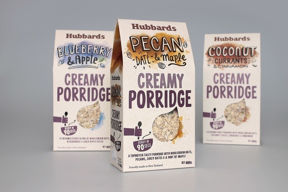
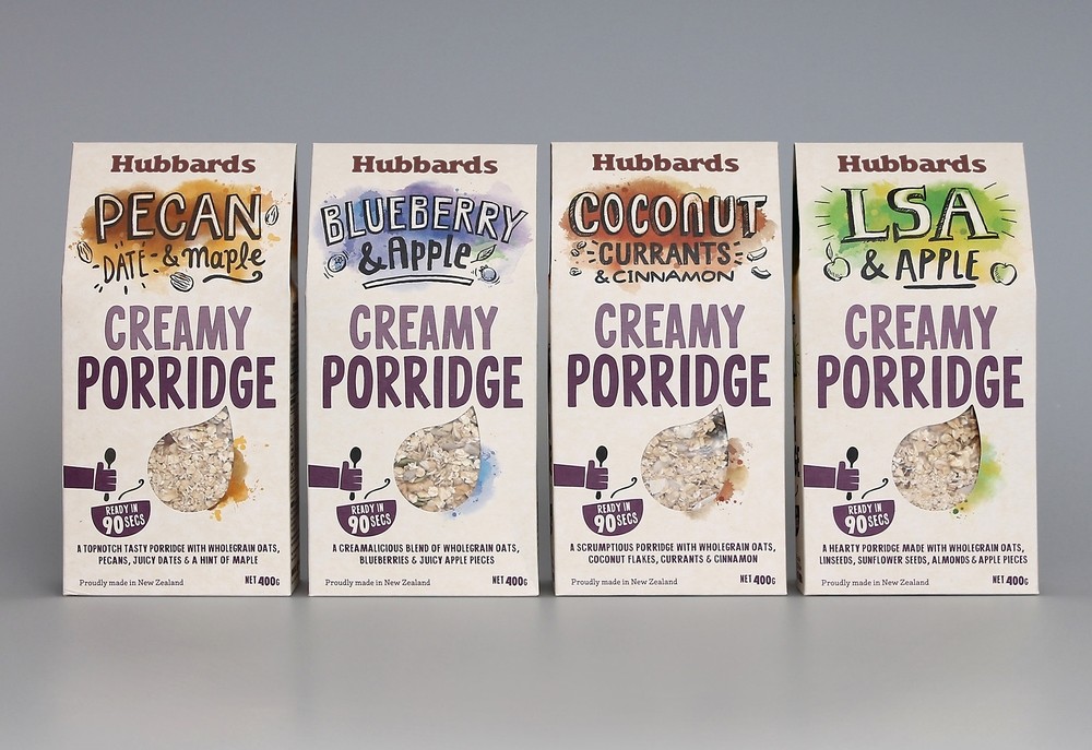
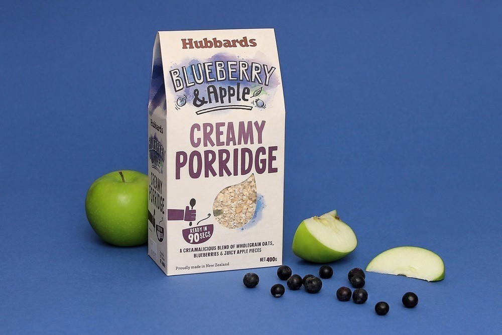
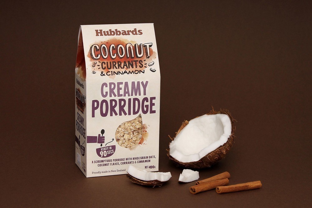
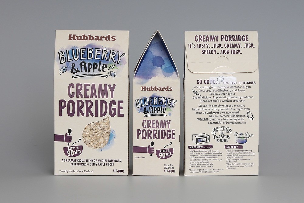
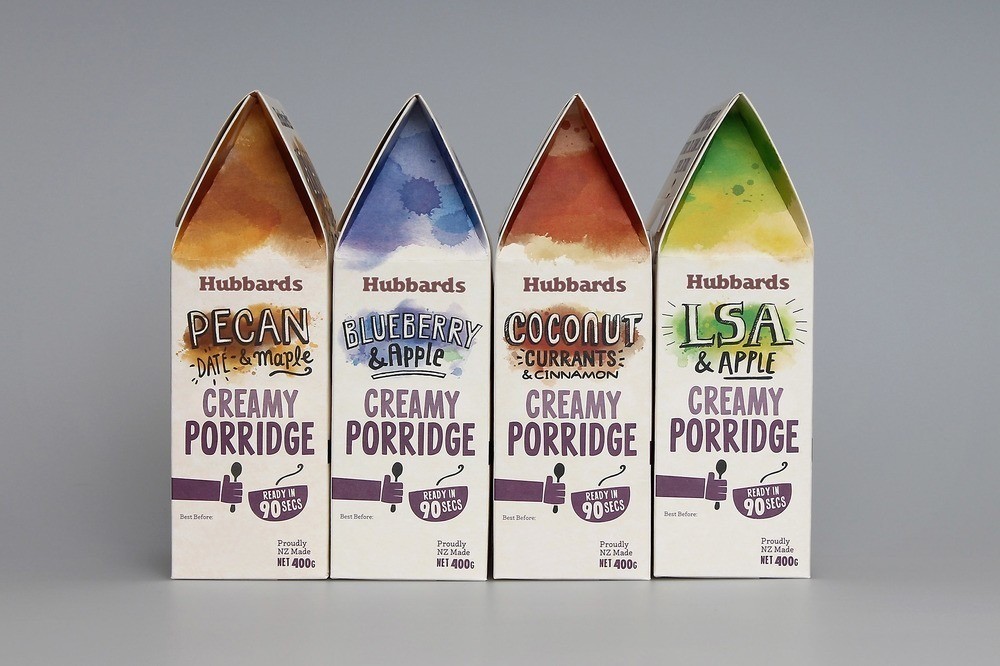
“As a product category that is expanding in New Zealand with consumers looking for experiences outside of cereals and mueslis, porridge is an area lacking in product innovation and usually identified by rustic, traditional messages. Hubbards identified this category as an opportunity to bring the strength of the brand into. Developing a range of modern creamy porridges, packed with flavour to satisfy the modern consumer, adding its own unique, quirky and bold packaging to create a new premium mainstream offering.
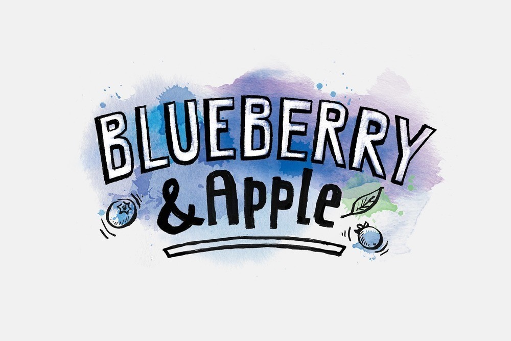
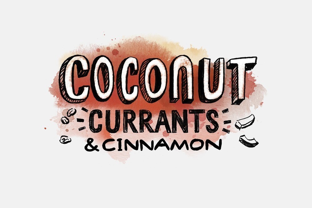
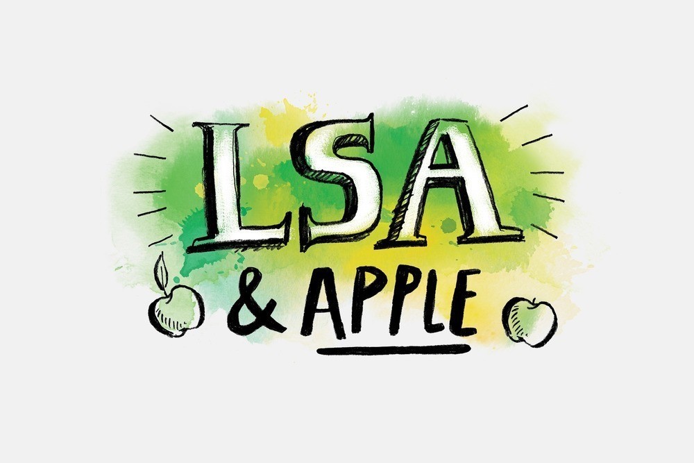
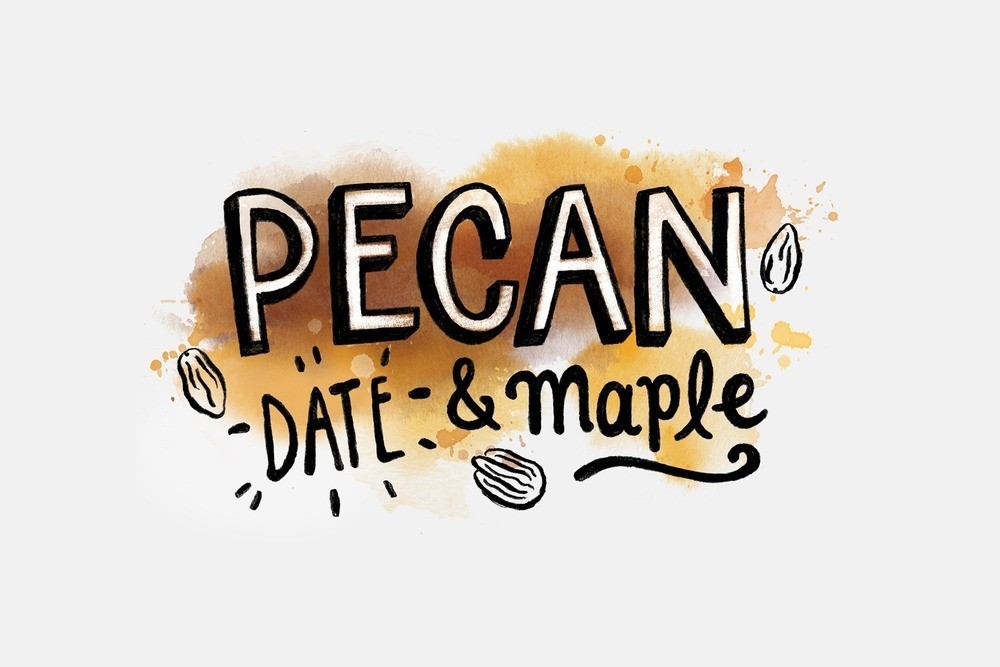
With a subtle nod to the heritage of the product, the pack shape was softened with the addition of a gable top. A clean, simple pack architecture allowed the hero flavour identifiers to have maximum impact. Vivid watercolours combined with loose, mural style typography giving each pack an individual voice while also communicating the product promises of flavour, warmth and creaminess. These cues are supplemented with a dollop style product window and using warm purple in all other graphic elements to bring cohesion to the family range. Colourful, earthy, and modern – an inspiring porridge range that is everything but traditional.”

CREDIT
- Agency/Creative: Coats Design
- Article Title: Coats Design – Hubbards Creamy Porridge
- Project Type: Packaging
- Substrate: Pulp Carton


