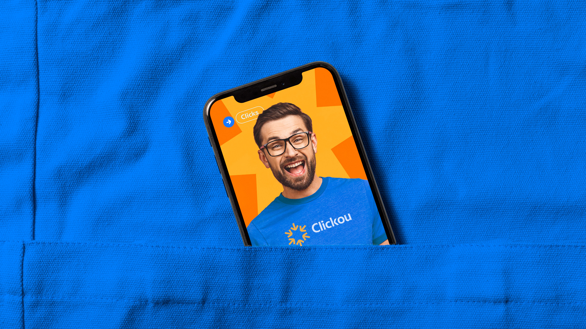
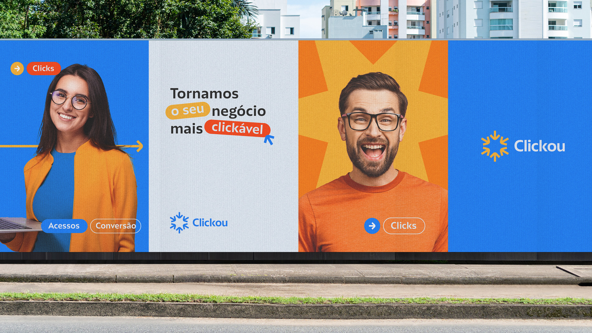
The creation of Clickou’s brand was an exciting and challenging process in which I explored creativity to develop a unique and impactful visual identity. As mentioned earlier, my main objective was to convey the animation and joy that the company represents without compromising the trust and seriousness necessary to attract the target audience.
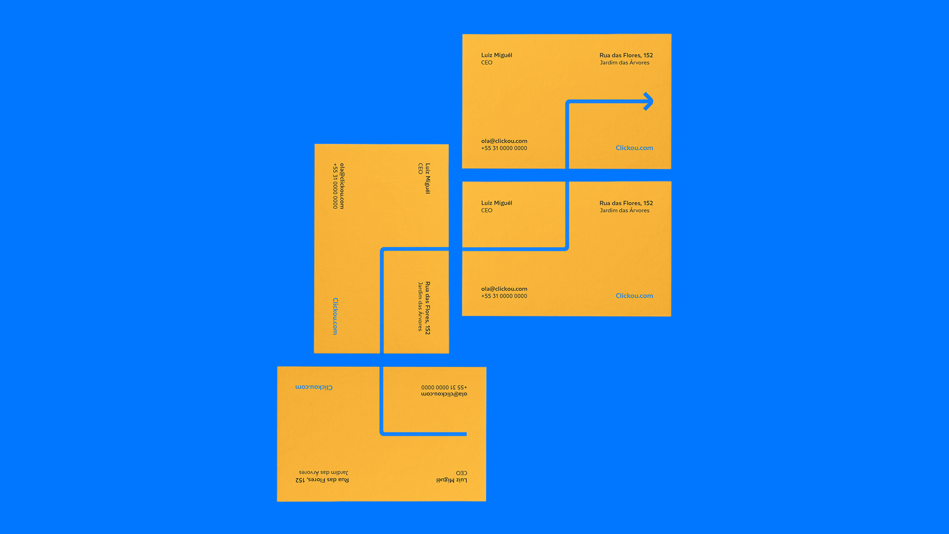
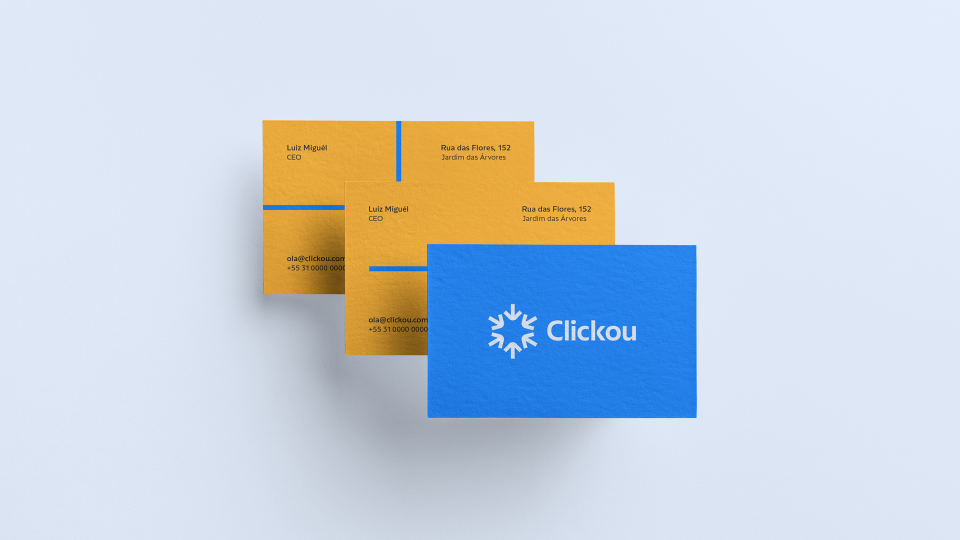
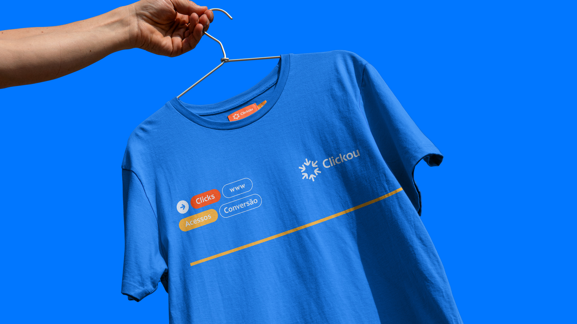
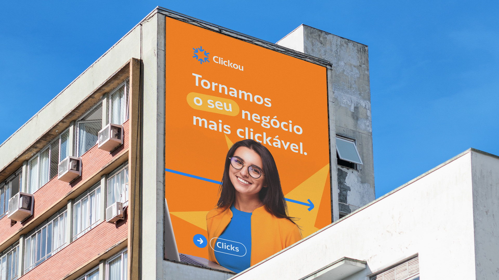
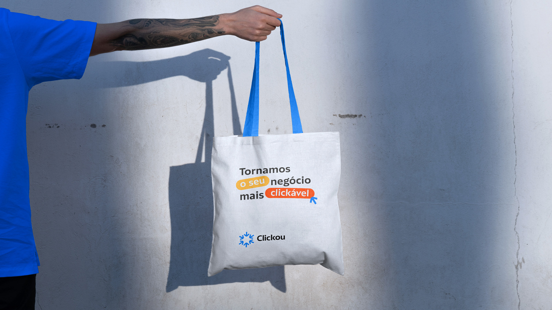
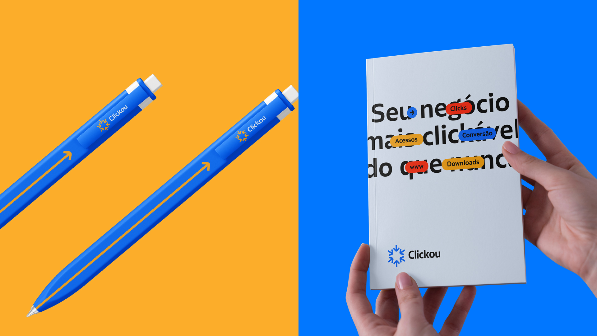
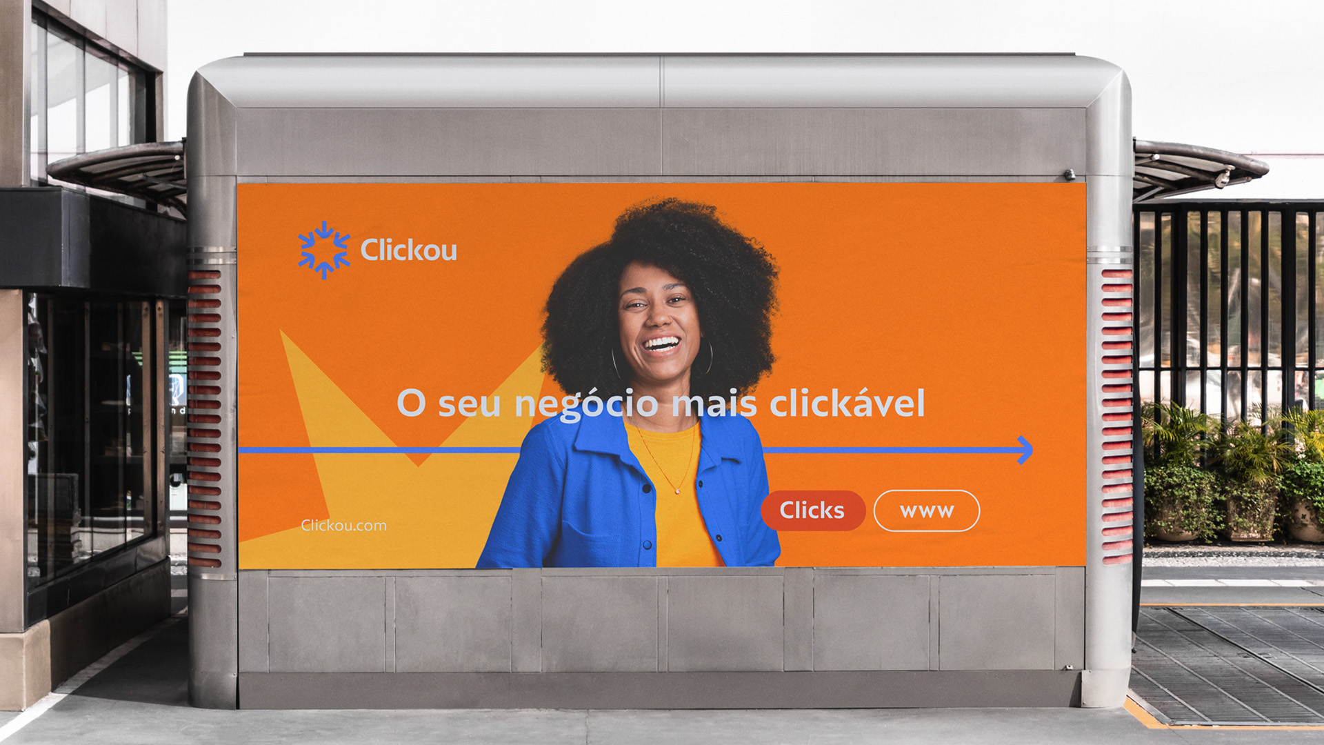
To achieve this goal, I started by defining a color palette that reflected Clickou’s vibrant personality. I opted for bright and vibrant tones like orange and blue, which convey energy and enthusiasm. However, to add a touch of sophistication and maturity to the visual identity, I included subtle nuances of softer colors such as gray and white. This balanced combination of colors resulted in a visually appealing and impactful visual identity.
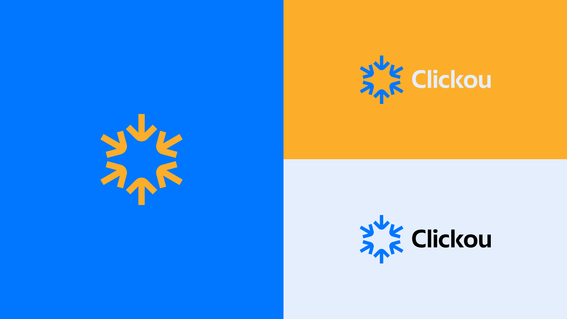
When creating Clickou’s logo, I sought to visually represent the idea of an explosion of clicks. I used dynamic geometric shapes like circles and triangles to symbolize clicks. Additionally, I incorporated arrows representing the mouse cursor, highlighting the agency’s emphasis on paid traffic and increasing the number of clicks and conversions. These combined elements resulted in a unique and memorable logo that effectively reflects Clickou’s identity.
The choice of typography played a fundamental role in creating Clickou’s visual identity. I opted for a modern and playful typography with clean lines and rounded letters. This choice added a touch of personality to the brand, making it more cheerful and friendly. At the same time, the typography maintains a professional aspect, conveying trust and seriousness. The combination of the logo with complementary typography resulted in a cohesive and consistent brand.
In addition to the logo and typography, I developed a series of additional graphic elements to strengthen Clickou’s visual identity. These elements include icons related to digital marketing and the world of clicks, such as bar graphs and arrow icons. They are used in various marketing materials such as banners, online ads, and the company’s social media. The consistent presence of these graphic elements reinforces the brand’s visual identity and helps create a recognizable and cohesive image for Clickou.
As the designer responsible for Clickou’s brand project, I am pleased to have achieved the goal of creating an animated and joyful visual identity while maintaining the necessary trust and seriousness to attract the target audience. Through careful combination of vibrant colors, dynamic shapes, and modern typography, Clickou’s visual identity conveys energy, enthusiasm, and professionalism. This unique and impactful brand will certainly help the company stand out in the market of agencies specialized in paid traffic and attract the desired audience.
CREDIT
- Agency/Creative: Vitor Matosinhos
- Article Title: Clickou Agency Visual Identity By Vitor Matosinhos
- Organisation/Entity: Freelance
- Project Type: Identity
- Project Status: Published
- Agency/Creative Country: Brazil
- Agency/Creative City: Belo Horizonte
- Market Region: South America
- Project Deliverables: Art Direction, Brand Design, Graphic Design
- Industry: Technology
- Keywords: agency, visual identity, brand, marketing
-
Credits:
Type: Plau


