


In an increasingly saturated visual landscape, Clear Architecture sought a brand identity that would articulate its clarity of vision and reinforce its positioning as a leading name in architecture across the Kingdom. This is where the collaboration with Ostudio began—a partnership built on the challenge of translating architectural precision into a visual language that is both timeless and distinctly modern.
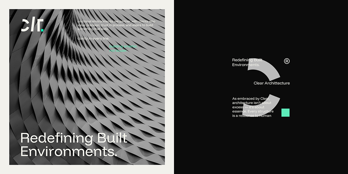
Drawing inspiration from the unique properties of mercury—fluid, adaptive, and reflective—Ostudio crafted an identity system that mirrors Clear’s philosophy: adaptable yet grounded, dynamic yet deliberate. This concept materialized through a minimalist yet structurally sound visual framework built on geometric consistency, transparency, and compositional harmony, allowing the brand to stand out with quiet confidence.
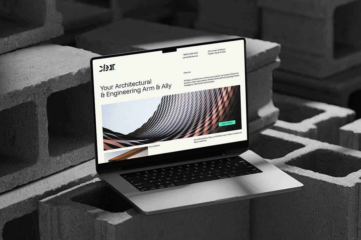
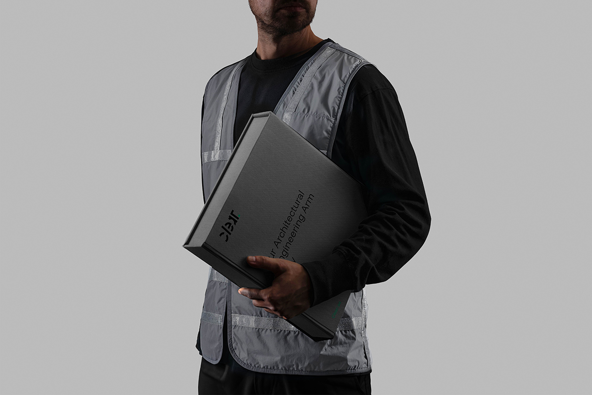
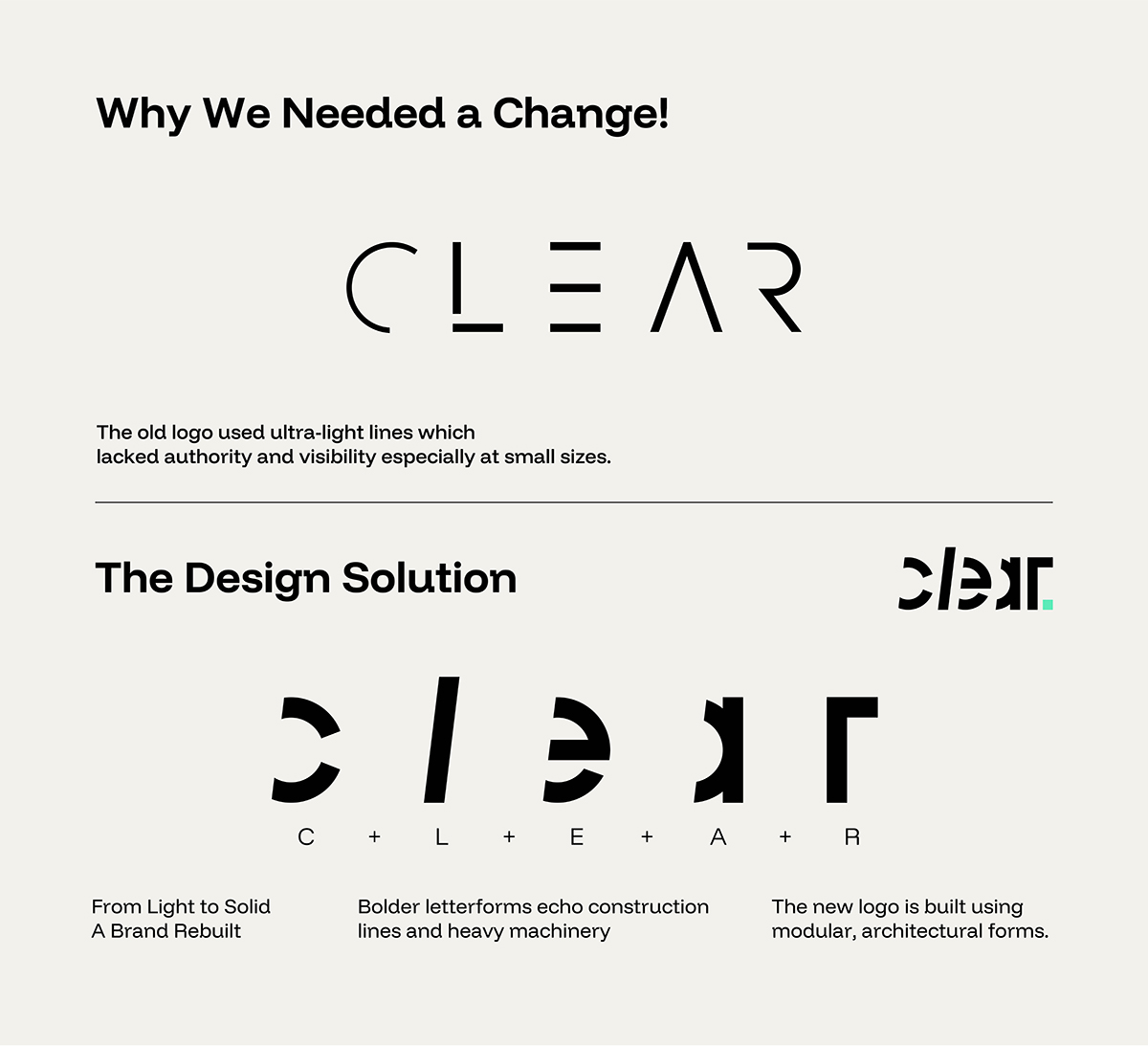
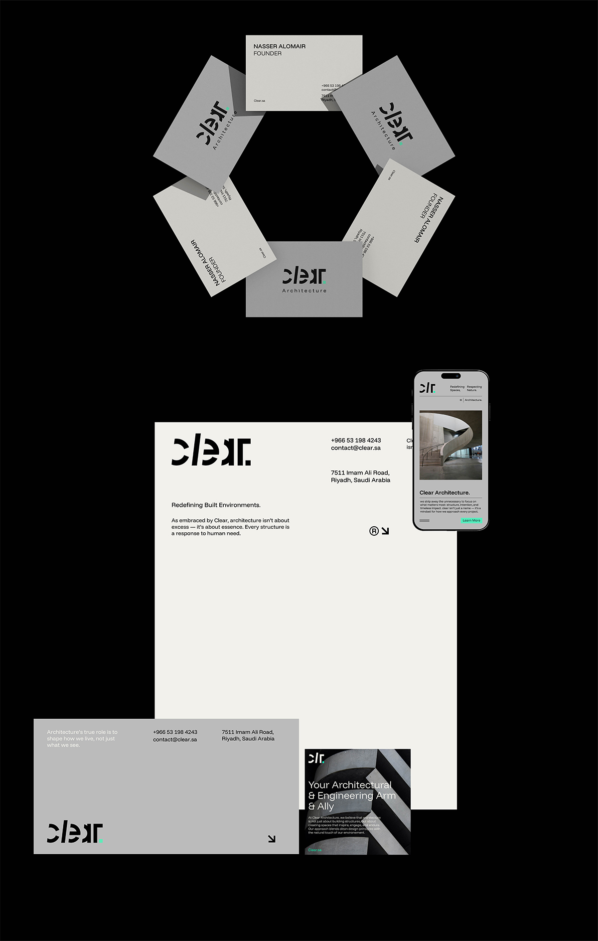
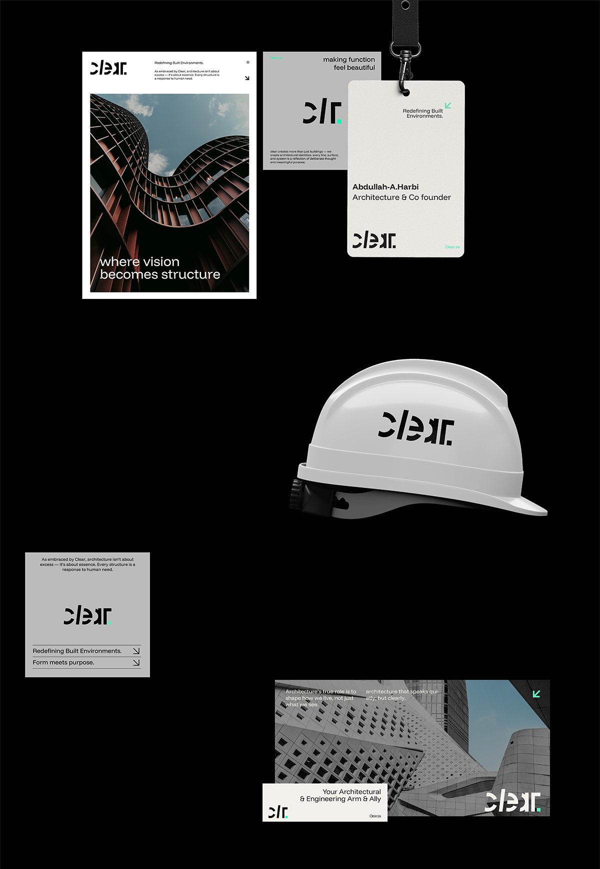
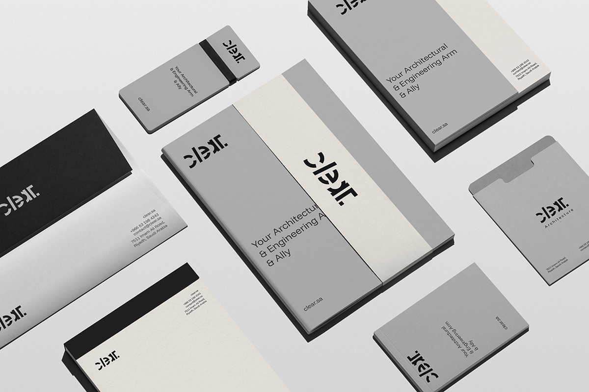
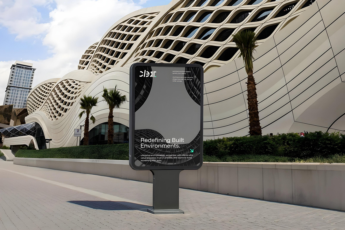
The primary logo was designed with intentional restraint, where the subtle tilt of the letter “L” serves as a creative nod to the company’s approach to thoughtful design interventions. The final period punctuates the logotype with authority, signaling decisiveness and commitment to quality. To complement this, a secondary logo was introduced for internal and creative applications—a flexible expression that reinforces brand fluidity without compromising its integrity.
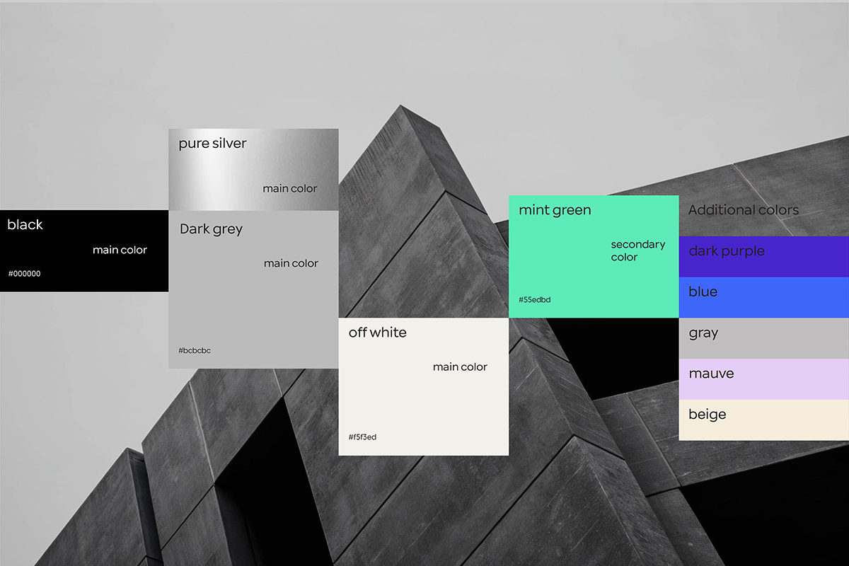
The color palette was curated to embody balance and boldness: silver, off-white, and black as the core foundations, projecting strength and clarity, while a vibrant green introduces energy and renewal. Supporting hues—mauve, blue, gray, and beige—extend the brand’s range into more expressive and editorial territories, enabling versatility across touchpoints.
Every element of the identity was designed to work as part of a coherent system—not merely for aesthetic appeal, but to serve as a strategic tool that enhances recognition, functionality, and storytelling. From logomarks to layout, from color to tone, the brand system communicates Clear’s core values with precision: clarity, resilience, and purpose.
This is not just a visual facelift—it’s a comprehensive redefinition of how Clear Architecture shows up in the world, anchored by a visual identity that is as intentional as the spaces they design.
CREDIT
- Agency/Creative: Ostudio
- Article Title: Clear Architecture’s Story, Told Visually by Ostudio
- Organisation/Entity: Agency
- Project Type: Identity
- Project Status: Published
- Agency/Creative Country: Saudi Arabia
- Agency/Creative City: Riyadh
- Market Region: Middle East
- Project Deliverables: Brand Design, Brand Guidelines, Brand Identity, Brand Strategy
- Industry: Real Estate
- Keywords: Clear Architecture, Visual Identity, Professional Services, Strategic Branding
-
Credits:
Creative Director: Omar Almoteq


