


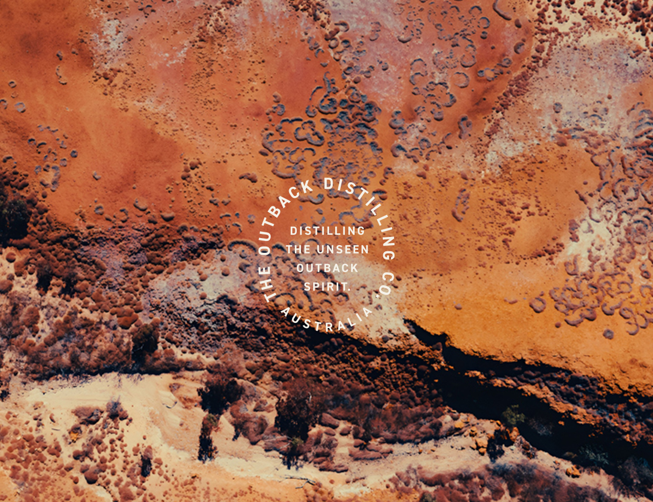
Australia’s Outback is often seen as barren and harsh, a place defined by heat, dust and vast horizons. But while laying the strategic foundations for The Outback Distilling Co., a more nuanced truth emerged: what first appears empty is layered with quiet complexity. Muted colours shift across the land. Ghost gums reveal fine grain in their bark. Skinks trace delicate lines in the sand. Wildflowers appear where logic says they shouldn’t.
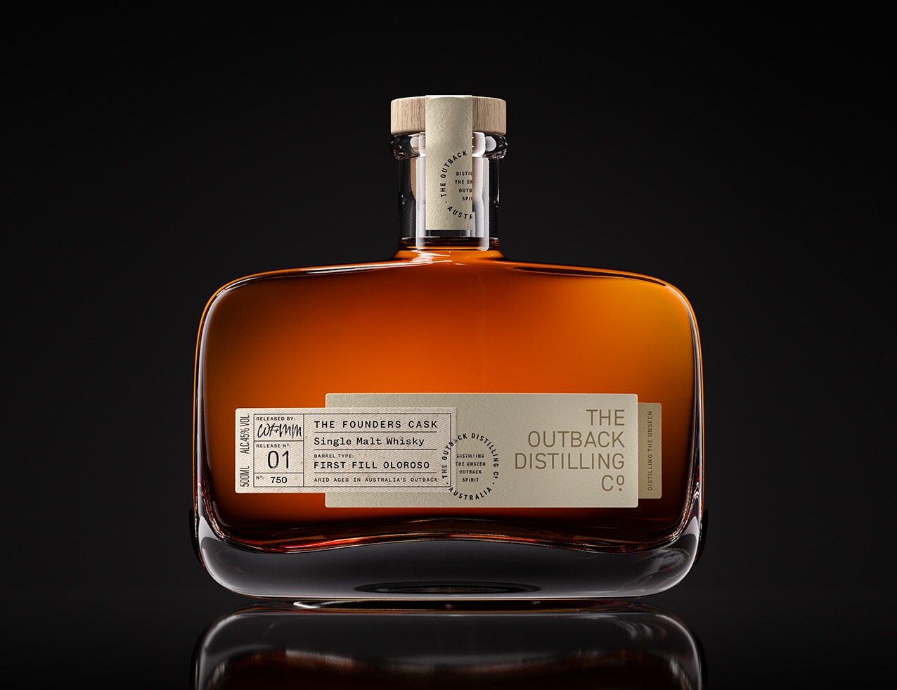
The Founders Cask, the distillery’s first release, set out to translate this deeper reality into a whisky. As Australia’s first arid aged spirit, matured in the Outback itself, the design needed to unfold gradually, revealing detail in the same way the landscape does. The aim was to express the Outback’s raw honesty in a refined, contemporary form, using a restrained and premium design language that avoids cliché.
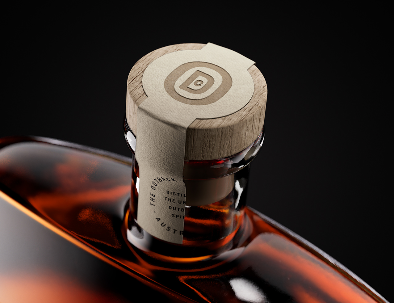
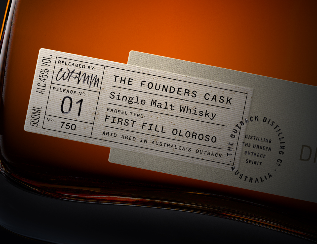
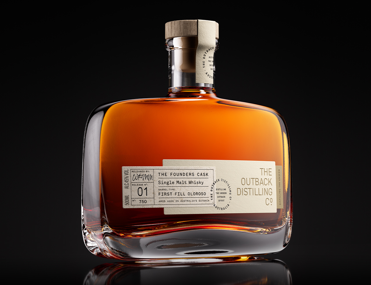
The label is constructed as a series of tactile layers, each grounded in the idea of the unseen and communicating through texture rather than sight. The top panel uses a fabric stock inspired by the canvas of a bushman’s swag. Beneath it, a second textured paper introduces natural softness, while a small discovery tab completes the structure, holding the “Distilling the Unseen” message as a quiet reminder that the landscape’s richness lies beneath the surface. The masterbrand roundel is pressed into the label through a deep deboss, creating an impression reminiscent of traditional cattle branding while remaining understated and modern.
The closure continues this sense of material clarity. Crafted in pale wood with a gently worn feel, it recalls timbers shaped by Outback conditions. At its centre, a bespoke monogram condenses the brand’s initials into progressively smaller forms, encouraging closer inspection and reflecting the way the landscape reveals its character only with time.
The bottle form was chosen for its soft edges, reminiscent of the worn rock formations found throughout the Outback.
The colour palette draws from muted greens, soft neutrals and the powdery tones seen across arid country. It reflects the gentler hues that appear as light shifts through the day, bringing a quiet sense of place without leaning on obvious references. The result is a pack that feels modern, layered and unmistakably Australian. Honest in its materials. Subtle in its gestures. Connected to place without ever becoming literal.
The Founders Cask is a whisky shaped by what cannot be seen. This design brings that idea to life, offering a multi layered, quietly expressive interpretation of the Outback’s true character.

CREDIT
- Agency/Creative: Clay Andrews
- Article Title: Clay Andrews Reveals The Founders Cask as a Refined Expression of the Australian Outback
- Organisation/Entity: Creative
- Project Status: Published
- Agency/Creative Country: Australia
- Agency/Creative City: Sydney
- Market Region: Australia
- Project Deliverables: Packaging Design
- Industry: Food/Beverage
- Keywords: WBDS Creative Design Awards 2025/26 , Packaging Design, Whisky Design, Drinks Design, Brand Identity, Logo Design,
-
Credits:
Creative Collaborator: Ewa Oliver


