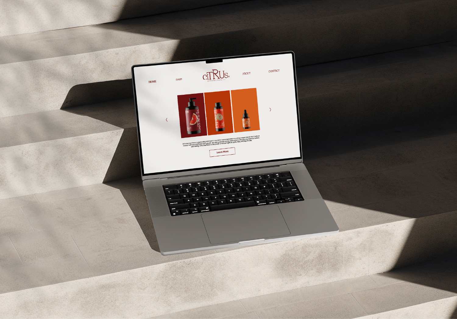
Citrus Skincare & Cosmetics is a brand specialising in providing skincare products that help improve skin imperfections with its main ingredient being citric acid from sour fruits.
The acid works to dissolve and remove dead skin cells to create a new epidermis layer, enhancing skin resistance; however, it is often underutilised due to its corrosive nature, which makes consumers tend to be “afraid” to apply products containing acid on their skin. Citrus is here to bring customers a more positive perspective and encourage them to use skincare products having acid, especially citric acids.
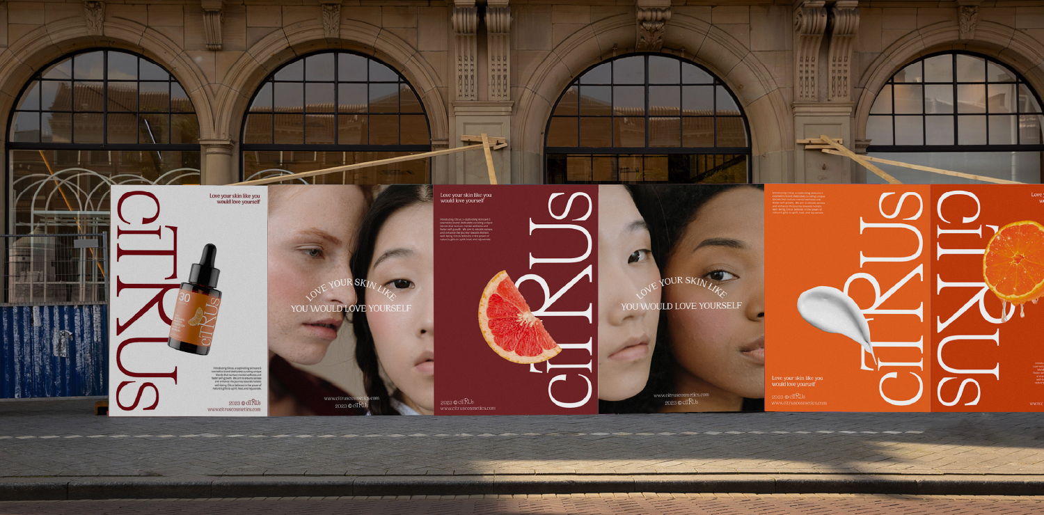
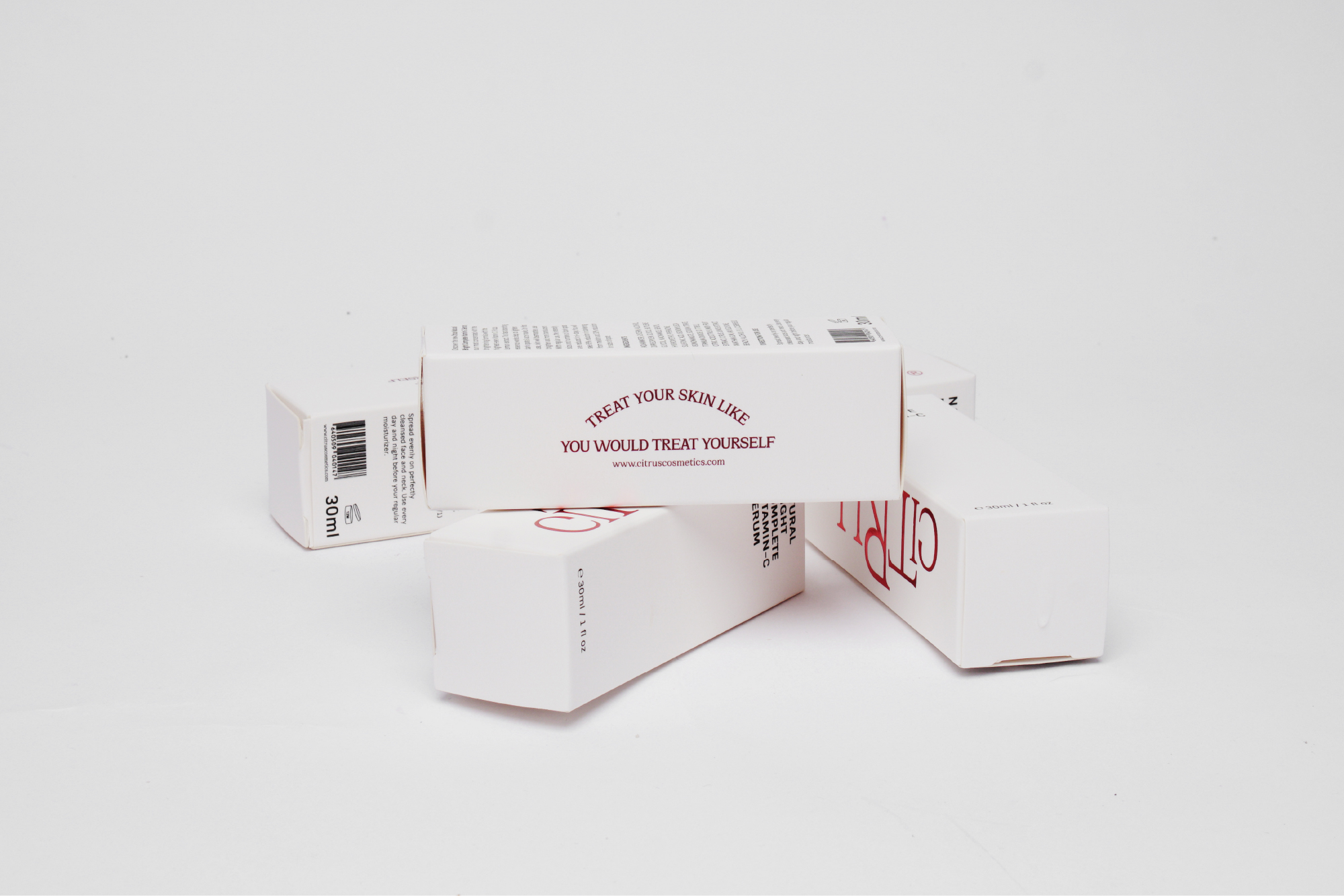
With the slogan “Treat your skin like you would treat yourself,” Citrus wants to convey the message “love yourself” to various target audiences, especially women aged 18-30, by prioritising nurturing the skin from deep within through the use of Citrus products.
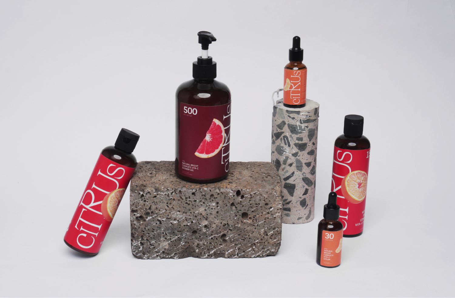
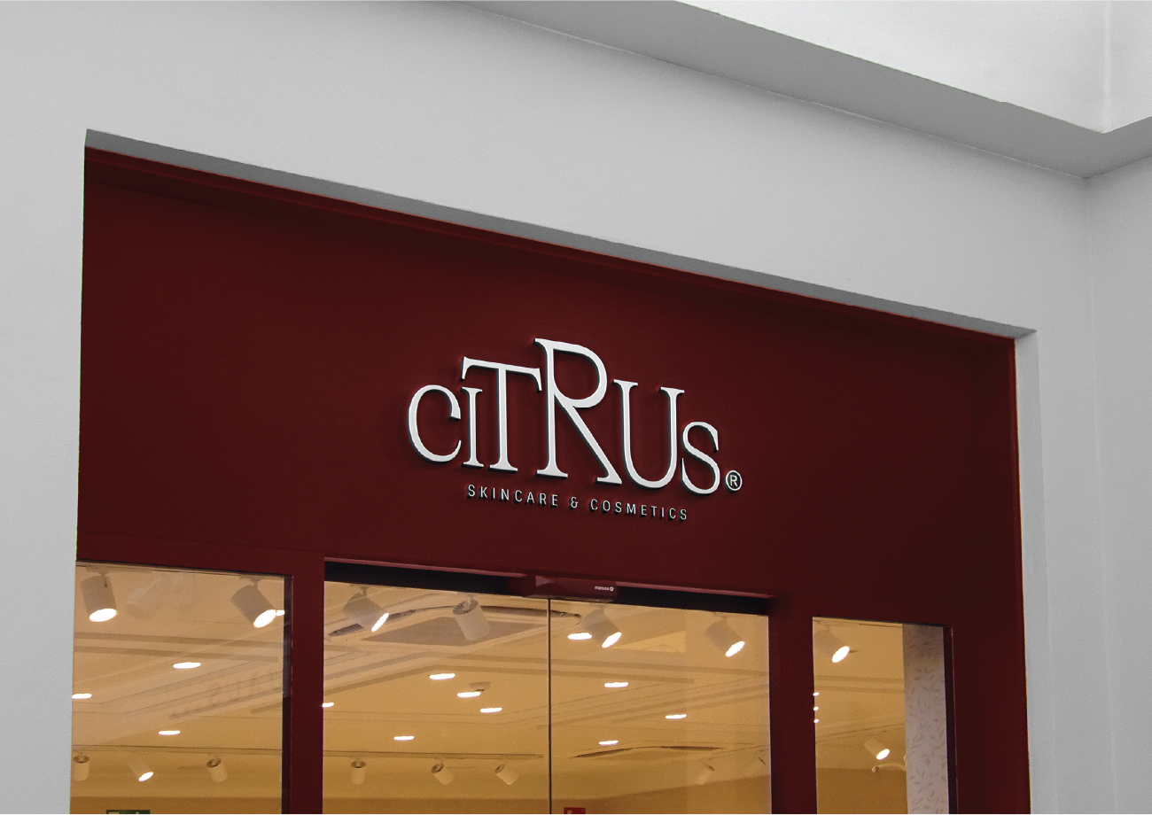
Concept: Drawing inspiration from the common structural shape of citrus fruits called segments to create the shape of the logotype. The diversity in types and sizes of these fruits is depicted by the main palette and the percentage of colors throughout overall brand applications.
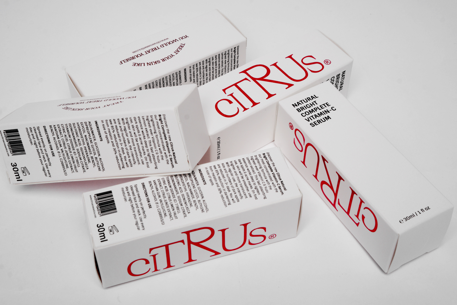
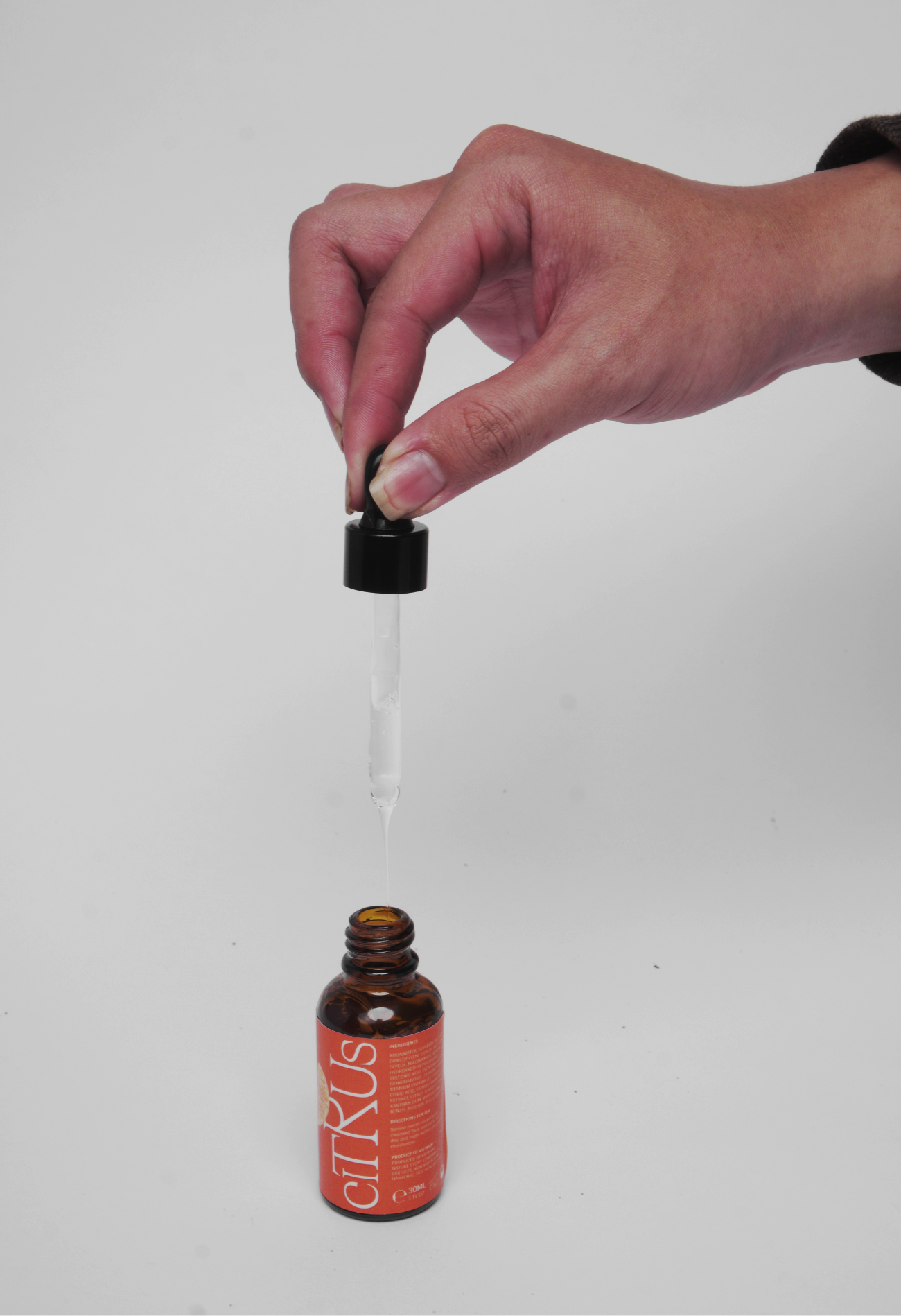
The main palette consists of three (03) colors representing the selected citrus fruits: grapefruit (50%) – orange (30%) – tangerine (20%). According to that, the product as well as packaging system are also divided into 3 main lines: shower gel – moisturizer – serum.
Visualize: Combining 02 segment shapes together evokes the image of the natural segment structure of citrus fruits, while creating an invisible axis for the segments to wrap around. It means that the straight side of logo and shapes always lies closest to the longest edge of the application.
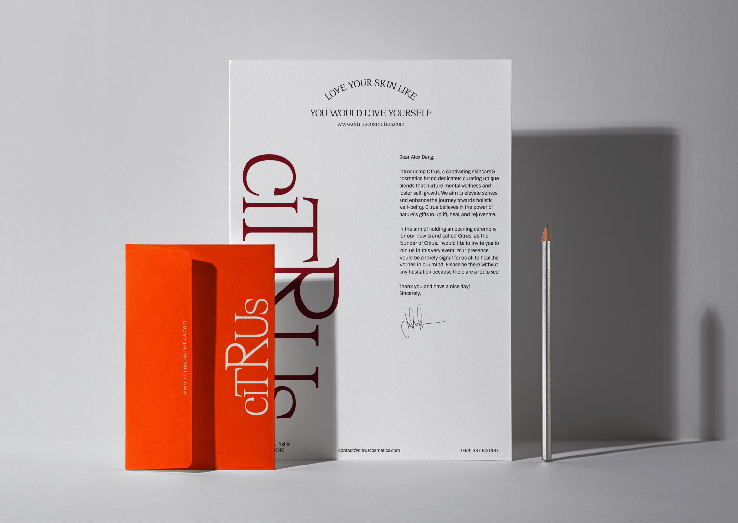
The citrus fruits images—the main representative components of brand’s products—are isolated from the background and placed in the foreground, reflecting the idea of “prioritizing your skin.” The slogan always runs along the arc shape of the segments.
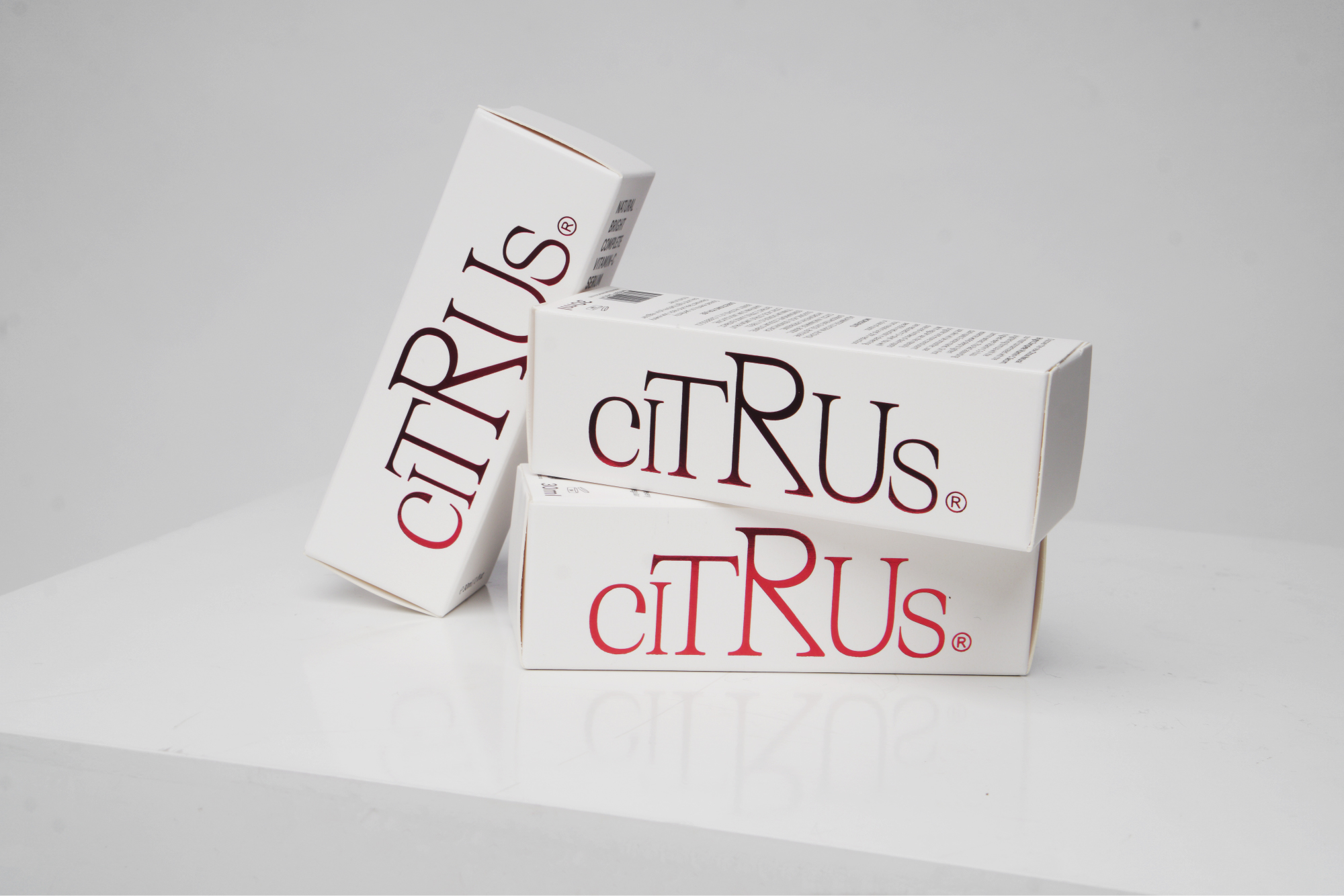
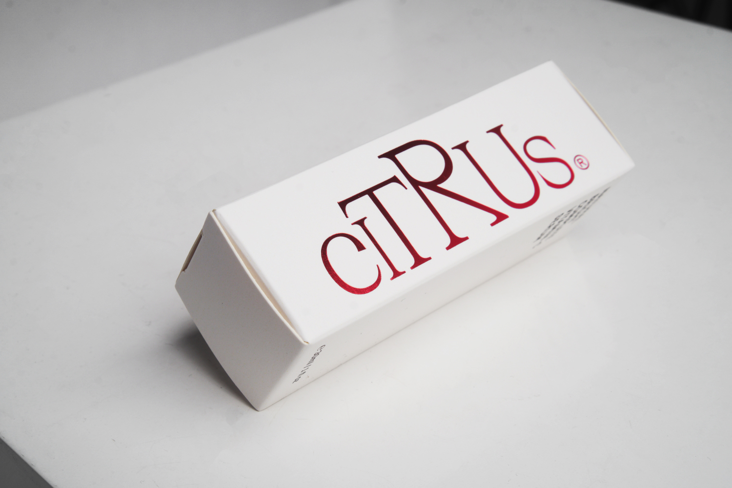
Red foil stamped printing technique (SFX) is applied for the logo in some specific applications (ex. business cards and serum packaging) to highlight the brand’s name, as well as represent the elegance of the brand.
CREDIT
- Agency/Creative: Thu Ngân
- Article Title: Citrus Skincare & Cosmetics Brand and Packaging Design by Thu Ngân
- Organisation/Entity: Student
- Project Type: Identity
- Project Status: Published
- Agency/Creative Country: Vietnam
- Agency/Creative City: Ho Chi Minh City
- Market Region: Asia
- Project Deliverables: Brand Identity, Packaging Design
- Industry: Beauty/Cosmetics
- Keywords: beauty, cosmetics, luxury, delicate, fresh, minimal
-
Credits:
Graphic Designer: Lê Nguyễn Thu Ngân


