The challenge
Cisk Lager is Malta’s most iconic and recognised brand in the local market. Launched in 1929, its successful brand evolution and diversification have made it a key brand for owner Simonds Farsons Cisk, and a much-loved brand across the Maltese islands and their people. The winner of international beer awards, it has established itself as Malta’s national beer, competing well at home and abroad against the world’s top brands.
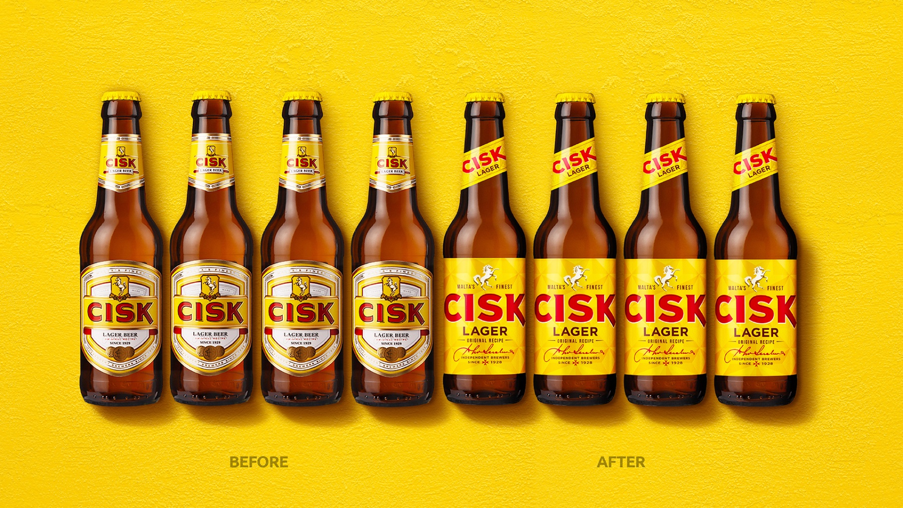
The brand has gone through various redesigns and ‘face-lifts’ over its 90 years’, with the most recent one taking place in 2015. To date these rebranding exercises have respected and played close to the history, heritage and origins of the original Cisk brand launched in 1929. However, the world of modern beer has moved on.
The opportunity
Cisk wanted to now invest in its brand, to not only show its loyal fan base that it’s loved, but to also broaden its appeal to tourists – futureproofing the brand and opening the doors to a wider export market.
Key target audiences were therefore:
• Existing loyal consumers across all age-groups who have been enjoying Cisk for years
• New consumers, just entering legal drinking age, who see themselves as part of a modern Europe
• New and existing Cisk consumers from the many international markets where Cisk is slowly becoming established
Our opportunity was to evolve Cisk with more confidence; focusing on a design system that amplifies fewer brand assets to create a more integrated brand across all touch points.
The insight
Cisk is often viewed as familiar and reliable but rarely exciting. It’s part of the Maltese culture and community, but not necessarily the future. Yet, our research showed that to many, Cisk is Malta and Malta is Cisk – a national treasure and pride of the Maltese islands.
We needed to bring to life the very best of the brand’s heritage in a way that’s relevant to a whole new audience now and in the future, and in and out of Malta.
The idea
‘Strength of character in the heart of the Med’ harnesses the loud and proud spirit of Malta and its people. Their bold tenacity, the sunniest place in the world and a melting pot of where east meets west.
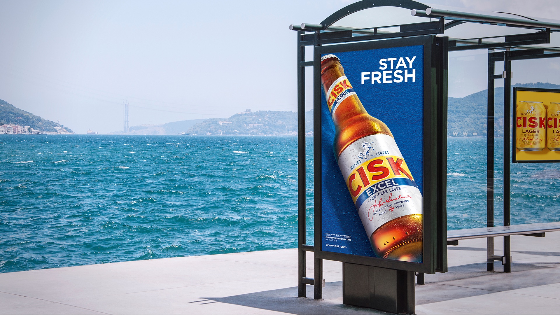
This is brought to life in a considered design system working across all touchpoints, and in line with three key brand principles:
iconic authority – red, yellow and a symbol of Malta
radiant – naturally radiant, uplifting and optimistic
bold – expressive, colourful and confident
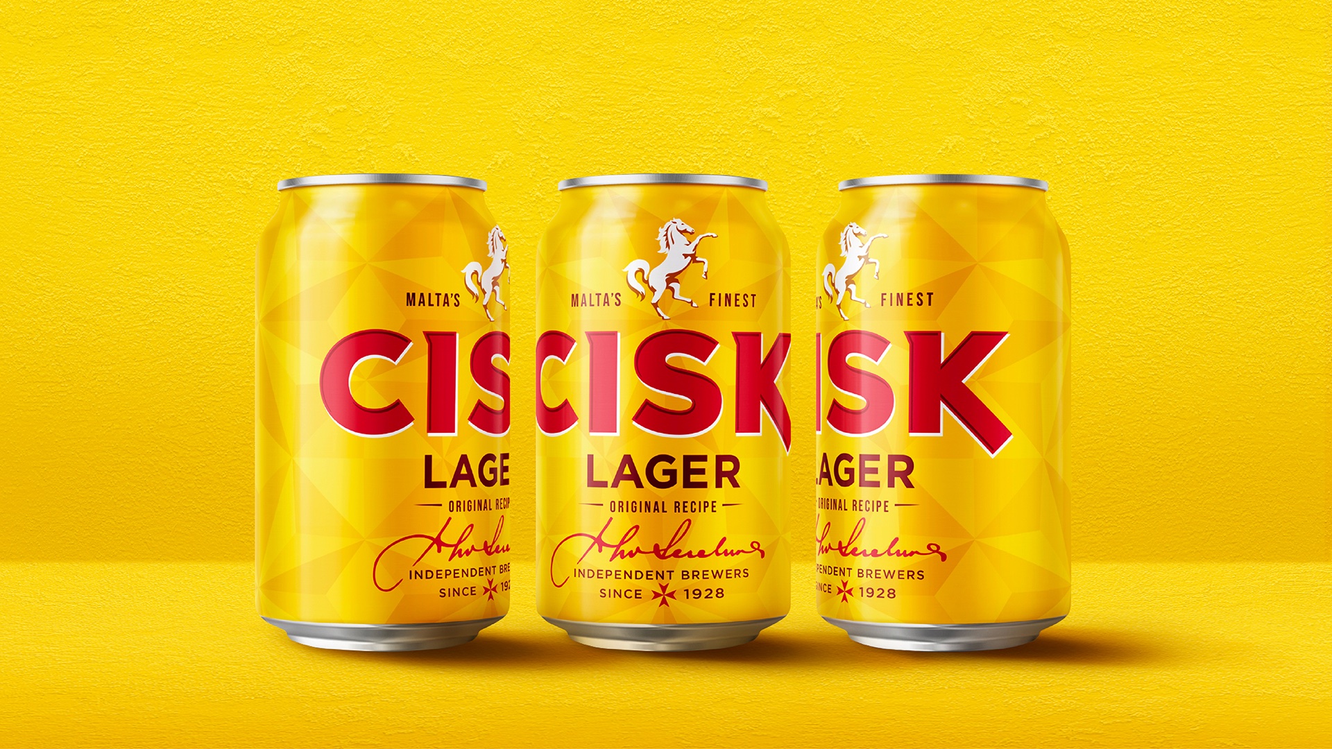
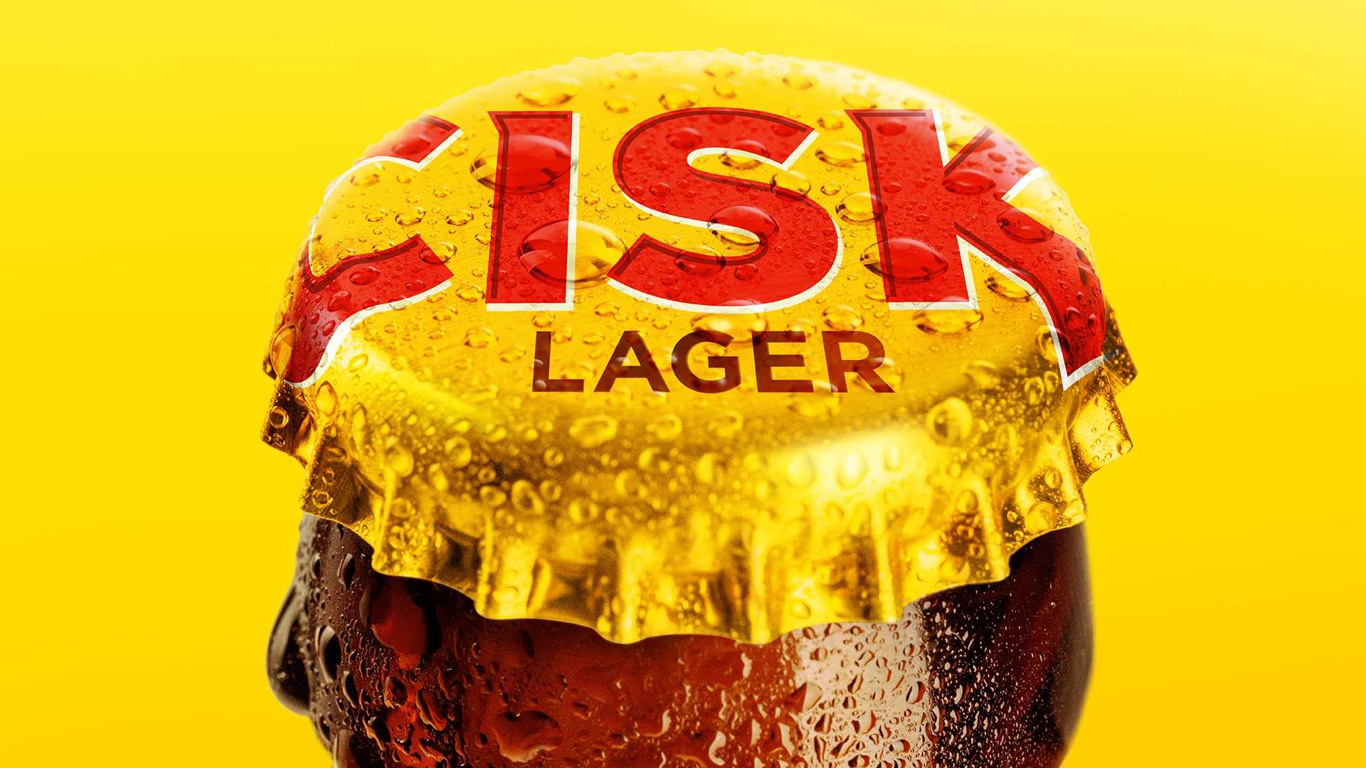
The instantly recognisable red-and-yellow colourway, for which Cisk is so well-known, comes alive with the new brand expression. And represents the vibrancy of the weather and culture.
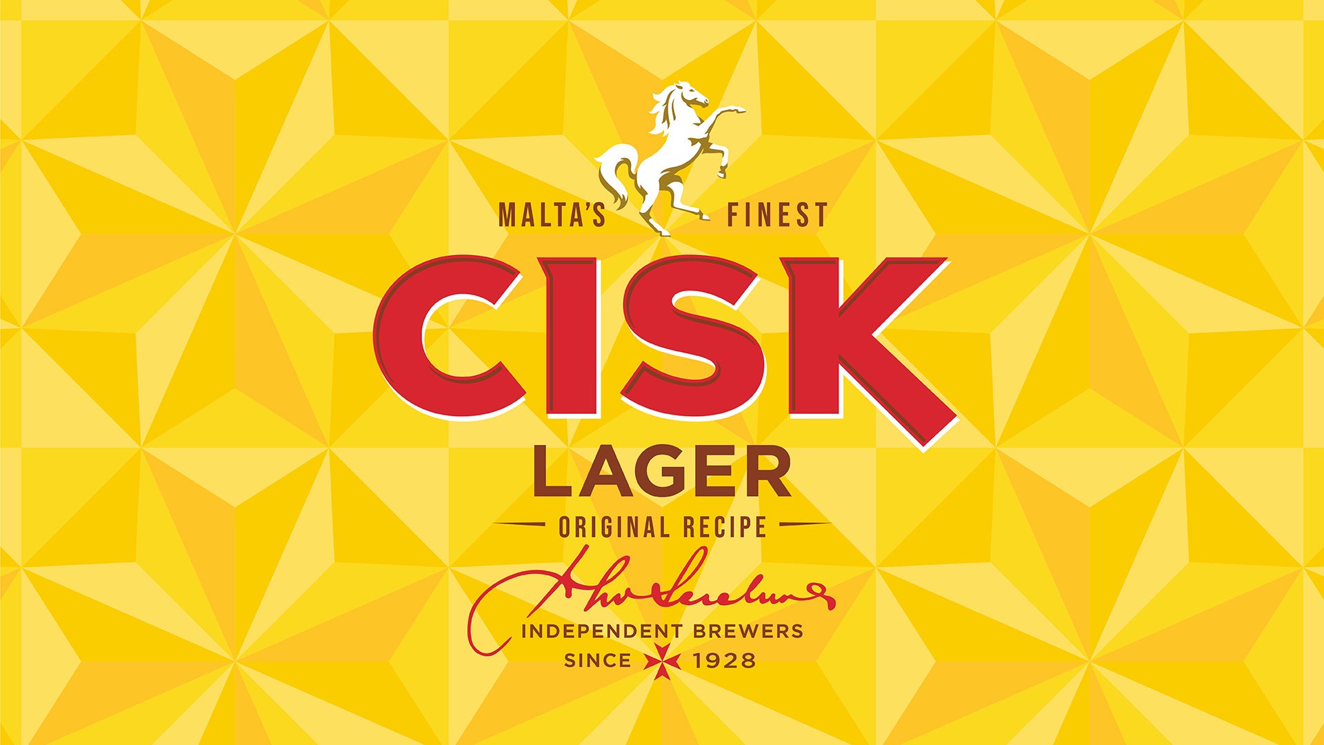
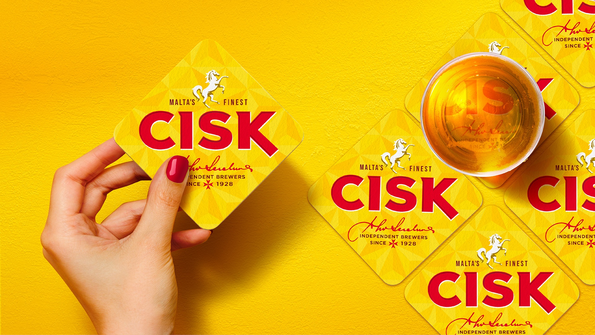
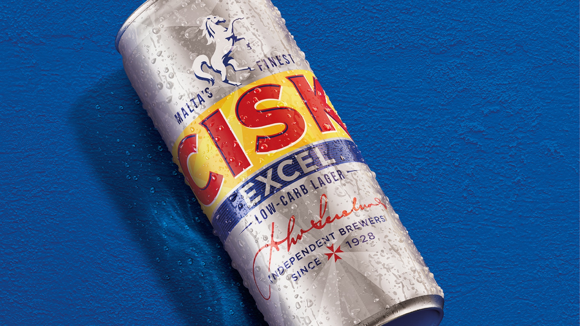
A word marque only from Cisk: Recrafted for character, the ‘C’ references a horseshoe and the ‘K’ represents the brand’s rearing stallion.
Liberated assets: The stallion, previously highly detailed and contained within a shield, has been boldly redrawn and inverted to capture intrinsic brand strength and agility.
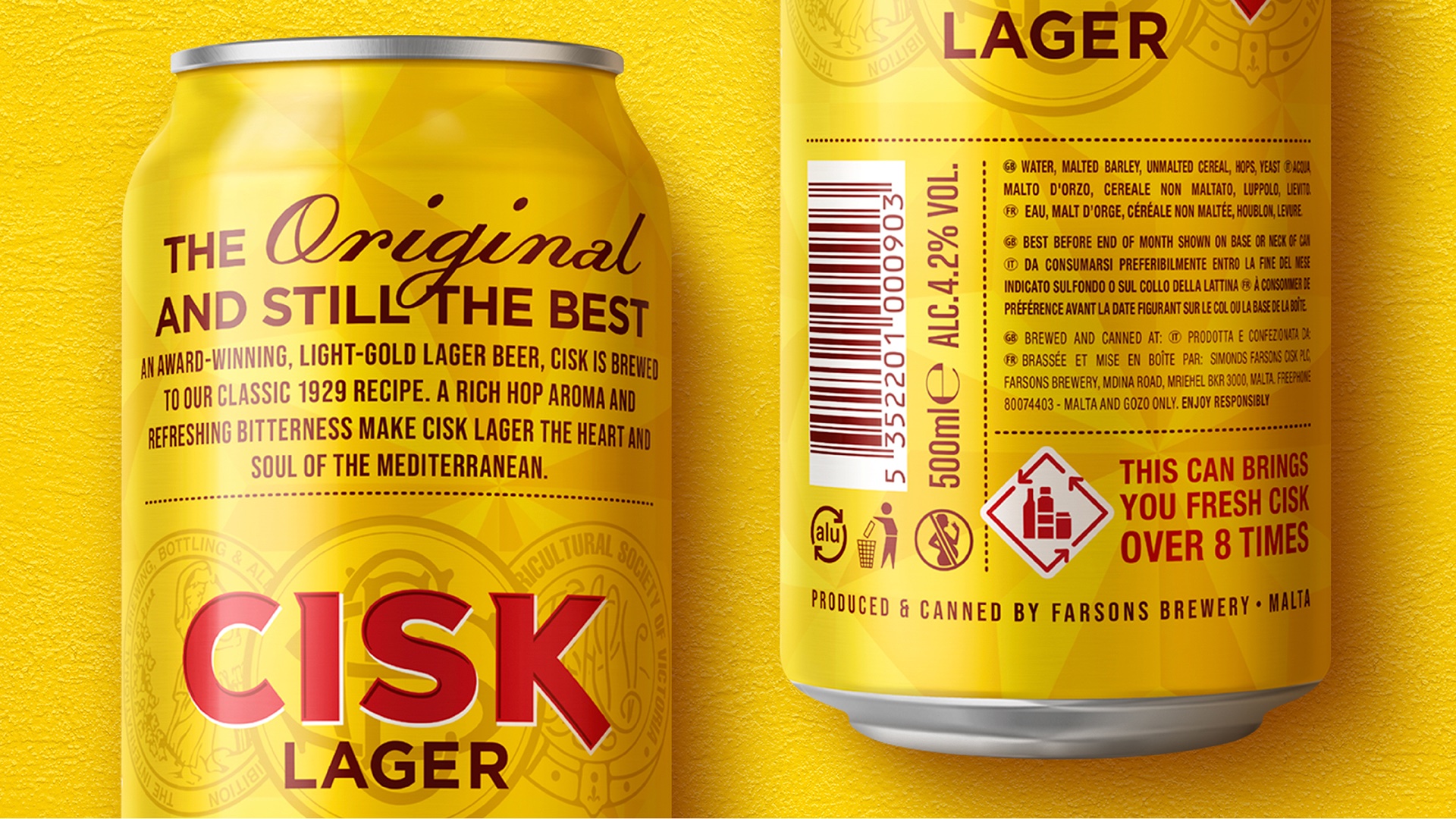
A facet pattern only from Malta: Subtle but at the heart of the brand’s DNA, a new faceted pattern radiates from the Maltese Cross, serving as a foundation for the whole brand and encapsulating pride in Cisk’s Maltese heritage.
Tone of voice: Warm and friendly, passionate and positive and exacting and inventive.
Impact
Relaunched at the start of June’23, initial consumer and trade reaction has been very positive. Our new design system gives Simonds Farsons Cisk a robust and flexible structure that will continue to build brand equity now and in the future. It remains part of Maltese heritage, but with an eye firmly on what’s to come.
“The modernised Cisk brand identity comprises many elements, working together to create something greater. The upgraded iconic assets will work beautifully in any environment – events, points of sale, communication touchpoints, still and animated campaigns. We’re incredibly proud of what Cisk has achieved to date and equally excited about what the future holds.”
Susan Weenink Camilleri, Head of Sales and Marketing at Simonds Farsons Cisk


CREDIT
- Agency/Creative: Bluemarlin
- Article Title: Cisk – A Future-Facing Rebrand for Malta’s National Treasure
- Organisation/Entity: Agency
- Project Type: Identity
- Project Status: Published
- Agency/Creative Country: United Kingdom
- Agency/Creative City: Bath
- Market Region: Europe
- Project Deliverables: Brand Design, Brand Identity
- Industry: Food/Beverage
- Keywords: WBDS Agency Design Awards 2023/24
- Keywords: Identity,Brand Redesign
-
Credits:
Associate Creative Director: Guy Robertson
Senior Artworker: Steve Gordon
Executive Creative Director: David Hodgson
Account Director: Charlie Spiers
CEO: Andrew Eyles
Account Manager: Sarah McDougall
Head of Sales and Marketing, Simonds Farsons Cisk: Susan Weenink Camilleri
Business Support Manager - Events & Sponsorship, Simonds Farsons Cisk: Steve Borg
Marketing Manager - Beers, Simonds Farsons Cisk: Karl Bondin


