Espresso Blend Series for Conte Coffee Roasters is a visual and sensory journey into the world of specialty coffee, where form meets craft to celebrate the art of the roast. This packaging was created to offer each blend a unique character while having a solid, strong brand presence in the range overall. The design language harmoniously mixes minimalism with a warm artisanal style, echoing the roastery’s philosophy: to serve genuine, good-quality coffee with simplicity and clarity.
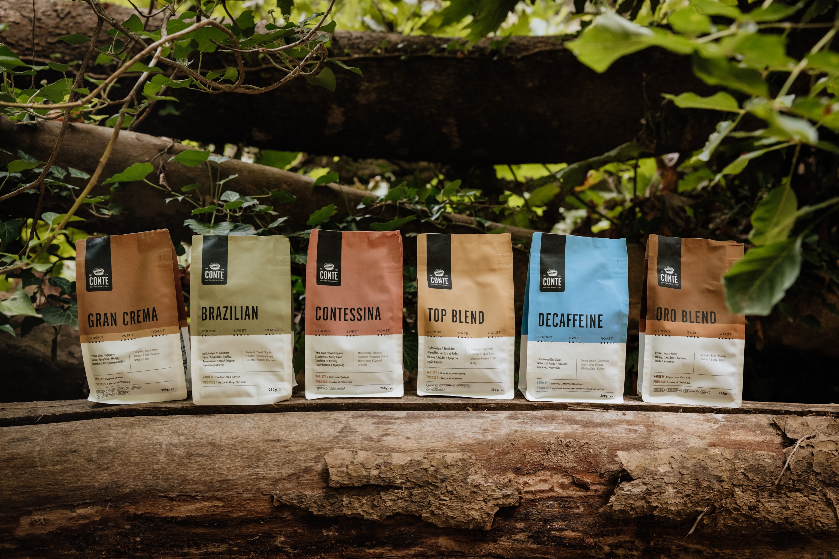
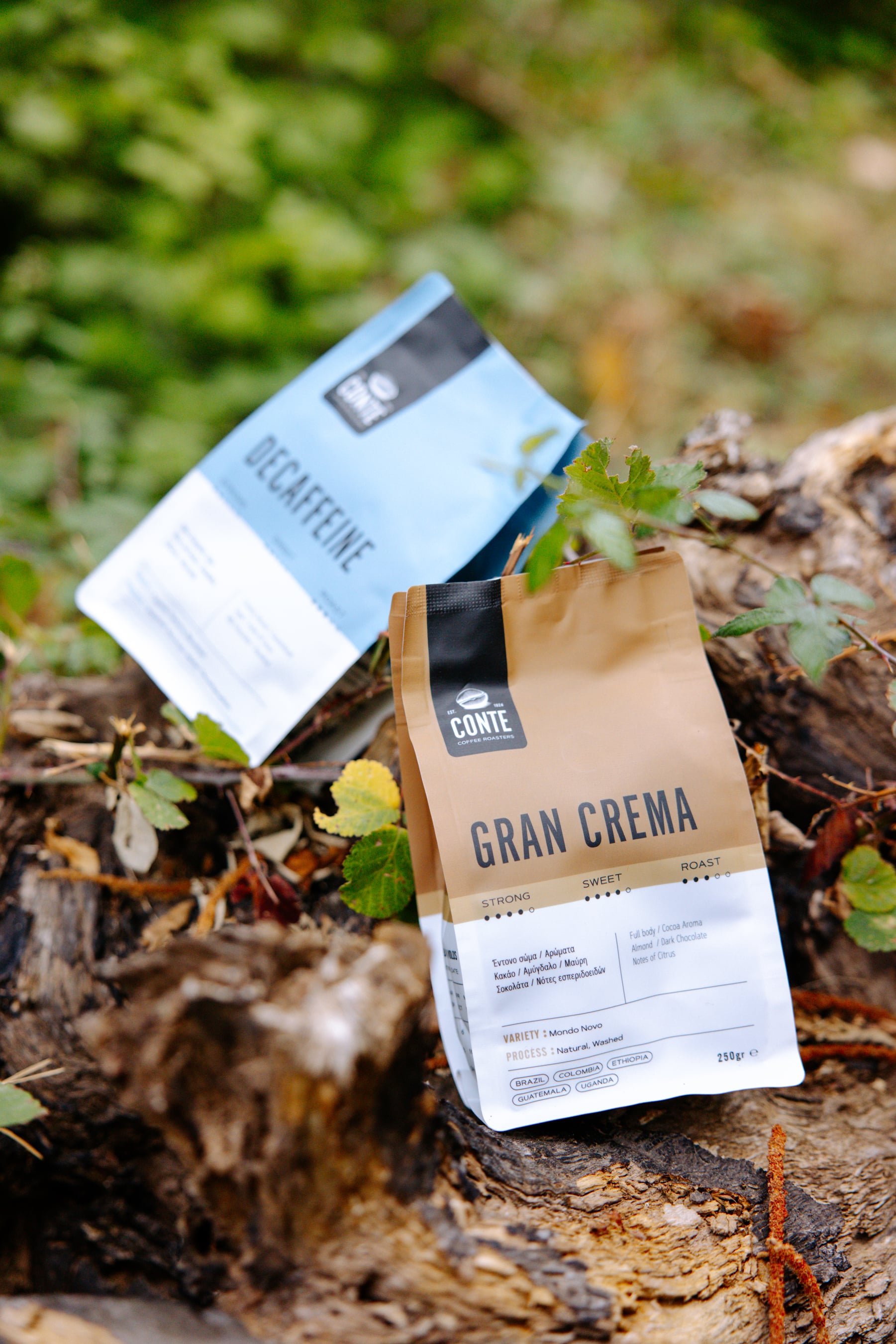
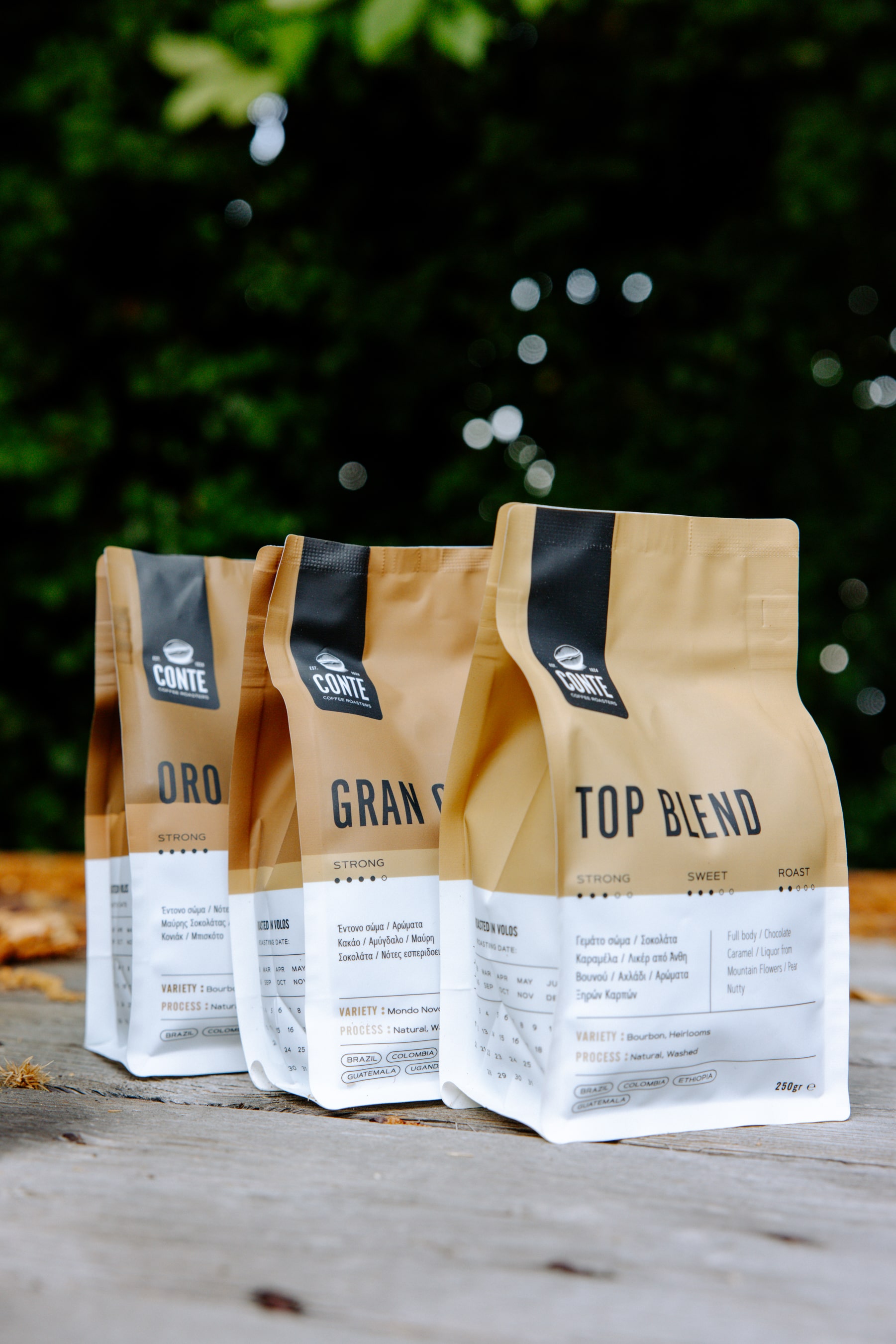
Each blend is communicated through its own distinctive color palette, selected with care to express its flavor and place of origin. Dark brown earth tones suggest rich crema, muted greens suggest luxuriant plantations, warm terracottas suggest Mediterranean elegance, golden tones convey balance, and the flash of blue in Decaffeinato suggests lightness without compromise. This color code makes it easy for customers to find their favorite blend at a glance, while encouraging exploration of the range.
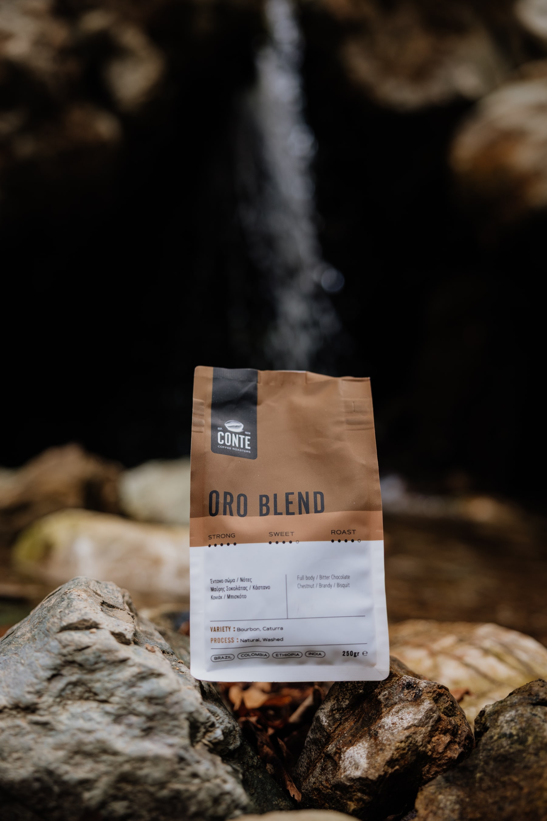
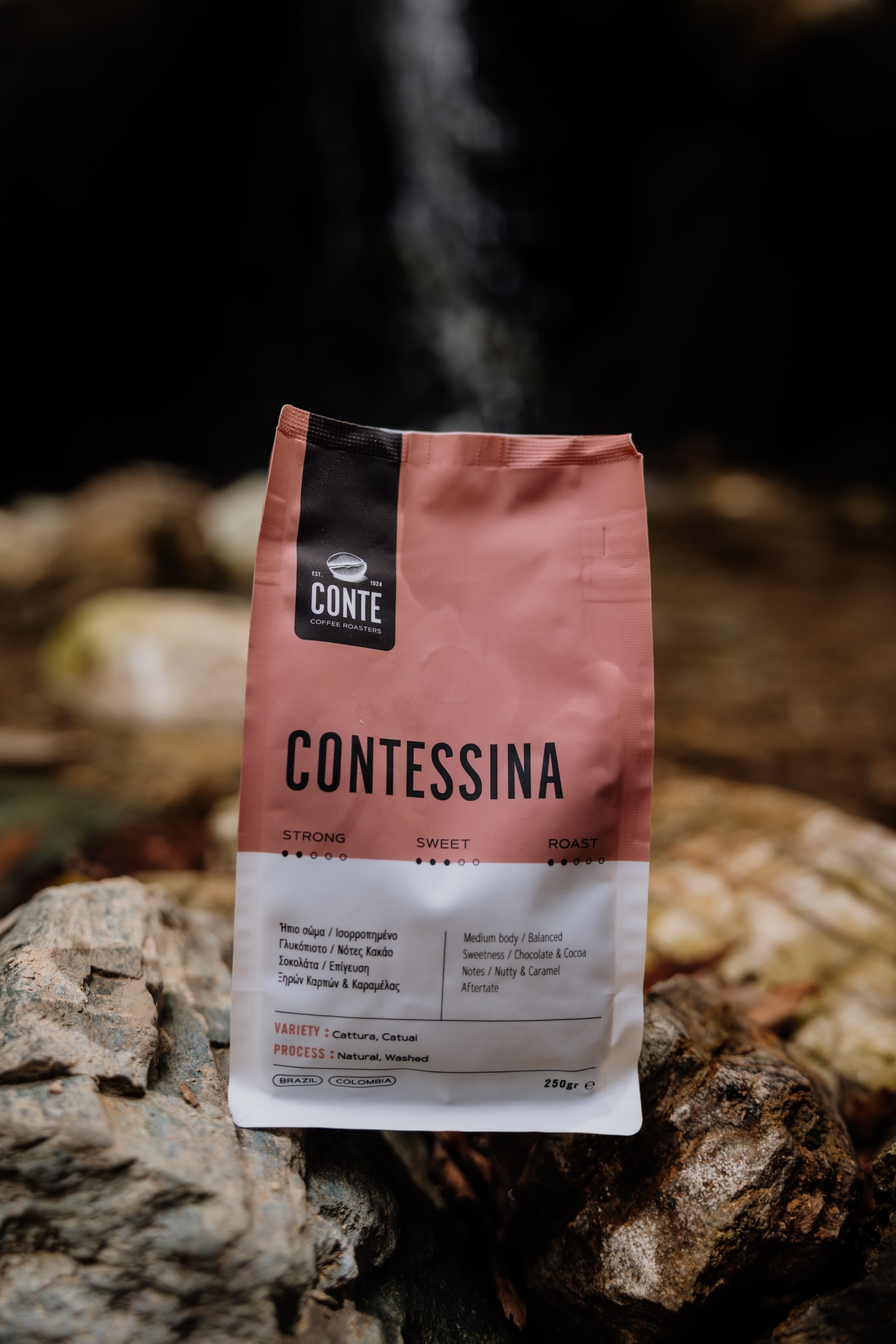
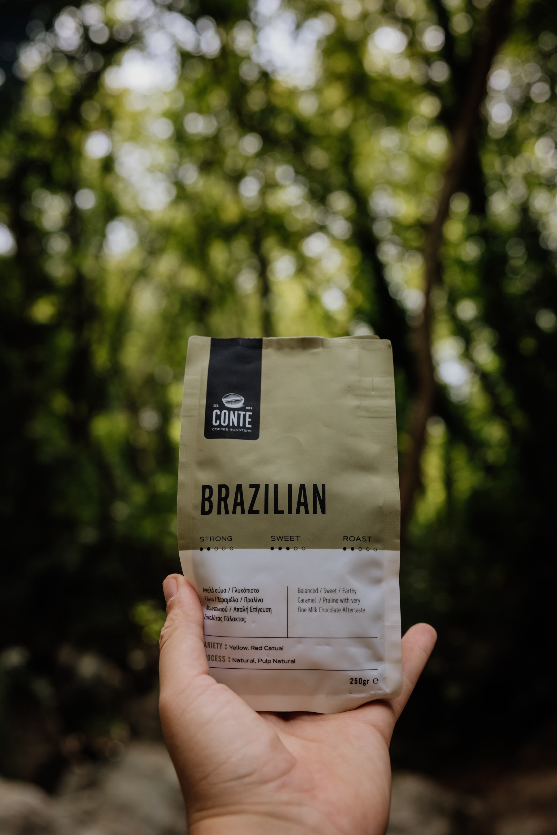
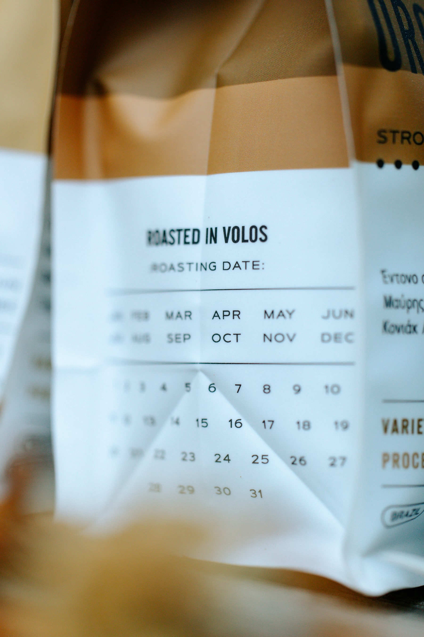
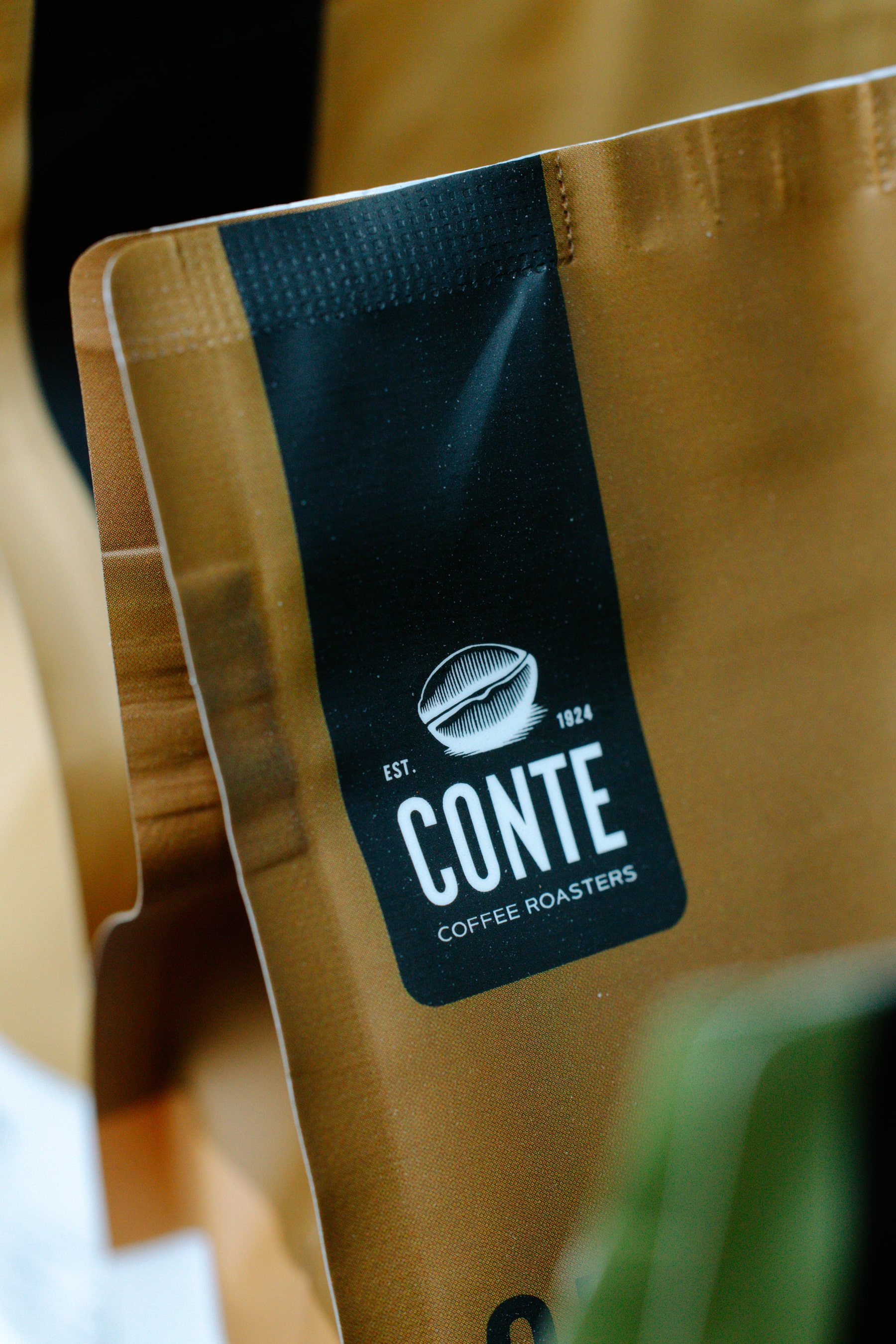
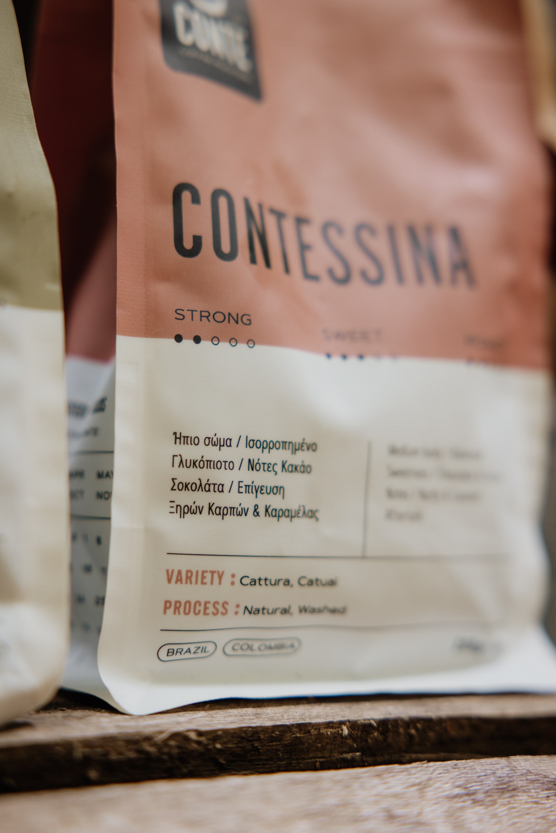
The design’s structure is basic yet effective. The top of each bag is left for its signature color block, with the Conte logo prominently displayed as a badge of quality. Below, simple typography communicates important product information—strength, sweetness, roast, tasting notes, and varietal information—in a grid-like pattern that speaks to precision and craftsmanship on the part of the brand. The repeating structure creates a powerful brand presence on the shelf, while the bold, clean look communicates premium positioning.
Beyond visual considerations, the matte-finish bags are selected both for form and function. Their tactile quality enhances the sensory relationship between consumer and product, while their barrier function ensures the freshness of the beans. The decision to film the set in a green, natural setting was intentional—to bridge the product to the natural environment it originates from, and to promote the brand’s virtue of sustainability and authenticity.
Emotionally, Blends Series speaks to the ritual of coffee as everydayman’s daily indulgence. Choice without bewilderment, guiding customers to the right blend for their occasion—either the power of Gran Crema, the smooth comfort of Brazilian, or the relaxing peace of Decaffeinato. Design-wise, it is a gesture of balance: individuality within unity, sophistication without decoration, and storytelling rooted in function.
The result is packaging that not just protects and displays the product, but also represents Conte Coffee Roasters’ mission—to bring the beauty of fine coffee into lives with heart, clarity, and beauty.
CREDIT
- Agency/Creative: Circus Design Studio
- Article Title: Circus Design Studio Elevates Conte Coffee Roasters with a Distinctive Espresso Blend Series
- Organisation/Entity: Agency
- Project Type: Packaging
- Project Status: Published
- Agency/Creative Country: Greece
- Agency/Creative City: Volos
- Market Region: Europe
- Project Deliverables: Brand Design, Brand Experience, Brand Identity, Branding, Creative Direction, Graphic Design, Packaging Design, Photography
- Format: Bag, Pouch
- Industry: Food/Beverage
- Keywords: coffee, roasting, pouch, packaging, beans, minimal
-
Credits:
Photography: Mike Chatzigiannis


