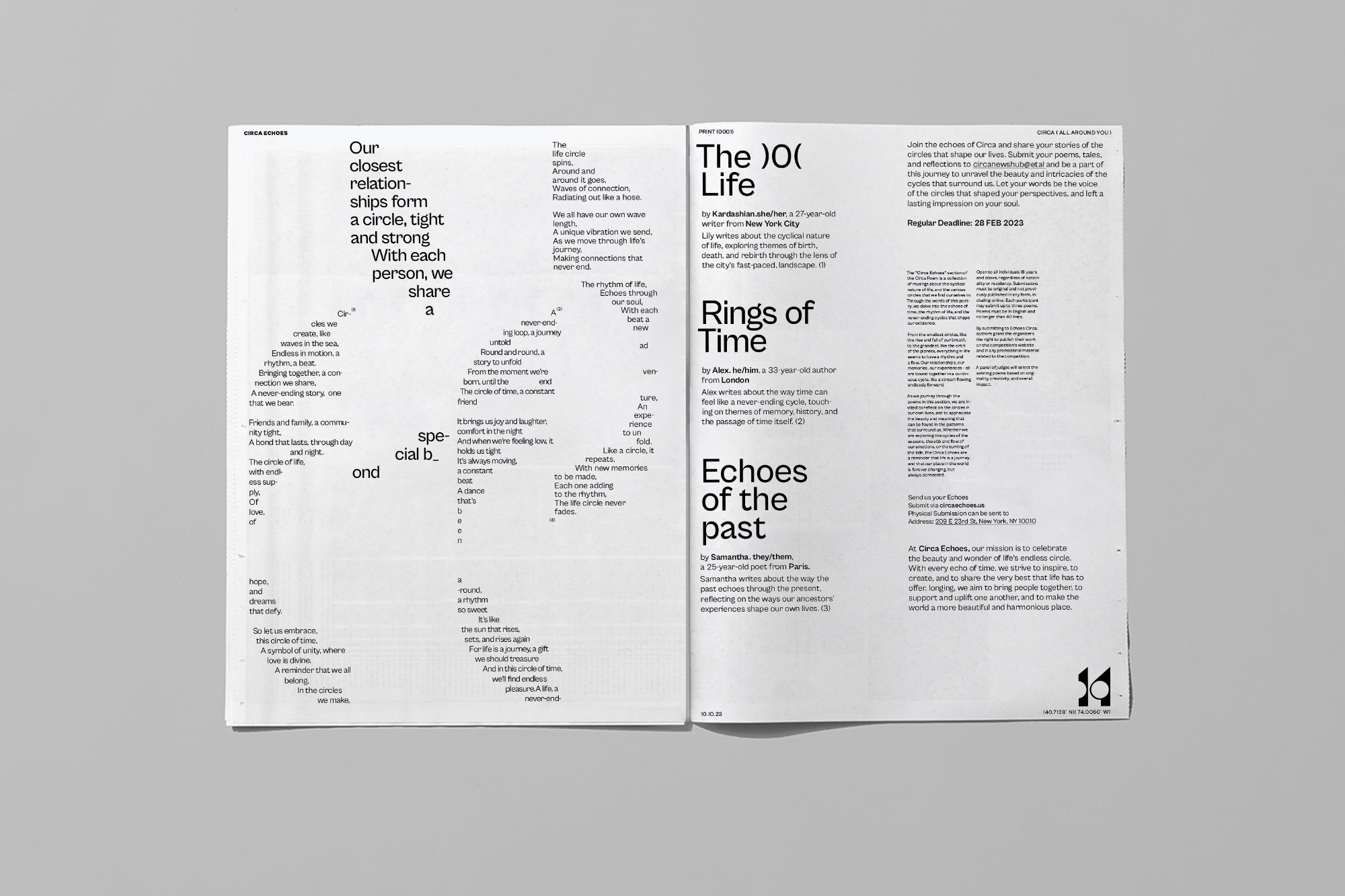
Circa newspaper is not just a mere shape; it serves as a portal to a realm brimming with imagination, spirituality, and inclusiveness. This remarkable publication is committed to delving into the multifaceted expressions of the potent symbol of the circle. Through profound analysis, captivating interviews, and evocative poetry, Circa unearths the rich tapestry woven by the circle in all its manifestations.
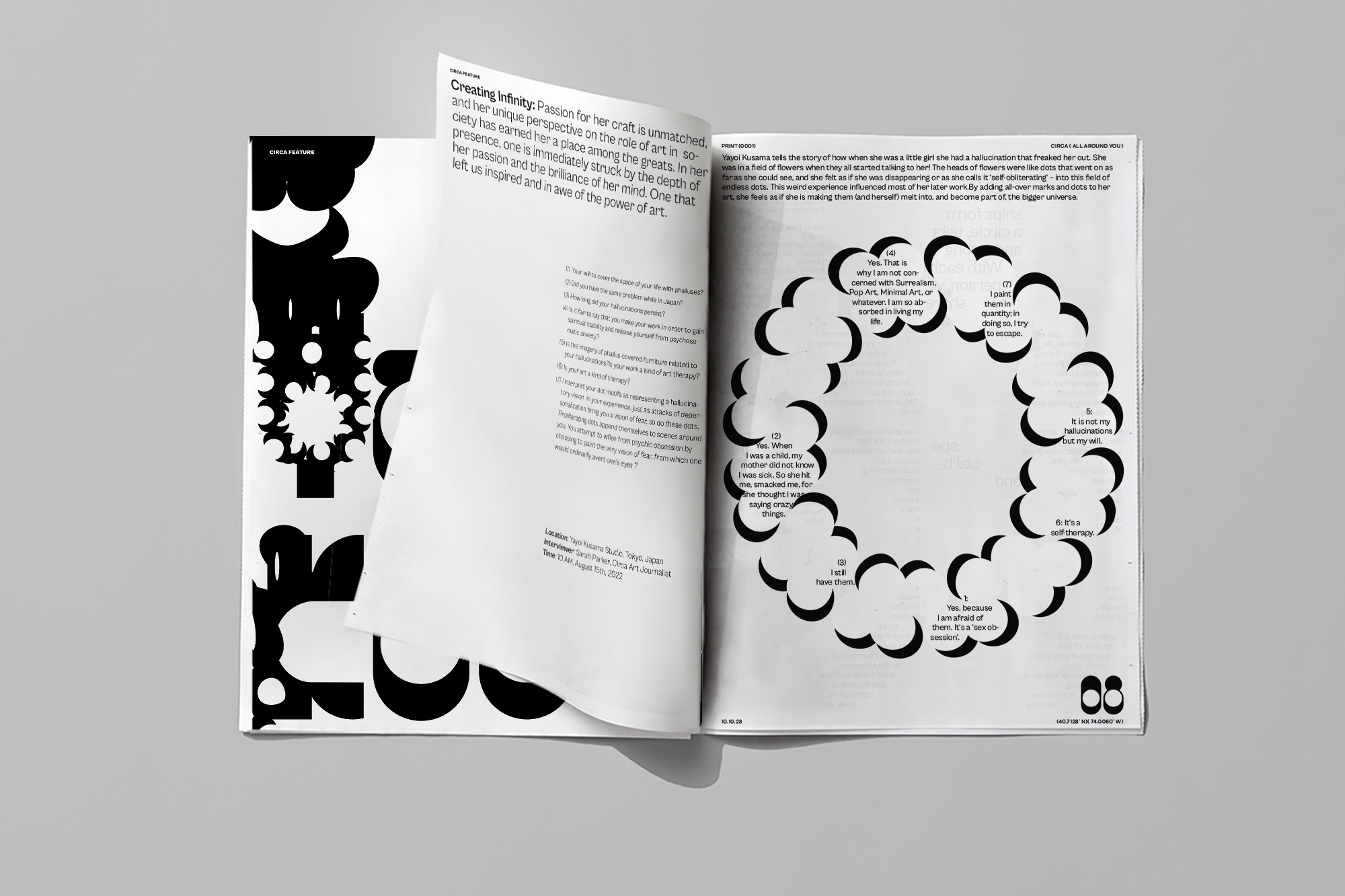
Through interviews with artists, thinkers, and visionaries, Circa uncovers the personal narratives and creative processes behind their exploration of the circle. These conversations shed light on the profound impact of the circle as a universal symbol that resonates across cultures, religions, and artistic disciplines. By amplifying diverse voices, Circa ensures that every perspective is celebrated and honored, fostering a sense of unity and belonging among its readership.
The poetry within Circa weaves a tapestry of emotions, inviting readers to reflect on the circle’s symbolic power. Through the rhythmic cadence of words, poets capture the essence of the circle’s eternal nature, its cyclical rhythms mirroring the ebb and flow of life itself. The evocative verses encourage readers to contemplate their own place within the larger cosmic order, offering a space for introspection and connection to the universal themes that unite us all.
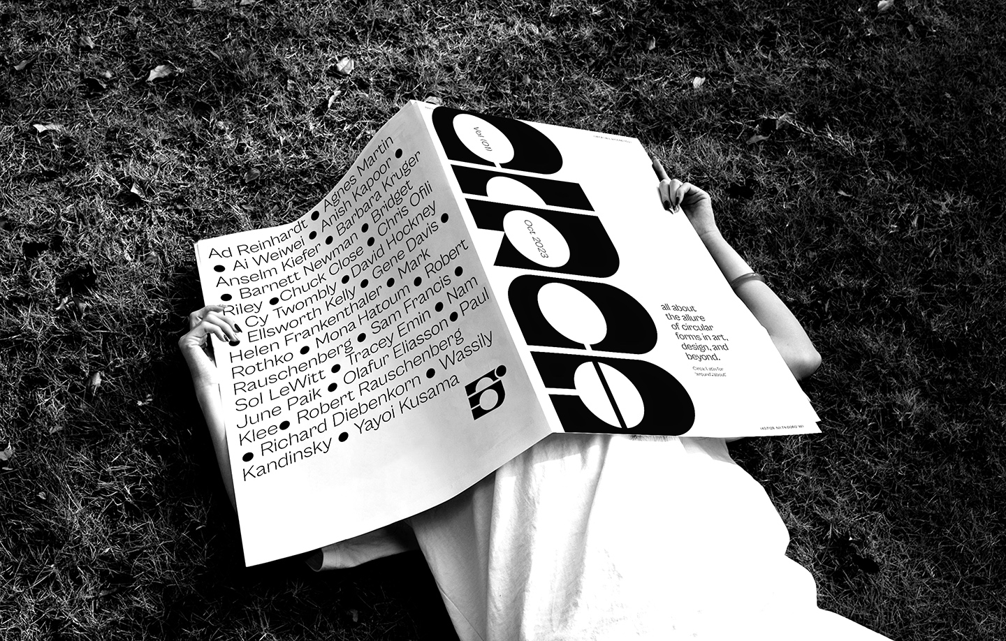
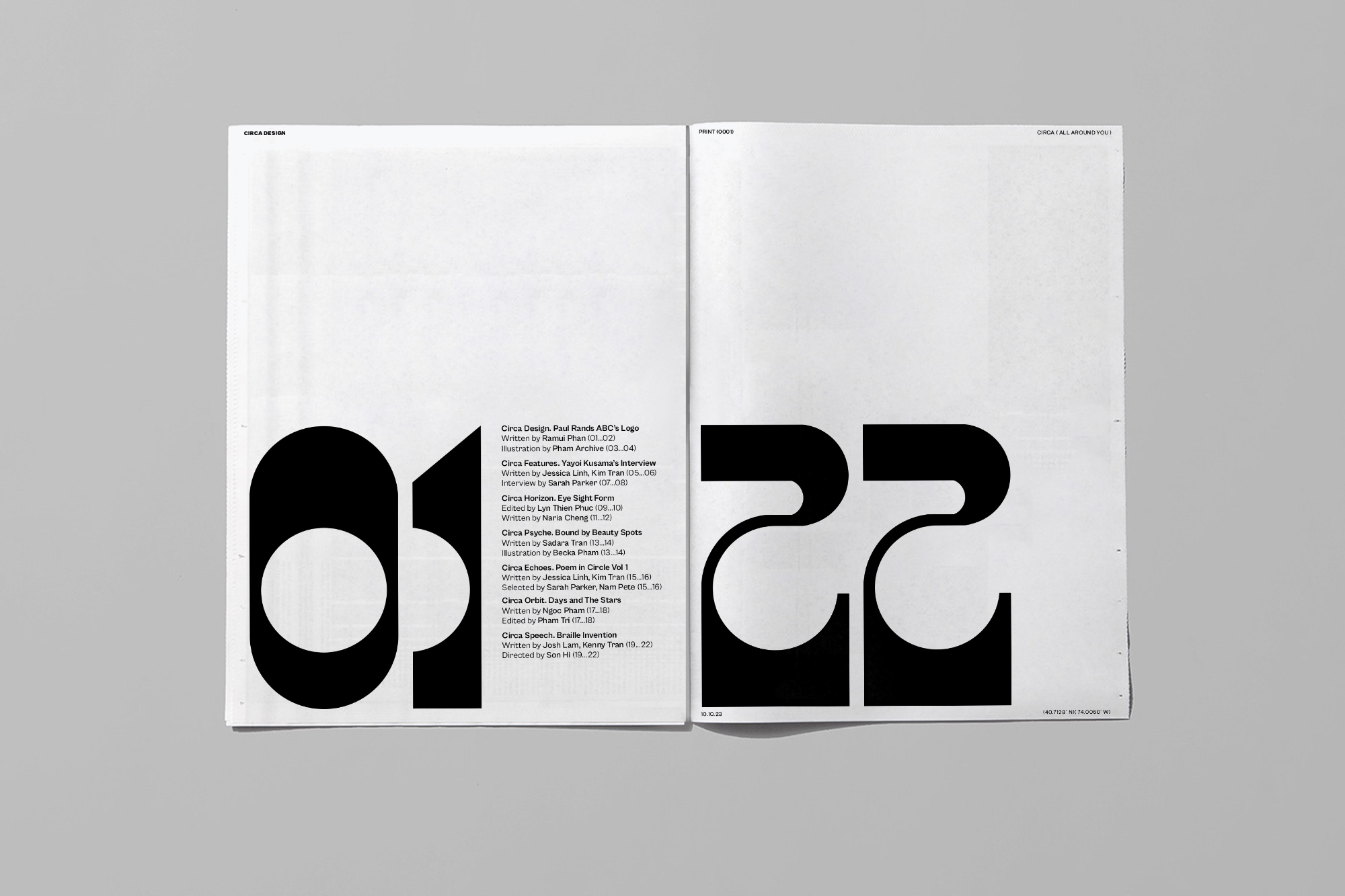
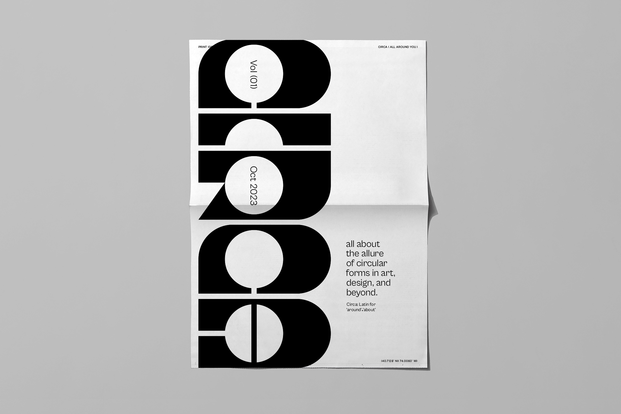
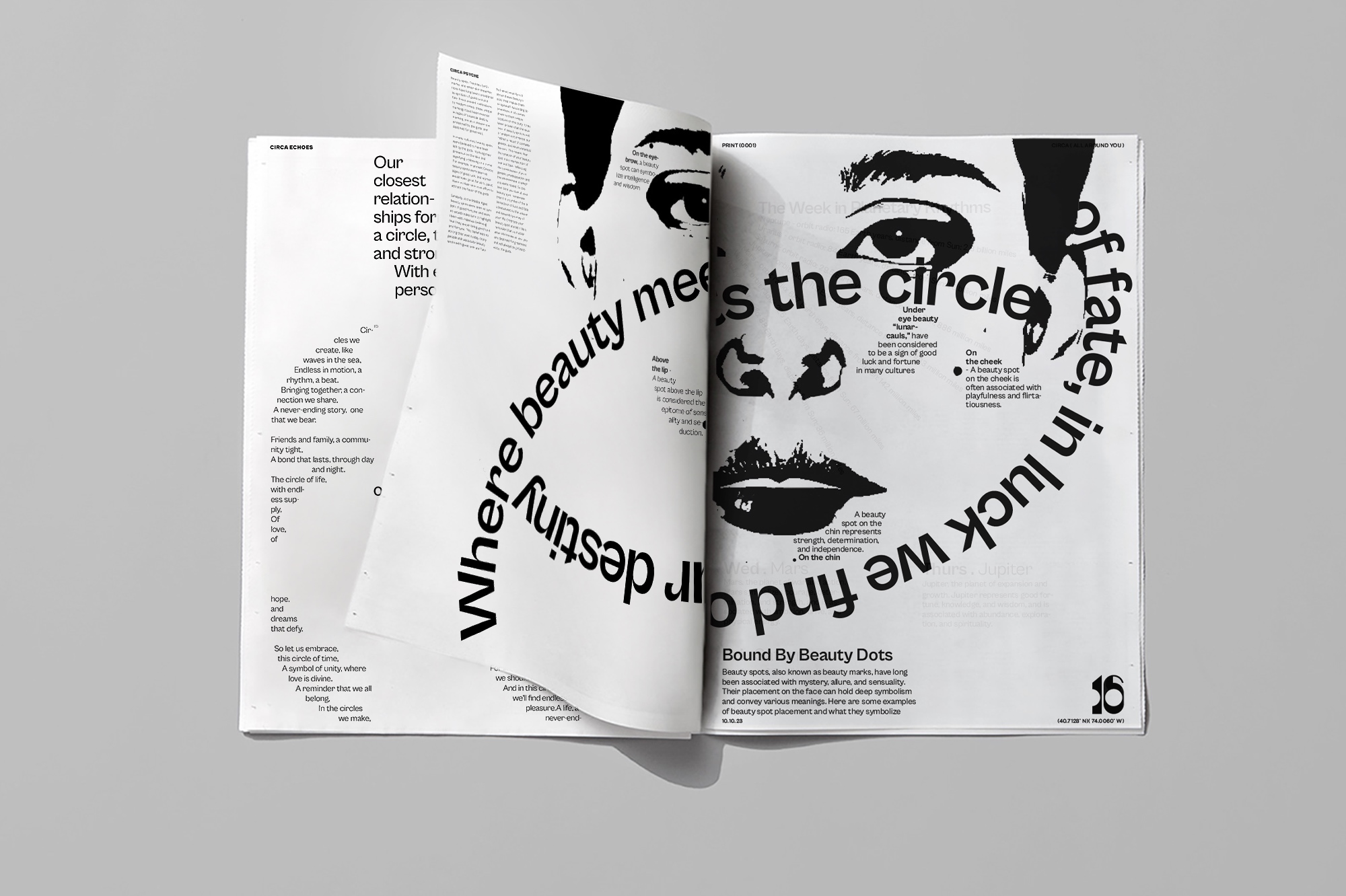
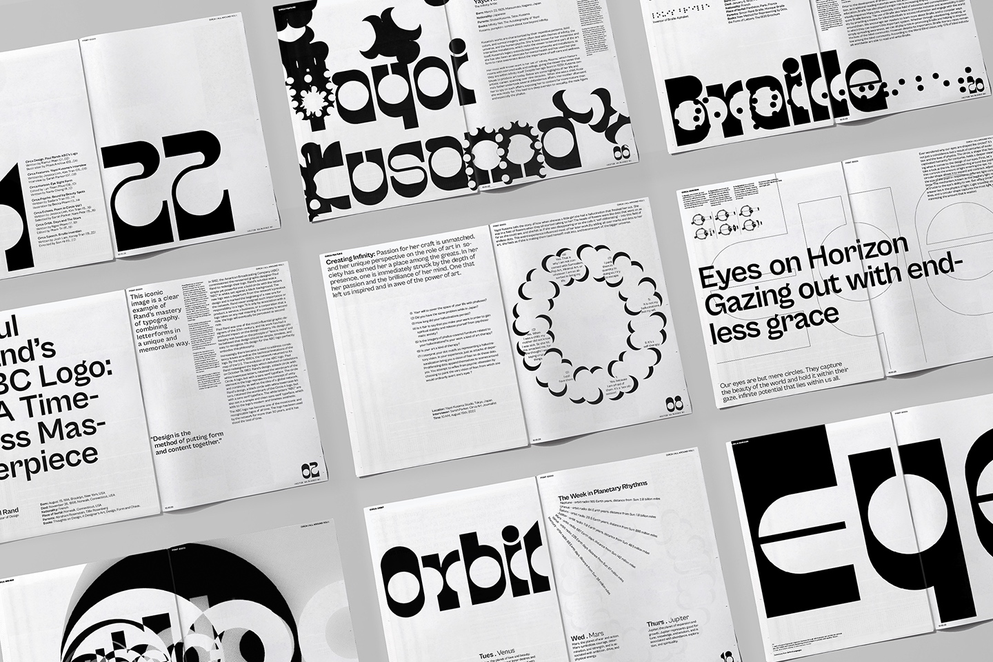
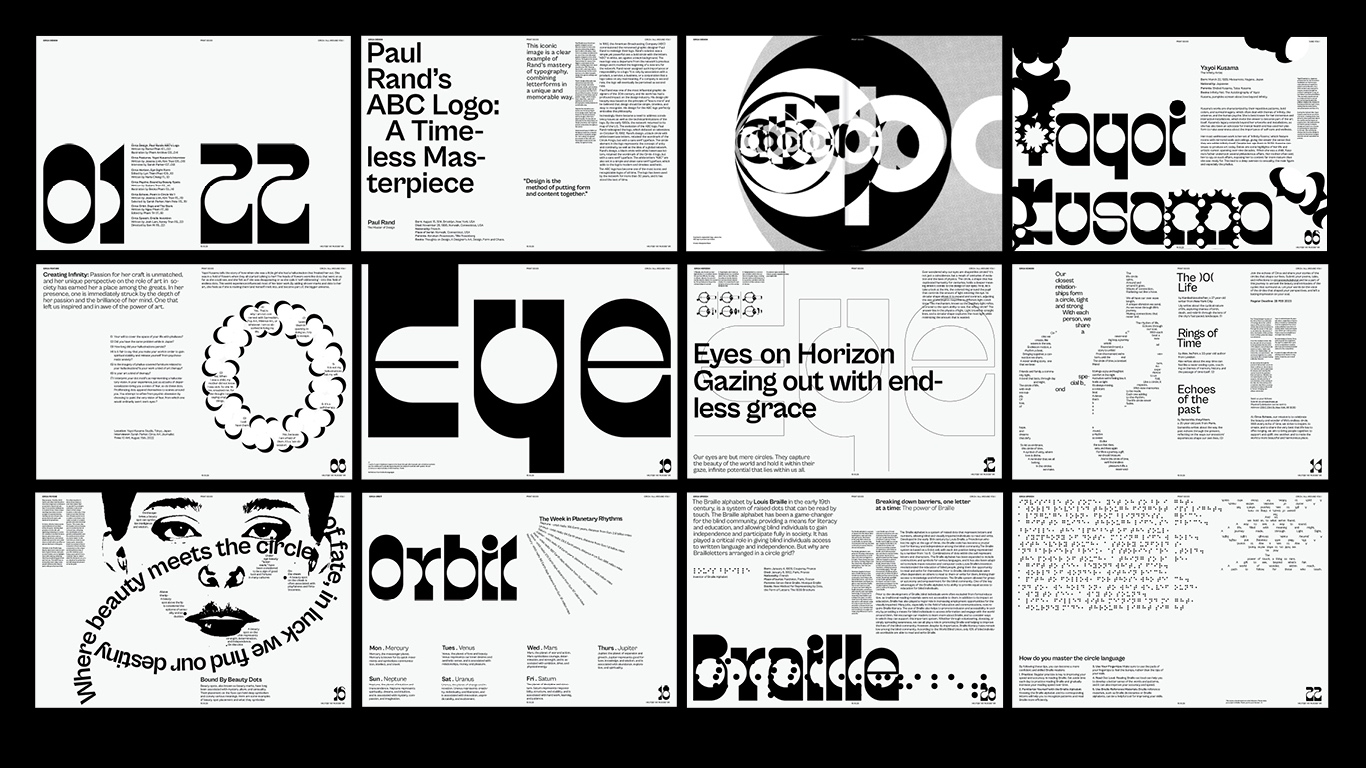
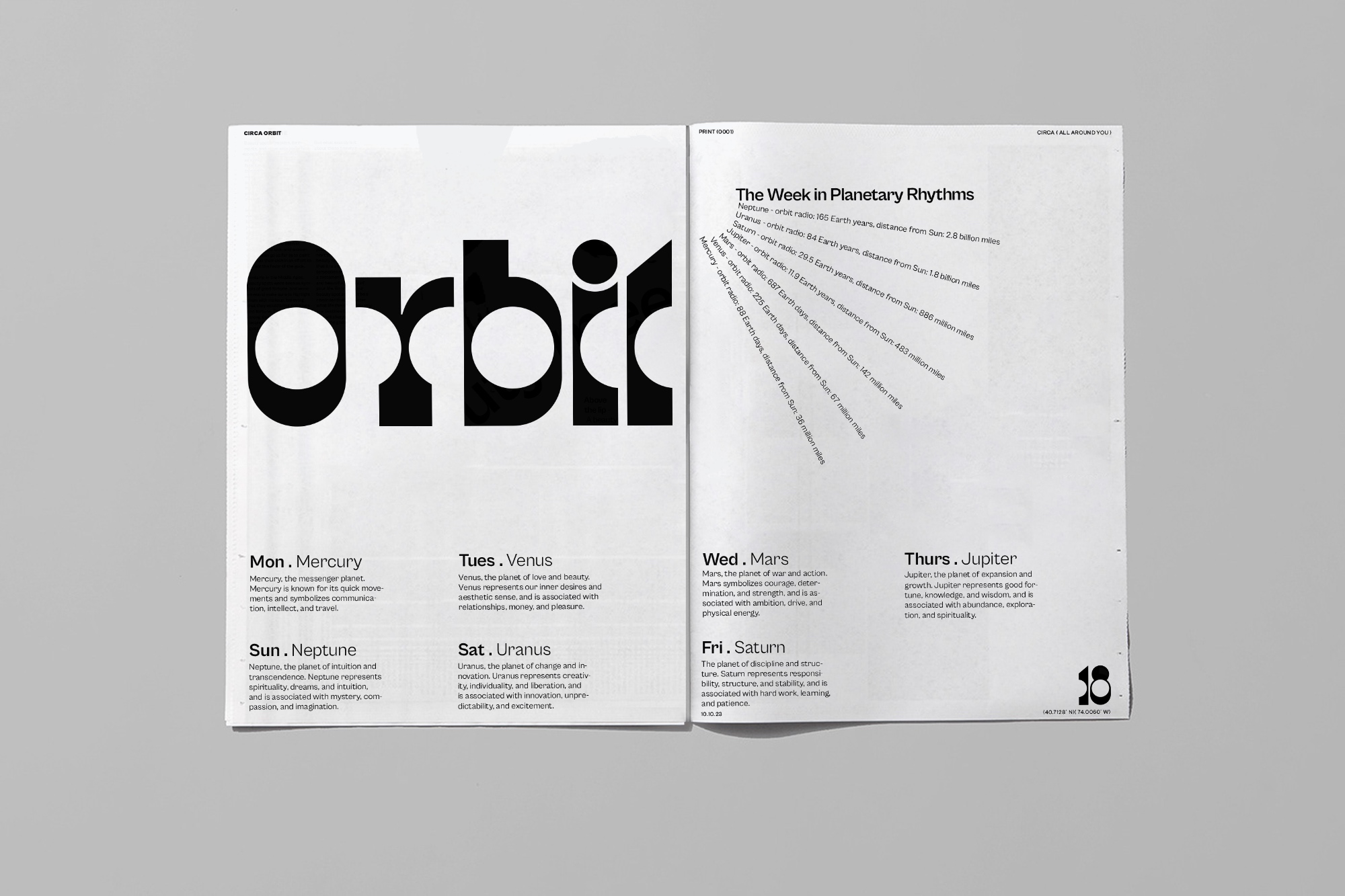
Beyond its captivating content, Circa’s design philosophy is a testament to the publication’s commitment to pushing the boundaries of creativity and aesthetics. Every aspect of the newspaper’s layout and visuals incorporates circular forms, creating a visually stunning and immersive reading experience. The circular typography dances across the pages, drawing the eye and guiding the reader through the articles with a sense of graceful movement. The graphics, too, embrace the circular motif, lending a harmonious and cohesive aesthetic to the publication as a whole.
By challenging readers to engage with information in new and unexpected ways, Circa ignites their imagination and broadens their perspectives. The innovative design elements inspire a sense of curiosity and playfulness, encouraging readers to interact with the content, turning each page into a journey of exploration.
At its core, Circa aims to inspire and empower readers by celebrating the beauty, diversity, and inclusivity inherent in the symbol of the circle. It strives to create a vibrant community that embraces different cultures, beliefs, and experiences. By embracing the transformative power of the circle, Circa fosters a sense of unity and interconnectedness, reminding readers that we are all part of a larger whole, bound together by the endless reflections of the circle’s unique vision.
CREDIT
- Agency/Creative: Minh Pham
- Article Title: Circa Newspaper – Typography for Periodical Publication
- Organisation/Entity: Student
- Project Type: Typography
- Project Status: Non Published
- Agency/Creative Country: United States
- Agency/Creative City: Long Island City, Queens
- Market Region: North America
- Project Deliverables: Typography
- Industry: Mass Media
- Keywords: WBDS Student Design Awards 2023/24
- Keywords: Typography: Periodical Publication
-
Credits:
Educational Institution: School of Visual Arts
Educator's Name: Pedro Mendes


