Cinco Jotas is a 100% Ibérico Ham Brand since 1879.
They maintain traditional and natural processes accomplish by different masters which made each piece unique.
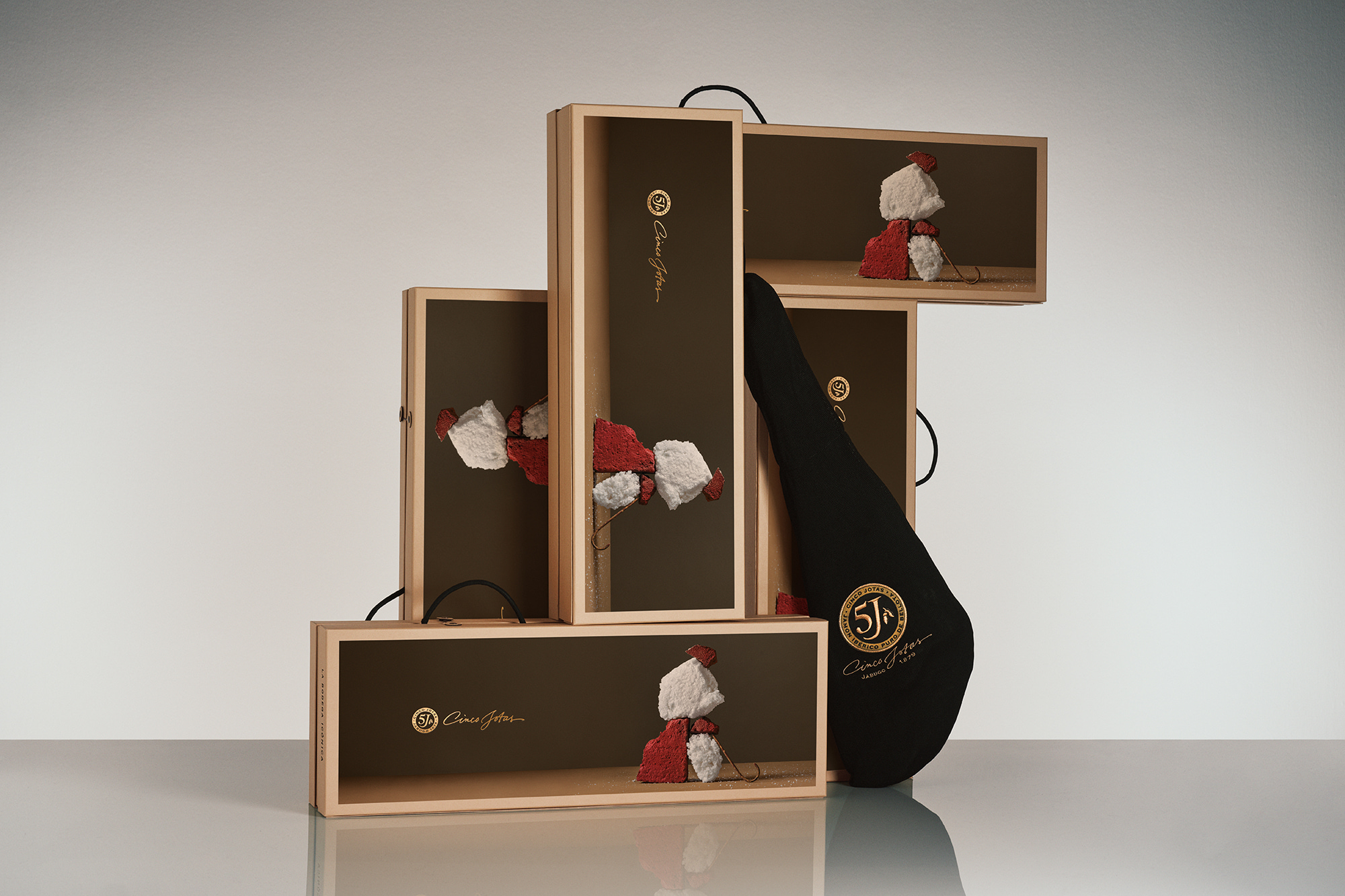
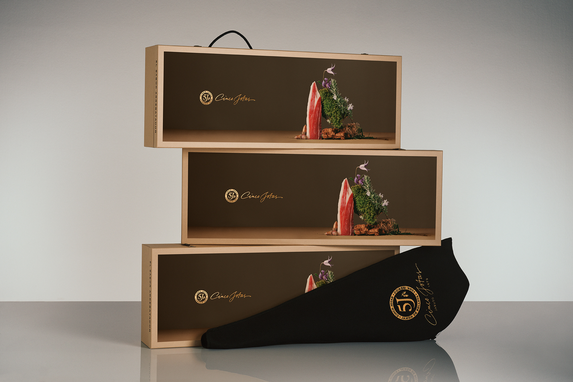
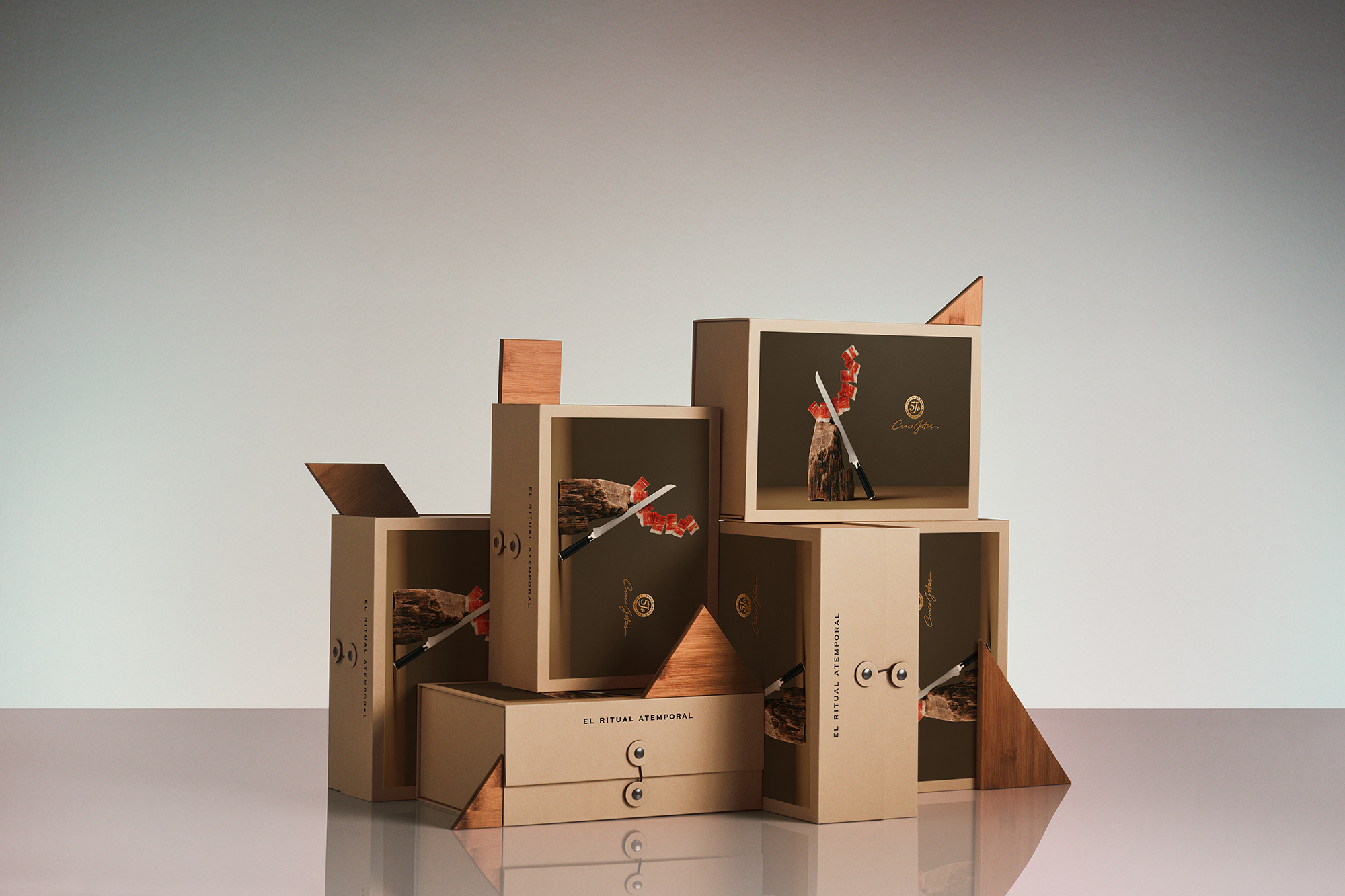
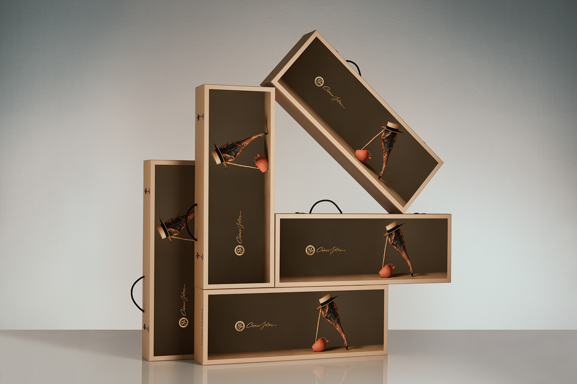
For another year, we had the pleasure of developing the packaging of the Cinco Jotas Christmas edition, in which we evolved the premium ham brand towards luxury, gastronomy and art.
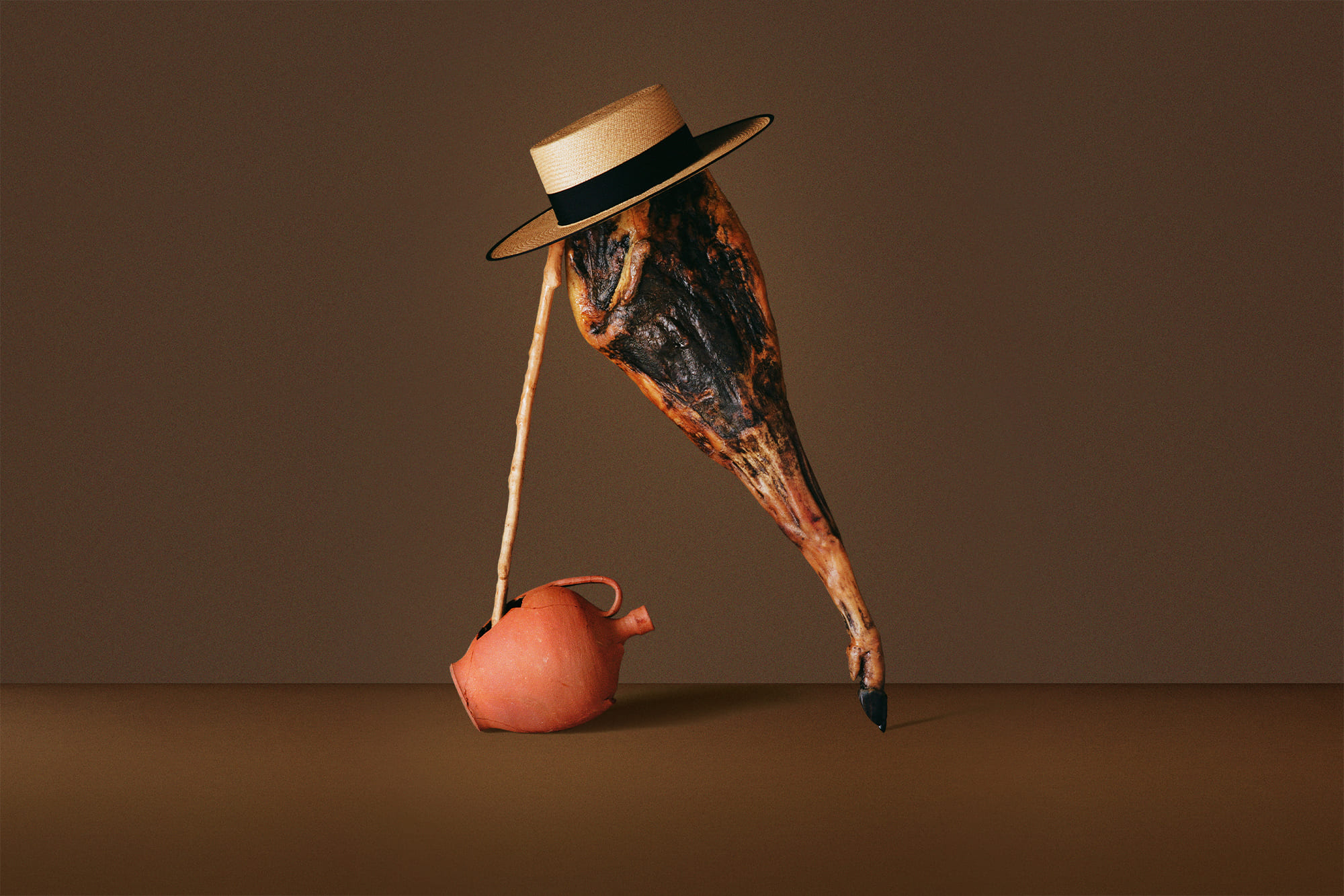
In a moment of change and constant update, this year the concept is based on the reinterpretation of a classic. To bring the concept alive, Ana Domínguez and Nacho Alegre reinterpret the Spanish traditions through sophisticated still lifes which keep folklore alive through languages of the present. Pieces and materials that represent classical Spanish culture from a contemporary perspective, maintaining the origins of a timeless trade.
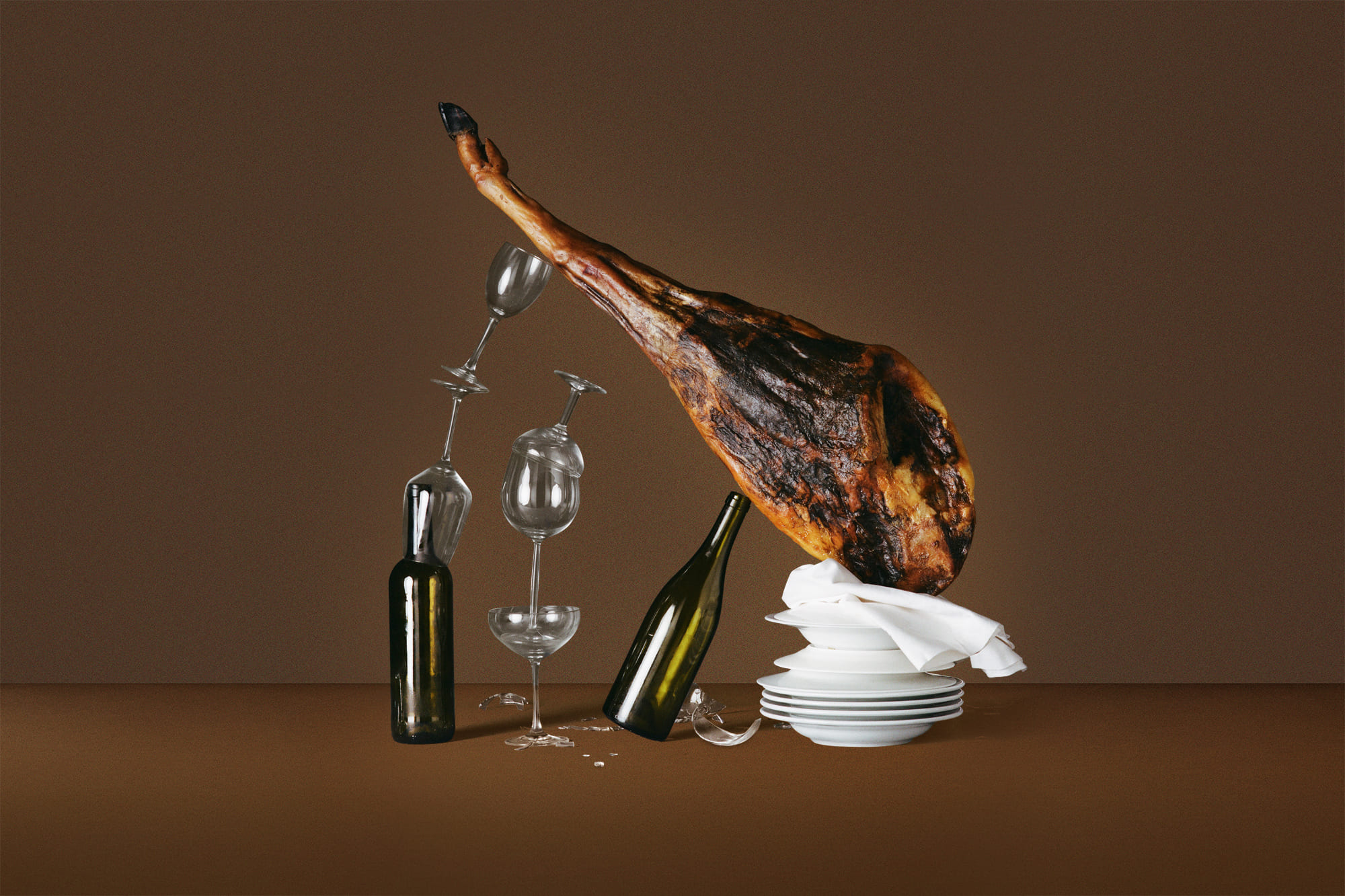
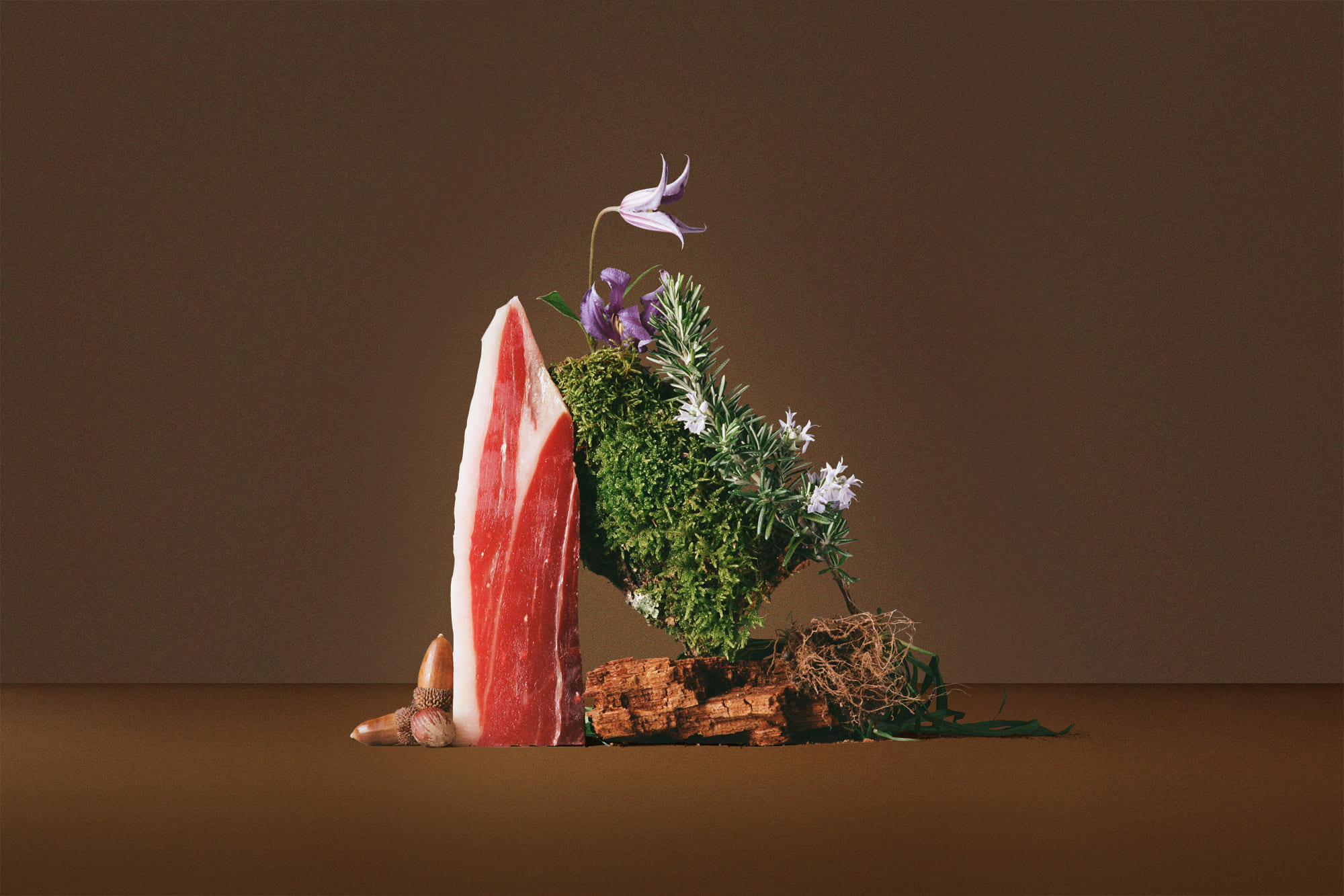
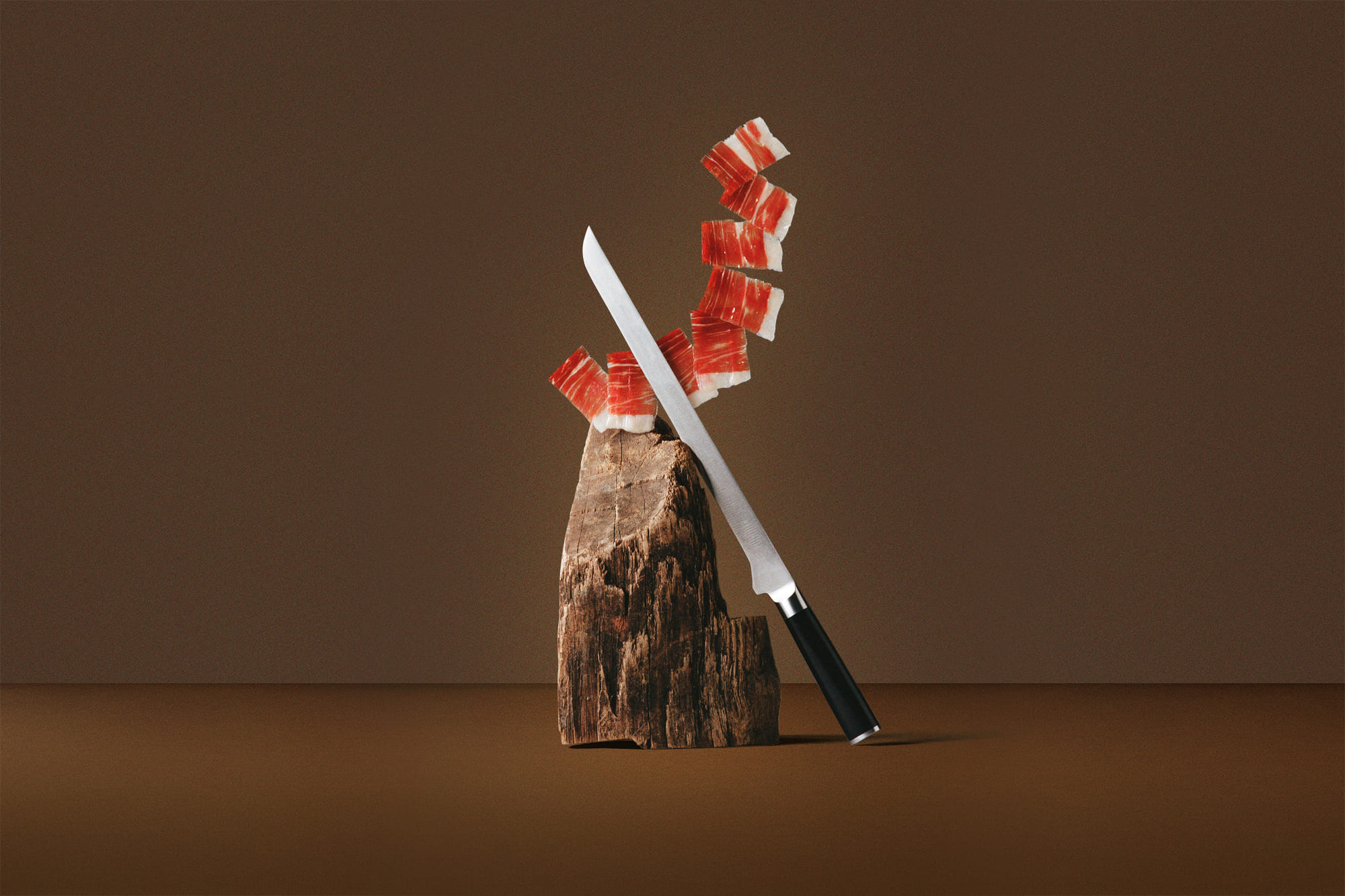
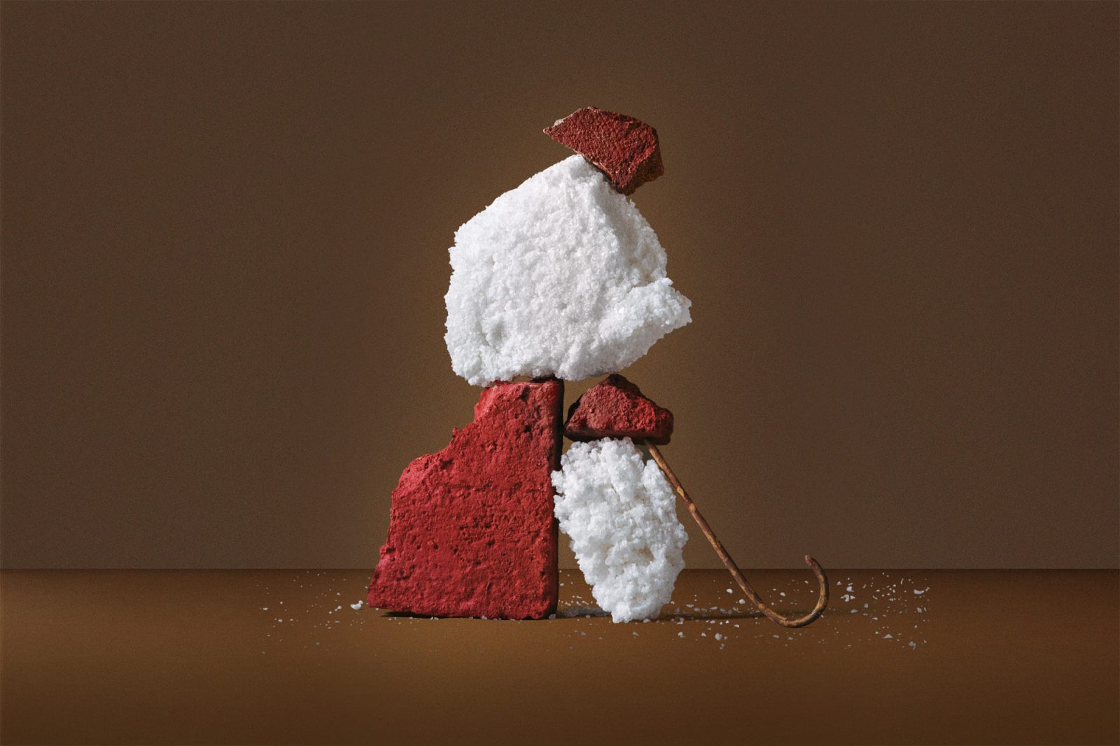
The photographies evoke us this reinterpretation of a classic through natural compositions built with the different assets of Cinco Jotas, Ana and Nacho play with balance and materials to achieve an unique universe that remind us to the great still life Spanish artists from the Baroque, coming back to this previous idea of the reinterpretation of a classic.
They blend with masterly the different pieces and materials, mixing the roughness of the stone with the lightness of the salt, the strength of the whole ham with the delicacy of the glass, achieving as a result a powerful scene where the common things turn into a piece of art.
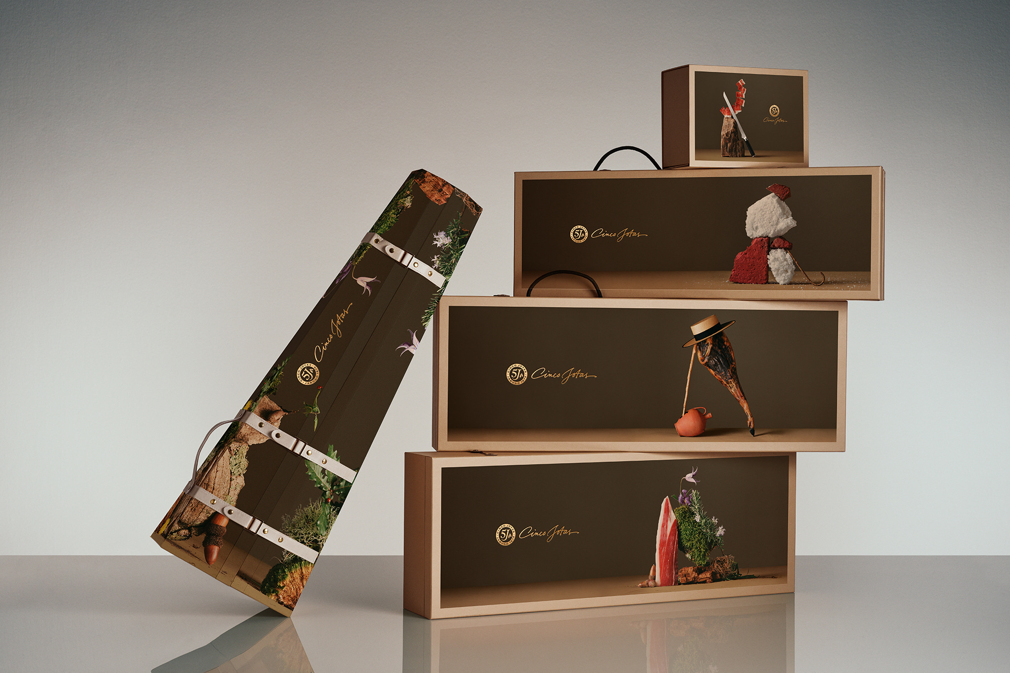
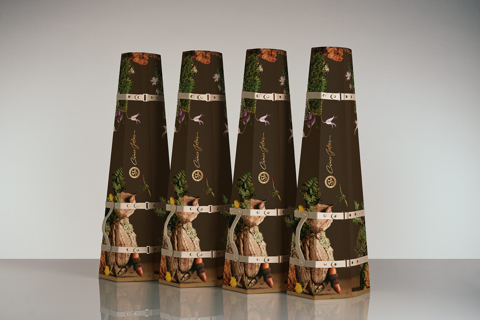
Ana and Nacho also did the packshots, clean and dynamic compositions that enhance the value of the protographies. Moreover, the presentation of the packs raises the product following the luxury trends.
To complete this reinvented classic, we incorporate luxury and art codes in the brand’s identity and we impregnate the Key Visual with these freshness and dynamic compositions, capturing the different key elements that define Cinco Jotas: the immutable dehesa, the inimitable winery, the lived art, the timeless ritual, the beloved gift, the captivating taste.
CREDIT
- Agency/Creative: Morillas Brand Design
- Article Title: Cinco Jotas – The Reinterpretation of a Classic
- Organisation/Entity: Agency
- Project Type: Packaging
- Project Status: Published
- Agency/Creative Country: Spain
- Agency/Creative City: Barcelona
- Market Region: Europe
- Project Deliverables: Graphic Design, Packaging Design, Product Design
- Format: Box
- Substrate: Pulp Carton
- Industry: Food/Beverage
- Keywords: WBDS Agency Design Awards 2023/24
- Keywords: Packaging Design ,Product Creation
-
Credits:
Photographer: Nacho Alegre
Photo Art Direction: Ana Dominguez


