Cinco Jotas, an icon of Spanish gastronomy with a heritage spanning over a century, embarked on a repositioning journey in 2019 to elevate the brand to a luxury level. This transformation solidified Cinco Jotas as more than a culinary experience—it established the brand as a true masterpiece of worldwide gastronomy. Renowned for its 100% Iberian acorn-fed ham, Cinco Jotas represents the pinnacle of Spanish artistry, culture, and tradition. Every piece of ham is not just a product; it is a work of art, a testament to the dedication, expertise, and passion of master artisans devoted to crafting an exceptional and exclusive experience.
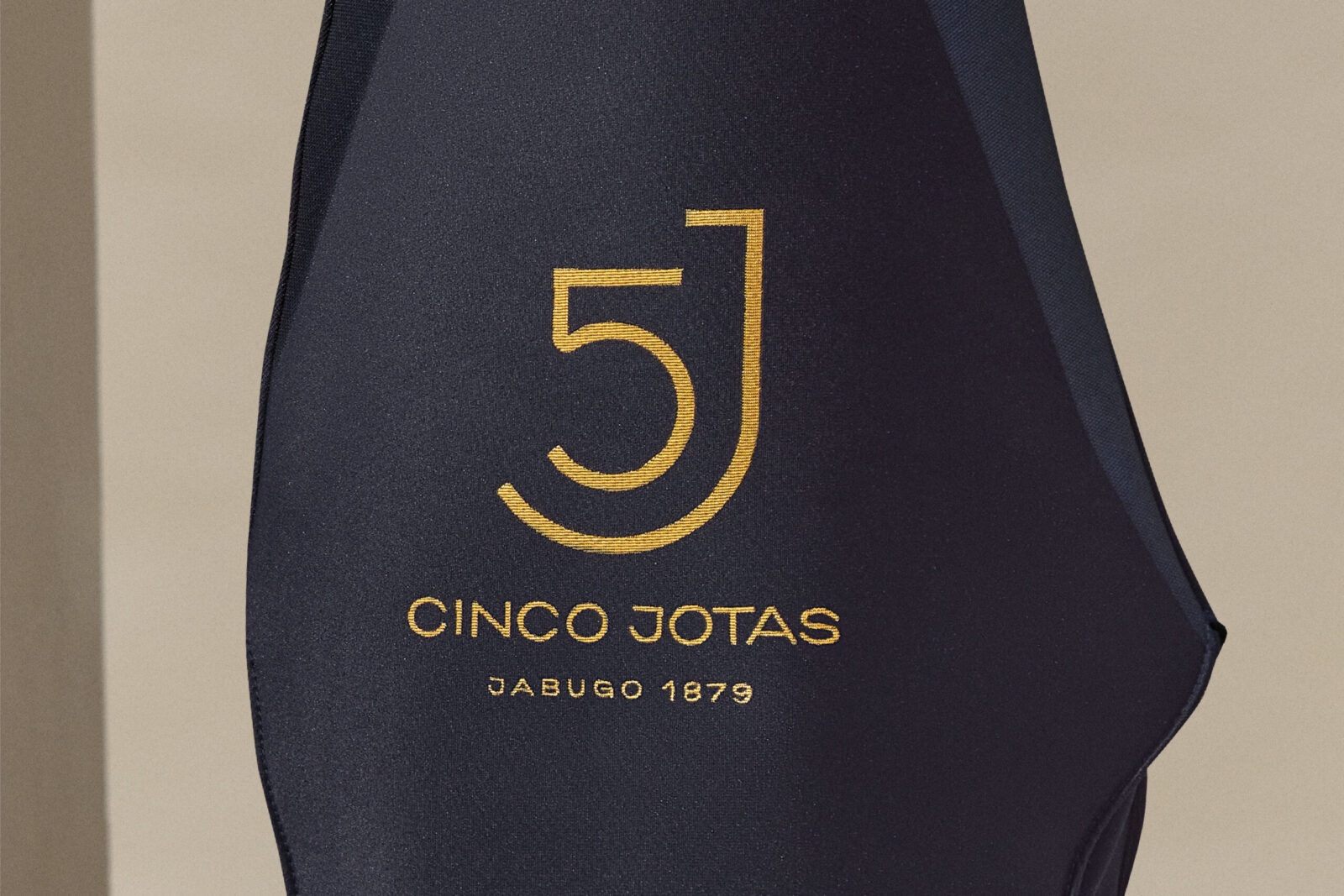
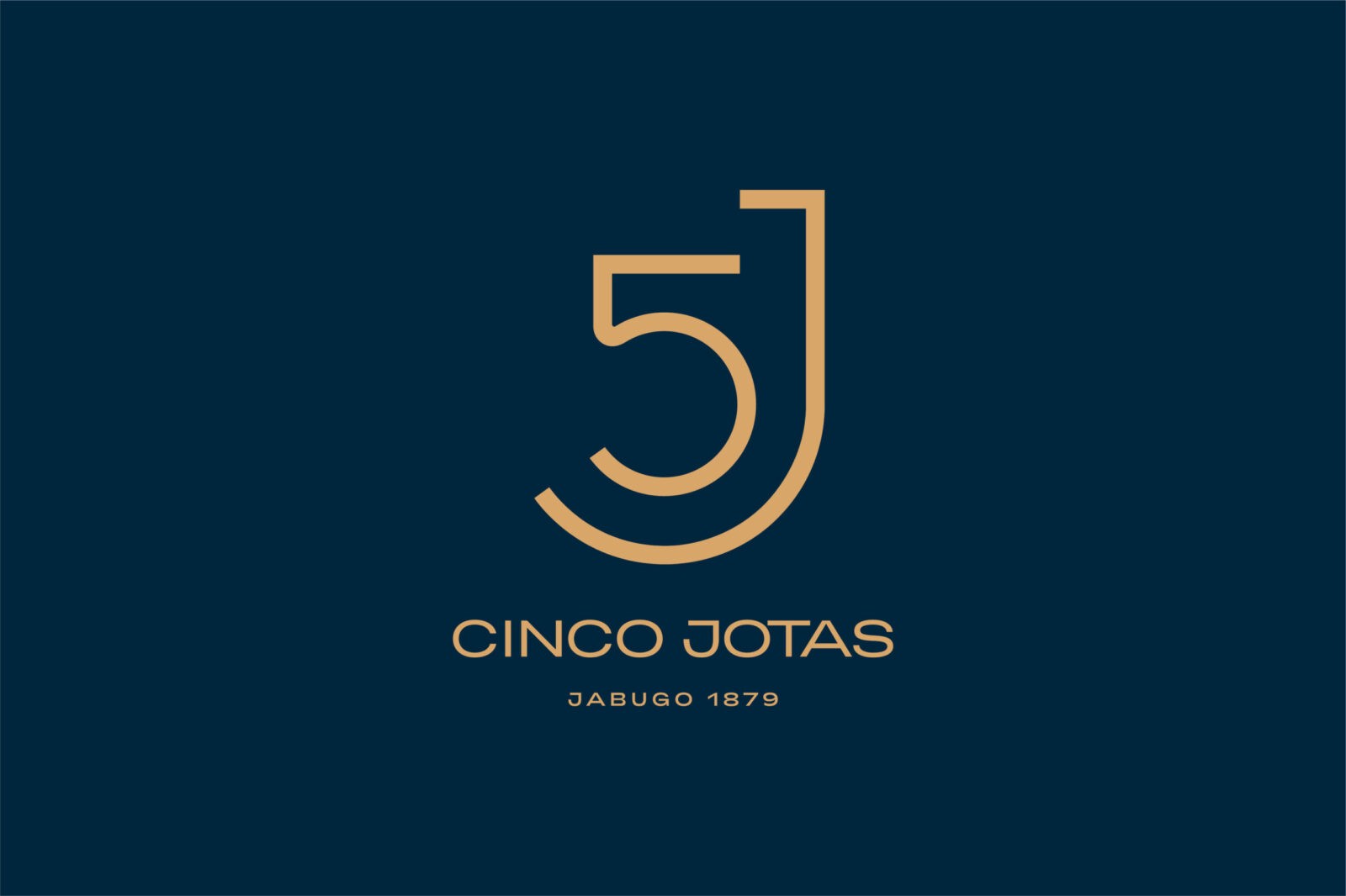
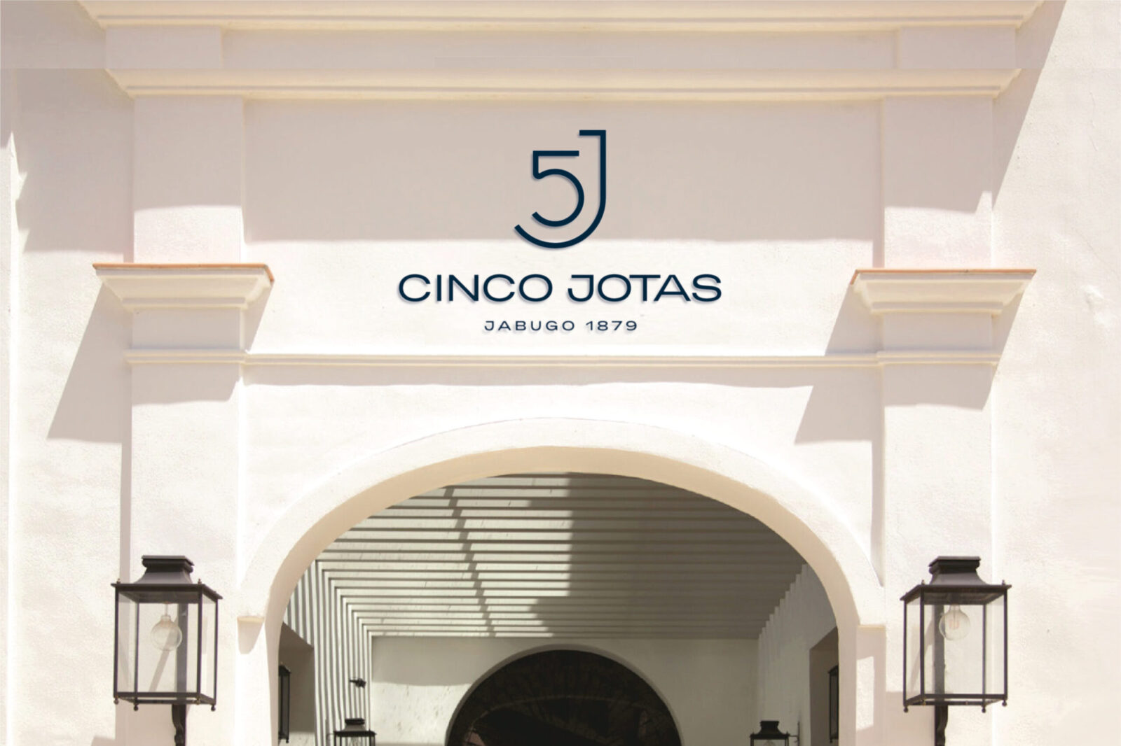
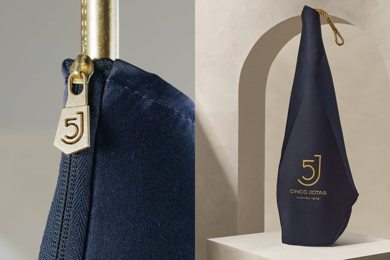
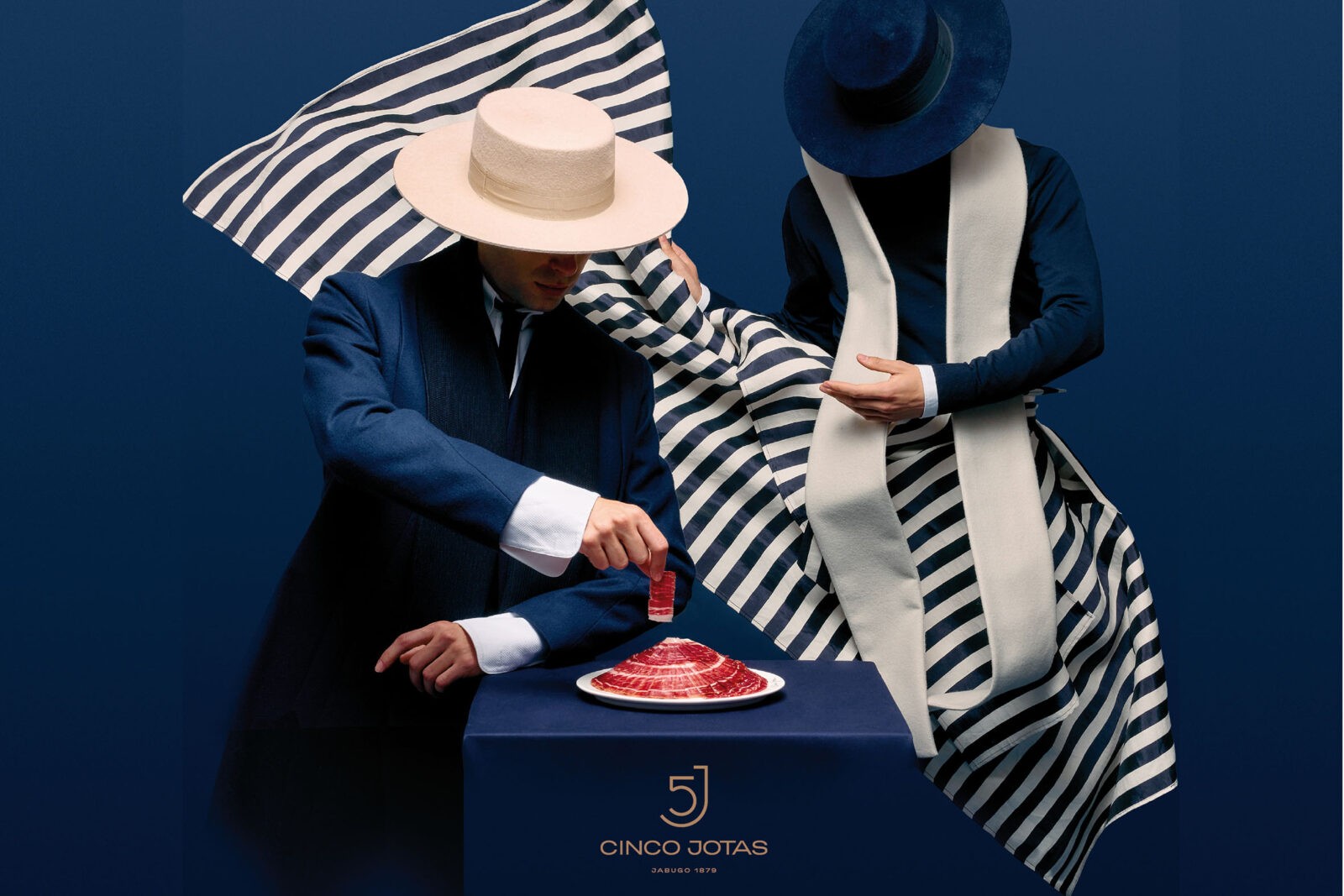
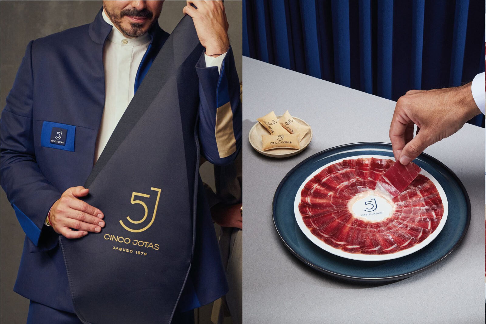
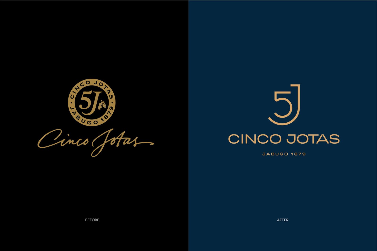
Morillas accepted the challenge of translating this profound heritage into a contemporary brand expression that captures both the sophistication and authenticity of Cinco Jotas. We designed a cohesive visual identity that aligns with the codes of luxury, creating an elevated visual language that resonates with elegance, excellence, and minimalism. The refreshed brand identity now features a refined Midnight Blue and an organic Albero tone—distinctive colours that establish a memorable and prestigious presence, reflecting Cinco Jotas’ unique character and ambition.
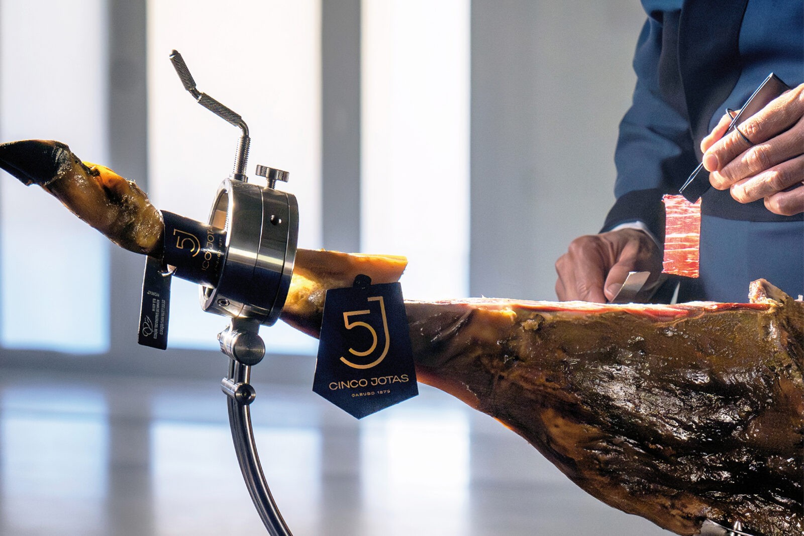
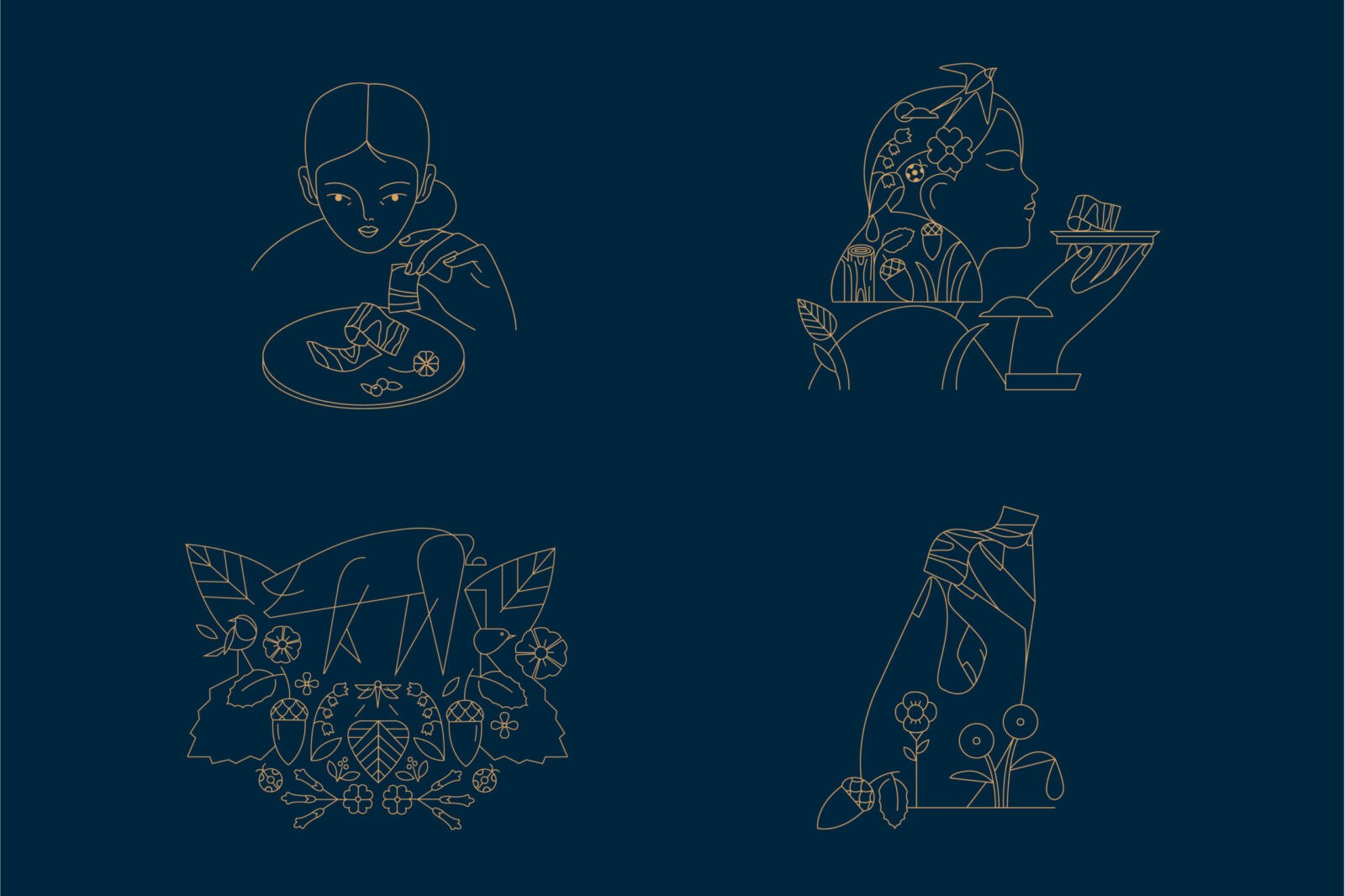
In addition to a sophisticated colour palette, the logo, symbol, and every graphic element underwent a thorough redesign to embody simplicity and refinement, qualities that resonate deeply within the luxury category and its visual trends. The reimagined logo, typography, and photographic style, along with meticulously selected details, together express Cinco Jotas’s obsession with precision, beauty, and passion for quality.
With this new identity, Cinco Jotas is positioned not only as a leader in fine gastronomy but as a cultural and artistic symbol of Spain itself. The brand’s journey from iconic heritage to elevated luxury stands as a testament to the enduring artistry and spirit of Cinco Jotas, now resonating on a global stage as a beacon of Spanish excellence. This evolution reinforces its commitment to celebrating tradition while inviting a new generation of connoisseurs to discover the magic of Spanish gastronomy.
CREDIT
- Agency/Creative: Morillas Brand Design
- Article Title: Cinco Jotas Rebranding by Morillas Brand Design
- Organisation/Entity: Agency
- Project Status: Published
- Agency/Creative Country: Spain
- Agency/Creative City: Barcelona
- Industry: Food/Beverage
- Keywords: Identity: Brand Redesign , WBDS Agency Design Awards 2024/25
- Keywords: WBDS Agency Design Awards 2024/25
-
Credits:
Illustrator: Pablo Salvaje
Illustrator: Judit Canela


