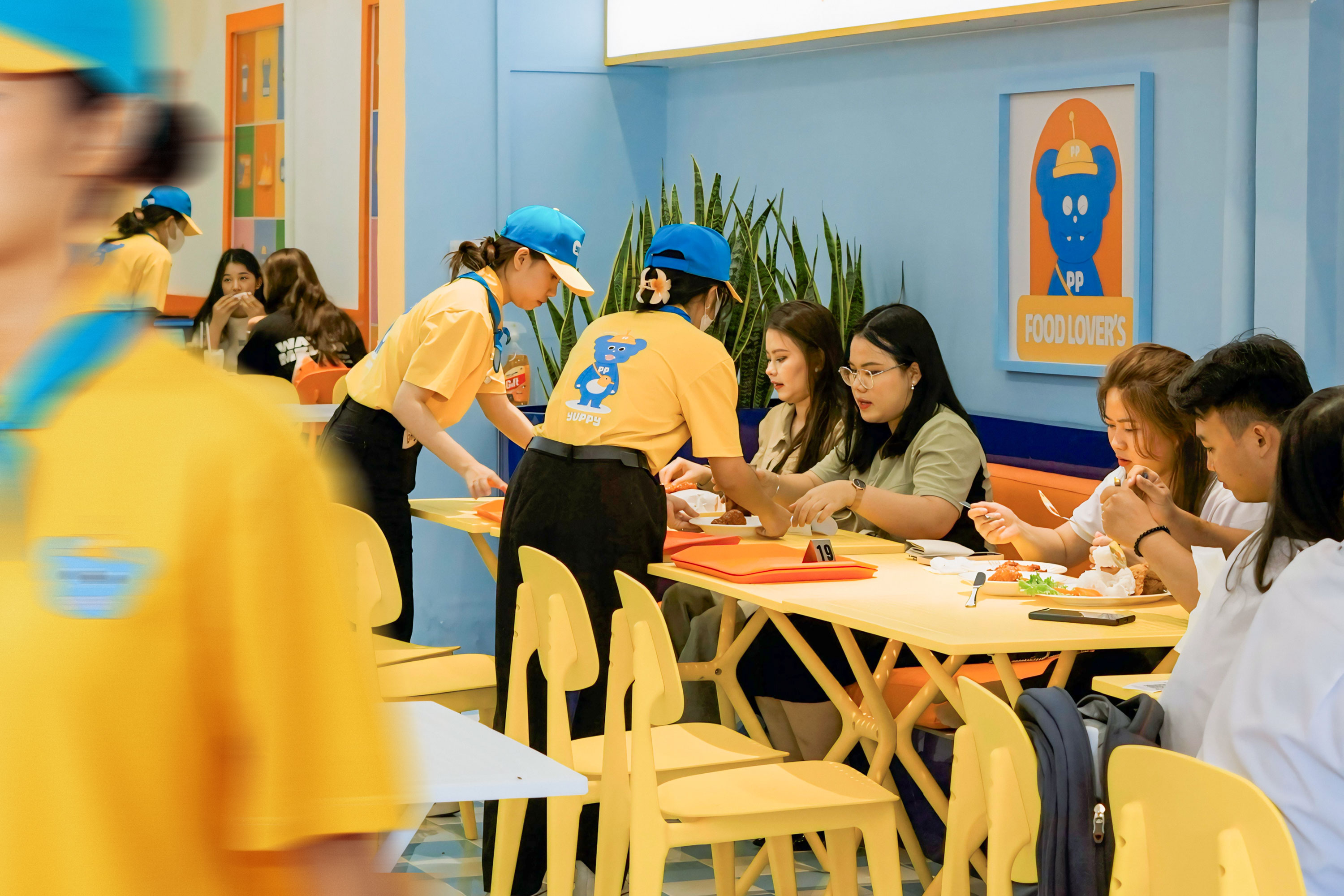
About Project: Yuppy – Fast Food & Convenience Store is the ideal combination for energetic and youthful individuals, where you can enjoy quick, delicious, and convenient meals. Yuppy not only focuses on providing fast, tasty, and convenient food but also develops a friendly, dynamic, and colorful space, promoting a positive lifestyle and the vibrancy of young people. From breakfast to dinner, from fried chicken to pizza, Yuppy commits to providing customers with the most wonderful and convenient culinary experiences.
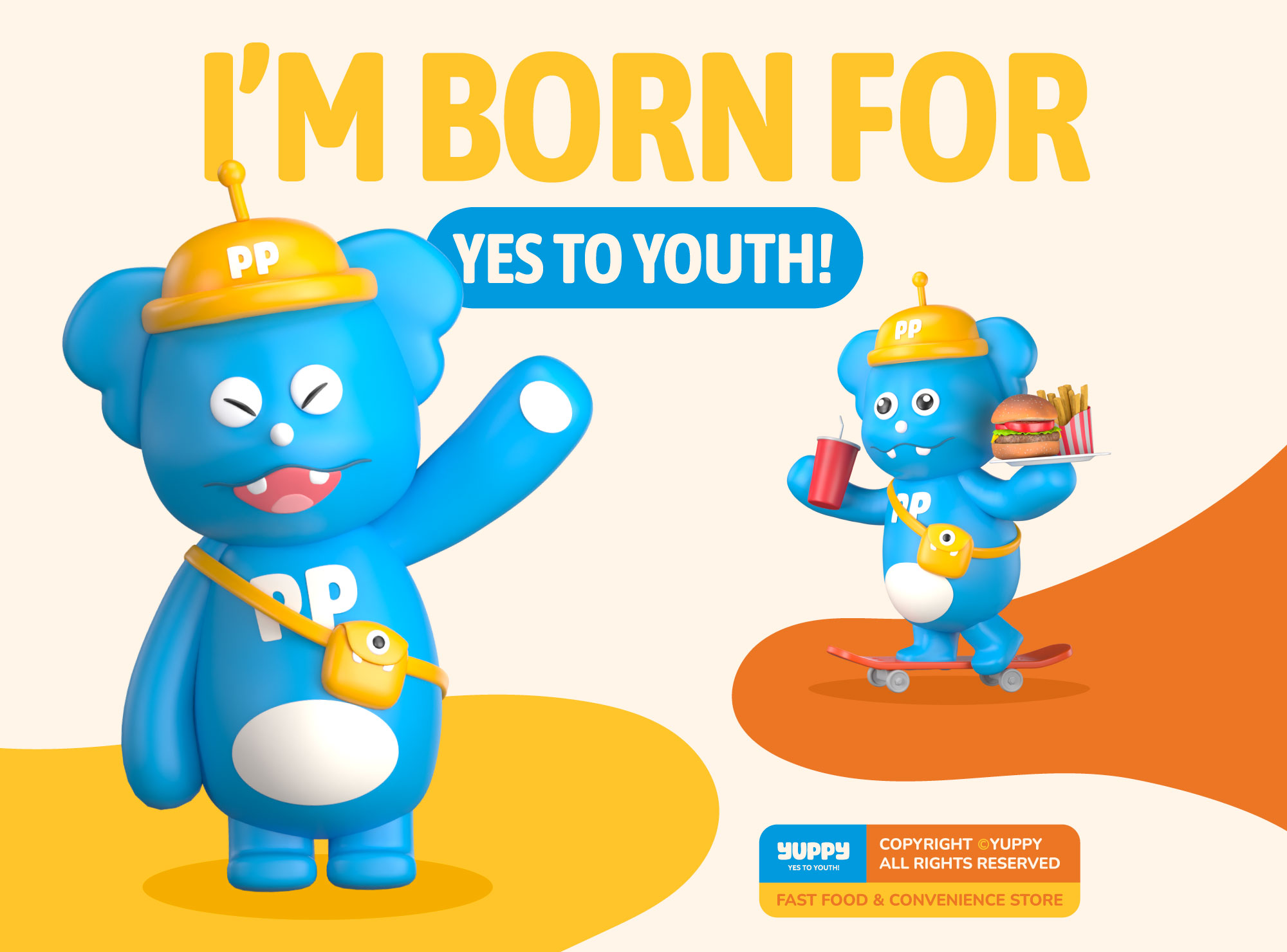
Brand Mascot: Y (Young – Youthful), U (Urban), P (Professional), PY (Happy)
Youthful and vibrant spirit are the core values that Yuppy aims for. The brand is not only a place to create products for the young generation but also a place to promote their creativity and enthusiasm.
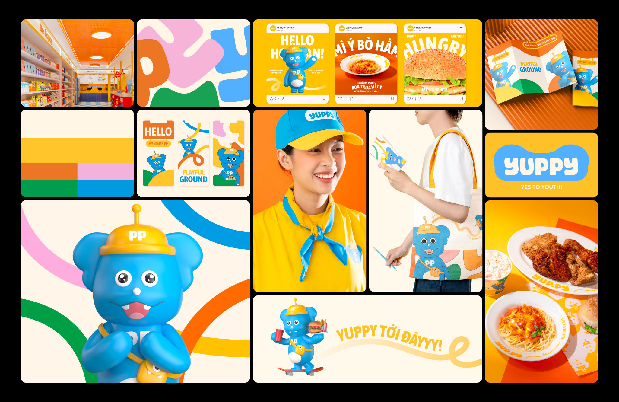
Therefore, Cillgold has created a fictional character – PP – as the symbol of the brand’s lively spirit. PP is a lively and energetic boy who always brings joy and attracts everyone around him. With a chubby body in bright blue color, the highlight is his large round sparkling eyes, always radiating enthusiasm and happiness to everyone around.
Logo: The brand’s logo is designed with a simple, robust, and dynamic spirit, yet still retains a friendly and playful feel thanks to rounded details and the rhythmic flow of the font. With freely designed lines, it creates a natural and flexible feeling. The logo is optimized to attract attention from both near and far, making it easy to apply in various brand contexts.
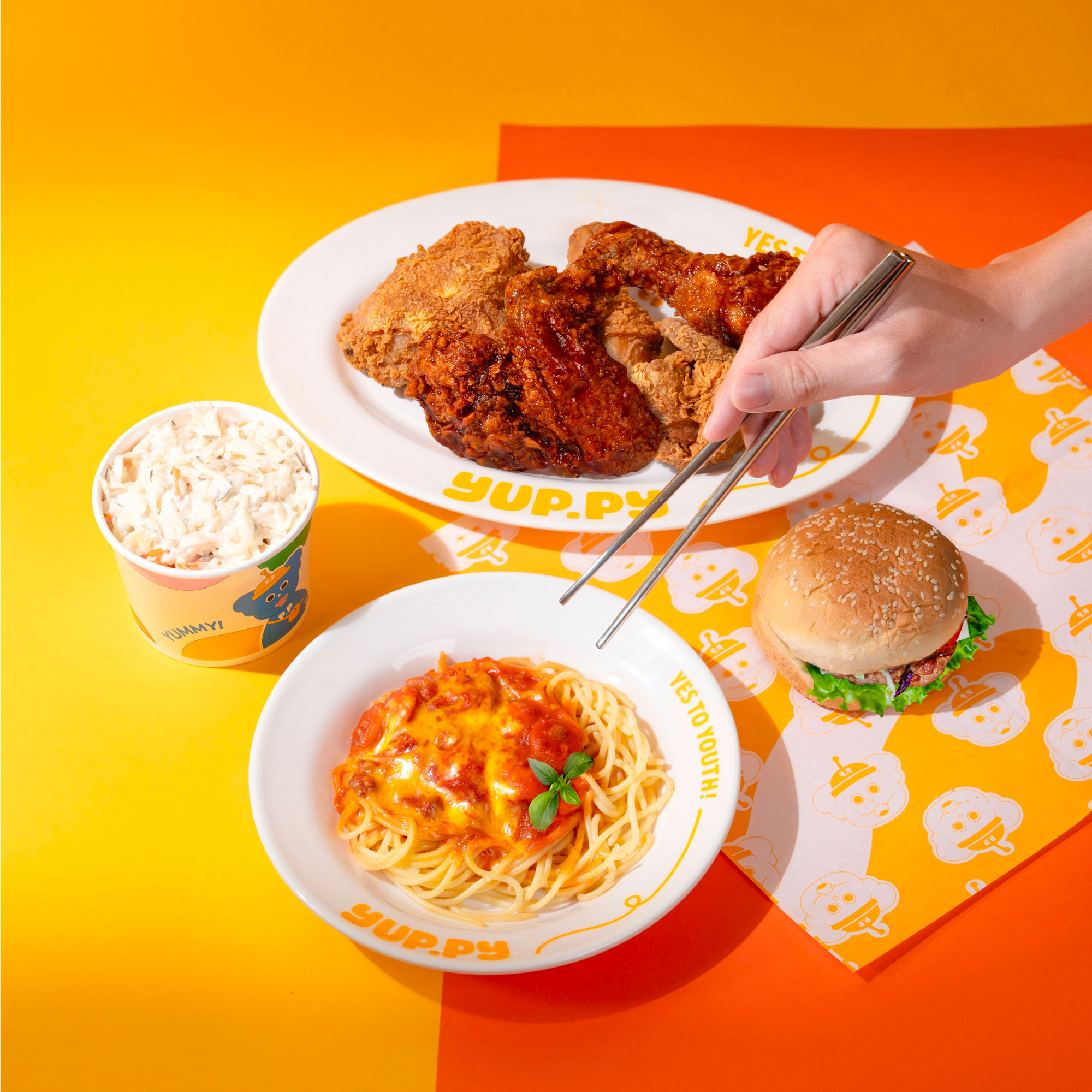
Key Visual: Yuppy’s color palette is composed of vibrant and lively colors: Milk White: Evokes a creamy sensation, Fresh Blue: Provides a cool, refreshing feeling, Golden Cheese: Represents warmth and dynamism, Fruit Pink: Enhances cuteness and friendliness, Spicy Orange: Stimulates a strong taste sensation, evoking deliciousness, Lettuce Green: Symbolises the cool green of vegetables
In terms of Yuppy’s main visual elements, the most prominent features are the rounded shapes filled with color, combined with overlapping lines to create a playful and dynamic feel. Additionally, Cillgold has developed box elements for communication purposes to further embellish both PP’s dialogue and the brand’s message.
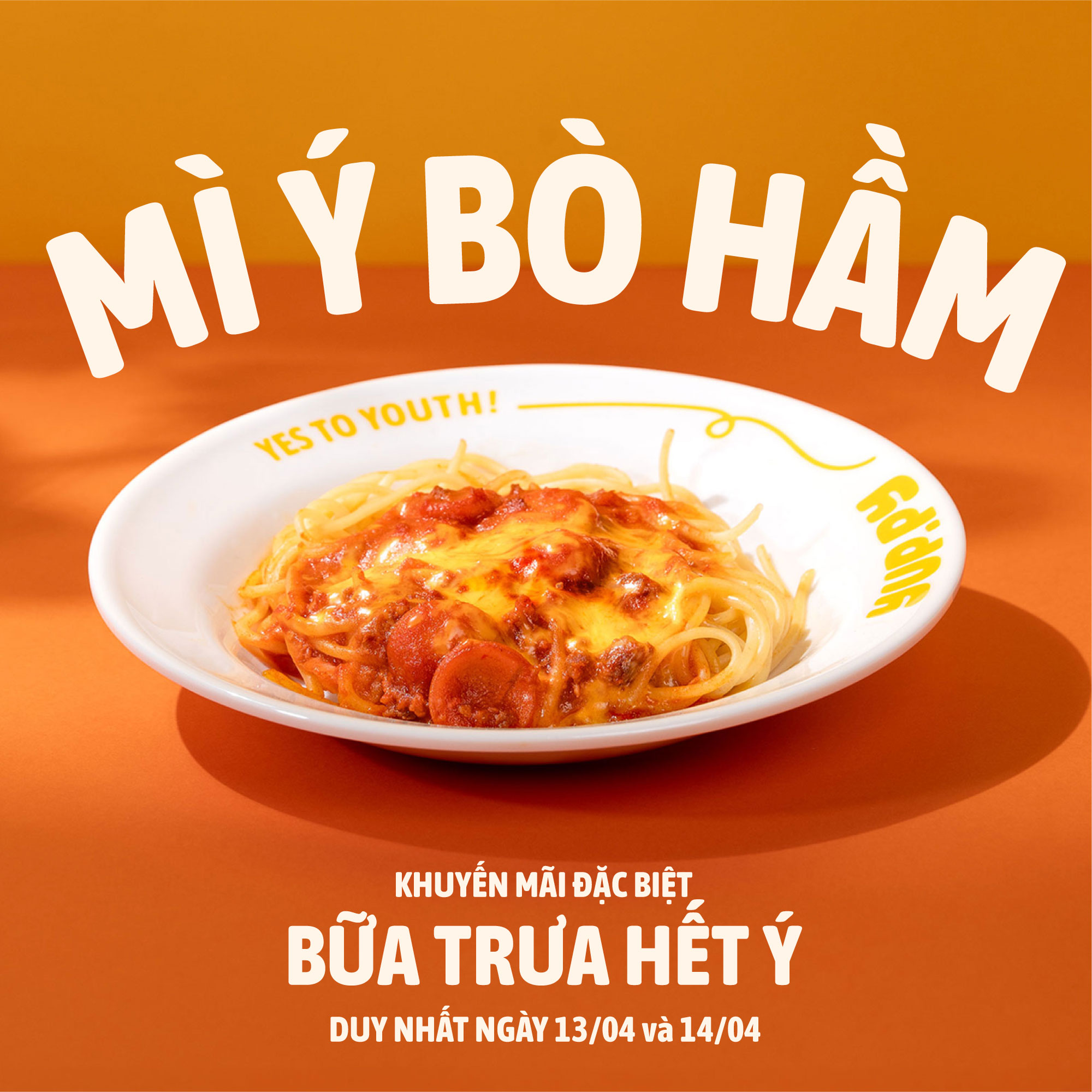
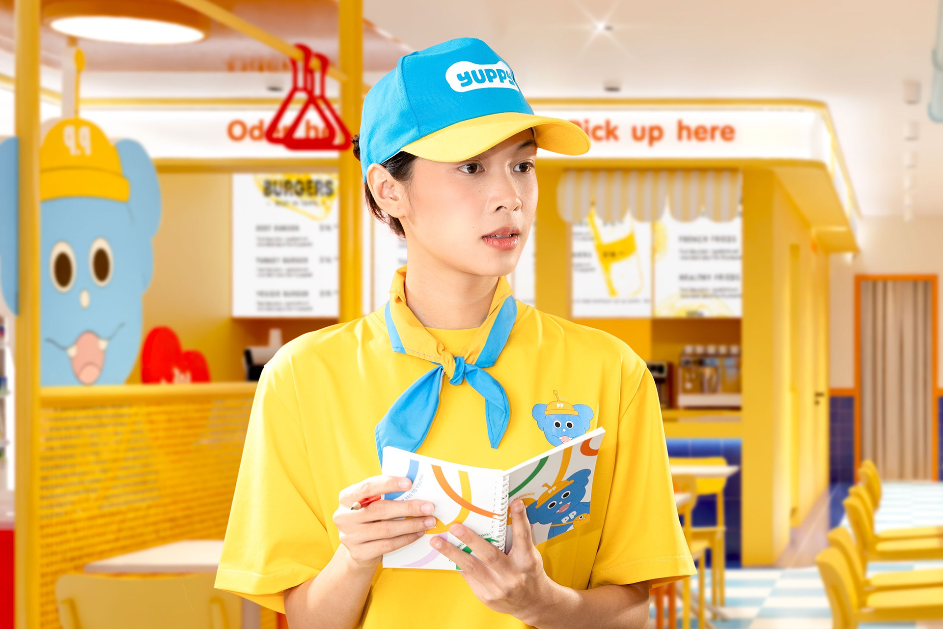
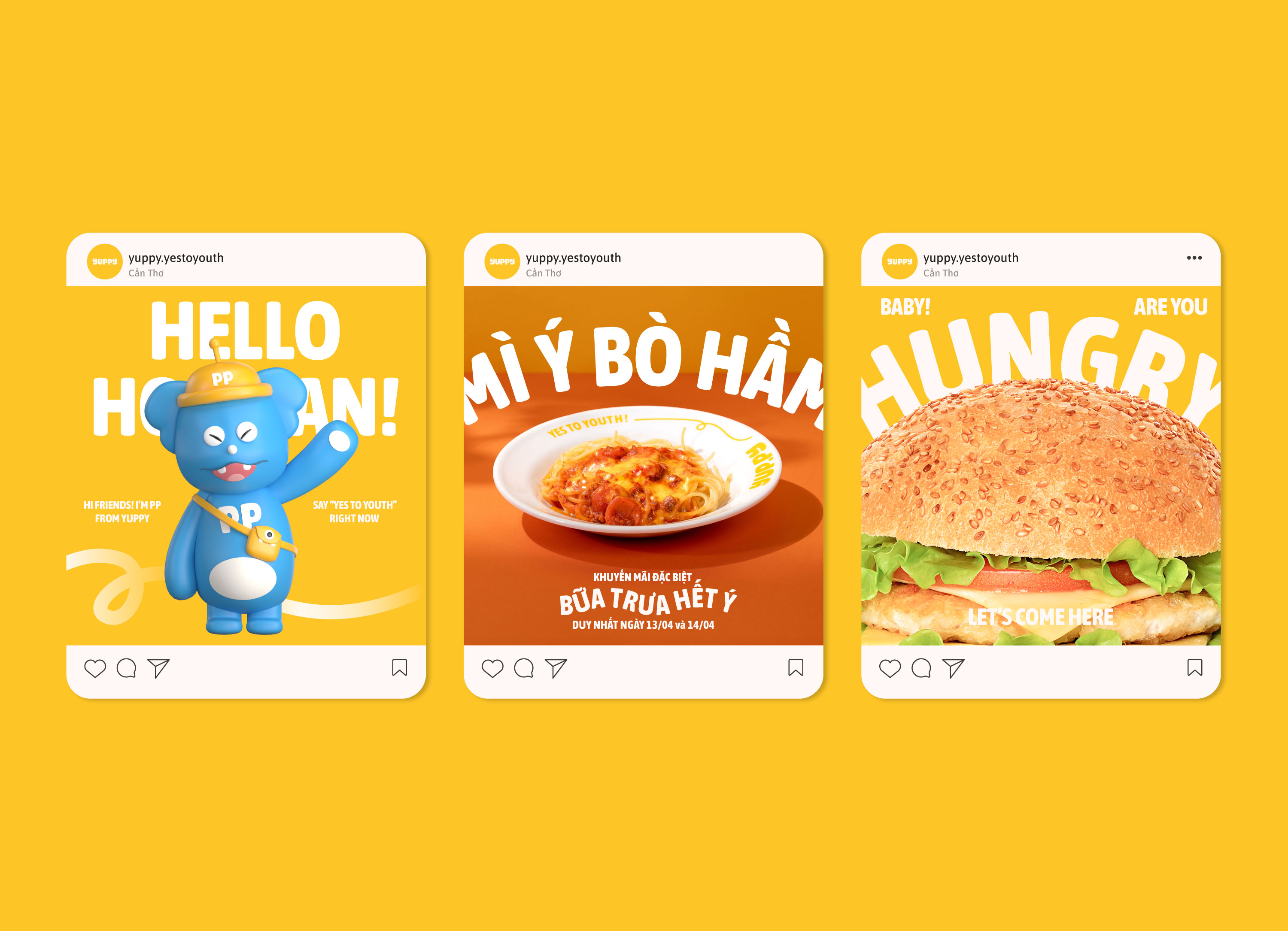
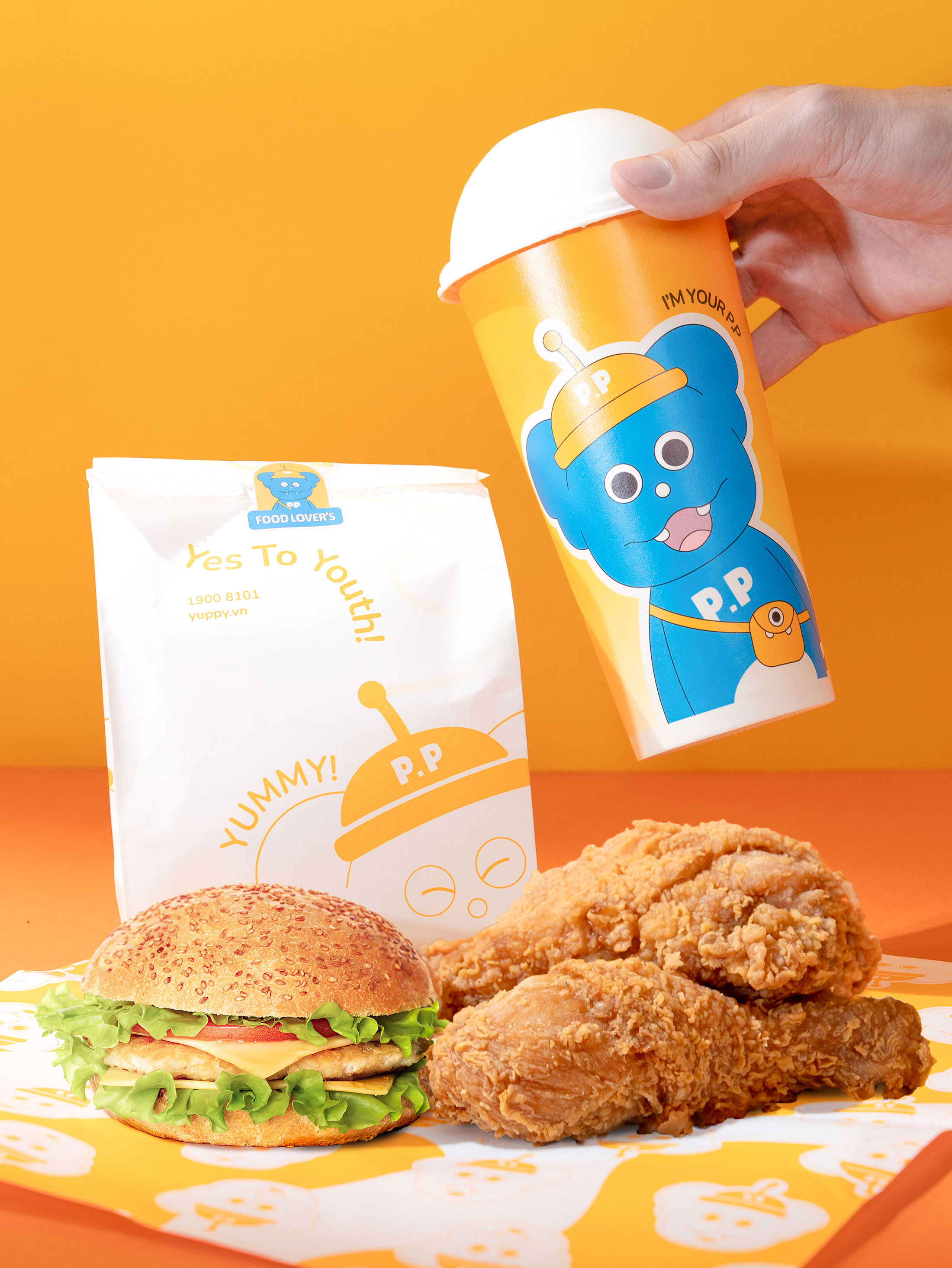
Cillgold isn’t just focused on building Yuppy’s brand identity; they’ve also crafted a special marketing plan for the grand opening week. This involves creating unique merchandise and designing daily social media ad posts to grab attention and draw a large audience interested in the brand.


CREDIT
- Agency/Creative: Cillgold
- Article Title: Cillgold Agency Creates a Vibrant, Youthful Brand Identity System for Yuppy
- Organisation/Entity: Agency
- Project Type: Identity
- Project Status: Published
- Agency/Creative Country: Vietnam
- Agency/Creative City: HCMC
- Market Region: Asia
- Project Deliverables: 3D Design, 3D Motion, Animation, Brand Identity, Branding, Food Photography
- Industry: Food/Beverage
- Keywords: Cillgold, Vietnam, Branding Identiy, FnB, Logo Design
-
Credits:
Agency: Cillgold


