


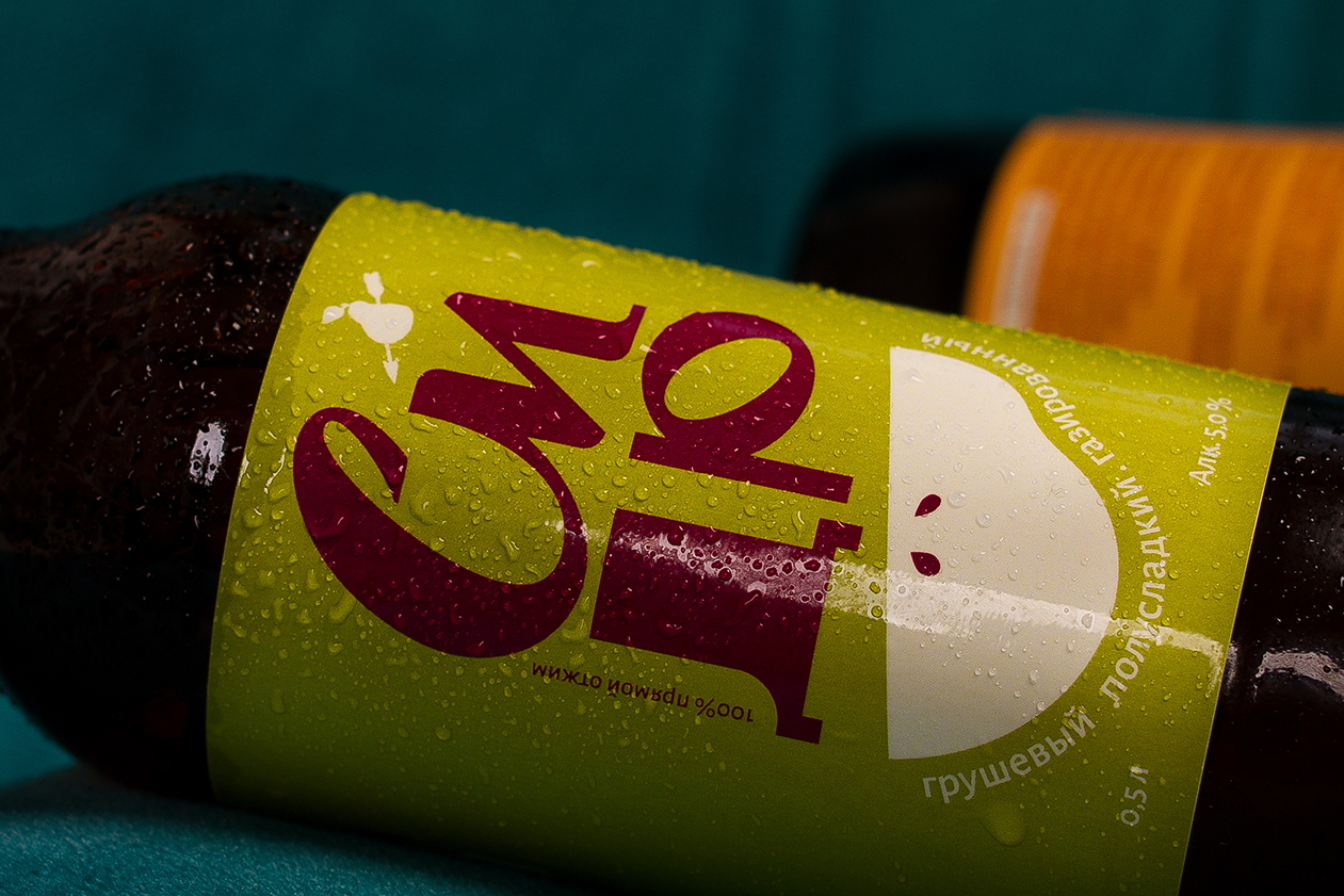
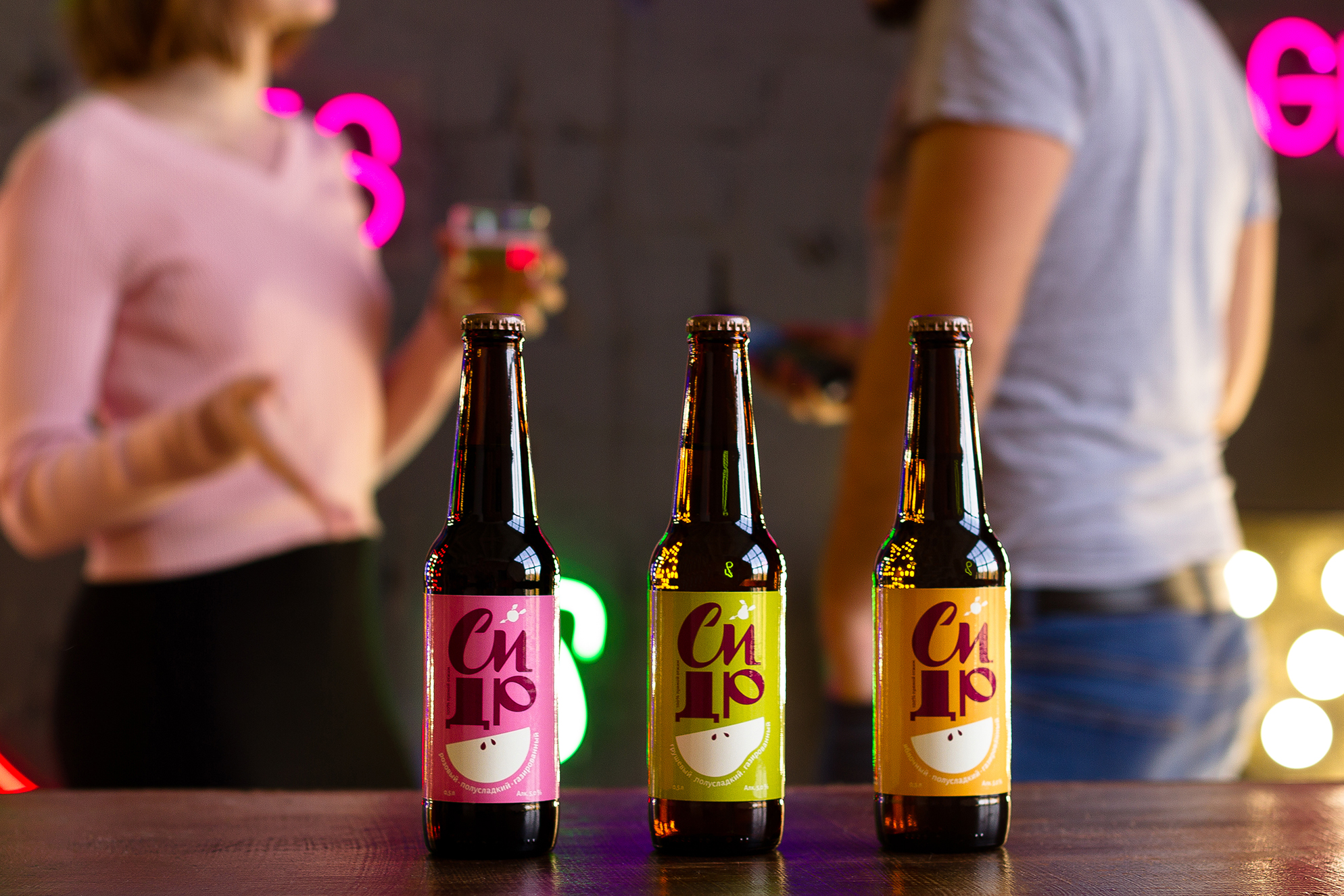
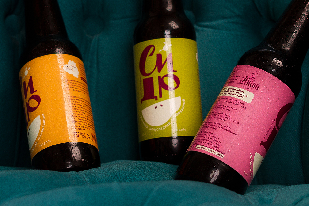
St. Anton – is a brand that starts its history since 2000 on the territory of Tula region and immediately takes leading positions among cider producers in Russia. Thanks to founders of the company that set themselves a goal to revive traditions of producing of apple cider in Russia.
New, youth-oriented concept of labels for three different tastes- two apple and one pear. Design has been done in a bright and modern style by combining large lettering, simple form of illustration and color, we managed to create a truly desired image making it a perfect addition to any party.


CREDIT
FEEDBACK
Relevance: Solution/idea in relation to brand, product or service
Implementation: Attention, detailing and finishing of final solution
Presentation: Text, visualisation and quality of the presentation


