In 2020, after starting as a freelancer, the founder of Chuck decided to form a team that operated as a small studio in Saigon. The team offered various services, including logo design, website development, and motion graphics.
After more than four years of operation, Chuck decided to establish a company to provide Motion Graphic services with a more professional team. Chuck has had the opportunity to collaborate with leading companies and well-known brands to deliver solutions for advertising campaigns, achieving high effectiveness.
Problem
Chuck was founded with various services, which posed significant challenges in delivering the best service quality for clients and made it difficult to build a distinct brand identity.
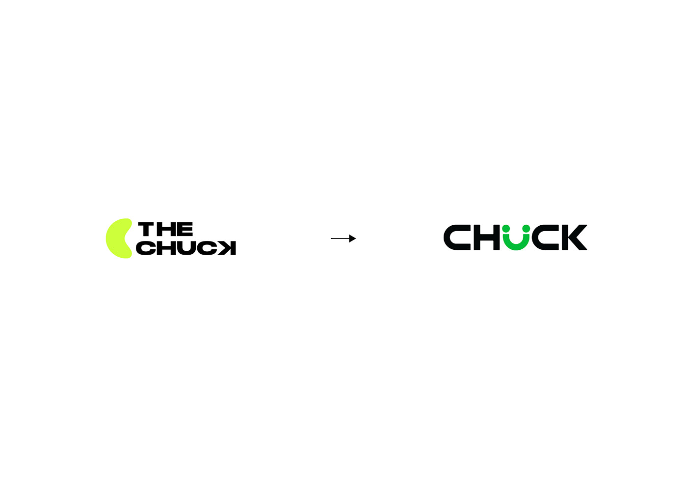
Initially, Chuck chose a neon green color scheme, which displayed well on digital devices but appeared inconsistent when printed. Additionally, the original name, “The Chuck Studio,” was lengthy and not particularly memorable, so it was later simplified to “Chuck.”
Recognizing these challenges, Chuck partnered with Minute-Creative to completely transform its development strategy. By refreshing the brand and focusing primarily on motion graphics, Chuck is now well-positioned for robust growth in the next phase.
Brand Concept
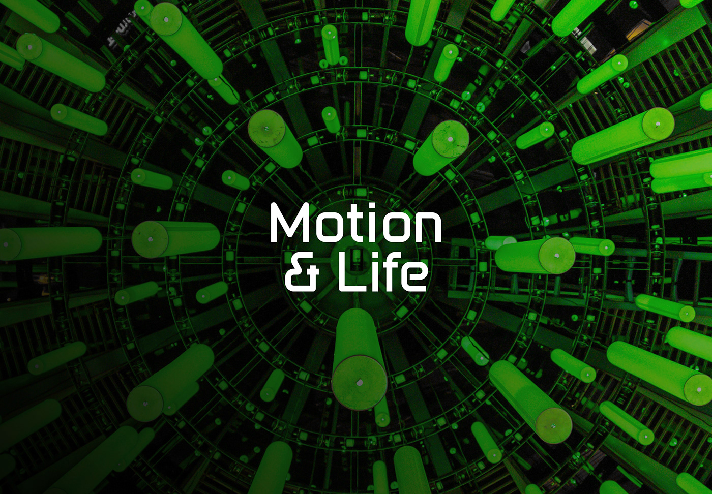
Motion & Life – Bringing Vitality To Your Brand
“Motion & Life” is a unique concept that combines the two elements of “motion” and “life,” bringing emotionally engaging and captivating visual experiences. “Motion” would merely be movements without emotion, but when infused with life in each small detail, every piece becomes vivid and full of character. “Life” is the journey of bringing the brand into reality, creating a deep connection with customers through the most authentic visuals.
“Motion & Life” is not just a way to convey messages but an art of building strong relationships, where every image and every movement becomes the vibrant voice of the brand.
Logo
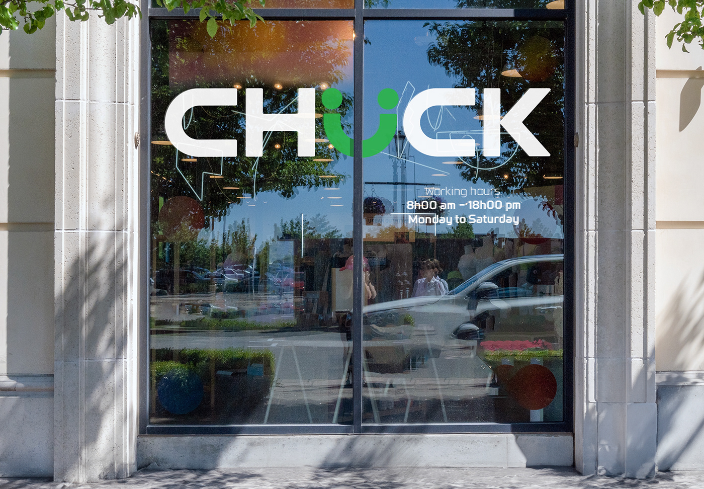
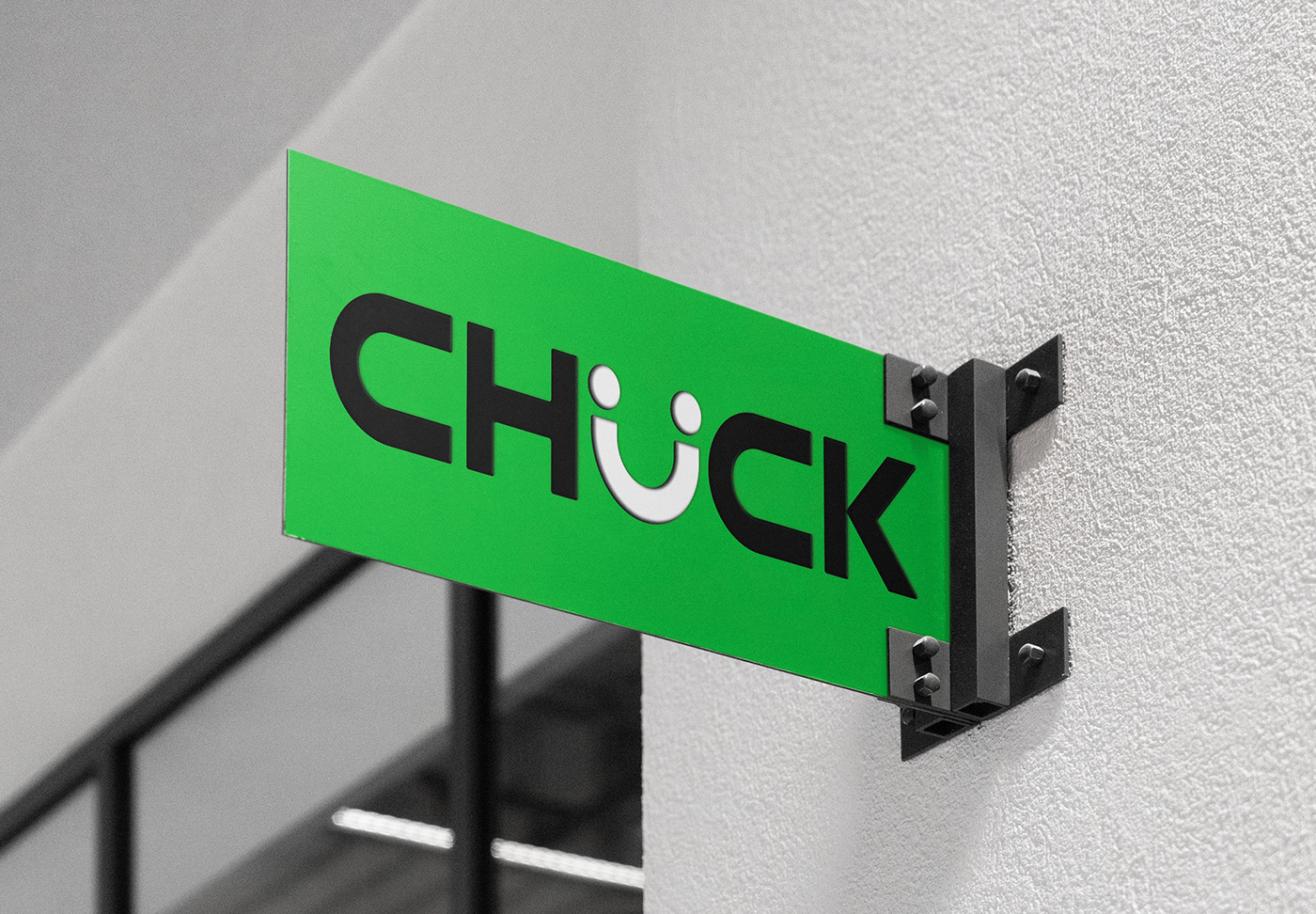
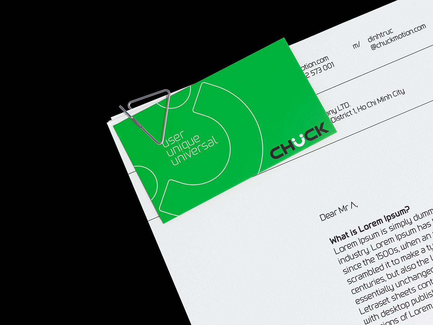
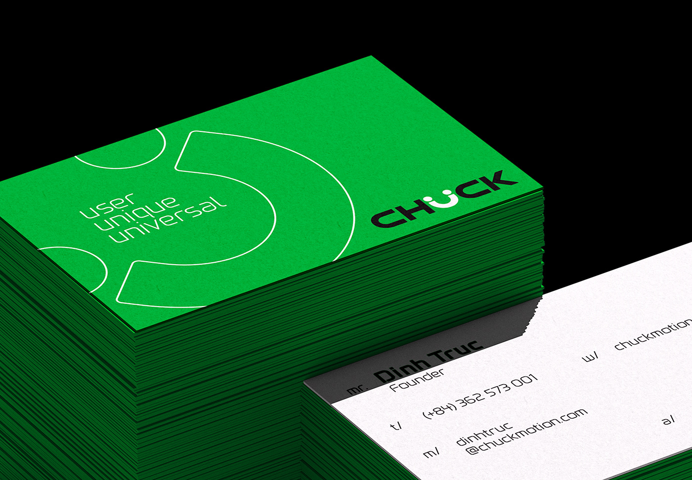
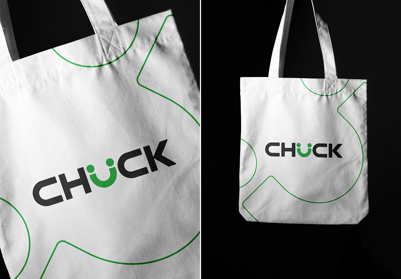
The new logo is distinguished by its brightness, featuring a more generous smile and sparkling eyes while still retaining the familiar friendliness of the past version. This new symbol is elegantly integrated into the letter “U,” embodying Chuck’s core values: a youthful, dynamic, and friendly smile – two people shaking hands in cooperation – and the satisfied smile of a customer. Chuck’s creativity and fresh approach promise high-quality services that meet client expectations.
The bright eyes and clever design reflect a commitment to delivering innovative, modern, and highly effective solutions in motion graphics. This new logo marks a shift in brand identity, affirming Chuck’s dynamic spirit and readiness to break new ground in pursuit of ambitious goals.



CREDIT
- Agency/Creative: Minute Creative
- Article Title: Chuck Motion’s New Visual Identity by Minute Creative
- Organisation/Entity: Agency
- Project Type: Identity
- Project Status: Published
- Agency/Creative Country: Vietnam
- Agency/Creative City: Ho Chi Minh City
- Market Region: Asia
- Project Deliverables: Brand Design
- Industry: Entertainment
- Keywords: brand design, brand redesign, brand identity, brand strategy, branding, identity system, logo design, rebranding
-
Credits:
Branding Studio: Minute Creative
Art Direction / Brand Designer: Leo Dang
Creative Partner (Copy-based): Passi Trinh
Account Executive: Cia Nguyen


