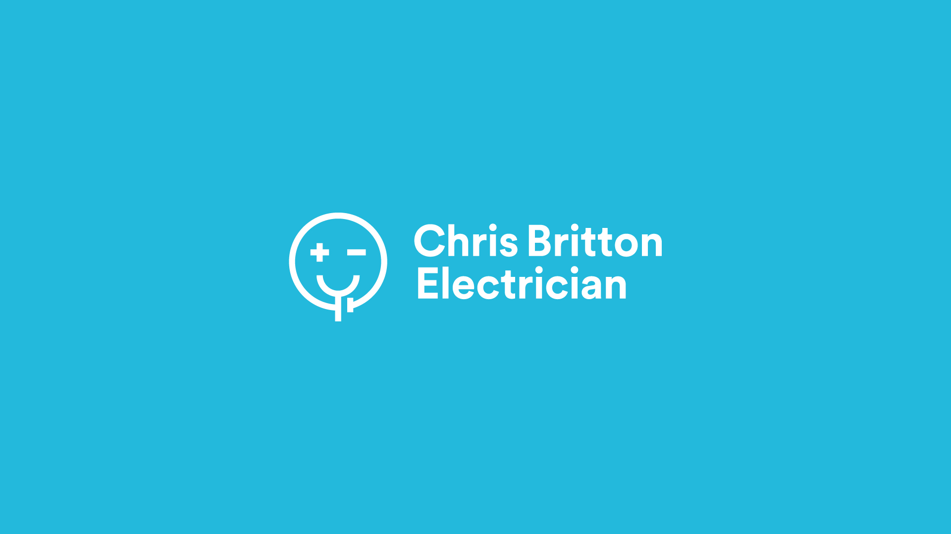
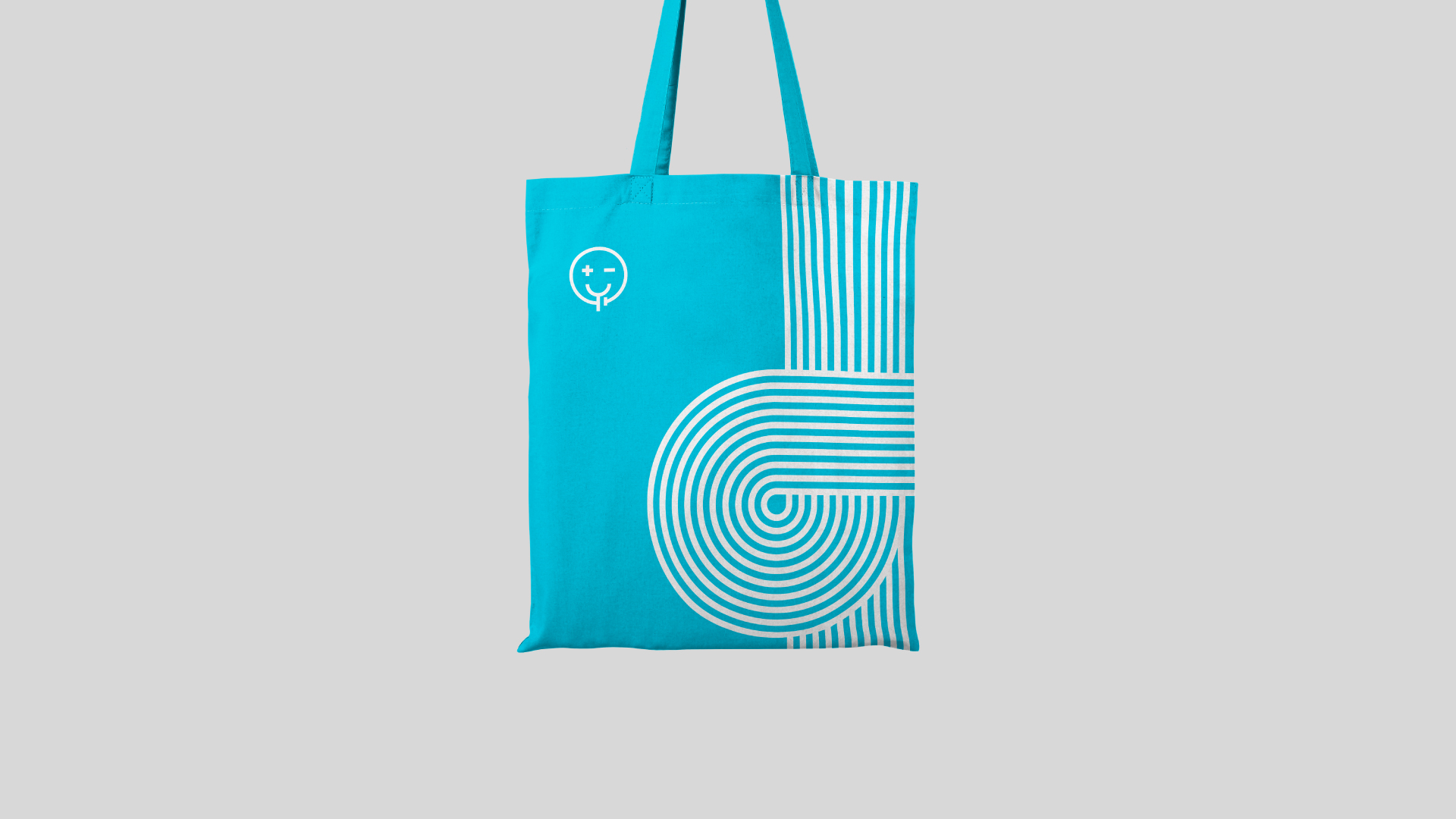
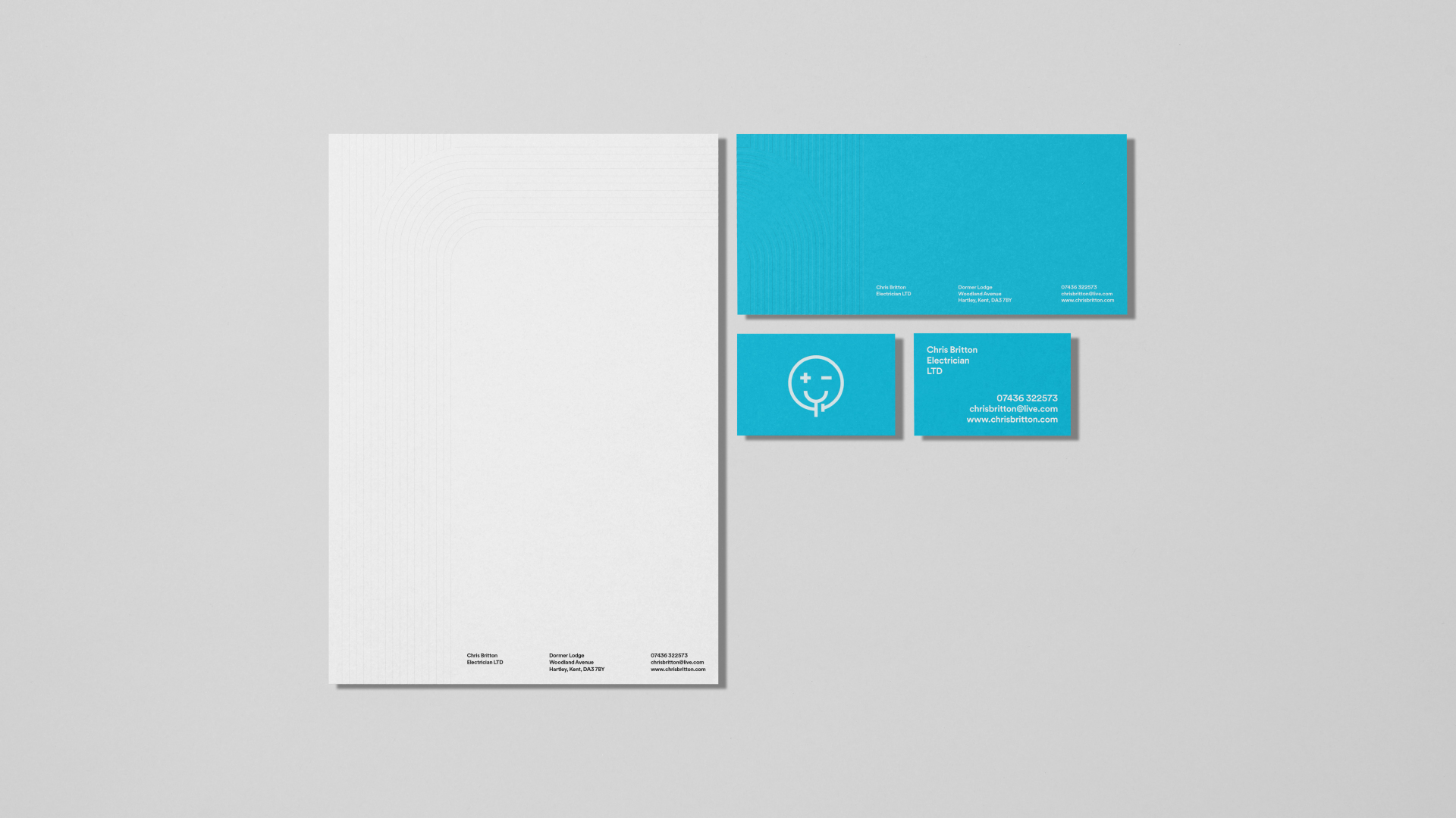
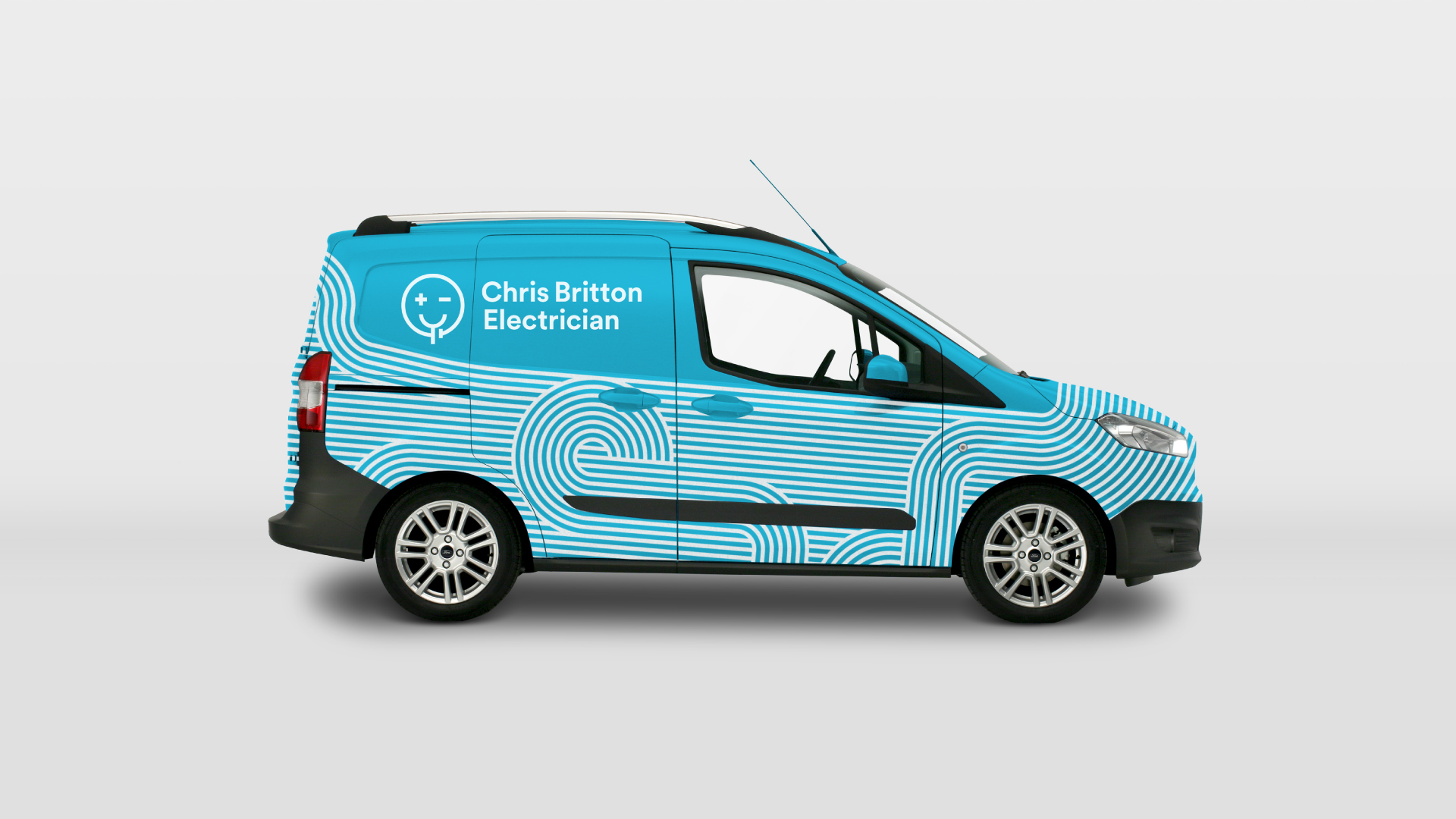
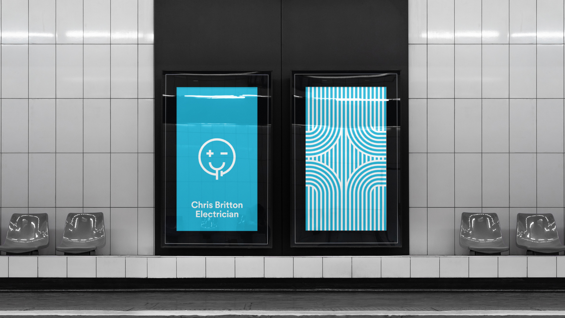
Within the village that Chris and I come from, Chris has been unknowingly building his brand (or reputation) for the last 26 years. Chris at heart is a traditional British cheeky Chappy with a beaming smile, and this visual identity simply needed to be an extension of that. So rather simply what I have done is to combine Chris’s ever-present smile into the world of electronics and the combination of the two elements became the logo. The eyes making a + – symbol, the neck is a battery and the contour of the face is a connected circuit. To us this hit the nail on the head the first time around, it’s simple, it communicates not only what the business does but also the brand values, it’s unique, memorable and it raises a smile!
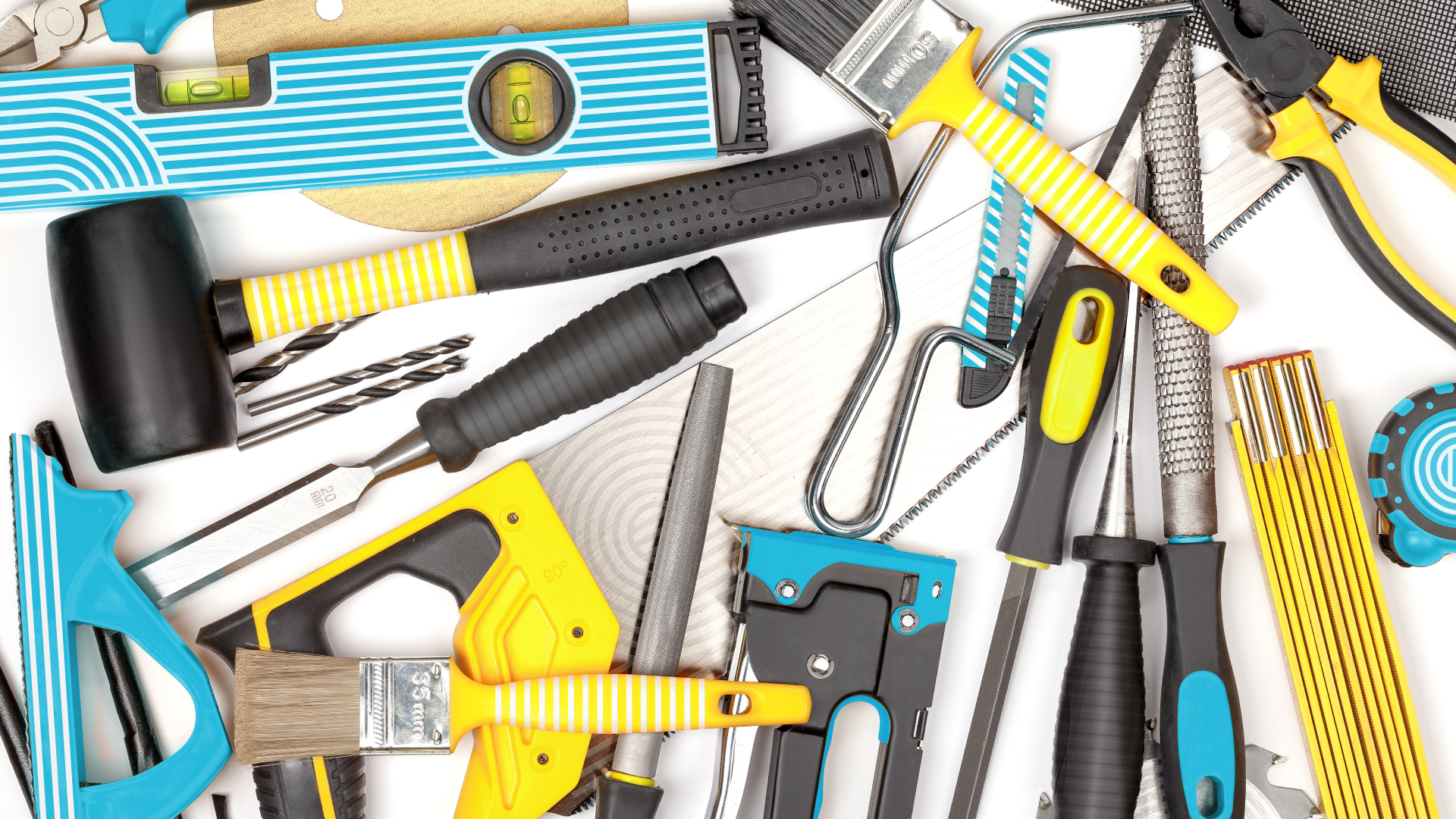
Now the Logo was established, the visual identity needed to be worked out. The issue we all have with calling a tradesman is you simply do not know who you are about to let into your home and this is unnerving for some. I wanted to tackle this issue head-on and create a very bright and friendly visual identity to reassure the prospective client’s that the tradesman they were about to call would be professional but above all else friendly. To help achieve this, colour played an instrumental role. The colours Blue and Yellow were selected as they represent the Earth and Neutral wires that are in a 3 pinned plug, but outside of the literal representation the colour Blue is the colour of trust and yellow stands for creativity and joy.
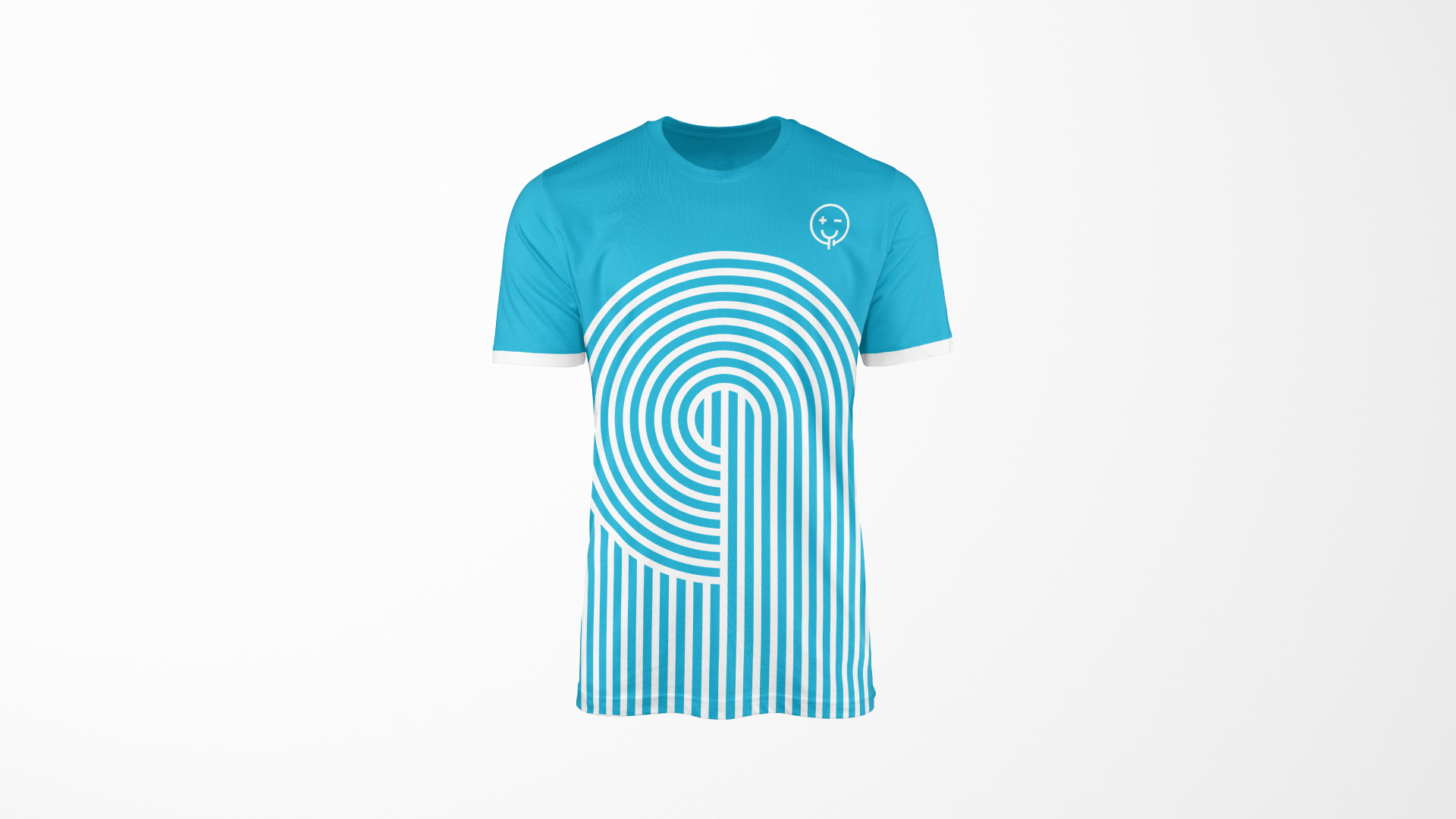
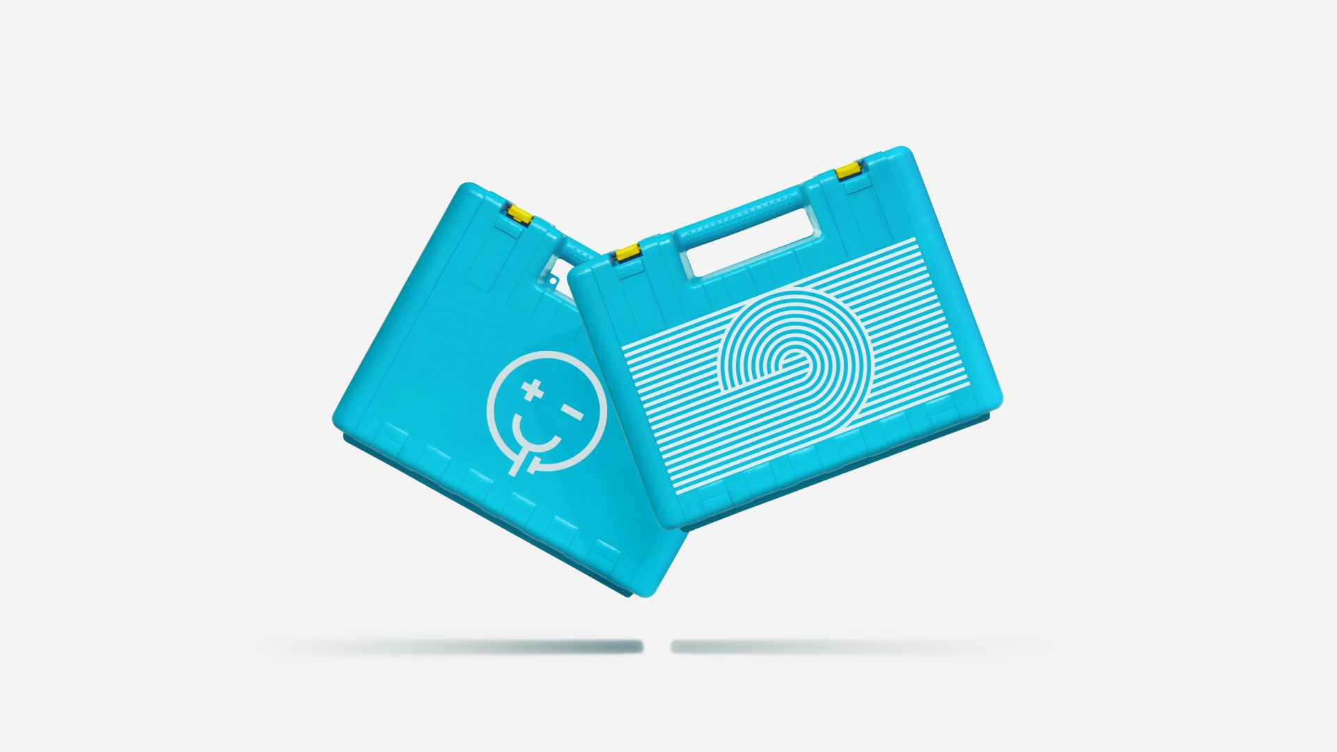
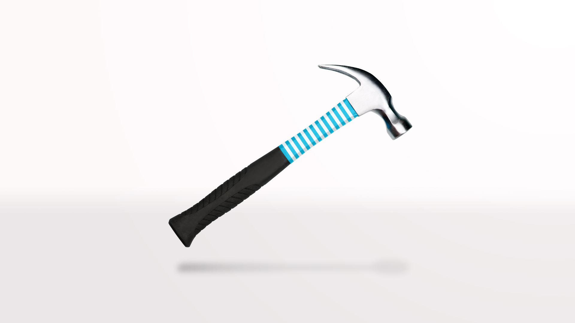
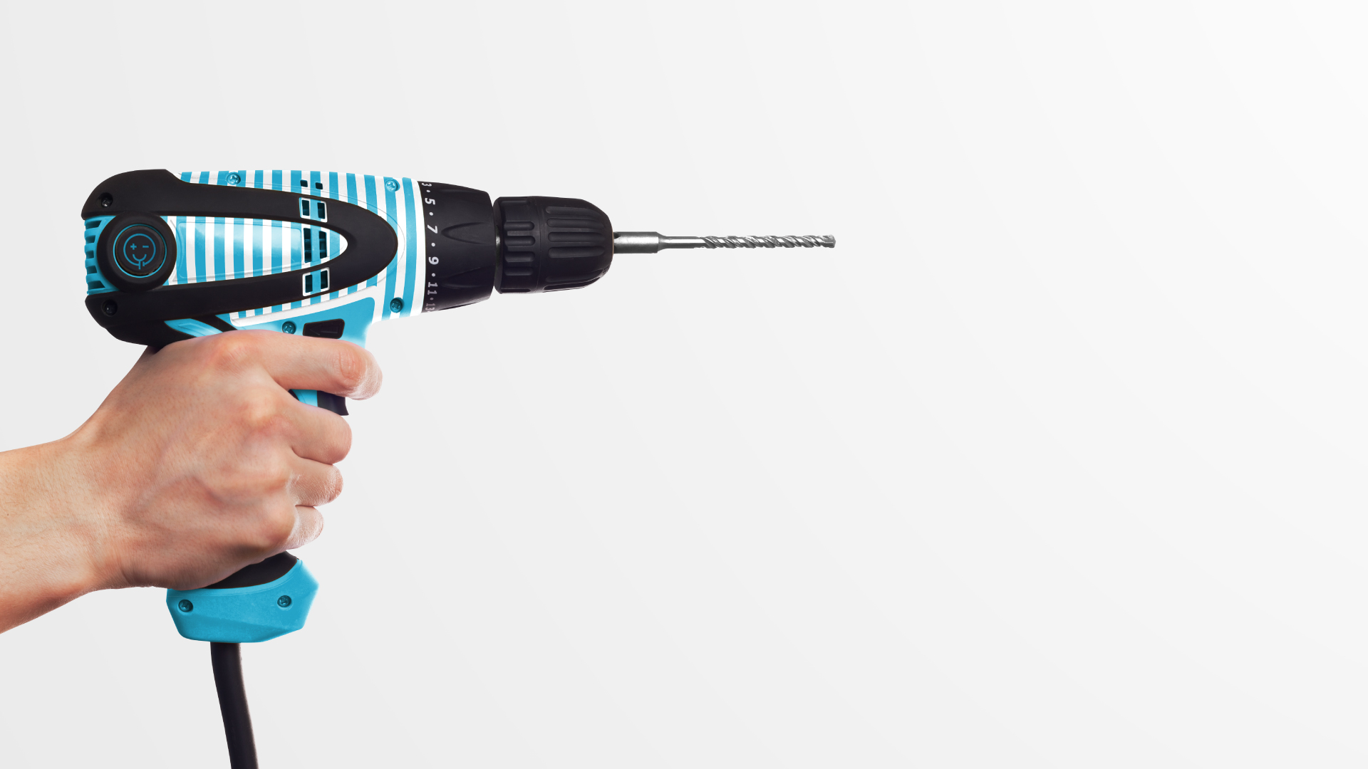
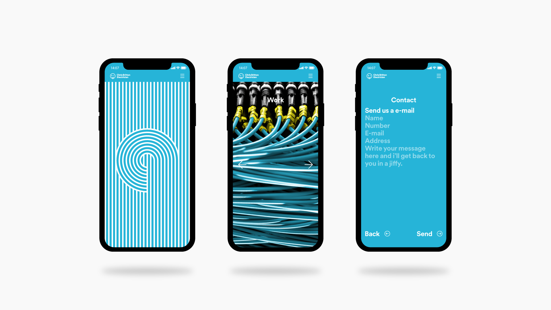
Chris is an utter perfectionist with meticulous attention to detail and to accompany the visual identity I have created a bold and playful pattern system that plays off the concept of perfectly wound and ran cables. This particular asset was essential for us to showcase, as this reflects exactly how Chris executes his work. Visual identity’s work like a conversation, you can either talk constantly and end up repeating yourself or you can say something once, pause, and give the other person time to appreciate what it is that you have just said (providing you have just said something intelligent), I believe a good visual identity should be the latter. Throughout most of the branding assets, the Car, the T-Shirt, the advert, there is a maximum of 3 assets used at any one time, the logo, the colour, the pattern system. The concept that less is more has been used herein the extreme, text has barely been used in this identity as the logotype indicates exactly what the business does, the colours evoke the correct emotions and the pattern system hints at the execution and is strong enough to stand alone, which when all three assets are used together almost completely eradicate the need for further explanation, thus tightening the identity and allowing for extremely quick and memorable communication.


CREDIT
- Agency/Creative: Daniel Britton
- Article Title: Chris Britton Electrician Branding Concept
- Organisation/Entity: Freelance, Non Published Concept Design
- Project Type: Identity
- Agency/Creative Country: United Kingdom
- Market Region: Europe
- Project Deliverables: Brand Advertising, Brand Architecture, Brand Creation, Brand Design, Brand Experience, Brand Identity, Brand Naming, Brand Strategy, Branding, Graphic Design, Identity System, Photography, Research, Tone of Voice
- Industry: Public Utility
- Keywords: Chris Britton Electrician, Electrician, Tradesman, Brand Identity, Brand, Branding, Advertising, Start-up, SME, Business, Logo Design, Identity Design, Web Design, Mobile Design, Brand Strategy, Strategy, Visual Strategy


