


Chomp Kombucha is a course project that was completed at University of the Pacific. For this assignment, we were tasked to research and develop a brand and packaging designs for the drink, kombucha.
Before I could create a name and concept for the brand, I needed to conduct extensive research. In order to fully understand how to properly market the product, I first read up on what Kombucha is, how it is made, and what kind of audience the drink is typically marketed to. I then looked at competitors to see what sets them apart from others. Initially, ideas had stemmed from the drink’s origins and I had played around with multiple names and design concepts circling around how kombucha is made.
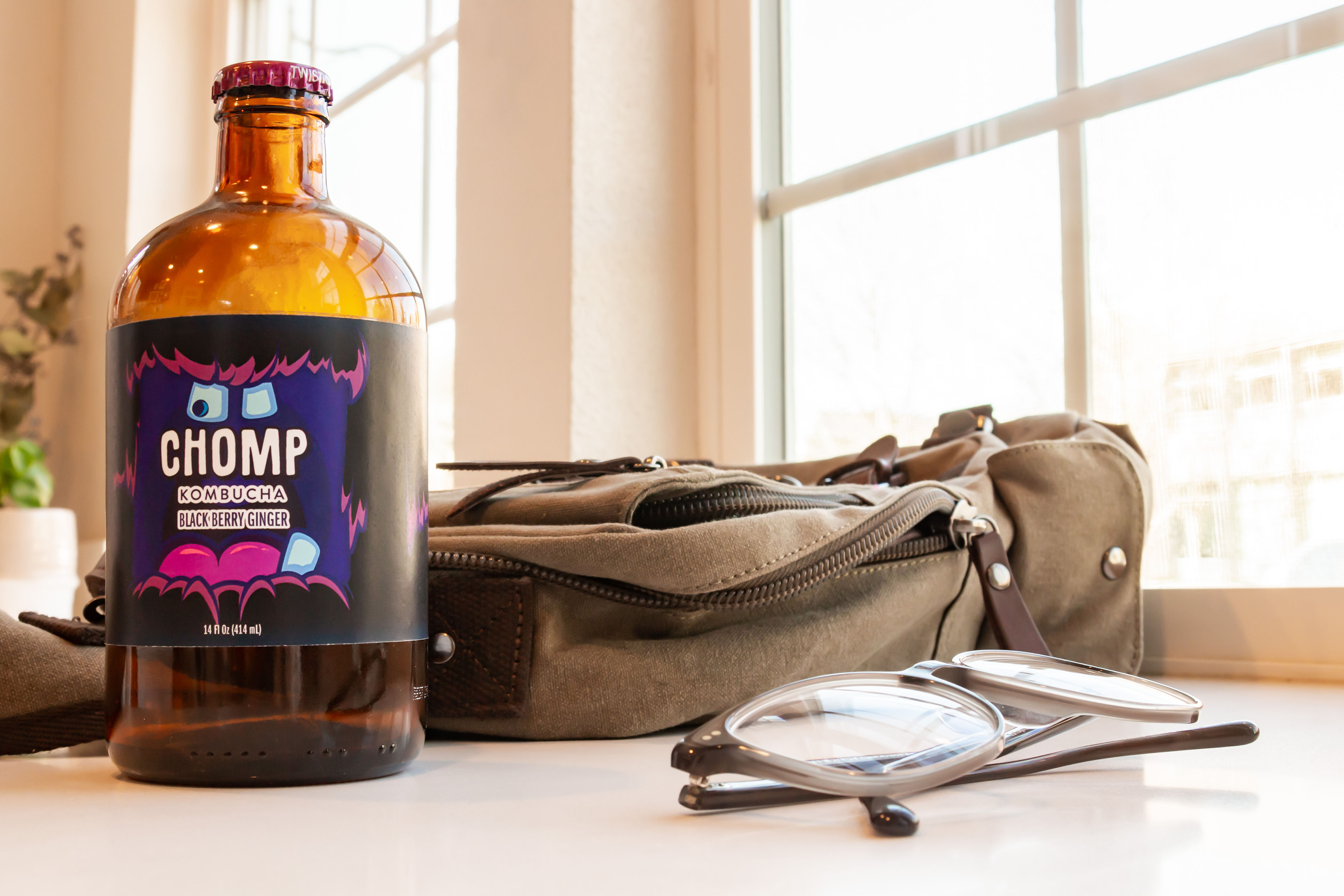
However, I decided that I wanted to use one of kombucha’s features as the driving factor for my design concept and that the designs would highlight those features in a way that would be marketable to consumers. So further into the research phase, I had asked kombucha drinkers to describe the drink’s characteristics, what words they would associate kombucha with, and what kind of flavors they were most interested in drinking. Many buzz word such as “fizzy”, “tangy”, and “bubbly” were used, but the most common phrase I had heard was that the drink “has a bit of a bite to it”, and so, Chomp Kombucha was born.
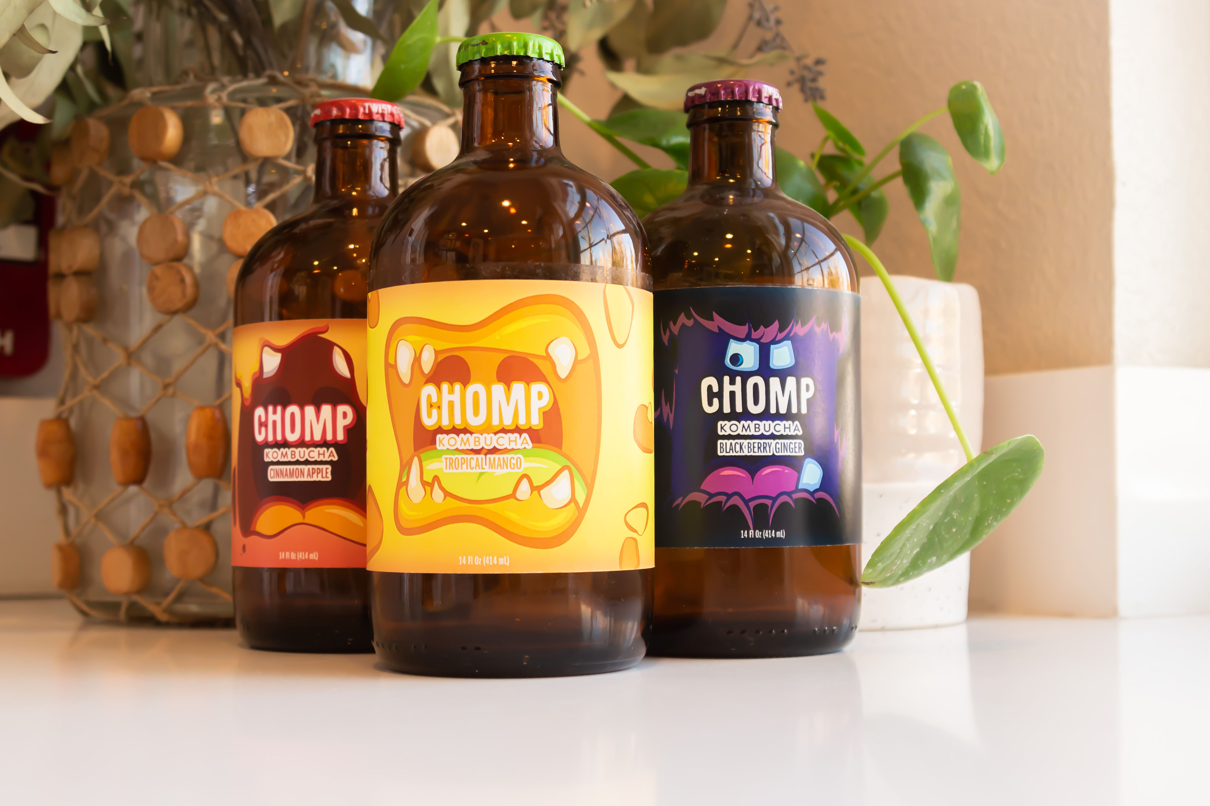
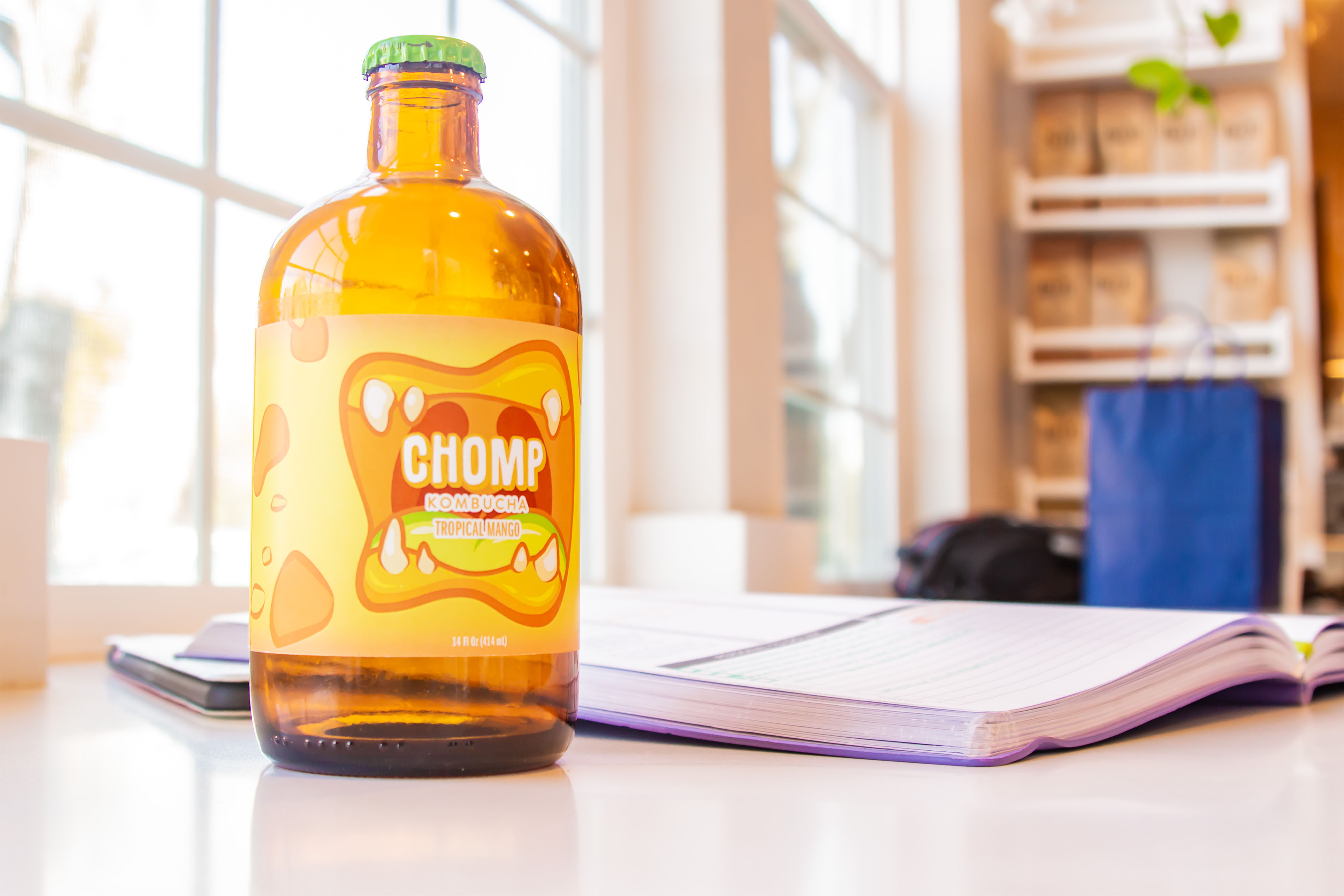
Chomp Kombucha is directed towards a slightly younger audience of young adults in college, and so I decided to go with a slightly more playful but bold tone. The concept of Chomp Kombucha is “The drink that bites back. Don’t worry. You’ll like it.” To match Chomp’s concept, I decided to create loud, bold, quirky illustrations of the mouths of monsters eating the brand’s name. The illustrations would live up to Chomp’s simple but striking name and also intrigue the eyes of our younger consumers with its bright colors and amusing graphics.
Label designs for three different flavors were designed in order to create both a sense of individuality and brand consistency. The designs needed to be different enough from one another to still stand out, but when being put together, act cohesively and be recognized as the brand, Chomp, as a whole.

CREDIT
- Agency/Creative: Iz Enriquez Design
- Article Title: Chomp Kombucha Label Design Concept Create by Iz Enriquez Design
- Organisation/Entity: Student, Non Published Concept Design
- Project Type: Packaging
- Agency/Creative Country: United States
- Market Region: North America
- Project Deliverables: Brand Creation, Brand Naming, Graphic Design, Illustration, Packaging Design, Photography, Research
- Format: Bottle
- Substrate: Glass Bottle


