


Saigon is a huge sound collection, where the hustle and bustle is condensed, from the vibrant rhythm of traditional markets to the murmurs of construction sites and modern infrastructure development projects. This multidimensional blend creates an authentic portrait of a city constantly moving forward.
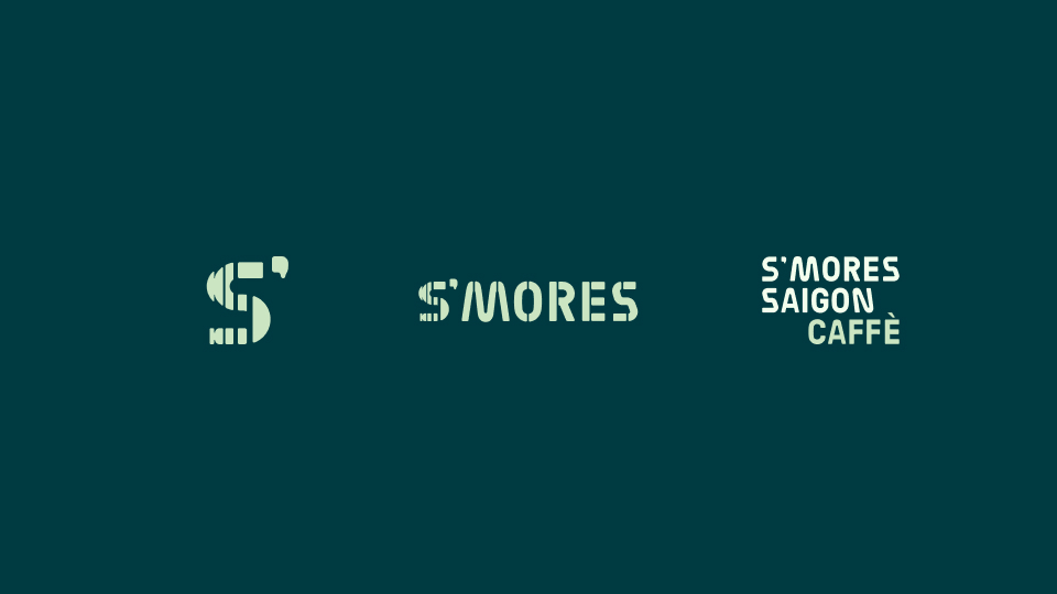
With the guiding principle S is Some – Saigon – Sound, the S’mores project is undergoing brand re-identification to capture a part of Saigon’s culture through the sense of hearing. Culture is incomplete without sound: from the morning rhythm of life – the sound of exercising, traffic jams, typing in offices – to the sounds of rush hour and the nighttime calls of countless people rushing to make a living. All of these clearly depict the spirit of Saigon – a sleepless city.
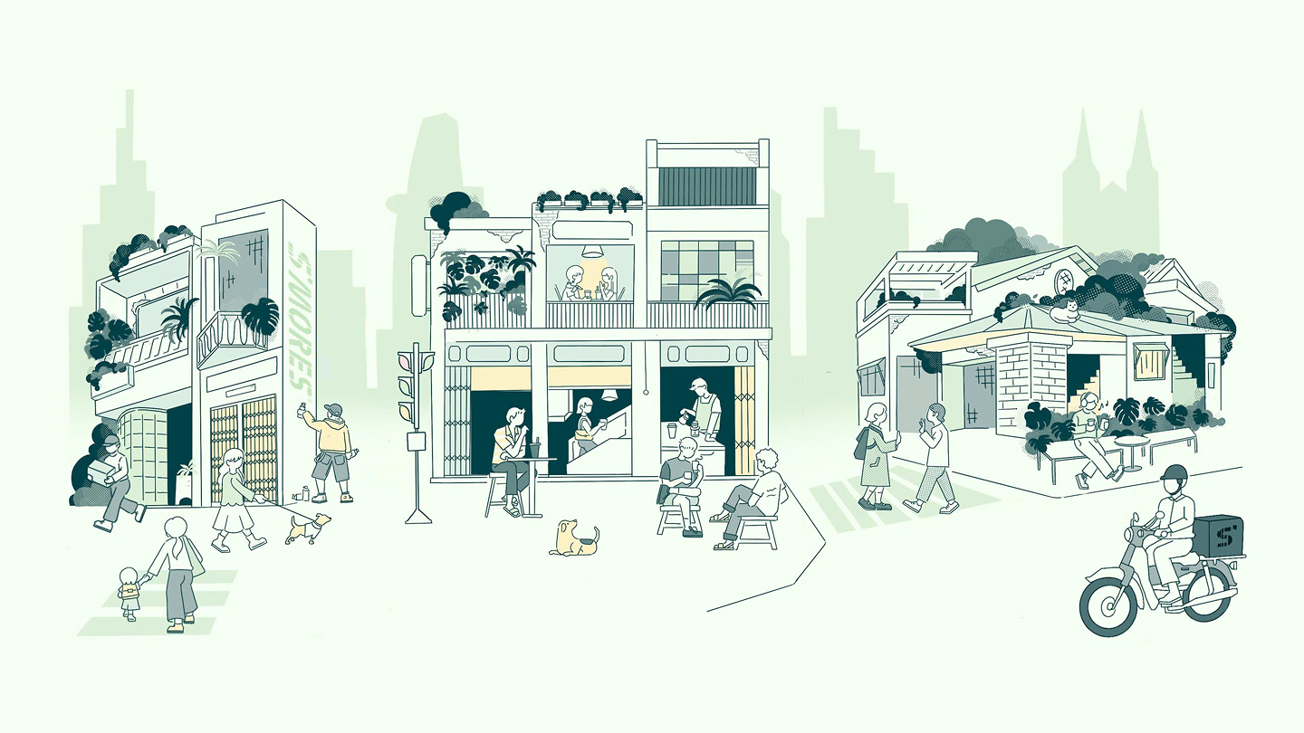
S’mores Saigon Caffè aims to be a place that fully recreates the pure dynamism of the city in the morning and the relentless vibrancy when night falls.
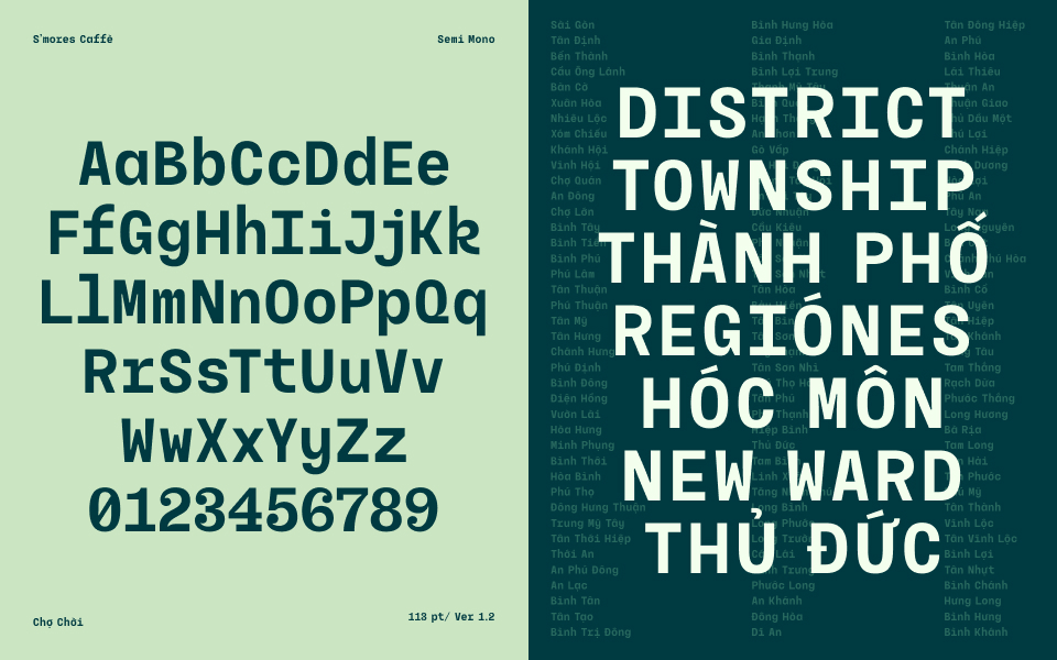
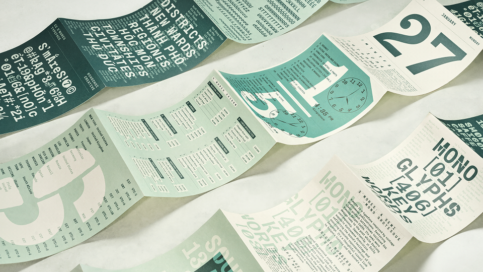
Choosing Monospace as our foundation because it perfectly symbolizes the shift from handwriting to the typewriter – representing a crucial moment where different ideas collide to fuel innovation. From this base, a set of alternate glyphs was developed by blending sharp Stencil and Brutalist Shapes, calculated to align with the overall concept’s rhythm. To maintain a distinctive look without sacrificing readability, these alternate glyphs are used judiciously to balance the text’s functional legibility with a memorable brand identity.
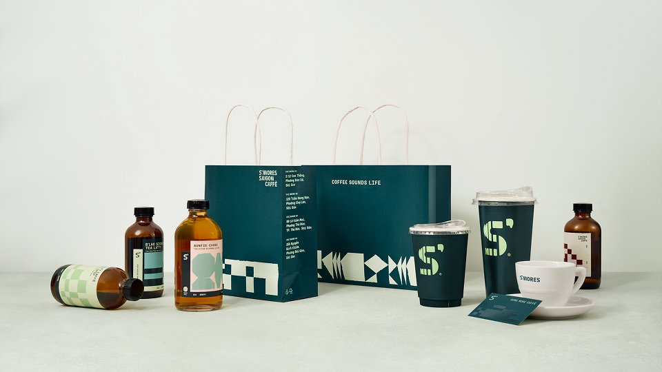
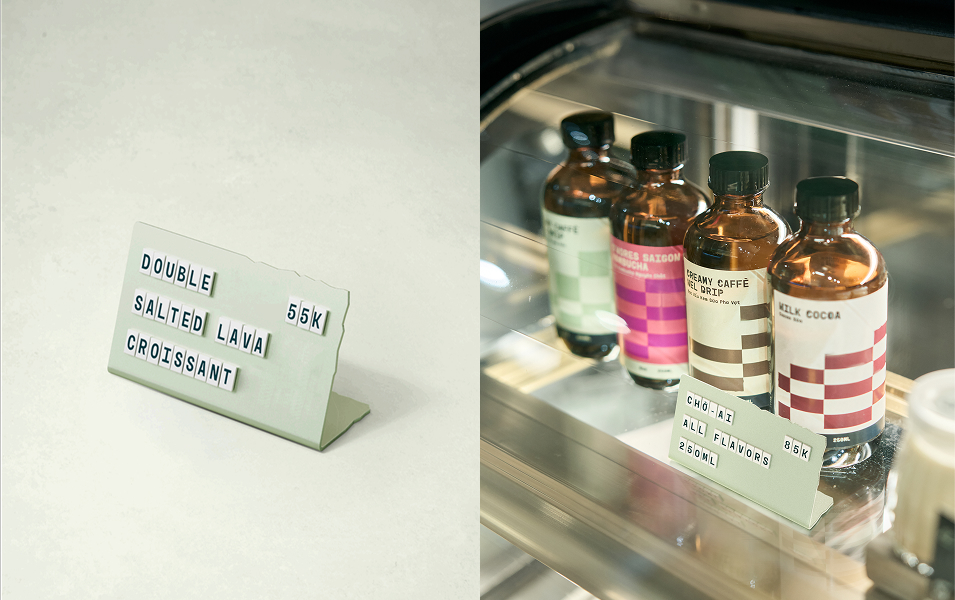
For all official stationery, we assert brand presence through the exclusive use of our primary colors, guaranteeing consistency and impact in formal communications. For other brand touchpoints, we pull back to celebrate the unadorned beauty of the materials themselves – the warmth of ceramic, the rustic appeal of kraft paper, the modernity of transparent plastic. The resulting contrast is a dynamic identity that feels both meticulously crafted and effortlessly genuine.
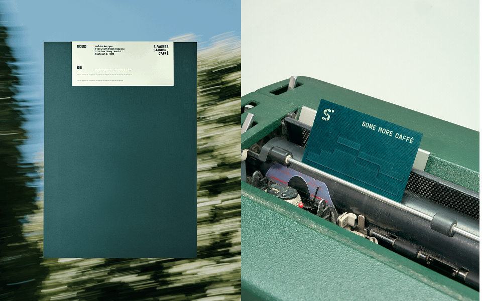
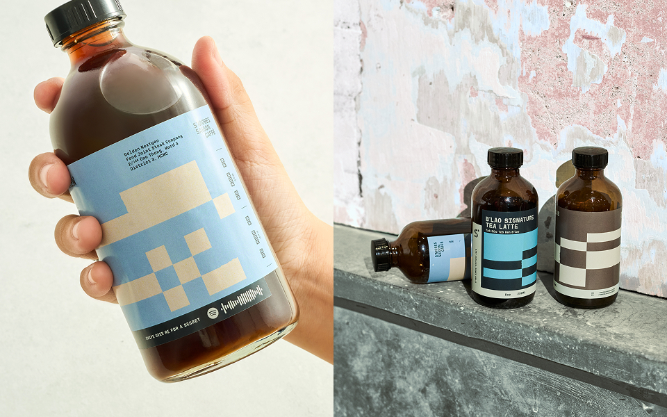
Our visual identity captures the dual energy of Saigon, transitioning from a calm, neutral daytime palette to a vibrant, energetic nighttime one. This system bridges heritage and modernity through a mix of geometric and angular shapes. The packaging brings this story to life, combining these graphics with a custom typeface and a unique “sound pattern” visual rhythm. Interactive elements, like an integrated Spotify code, transform the package into a dynamic portal for brand engagement.
CREDIT
- Agency/Creative: Cho Choi Creative
- Article Title: Cho Choi Creative Captures Saigon’s Sonic Energy Through a Dynamic Identity for S’mores Saigon Caffè
- Organisation/Entity: Agency
- Project Type: Graphic
- Project Status: Published
- Agency/Creative Country: Vietnam
- Agency/Creative City: Ho Chi Minh City
- Market Region: Asia
- Project Deliverables: Brand Design, Brand Identity, Brand Redesign, Illustration, Packaging Design, Type Design
- Industry: Food/Beverage
- Keywords: type design
-
Credits:
Creative Director: Cho Choi Creative


