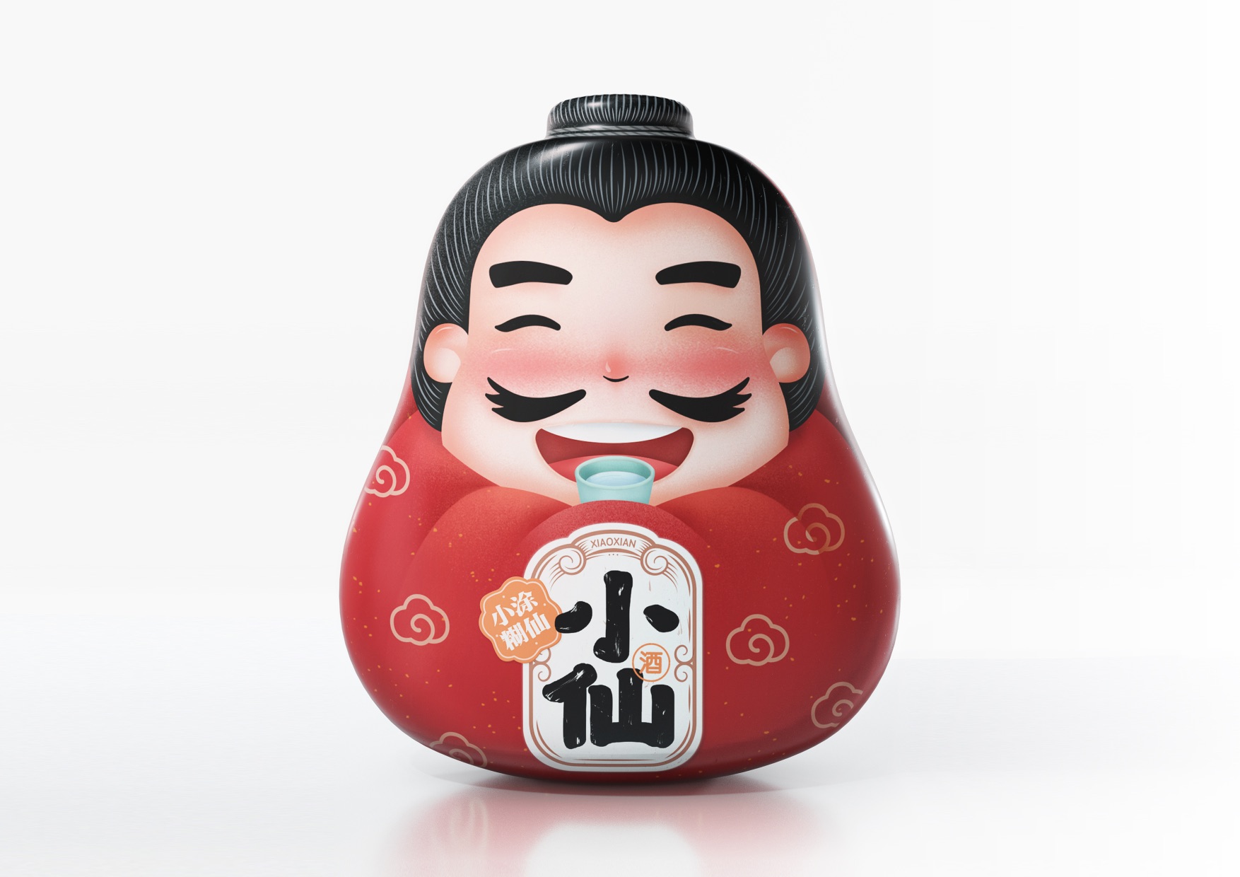
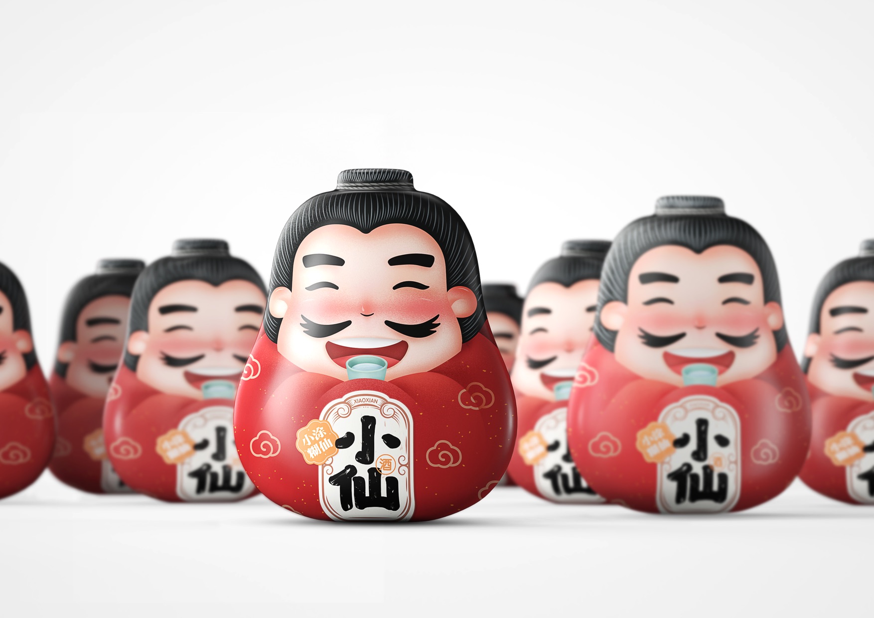
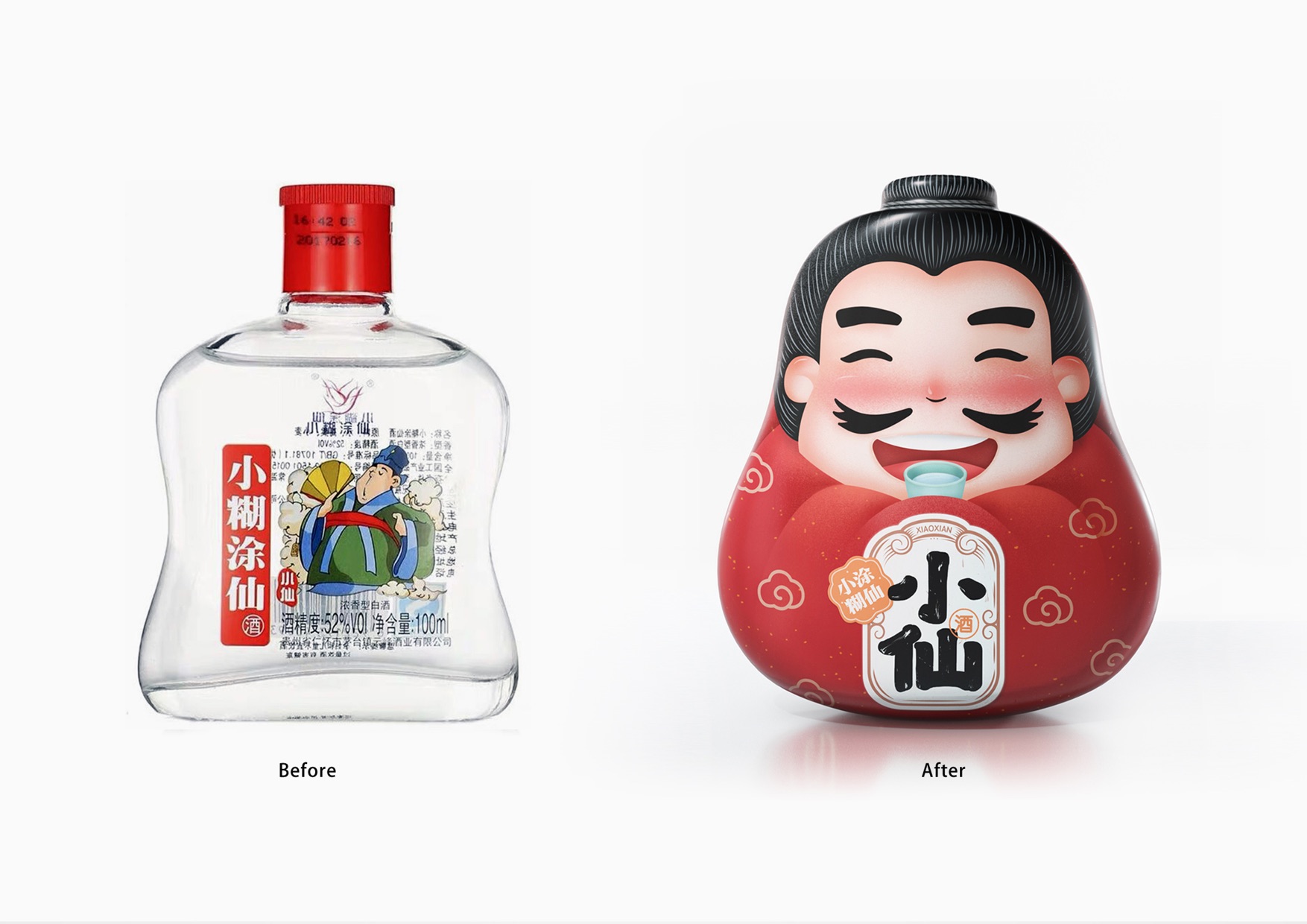
This is a kind of Chinese liquor packed in a small bottle. Like the west, Chinese people also believe in gods, but have different words to call them, such as “Xian (immortal)”. The product is named Little Immortal. In Chinese language context, while reducing the seriousness of a god’s image, the name delivers a sense of affinity.
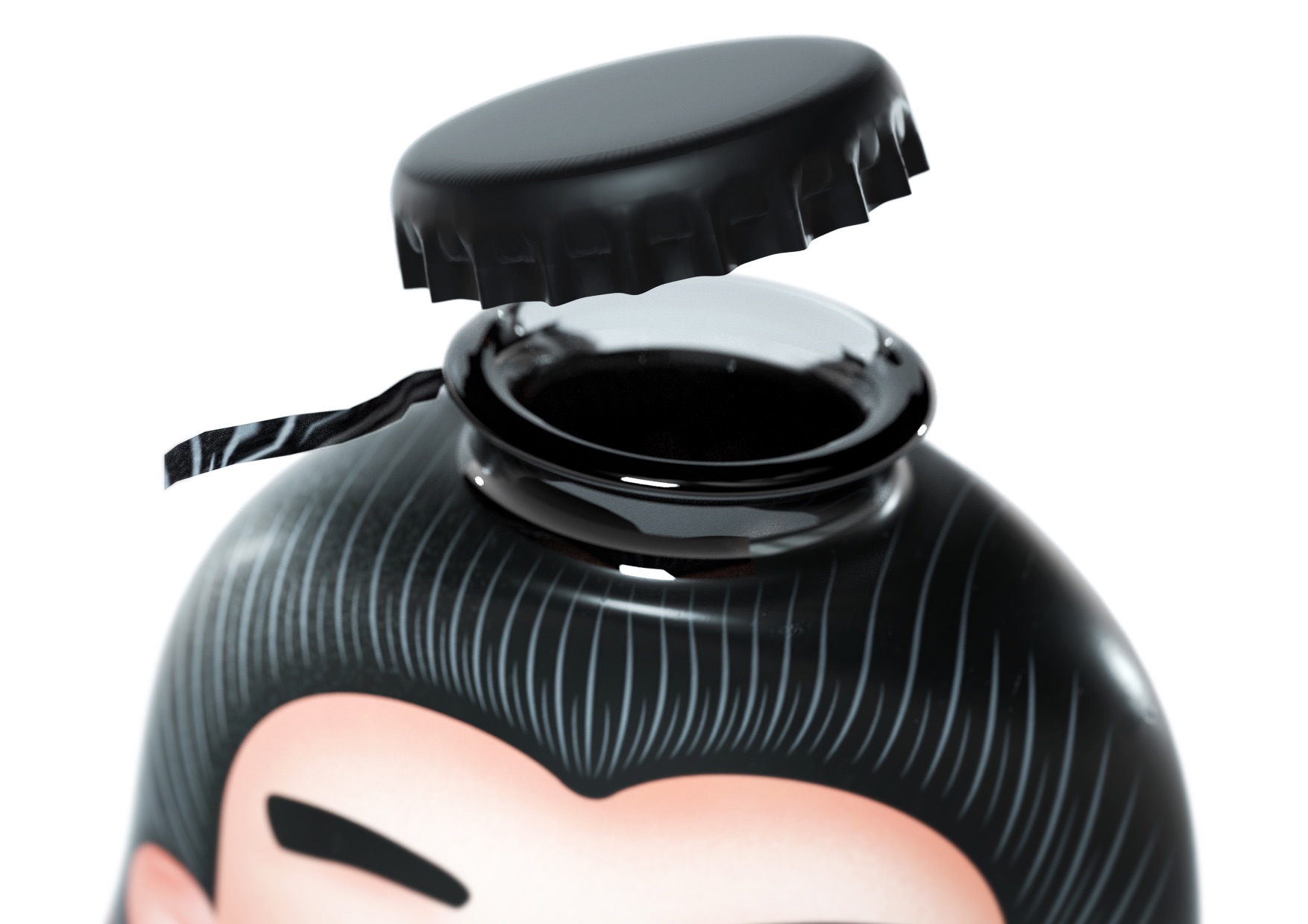
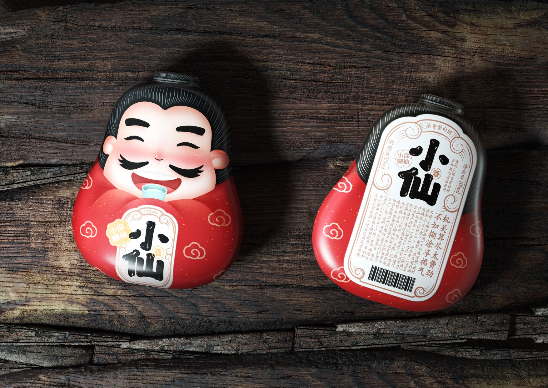
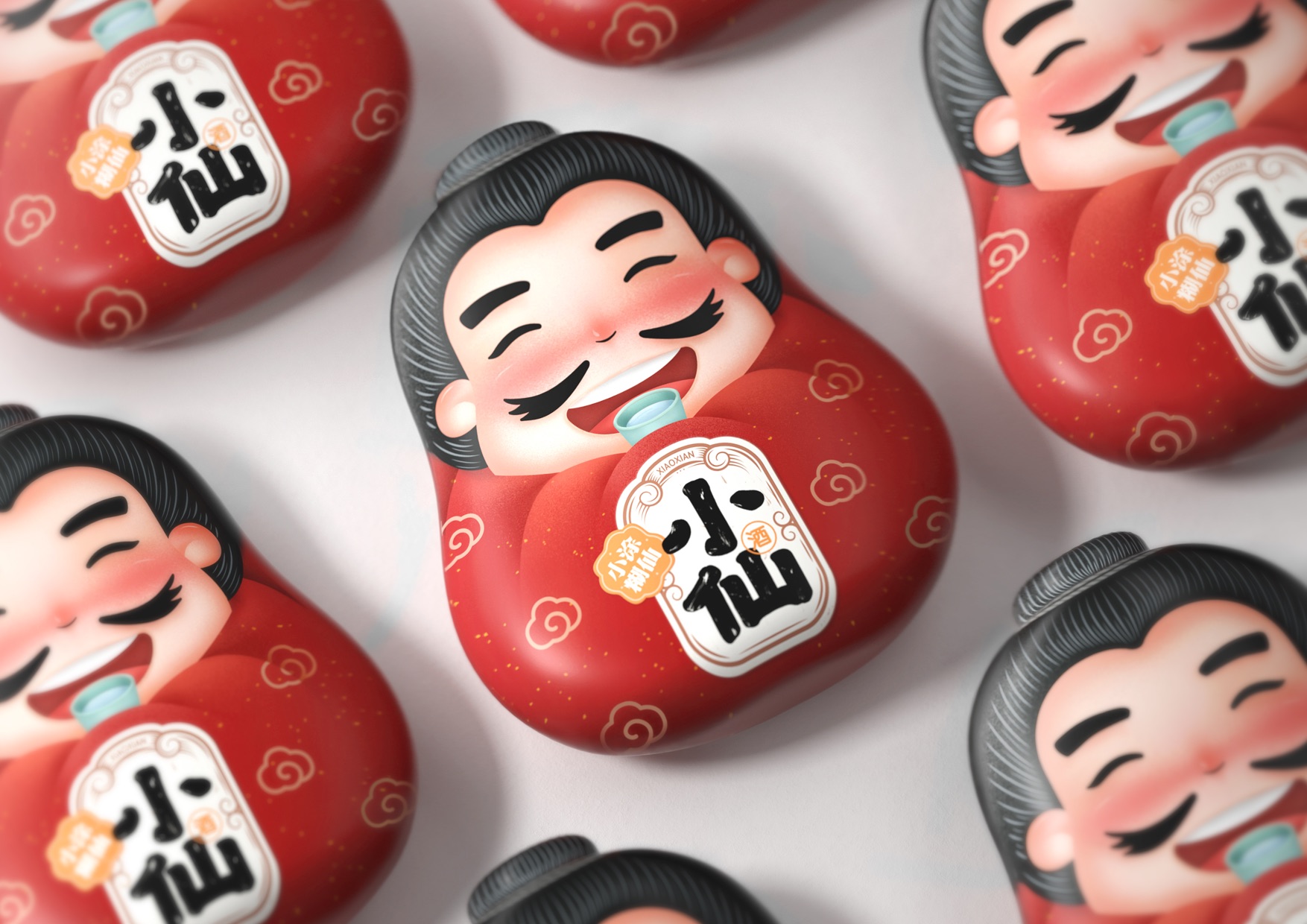
We expect to adopt heat-shrinkable matte film to cover the entire glass bottle, including the cap. After the process, the image of an adorable immortal will appear. His posture and flushed cheek signify the nature of the product. The shape of the container looks like a tumbler, implying that the liquor will not make people drunk so as to highlight the high quality of the liquor.
CREDIT
- Agency/Creative: ShenZhen Lingyun creative Packaging Design Co.,Ltd.
- Article Title: Chinese Liquor Packaging Redesign
- Organisation/Entity: Agency
- Project Type: Packaging
- Project Status: Published
- Agency/Creative Country: China
- Agency/Creative City: ShenZhen
- Market Region: Asia
- Project Deliverables: Packaging Design
- Format: Bottle
- Substrate: Glass Bottle
- Industry: Food/Beverage
- Keywords: WBDS Agency Design Awards 2021/22
-
Credits:
Creative Director: Xiongbo Deng
Designer: Xing Liu
FEEDBACK
Relevance: Solution/idea in relation to brand, product or service
Implementation: Attention, detailing and finishing of final solution
Presentation: Text, visualisation and quality of the presentation


