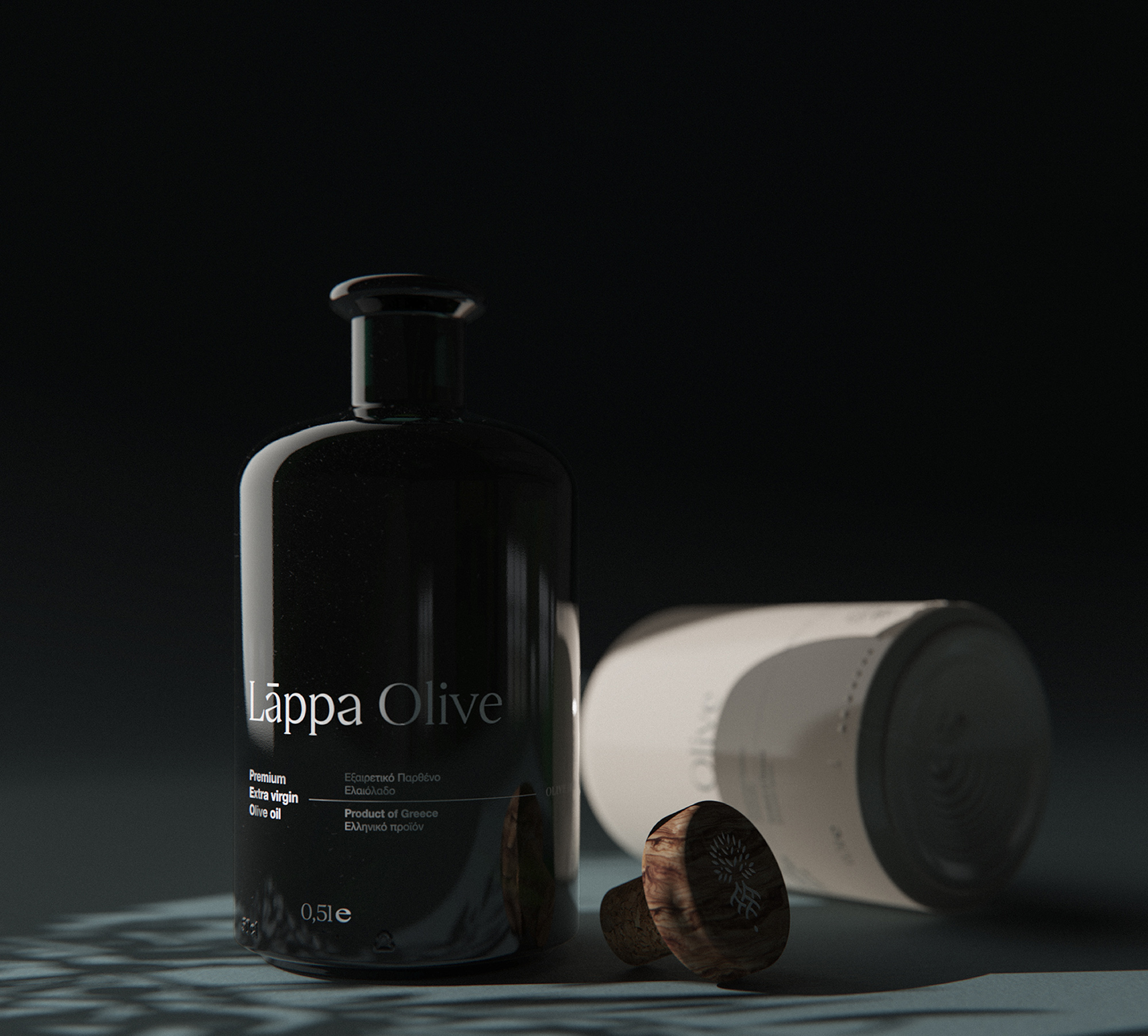
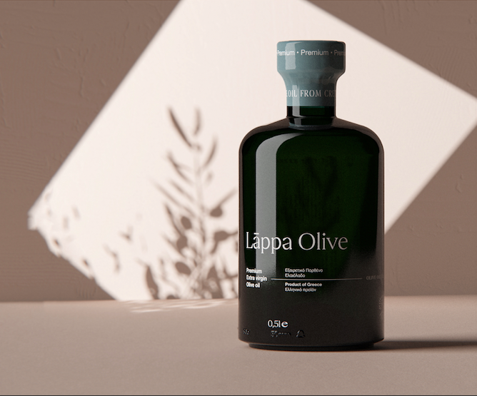
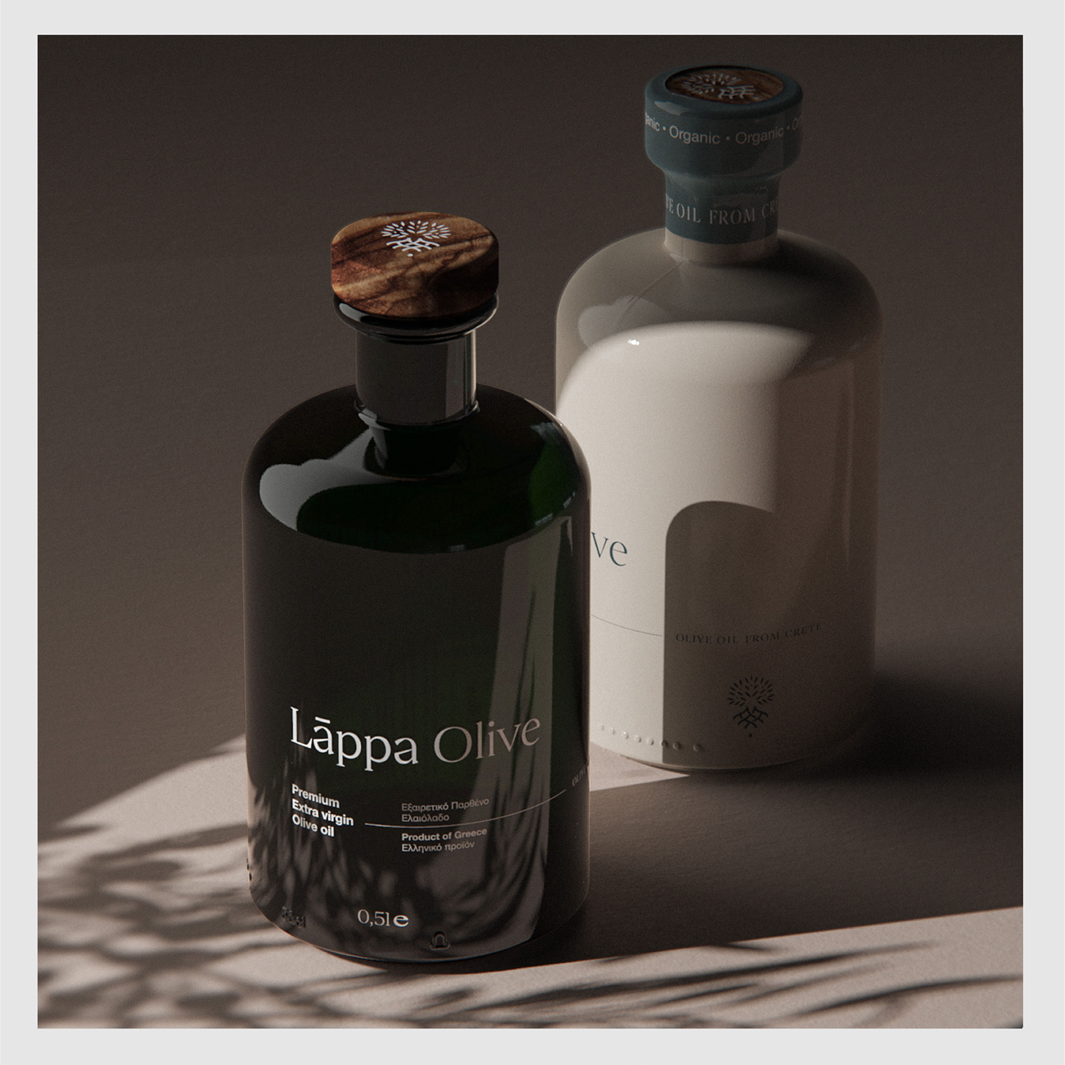
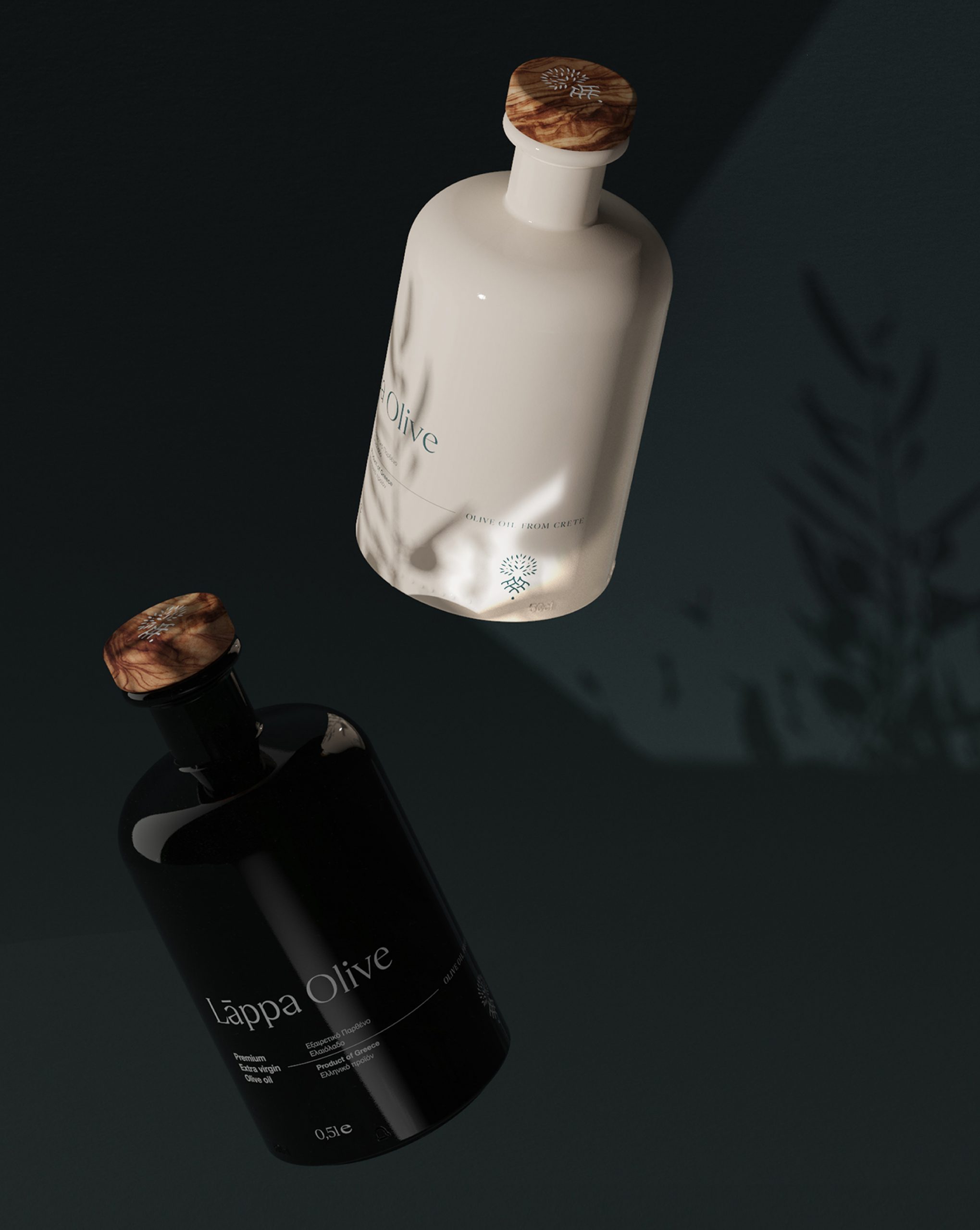
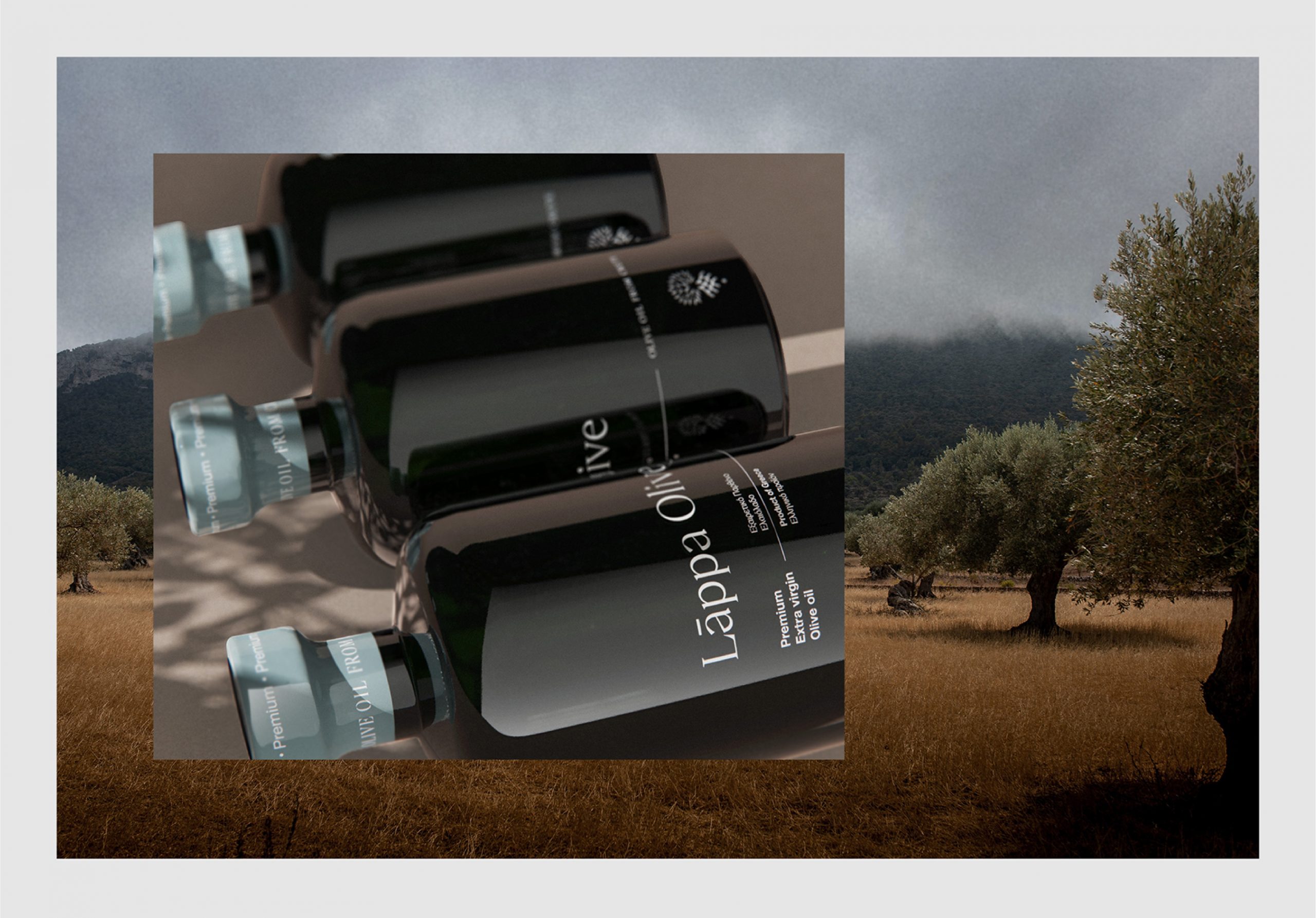
We’ve been asked from Lappa Avocado to develop the product identity for their new series of olive oil products, Lappa Olive. Lappa is a place with rich history from ancient times. The task was to create a chic and simple identity which withstands the time and will stay “classic”.
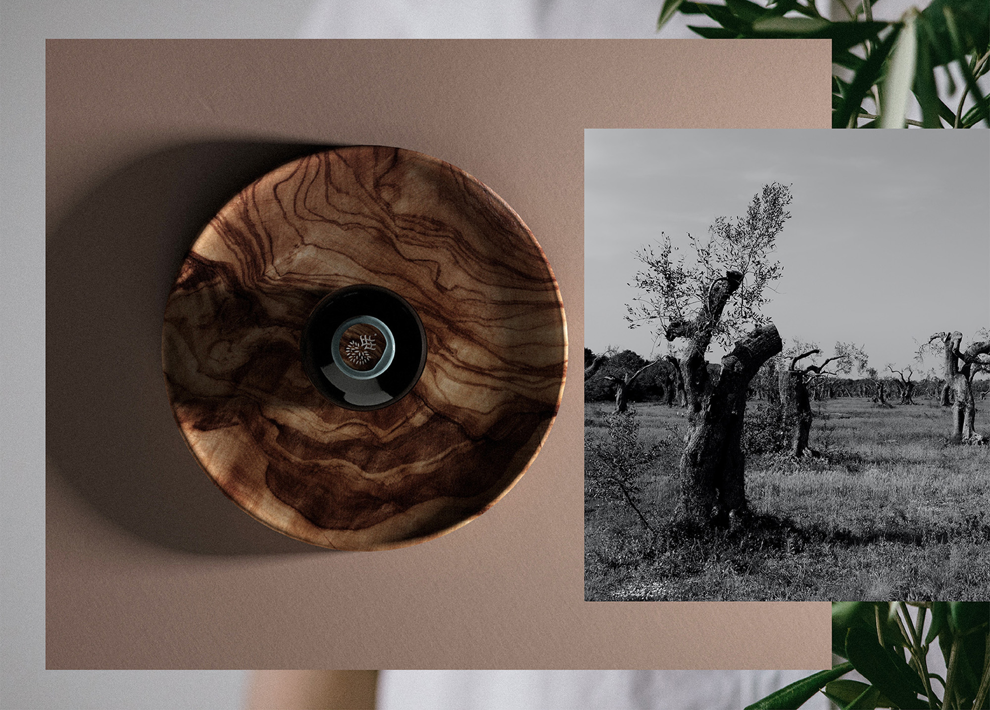
We choose to implement the story of five virgins (A Roman story) to the concept and try to blend it with the rich vegetation and the water springs of the area. To transfer the concept into the logo, we represent each virgin with a cavity at the end of the tree’s roots (water streams). The symbol shows the origin of the highest quality olive oil. On the packaging we used natural de-saturated colours, with simple typography, in order to create the feeling of the long history. Last we made the cap from olive wood to achieve a more natural look.
CREDIT
- Agency/Creative: Ruto design studio
- Article Title: Chic Olive Oil Packaging Design
- Organisation/Entity: Agency, Published Commercial Design
- Project Type: Packaging
- Agency/Creative Country: Greece
- Market Region: Europe
- Project Deliverables: Brand Identity, Branding, Graphic Design, Packaging Design, Research
- Format: Bottle
- Substrate: Glass Bottle, Wood


