


Overview:
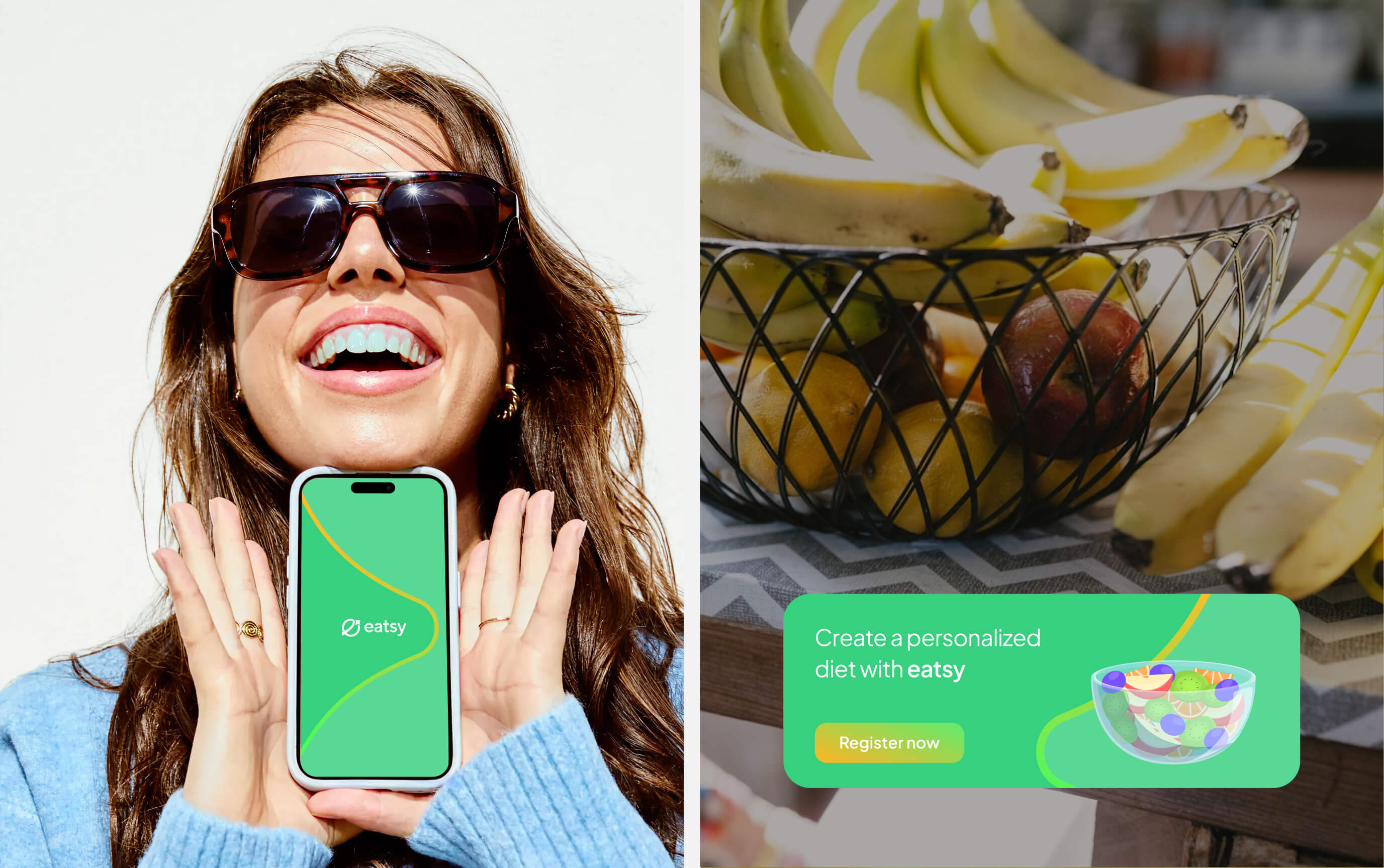
Eatsy is a Top 1 application of Nutrition for Fitness Fans in Vietnam, which was a featured app on the Apple Store in 2023. Eatsy helps people build a self-control lifestyle, rebranding its with a new visual identity system created by Chefthai Creative that is rooted in self-control, transformation and technology.
Creative Concept: “Self-control lifestyle”
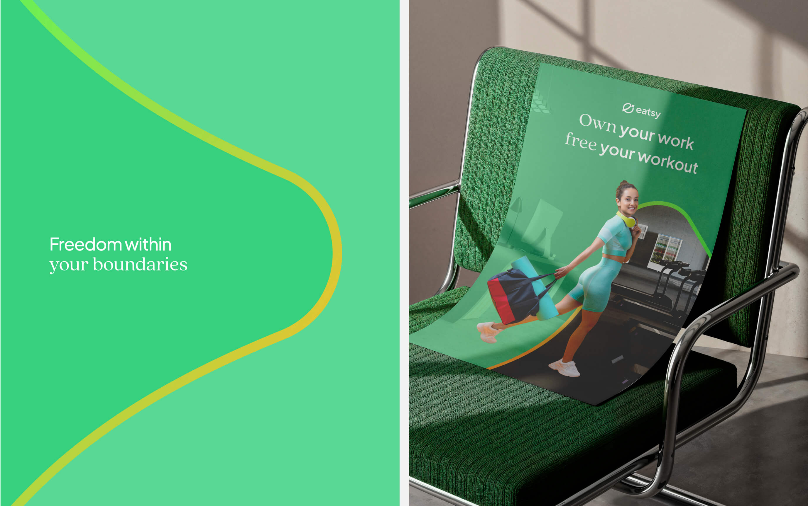
Inspired by an area enclosed by boundary lines conveys the message of ‘freedom within limits, freedom with control.’ The star’s wing also resembles a peak of a harmonic oscillation graph (in mathematics), symbolizing the idea that ‘good health begins with maintaining and consistently repeating positive habits.
Key Visual Elements:
• A combination of a modern minimalist sans-serif typeface and a serif typeface, reflecting both technology and personalization, lifestyle.
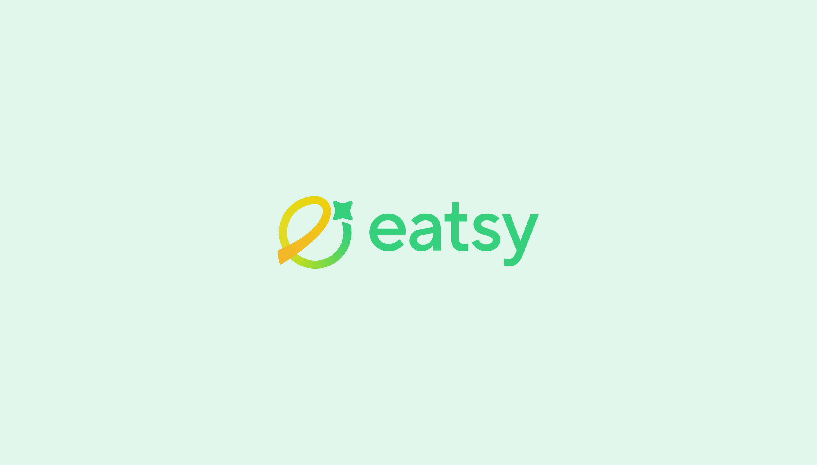
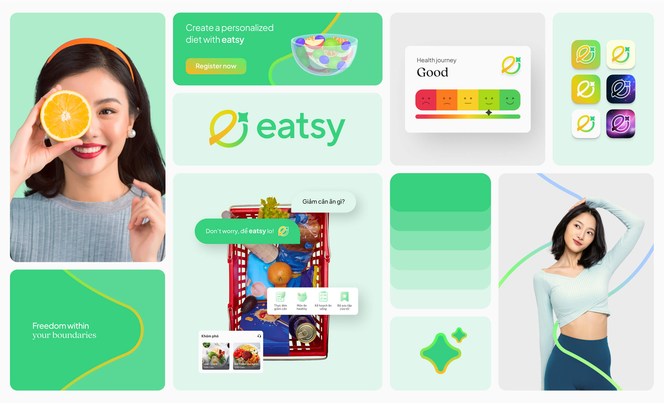
• To ensure the app can naturally spread through word of mouth, Eatsy has crafted a logo with a simple form that is easy to visualize and describe. The logo draws inspiration from the image of an orange, symbolizing nutrition and health, combined with a four-pointed star that serves both as the stem of the orange and as a metaphor for AI and technology. Notably, the letter ‘e’ in Eatsy is subtly formed by the star’s trajectory 💫, symbolizing the journey of improving health.
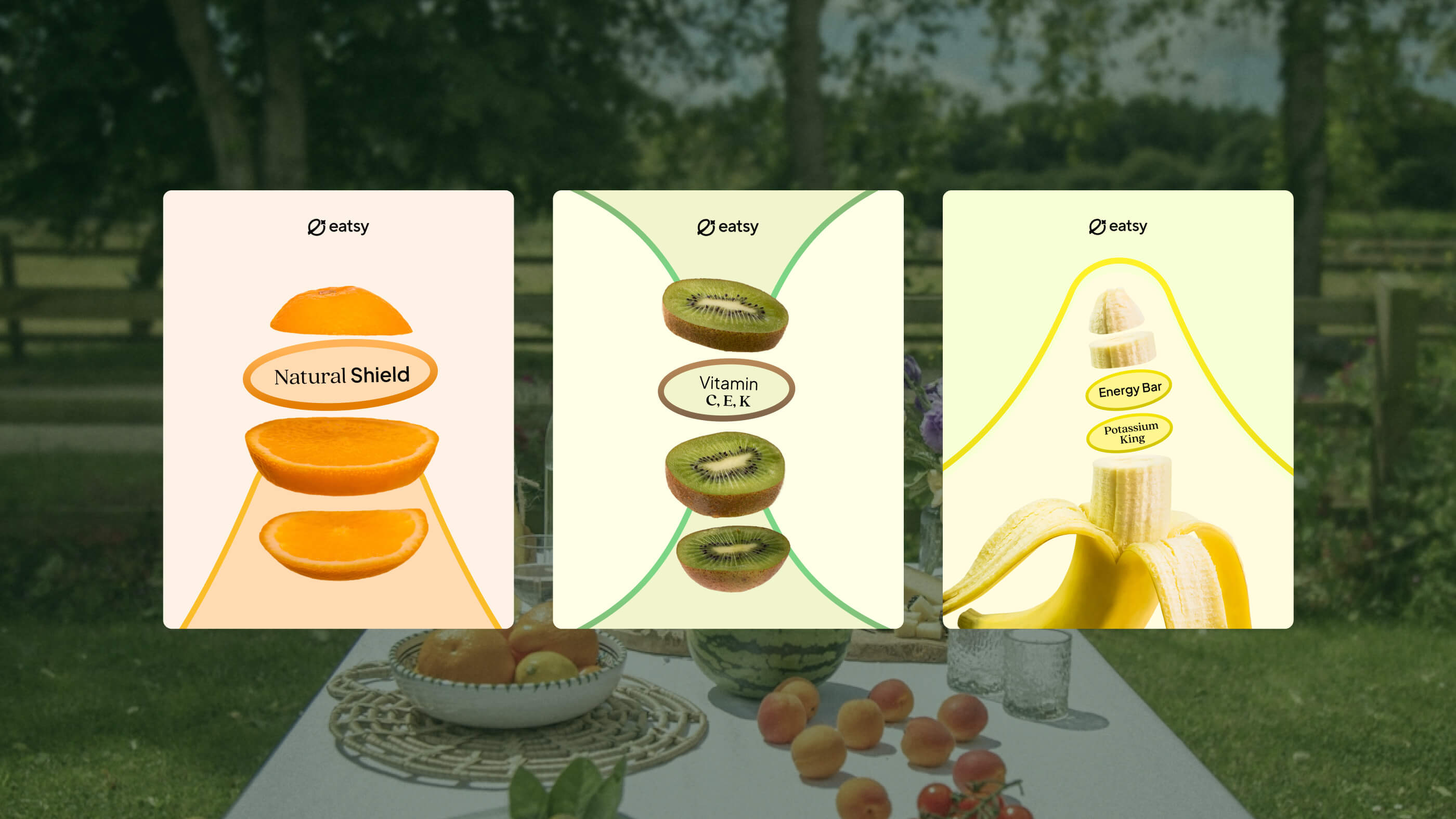
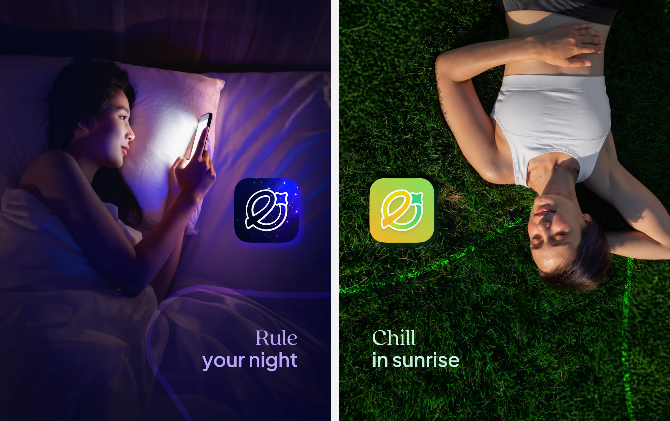
• The logo employs a vibrant orange–green palette, evoking positivity and confidence throughout the journey of self-transformation. At the same time, within the Eatsy app, the red–orange–green spectrum corresponds to health states ranging from SOS to Perfect. Therefore, the use of gradient in the brand identity also symbolizes the continuous journey of improving one’s health.
Application & Impact:
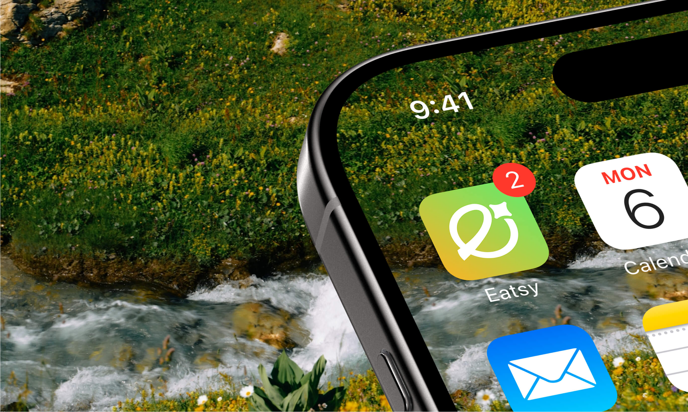
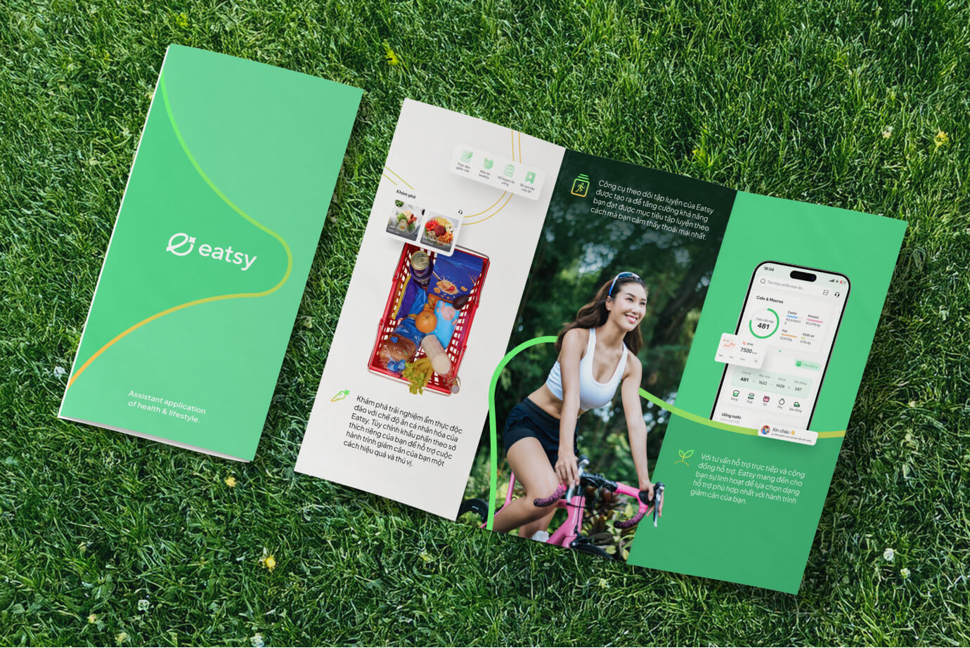
The new identity is extensively applied across marketing communications, social media, and printed materials. Within the Eatsy app, it is featured in banners and thumbnails, while the star element of the logo is utilized as a waiting icon, AI icon, and symbolic mark—ensuring a consistent and cohesive experience across the Eatsy ecosystem.
The re-branding elevates Eatsy’s branding, enhancing the sense of premium quality, enriching user experience and connection, while encouraging more users to adopt the Eatsy Pro subscription.
CREDIT
- Agency/Creative: Chefthai Creative
- Article Title: Chefthai Cooks a Fresh Taste for Eatsy with an Insightful Identity
- Organisation/Entity: Freelance
- Project Type: Identity
- Project Status: Published
- Agency/Creative Country: Vietnam
- Agency/Creative City: Hanoi
- Market Region: Asia, Global
- Project Deliverables: 2D Design, Advertising, Animation, App Design, Art Direction, Brand Architecture, Brand Design, Brand Guidelines, Brand Identity, Brand Mark, Brand Redesign, Brand Strategy, Brand Tone of Voice, Branding, Graphic Design, Identity System, Logo Design, Motion Graphics, Rebranding
- Industry: Health Care
- Keywords: eatsy, health app, viet nam, chefthai, branding, rebrand
-
Credits:
Branding Studio: Chefthai Creative
Creative Director / Brand Designer: Chef Thai
Logo Motion: Thinh NP
Project Assistant: GUSTIEN


