Situation
Food on Wheels has long been an iconic part of American culture. First came the Oscar Meyer Weinermobile in 1936, followed by the ice cream vans of the 1950s. Then, in 1974, one visionary thinker transformed an old ice cream van into the first-ever taco truck on the streets of LA.
The revolution really came into its own during the Great Recession of 2008, when entrepreneurs had to find new ways to make old businesses work. No longer confined to brick-and-mortar establishments, innovative chefs exploded out into the streets and public spaces. Catering technology and social media converged to make gourmet food on wheels the hottest trend in dining. The food truck has transformed the culinary landscape from those first fast-and-cheap tacos to today’s elevated street foods.
Chef Units was founded in 2012 to answer the growing demand for mobile kitchens. Company founder Marco Novo combined his engineering background with a skilled team of designers and builders to custom-craft specialty vehicles and mobile units on demand.
Utilizing premium, high-quality materials, each space is optimized for efficiency, safety, and functionality to create a dynamic workspace where culinary creativity can thrive. Each fully custom design is a functional work of art.
Over the past decade, the company has created over 500 uniquely designed mobile kitchens, from food trucks and trailers to shipping container kitchens. Now this highly innovative and successful company is ready to take it to the next level. As part of this journey, they needed to modernize the brand to match the vision.
Solution
Pencil Worx started rebranding by carefully culling the dated bits from the core identity while retaining its valued legacy. We knew how important it was to celebrate the company’s formative role in the food truck revolution, building on its loyal customer fan base while moving forward as the top tier of its industry.
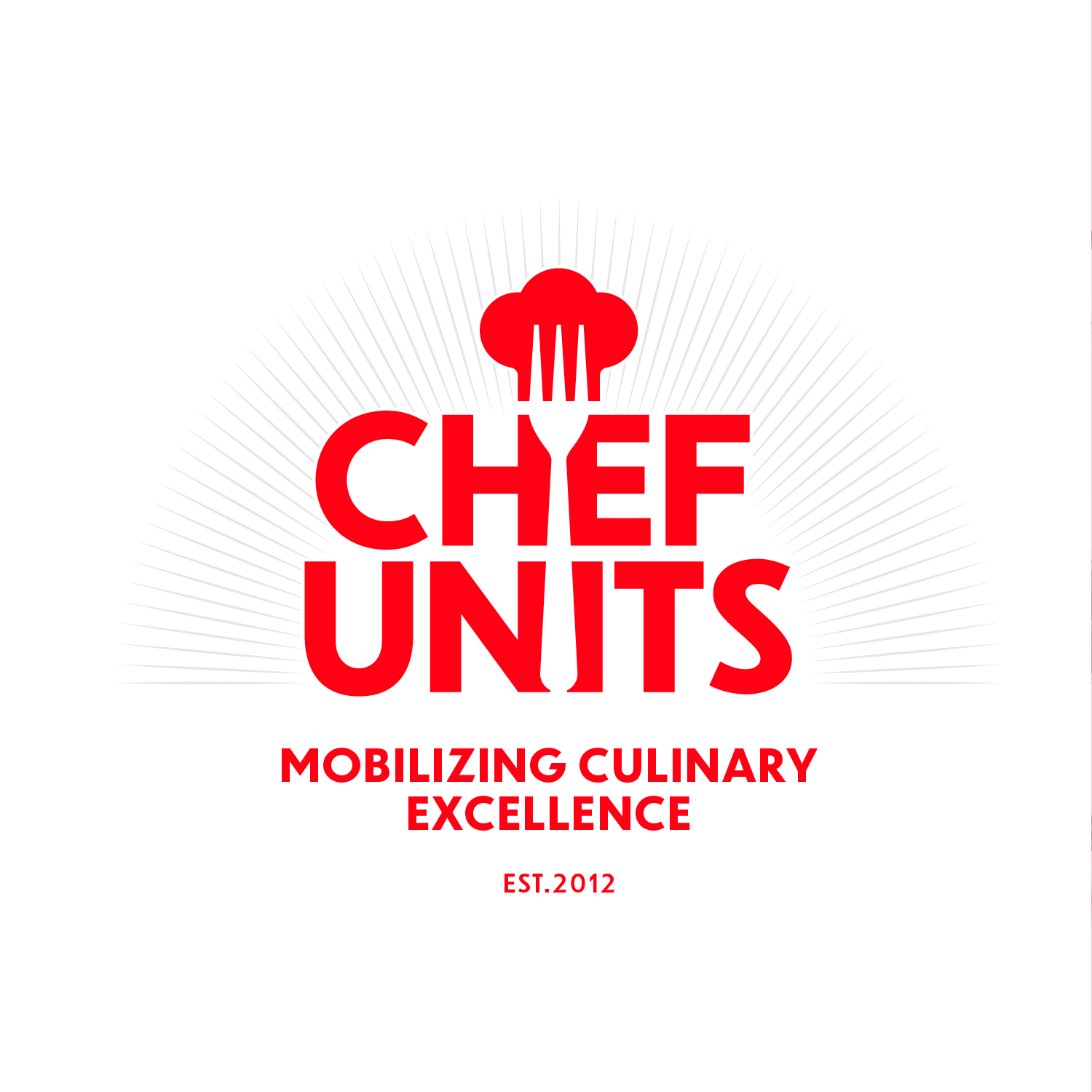
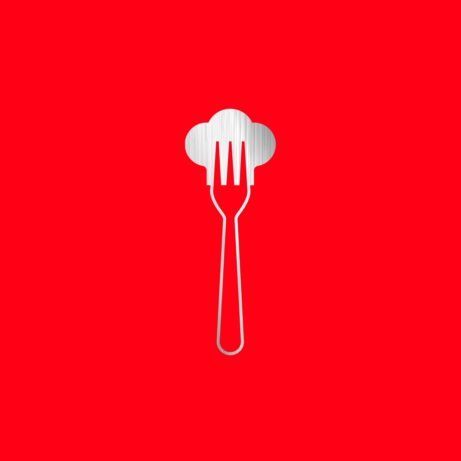
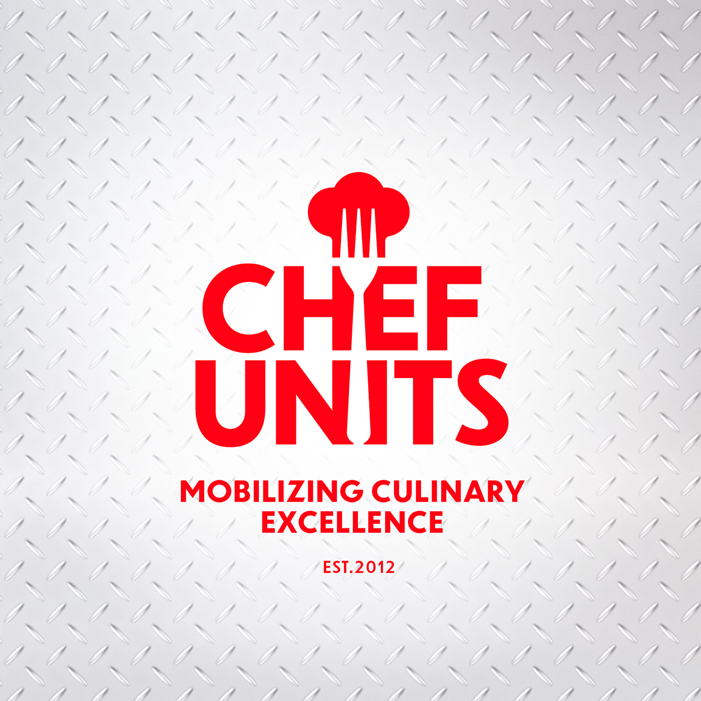
We began by focusing on the logo itself, one of the most valuable assets of any brand identity. The knockout chef’s fork and hat is an easily recognizable and iconic nod to cooking. But the square-ish, hard-angled font looked dated and militaristic. Instead of a visual balance, the typography was outsized to the pictorial mark, overwhelming it and rendering it nearly invisible.
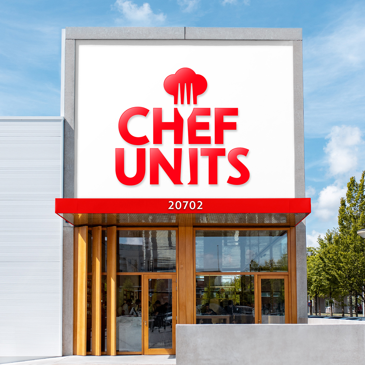
We chose a modern, slightly rounded font that easily integrates with an enlarged, more rounded version of the original chef hat and fork. The resulting visual balance brings the iconic image forward and enhances it. The mark, text, and icon seamlessly reinforce the brand identity in the new combination.
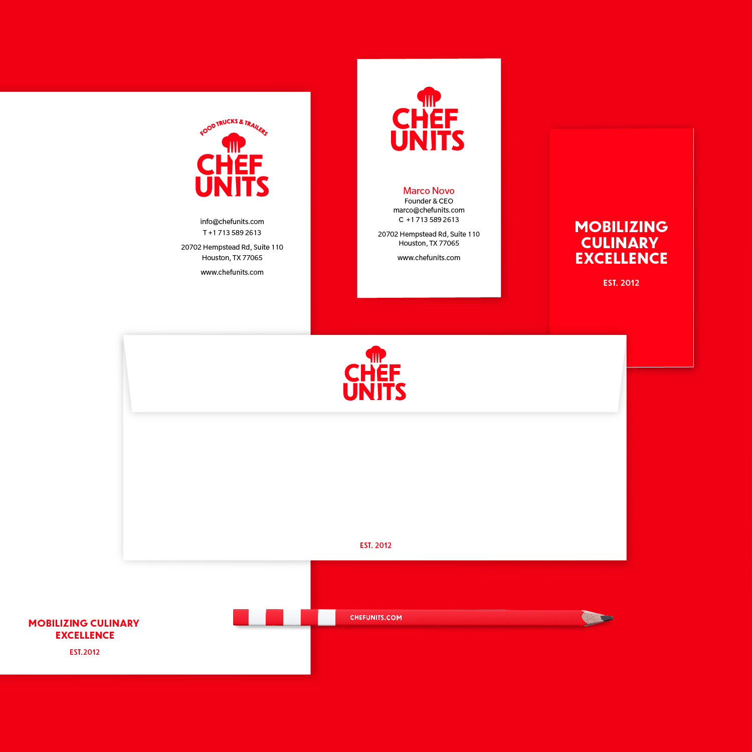
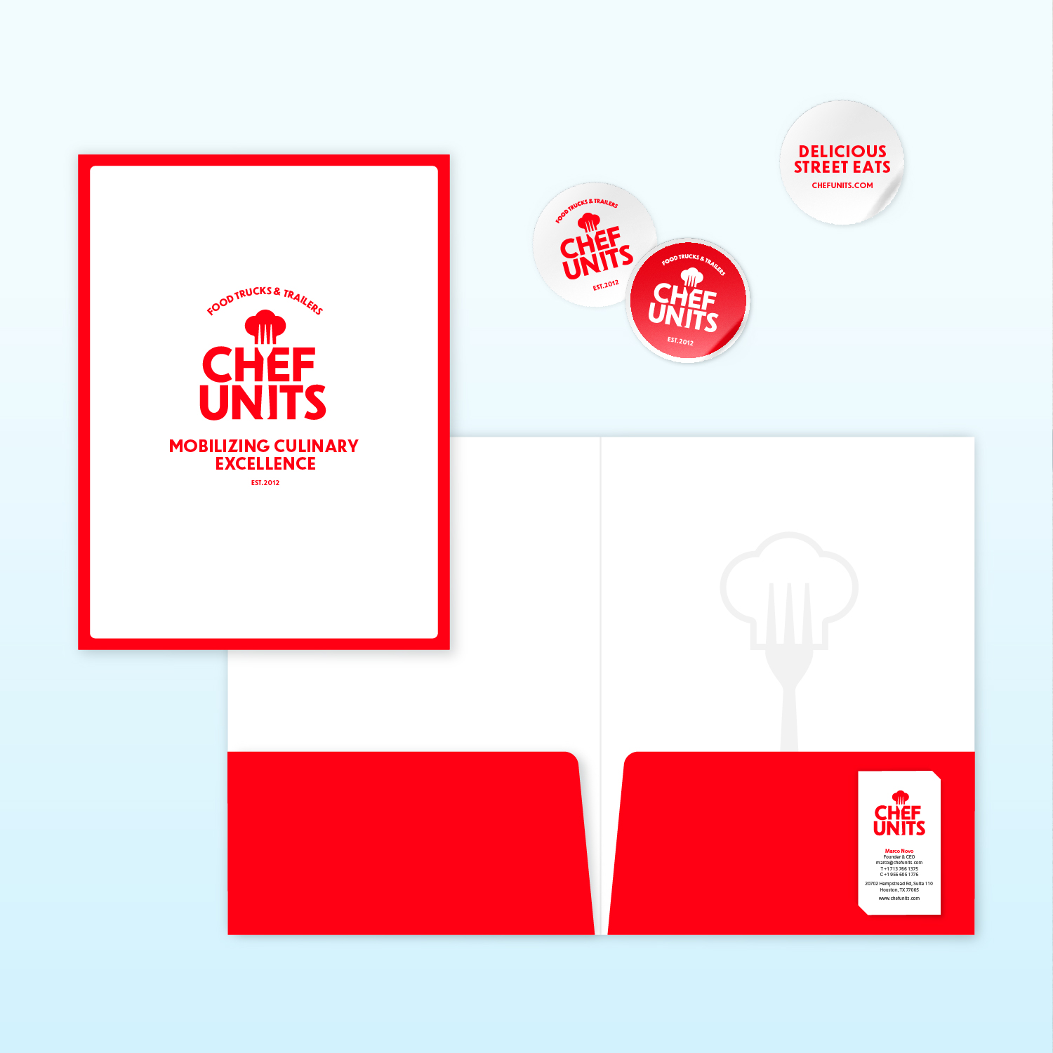
The color palette is built around a vibrant red that summons the heat and energy of the kitchen, with the secondary colors adding a friendly and confident air that echoes the creative excitement of the culinary world.
The result is a clear, strong brand identity that offers continuity to the past while feeling fresh, friendly, and approachable, helping it stand out in a highly competitive market.
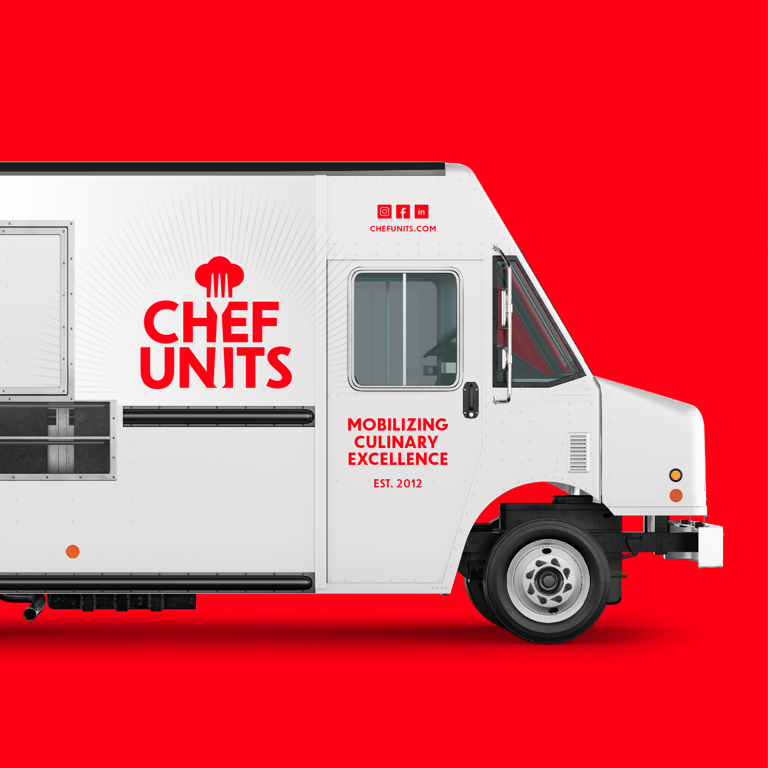
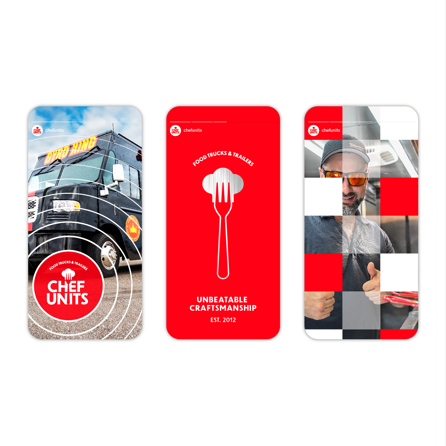
Pencil Worx will continue to guide new approaches to design applications and brand activation as the rebranding process moves forward. We are excited to play an active role in website design, social media applications, advertising photography, promotional materials, and interior and exterior design applications for company facilities.
CREDIT
- Agency/Creative: Pencil Worx
- Article Title: Chef Units Reimagined: Pencil Worx Crafts a Fresh Identity for Mobile Kitchen Innovator
- Organisation/Entity: Agency
- Project Type: Identity
- Project Status: Published
- Agency/Creative Country: United States
- Agency/Creative City: New York
- Market Region: North America
- Project Deliverables: Brand Guidelines, Brand Identity, Logo Design, Rebranding, Visualisation
- Industry: Professional Services
- Keywords: Mobilizing Culinary Excellence
-
Credits:
Brand Identity: Sam Ayling


