


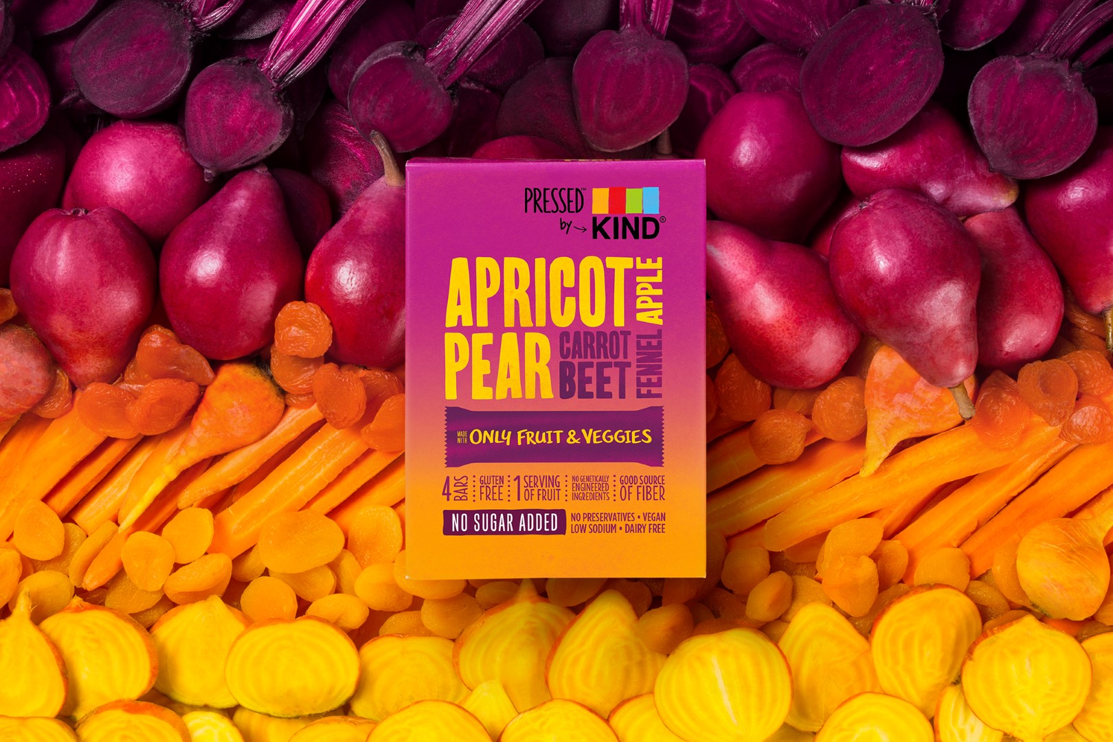
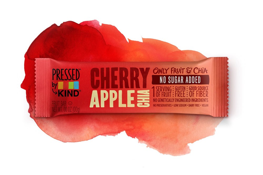
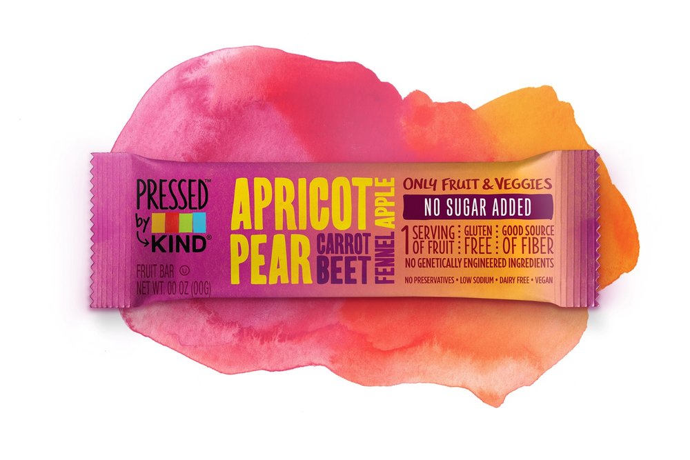
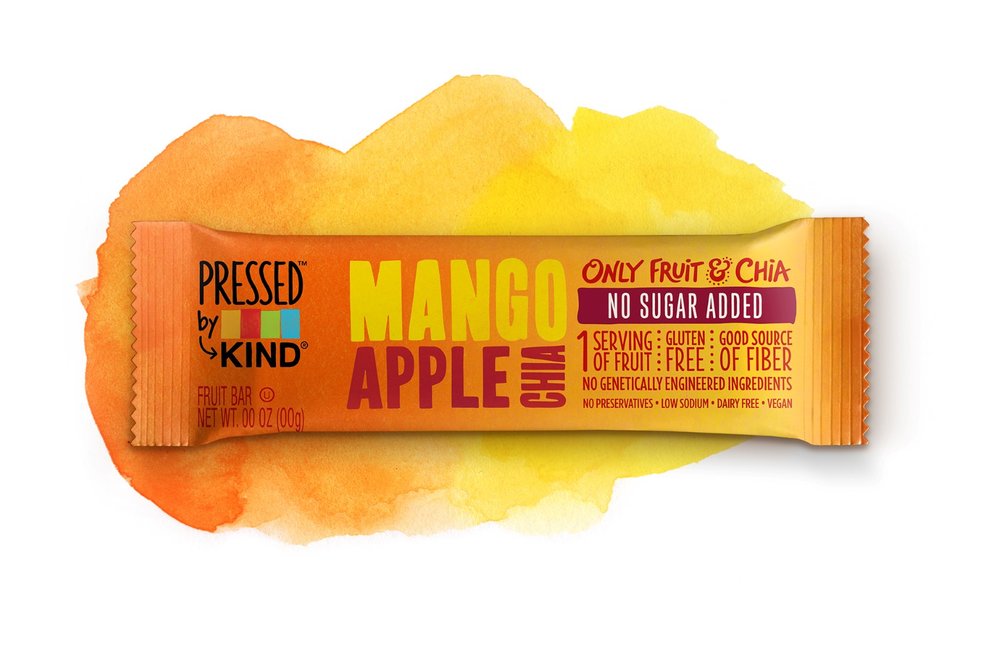
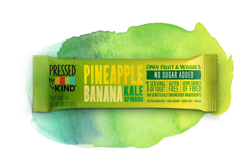
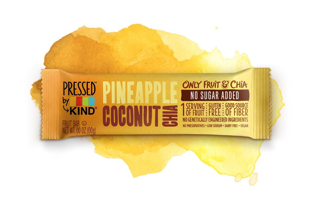
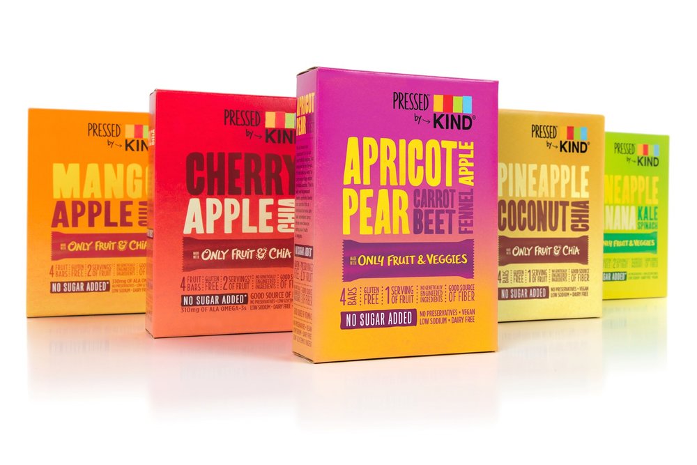
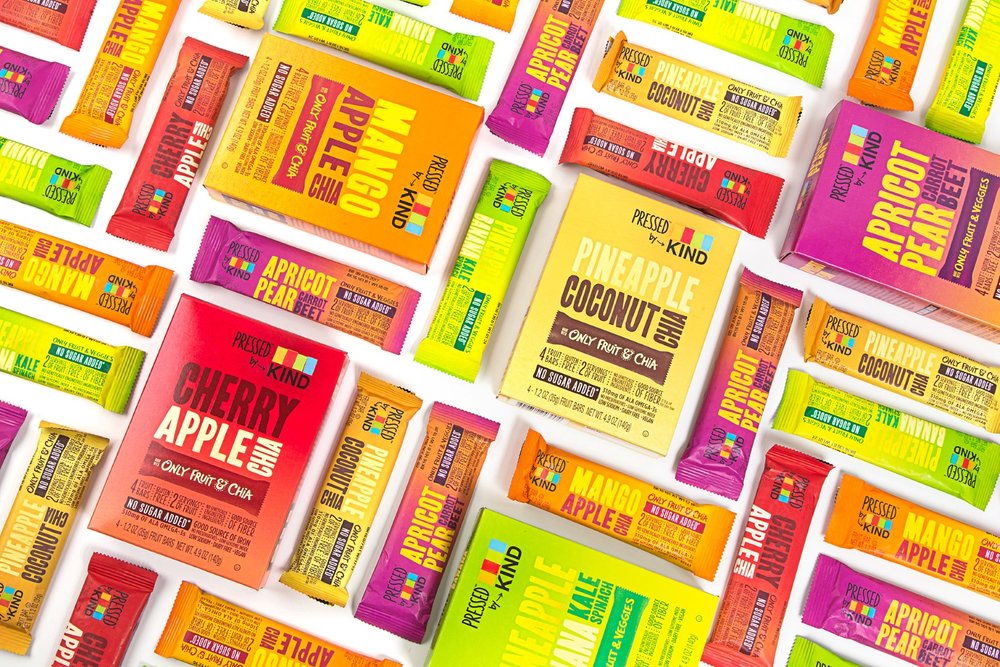
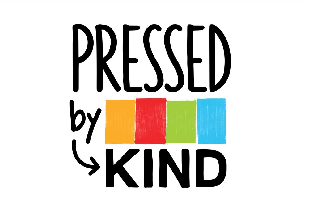
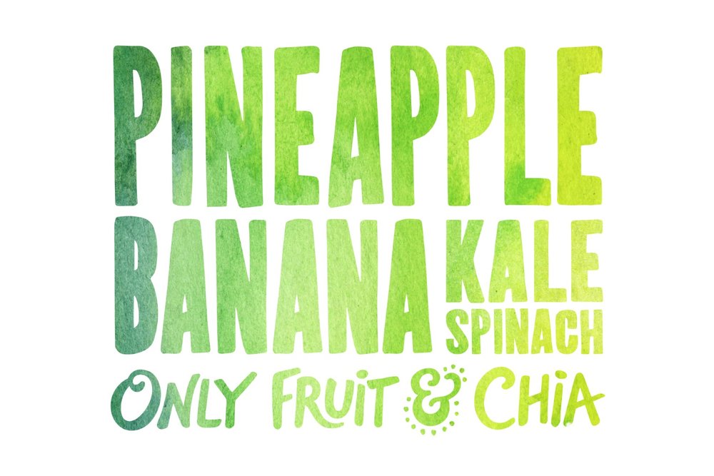
” For a brand known for products with “ingredients that you can see & pronounce,” transparency has been a core component of KIND’s packaging DNA. However, maintaining shelf stability for their new fruit and veggie innovation necessitated eliminating the wrapper’s clear window. KIND needed to rethink their approach to communicating their ingredient story through packaging while preserving brand recognition. We developed a design solution by leveraging aesthetic cues from the juicing category. Hand-drawn type, bold color, and soft textural elements communicate the natural ingredients and create appetite appeal. Brand recognition is maintained through the structured visual language already known to KIND.The goal behind the logo was to interpret KIND’s master logo to create a sub-brand that can stand on its own while visually relating to the parent brand. The addition of texture and new typographic elements let the brand feel like its own special category. A system of typography with a hand-drawn aesthetic speaks to the nature of the product, while a gridded composition gives a nod to KIND’s original brand design.”
CREDIT
- Agency/Creative: Chase Design Group
- Article Title: Chase Design Group – Pressed By Kind
- Project Type: Packaging
- Format: Wrap
- Substrate: Plastic


