


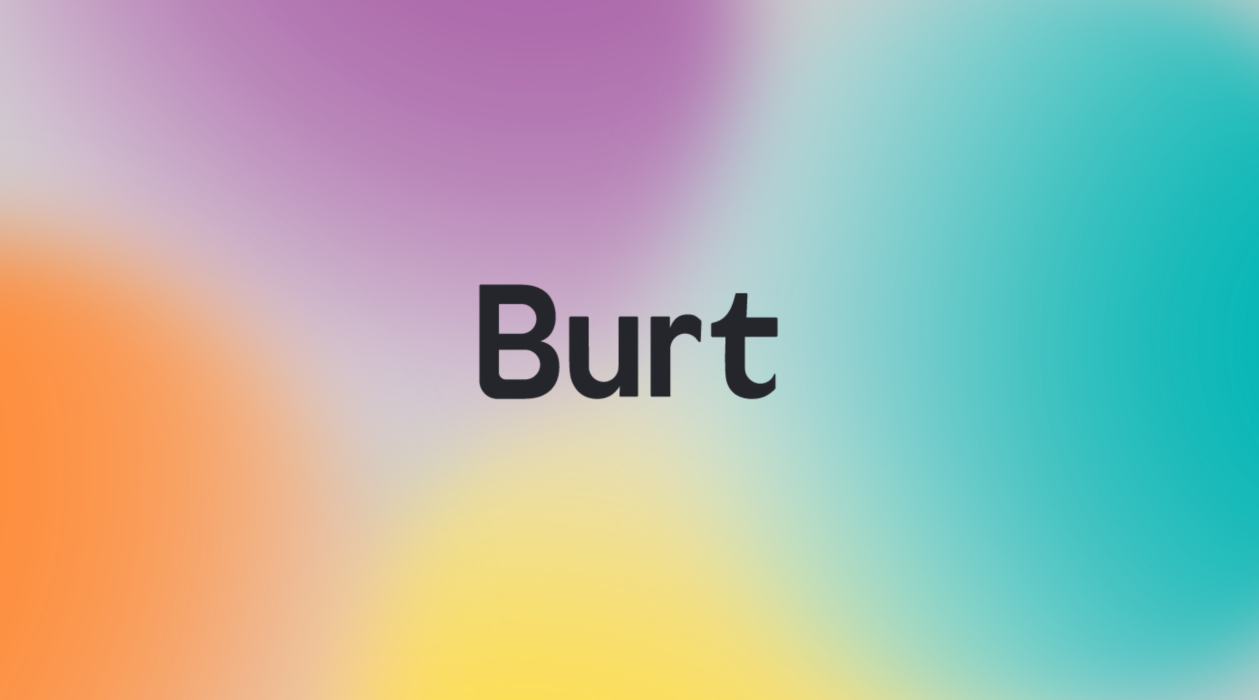
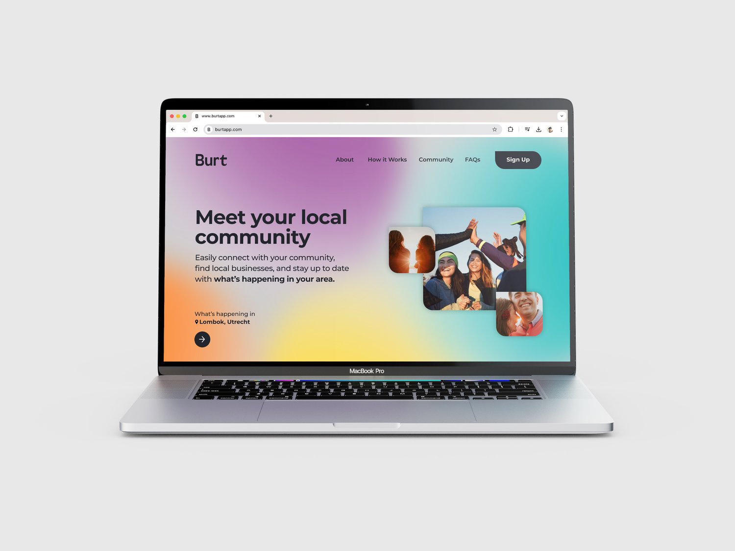
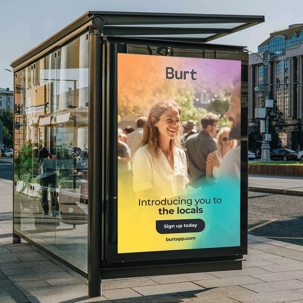
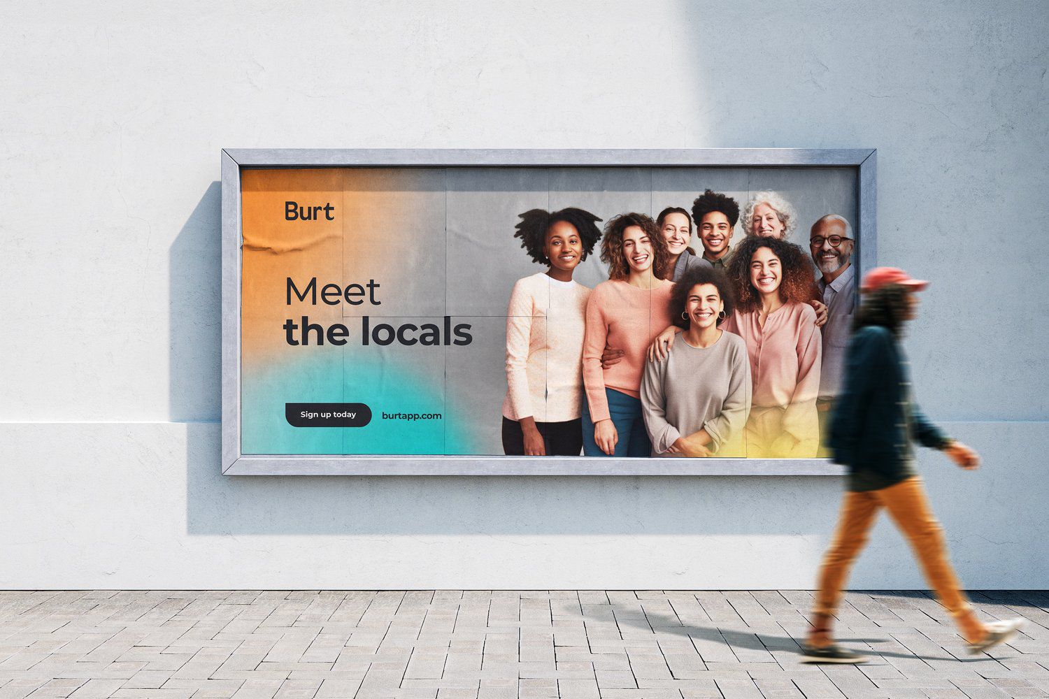
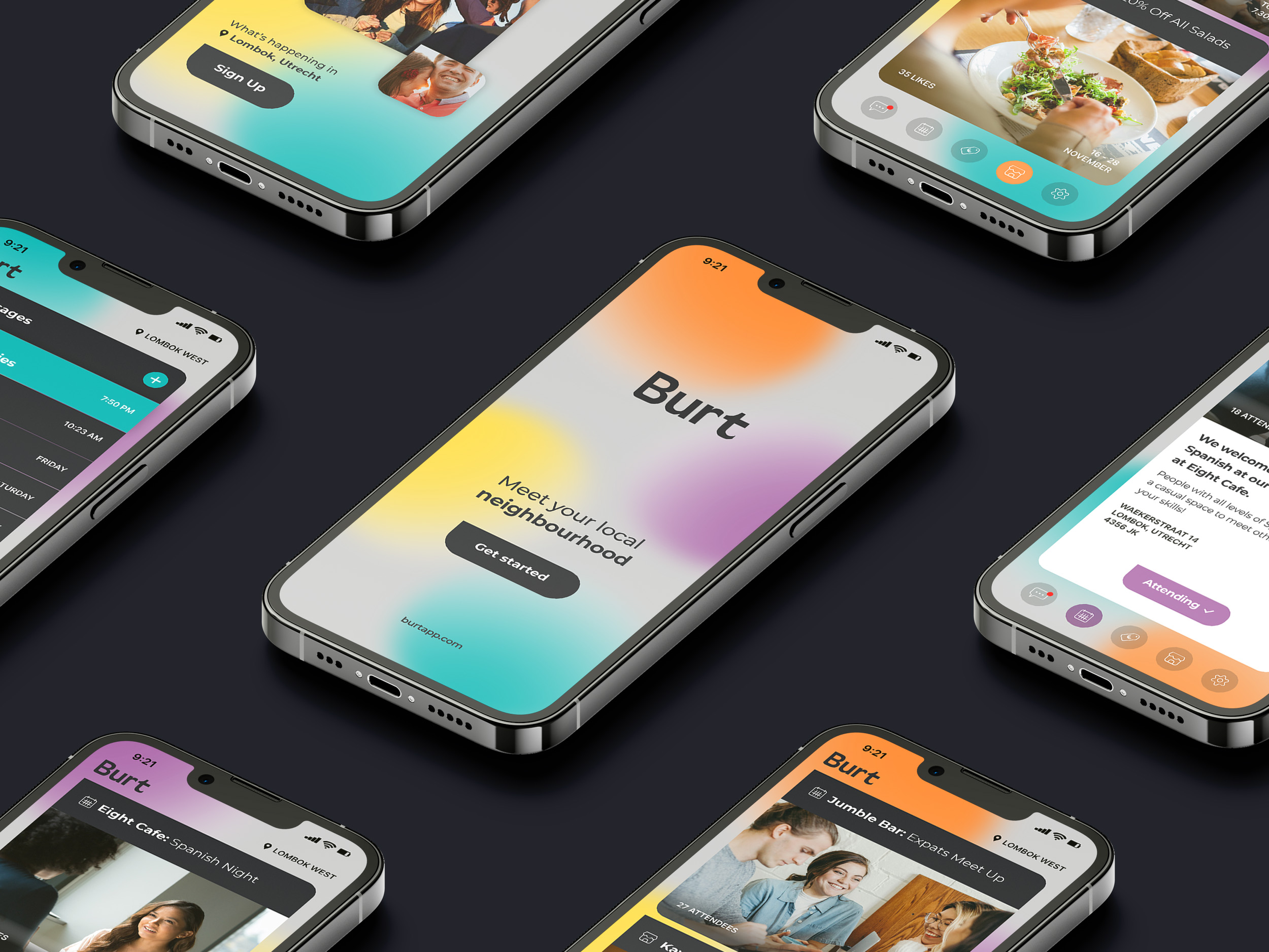
Introducing Burt, your friendly neighbourhood mobile app. Inspired by the Dutch word for “neighbourhood,” the name itself evokes a sense of friendly familiarity. The overall brand design seamlessly embodies the app’s four core attributes: location, community, diversity, and conversation.
The design has been translated into a burst of bright, colourful gradient dots that instantly draw in the eye of the user. The design is playful and approachable, reflecting the app’s diverse user base. Each dot also represents a unique voice within the community, coming together to form a vibrant whole. The entire brand identity and aesthetic utilises these bright colours to create a welcoming and inclusive feel.
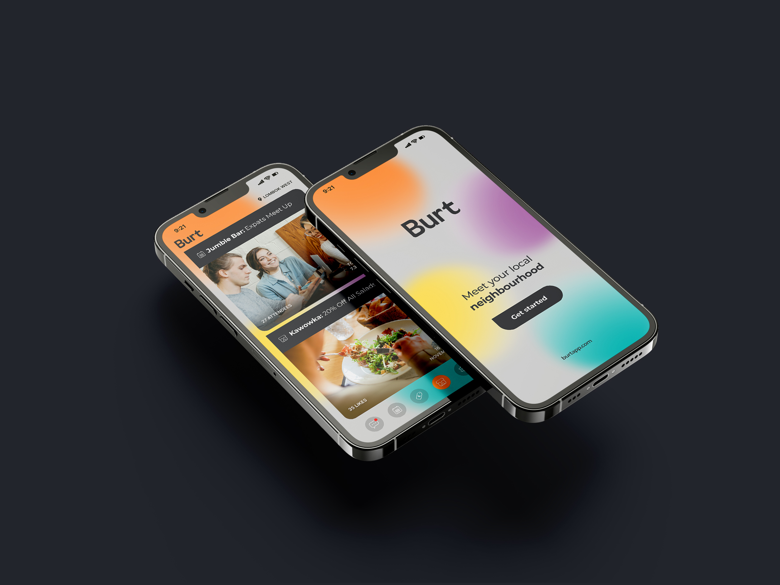
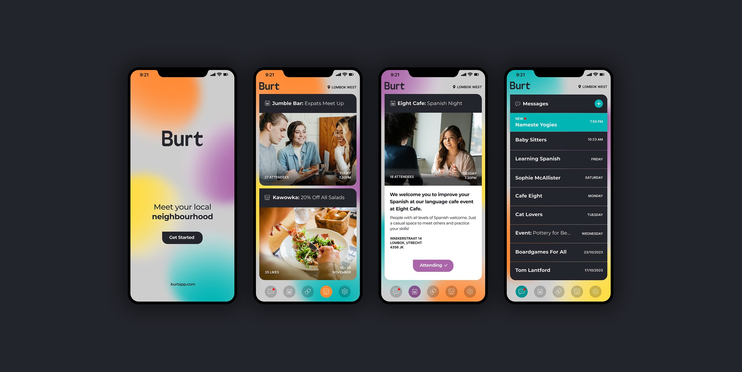
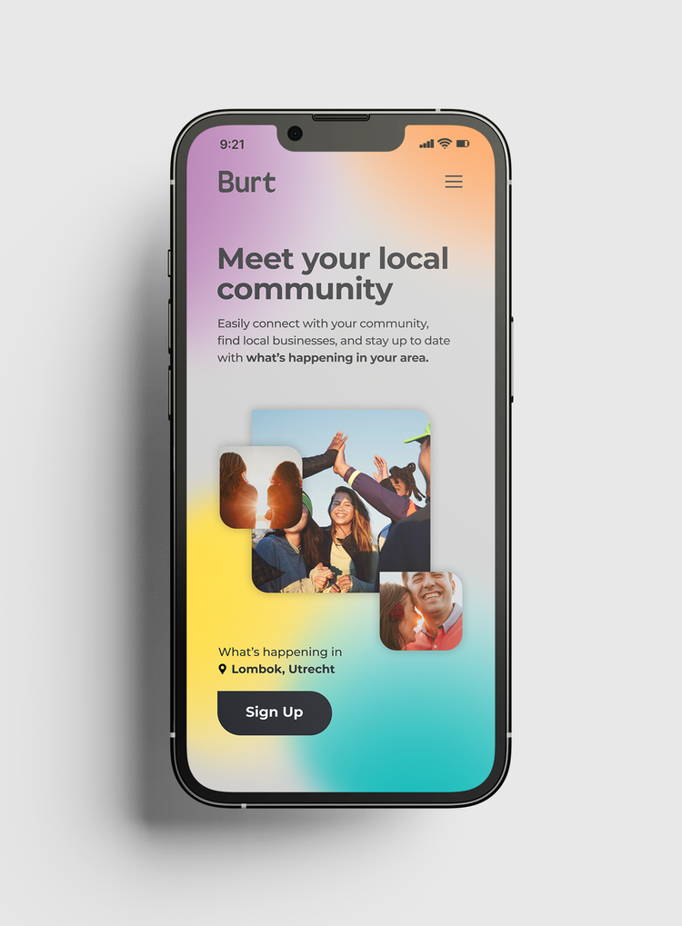
But aesthetics are just one piece of the puzzle. Functionality is an important component of the Burt mobile app design. The user interface has been designed to be modern, easy to use and intuitive. The key here is that no matter your age, background or tech skills, connecting with your local neighbourhood through Burt is effortless. This focus on simplicity reinforces the brand’s core values – fostering a sense of community through ease of use and open communication.
In essence, Burt’s holistic branding is a visual language that seamlessly reflects the community app’s mission of bringing people together. By fostering a welcoming, energetic and user-friendly environment, Burt empowers its users to connect, share, learn what’s going on nearby and build a stronger sense of belonging within their neighbourhood.
The overall design has been translated into a burst of bright, colourful dots that instantly draw in the eye of the user. The design is playful and approachable, reflecting the app’s diverse user base. Each dot also represents a unique voice within the community, coming together to form a vibrant whole. The entire brand identity and aesthetic utilises these bright colours to create a welcoming and inclusive feel.
But aesthetics are just one piece of the puzzle. Functionality is key. The Burt app user interface has been designed to be modern and intuitive. The key here is that no matter your age or tech skills, connecting with your neighbourhood through Burt is effortless. This focus on simplicity reinforces the brand’s core values – fostering a sense of community through ease of use and open communication.
In essence, Burt’s branding is a visual language that seamlessly reflects the community app’s mission of bringing people together. By fostering a welcoming, energetic and user-friendly environment, Burt empowers users to connect, share, and build a stronger sense of belonging within their neighbourhood.
CREDIT
- Agency/Creative: Charlotte Fosdike
- Article Title: Charlotte Fosdike Creates Vibrant Branding and Mobile App Design for Burt App
- Organisation/Entity: Freelance
- Project Type: Digital
- Project Status: Published
- Agency/Creative Country: Netherlands
- Agency/Creative City: Utrecht
- Market Region: Europe, North America, Global
- Project Deliverables: App Design, Art Direction, Brand Design, Brand Identity, Brand Naming, Branding, Graphic Design, User Experience, Web Design
- Industry: Technology
- Keywords: branding, brand identity, logo design, app design, user interface, community app
-
Credits:
Design Director: Charlotte Fosdike


