


Brand Introduction
Charlie, a distinguished brand under the umbrella of High Queen Distillers, represents the pinnacle of a three-generation legacy in the distillery business. Iris Design was exceptionally fortunate to be a part of High Queen Distillers’ journey, entrusted with the task of redesigning their iconic brand, Charlie. Iris Design delved deep into the brand, analyzing its strengths and uncovering hidden opportunities. Recognizing the imperative for a strategic overhaul, we undertook a comprehensive initiative to redefine Charlie’s brand identity, strategically tackling the impediments that hampered its market prominence.
Key Features of Charlie:
Rare and classic blend of the finest scotch, matured malts, and exquisite grain spirits.
Zero artificial flavors for the purest blend of malt and scotch.
Charcoal-filtered for a seamless balance of natural flavors and low hangover.
Challenge at Iris Design
Overcoming Low Sales
When Highfield Distillers approached Iris Design, the challenge was clear – low sales due to poor shelf visibility and readability. The iconic brand ‘Charlie’ needed a redesign to stand out on the shelf and revitalize its presence in the market.
Focus
Redefining Presence: The Iris Design Solution
Iris Design embarked on a transformative journey with Charlie, reimagining every aspect of its branding and packaging. The primary focus was on enhancing the name’s readability, ensuring it commands attention on the shelf, and revitalizing the brand’s overall presence.
Strategic Changes:
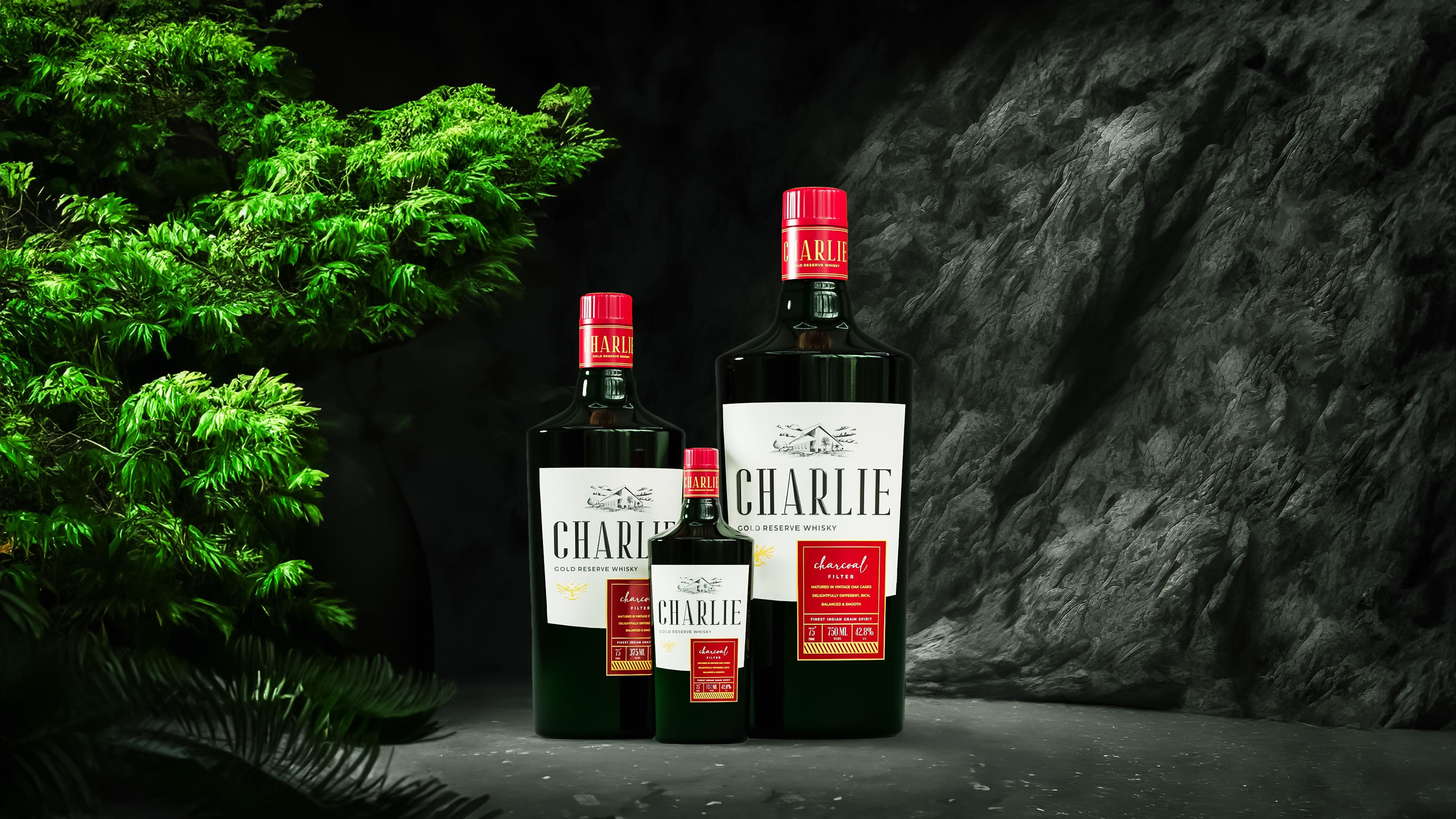
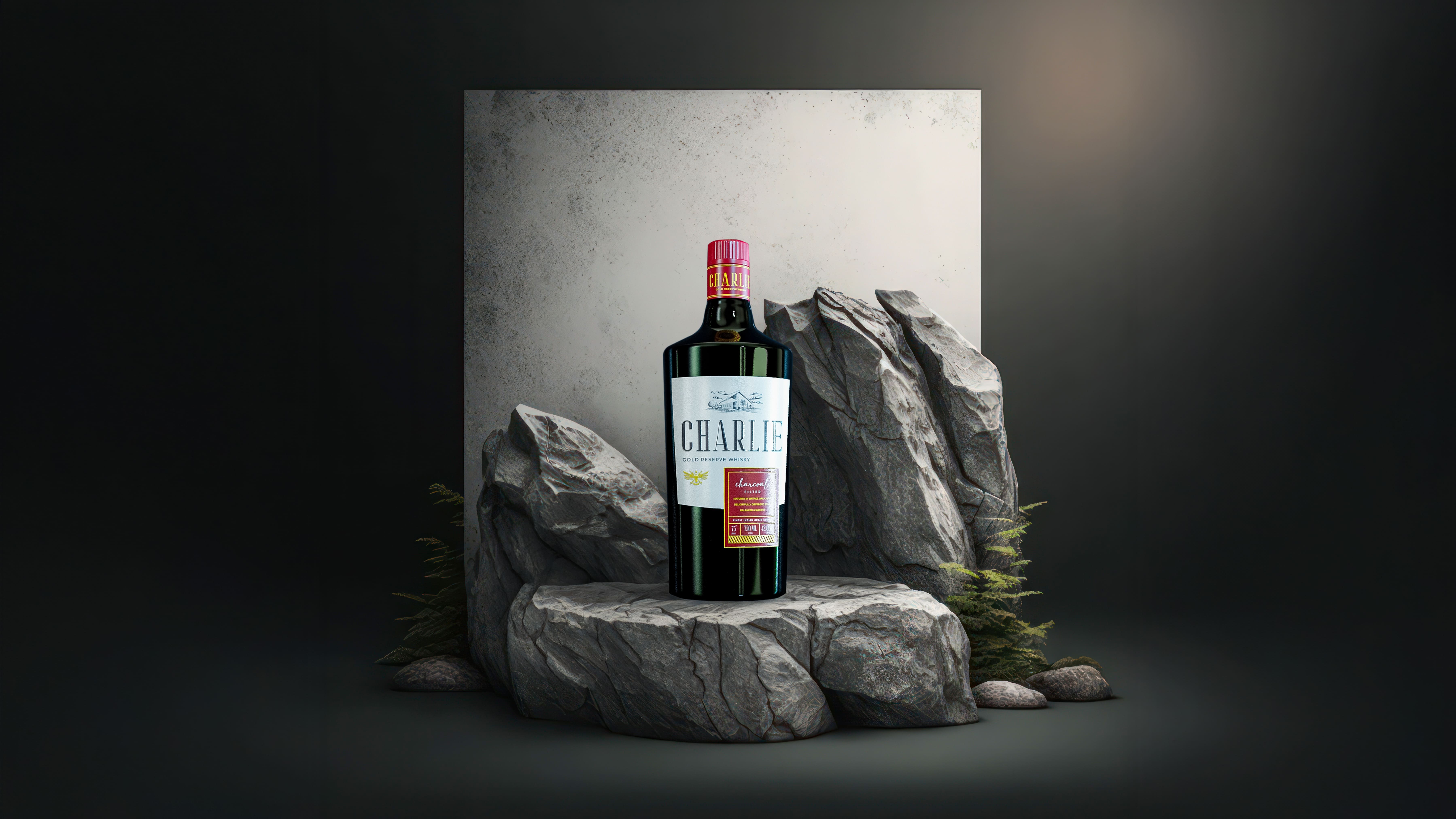
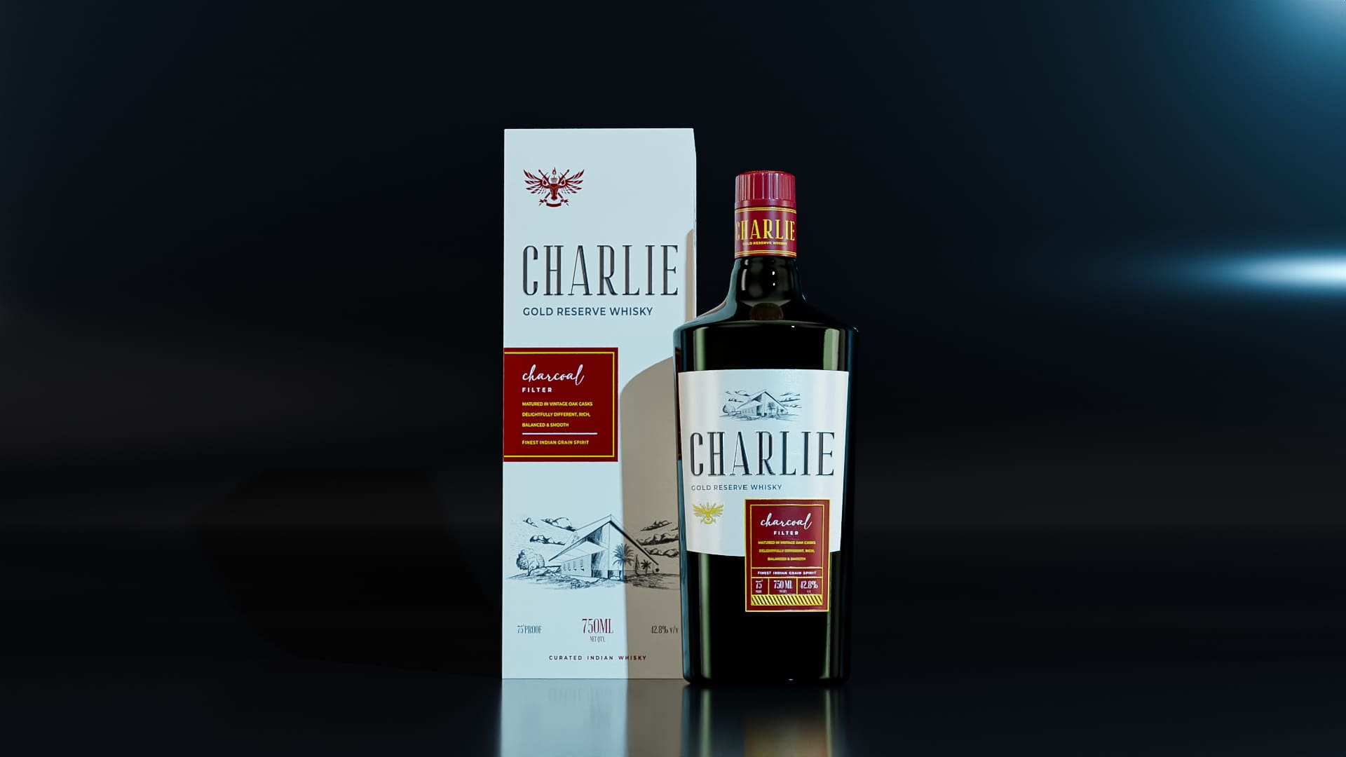
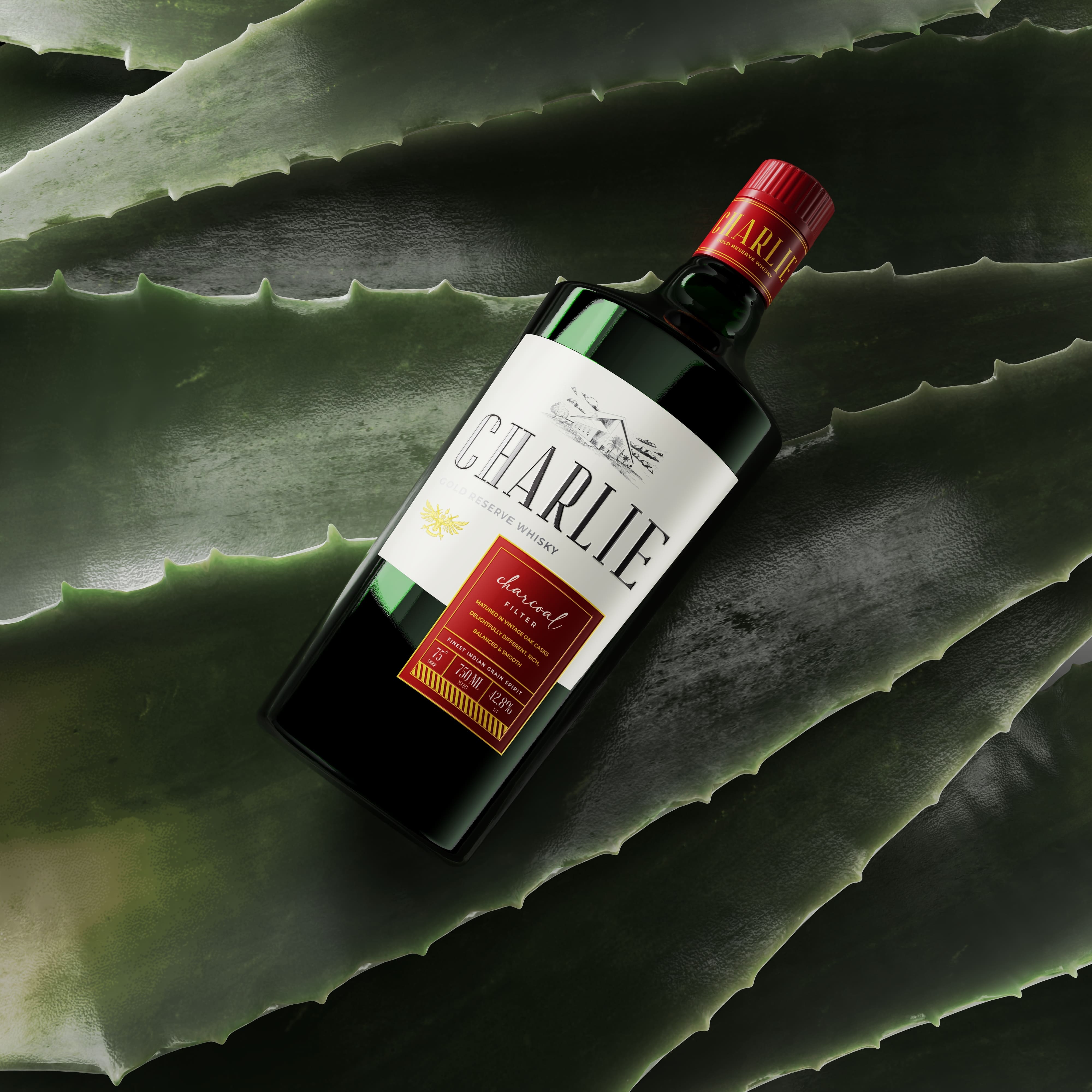
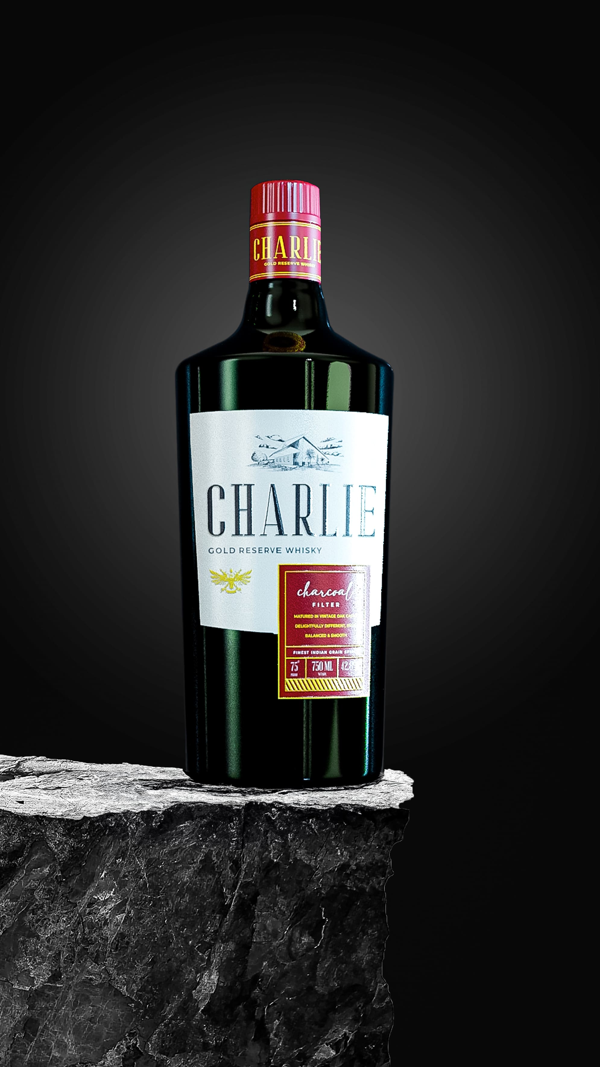
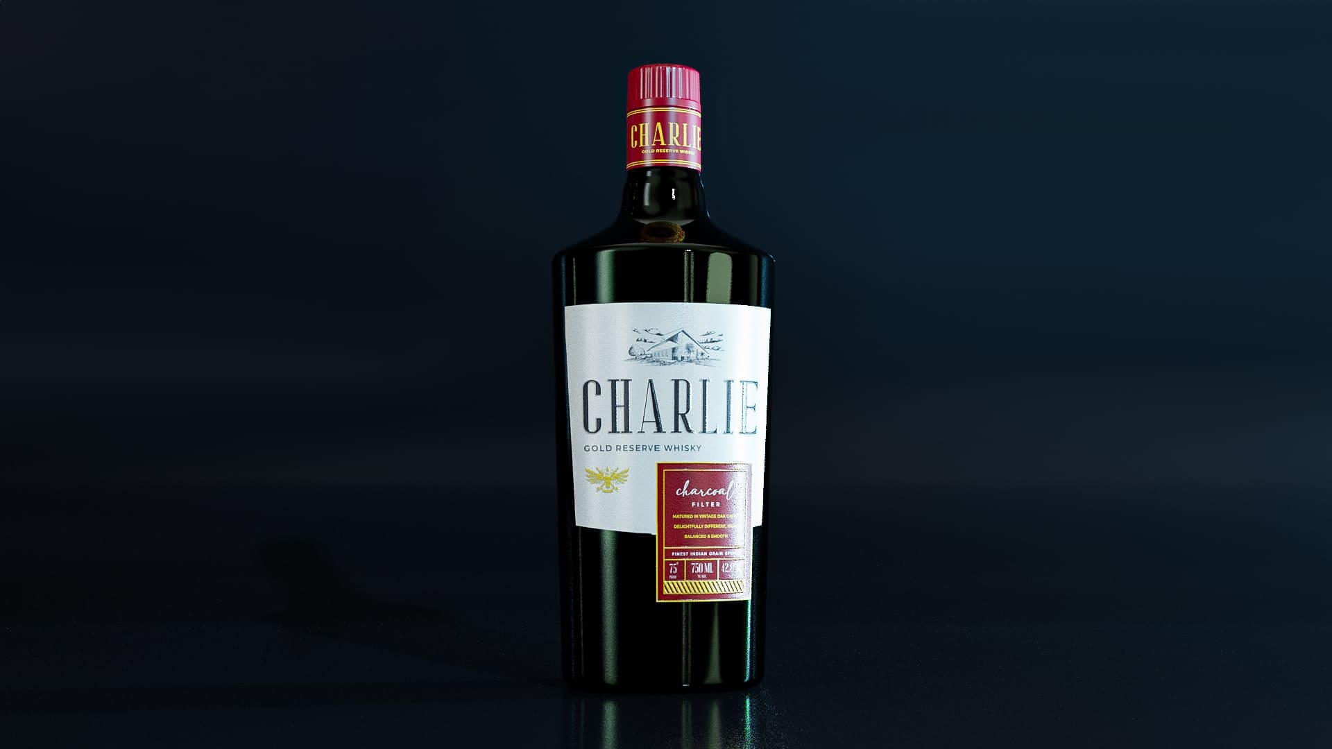
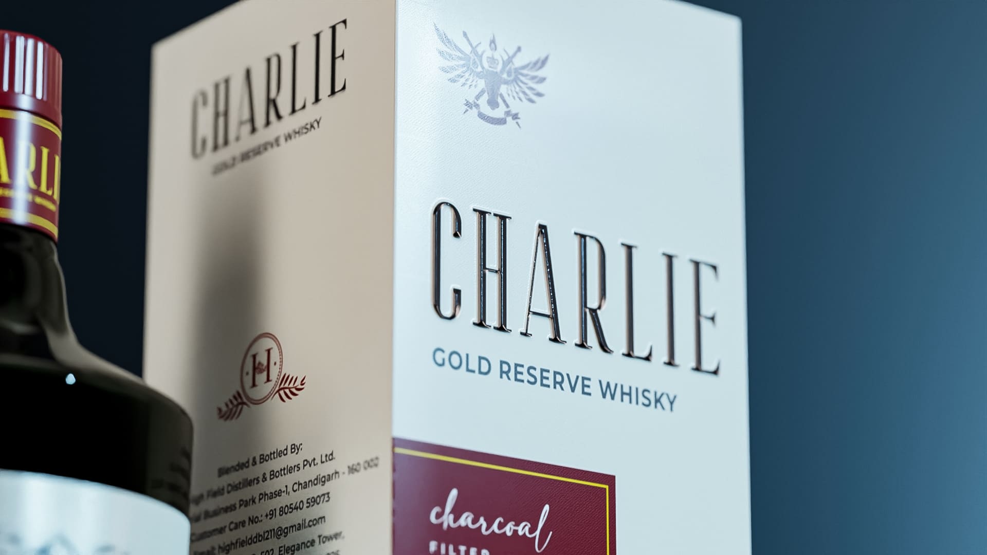
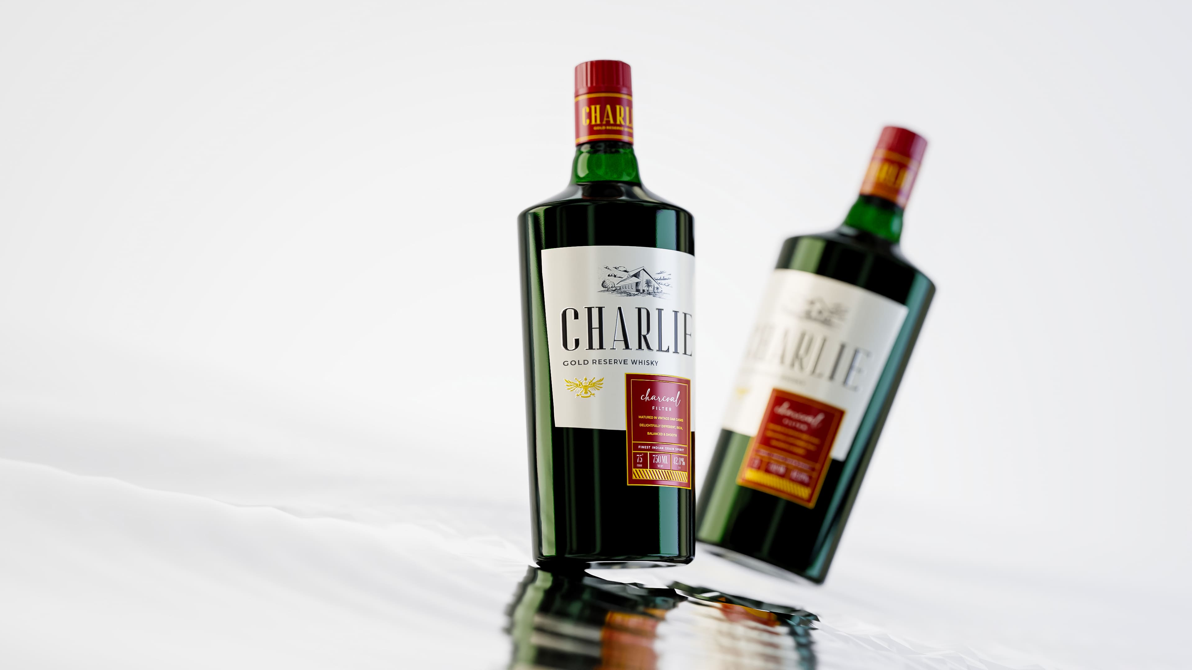
Bottle Design: The shape and structure of the bottle were redefined for a high-end, elegant look.
Colour Shift: Transition from brown to white for increased visibility and a premium aesthetic.
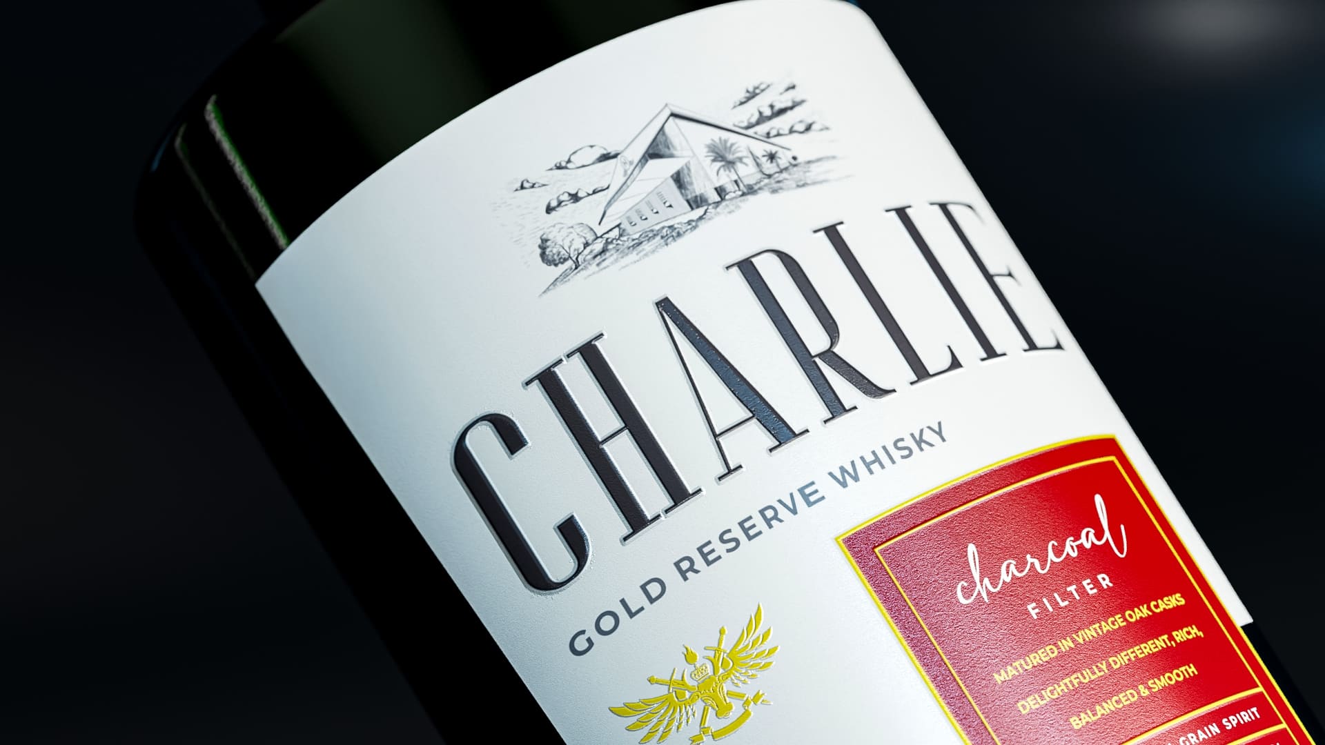
Typeface Enhancement: Increased x-height and thickness of the font for improved visibility and readability. We also stylized it with a modern touch, breathing fresh life into Charlie’s identity.
Illustration of Distillery: The center piece of the redesign, the illustration of Charlie’s distillery, served a dual purpose. Beyond aesthetics, it conveyed sustainability, featuring a green haven with over 2000 plants, meticulously crafted by a horticulture specialist.
Messaging: Emphasis on the use of “Charcoal Filter” for a low hangover showcased prominently in the packaging.
Psychological Elements: Diagonal lines, strategically placed below the “Charcoal Filter” and composition details, to attract attention subconsciously.
The Subconscious Strategy:
Illustration Impact: The distillery illustration was strategically placed to forge a natural connection with consumers. It became a visual narrative, inviting consumers to experience the brand’s commitment to sustainability.
Diagonal Lines: Purposeful placement of diagonal lines beneath the “Charcoal Filter” and composition details was a subconscious strategy. Psychologically, diagonal lines attract attention in a sweeping manner, ensuring that even a casual glance engages the observer.
Green Haven Concept: The green haven, with its abundance of plants, subtly communicated eco-friendliness. This not only aligned with current consumer trends but also created a positive association with the brand.
Results:
The redesign not only strengthened the brand’s natural connection but also elevated its shelf appeal with a distinctive and refreshing aesthetic. The new design speaks to the soul of the distillery, embodying the essence of Charlie Gold Reserve Whisky – a toast to those who dare to be different.
CREDIT
- Agency/Creative: Iris Design
- Article Title: Charlie Whiskey Brand Redesign
- Organisation/Entity: Agency
- Project Type: Packaging
- Project Status: Published
- Agency/Creative Country: India
- Agency/Creative City: Gurugram
- Market Region: Asia
- Project Deliverables: 3D Design, Art, Brand Design, Brand Redesign, Branding, Graphic Design, Illustration, Label Design, Packaging Design, Paperwork, Product Design
- Format: Bottle
- Industry: Food/Beverage
- Keywords: Alcohol, Whiskey, Packaging
-
Credits:
Communication Designer: Manvendra singh
Content Writer: Kanupriya Singh


