Client: Charitable organization of Belneftegaz Task: Develop positioning, naming, logo and identity. Solutions: Since the charitable organization of Belneftegaz is a new foundation that is just starting its activity, it was important for us to form a clear and reliable image from the beginning. One donation will not change the situation completely. One project will not change the whole world, but what if there are more and more of these small victories every day?
Each project of the foundation is a contribution to the development of an entire society. We are getting closer to having as many happy and healthy people in the world as possible with the implementation of each project. We are getting closer to great happiness with every little help.
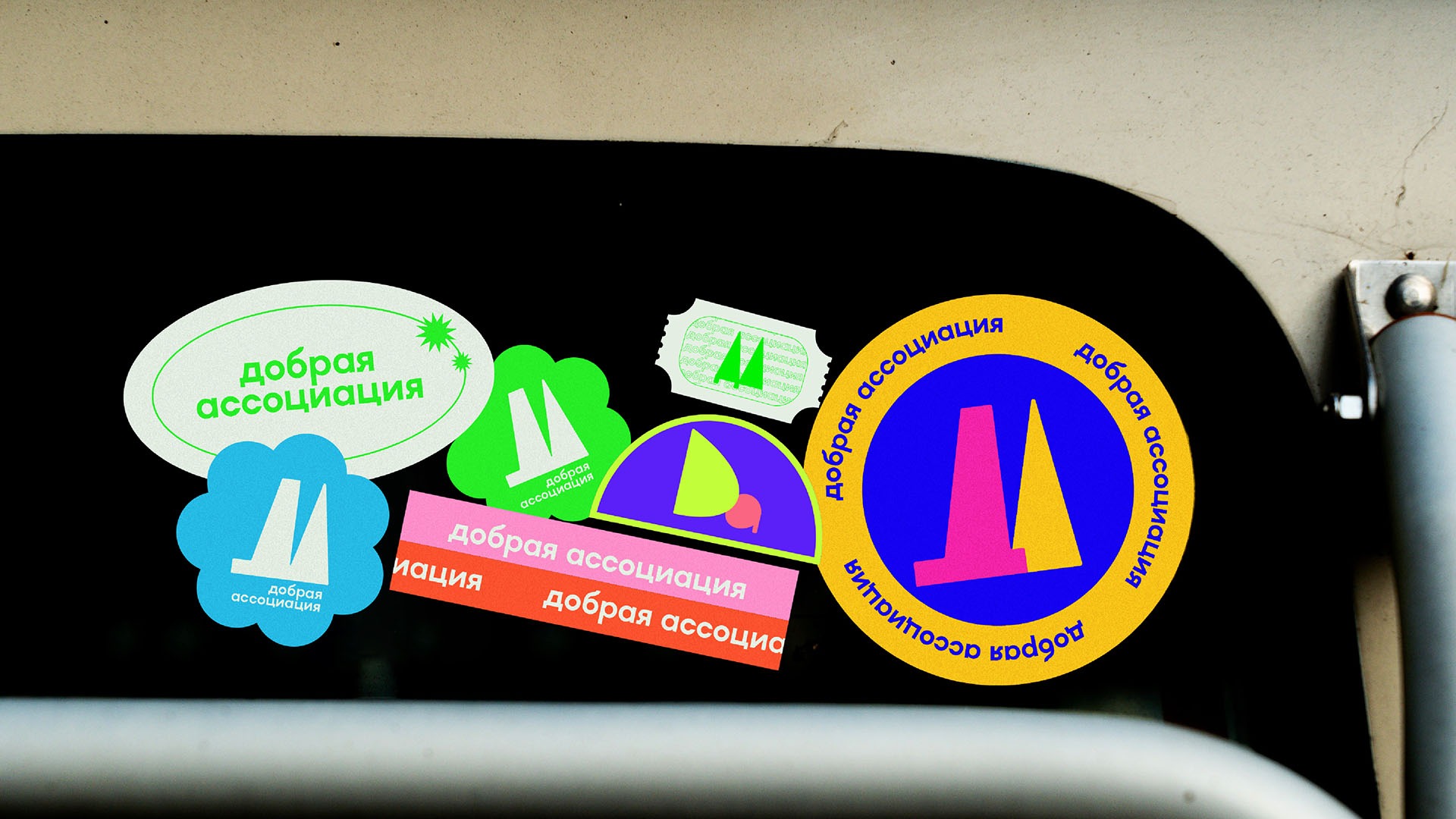
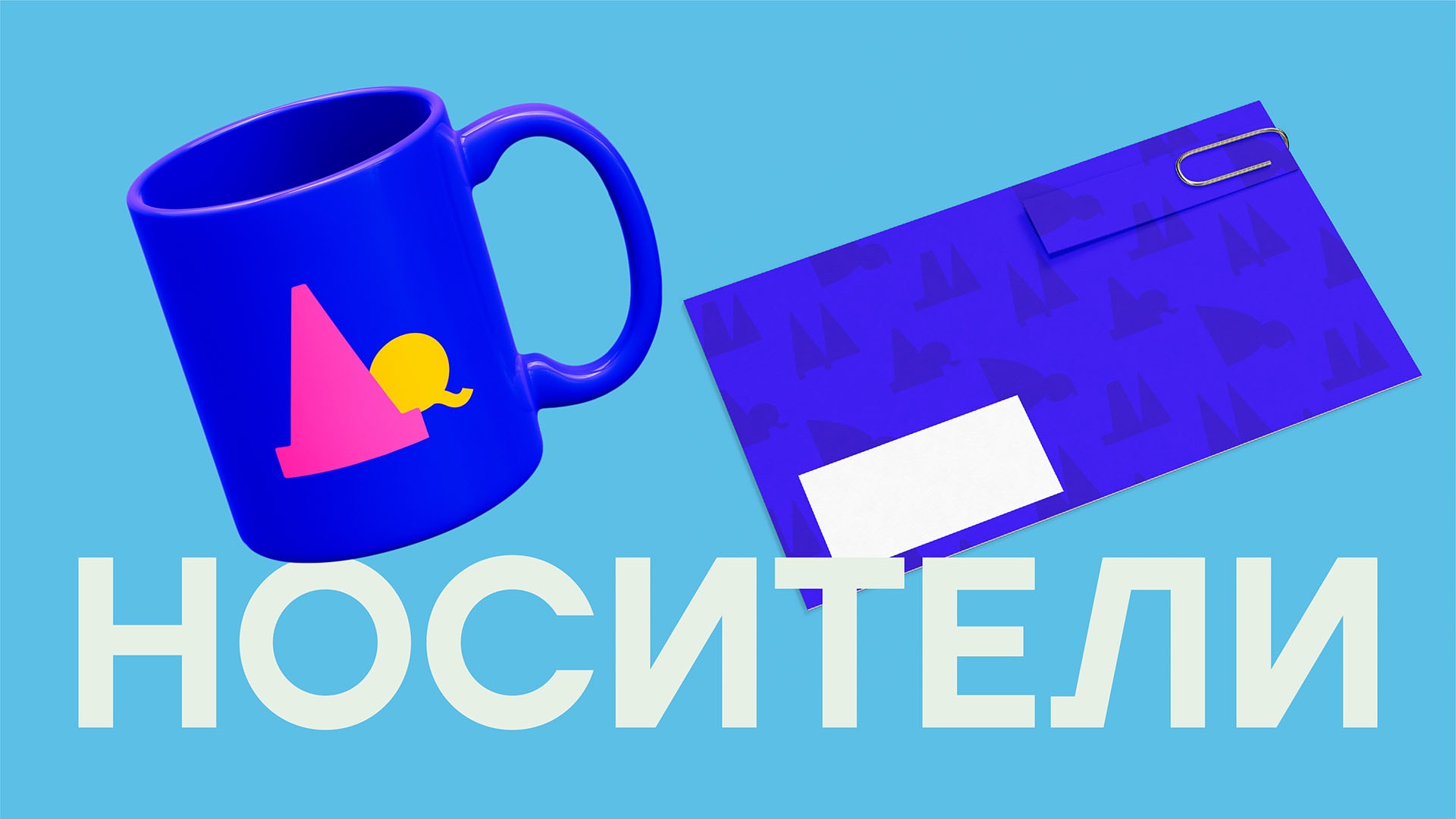
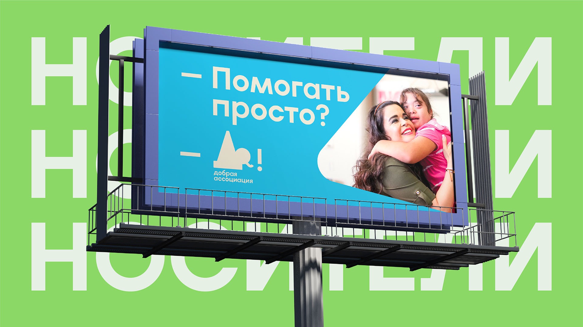
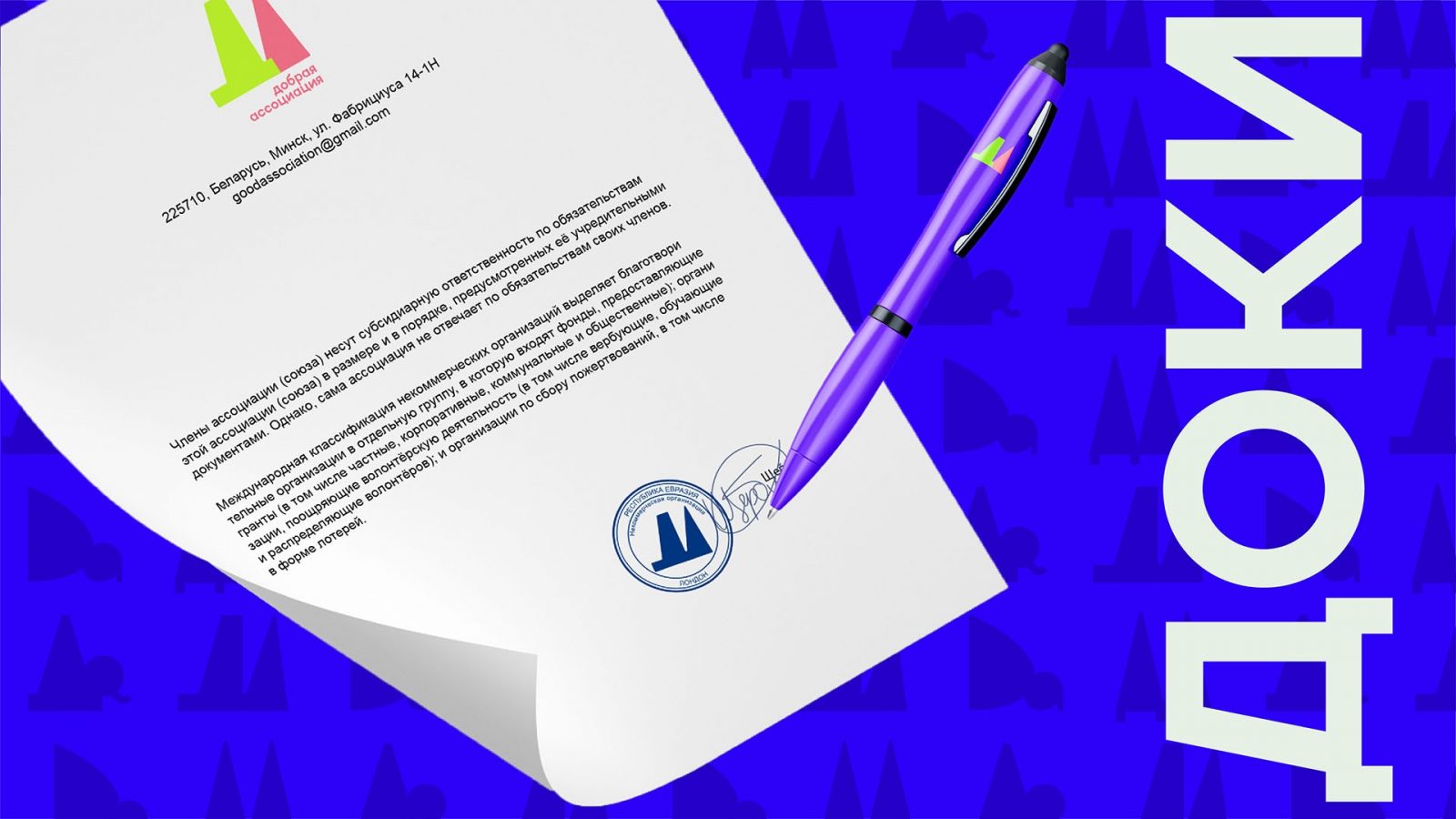
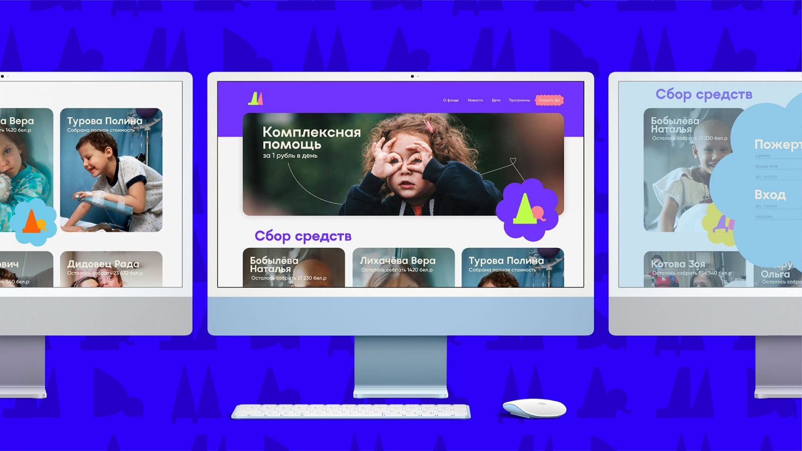
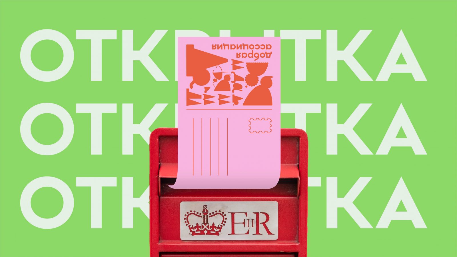
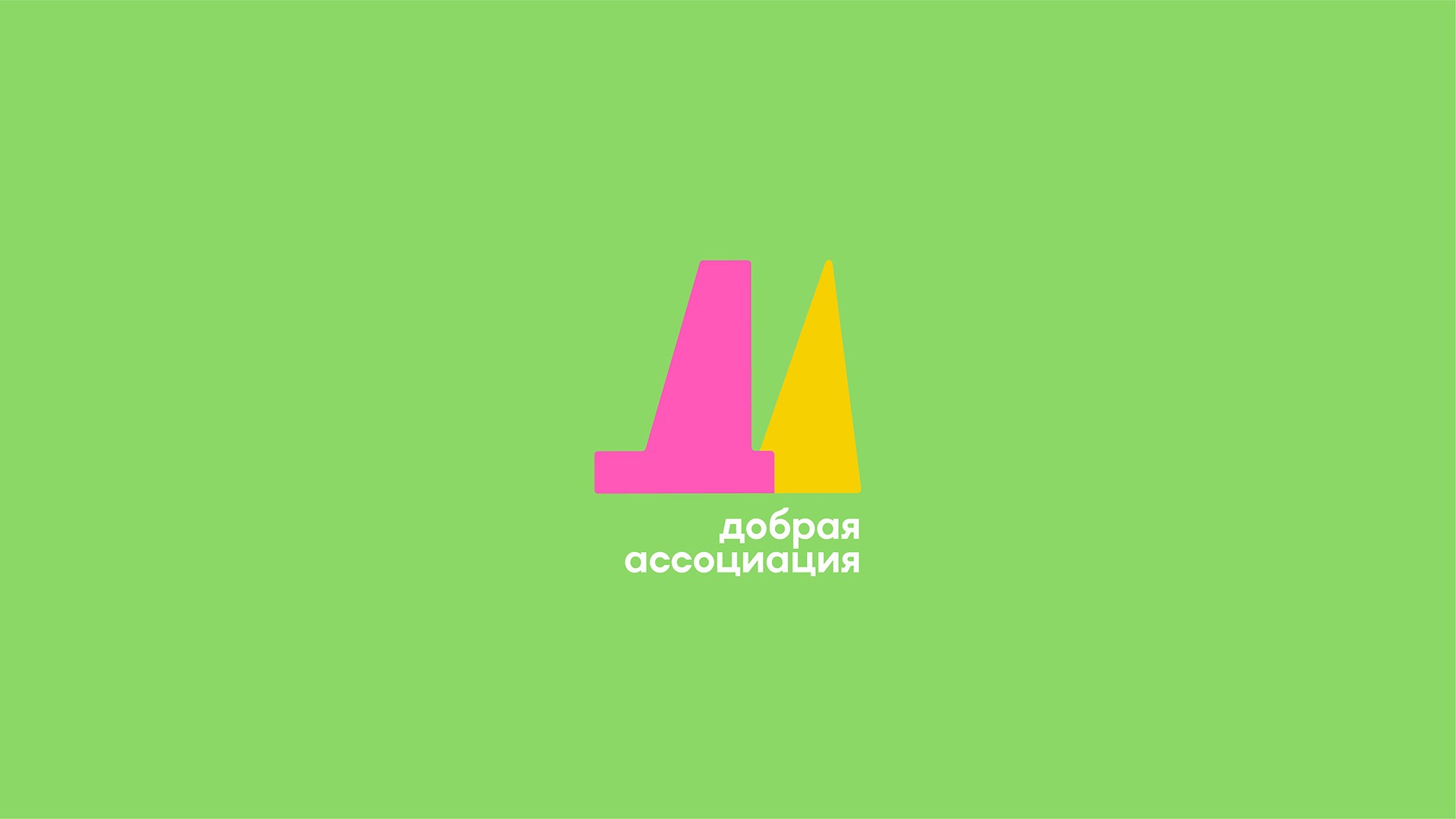
Charity is an area in which every DA (YES) becomes a hope, an important decision, sometimes the best one for someone’s life. For the charitable organization “Dobraya Assotsiatsiya” (Kind Association) from Belneftegaz, we have created a communication logo consisting of the abbreviation DA, emphasizing how important each DA is in the charitable sphere. Each DA is unique, so we asked different people to write DA and then translated them into graphic form, creating dozens of logo variations, dozens of important DA. All this formed the graphic environment for identity and communication.
Naming: We have not used words that can create any reference to vulnerability, weakness or insecurity from circumstances. After all, everything is only in our hands! So the name should reflect confidence in success and optimism, show the effectiveness of the foundation and its reliability.
Naming was created clear and memorable as a result of creative work, taking into account the positioning, the wishes of the client and the characteristics of the target audience. It has several meanings: “Dobraya Assotsiatsiya” (Kind Association) On the one hand, as an “association of goodness,” and on the other hand, the naming conveys all that is associated with good.
Logo and Identity: According to our author’s method of evidence-based design, we analyzed logos of charitable foundations and organizations: we studied all characteristic forms, colors and images in this niche both on the market of the Republic of Belarus and the Russian Federation and abroad. This allowed us to identify a unique graphic solution for the visual image of the charitable organization “Dobraya Assotsiatsiya” (Kind Association).
We have created a communication logo consisting of the abbreviation DA, emphasizing how important each DA is in the charitable sphere, which becomes a hope, an important decision, sometimes the best one for someone’s life. Each DA is unique, so we asked different people to write DA and then translated them into graphic form, creating dozens of logo variations, dozens of important DA. All this formed the graphic environment for identity and communication.



CREDIT
- Agency/Creative: Moloko Creative Design Agency
- Article Title: Charitable Foundation «Dobraya Assotsiatsiya» Identity by Moloko Creative
- Organisation/Entity: Agency
- Project Type: Identity
- Project Status: Published
- Agency/Creative Country: Belarus
- Agency/Creative City: Minsk
- Market Region: Europe
- Project Deliverables: Brand Identity, Branding, Design, Graphic Design, Logo Design
- Industry: Non-Profit
- Keywords: branding, identity, brand identity, logo, logo design
-
Credits:
Creative Director: Denis Misiulia
Designer: Rostislav Shcherbich
Development of positioning and naming concept: Dina Vasilevich, Vitalina Dubitskaya
Management: Olga Kazyaba, Anastasia Rabyko


