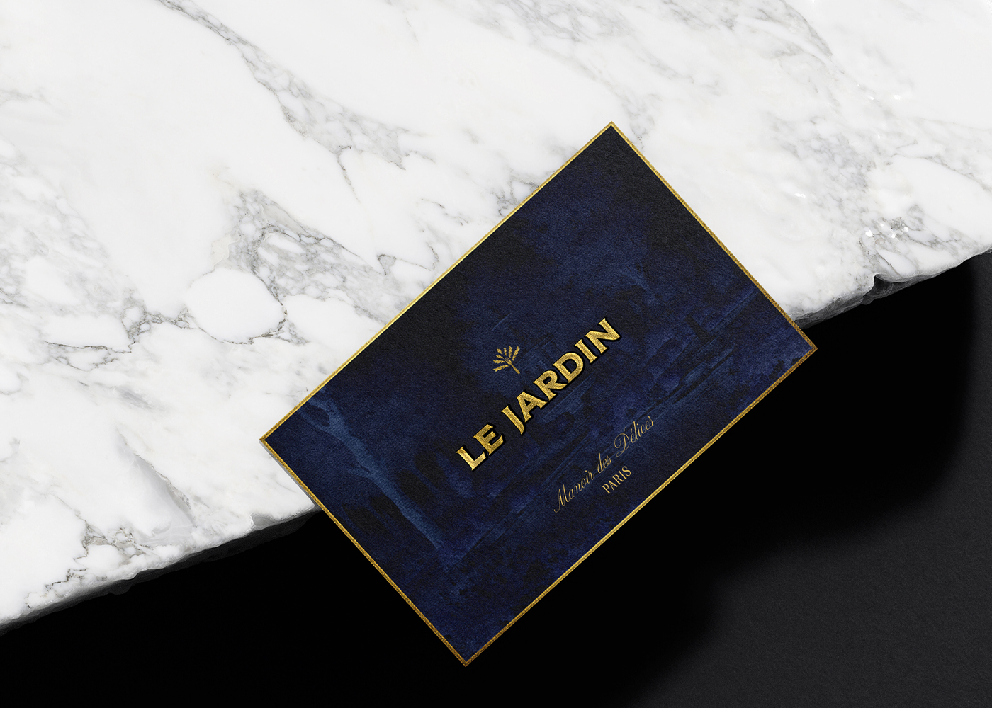
Le Jardin is an exclusive fine dining restaurant nestled in the heart of Paris, a city synonymous with elegance, culture, and culinary excellence. Le Jardin offers a dining experience that transcends the ordinary, blending the timeless beauty of French gardens with the sophisticated artistry of haute cuisine. Every aspect of Le Jardin, from its meticulously crafted menu to its refined ambiance, is designed to provide a luxurious and memorable experience for its discerning guests. This branding concept for Le Jardin delves into the intricate design choices, visual elements, and the overall narrative that define the brand’s identity.
The essence of Le Jardin lies in its ability to fuse tradition with innovation, offering a culinary experience that is both rooted in the heritage of French cuisine and forward-looking in its approach. The brand is inspired by the serenity and elegance of French gardens, where nature’s beauty is harmoniously cultivated. This inspiration is reflected in the restaurant’s design, ambiance, and overall brand identity, creating a seamless connection between the visual and sensory experiences.
The target audience for Le Jardin comprises individuals who appreciate the finer things in life—those who seek more than just a meal, but a culinary journey that engages all the senses. These are guests who value quality, sophistication, and authenticity. For them, dining at Le Jardin is an escape into a world where every detail is meticulously considered, where tradition meets modernity in perfect harmony, and where luxury is subtle yet profound.
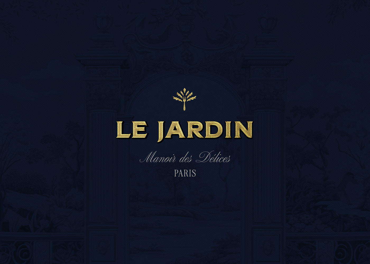
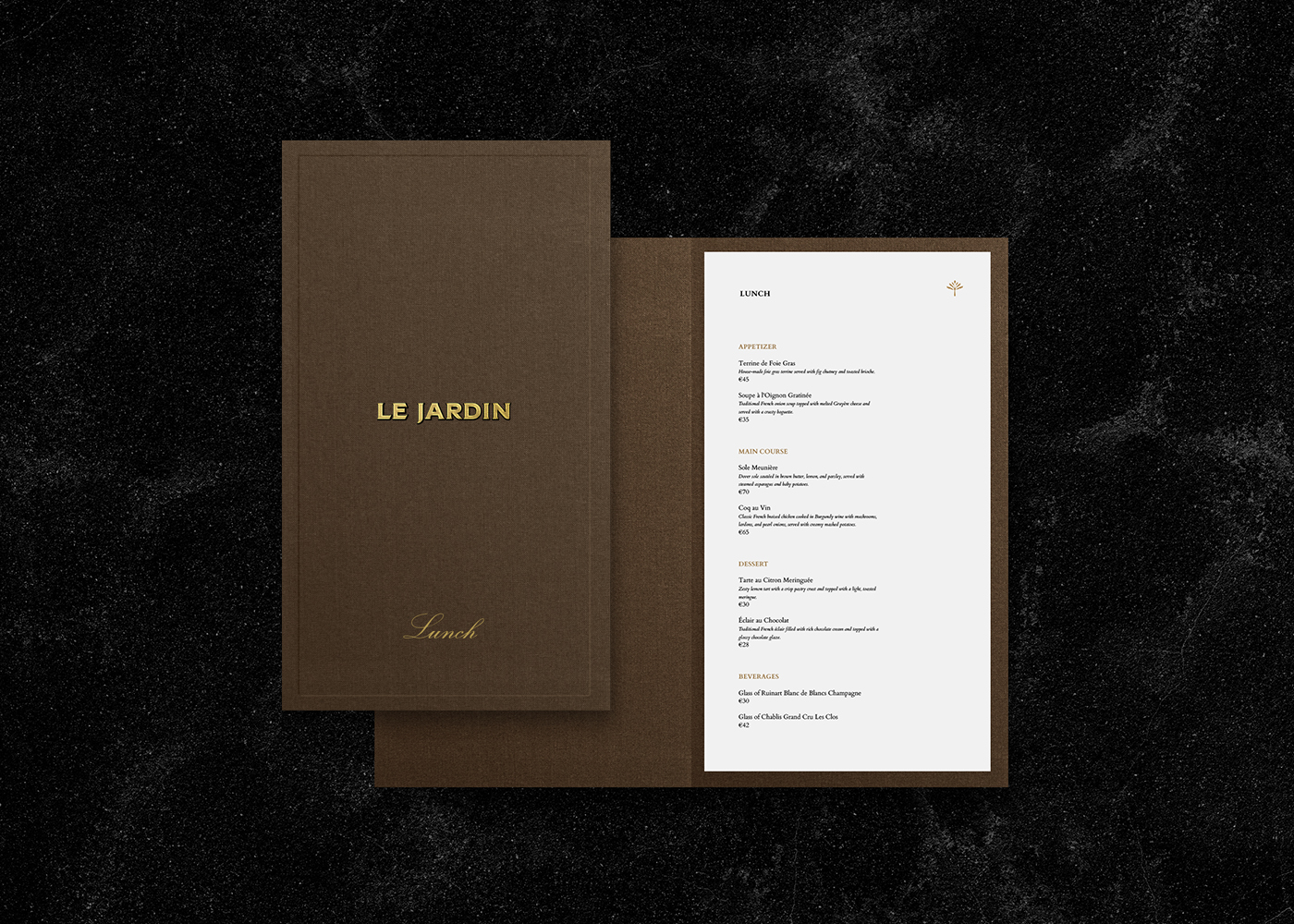
Typography plays a crucial role in conveying the brand’s values and personality. At Le Jardin, the choice of a classic serif font was intentional, serving as a nod to the rich history and sophistication of French culture. Serif fonts are known for their elegance, readability, and timeless appeal. They carry a sense of gravitas and tradition, qualities that align perfectly with the ethos of Le Jardin. The serif font used in Le Jardin’s branding speaks to the legacy of French cuisine, emphasizing the restaurant’s commitment to honoring tradition while presenting it in a contemporary context.
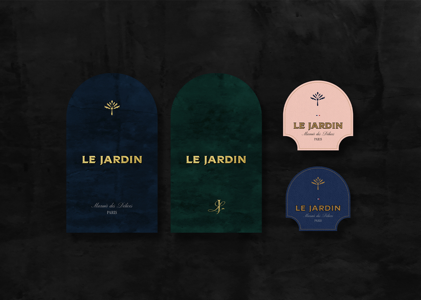
Complementing the serif font is a graceful script, introduced to add a layer of warmth and personalization to the brand. The script font is delicate and flowing, as if each word were penned by hand with care and intention. This typographic choice is more than just an aesthetic decision; it reflects the personal touch that Le Jardin extends to its guests. The script font evokes a sense of intimacy, inviting diners to feel at home in a setting that is both luxurious and welcoming.
The interplay between the serif and script fonts creates a dynamic yet cohesive visual language. The serif font establishes the brand’s authority and connection to tradition, while the script font softens the tone, adding a human touch that resonates with the restaurant’s emphasis on personalized service. Together, these fonts convey a message of elegance, sophistication, and timeless beauty.
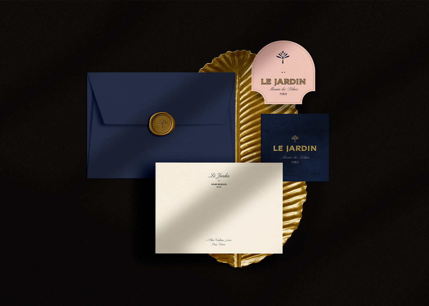
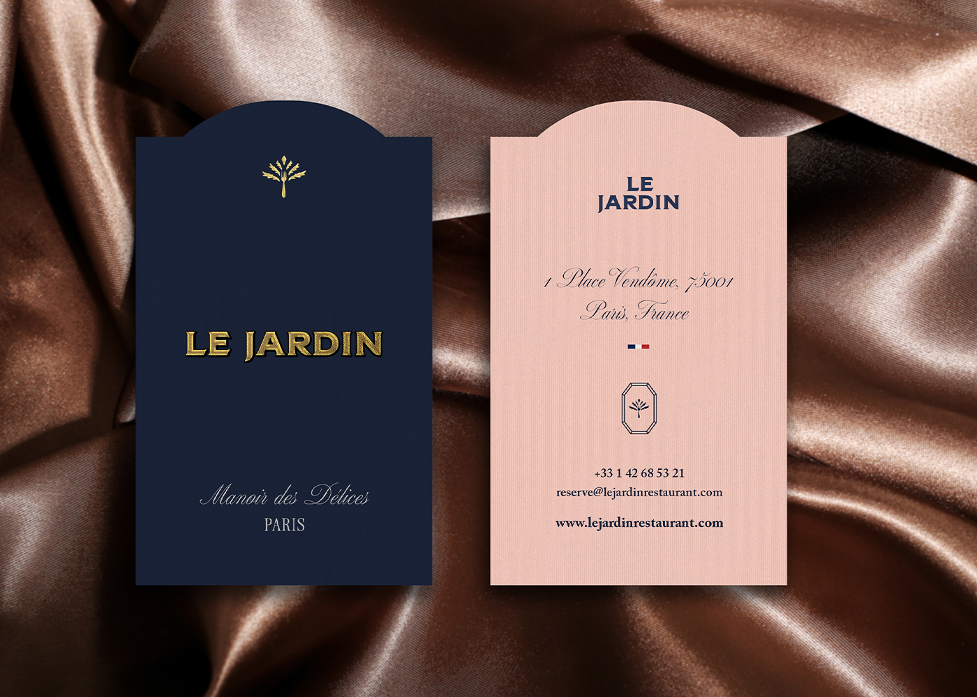
The color palette chosen for Le Jardin is a carefully curated selection of tones that reflect the brand’s core values of elegance, luxury, and serenity. The primary colors—Navy Blue, Peach Puff, Gold, and a Grape-Inspired Purple—each play a distinct role in shaping the restaurant’s visual identity.
• Navy Blue serves as the foundation of the palette, providing a backdrop of timeless sophistication. This color evokes the serene elegance of a Parisian evening, creating a sense of calm and stability. Navy Blue is often associated with trust, intelligence, and authority, making it an ideal choice for a brand that prides itself on offering an unparalleled dining experience.
• Peach Puff introduces a whisper of romance and warmth, balancing the formality of Navy Blue. This soft, muted tone adds a touch of intimacy to the ambiance, making the space feel inviting and comfortable. Peach Puff also enhances the overall aesthetic by adding depth and complexity to the color palette.
• Gold accents infuse the brand with opulence and grandeur. Gold is a color synonymous with luxury, wealth, and success. In the context of Le Jardin, gold is used sparingly, ensuring that its impact is both subtle and profound. The gold accents highlight key elements of the design, drawing attention to details that exemplify the brand’s commitment to excellence.
• Purple brings a rich, luxurious touch to the palette, symbolizing the tradition of French viticulture. This deep, elegant color ties the brand to the world of fine wine, reinforcing the connection between the restaurant’s culinary offerings and its carefully curated wine selection. The Grape-Inspired Purple also adds a sense of mystery and allure, inviting guests to explore the depths of Le Jardin’s offerings.
Together, these colors create a visual harmony that is both striking and understated, reflecting the balance between simplicity and opulence that defines Le Jardin’s brand identity.
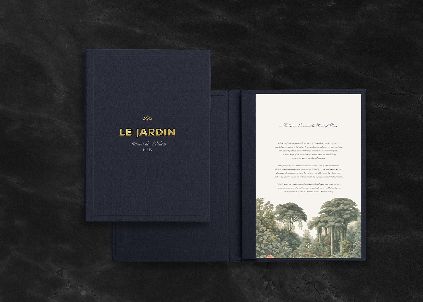
A key element of Le Jardin’s branding is the use of vintage garden illustrations. These hand-drawn illustrations serve as a visual bridge between the past and the present, evoking a sense of nostalgia while maintaining a timeless appeal. The illustrations are inspired by the classic beauty of French gardens, where nature is carefully curated to create spaces of tranquility and elegance.
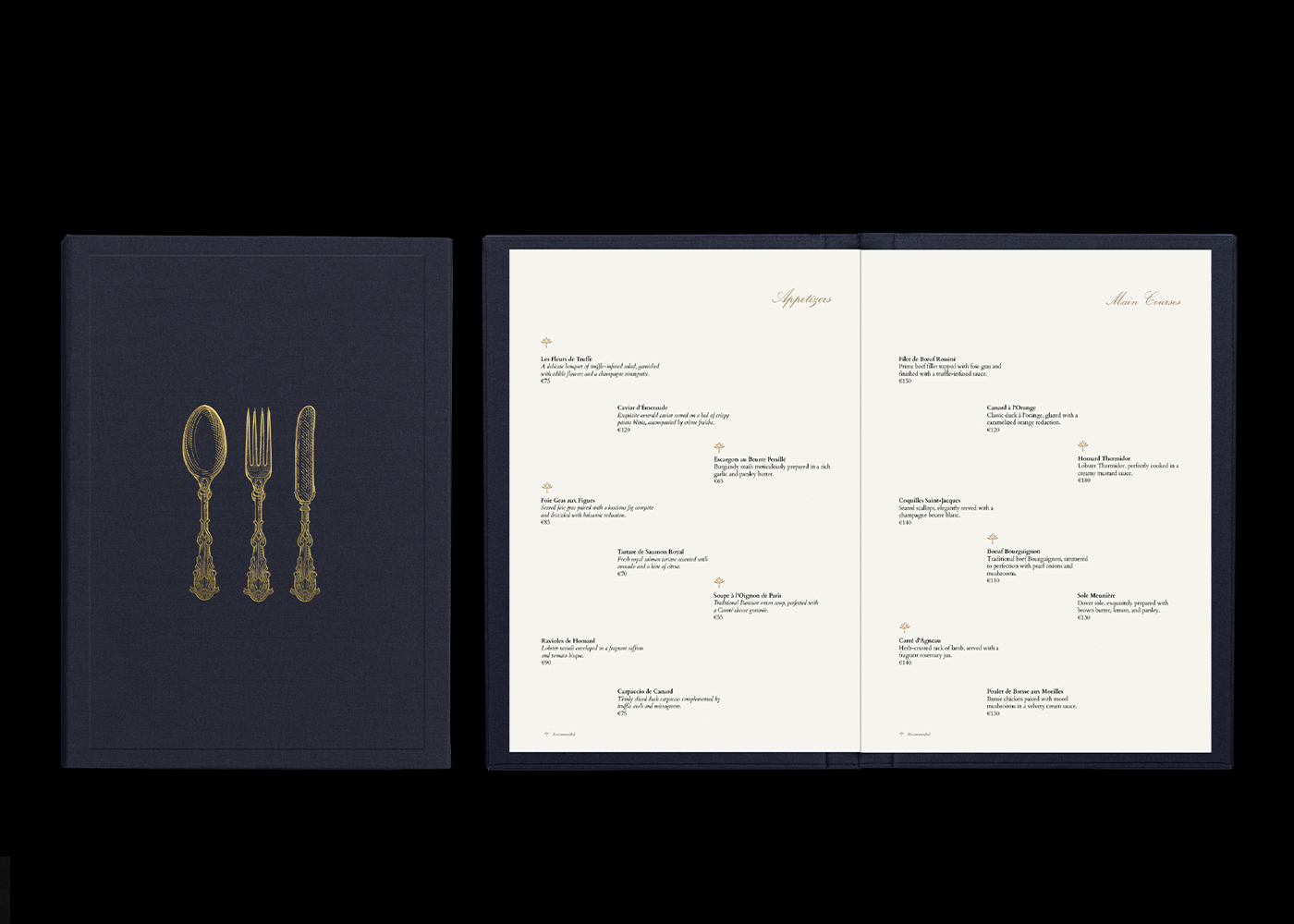
The illustrations are integrated into various aspects of the brand’s visual identity, including menus, signage, and promotional materials. Their delicate lines and intricate details add a layer of sophistication to the design, enhancing the overall aesthetic without overwhelming it. The use of vintage garden illustrations aligns with the brand’s commitment to honoring tradition while offering a modern dining experience.
These illustrations also serve a functional purpose, guiding guests through the restaurant’s offerings in a way that is both intuitive and visually pleasing. Whether it’s a delicate floral motif on the menu or a decorative border on the wine list, each illustration is thoughtfully placed to enhance the guest’s experience. The illustrations add depth to the brand’s narrative, reinforcing the connection between the elegance of French gardens and the sophistication of Le Jardin.
The Brand Experience: A Journey of Elegance and Taste
Le Jardin’s brand is not just a visual identity—it’s a complete sensory experience. From the moment guests enter the restaurant, they are enveloped in an atmosphere that resonates with the elegance and artistry of Paris. The design elements work in concert to create a space that is both luxurious and welcoming, where every detail is carefully considered to enhance the overall experience.
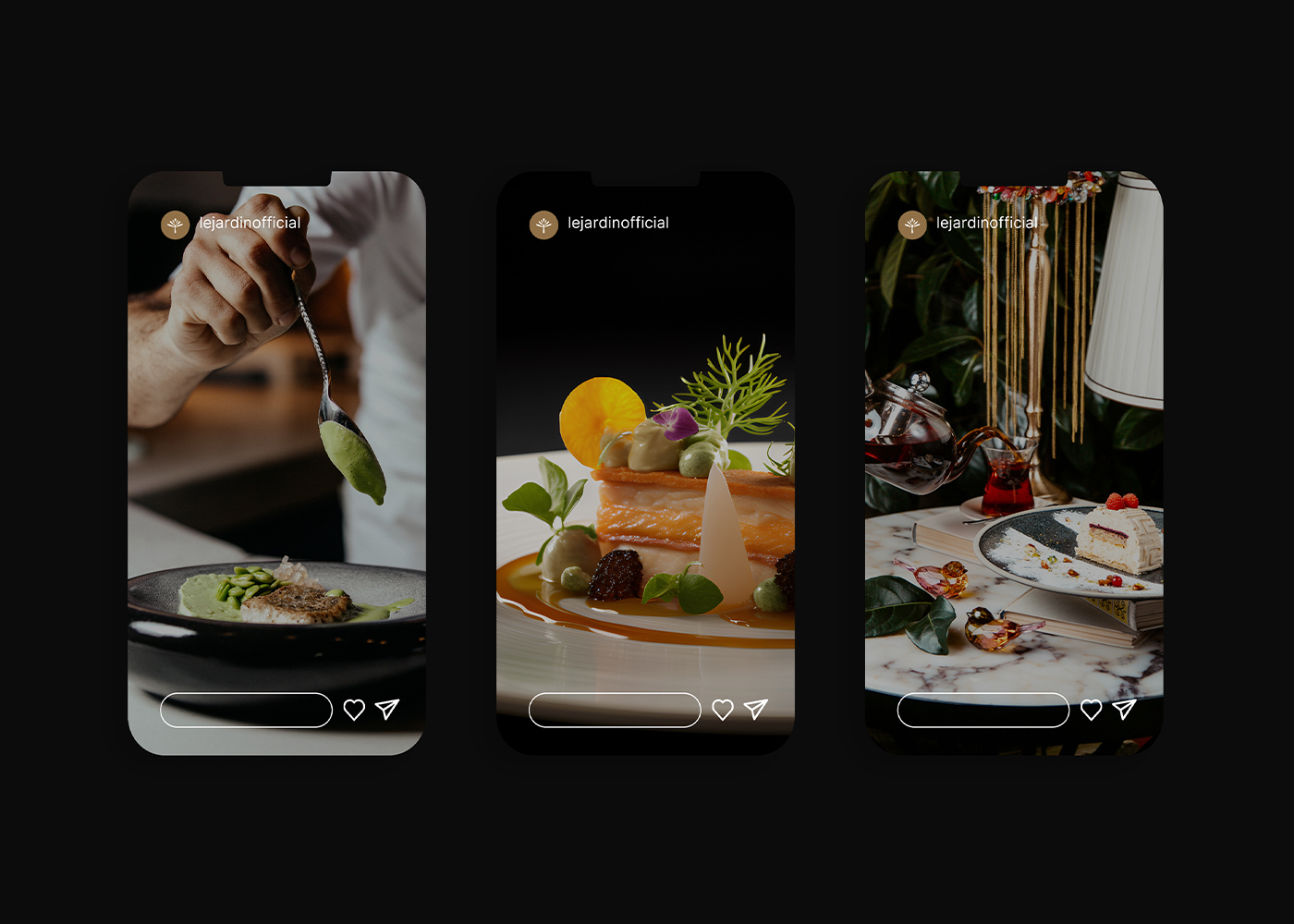
The brand experience at Le Jardin is one of quiet sophistication. There is no need for ostentation or extravagance; instead, luxury is conveyed through subtle details and refined touches. The combination of classic serif fonts, delicate script, vintage illustrations, and a rich color palette creates an environment where guests feel both special and at ease. The experience is immersive, engaging all the senses in a journey that celebrates the beauty of French culture and the art of fine dining.
Le Jardin’s commitment to minimalism is evident in the design’s restraint. Every element serves a purpose, contributing to the overall narrative without cluttering the visual or sensory experience. This minimalist approach allows the brand’s core values—elegance, luxury, and timelessness—to shine through, creating an identity that is as enduring as it is captivating.
CREDIT
- Agency/Creative: Chandor
- Article Title: Chandor Create Branding for Le Jardin, a Parisian Exclusive Fine Dining Restaurant
- Organisation/Entity: Agency
- Project Type: Identity
- Project Status: Published
- Agency/Creative Country: France
- Agency/Creative City: Chandor / Jakarta - Indonesia
- Market Region: Europe
- Project Deliverables: Brand Design, Brand Identity, Brand Mark, Brand Naming, Brand Strategy, Branding, Editorial Design, Graphic Design, Logo Design, Poster Design
- Industry: Hospitality
- Keywords: Branding, brandidentity, elegant, restaurant, finedining, minimalism, classy, timeless
-
Credits:
Creative Director: Azoin Arilv Zeneing
Brand Design: Allzoin


