


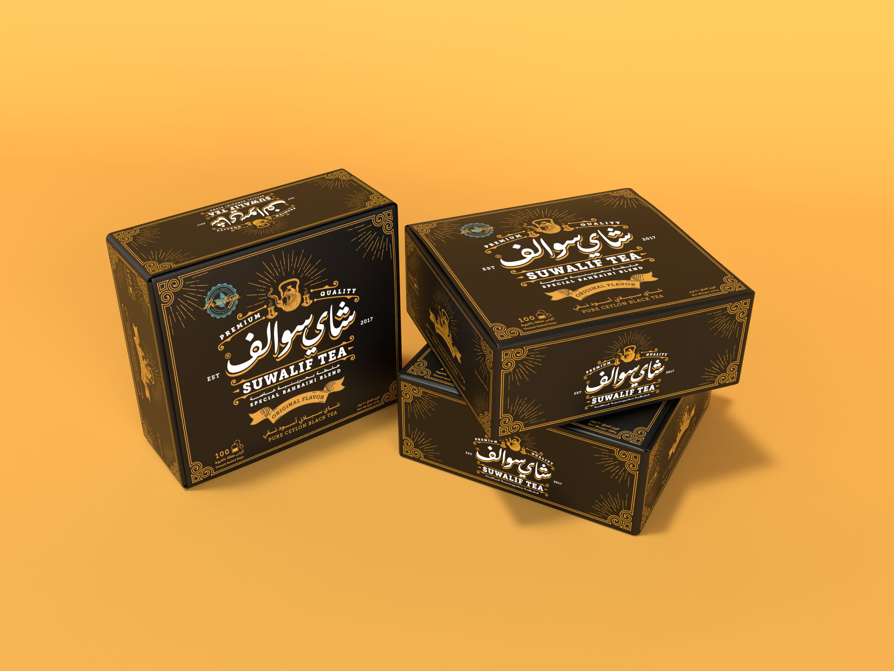
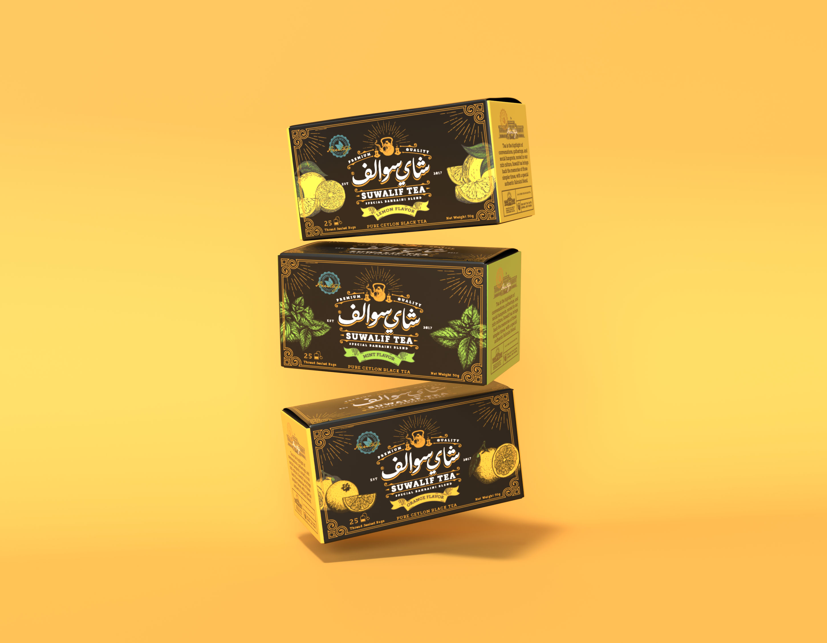
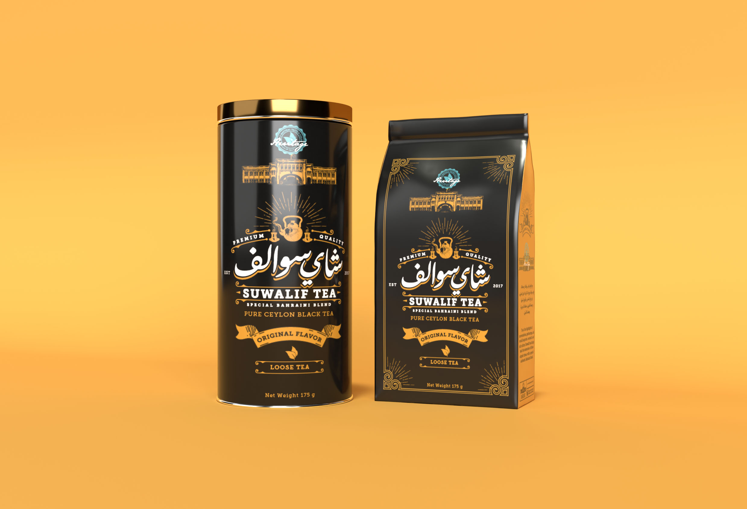
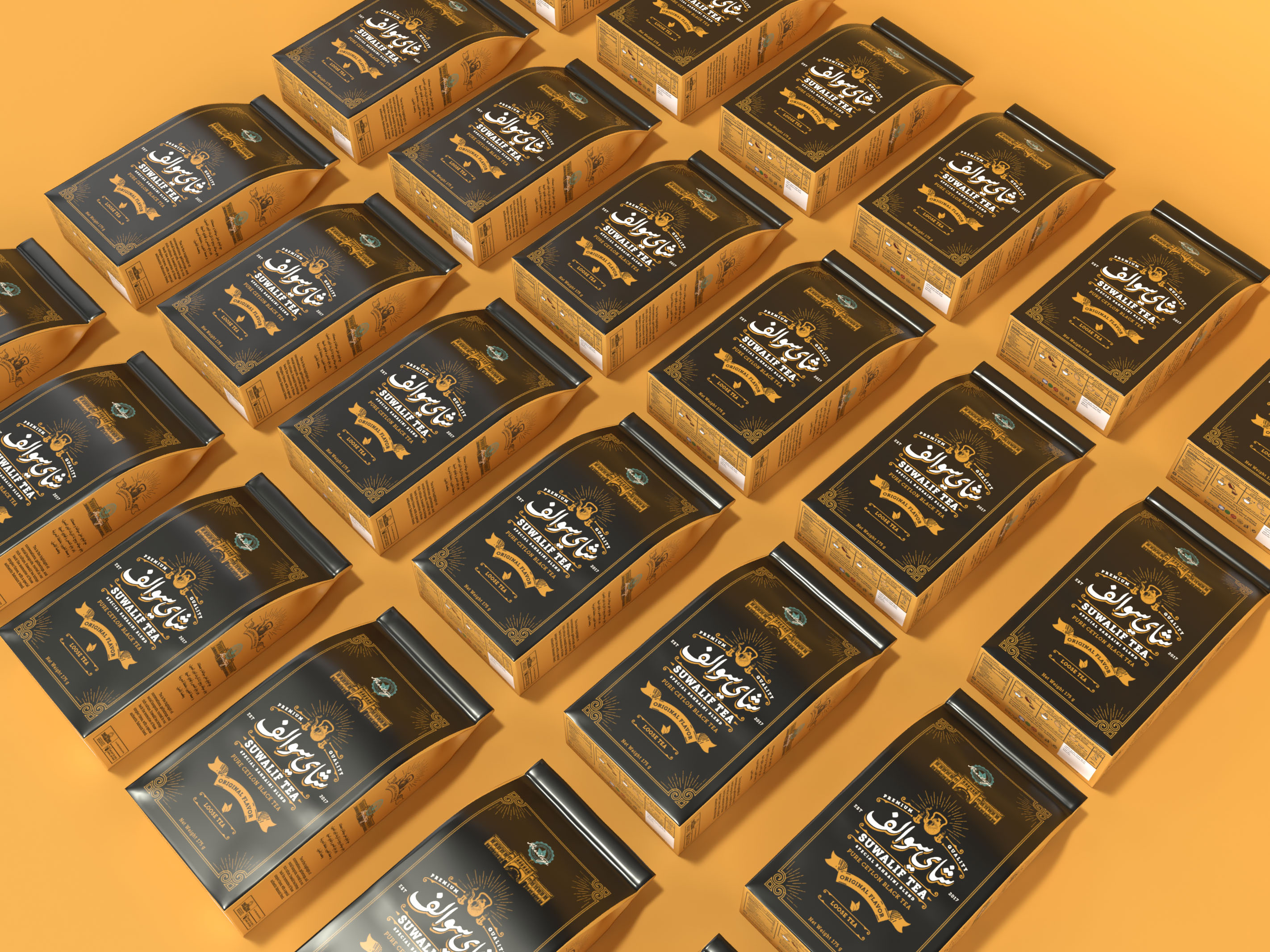
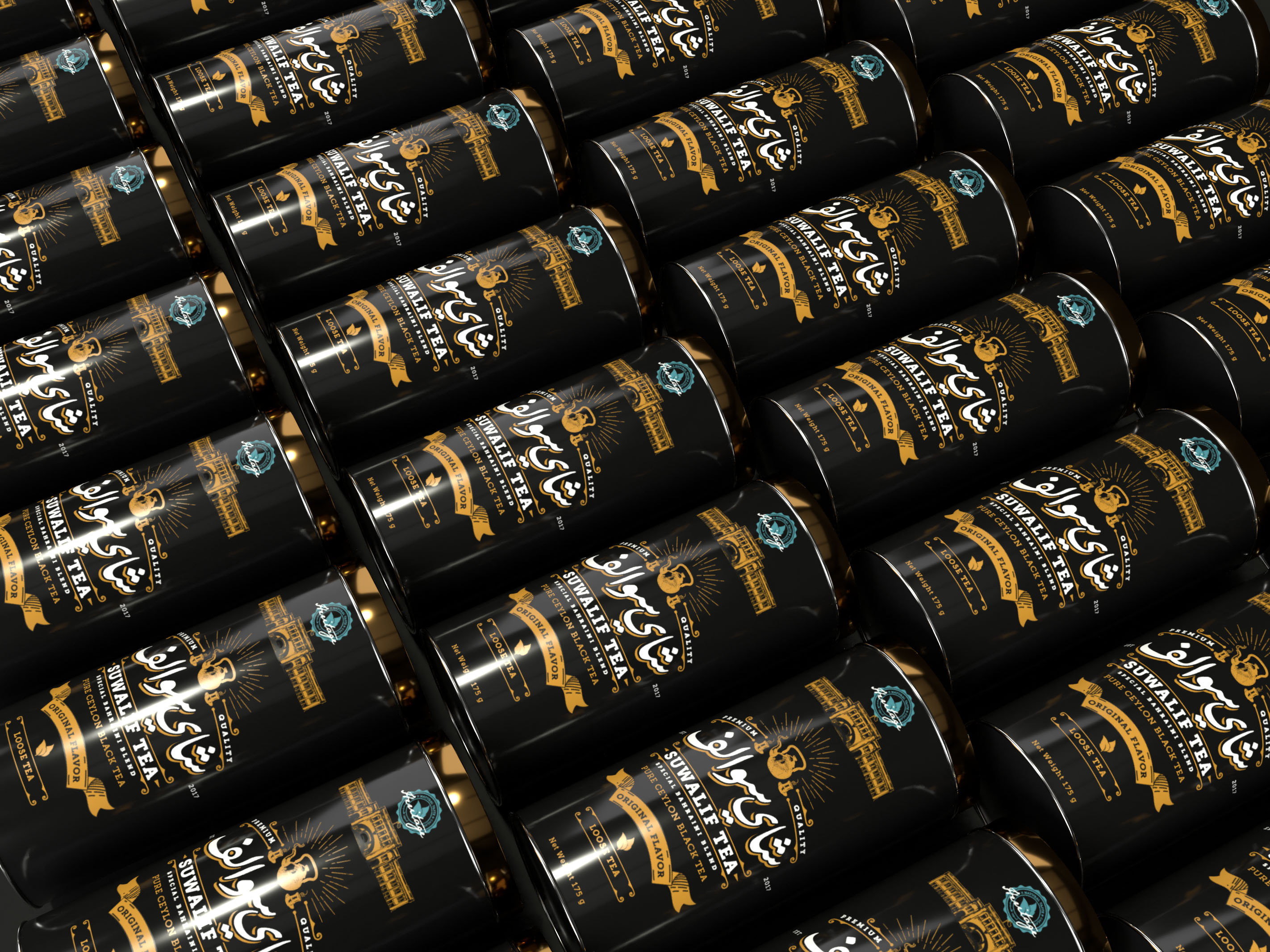
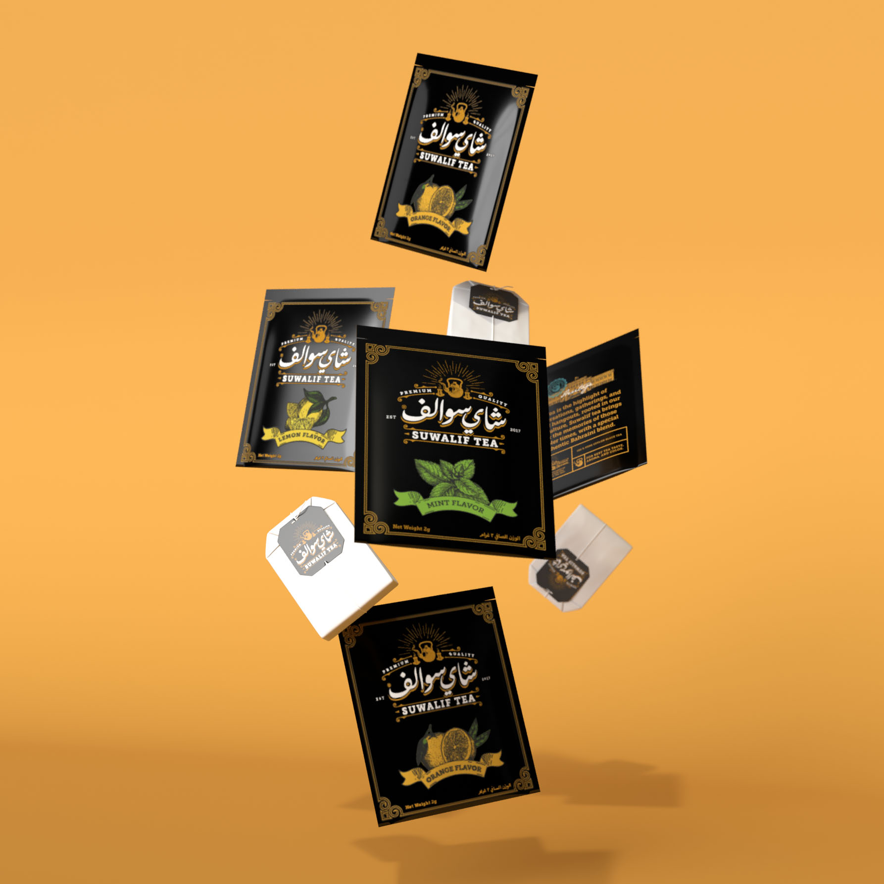
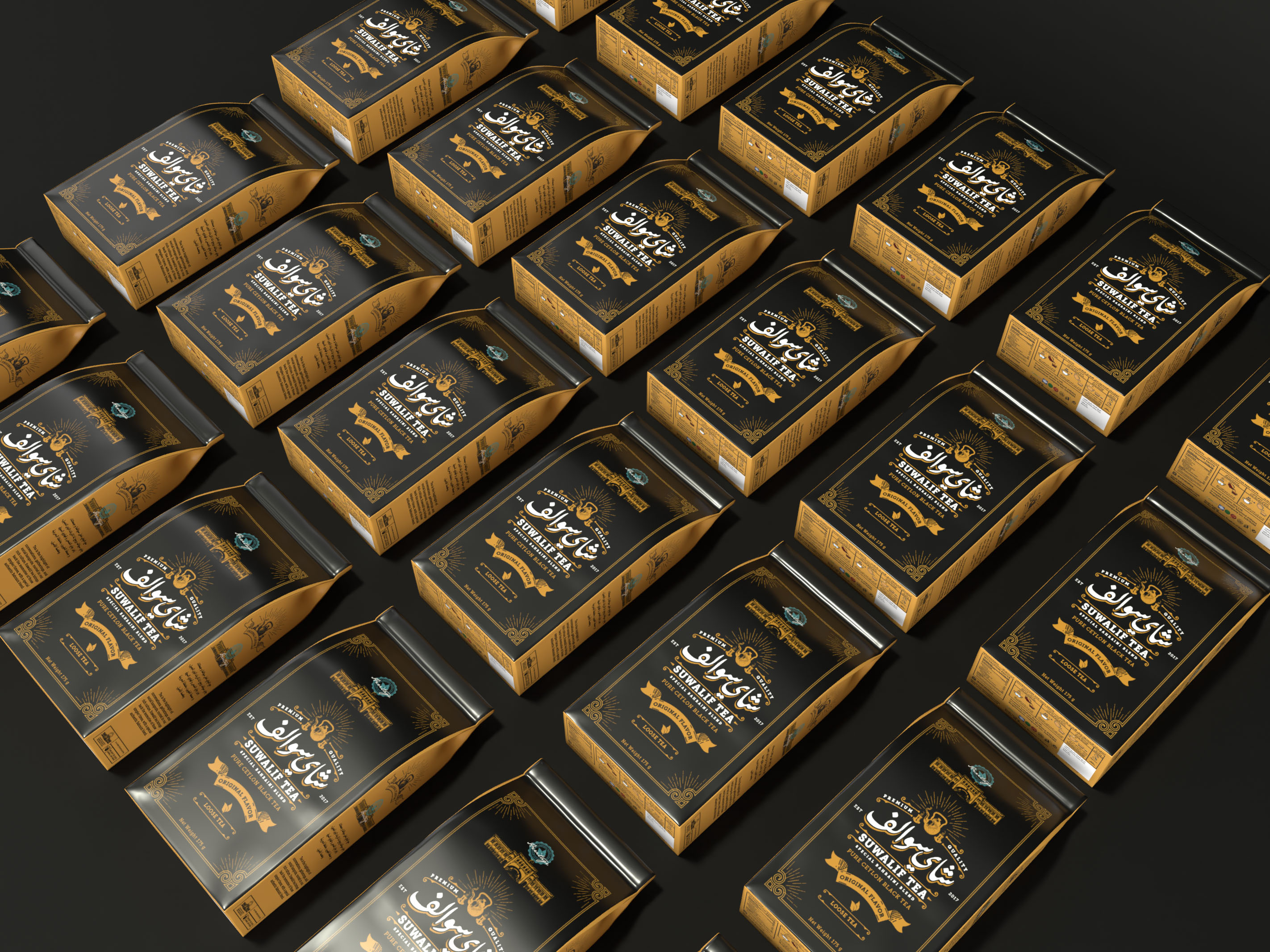
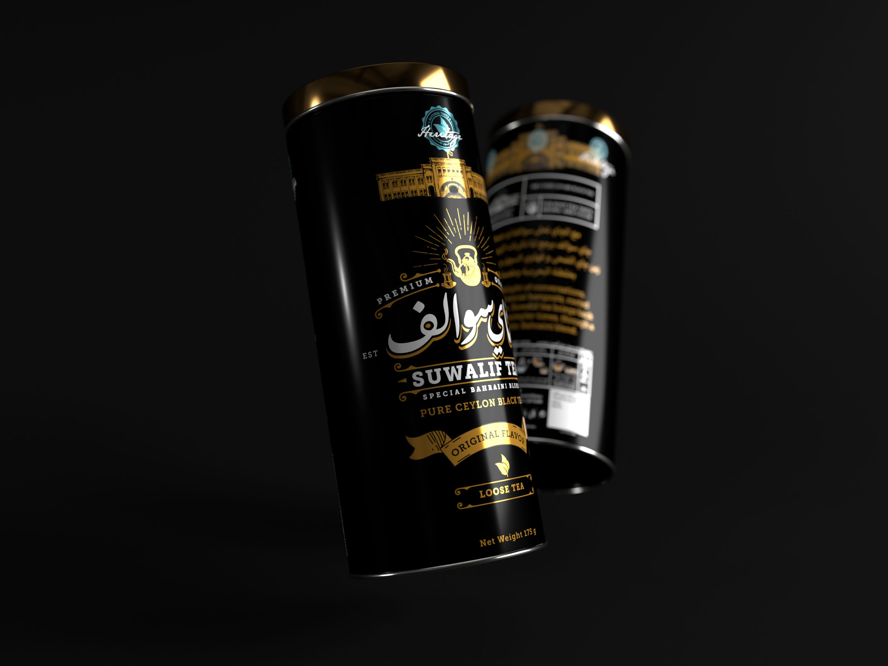
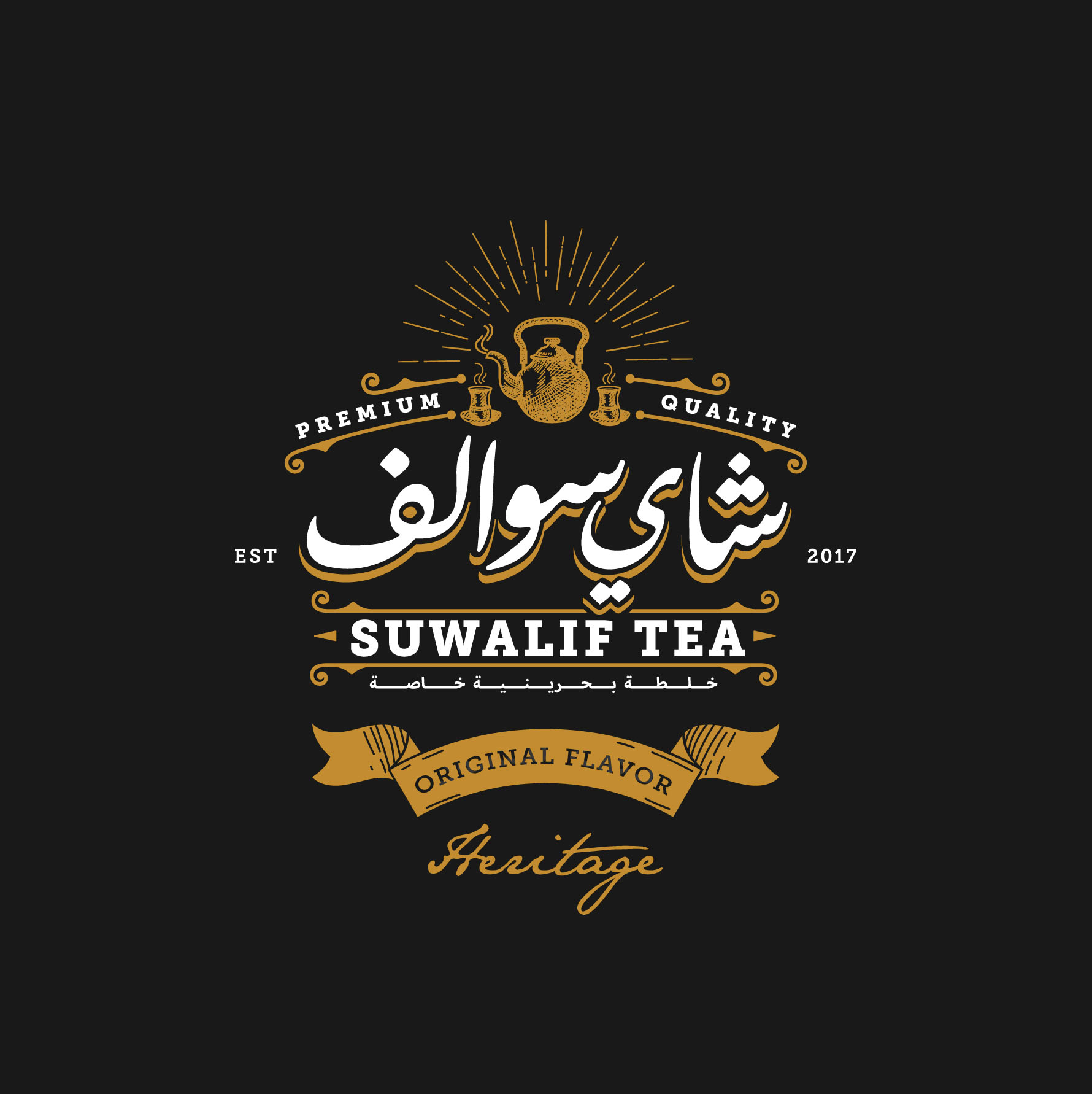
“Suwalif” in Arabic means conversations, often associated with drinking tea as the preferred social drink served during hangouts, family visits, deeply rooted in the heritage of Bahraini people where their main hangouts were the traditional cafes in the heart of the “Souqs” of Manama the capital of Bahrain. So the design was trying to depict a vintage style to leverage that tie between tea and the act of socializing back in the ’50s. The dark black color was chosen to differentiate the brand from the rest of the existing big brands on supermarket shelves, also to have that classical packaging feel to be in line with the story behind the brand.
CREDIT
- Agency/Creative: Chameleon Creative Studio
- Article Title: Chameleon Creative Studio Redesigns Suwalif Tea Packaging
- Organisation/Entity: Agency, Published Commercial Design
- Project Type: Packaging
- Agency/Creative Country: Bahrain
- Market Region: Middle East
- Project Deliverables: Brand Redesign, Packaging Design, Research
- Format: Bag, Box, Can, Tin
- Substrate: Metal, Pulp Paper
FEEDBACK
Relevance: Solution/idea in relation to brand, product or service
Implementation: Attention, detailing and finishing of final solution
Presentation: Text, visualisation and quality of the presentation


