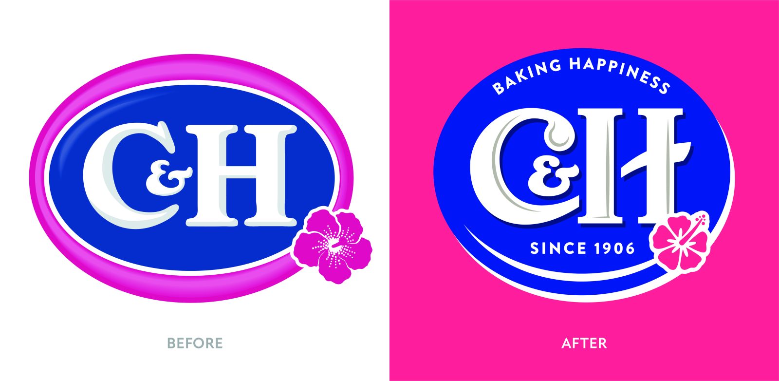
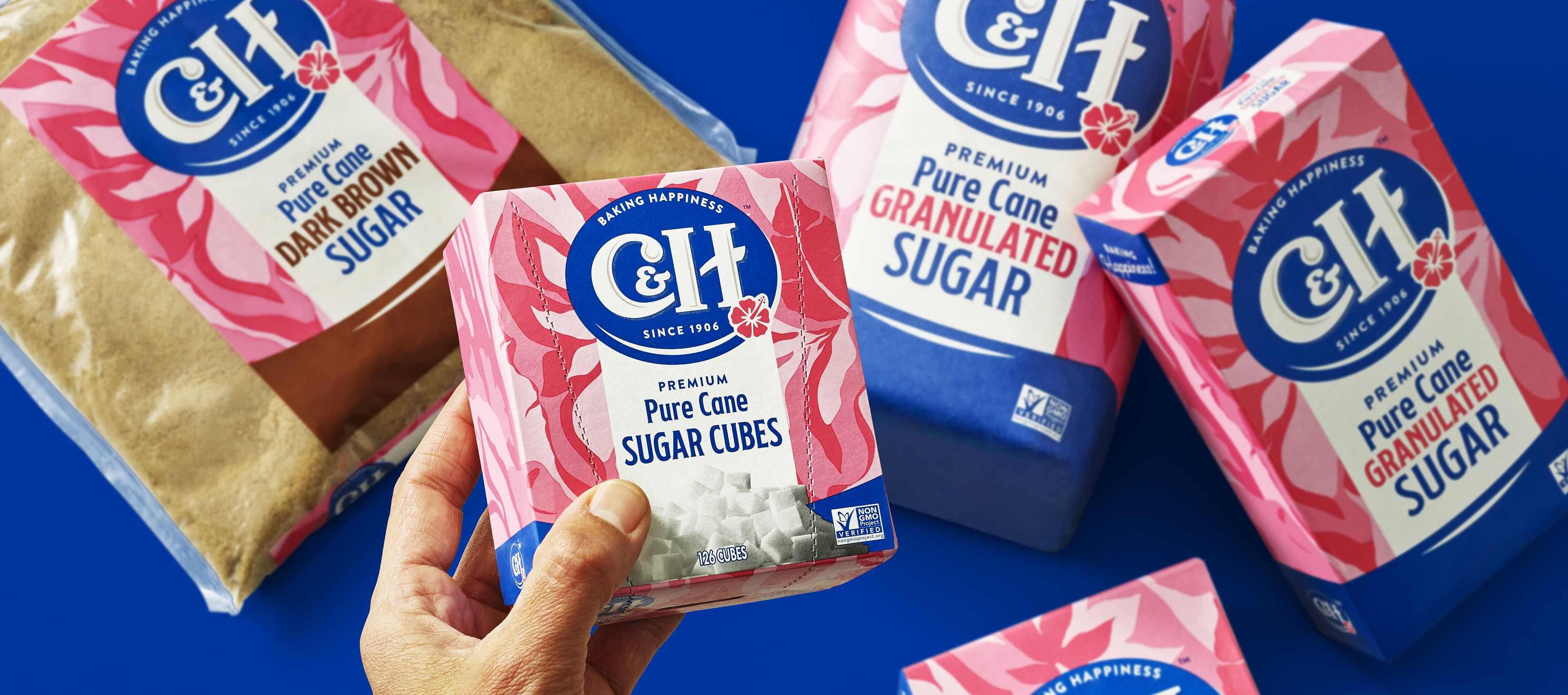
When global sugar cane company ASR Group wanted to redesign its West Coast sugar brand, C&H(TM) Sugar, they came to Equator. The brand’s identity had remained unchanged for a few decades and ASR wanted to ensure modern-day consumers could relate to and connect with it. They requested a redesign that would resonate with existing and aspirational customers alike and include a refresh of both the logo and the packaging.
Our team began with a thorough exploration of the category, tracking recent shifts and mapping the direction in which it was heading. Noting a shift away from the stringent anti-sugar movement and towards an ‘everything in moderation’ approach that framed sugar as an acceptable source of enjoyment, we developed an emotive concept based around the joy and happiness people experience when baking for themselves and others.
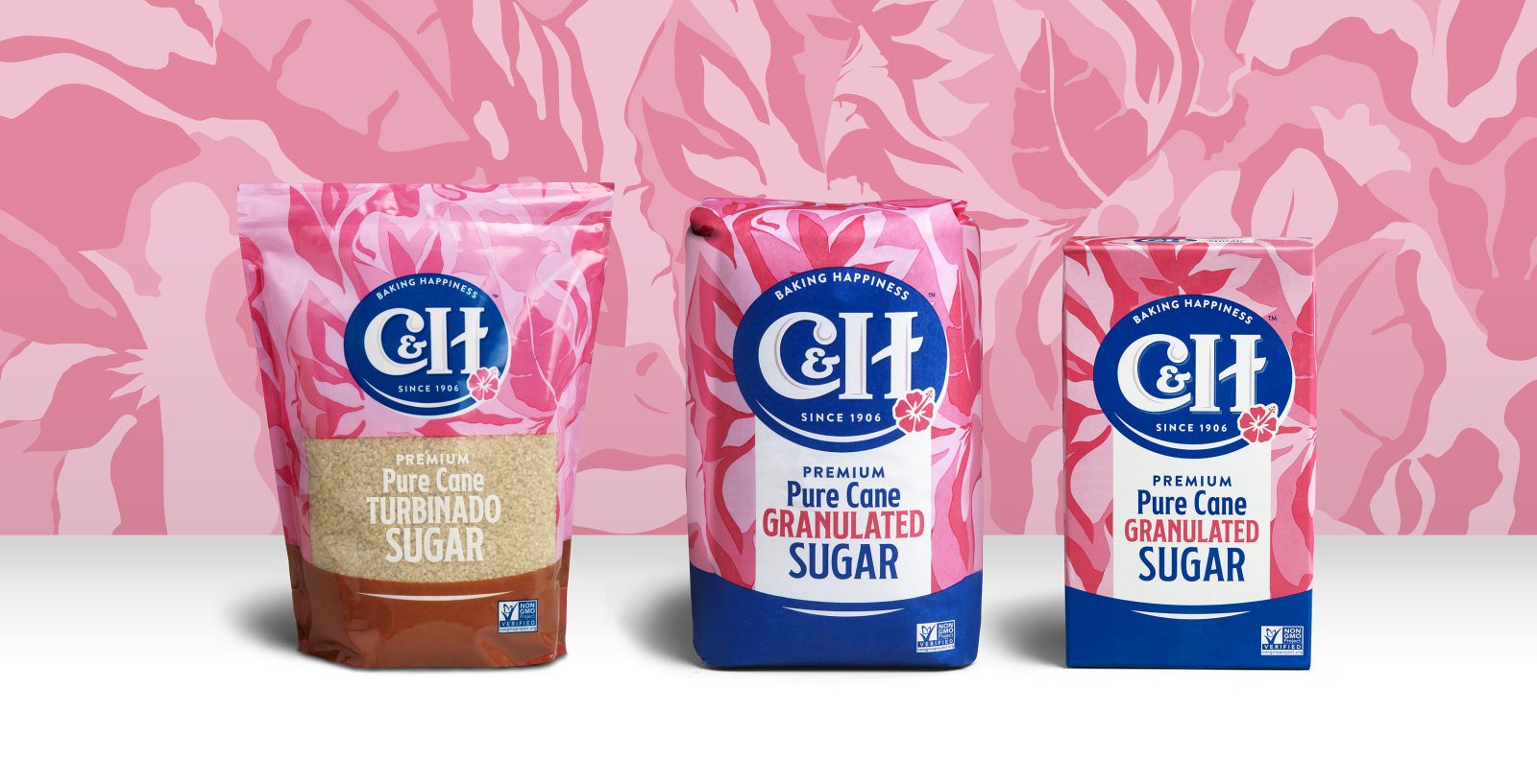
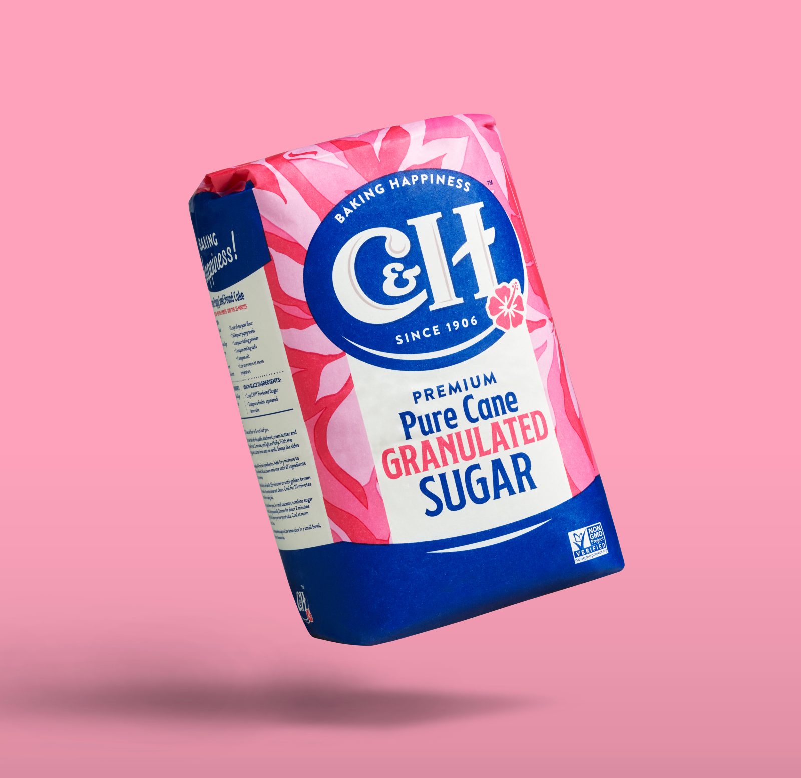
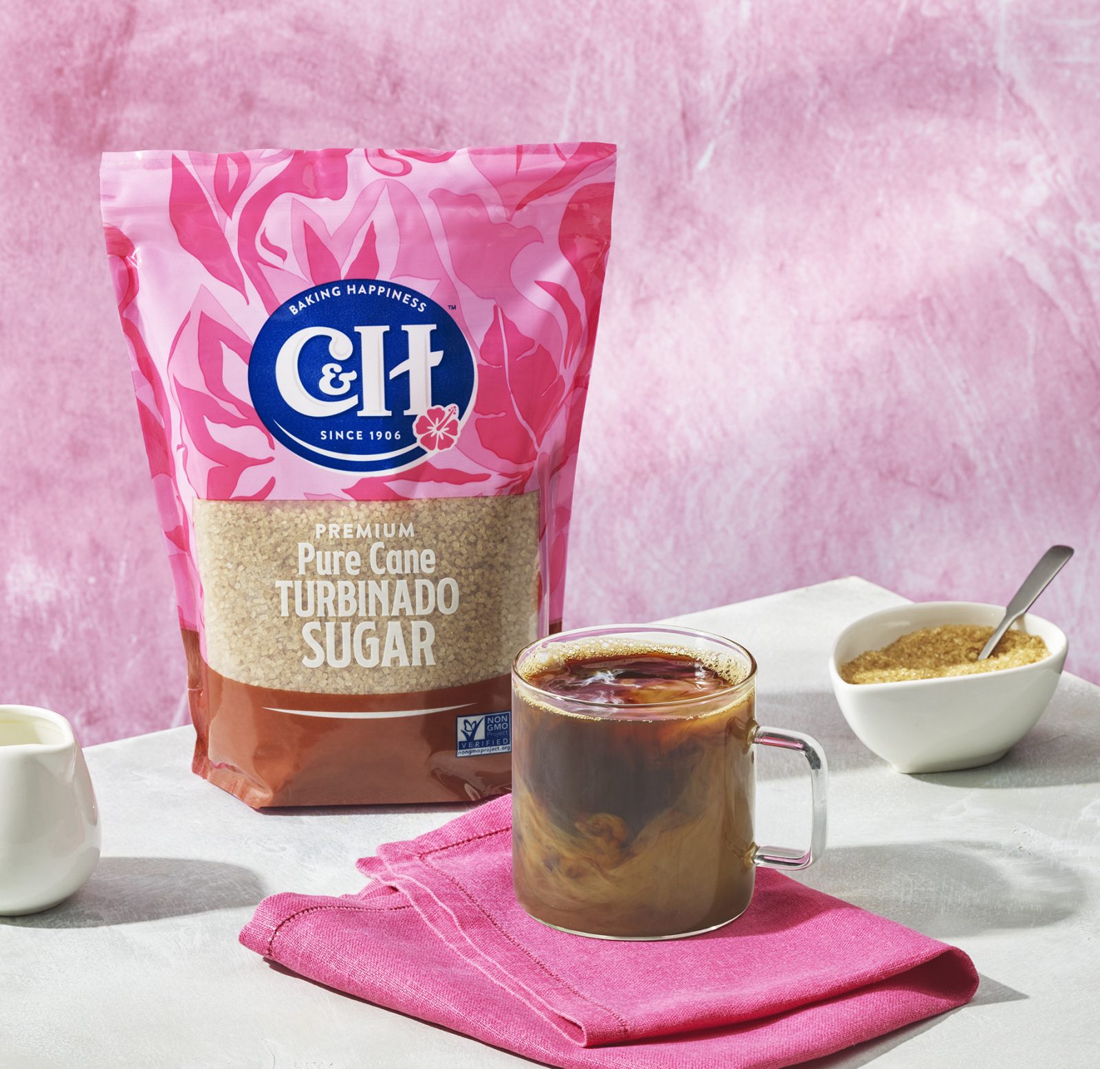
We also paid close attention to the brand’s origin. As the name C&H(TM) was derived from the states of California and Hawaii (where the sugarcane was originally grown and harvested), we wanted to incorporate this into the redesign. We carried over the hibiscus from the old logo to keep this tropical aesthetic and our in-house illustrators developed a botanical background for the packs in pink, their brand color. The pattern is lush but also uplifting and expressive at the same time and brings together the brand’s tropical elements with the emotive aspects of happiness and joy that it seeks to elicit from consumers.
The overall design breathes new life into this pantry favorite, highlighting its tropical origins and communicating the everyday pleasure to be found in baking for friends and family. By comprehensively researching category and consumer, we were able to ensure that, when it came to C&H’s consumer base, the baton could be handed seamlessly from older generations to Millennial parents and Gen Z shoppers.
CREDIT
- Agency/Creative: Equator Design
- Article Title: C&H Sugar Packaging Redesign
- Organisation/Entity: Agency
- Project Type: Packaging
- Project Status: Published
- Agency/Creative Country: United States
- Agency/Creative City: Chicago
- Project Deliverables: Packaging Design
- Industry: Food/Beverage
- Keywords: WBDS Agency Design Awards 2022/23


