


Background: The Grape Collective is a Swedish wine company that was founded to bring playfulness and joy into a conservative and pretentious category. Wine should be enjoyed by all people and not just judged by some. The content and design of the products is the company’s primary communication channel. The name and label of each product must describe the wine, break with the competitors’ wine aesthetics, support the sellers with arguments and at the same time entertain the consumer.
Brief: Relate to The Grape Collective’s product philosophy and create concepts, names and graphics for a neutral Spanish red wine. The wine is neither strong nor light, rough or sweet. It is not unique in any way but also never wrong.
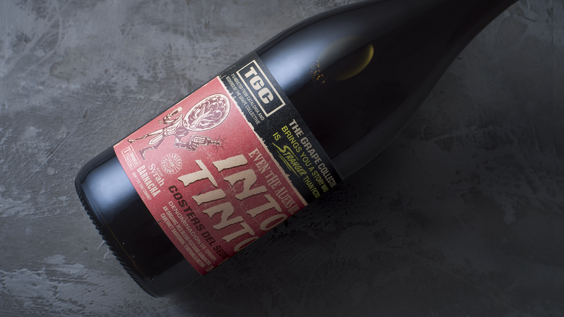
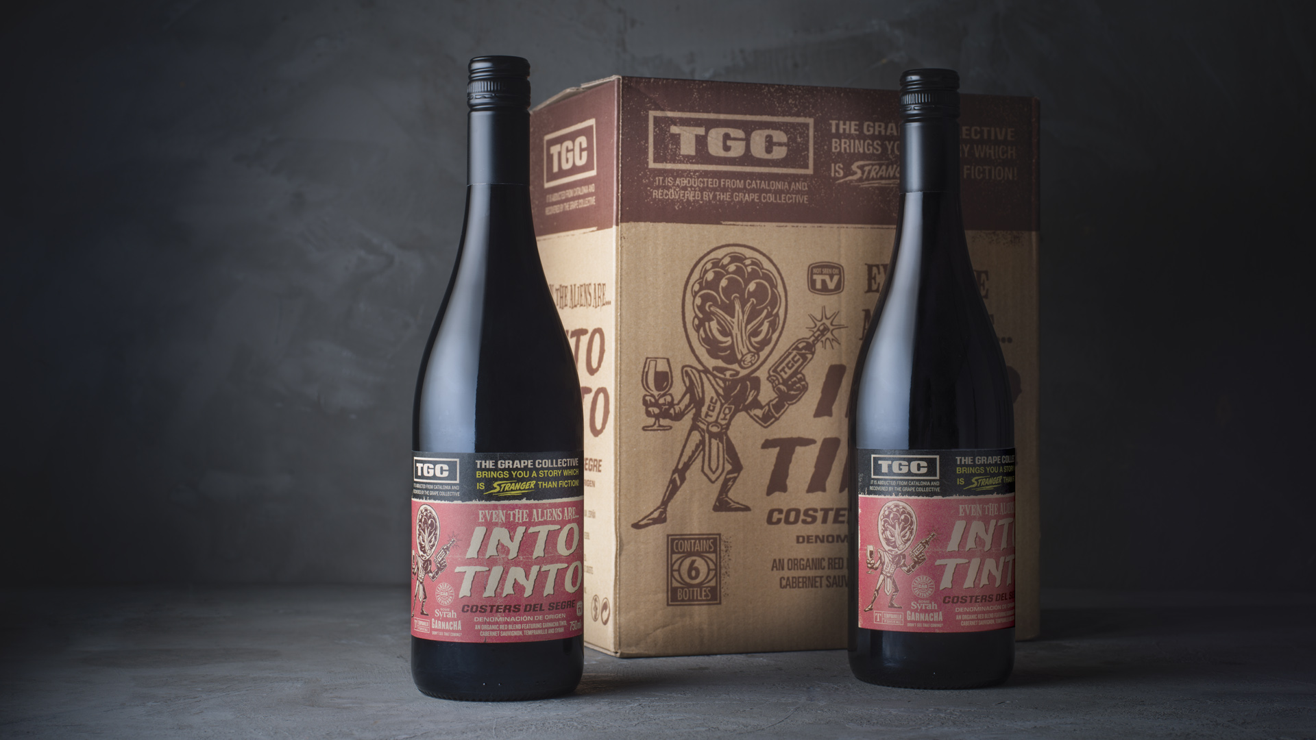
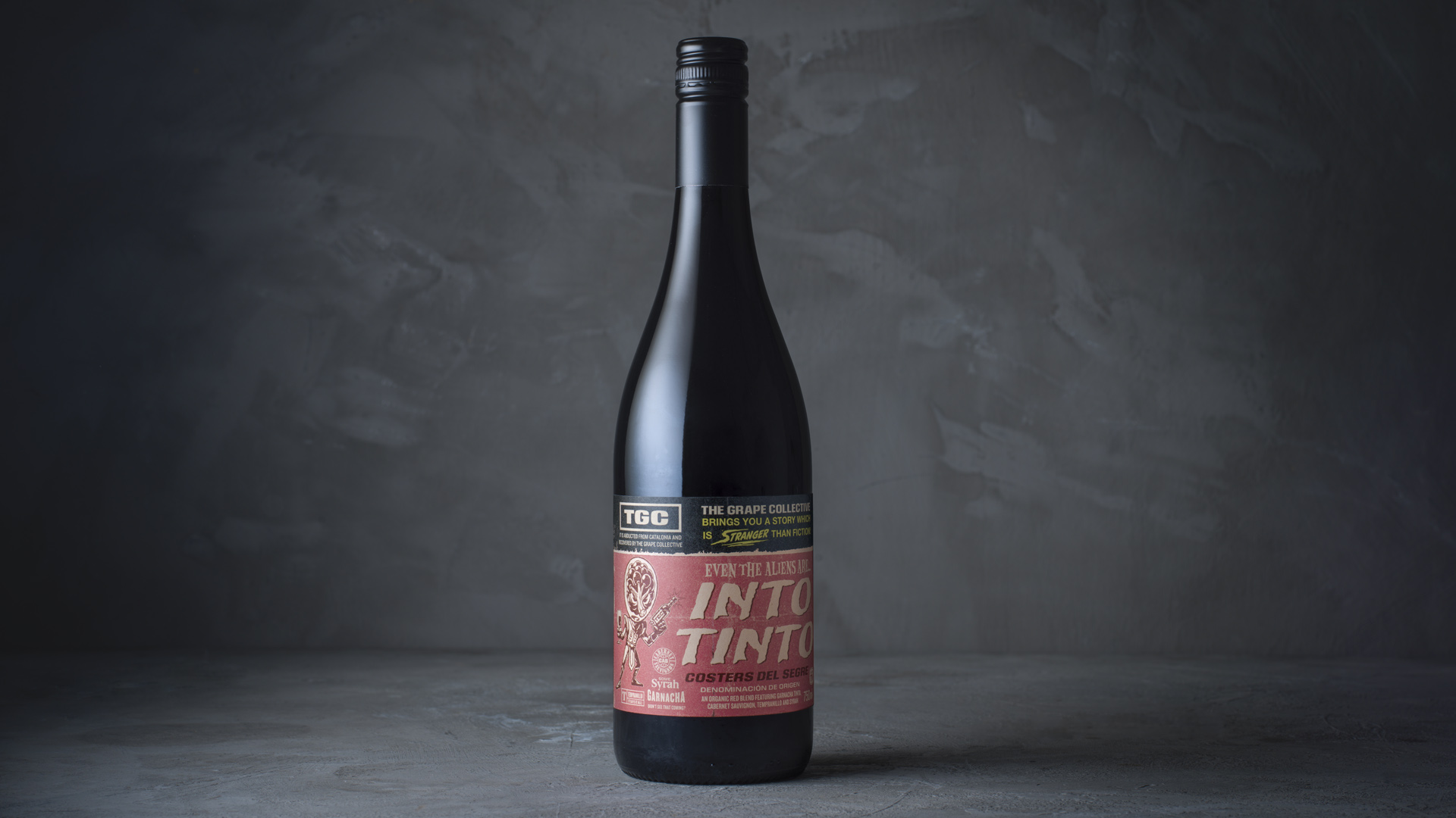
Solution: The Spanish translation for red wine is “Vino Tinto”, a name that is commonly known by most Swedish wine consumers. “Into Tinto” became a play with letters and words, creating a name that was easy to remember, was visually powerful and had the potential to build a larger concept on. A neutral wine is usually seen as negative among wine connoisseurs, we saw it in a different way: As this red wine is neither too heavy nor too light, it appeals to a larger and wider target group. In fact, most people like Tinto, from average Joes to royalties and everything in between (mods, rockers, anti vaxxers and news anchors).
This wine is definitely something that you can agree upon. To prove our point, we applied our thesis together to an extremely small and picky target group on the label: visitors from outer space with heads made of grapes. If even these aliens are into Tinto, tell me who isn’t into Tinto?
Aesthetics
The concept was inspired by the sci-fi movies from the 50’s and 60’s. We saw that imperfection and the analog aesthetics were suitable for a category which get its premium cues through irregularity and signs of manual production. The space race had a big impact on creative industry.
Music, fashion and transportation made us ready to meet the new unknown. The grape head borrowed it looks, gestures and features from this period. With some minor adjustments, “the grape head” borrowed it looks, gestures and features from this specific period.
The logo was one of the most important elements. To avoid that the label became too childish or obvious, it had to incorporate a sense of mystery instead of just than being retro futuristic. Making this a label that you want to discover in detail, we decorated every square inch with graphic elements and information.
CREDIT
- Agency/Creative: CH Graphiste
- Article Title: CH Graphiste Design Label for Into Tinto Wine
- Organisation/Entity: Agency
- Project Type: Packaging
- Project Status: Published
- Agency/Creative Country: Sweden
- Agency/Creative City: CH Graphiste/Stockholm
- Market Region: Europe
- Project Deliverables: Brand Creation, Copywriting, Packaging Design
- Format: Bottle
- Substrate: Glass Bottle
- Industry: Food/Beverage
- Keywords: wine, packaging design, Science fiction, Spanish wine
-
Credits:
Designer/copy writer: Henrik Hallberg
Illustrator: Mikael Eriksson


