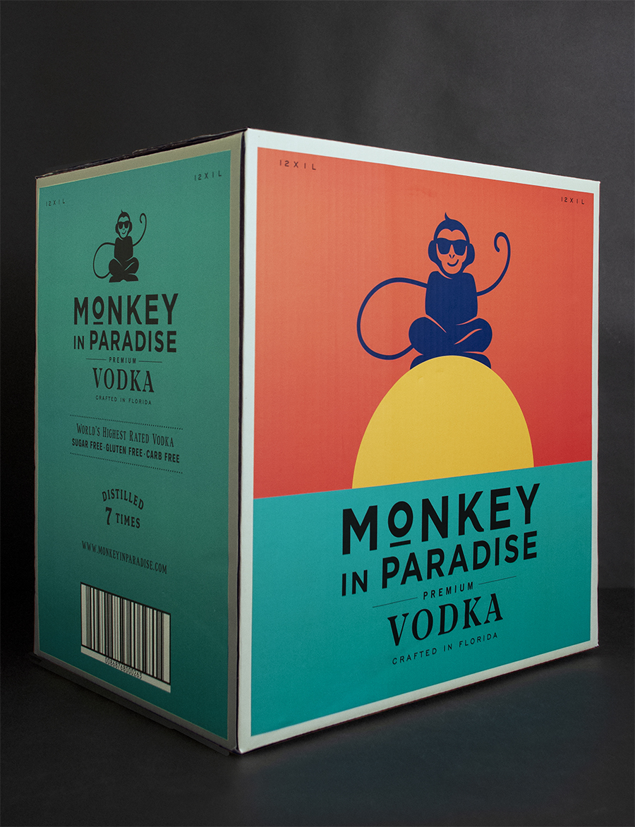
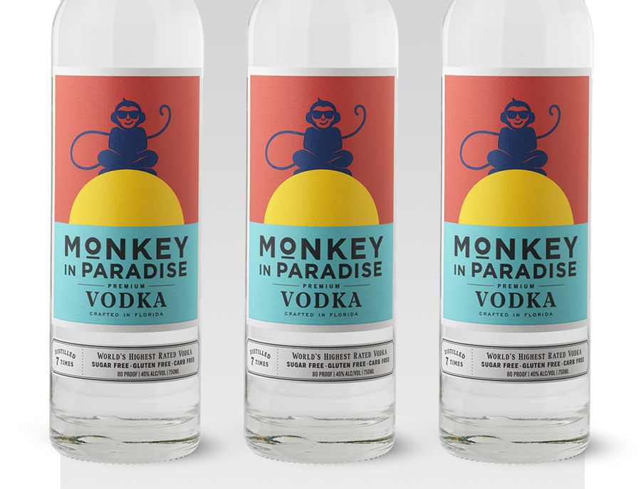
Monkey in Paradise is an award-winning vodka crafted in Florida. Although they had received the highest accolades in the most respected industry competitions, the look and feel of their packaging did not support and communicate the premium quality of their product. CF Napa Brand Design was tasked with completely revamping the fledgling vodka brand to communicate the premium position it earned and deserved. The goal was to better position the brand within the cocktail beach culture of their home state of Florida. The new packaging needed to appeal to the millennial consumer and reflect the vodka’s status as an award-winning spirit, without sacrificing the hip, fun vibe of the brand.
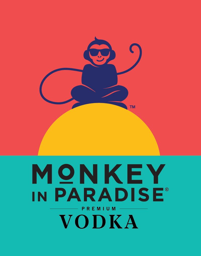
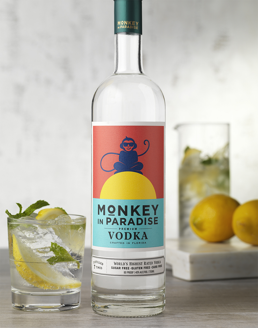
CF Napa met the goal with a completely reimagined monkey icon and bold, colorful packaging. The bright colors chosen by CF Napa call to mind an image of classic Florida: warm sun, fun on the beach and life on the water. The new “zen” monkey, printed in a deep blue, sports a cheeky smile while relaxing on top of a pop graphic sunset of bright yellow and orange. The revamped icon supports the brand’s motto, “Life is What You Drink from It,” and speaks to the popular sunset toast—a pastime that celebrates the good life and the conclusion of another beautiful day.
A teal block of color sets the brand name apart from the illustration. A second cream-colored label adds interest without distracting from the main label. This not only creates a nice home for product details and legal information, it also allows the main label to stand out. The blue-green capsule echoes the teal on the label, tying the two together and completing the look. The new package is fun, engaging and supports the quality of the product—a premium craft vodka that truly is, “The official vodka of paradise.”


CREDIT
- Agency/Creative: CF Napa Brand Design
- Article Title: CF Napa Redesigns The Official Vodka of Paradise
- Organisation/Entity: Agency, Published Commercial Design
- Project Type: Packaging
- Project Status: Published
- Agency/Creative Country: United States
- Market Region: North America
- Project Deliverables: Brand Identity, Brand Redesign, Brand Refinement, Brand Rejuvenation, Brand Strategy, Branding, Graphic Design, Illustration, Packaging Design, Rebranding
- Format: Bottle
- Substrate: Glass, Glass Bottle, Metal, Pulp Paper
- Keywords: WBDS Creative Design Awards 2020/21


