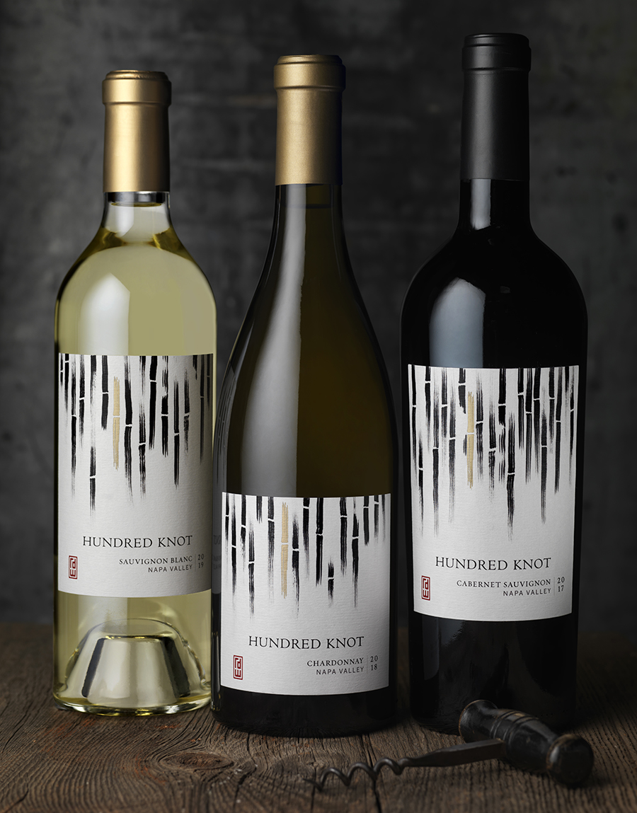
The new winery, RD Winery, came to CF Napa Brand Design to create the name and packaging design for their new, flagship, higher-tier wine brand that focuses on the cool climate grapes of southern Napa. This brand was to be sold at their tasting room, in wine shops and in restaurants. The winery’s new tasting room, located at the corner of Highway 29 and Highway 12 in Napa, California, is at the gateway to the Napa Valley and has the unique opportunity to be the one of the first tasting rooms to draw in winetasting tourists. It was imperative to design a wine package that would attract these tourists, as well as local wine lovers, while maintaining a connection to the winery’s roots in Vietnam. Additionally, the wine packaging design needed to communicate the sophistication of the brand, the quality of the wine and the passion and love that goes into the craft of winemaking. The design needed to evoke a sense of approachability without sacrificing its premium positioning.
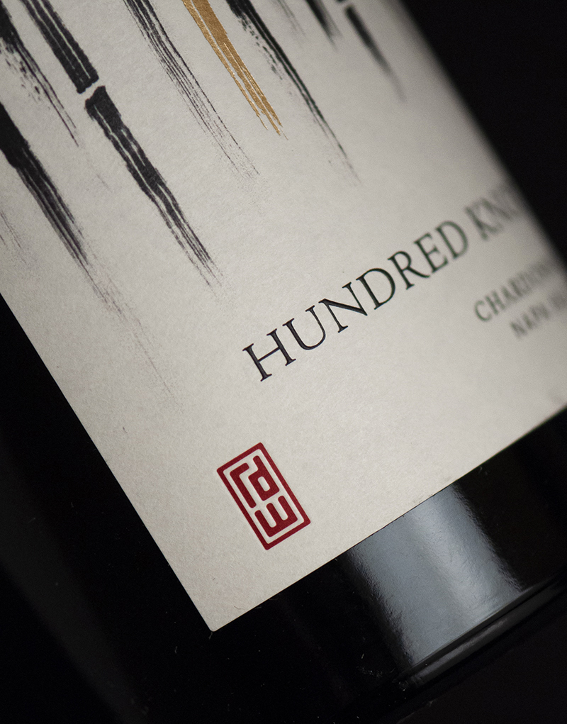
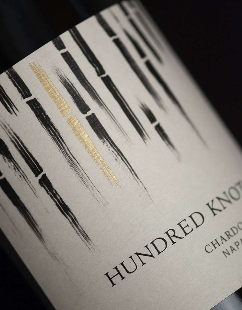
Drawing inspiration from the winery owner’s heritage, the name “Hundred Knot” was created for the brand. The name was based on an ancient Vietnamese parable about a wealthy landowner that promises his daughter’s hand in marriage to a young laborer if he is able to bring him a bamboo stalk with one hundred knots. The story teaches the importance of hard work, perseverance and the power of love – core principles for winemaking. The label for each of the wine varietals has a unique bamboo pattern, just as no two bamboo trees are exactly alike. One bamboo stalk on each of the labels is dressed in gold foil, which catches the light and stands out amongst the rest of the forest symbolizing the shining reward of hard work. This design was also repeated on the shipper boxes for the brand. The final touch on the label is the RD Winery monogram logo, also designed by CF Napa Brand Design. The red logo takes its inspiration from the ancient Asian seals used to authenticate important documents. The seal unifies the winery’s offerings by appearing on its Fifth Moon brand as well as signage, business cards and company letterhead.


CREDIT
- Agency/Creative: CF Napa Brand Design
- Article Title: CF Napa Launches Hundred Knot for One of Napa’s Newest Wineries
- Organisation/Entity: Agency, Published Commercial Design
- Project Type: Packaging
- Agency/Creative Country: United States
- Market Region: North America
- Project Deliverables: Brand Creation, Brand Identity, Brand Naming, Brand Strategy, Branding, Graphic Design, Identity System, Packaging Design
- Format: Bottle
- Substrate: Glass, Glass Bottle, Metal, Pulp Paper


