


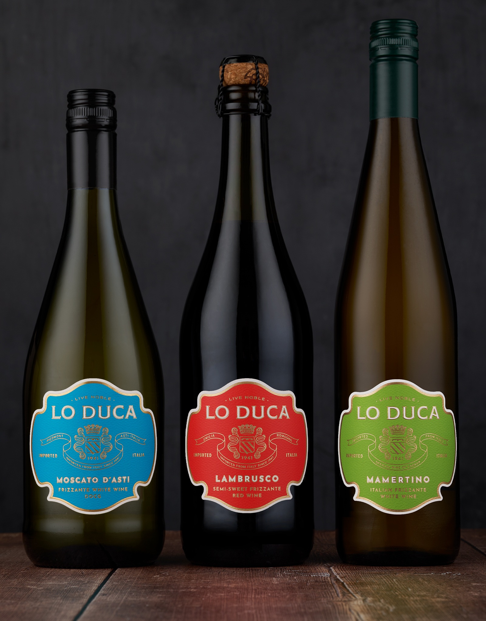
Lo Duca Bros. is a Wisconsin-based importer and distributor of fine Italian wines from small, family-owned vineyards. Many of the wines in their portfolio are unfamiliar to mainstream consumers, creating a strong opportunity for education. Some of these wines include Moscato D’ Asti, Lambrusco, and Mamertino.
– Moscato d’Asti is a highly refreshing, semi-sparkling white wine made from the finest grapes of Italy’s Asti region, bursting with bright, juicy notes and aromas of peach, honeysuckle, and orange.
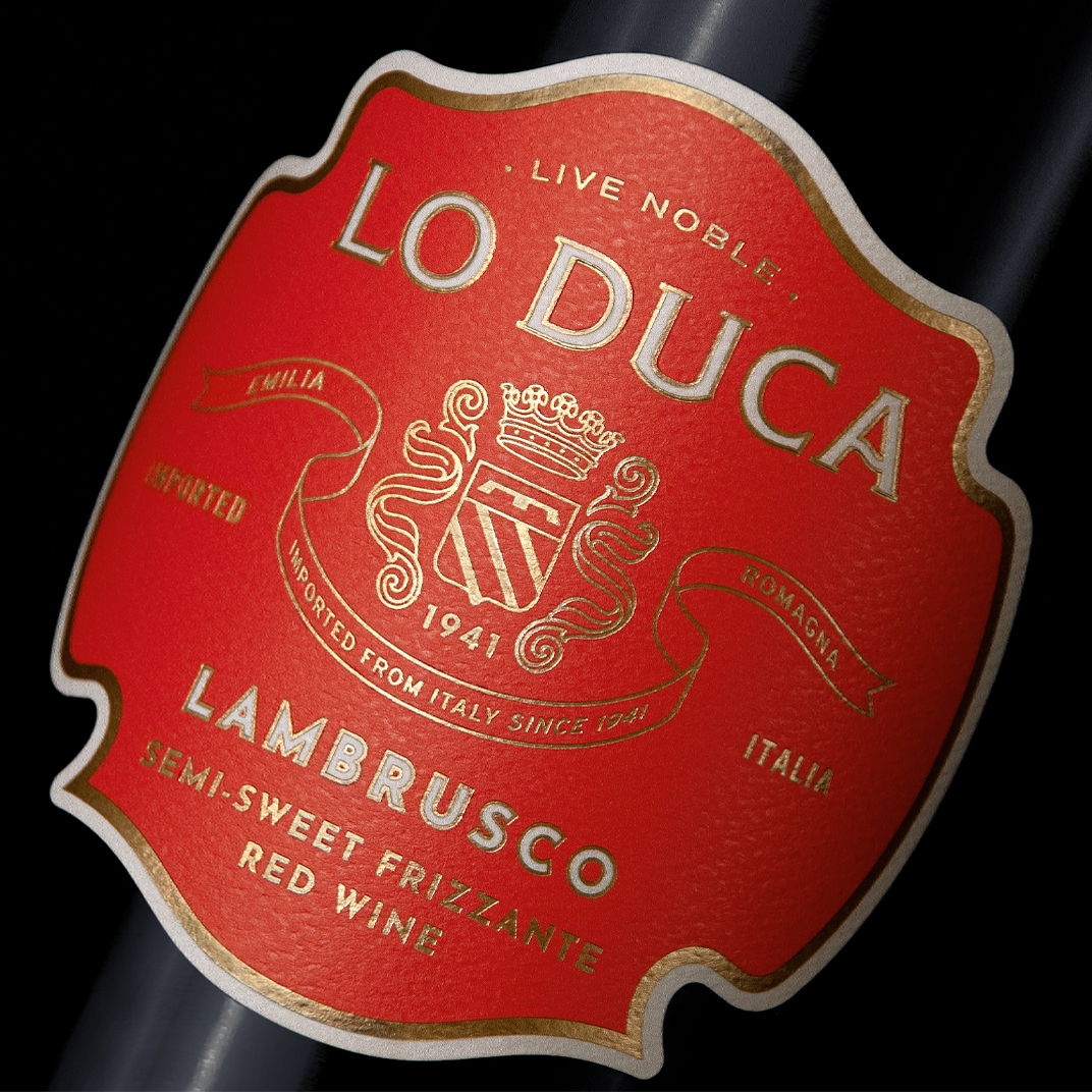
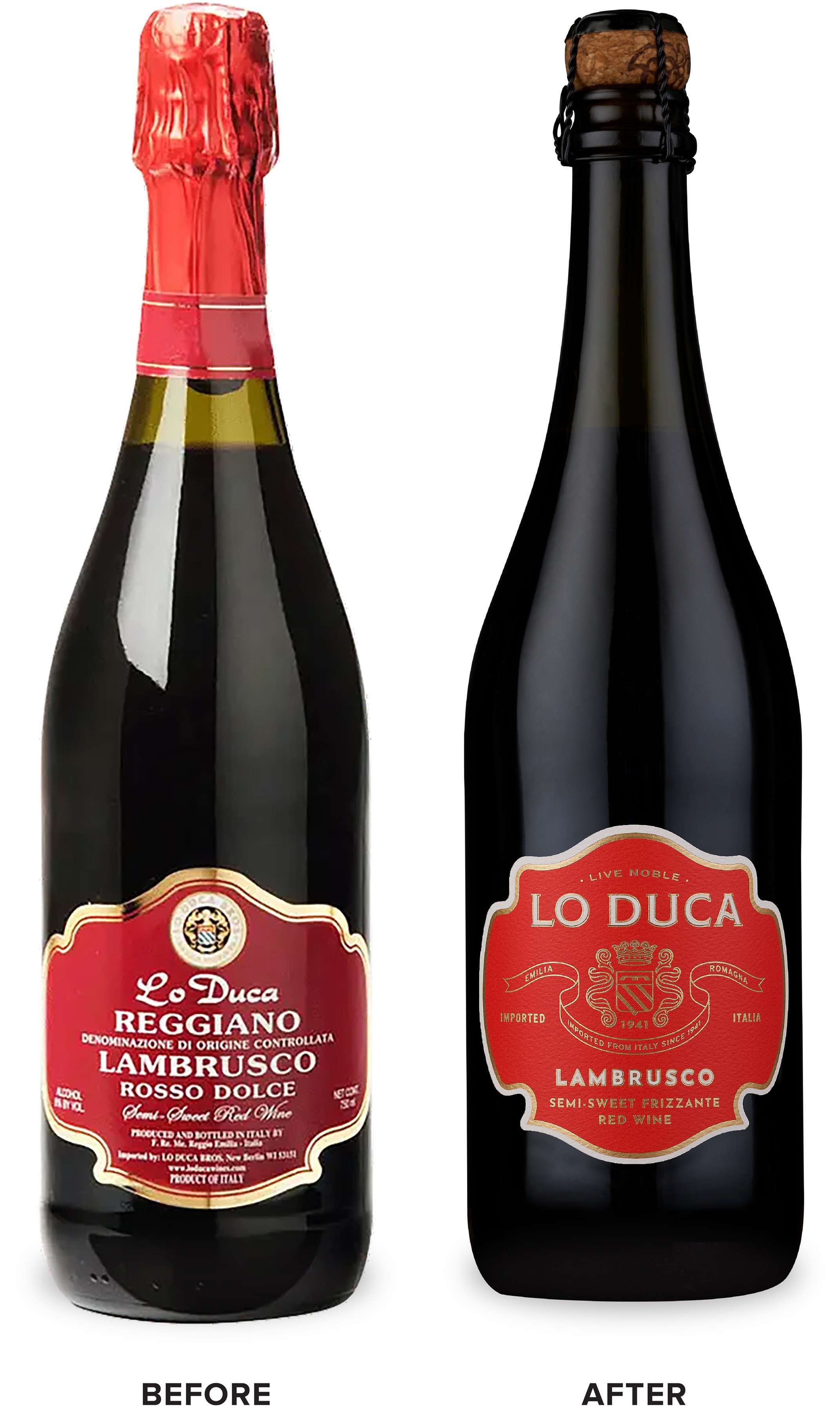
– Lambrusco is a semi-sweet, lightly sparkling red wine made entirely from Lambrusco grapes, offering the taste and smell of berries, plums, and dark cherries.
– Mamertino, known as the “Official Wine of Julius Caesar,” is a semi-sparkling, semi-sweet wine perfectly balanced with mouthwatering flavors of ripe pear, sweet apple, dried fruits, and apricot jam.
For the packaging redesign, Lo Duca aimed to spread awareness of these lesser-known varietals, engage younger consumers that are excited to try new wines, and upscale the packaging for their classic Italian varietals. We organized these offerings into 2 tiers – a frizzante tier and a still wines tier.
The frizzante wines tier is comprised of their lesser-known varietals and takes on a more youthful look. A vibrant color was selected for each varietal bringing a New World aesthetic to the packaging that will help consumers easily identify the wines. Detailed tasting notes help educate the consumer.
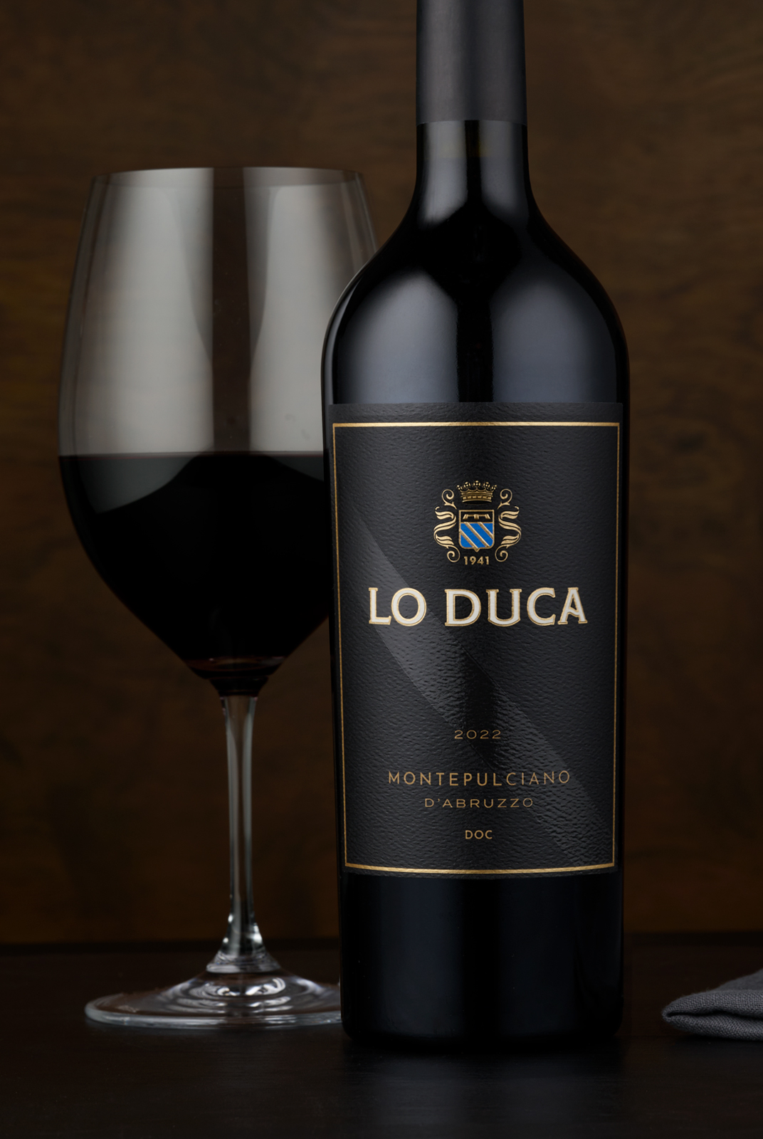
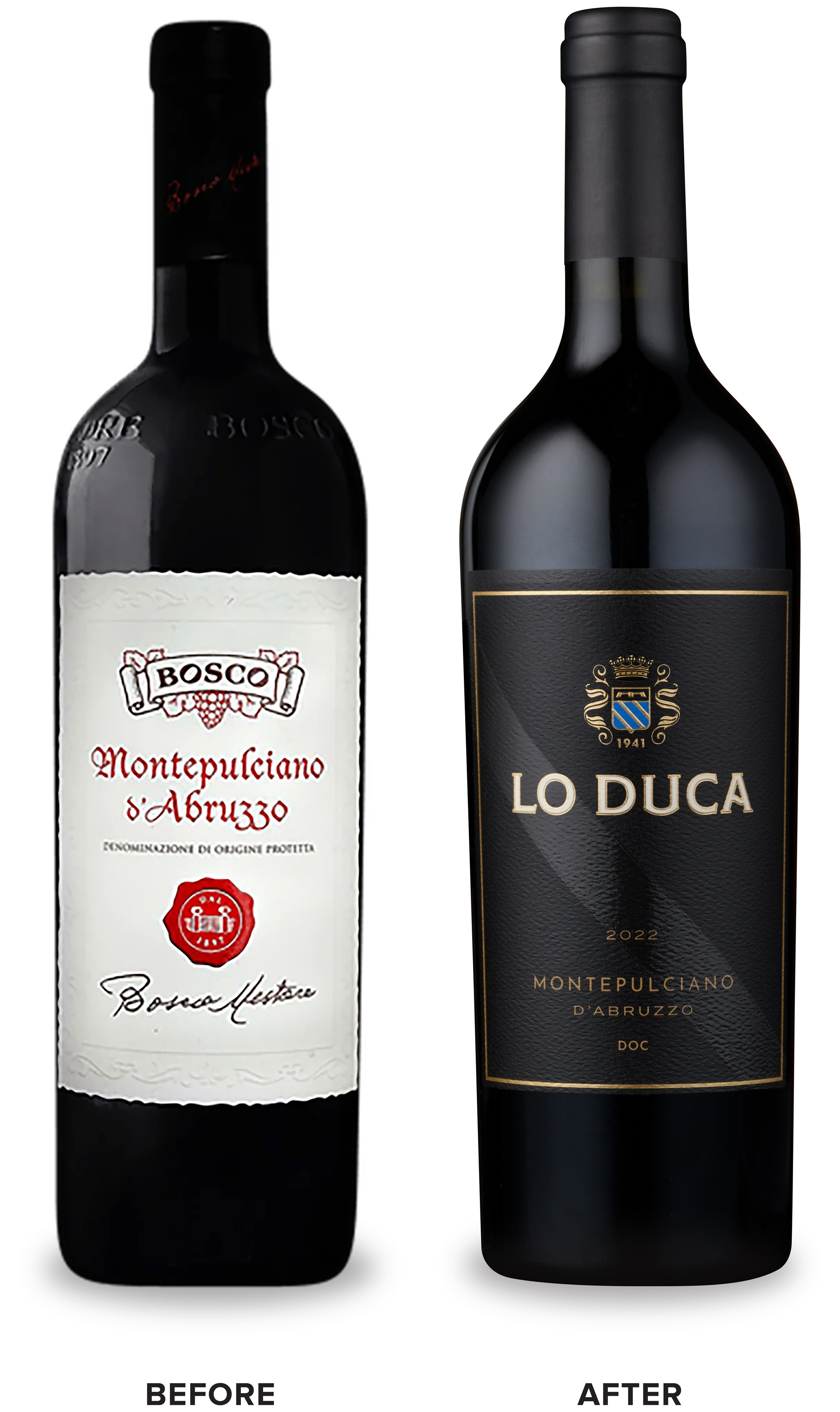
The still wines tier is a collection of Lo Duca’s more traditional Italian varietals that take on a more premium aesthetic. A sophisticated black label is bisected by a traditional diagonal stripe detail enhanced with a spot gloss finish.
CF Napa Brand Design reimagined the original Lo Duca Bros. crest into a modern icon, including imagery of a duke’s crown as a call back to the Italian translation of the brand name – “the duke”.
CREDIT
- Agency/Creative: CF Napa Brand Design
- Article Title: CF Napa Brand Design Reimagines Classic Italian Wines with Modern Sophistication
- Organisation/Entity: Agency
- Project Type: Packaging
- Project Status: Published
- Agency/Creative Country: United States
- Agency/Creative City: Napa, United States
- Market Region: North America
- Project Deliverables: Art Direction, Brand Design, Brand Identity, Brand Mark, Brand Redesign, Brand Refinement, Brand Rejuvenation, Brand Strategy, Branding, Creative Direction, Design, Graphic Design, Icon Design, Label Design, Logo Design, Packaging Design
- Format: Bottle
- Industry: Food/Beverage
- Keywords: Lo Duca Wine Packaging Design
-
Credits:
Design Agency: CF Napa Brand Design


