


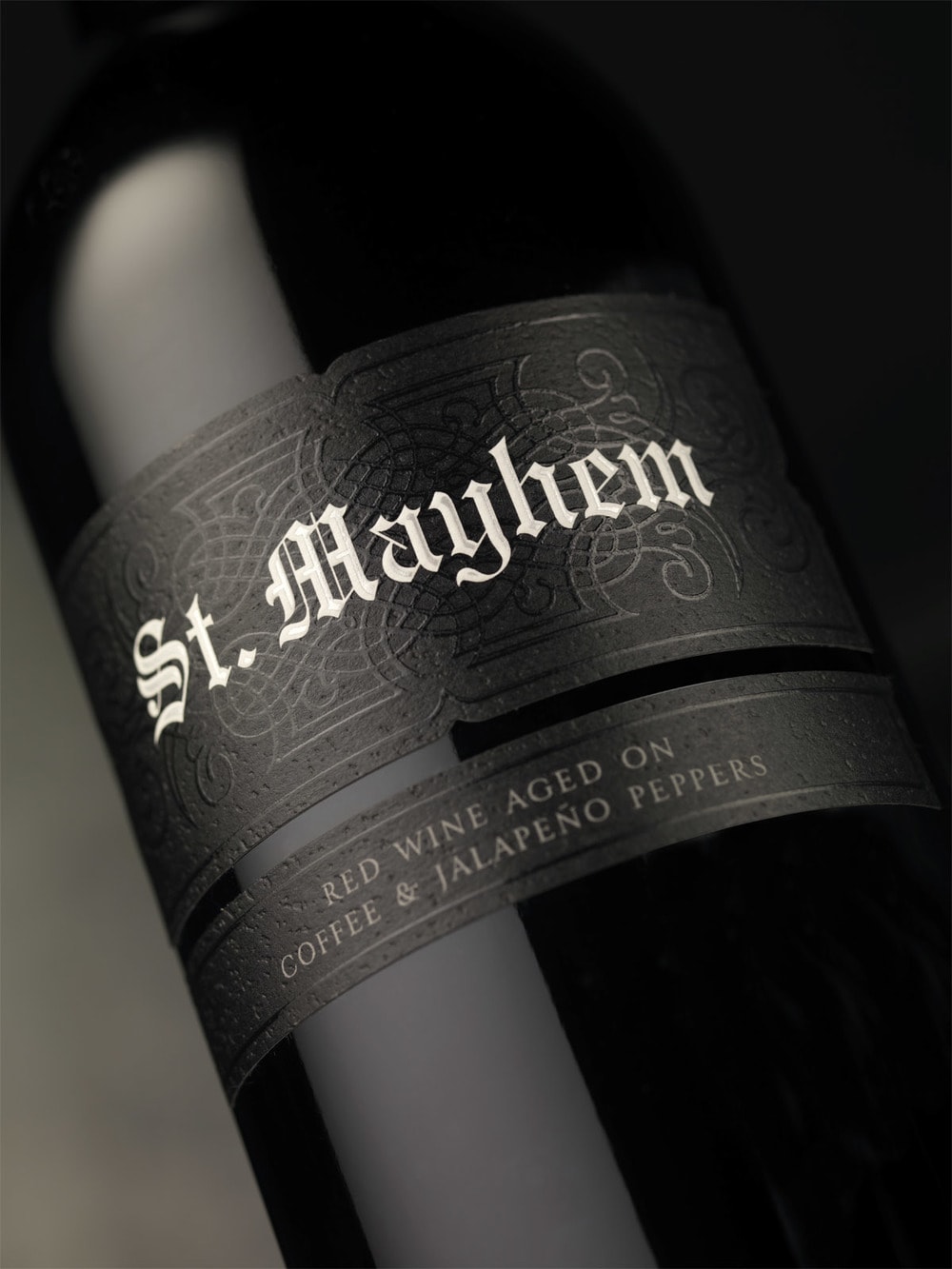
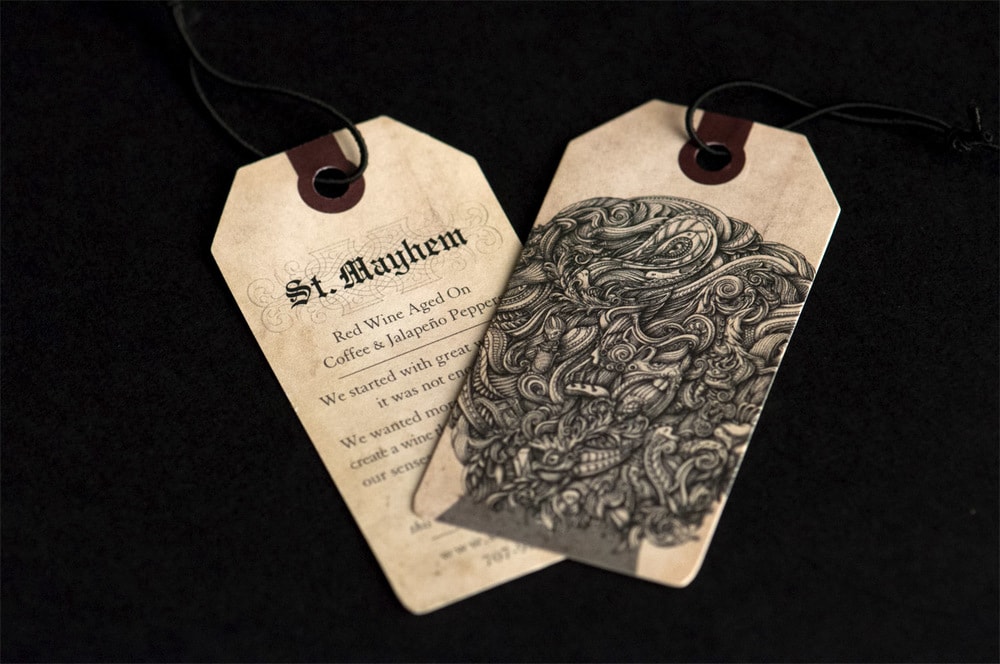
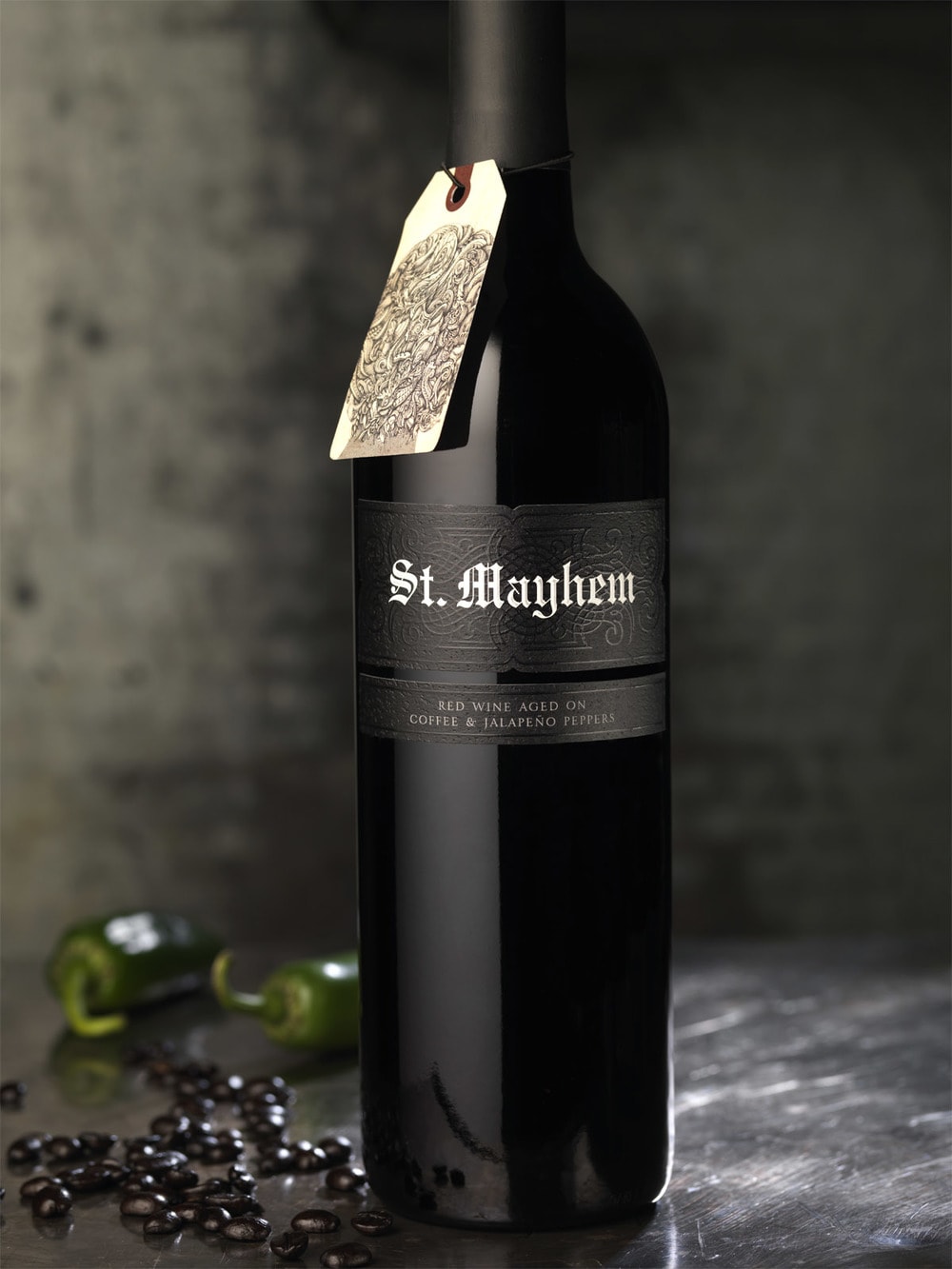
“Inspired by the craft beer and artisanal cocktail movement, Art+Farm’s new wine brand St. Mayhem leverages unique aging techniques never before used in the largely traditional wine category. The aptly named brand features white wines aged on ingredients like peach and ginger, and a red wine aged on coffee and jalapeño peppers. The packaging design for this unique wine brand needed to be as distinct as the wines themselves, without falling prey to appearing novelty. The solution leverages a sophisticated black on black motif that reinforces the quality promise that Art+Farm is known for, while communicating the creative energy of the brand that represents the unexpected. The final touch is a hangtag that highlights the flavor of the wine and a provocative personification of St. Mayhem himself.”
CREDIT
- Agency/Creative: CF Napa Brand Design
- Article Title: CF Napa Brand Design – Art+Farm Wine
- Project Type: Packaging
- Substrate: Pulp Carton, Pulp Paper


