


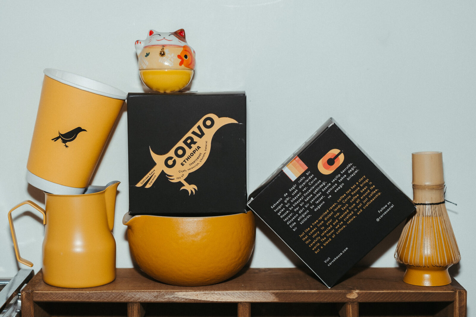
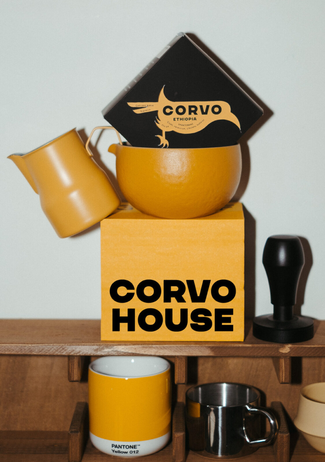
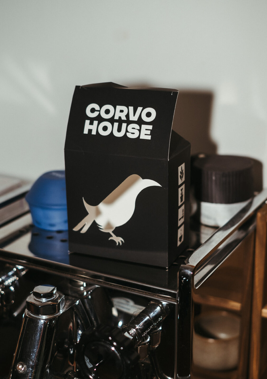
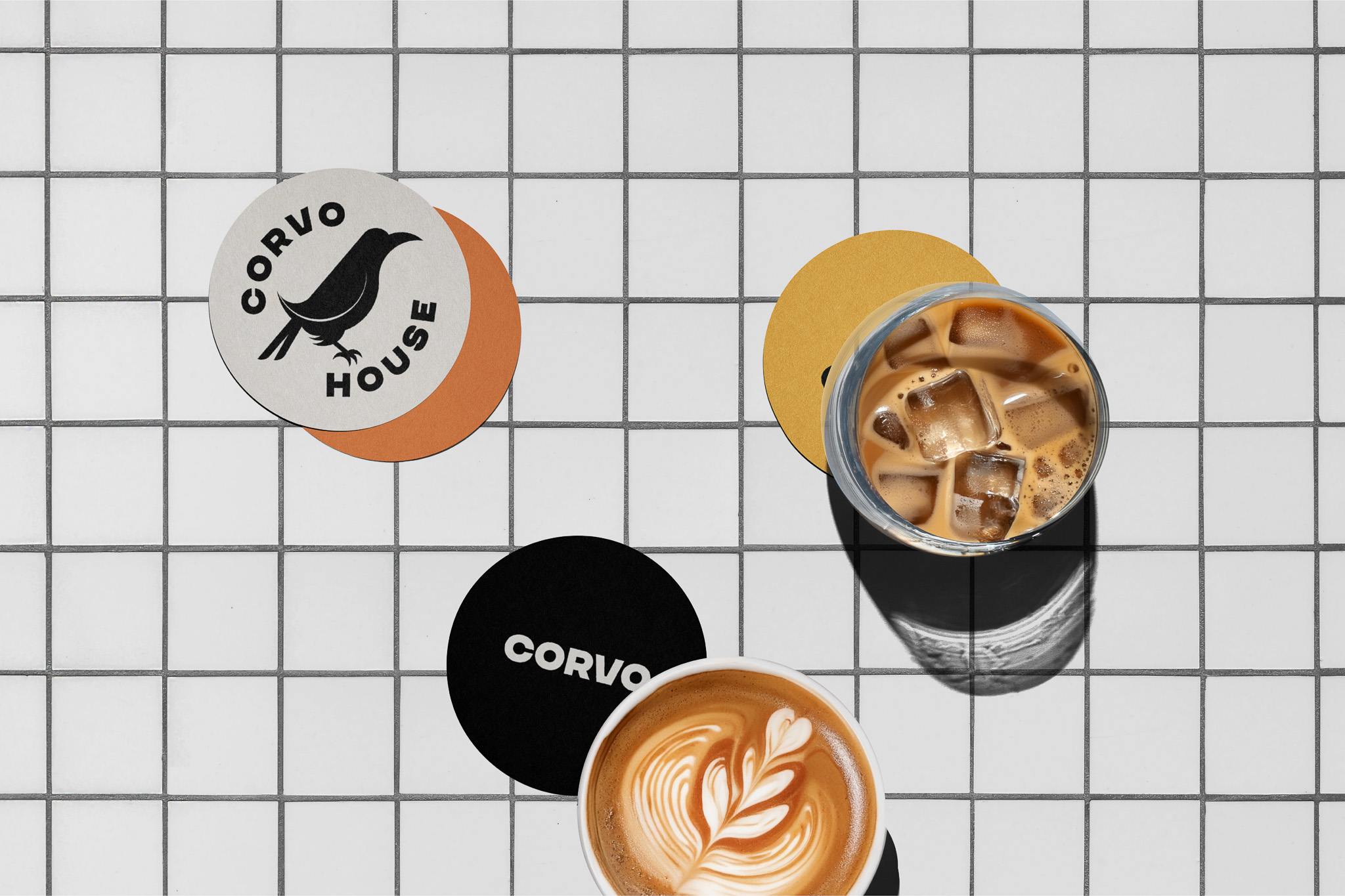
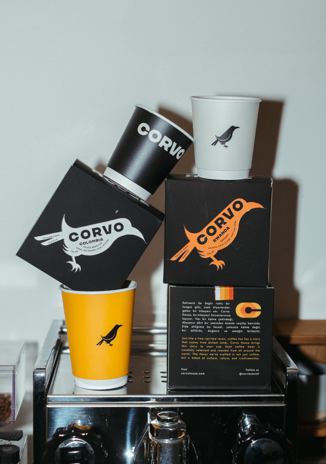
Corvo House is a specialty coffee brand whose visual identity is anchored in a strong, modern typeface and a minimalist crow icon, which together form the foundation of its bold and memorable branding. The crow is more than just a logo element—it is central to the brand story, evoking mystery, intelligence, and individuality, all qualities that align with the refined yet accessible character of the coffee itself.
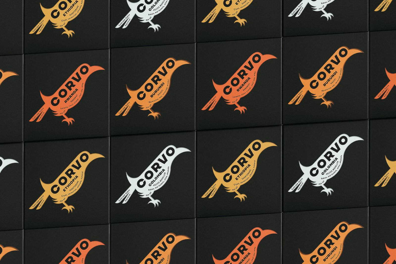
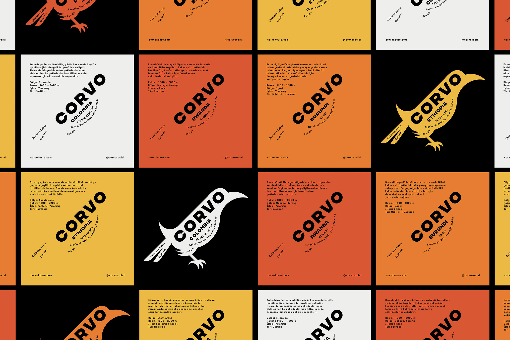
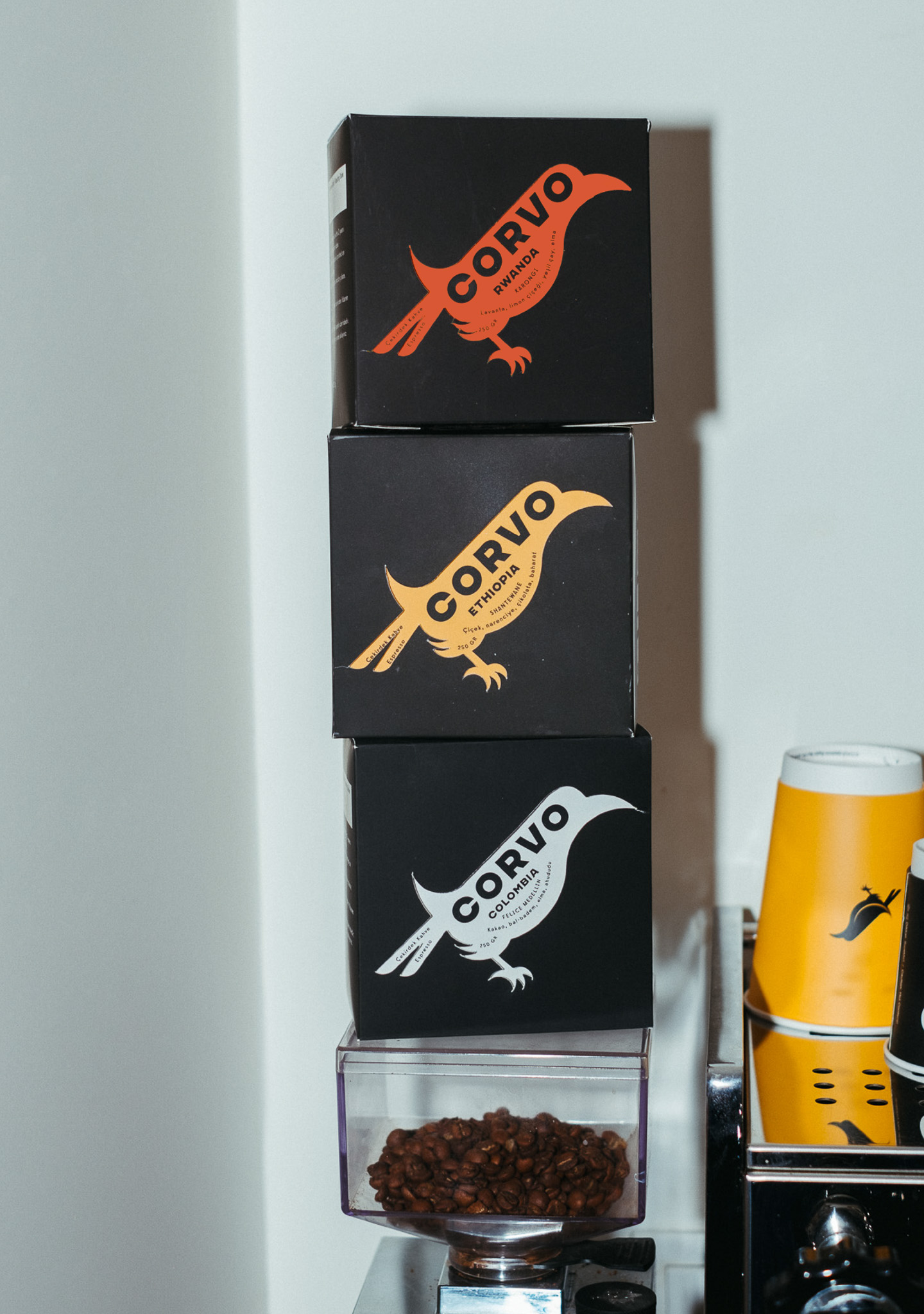
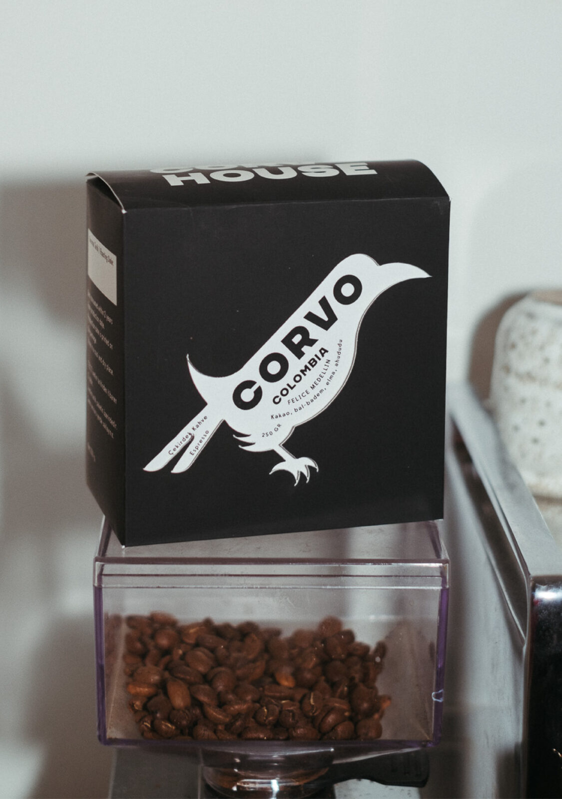
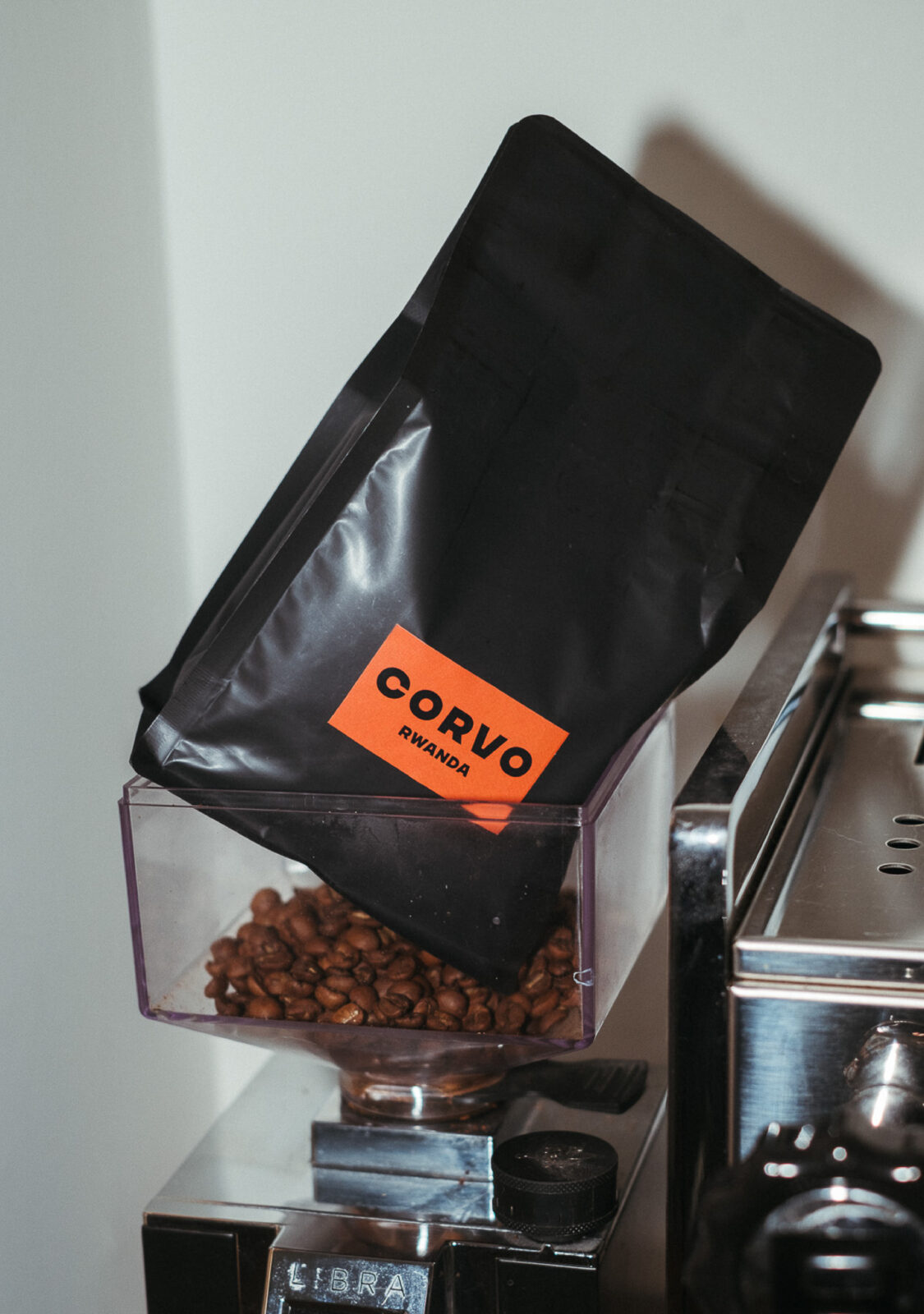
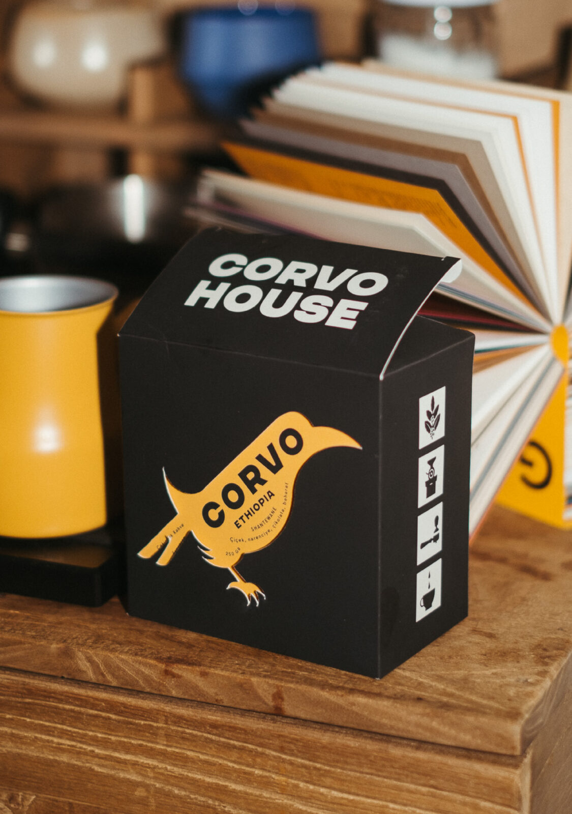
For the packaging design, I created matte black boxes that are sleek, allowing the intricate design elements to take the spotlight. Each box features a die-cut in the shape of a crow, revealing a brightly colored card underneath. This card serves not only as an accent color that differentiates each coffee variety but also as a storytelling layer. The brand name “CORVO” is printed at a 45-degree angle on the card, with the final “O” cleverly positioned to serve as the crow’s eye. This subtle integration ties the logotype and crow symbol into one cohesive visual unit, enhancing brand recall in a playful yet elegant manner.
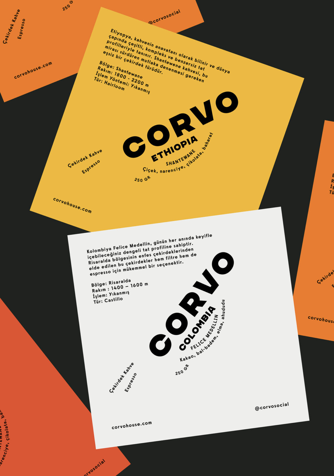
The text on the information cards curves gently to follow the contours of the crow’s belly and tail, forming an abstract bird shape that adds a unique and thoughtful touch. All coffee blends come in the same matte black box, but the interior card color changes depending on the origin of the coffee beans—an effective way to maintain consistency while making each variety distinct. This restrained use of color and shape keeps the packaging minimal and unified, yet engaging and memorable.
To add physical dimension and tactile interest, the combination of die-cut shapes and layered elements invites interaction—turning a simple coffee box into a more immersive unboxing experience.
In addition to packaging, I also designed a set of square lamps for the café’s service area, reinforcing the brand identity in the physical space. These lamps feature four custom minimalist icons representing key stages of the coffee journey: harvest, roast, prepare, and enjoy. These same icons are subtly applied to the sides of the packaging, creating a clear visual bridge between the in-store experience and the take-home product, and reinforcing the brand’s thoughtful, cohesive aesthetic.
CREDIT
- Agency/Creative: Ceren Burcu Turkan
- Article Title: Ceren Burcu Turkan Unveils Corvo House Through a Minimalist Coffee Identity and Striking Packaging Design
- Organisation/Entity: Creative
- Project Status: Published
- Agency/Creative Country: Netherlands
- Agency/Creative City: Amsterdam
- Project Deliverables: Brand Creation, Brand Design, Branding, Creative Direction, Packaging Design, Photography
- Industry: Food/Beverage
- Keywords: WBDS Creative Design Awards 2025/26 coffee, coffee packaging, coffee box, cafe, cafe branding, brand identity, minimal design, cutout


