


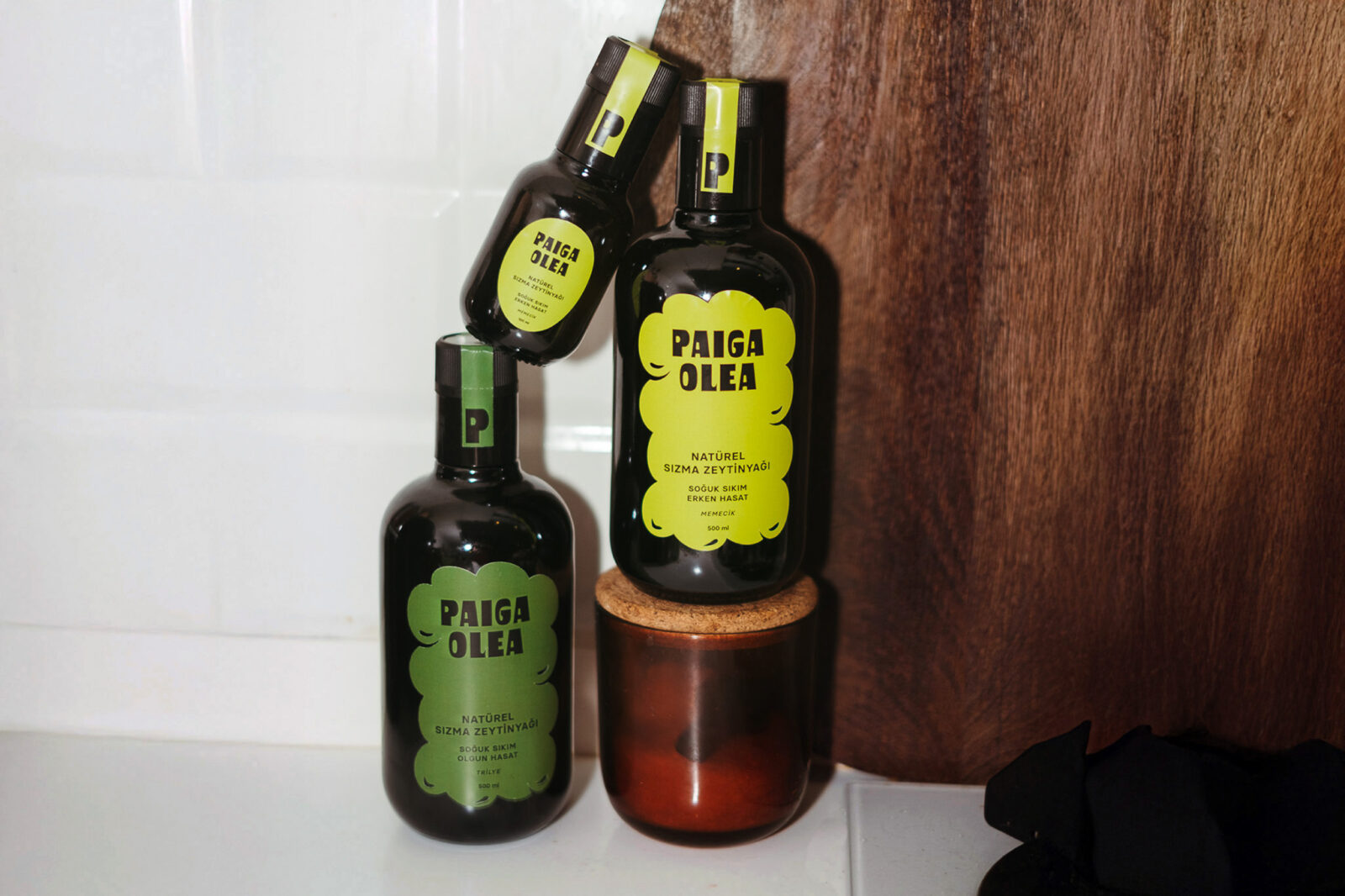
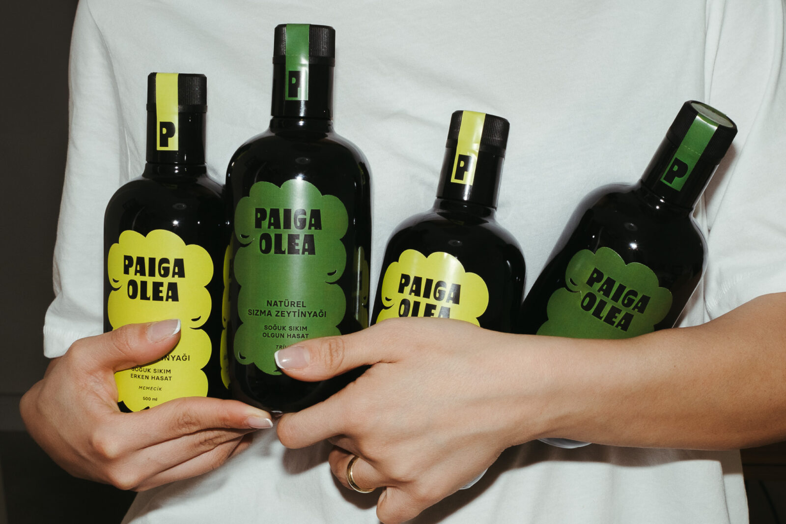
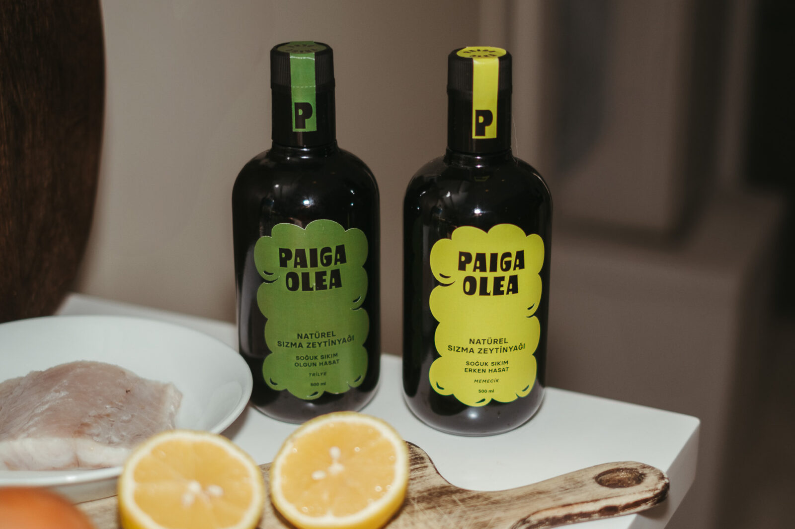
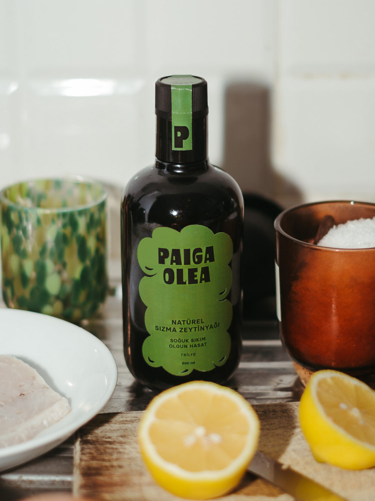
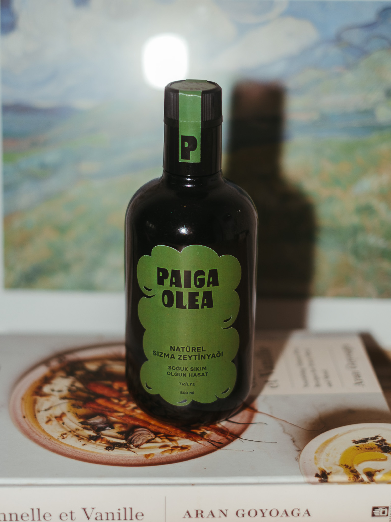
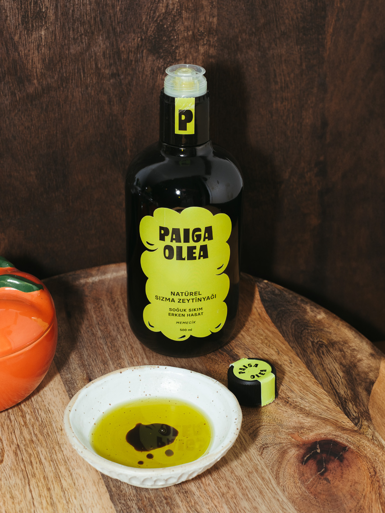
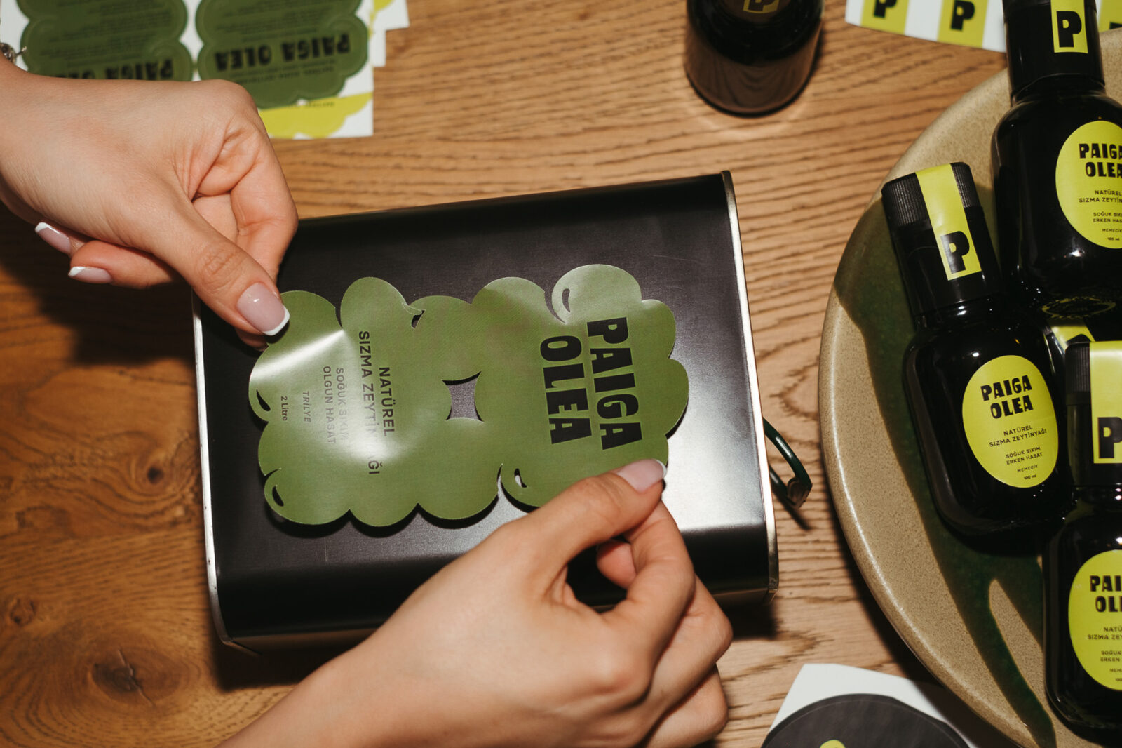
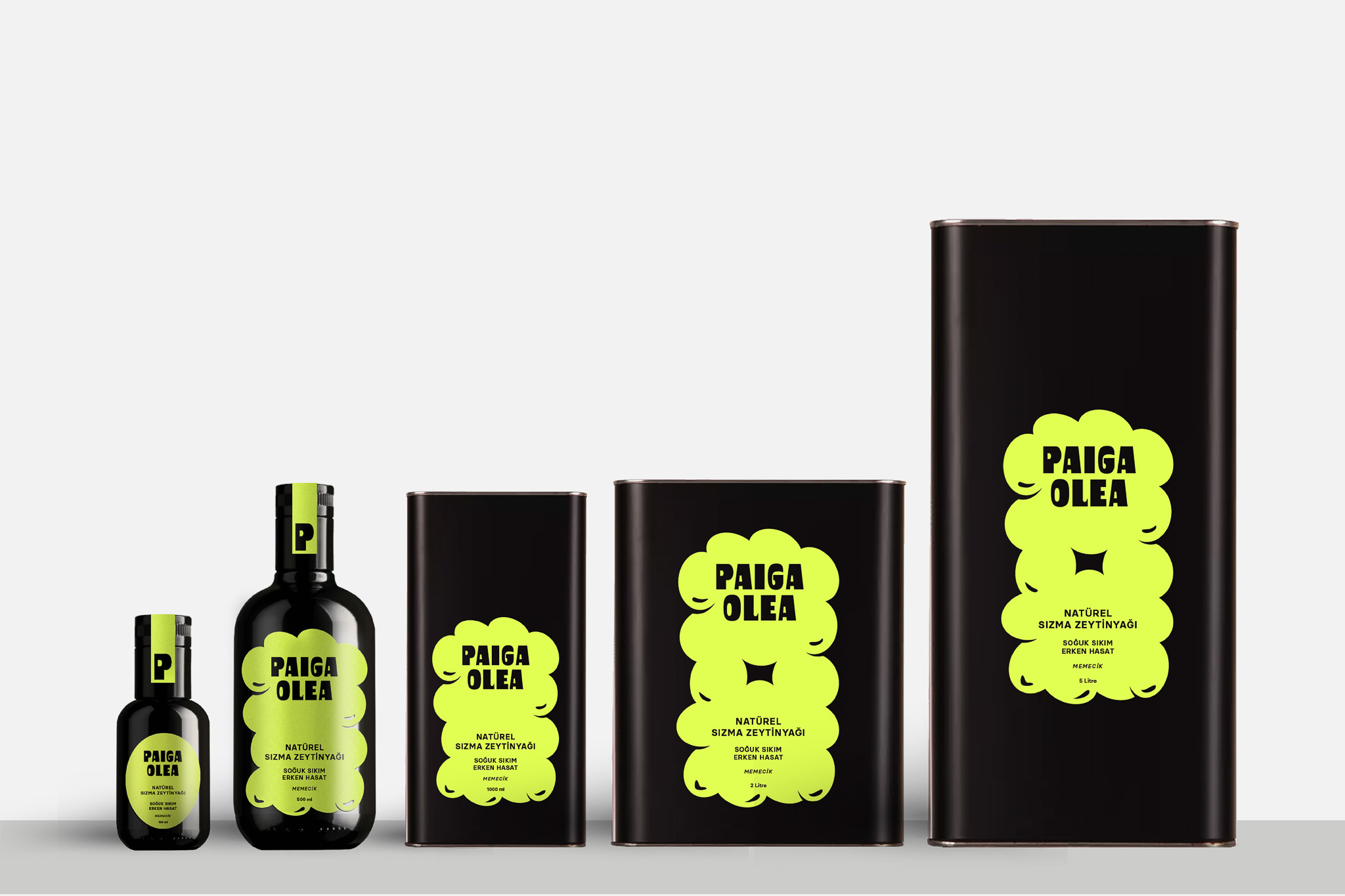
I designed the branding and packaging for Paiga with the goal of emphasizing the natural richness and quality of olive oil through a clean, modern aesthetic. At the heart of the design is a distinctive label shaped like the silhouette of a cluster of olives. This shape was chosen intentionally to communicate, in a literal and visually creative way, that the product is truly “full of” olives. It reinforces the purity and authenticity of the olive oil while offering a fresh take on traditional packaging elements.
For the early harvest variety, I selected a vibrant green color to reflect the freshness, vitality, and brightness of olives picked at the start of the season. In contrast, the ripe harvest variant features a deeper, richer olive tone, representing the maturity and fuller flavor profile of fully ripened olives. These carefully chosen colors help create an intuitive visual system that quickly communicates the differences between the two product types when placed side by side, making it easy for consumers to identify their preferred flavor profile.
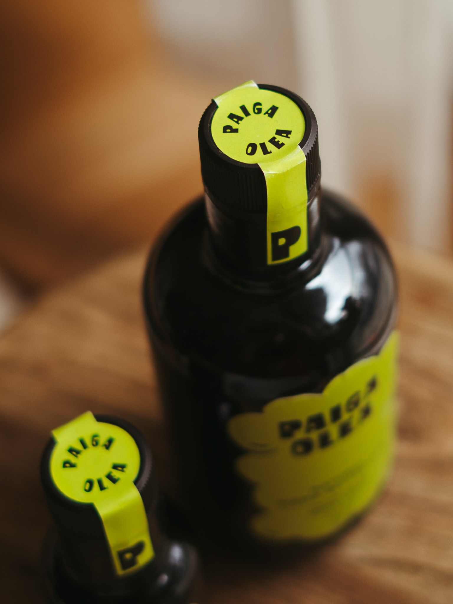
The overall look of the packaging is bold yet minimal, with a strong focus on clarity and functionality. The brand name, Paiga Olea, is presented in a memorable, playful typeface that stands out without overwhelming the design. By eliminating unnecessary decorative elements from the front label, the design allows essential information—such as the type of harvest and the pressing method—to take center stage. This stripped-down, elegant approach contributes to a premium and contemporary shelf presence that contrasts with the more traditional and often cluttered olive oil packaging styles.
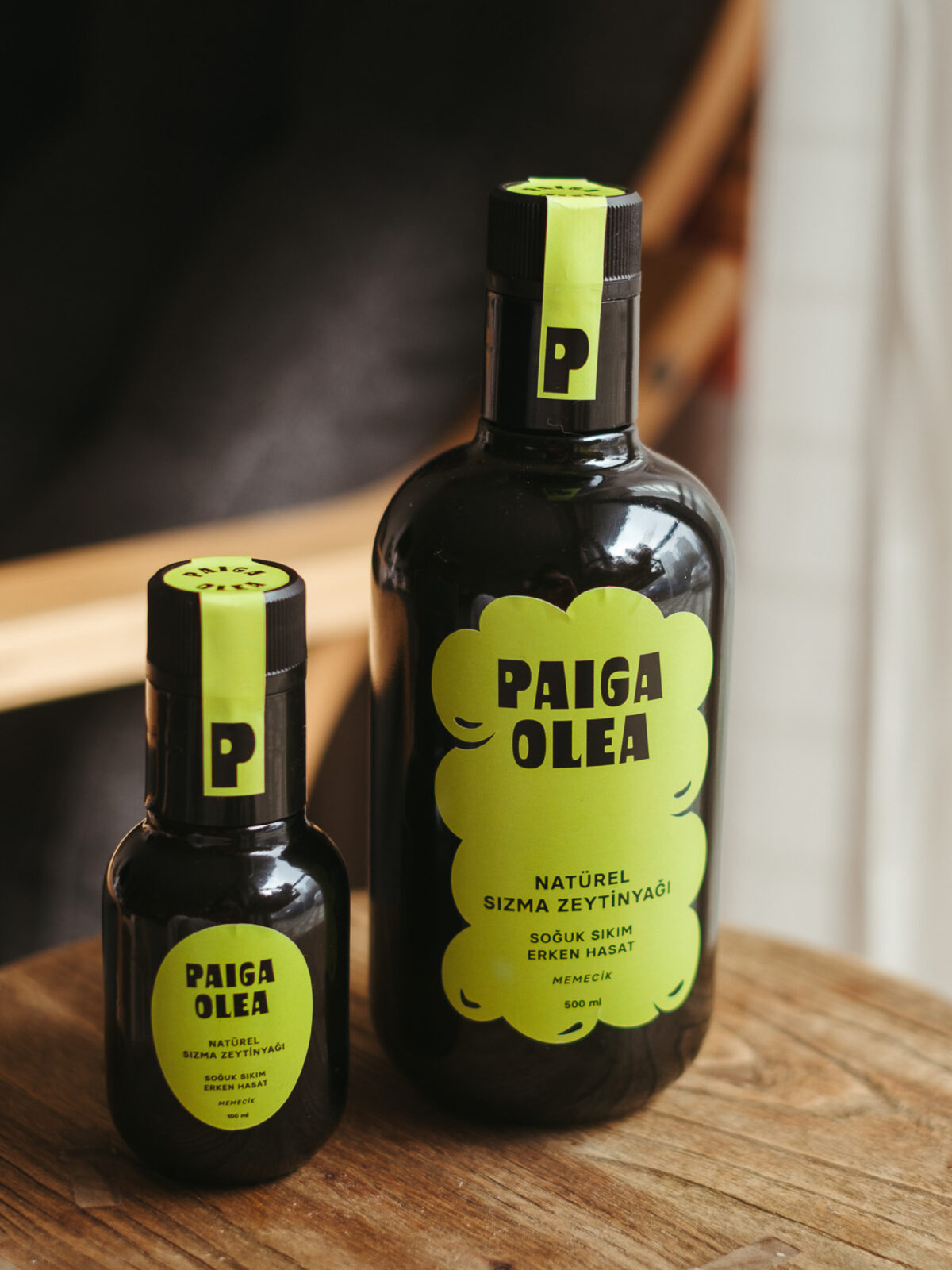
Additionally, the packaging evolves based on volume: as the product size increases from a 100ml trial bottle to 2L and 5L tins, the number of olives in the background increases as well. On the larger tins, a cutout created by the arrangement of olives makes it even more apparent that the design is built from olive imagery. This detail transforms the background from a passive pattern to a dynamic visual experience, deepening the connection to the product’s core ingredient in an engaging and imaginative way.


CREDIT
- Agency/Creative: Ceren Burcu Turkan
- Article Title: Ceren Burcu Turkan Introduces Paiga Olea With a Clean, Ingredient-Led Olive Oil Identity and Minimal Packaging System
- Organisation/Entity: Creative
- Project Status: Published
- Agency/Creative Country: Netherlands
- Agency/Creative City: amsterdam
- Project Deliverables: Brand Creation, Creative Direction, Label Design
- Industry: Food/Beverage
- Keywords: WBDS Creative Design Awards 2025/26 olive oil, packaging design, olive, bottle, label design


