


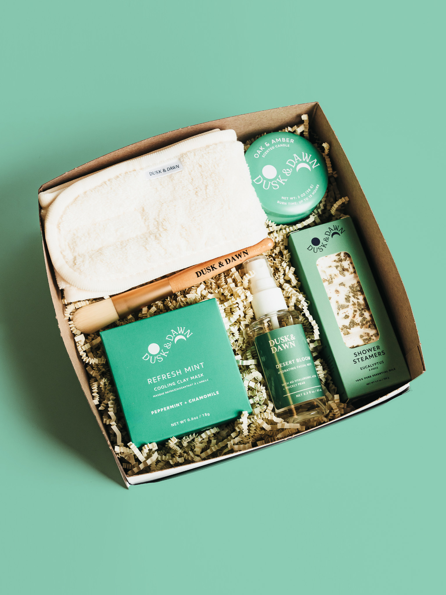
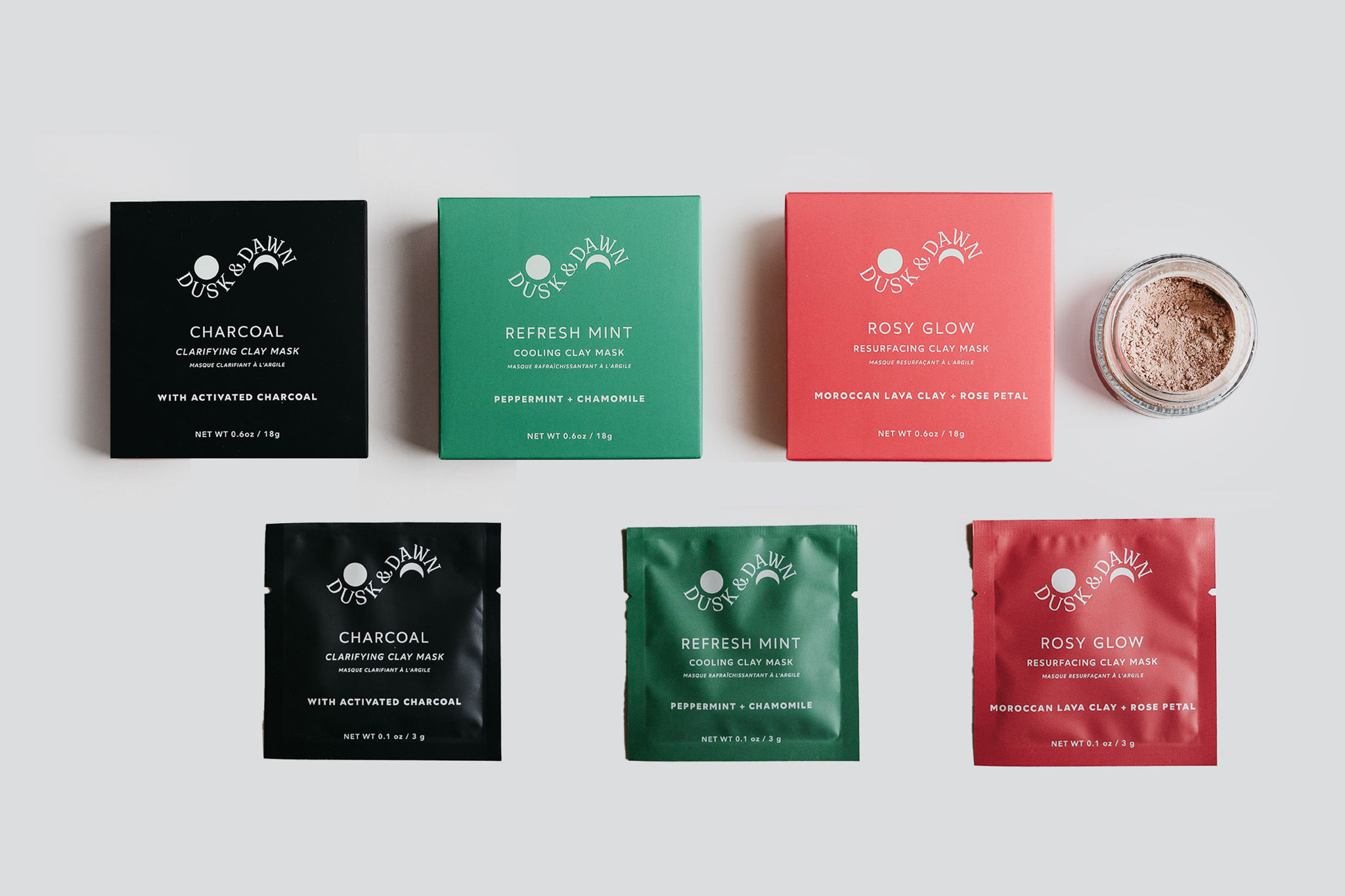
Dusk and Dawn is a self-care brand offering botanical blends designed to help individuals relax or boost their energy through the power of scents. The concept behind the Dusk and Dawn branding & packaging is to visualize the starry nights between dusk and dawn, while maintaining a color scheme that corresponds to the product ingredients across tea, candle, facial mask, and bath salt packages. The branding and packaging concept was developed to visually express this serene and poetic time frame, capturing the tranquil beauty of starry skies and the natural rhythm of day turning into night and back again.
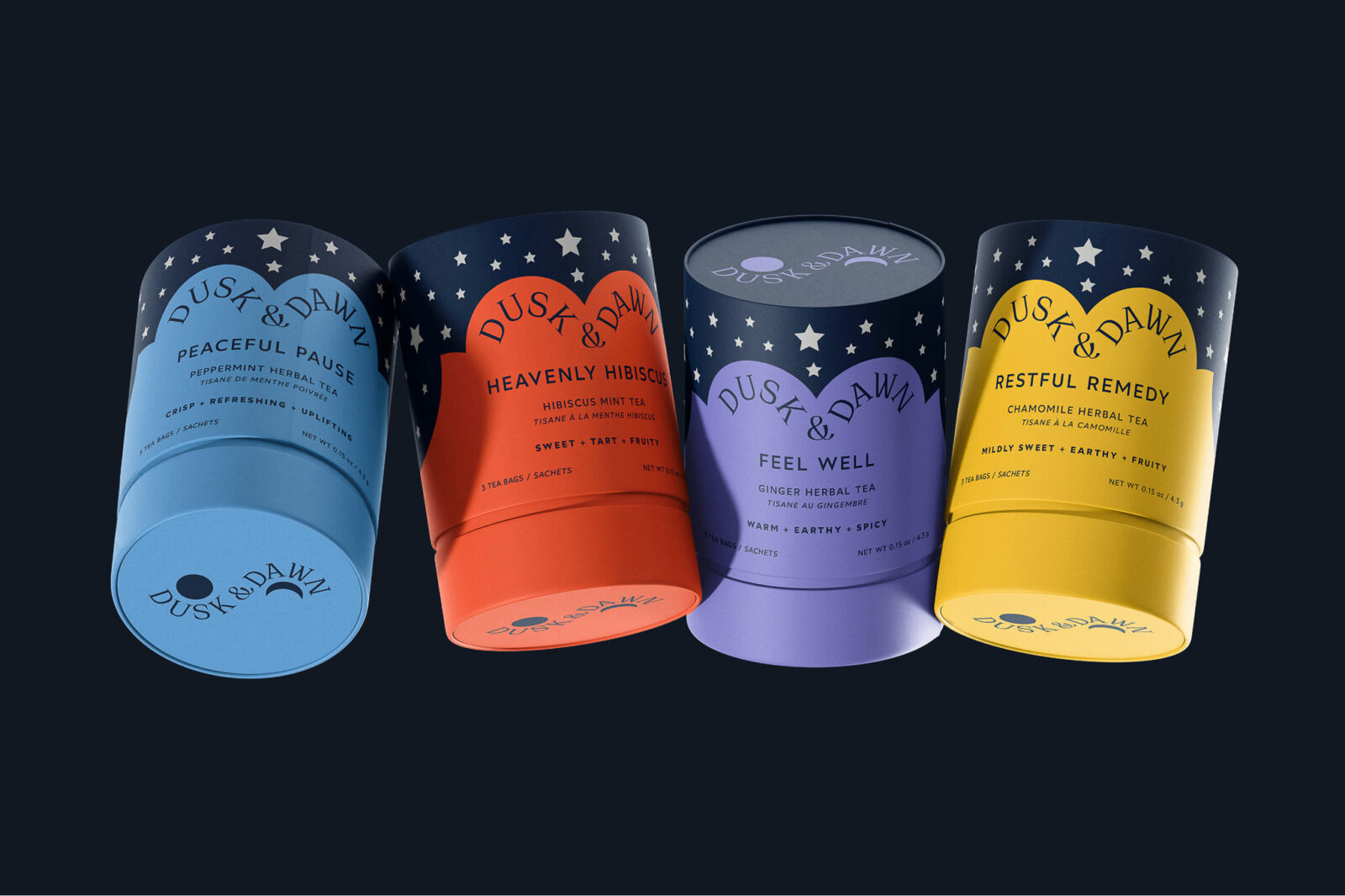
The double half-arc shapes were inspired by vintage moon calendar watch dials, where stars dominate the dark night sky in the absence of the moon. This design choice allowed for the use of color at the bottom of the packages, particularly in tea packaging, which includes pouches for loose tea and tubes for sachets.
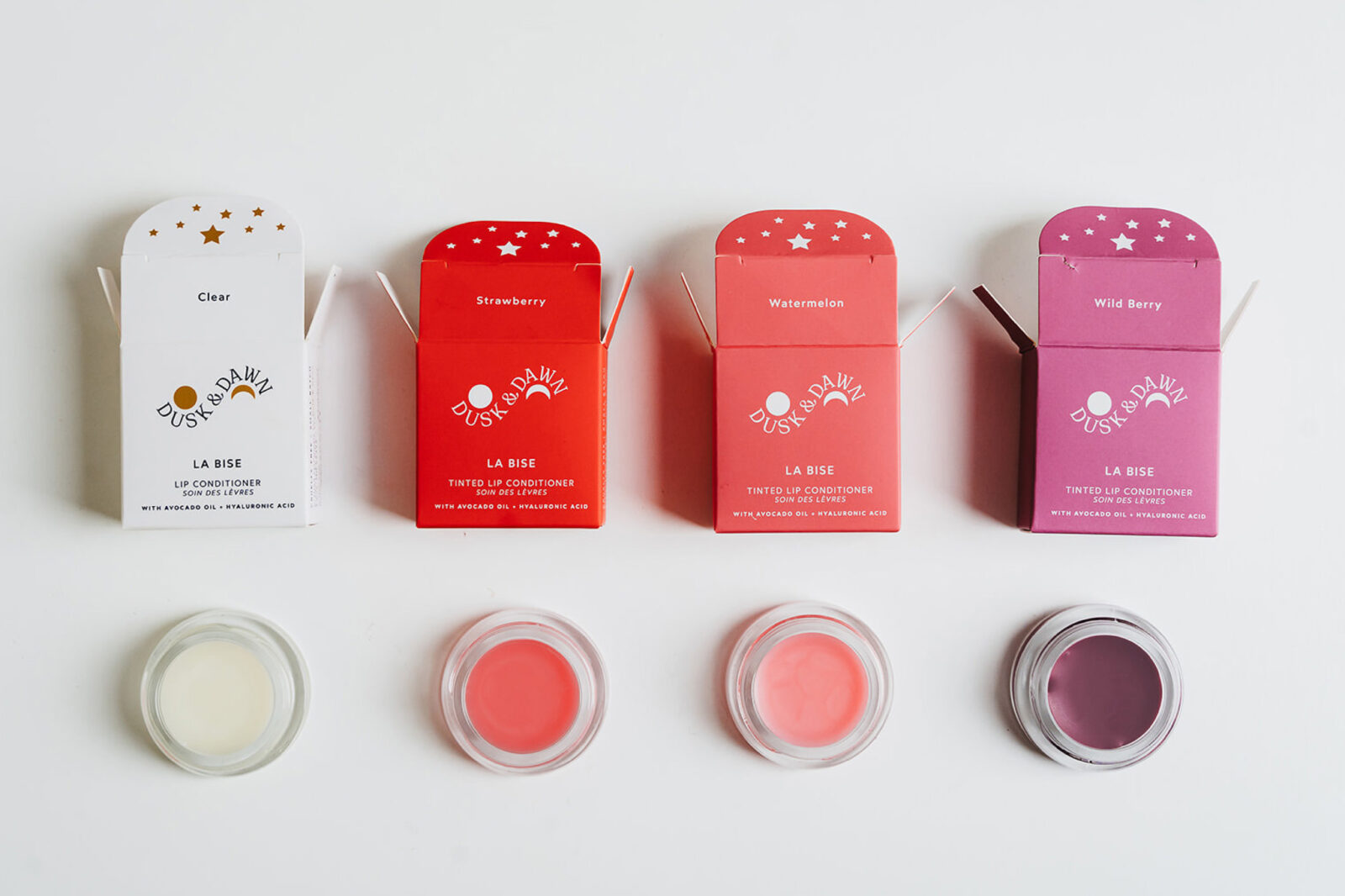
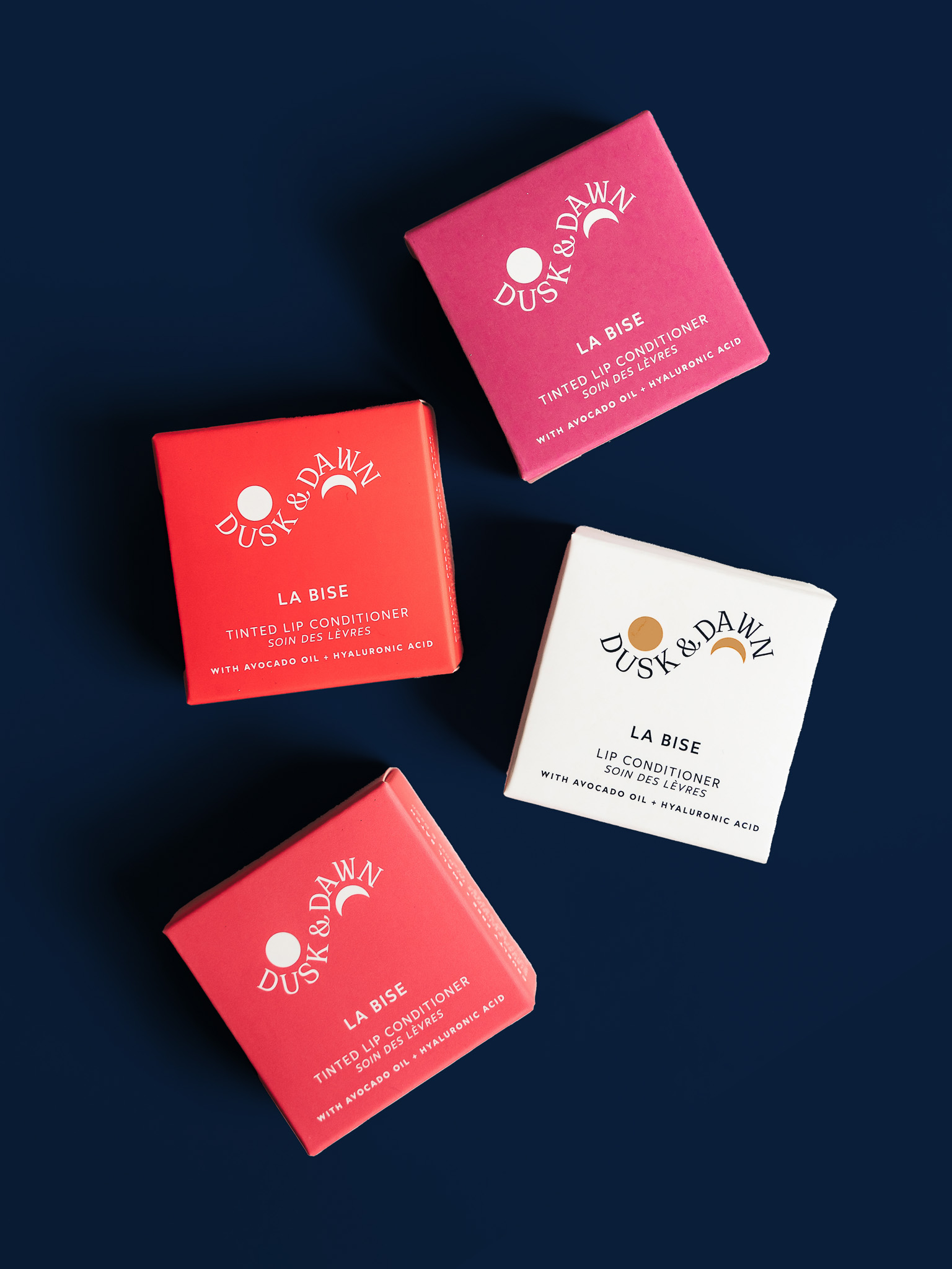
The color palette plays a crucial role across all product types, from tea and candles to facial masks and bath salts. For example, the tea packaging uses vibrant colors at the base of the pouches and tubes, allowing the ingredients of each blend to be visually communicated. These tones create a clear connection between what’s inside the package and the emotional or sensory benefits it provides.
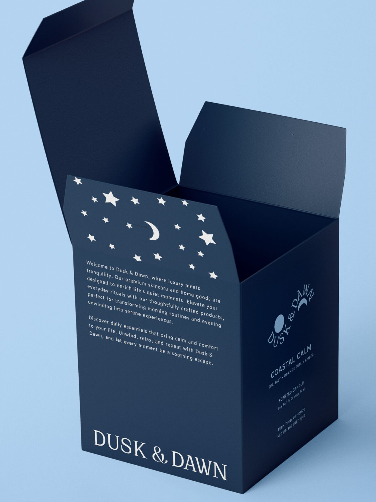
In contrast, the bath salt packages invert this design logic. They feature deep navy pouches with colorful typography and accents, creating a bold yet balanced visual impact. This inversion not only adds variety to the product line but also ensures visual harmony when items are grouped in gift sets. The candle packaging complements this system as well—large candles are presented in elegant boxes, while the smaller trial-sized candles come in bright, full-color tins that echo the larger brand color scheme.
Together, the cohesive visual identity of Dusk and Dawn reinforces the idea of holistic self-care, making each product feel like part of a calming, celestial ritual.


CREDIT
- Agency/Creative: Ceren Burcu Turkan
- Article Title: Ceren Burcu Turkan Introduces Dusk and Dawn as a Celestial Self-Care Identity Inspired by Botanical Rituals
- Organisation/Entity: Creative
- Project Status: Published
- Agency/Creative Country: Netherlands
- Agency/Creative City: Amsterdam
- Project Deliverables: Brand Creation, Branding, Creative Direction, Packaging Design
- Industry: Retail
- Keywords: WBDS Creative Design Awards 2025/26 home, retail, packaging, packagindesign, candle, box, self care


