


Celosia Ventures – a New York City born biotherapeutics investment firm was created by physician-entrepreneurs who concluded that it was time to use their vast experience, analytical prowess and know-how to take a wisened approach to biotech investing and advisory. The founders came to is + at to create its visual identity and digital presence, asking that the company be defined in identity as they are in their approach to biotech investing. Standing apart with meaning began with an apt name: Celosia.
The celosia flower blooms around the world, serving as an elegant metaphor for designing the identity by connecting the company founders’ homes and origin stories. And, with deeper meaning, the celosia’s form of bright, structured flowers represent boldness and courage. In floriography, to inspire one to perform courageous feats is to present them with a bouquet of celosia flowers.
The flower’s cerebral-shaped plumage also suggests organic humanity and the wisdom of the partners’ analytical and experience-driven model. Breathing both beautiful and practical life into the metaphor was a core design goal.
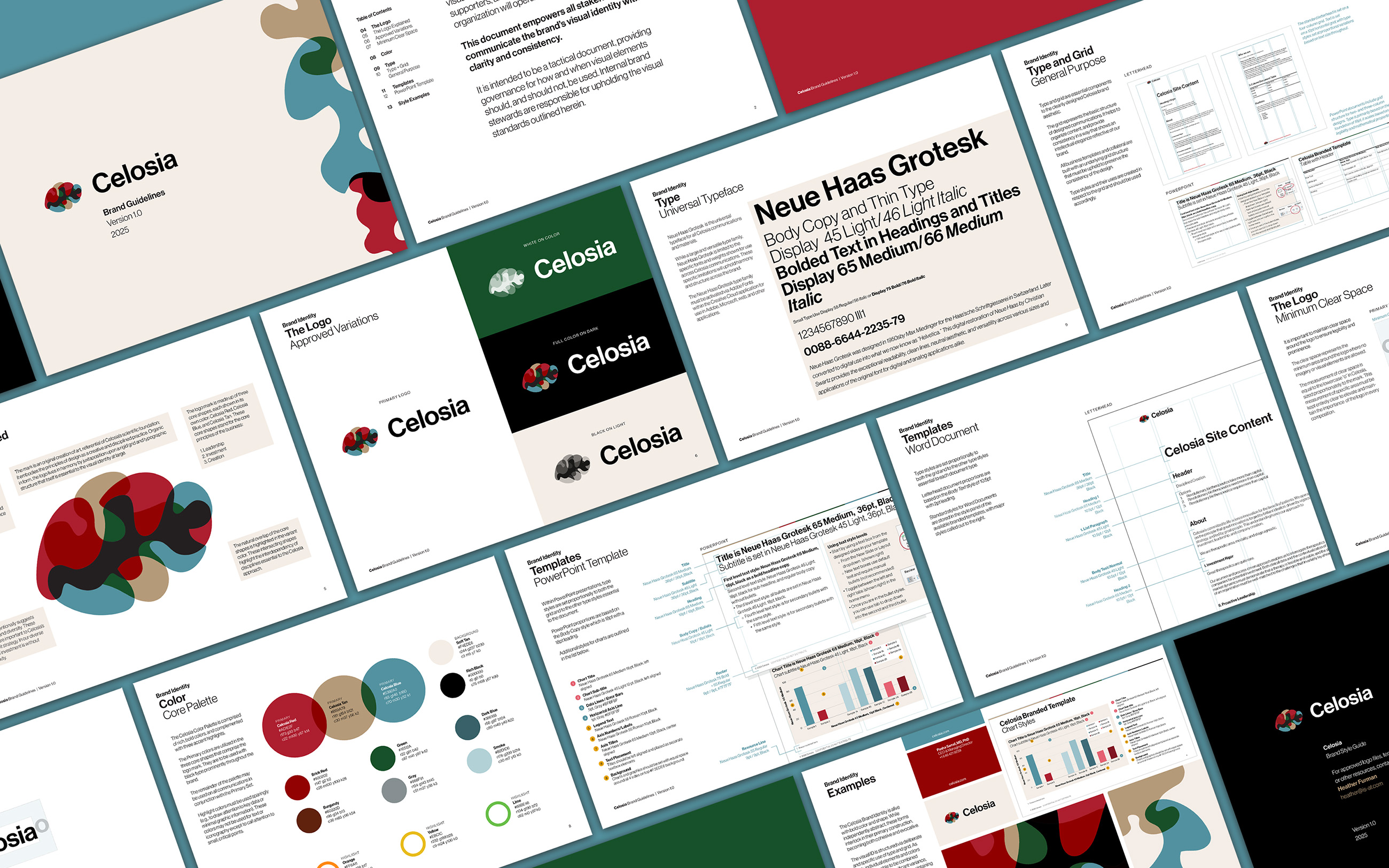
To deepen the meaning of the mark and highlight Celosia’s people–ideas–strategy approach to investing, the logo is constructed in three parts that, once combined, revealed other shapes and colors not visible when the parts are viewed alone. Each is a unique composition; together they make up a singular whole. Assigning meaning to each color adds further depth, representing a founder’s background and expertise.
For the visual identity to thrive in a communications system required a principled, grounding approach. is + at built a strong grid and typography, via Neue Hass Grotesk, to anchor the complexity and metaphor.
A disciplined identity that is at once both smart and approachable is the result. This identity lends itself to a digital presence that allows visual identity elements to interact, suggesting metaphor without distracting from the substantive meaning and calls to action of the Celosia website.
As the firm states, “valuable therapeutics require more than capital.” Celosia is expanding upon their vision by degrees, growing companies that work to return health the lives of patients. Several new biotech companies have come into their portfolio to-date, and their work is yielding truly impressive results.
CREDIT
- Agency/Creative: is + at
- Article Title: Celosia Brand Identity Design by is + at
- Organisation/Entity: Agency
- Project Type: Identity
- Project Status: Published
- Agency/Creative Country: United States
- Agency/Creative City: Brooklyn
- Market Region: North America
- Project Deliverables: Brand Design, Brand Guidelines, Brand Identity, Brand Mark, Creative Direction, Graphic Design, Identity System, Typography, User Experience, User Interaction, Web Design
- Industry: Professional Services
- Keywords: WBDS Creative Design Awards 2025/26 , Brand Identity Design
-
Credits:
Creative Director: Heather Furman
Strategic Director: Matthew Thornton


