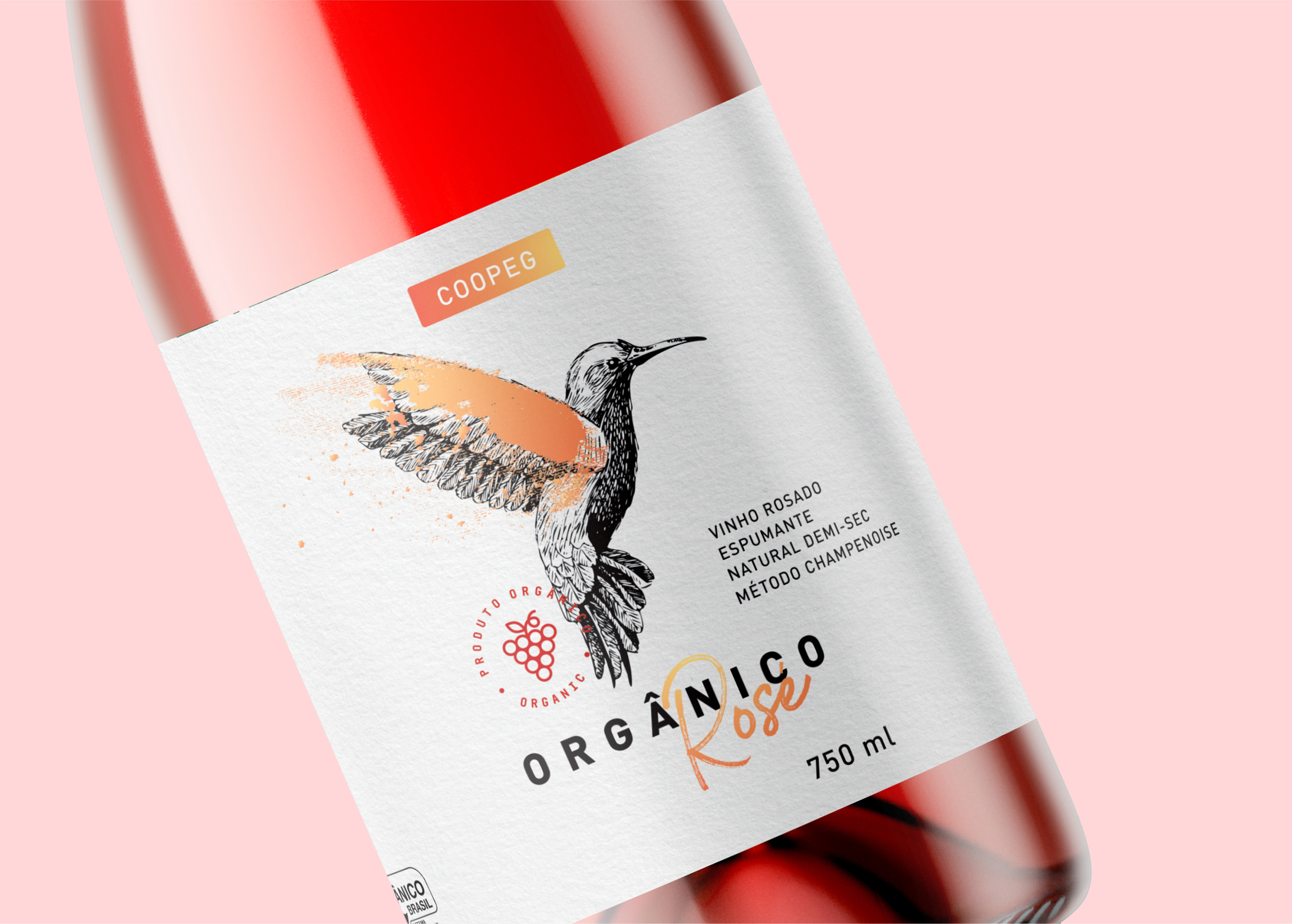
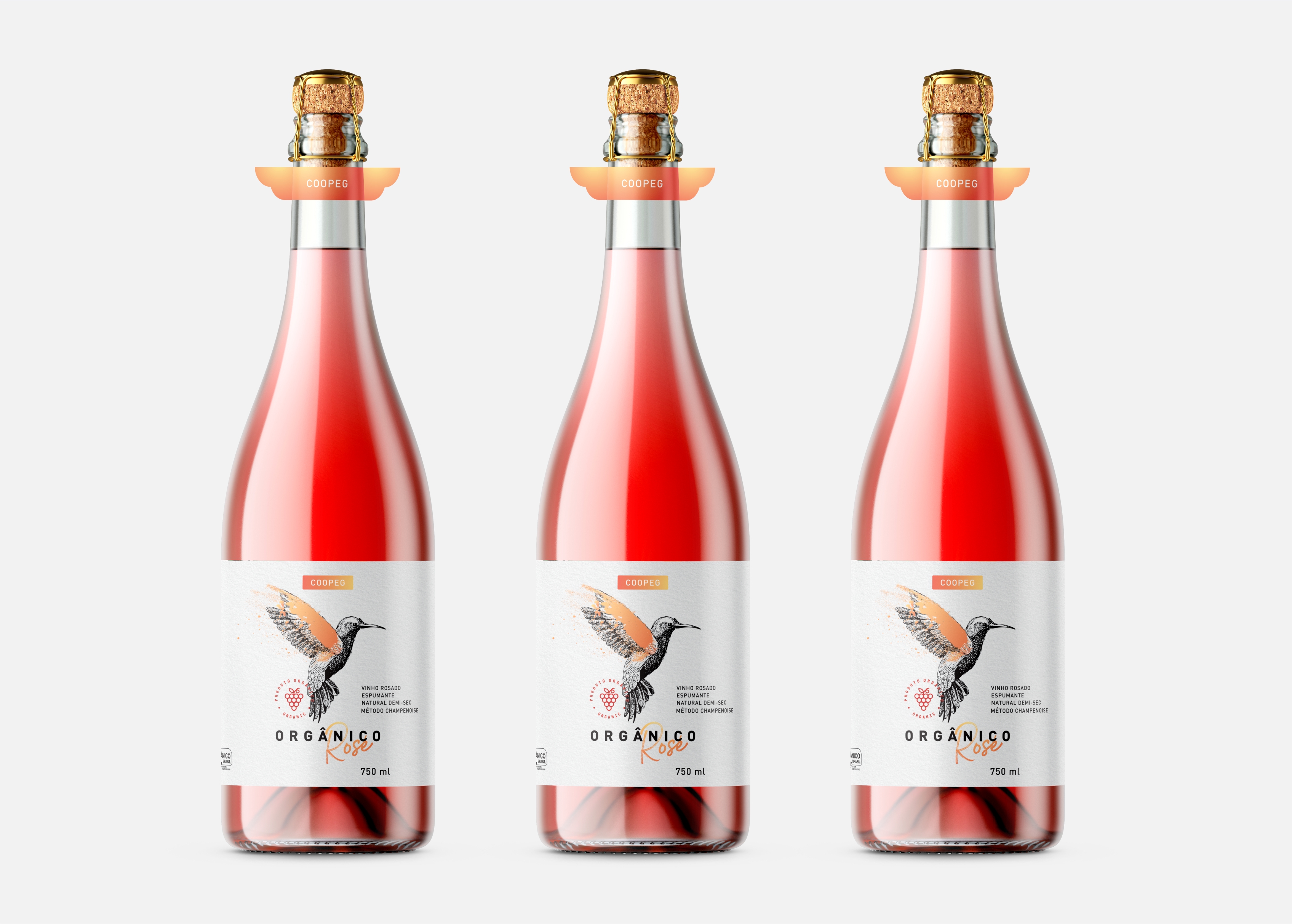
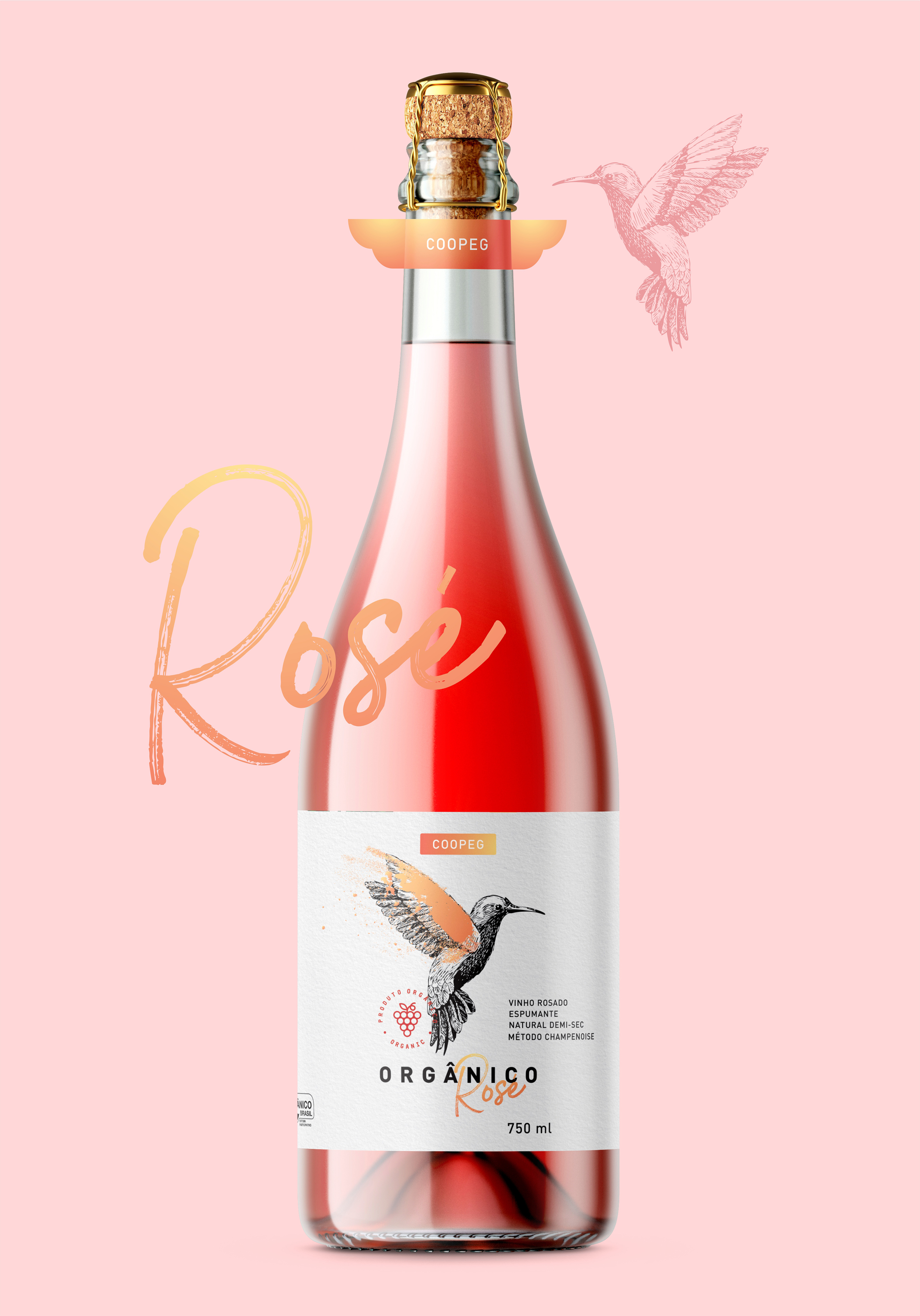
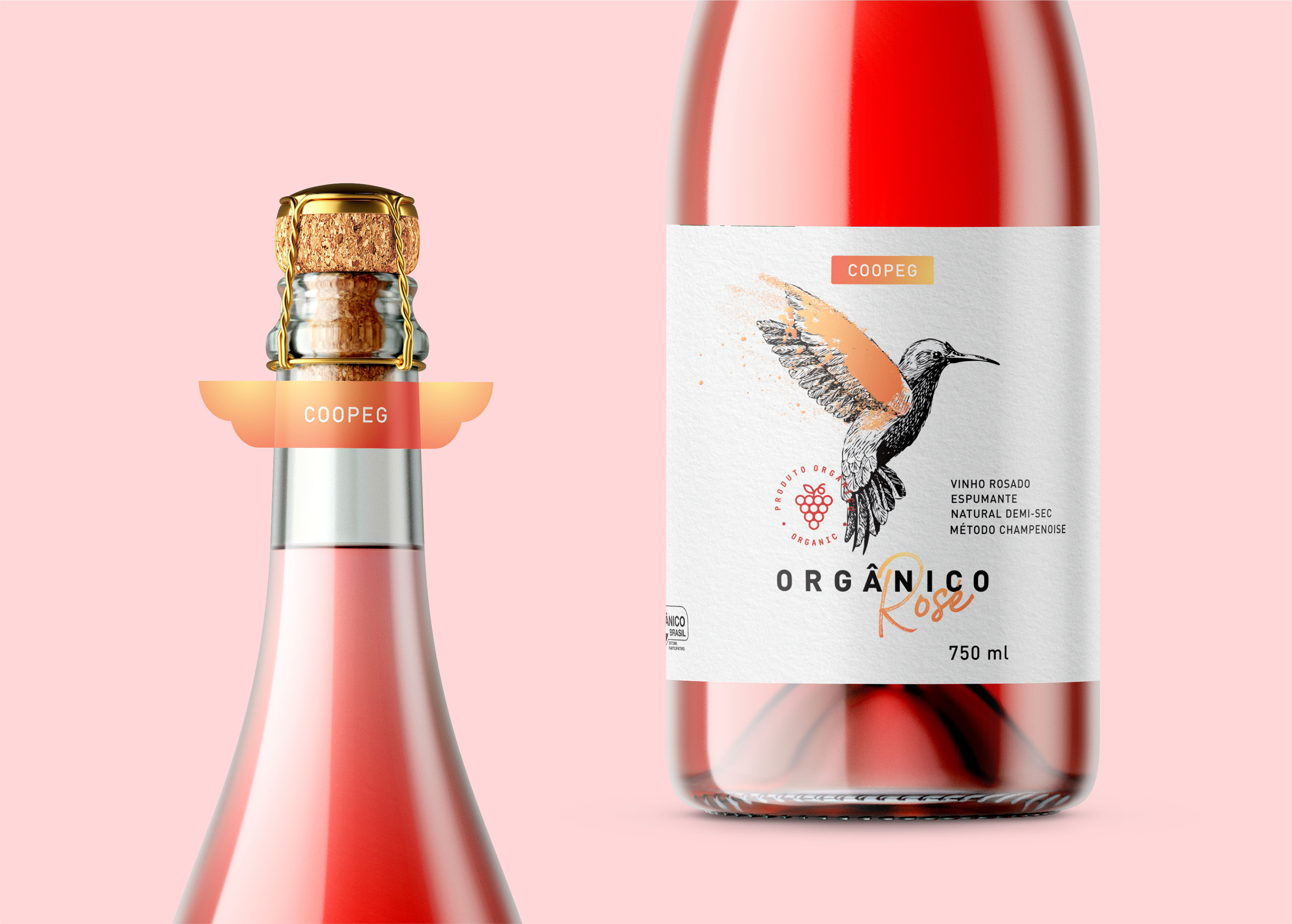
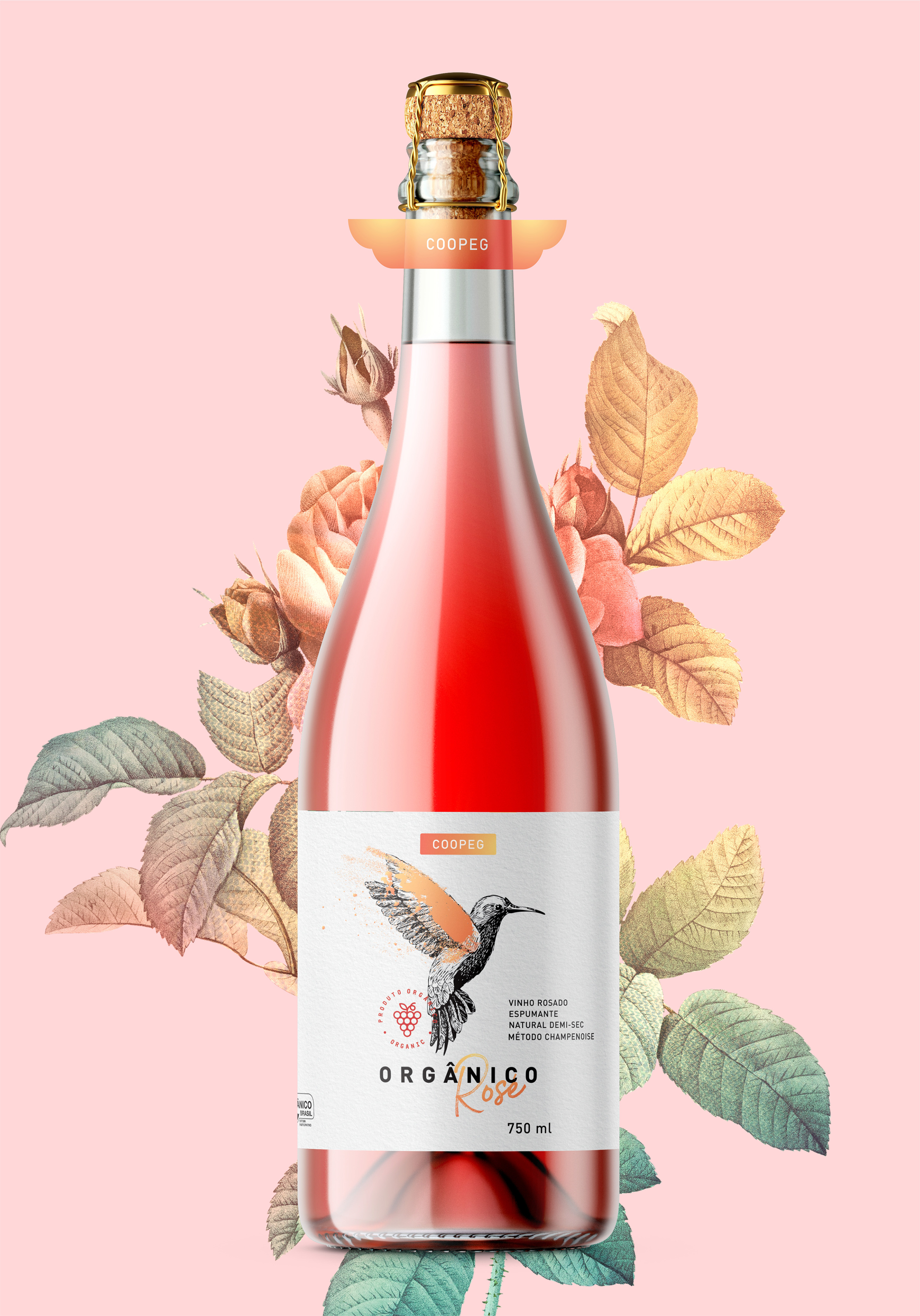
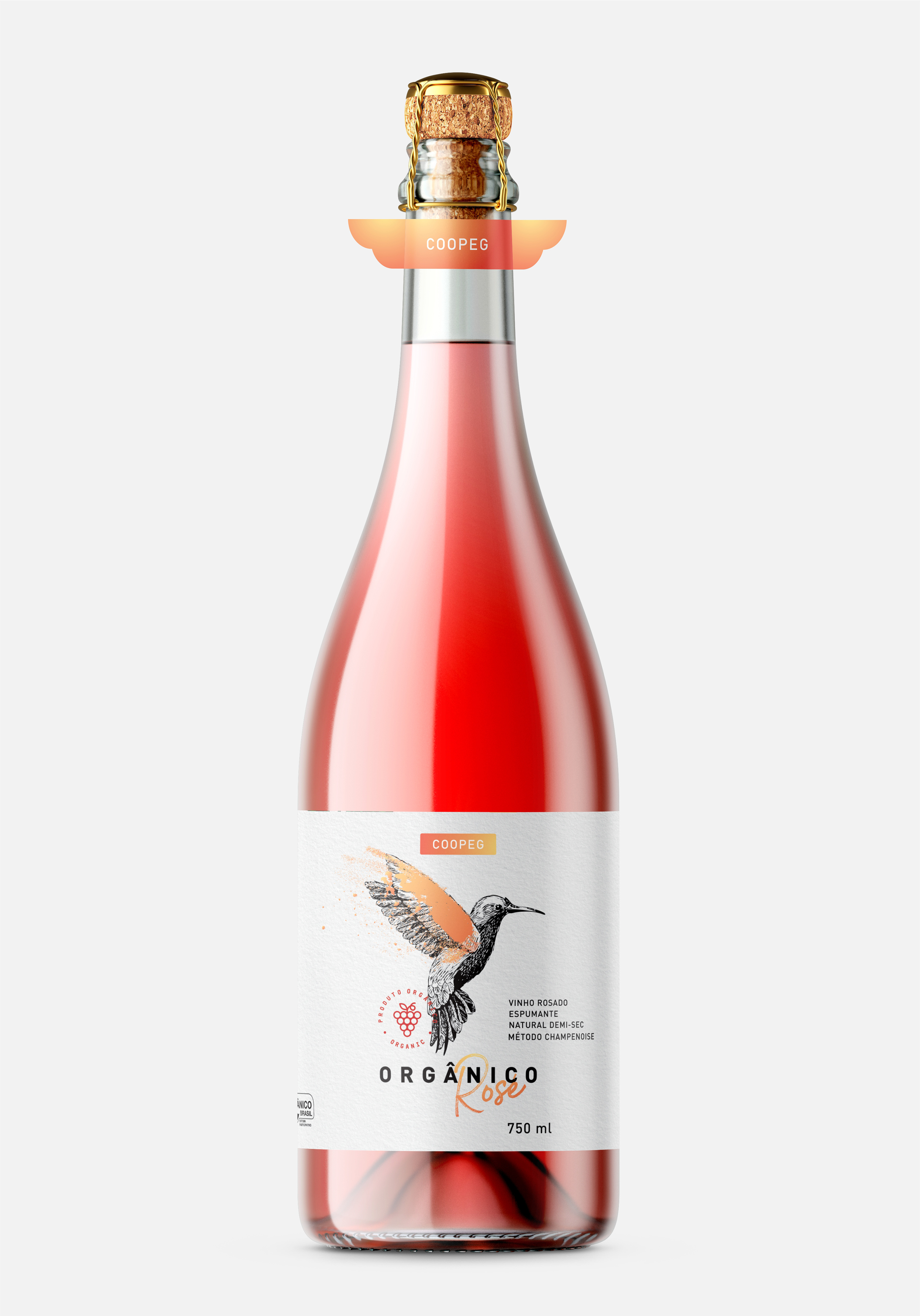
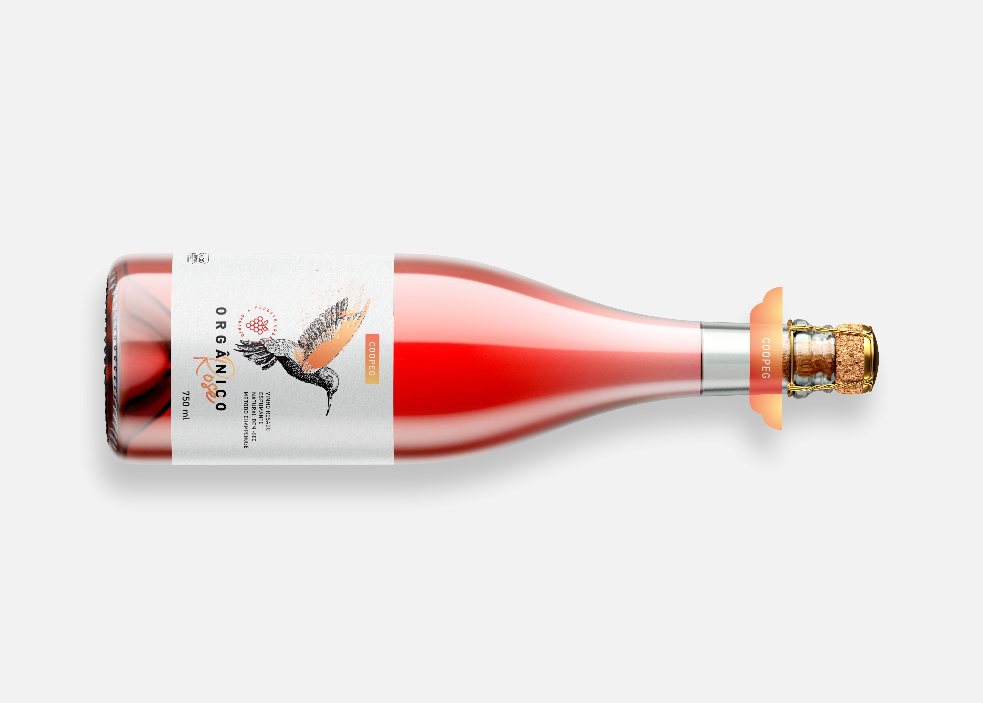
When I was asked to develop the new identity for COOPEG Rosé organic sparkling wine, we make a deal that the main characteristics to be reinforced would be: the natural, the organic origin of the product, the flavor of the sparkling Rosé (light and sweet), and the mixture between the rise of the value of the product and the typical Rosé relaxing feeling. For this purpose, the design proposes the use of a hummingbird as the main element, representing at the same time the natural origin and the sweetness of the sparkling wine. Also, the graphics selected in gold reinforce the appreciation of the product, which together with the free typography of “Rosé”, go along with the feeling of quality without austerity, making the product relaxed as it should be.
To make a great point of the differentiation of the product at the POS (point of sale), a sticker shaped like wings was created, remembering the hummingbird, and giving a bottle an iconic design to stick in the consumer’s memory.
CREDIT
- Agency/Creative: RPD Design
- Article Title: Celebrating the Rosé Spirit
- Organisation/Entity: Freelance, Published Commercial Design
- Project Type: Packaging
- Agency/Creative Country: Brazil
- Market Region: South America
- Project Deliverables: Brand Strategy, Graphic Design, Packaging Design, Research
- Format: Bottle
- Substrate: Glass Bottle


