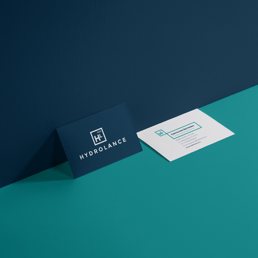
The situation: Hydrolance is one of largest suppliers of engineering equipment, firmly entering the top three market leaders in this field and trusted by huge number of builders, designers and suppliers. Nevertheless, the identity of the company, created in 1995, never changed. This is why Hydrolanceask CBA NVM to reshape the visual identity of the company.
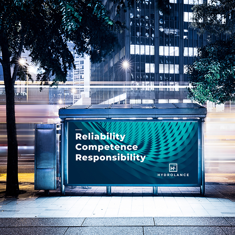
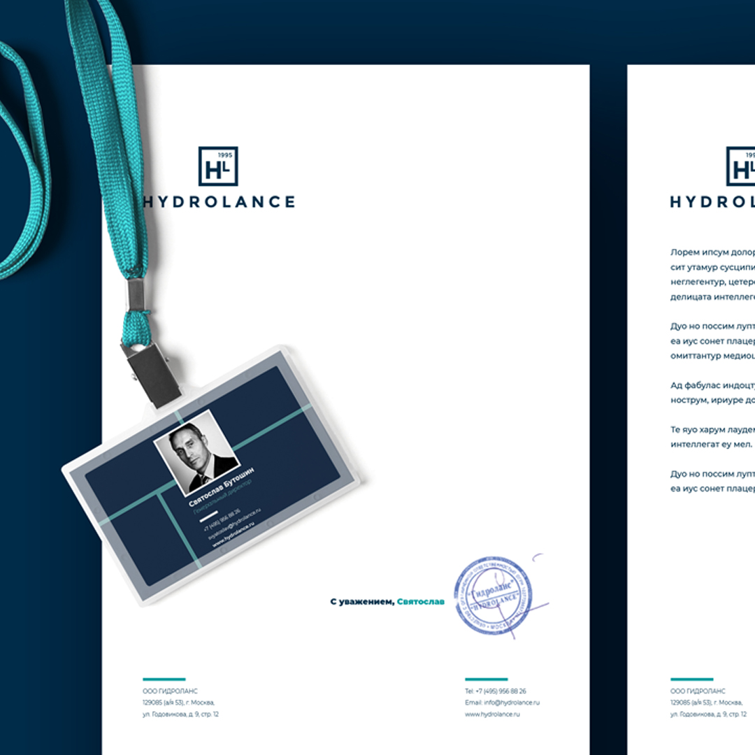
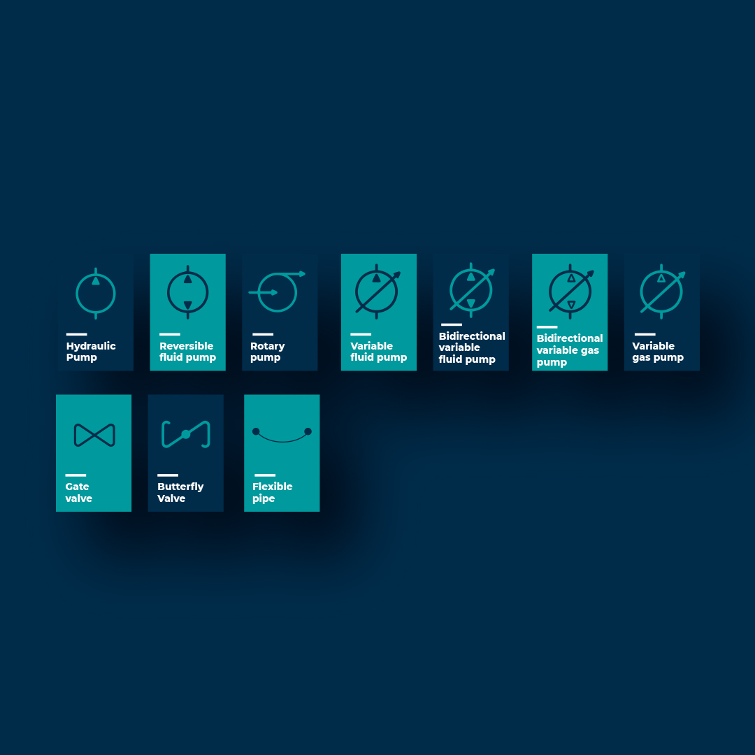
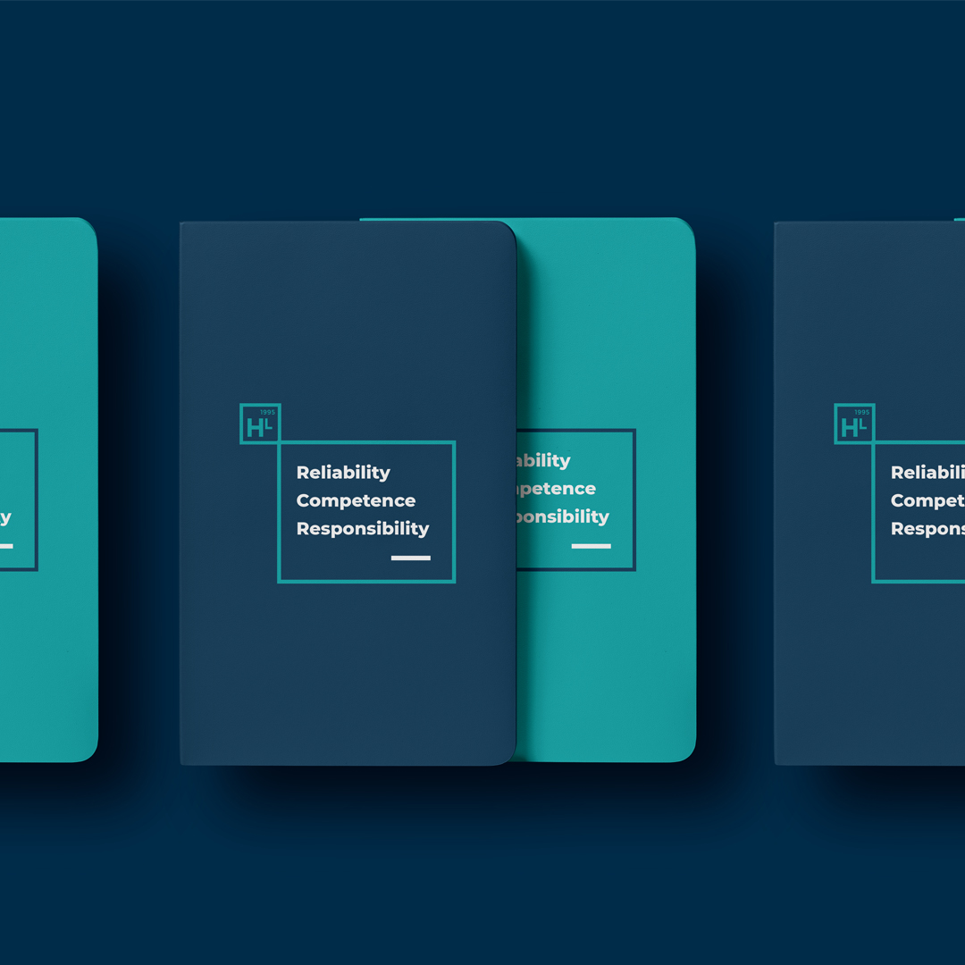
The solution: As Hydrolance is now international, CBA NVM design a modern visual identity for the brand and help her entering the global market. One of the first strong decision was to drop Cyrillic fopnt to make it more easy for international customers. We created a clear, impactful yet playful and bright identity, great importance was placed on simplicity of the message.
CREDIT
- Agency/Creative: CBA NVM
- Article Title: CBA Russia Creates New Corporate Identity
- Organisation/Entity: Agency, Published Commercial Design
- Project Type: Identity
- Agency/Creative Country: Russia
- Market Region: Global
- Project Deliverables: Brand Identity, Brand Strategy, Branding, Identity System, Rebranding, Tone of Voice
- Industry: Manufacturing
- Keywords: Branding, identity, design, engineering, russia
FEEDBACK
Relevance: Solution/idea in relation to brand, product or service
Implementation: Attention, detailing and finishing of final solution
Presentation: Text, visualisation and quality of the presentation


