


Introducing Cavilo, a brand that stands as a symbol of inclusive beauty and natural care. As a mother brand for multiple lines of hair and skincare products, Cavilo is built on the principles of embracing diversity and celebrating individuality. This project provided a unique opportunity to explore the delicate balance between bold, eye-catching elements and the clean, minimalist design that modern brands demand. The goal was to create a visual identity that could both stand out on its own and remain flexible enough to extend across various product lines, each with its unique target audience.
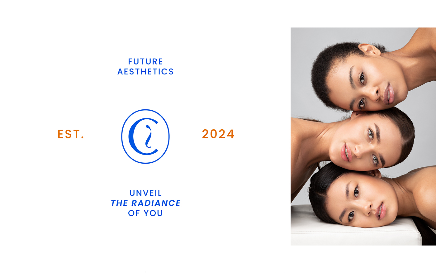
Cavilo’s branding journey started with in-depth research into its core values—clean beauty, inclusivity, and natural wellness. The design process included creating a logo that reflects these principles: bold and confident, yet adaptable to different product categories. The challenge was to ensure that Cavilo’s identity would be recognizable and cohesive, regardless of the product line it represented. Whether it’s skincare or haircare, the brand needed to speak a universal language of trust, quality, and modern elegance.
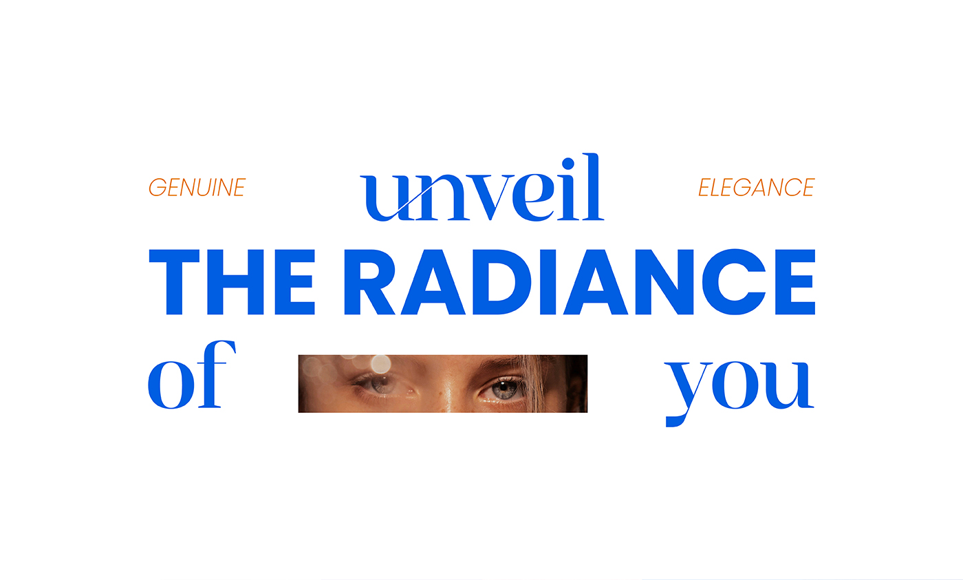
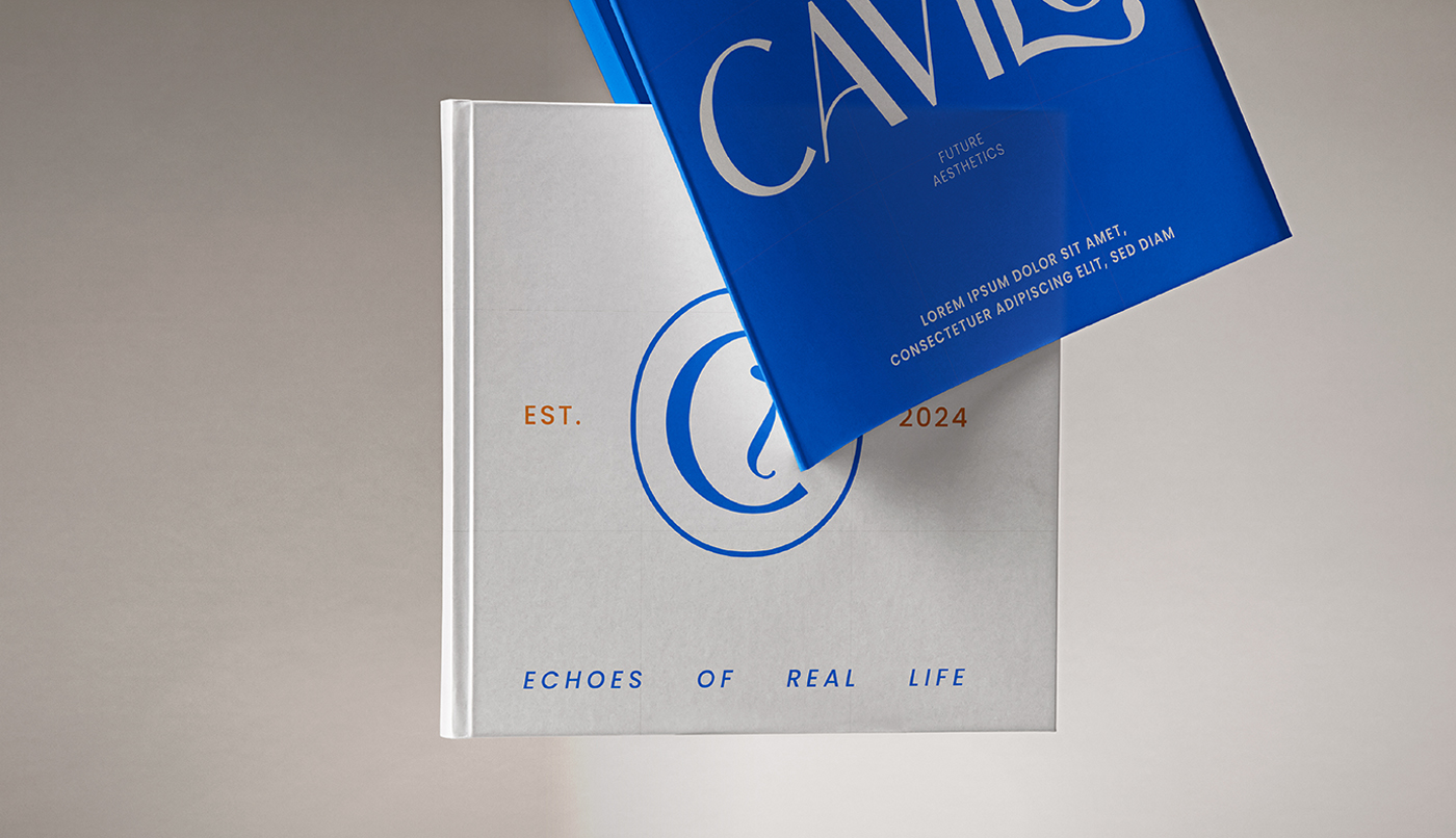
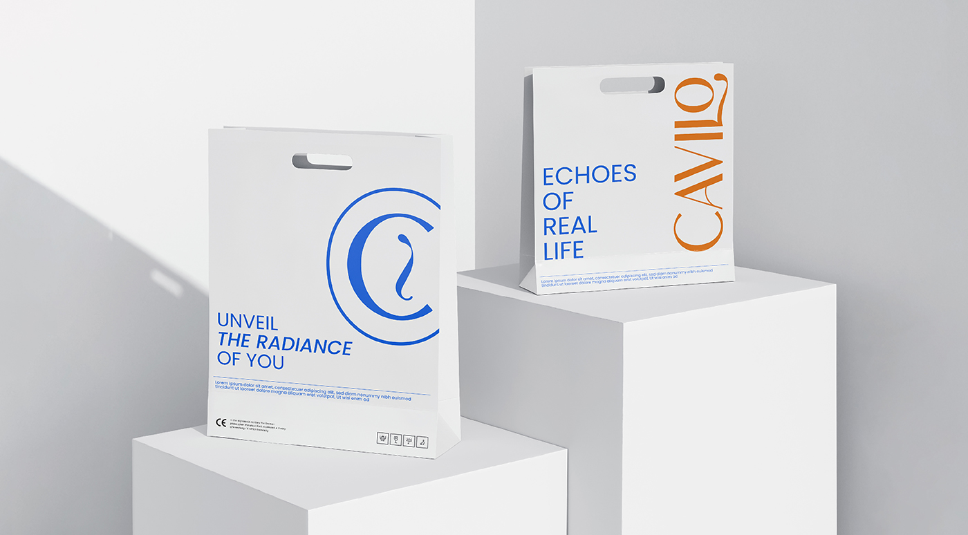
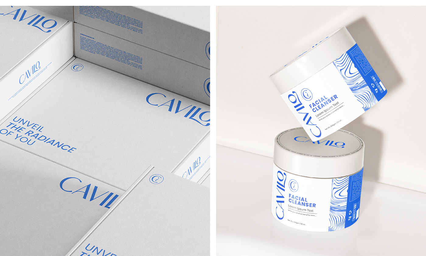
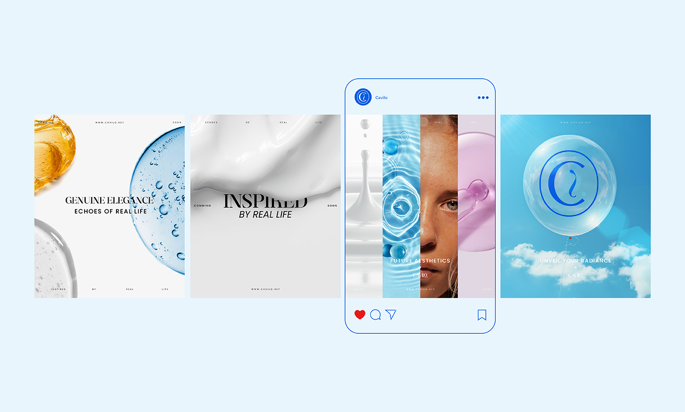
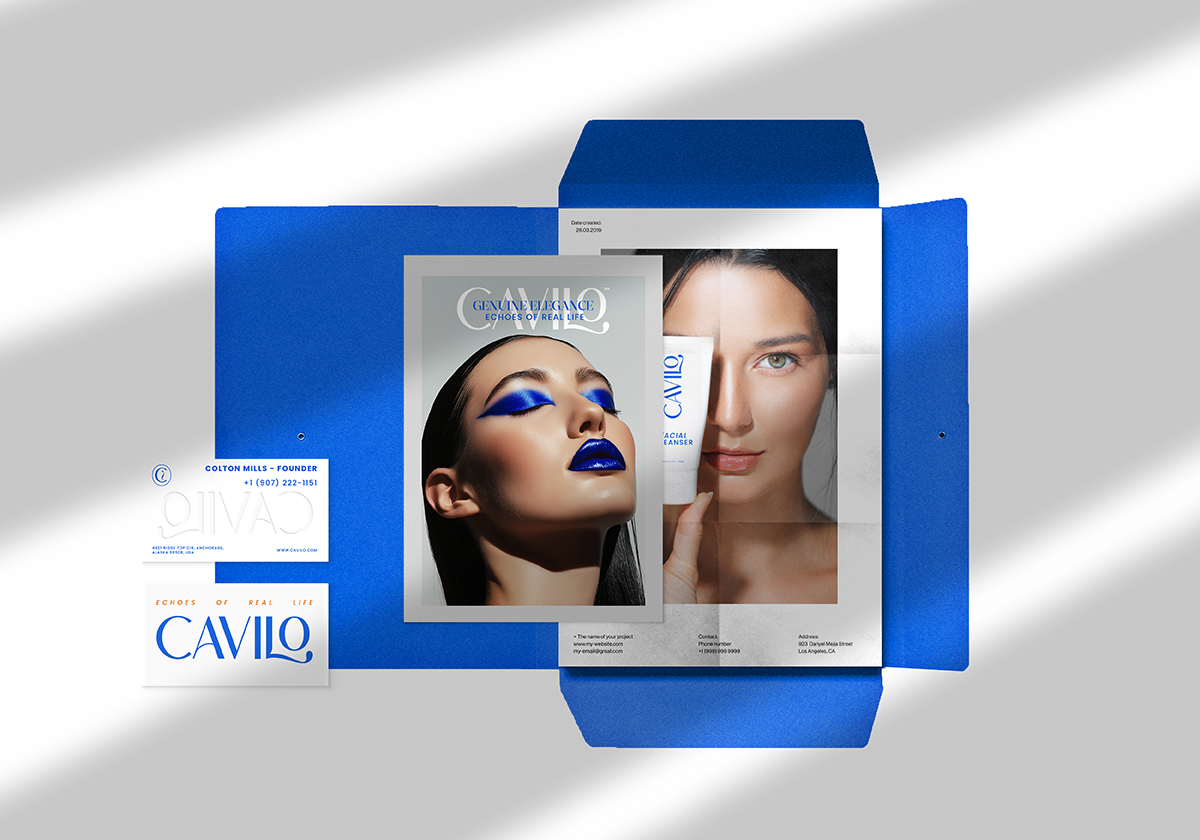
The color palette played a crucial role in this project. Vibrant shades like Spanish Orange and True Blue were chosen to symbolize energy and stability, while neutral tones like Diamond and Rich Black added sophistication and balance. This combination allowed for a visually striking yet approachable design, perfectly capturing Cavilo’s essence. The typography also echoed this balance, featuring a bold wordmark that conveys confidence and authority, yet remains versatile enough to suit multiple applications, from packaging to digital platforms.
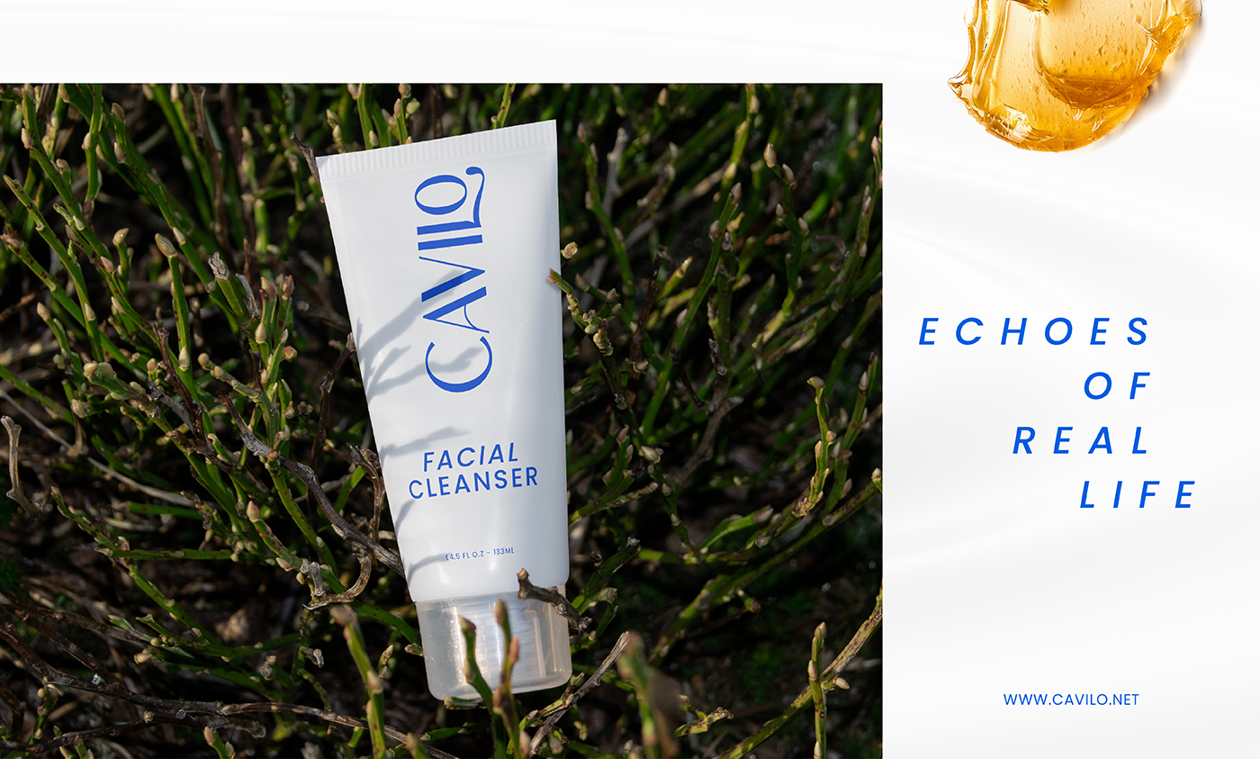
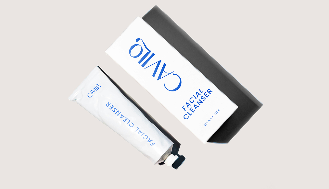
The packaging design was another critical aspect of the project. Cavilo’s products are designed to appeal to a wide range of audiences, so the packaging had to be equally inclusive. The minimalist approach ensured that the packaging remained elegant and accessible, while the bold colors and clear typography helped the products stand out on the shelves. The design language was kept simple yet impactful, reflecting the brand’s focus on natural beauty and effective solutions.

CREDIT
- Agency/Creative: Abdelrahman Raslan
- Article Title: Cavilo’s Hair and Skincare Brand Identity by Abdelrahman Raslan
- Organisation/Entity: Freelance
- Project Type: Identity
- Project Status: Published
- Agency/Creative Country: Egypt
- Agency/Creative City: Alexandria
- Market Region: Middle East
- Project Deliverables: Art Direction, Brand Design, Brand Strategy
- Industry: Beauty/Cosmetics
- Keywords: Branding, Visual Identity, Graphic Design, Minimalism, Bold Design, Skincare Branding, Haircare Branding, Clean Beauty, Inclusive Beauty, Packaging Design, Creative Direction, Brand Strategy, Product Design, Logo Design, Market Challenge, Eco-Friendly Design, Color Palette, Brand Development
-
Credits:
Multi-Disciplinary Designer: Abdelrahman Raslan


