‘Discover moments to pause and pamper’ – When water and sky touch on the horizon and the light shimmers atmospherically on the water surface, this special moment is created. A moment to pause and linger. A moment of calm and reflection. Bluphoria is this moment – light and carefree. A moment that gives you what is good for you and makes you happy. In which you can recharge your batteries, calm your mind, and touch your senses. Bluphoria crosses the physical boundaries of the paradisiacal thermal baths and bathing worlds of the thermal group Josef Wund, creating moments of well-being detached from space and time. With the new Bluphoria wellbeing brand experience, their guests can not only treat themselves to special breaks, but they can also now prepare relaxing wellness moments at home to pamper and pause.
The full immersive world of Bluphoria can be experienced by visiting the Therme Bathing Paradise in Black Forest, Germany. Bluphoria offers a full digital & physical immersive experience to their customers. The digital wellness content can be enjoyed whenever they want, wherever they want. They can choose their moment from a variety of categories like, guided meditations, sensory journeys, audio soundscapes, and personalised recommendations. The sensual wellbeing products can be enjoyed both at the Josef Wund Spa locations, as well as at home, which include bath & body, skincare, and nutrition products. The strategy and immersive digital experience were created by the creative, tech and production agency Happy Finish.
The project scope spanned Brand identity, brand packaging, naming, brand asset creation, brand guidelines, print and technical support.
The brand identity was inspired by their unique and iconic sites and the interplay of the elements – the clear, reflective water and the biophilic natural worlds of their thermal paradises – an authentic brand philosophy is born: Inside Out Wellbeing.
They believe that a true sense of wellbeing emerges when Inner and Outer Self align in harmony, when we connect with and nurture our needs for emotional, mental, and physical health. To nourish the body, mind, and soul Thermengruppe Josef Wund takes the greatest care in the selection and development of our Bluphoria products, and the quality of the ingredients used.
The name echoes the brands’ philosophy and is a combination of ‘Blue’ and ‘Euphoria’. ‘Blue’ is symbolic of the ocean and the sky, representing a feeling of serenity, tranquillity, and relaxation. ‘Euphoria’ is derived from the Ancient Greek term ‘euphoros’ meaning ‘born well, healthy.
Inside Out Wellbeing conjures up the idea of ‘duality’, which threads throughout the brand identity. From the portmanteau brand name, and the reflected logo, to the beautiful horizons where the sky meets the ocean.
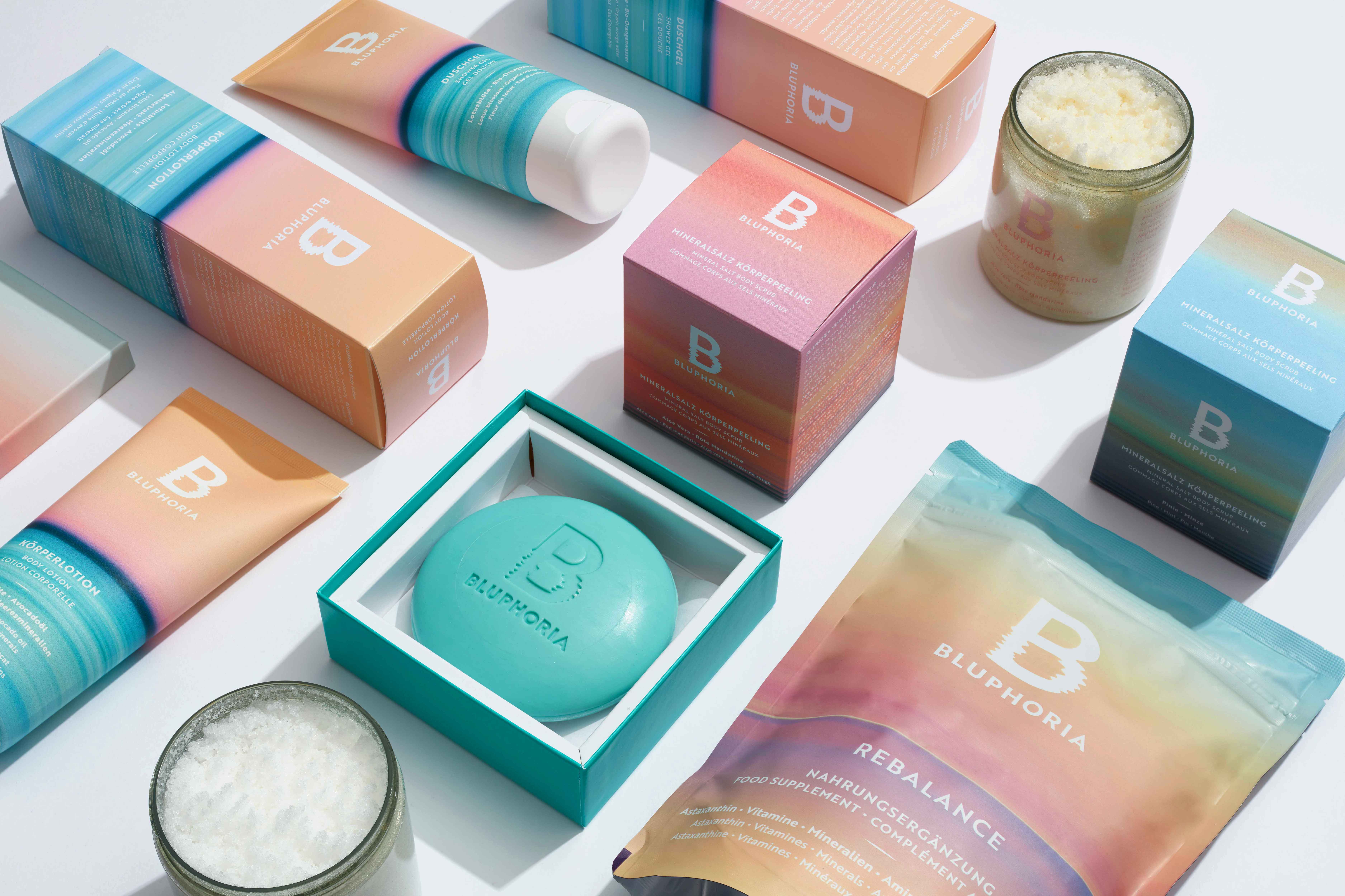
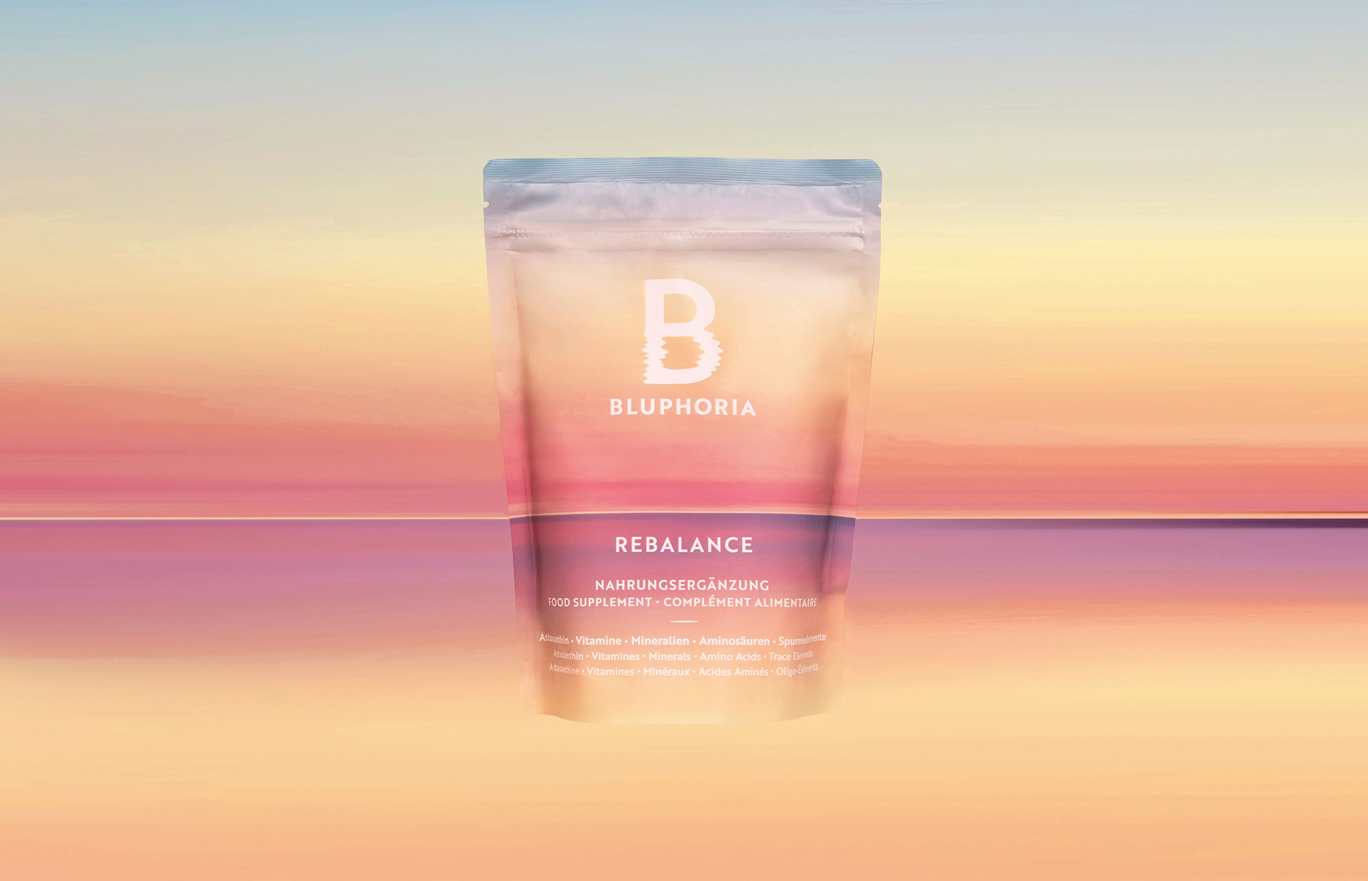
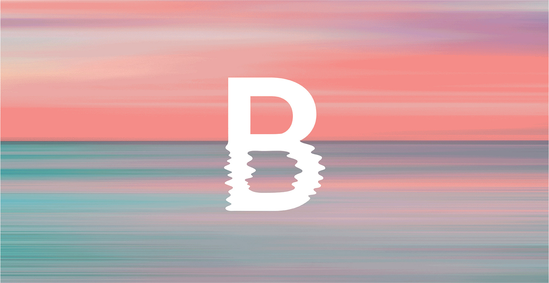
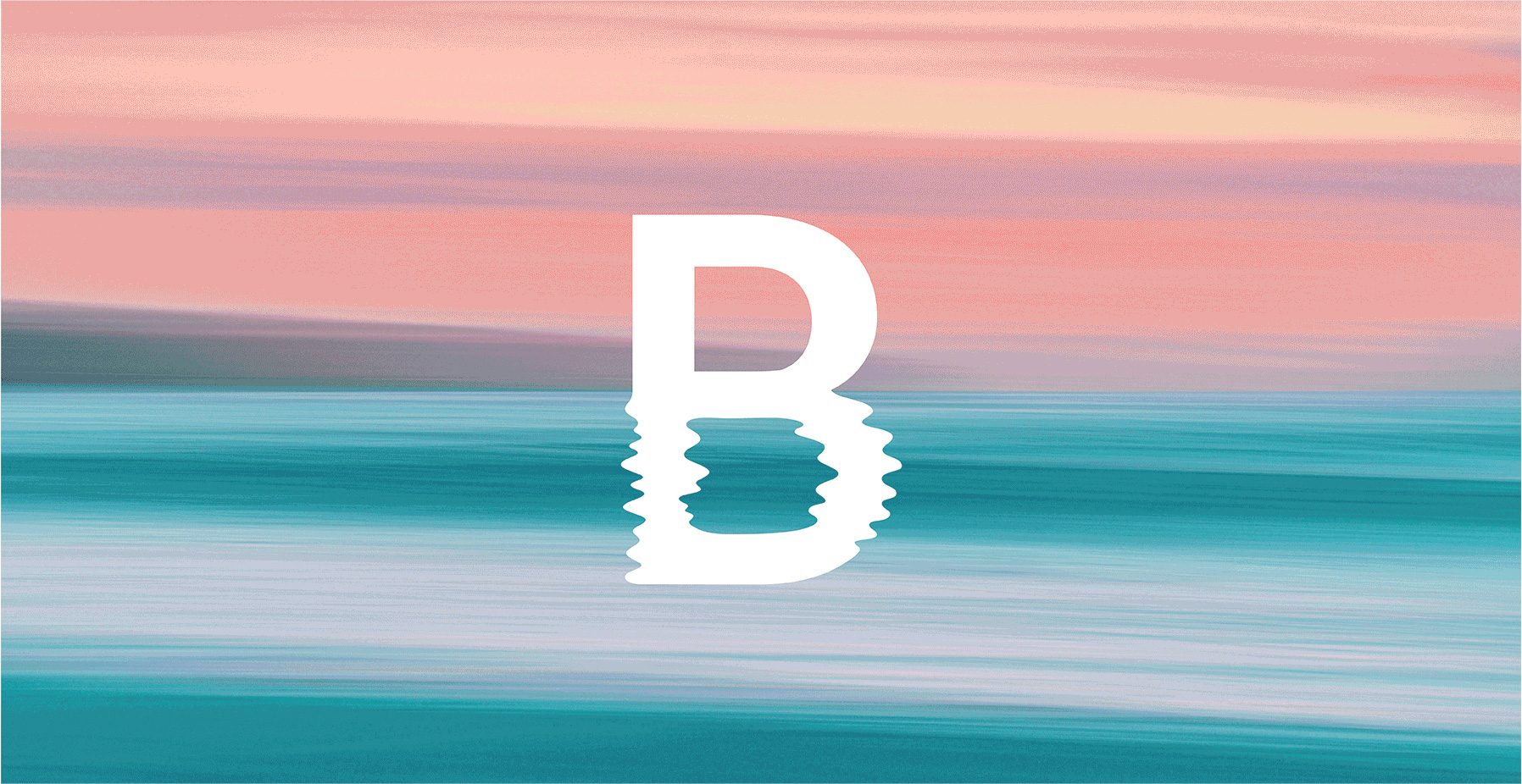
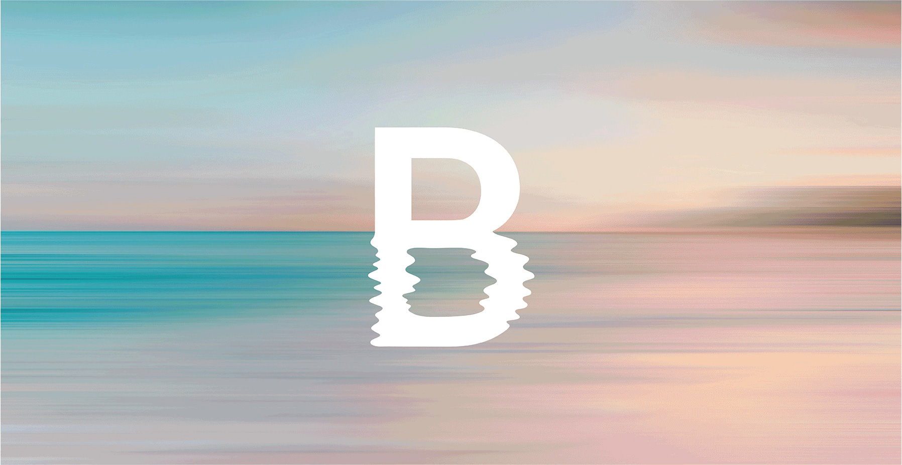
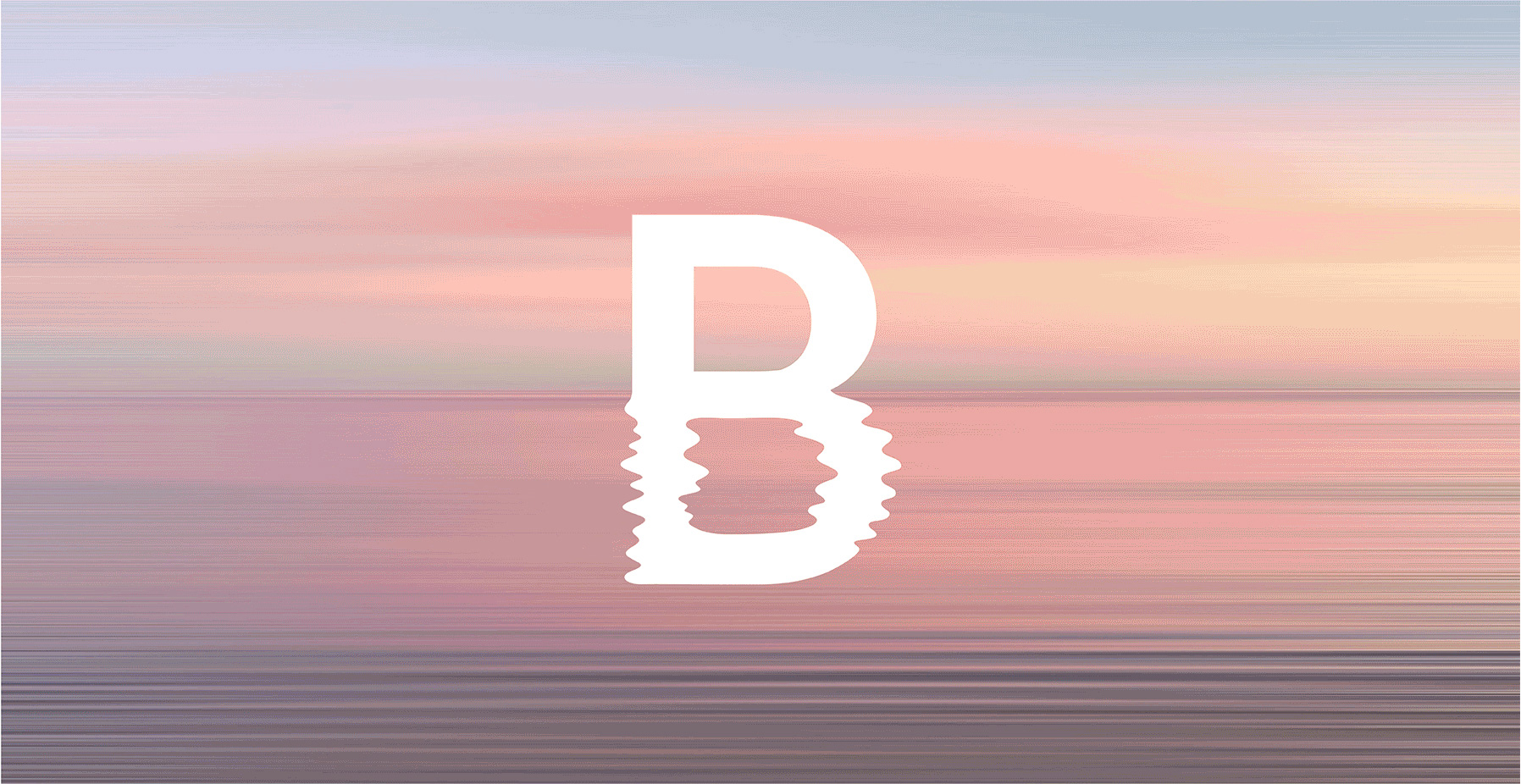
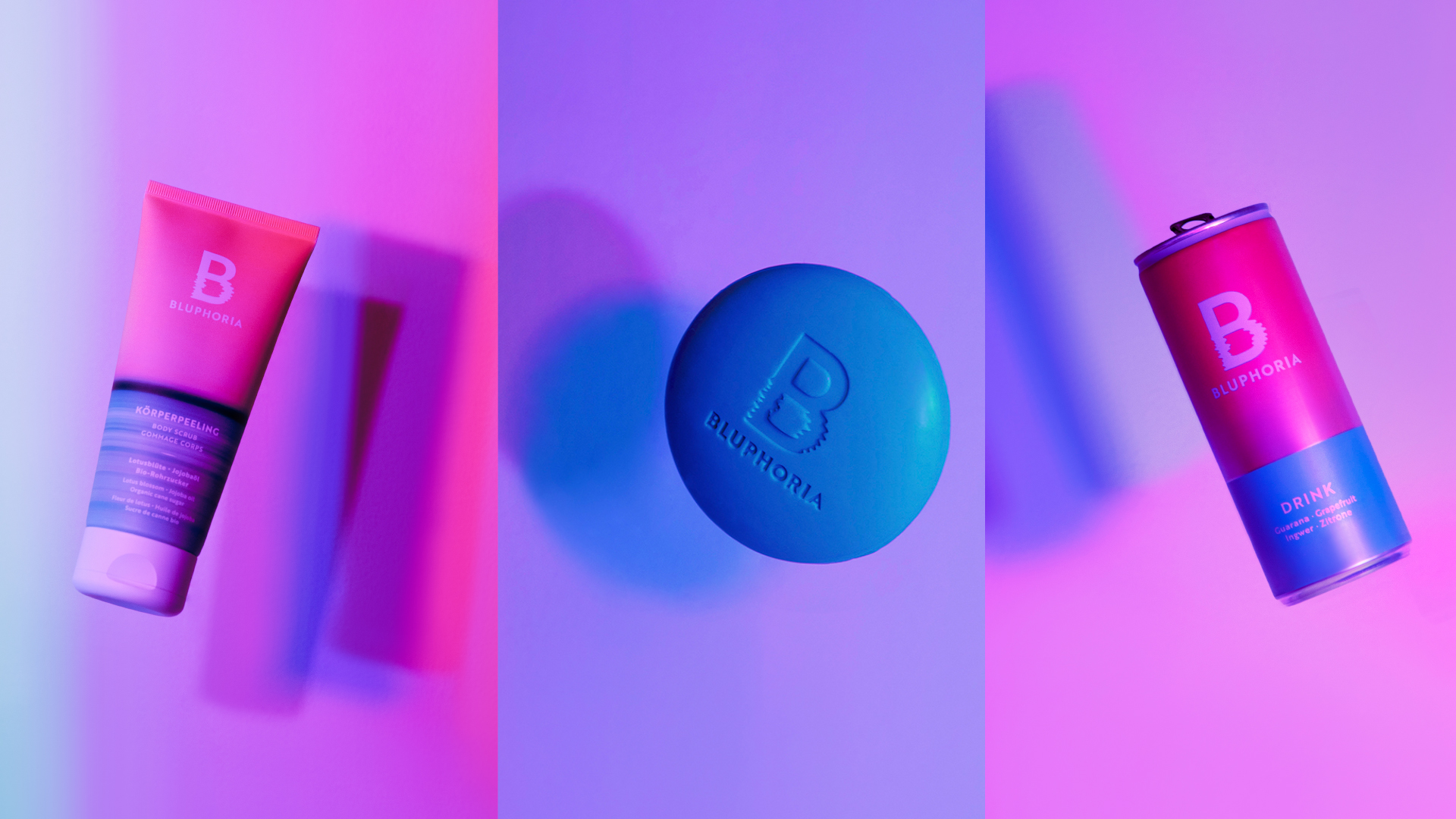
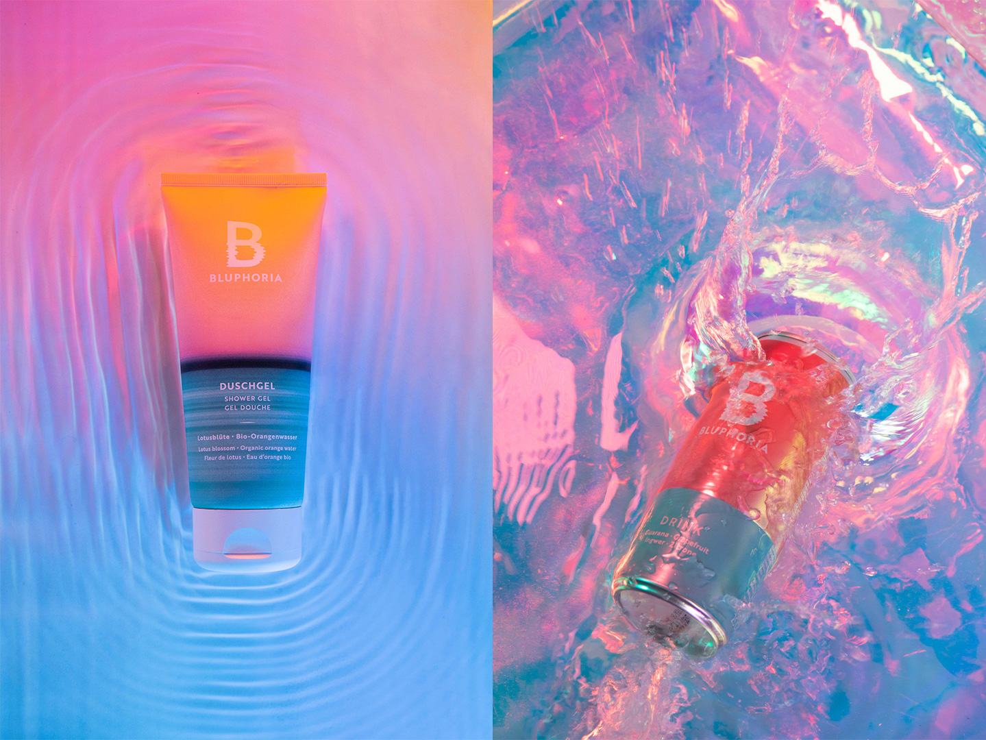
The evocative visual cues of Bluphoria describes the immersion into a unique world. The letter ‘B’ is presented as a mirror image of itself, part solid, part reflection, just as light is reflected in water; light that hits the surface of water and bounces back; reflections that dissolve into lively formations and movements, depicted against the atmospheric background of the Bluphoria brand identity. The logotype was crafted to be minimalistic, contemporary, and approachable, allowing the background horizons and ‘B’ logo to shine, as well as providing a strong foundation for it to float above.
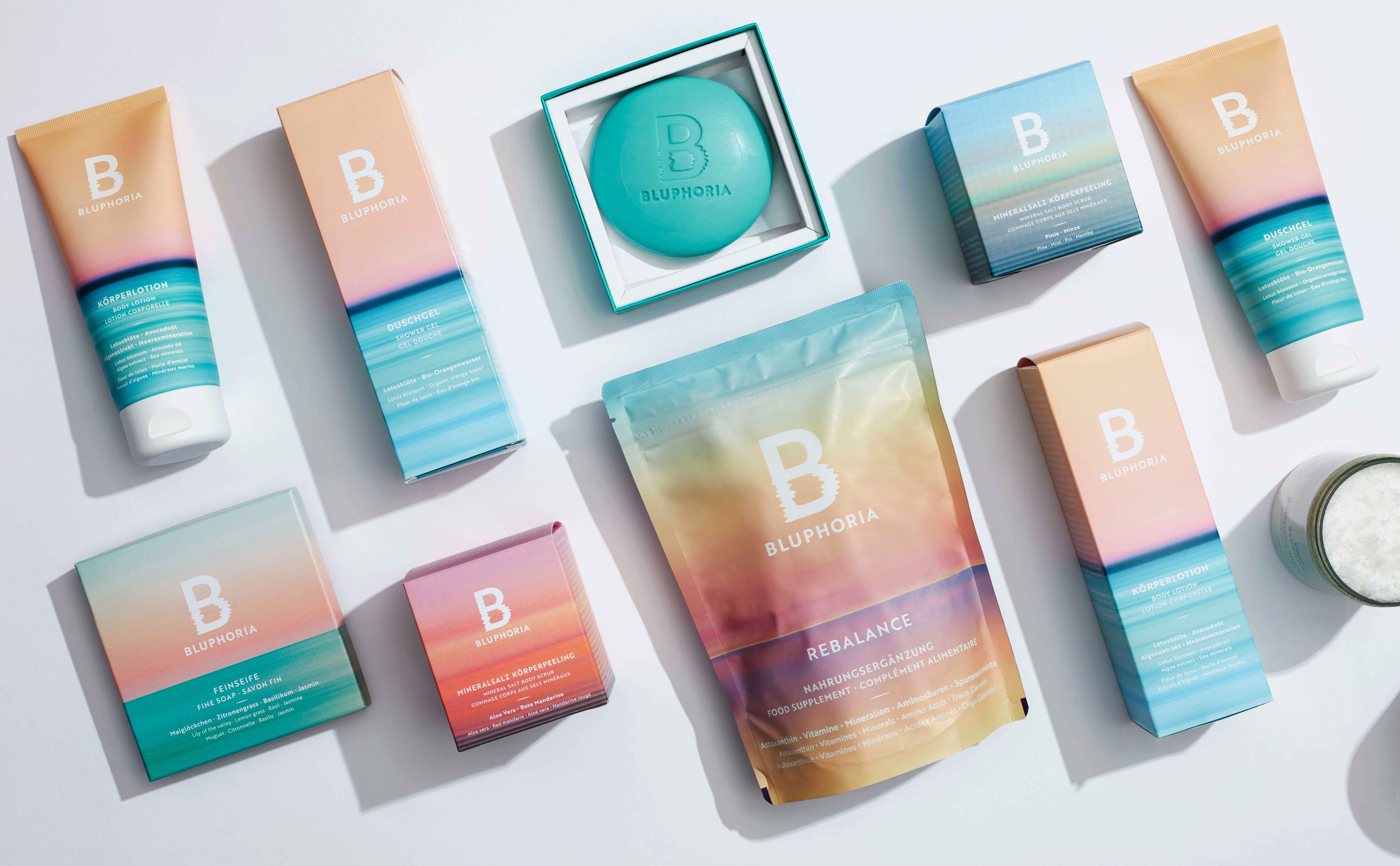
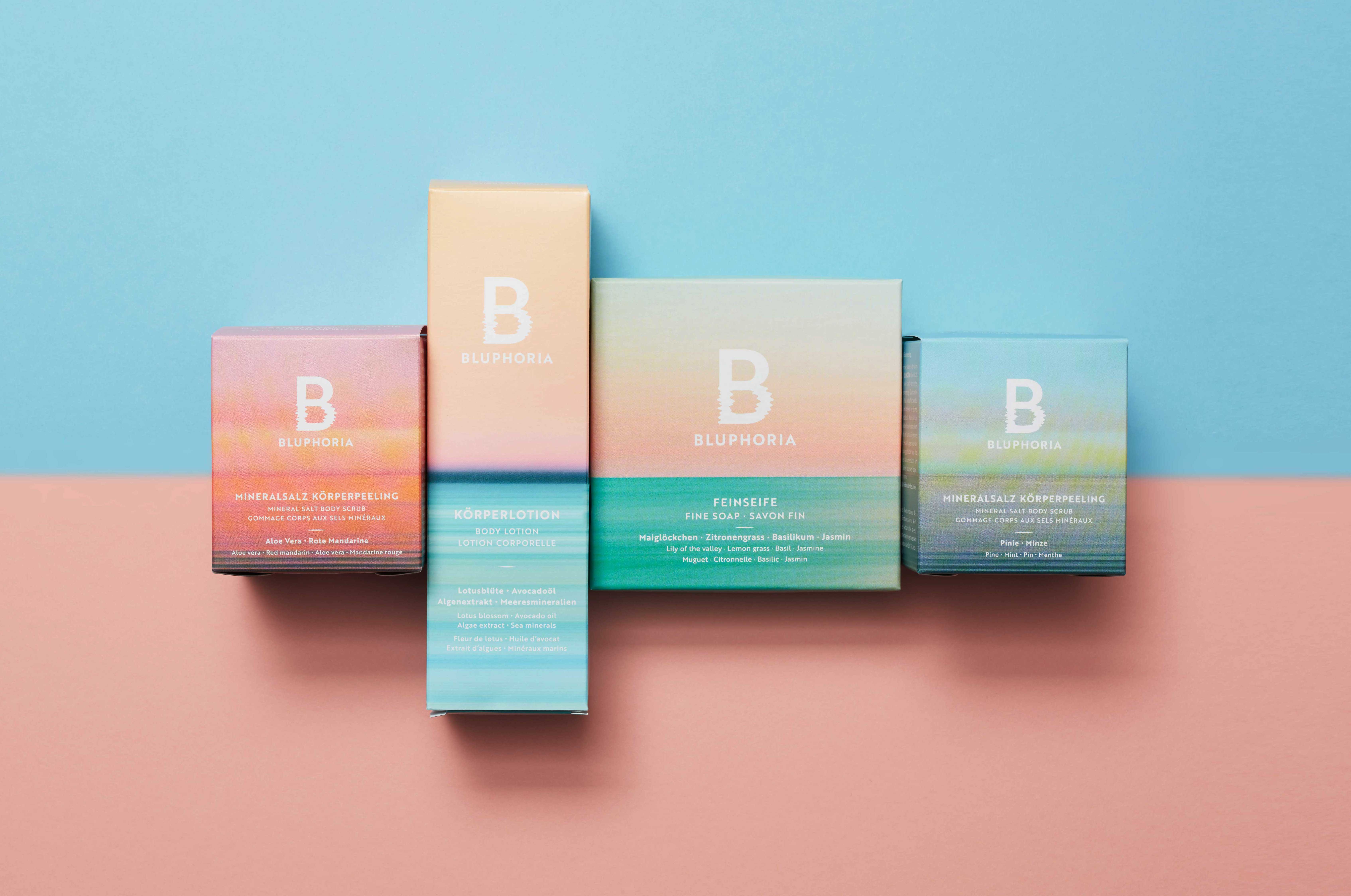
The horizon backgrounds add depth to the brand expression and strengthen their wellbeing credentials. There is currently a selection of 6 horizon backgrounds and were chosen specifically to evoke the different moods experienced at the wellbeing locations of the Thermengruppe Josef Wund.
The design vision was to flood each of the spa products with the evocative photographic horizon scenes. The design had to work across various substrates like carton board, aluminium cans, silver pouches, and plastic components. To achieve the desired look & feel each of the packaging substrates had their own individual technical challenges. With close collaboration with the manufacturer and technical packaging team, these challenges were overcome, and a high-quality print finish achieved.
The brands primary colour is Bluphoria Blue creates a calming and soothing effect and relates to the abundance of water and sky that envelopes the natural worlds of their thermal paradises. Bluphoria Blue is used to create contrast with warm colours like reds, oranges, and yellows. Combined they create a bold, vibrant, and yet serene design.
CREDIT
- Agency/Creative: Cattle Brands Studio
- Article Title: Cattle Brands Studio Creates Bluphoria – A New Wellbeing Brand Reimagining Spa Culture Today and Into The Future
- Organisation/Entity: Agency
- Project Type: Packaging
- Project Status: Published
- Agency/Creative Country: United Kingdom
- Agency/Creative City: London
- Market Region: Europe
- Project Deliverables: Brand Creation
- Format: Pouch
- Substrate: Plastic
- Industry: Beauty/Cosmetics
- Keywords: WBDS Agency Design Awards 2023/24
- Keywords: Bluphoria, wellbeing, immersive, brand identity & packaging, spa experience.
-
Credits:
Strategy and Digital Experience: Happy Finish
Technical & Artwork: Steve Williams
Pack Shot Photographer 1: David Lidbetter
Pack Shot Photographer 2: Arianne Amores


