


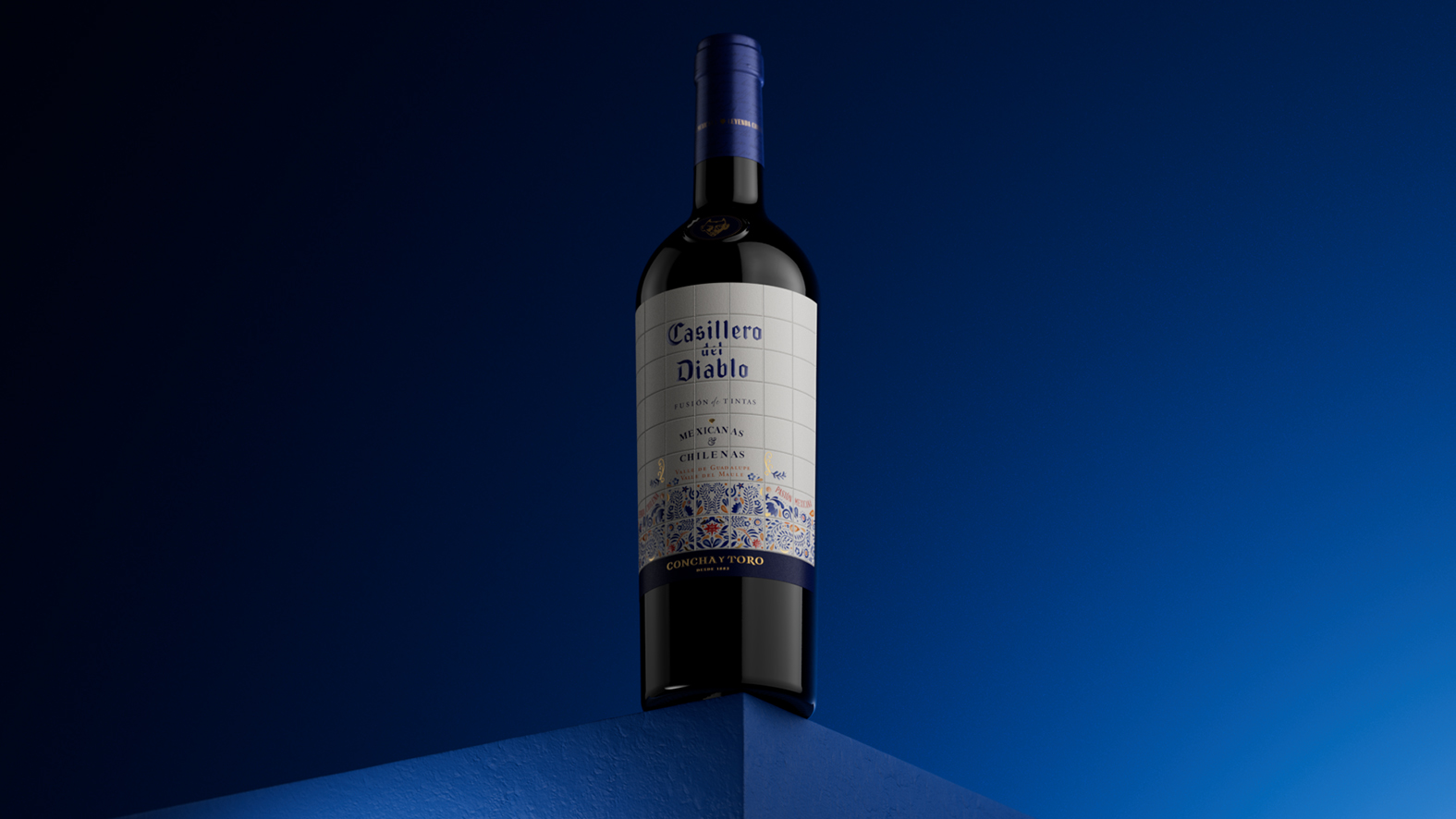
The Challenge: Uniting Two Origins Without Clichés
How do you represent the union of two countries like Chile and Mexico on a single label? This was the challenge presented to us by Casillero del Diablo (Viña Concha y Toro) for its first wine blending vineyards from both countries. The objective was clear: to create packaging that would pay homage to Baja California as a Mexican origin, while keeping the global DNA and winemaking seal of such an established brand intact. The risk was twofold: falling into cultural stereotypes or, conversely, creating a design so generic it communicated nothing. We knew the Chilean heritage was already implicit in the Casillero del Diablo brand itself; therefore, the strategic focus had to be on representing Mexico in an authentic, premium, and universal way.
The Strategic Vision: From the F1 Grand Prix to Talavera
The inspiration came not from the world of wine, but from the Mexican F1 Grand Prix. We observed how a global luxury event managed to integrate and celebrate Mexican culture through artistic interpretations on helmets and graphic pieces. It was proof that one could speak the language of Mexican art on a premium, international stage.
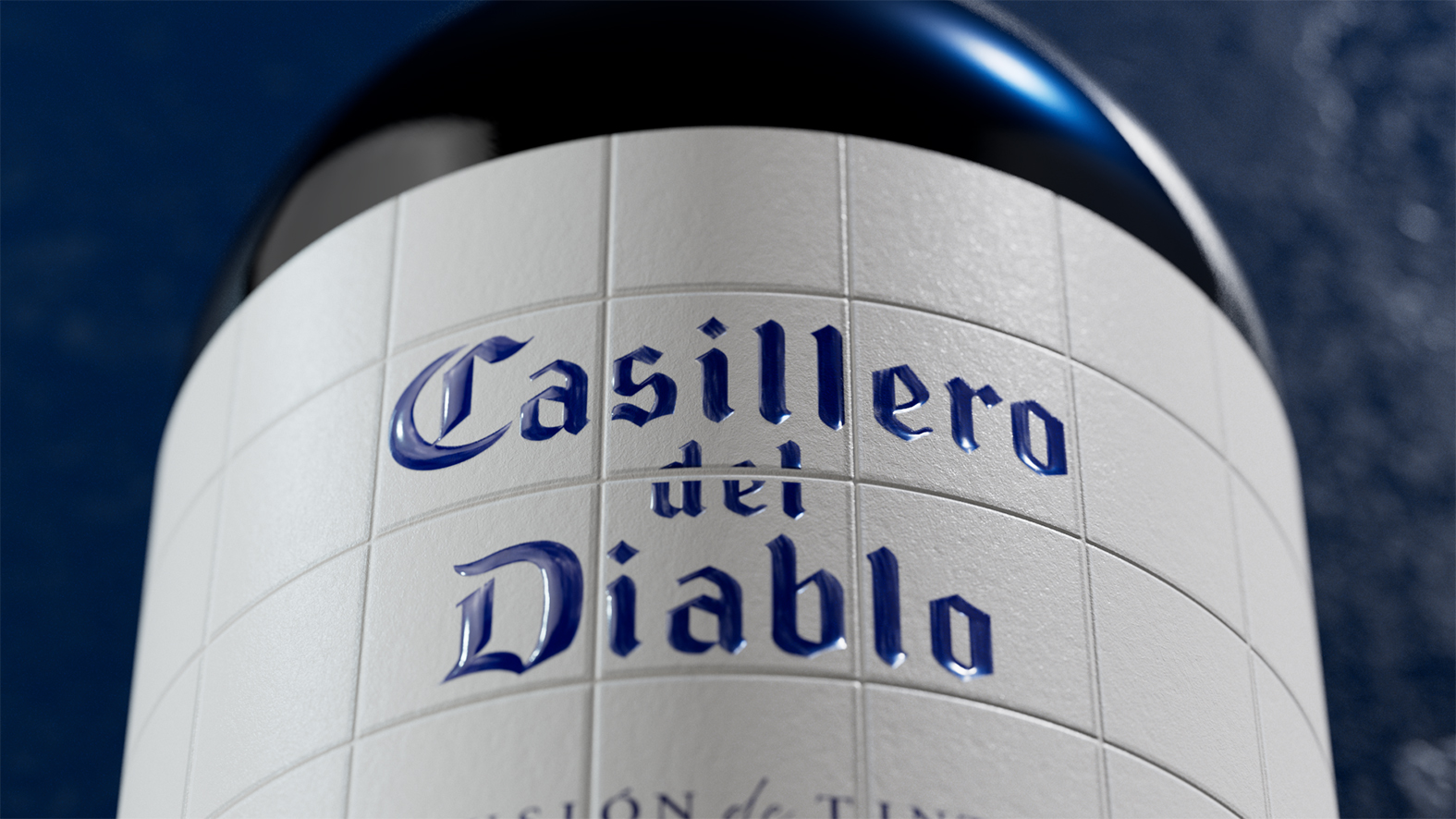
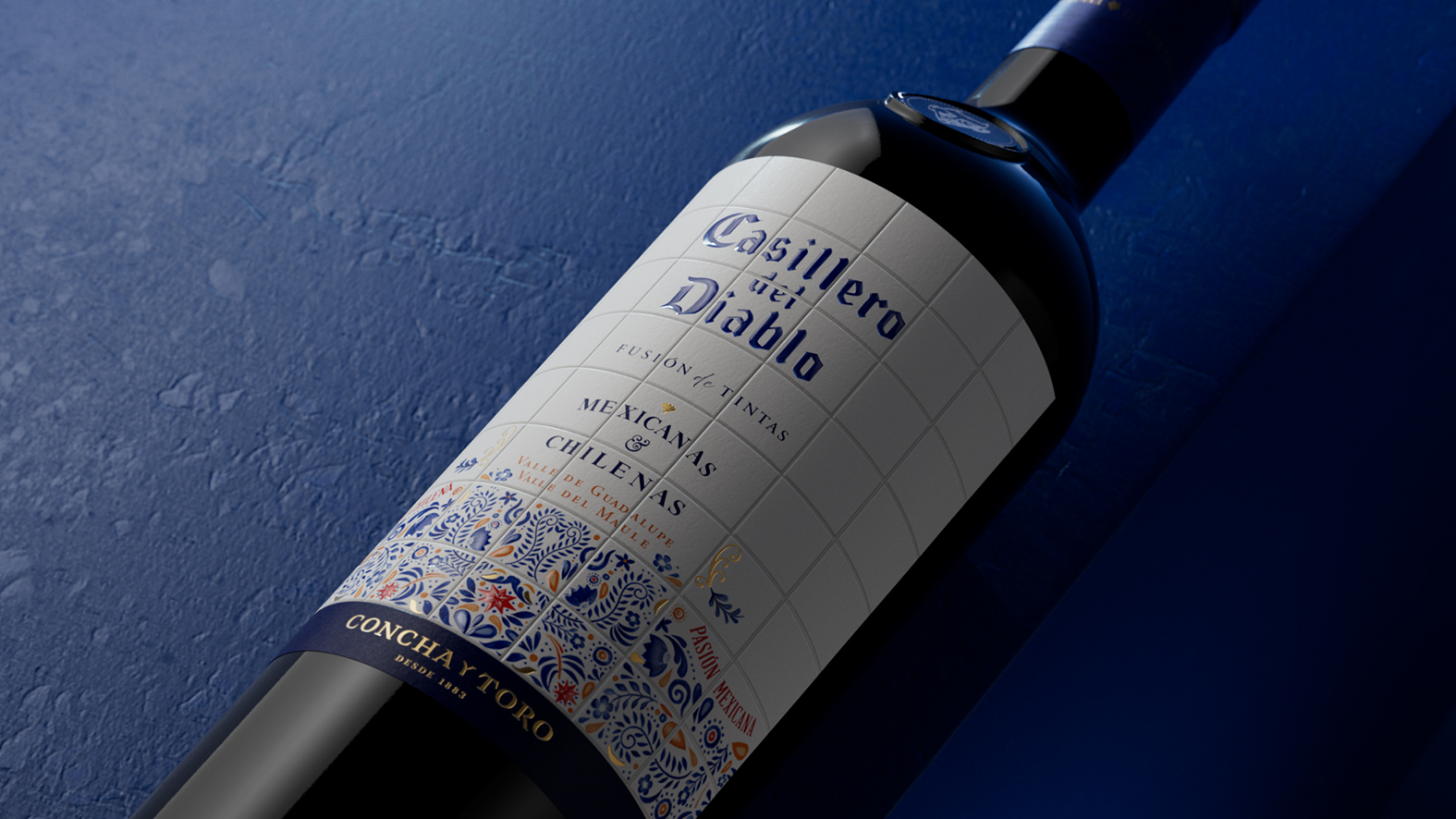
This led us to explore two creative paths with immense artisanal richness: Huichol art and Talavera pottery from Puebla. We chose Talavera for its ability to tell a story of tradition and sophistication through its patterns. It was the perfect symbol: a 100% Mexican visual language, instantly recognizable, but with the necessary elegance to dress a wine in a price segment above the standard “Reserva”. To bring the Talavera to life, we generated the initial illustrations by exploring various patterns. However, the real work was in the refinement. Each piece of the mosaic was adjusted by our team to integrate organically into the label’s structure, respecting the understated elegance and graphic codes of Casillero del Diablo.
Furthermore, we made a key decision to differentiate the product on the shelf: we modified the label’s size to be distinct from the traditional “Reserva”. This was essential to visually communicate that this was a new product in a higher category, not just a special edition.
The Result: A Toast Between Two Cultures
The final result is a label that achieves a perfect balance. It is unmistakably Casillero del Diablo, but with a heart that beats with the art and culture of Mexico. It is a design that doesn’t just dress a bottle, but tells a story of respect and admiration between two countries that share a passion for wine. More than just packaging, we see it as a brand asset that reinforces the international character of Casillero del Diablo and opens a new conversation with its consumers.
CREDIT
- Agency/Creative: Thingular Creative Partners
- Article Title: Casillero Del Diablo Launches Bi-Origin Wine Label Designed by Thingular Creative Partners
- Organisation/Entity: Agency
- Project Type: Packaging
- Project Status: Published
- Agency/Creative Country: Chile
- Agency/Creative City: Santiago
- Market Region: Global
- Project Deliverables: Packaging Design
- Format: Bottle
- Industry: Food/Beverage
- Keywords: CasilleroMexico, Fusiondetintas, RedFusionCasillerodelDiablo, CasillerodelDiablo
-
Credits:
Printing: CCL Label
Paper: Fedrigoni
3D render: JP Dominguez


