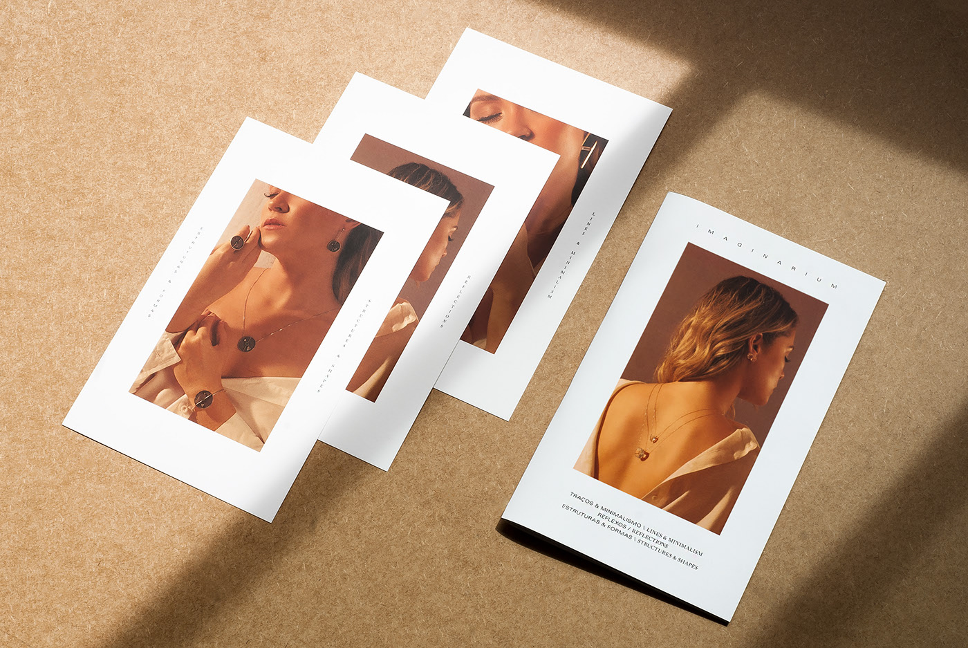
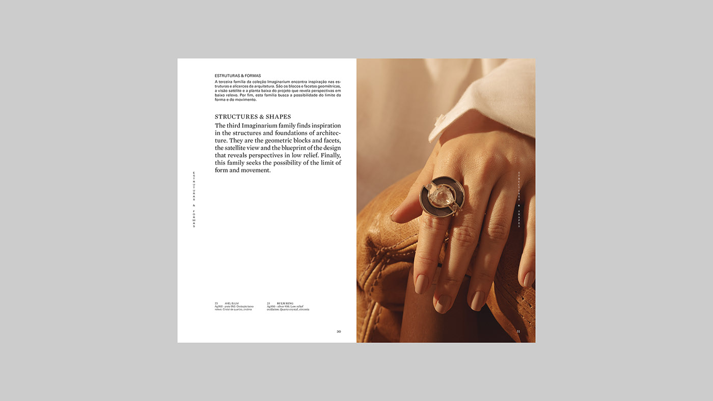
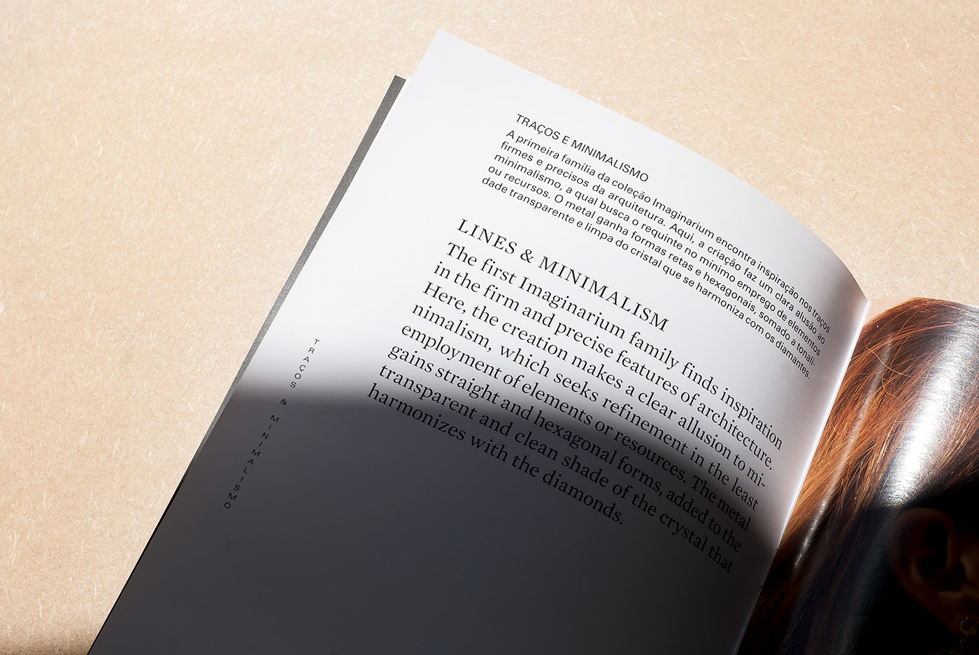
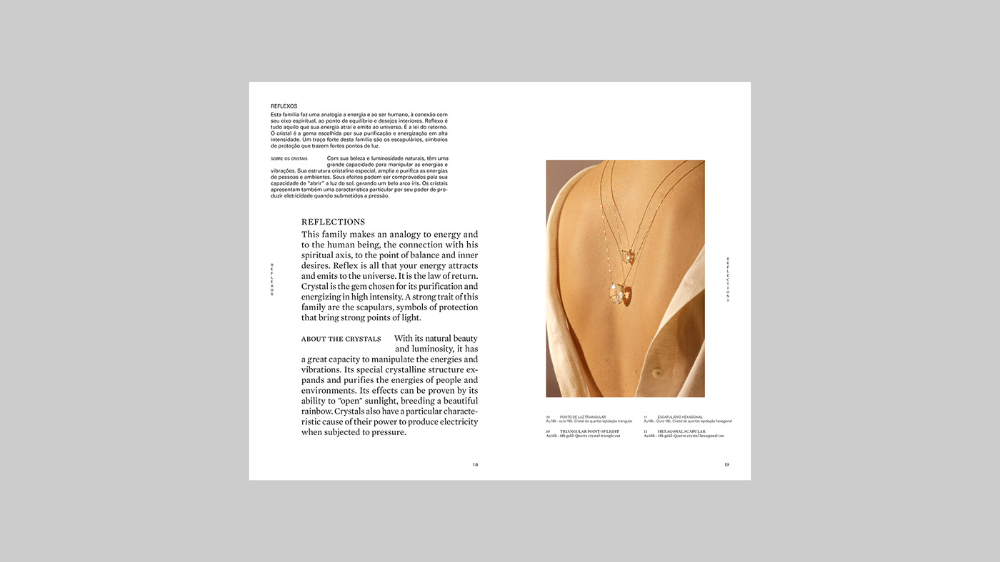
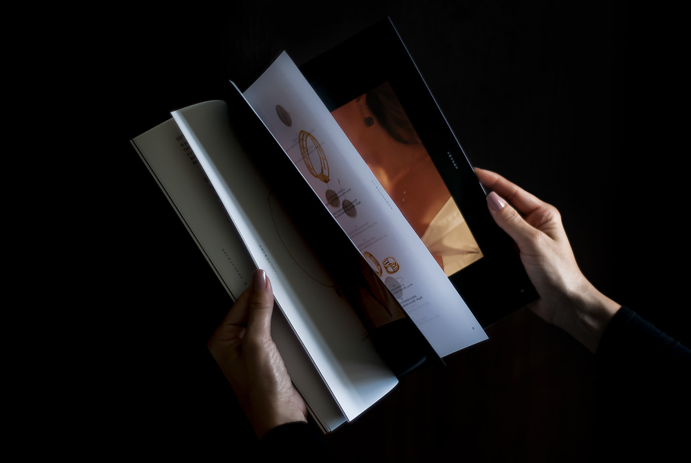
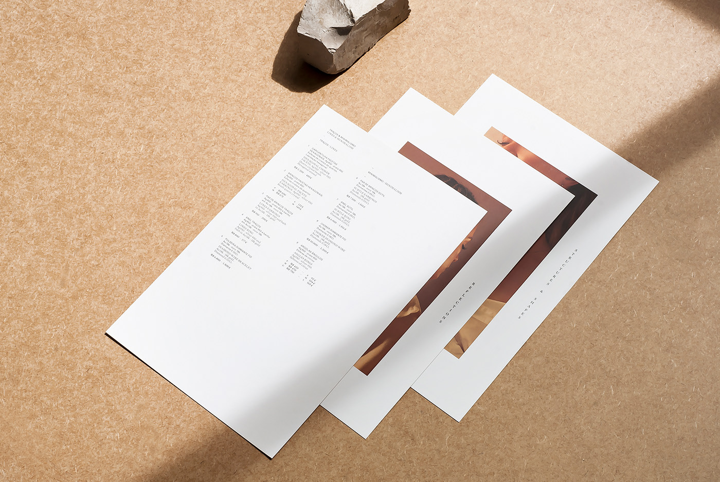
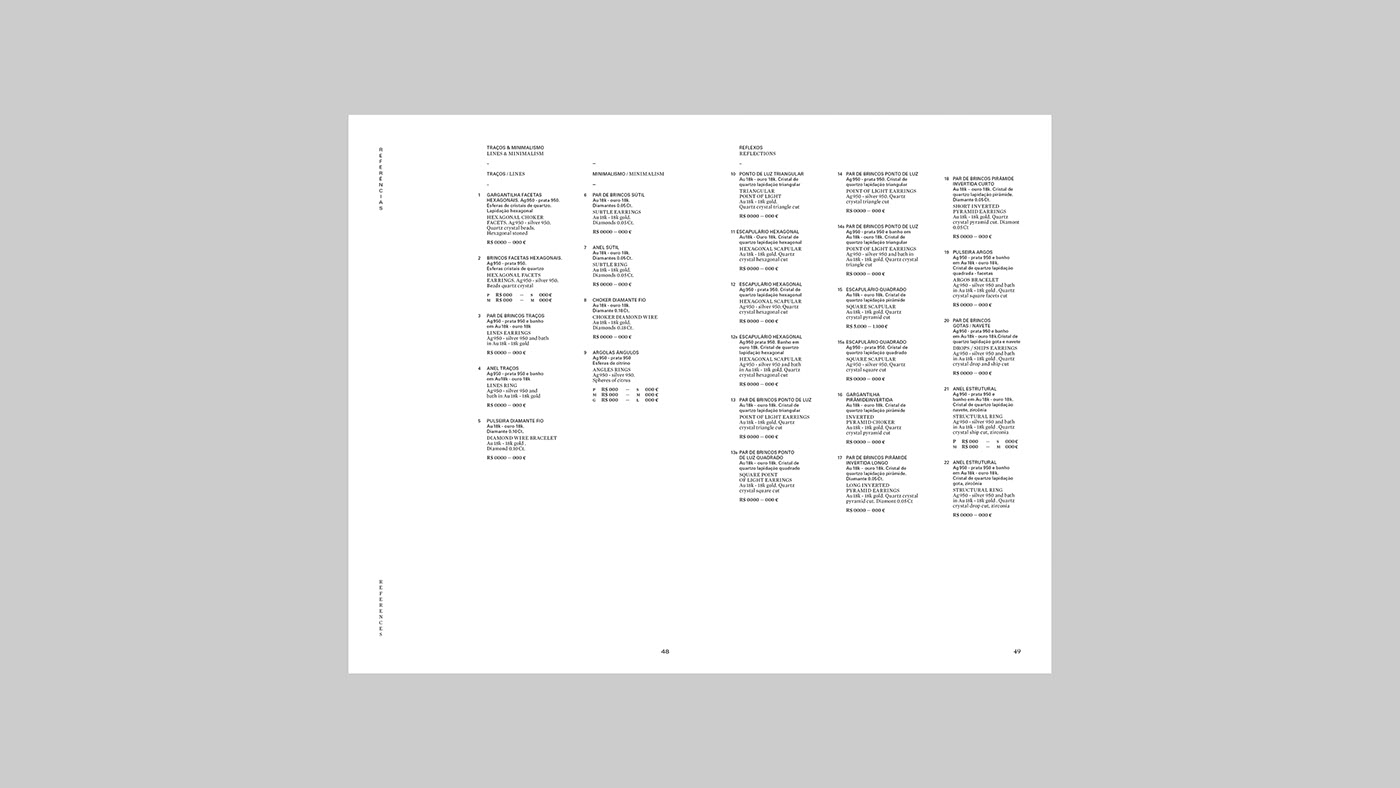
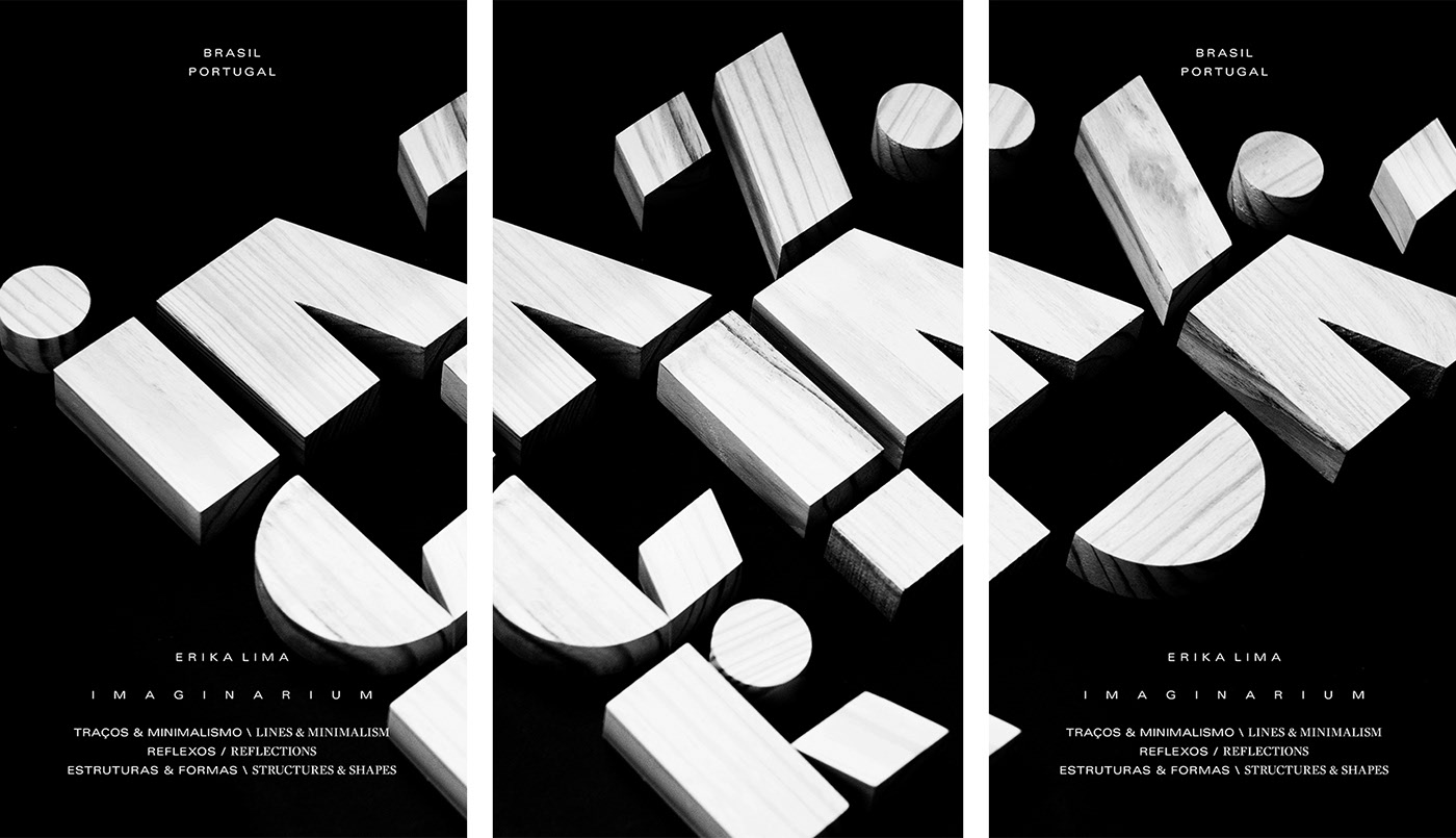
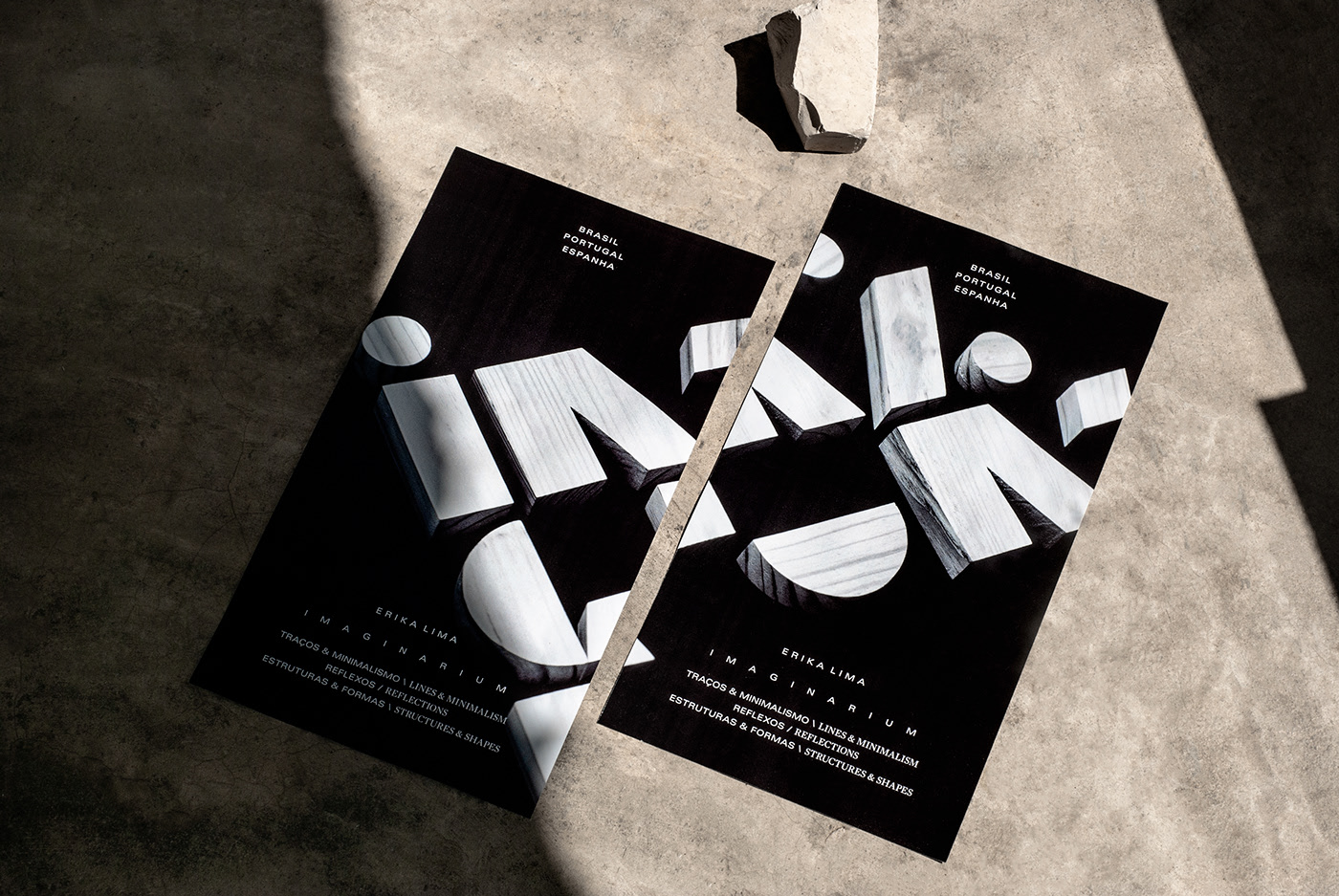
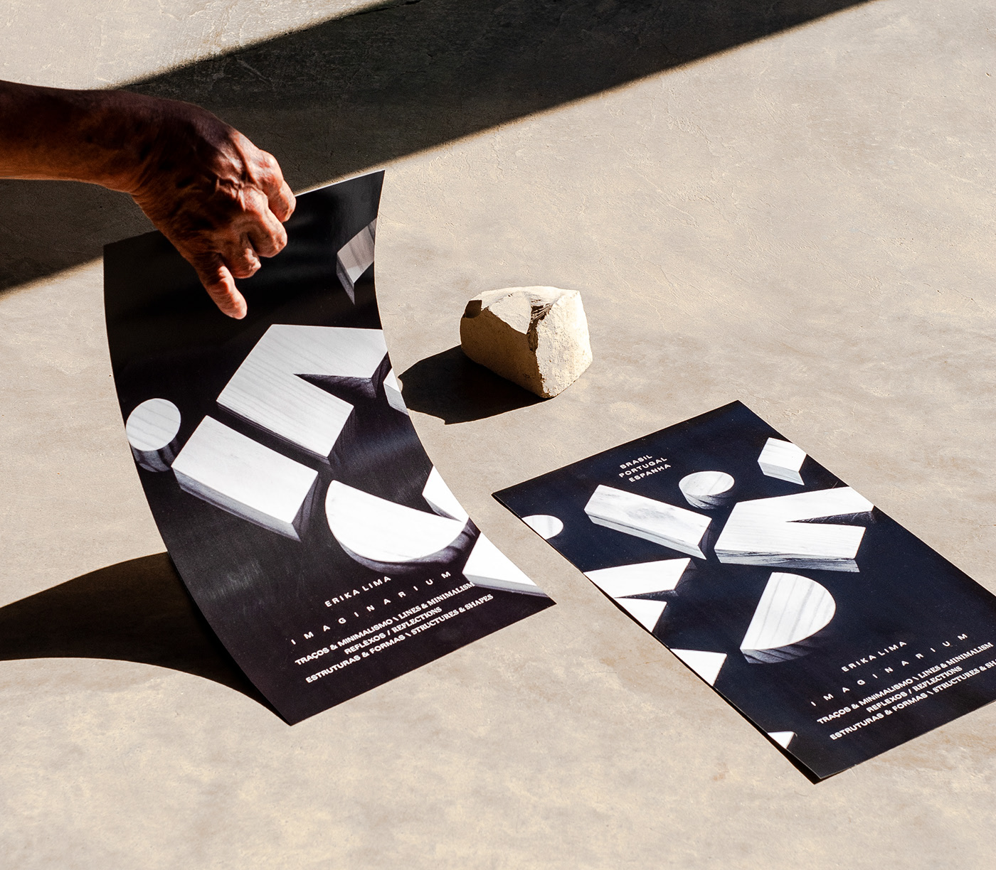
Imaginarium is the new jewelery collection of the Erika Lima designer and goldsmith. The pieces find reference in the architecture, the set of lights and shadows of the geometric forms, the satellite view and the blueprint of the project that reveals the perspective of the relief, exploring the limits of form and movement. The collection was divided into three families: 1. Lines & Minimalism; 2. Reflexes; 3. Structures & Shapes. Each family explore a particular typology of drawing, ores and precious stones. In addition to the development of the collection’s visual identity and its expography, an important part of this work was the development of a bilingual printed catalog, having as editorial structure the collection division of the three families. In addition, printed cards were produced to make up the exhibition table, facilitating the consultation of the pieces and values. For all these pieces we opted for a simple visual language, creating the necessary rhythm on the harmonization of the photos and contrasts between the editorial sections with emphasis on their changes. Another important visual characteristic is the choice of a san serif type for Portuguese information and a serif for English texts.











CREDIT
- Agency/Creative: CARTA&CARTA
- Article Title: Carta&Carta Art Direction and Editorial for New Jewelery Collection
- Organisation/Entity: Agency, Published Commercial Design
- Project Type: Identity
- Agency/Creative Country: Brazil
- Market Region: Europe
- Project Deliverables: Graphic Design, Product Architecture
- Industry: Fashion
- Keywords: jewelery, collection, exhibition design


