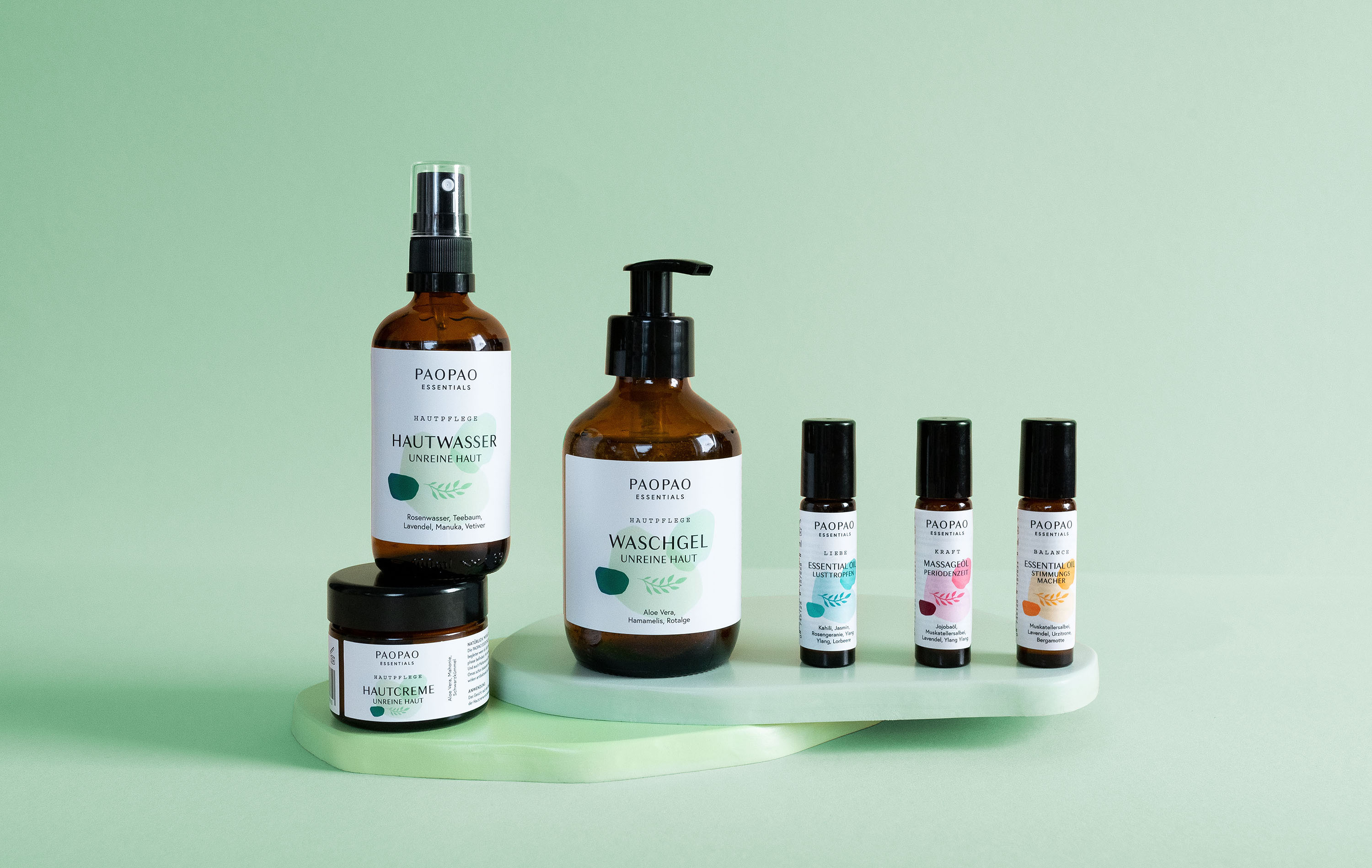
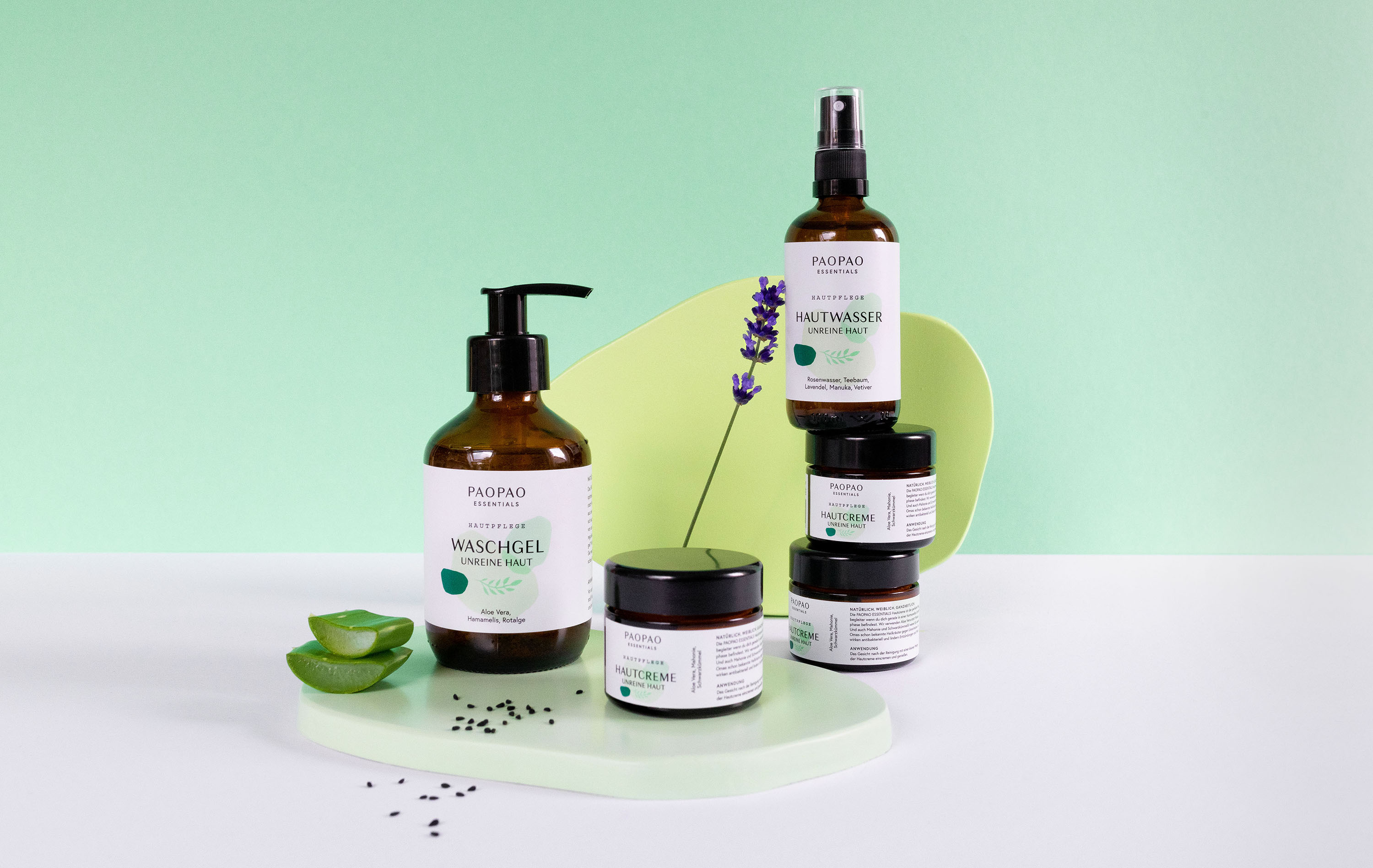
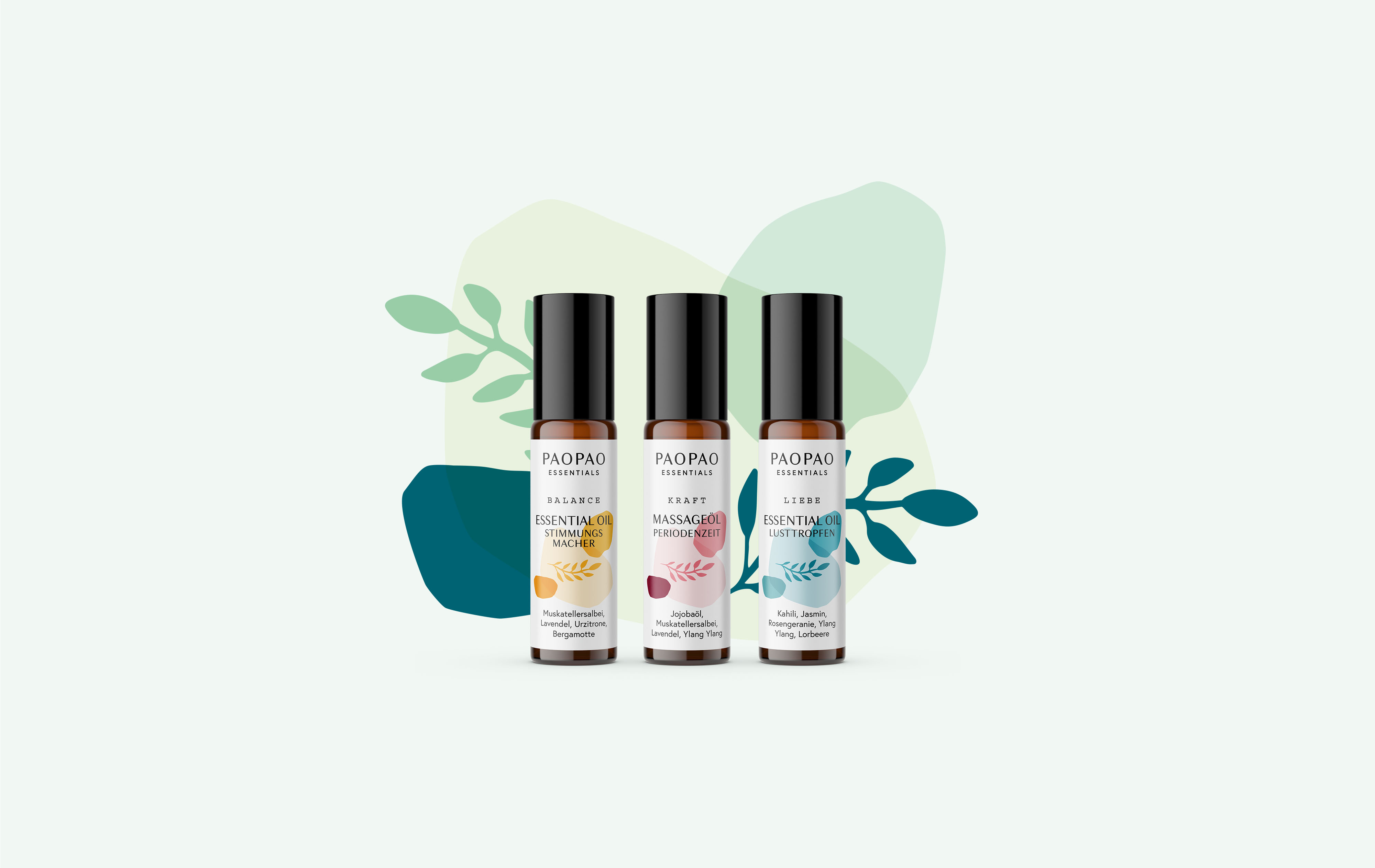
PaoPao Essentials is a german brand for skincare and natural products, whose focus is on the health and well-being of women. The products of PaoPao Essentials are intended to provide targeted support for complaints and side-effects of the female cycle: Essential Oils for mood-swings, loss of libido and cramps – Cleanser, Face Tonic and Face Cream for blemished skin.
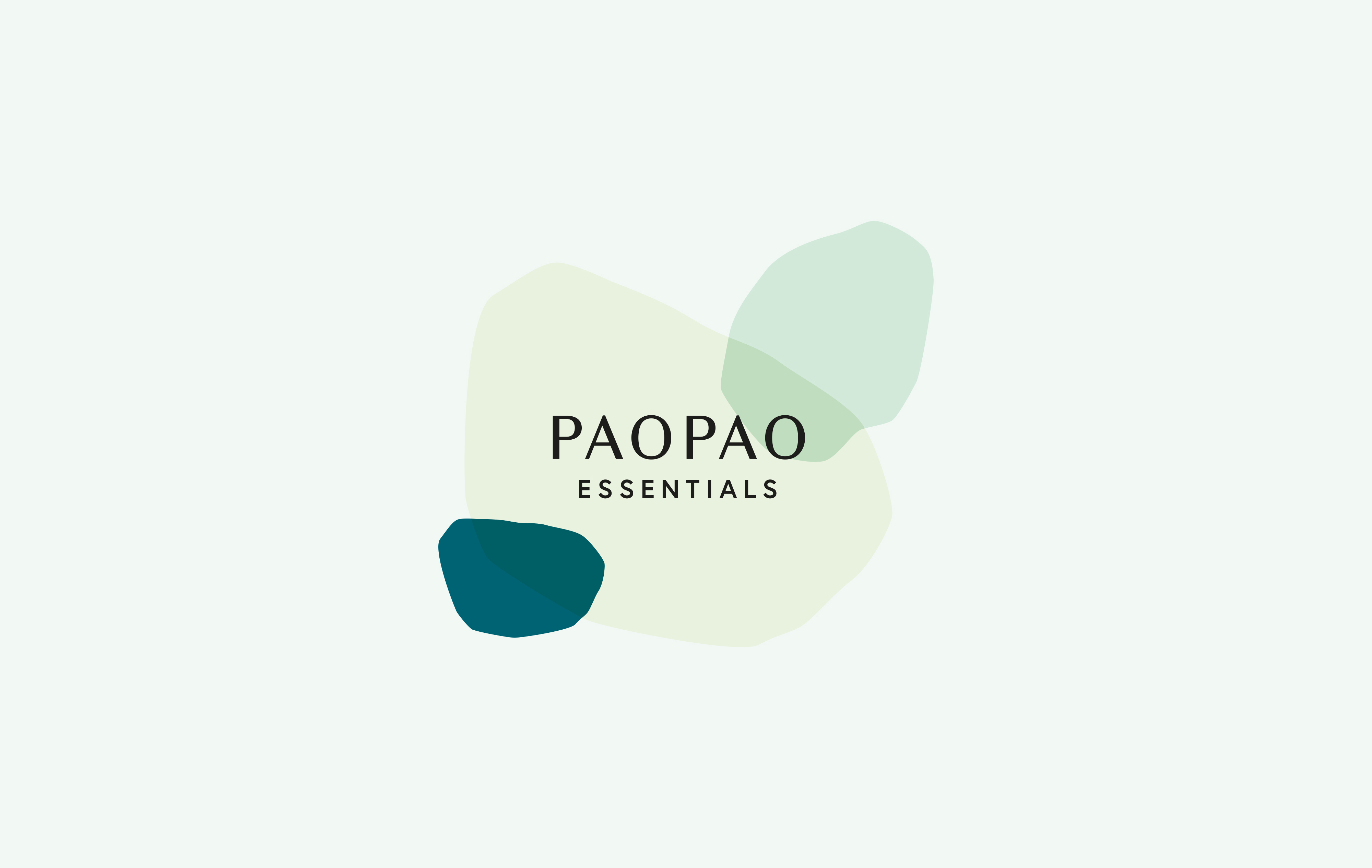
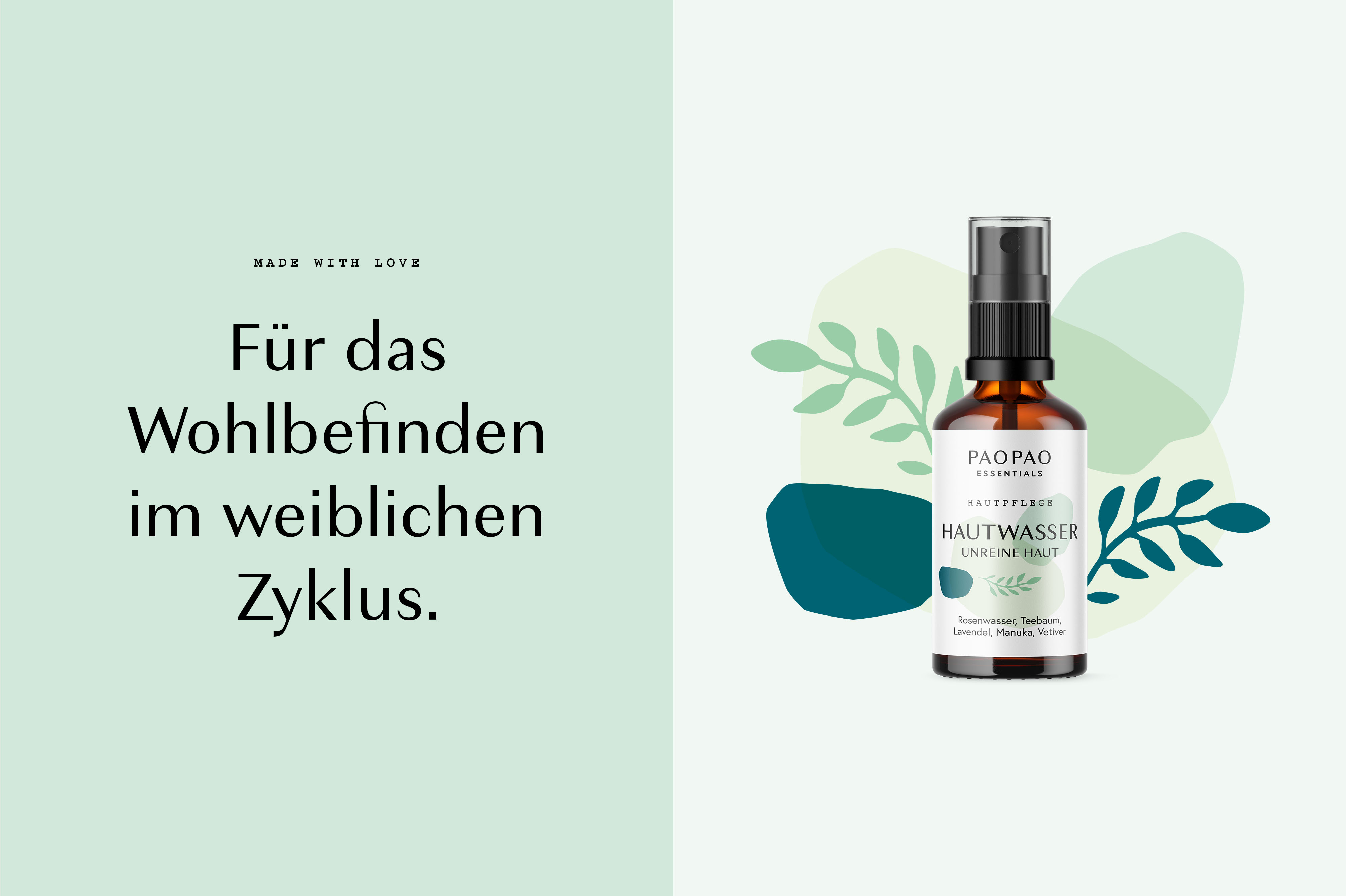
The client wanted a Redesign of their packaging with a more feminine touch, but not to playful. The target group are women between 20 and 35 years of age who are prone to complaints during their cycle. So my task was to develop a new appearance for the brand. The new packaging design is characterized by a combination of old and new elements: the leaf illustration (old element) with the organic shapes is the main feature of all products and is reflected in a slightly new look. A new logo, fonts and soft colors create a consistent and feminine clean look. The leaf is the main icon for PaoPao Essentials and associates the naturalness and lightness of the products.
The colors of the products match the respective purpose of the product. The skin care products are for blemished skin. The color green represents the strong power of nature and it also stands for relaxation. Green is said to be associated with the healing of the skin, so we went for a combination of cool and warm green tones. The natural contents of the products are based on finely selected herbs. This traditional character should also be reflected in the font selection. For this reason we decided on a combination of modernity and tradition – a modern sans serif font and a traditional typewriter.
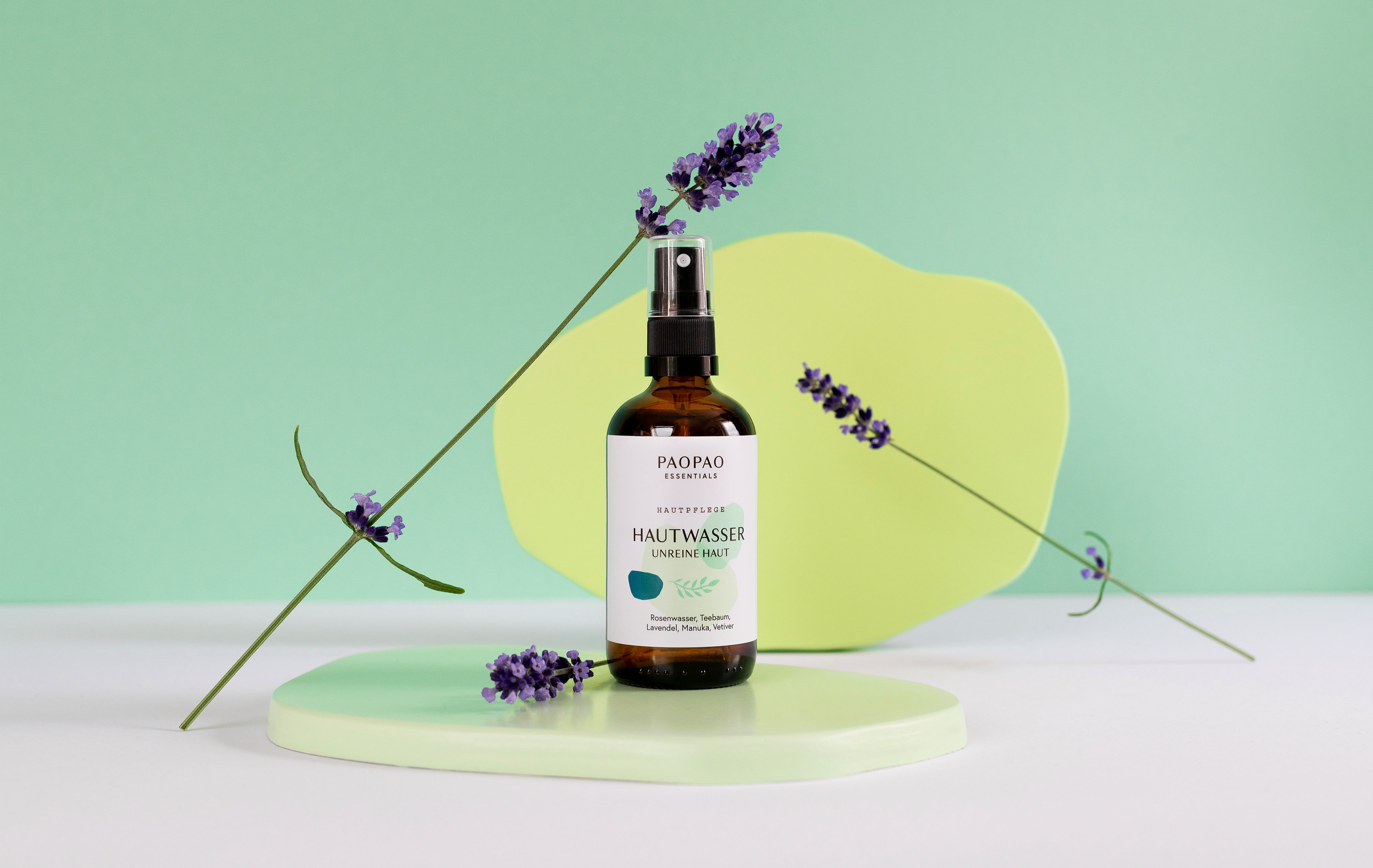
The soft pastel and organic shapes associate femininity (and the female body) and underline the minimalist design. These elements can also be found in the Photography Set-Design. The product shooting was a collaboration with photographer Anna-Maria Langer. We built the organic shapes of the packaging as background elements for the set design to create a consistent and unique brand look.
CREDIT
- Agency/Creative: Caroline Rubik
- Article Title: Caroline Rubik Creates PaoPao Essentials Packaging Design
- Organisation/Entity: Freelance, Published Commercial Design
- Project Type: Packaging
- Agency/Creative Country: Germany
- Market Region: Europe
- Project Deliverables: Brand Architecture, Brand Redesign, Branding, Graphic Design, Packaging Design, Photography, Product Architecture
- Format: Bottle, Jar
- Substrate: Glass, Glass Bottle, Glass Jar


