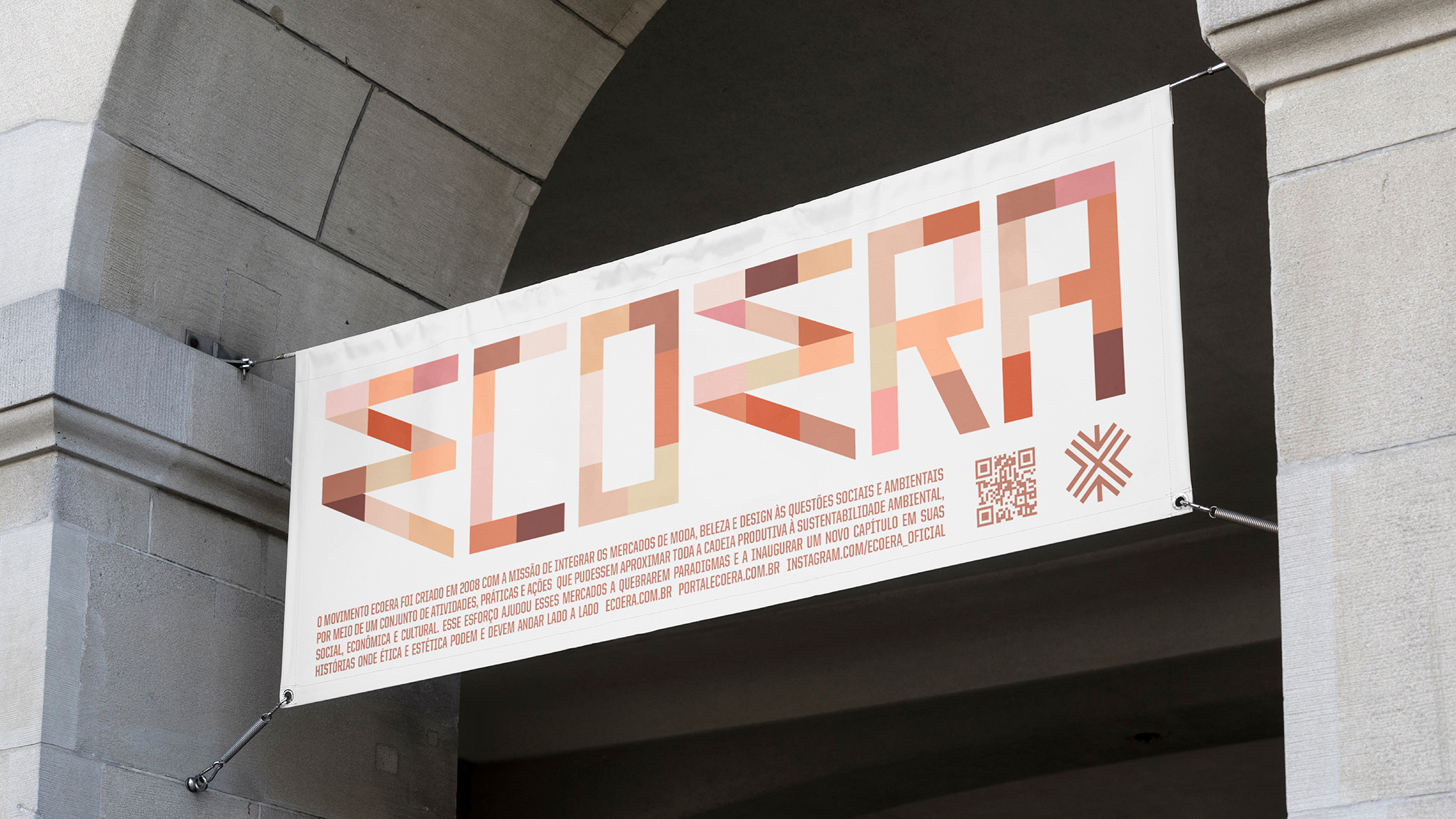
The Ecoera movement was created in 2008 by Chiara Gadaleta, sustainable fashion consultant and UN Global Pact ambassador in Brazil, with the mission of integrating the fashion, beauty and design markets with social and environmental issues through a set of activities, practices and actions that could bring the entire production chain closer to sustainability (environmental, social, economic and cultural). This effort helped these markets to break paradigms and inaugurate a new chapter in their stories where ethics and aesthetics can and must go hand in hand.
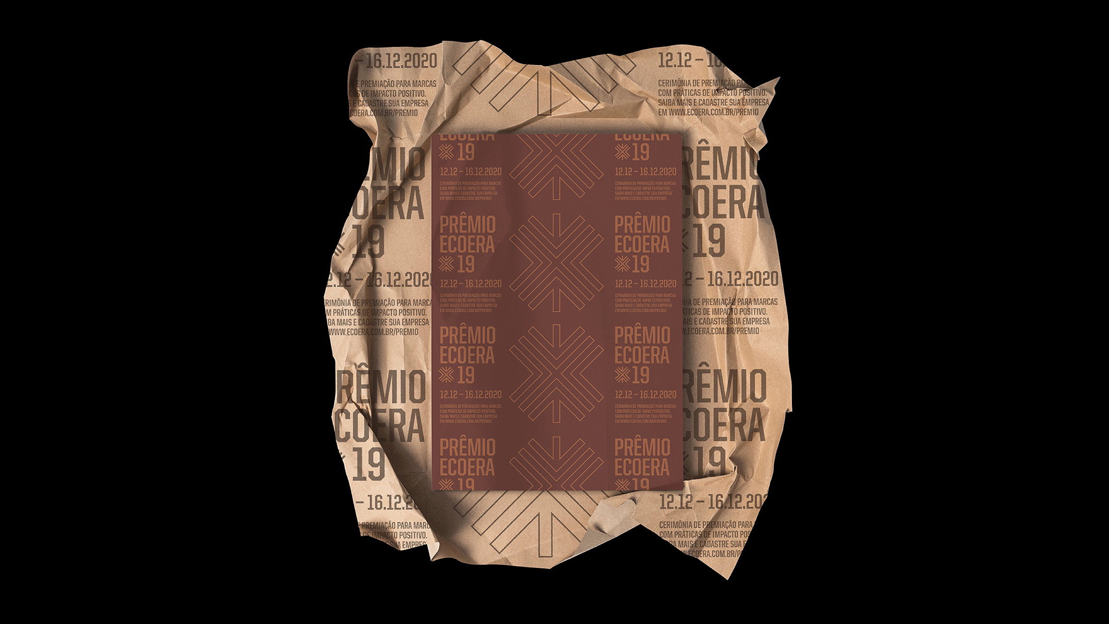
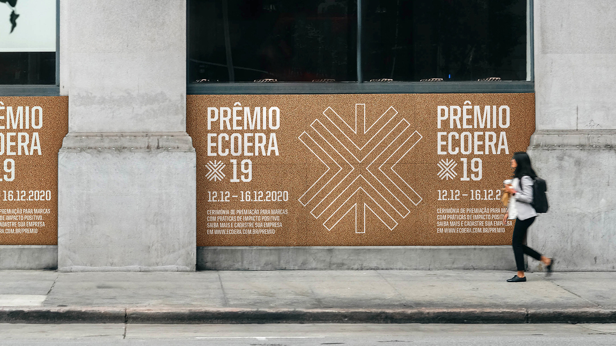
At the end of 2019, its new visual identity was launched in celebration of the 11 years of the movement and alignment with its history and the new challenges and positioning.
The new visual identity highlights Brazilian diversity and invites everyone to a deeper debate on the role of the social pillar of sustainability (usually overlooked or approached in a shallow way) and proposes an important reflection on the role of each of us in the constant construction of a more equitable society.
The main challenge was to align Ecoera’s history with the movement’s new goals, evading the stereotyped codes generally used in sustainability communication (aka green design). There was also a need for a versatile visual solution that suited the markets where the movement operates (fashion, beauty and design) and that translated the union of individuals building something new and bigger.
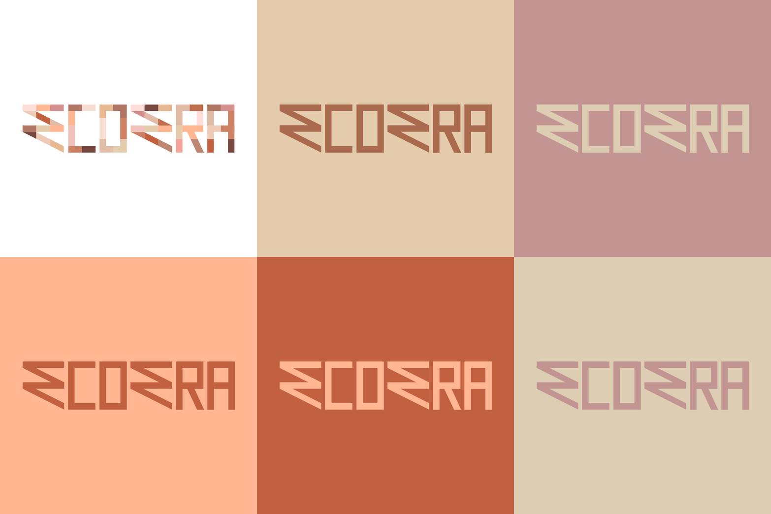
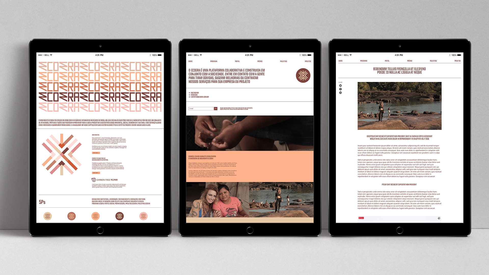
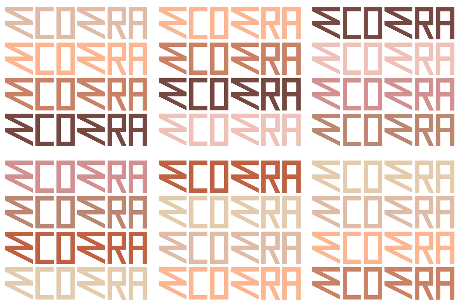
The logo brings an expressive and humanised aspect on the letters “E” (the most sonorous of the name), referring to popular / vernacular types and also to Pixo aesthetic, contrasting the other letters, marked by a rectilinear and sophisticated structure.
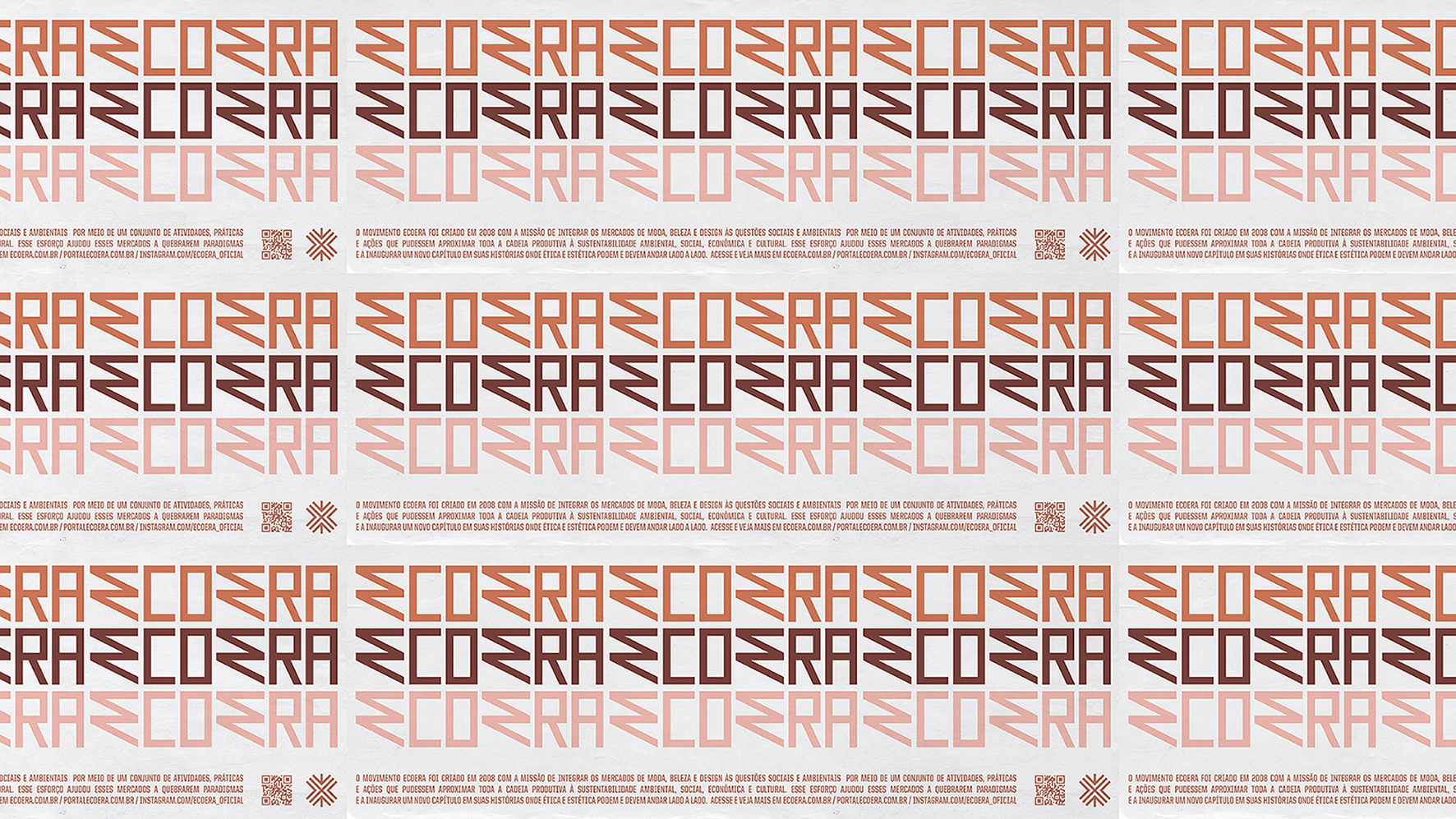
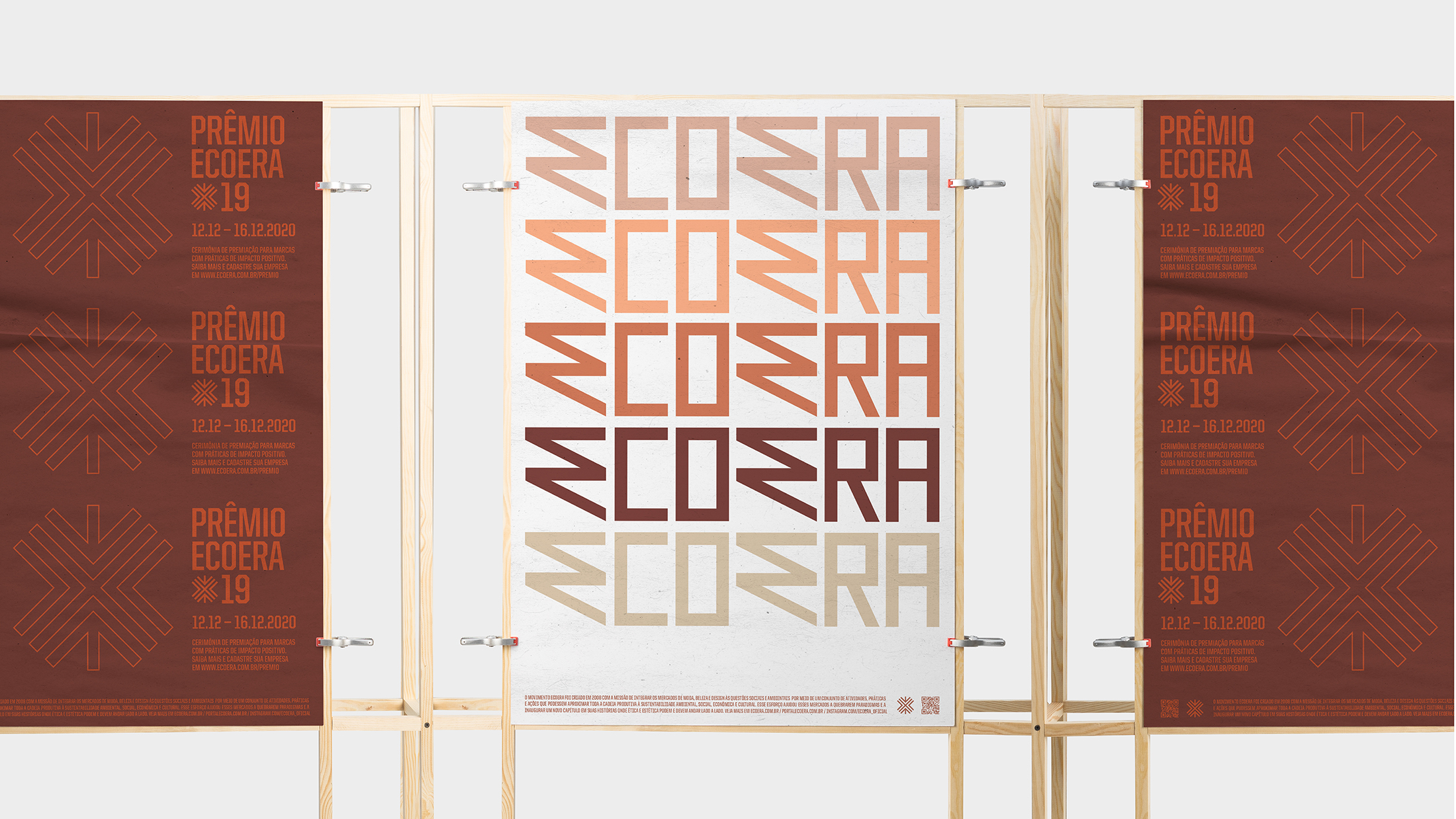
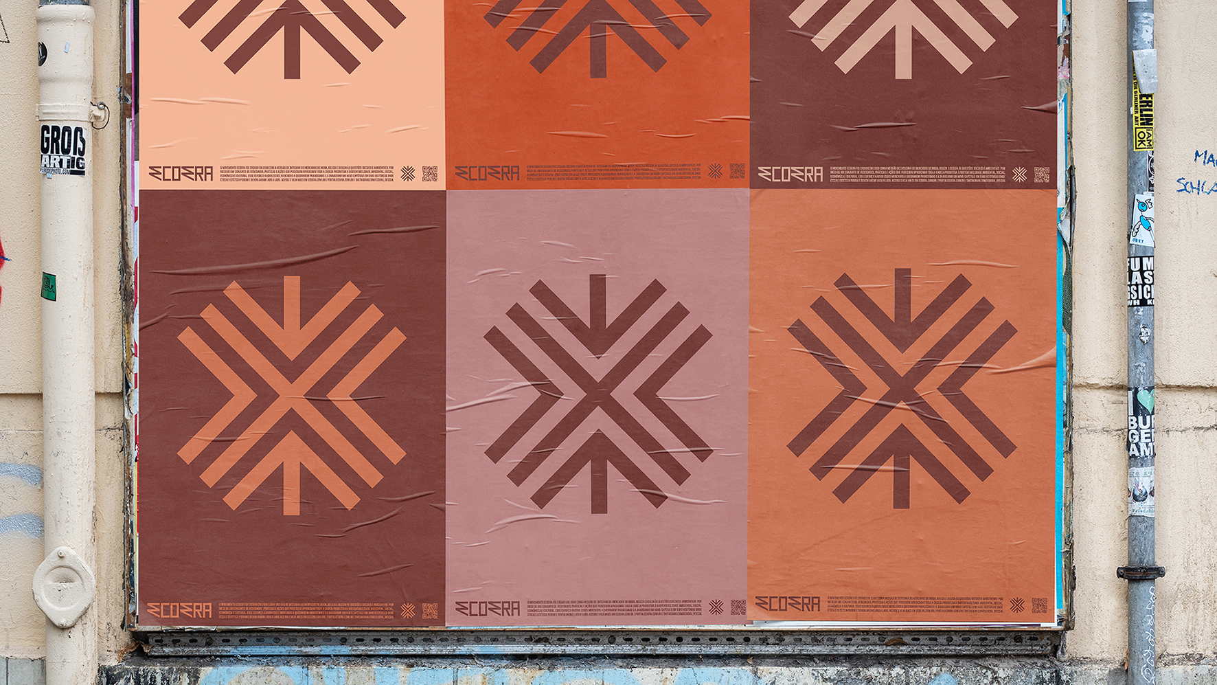
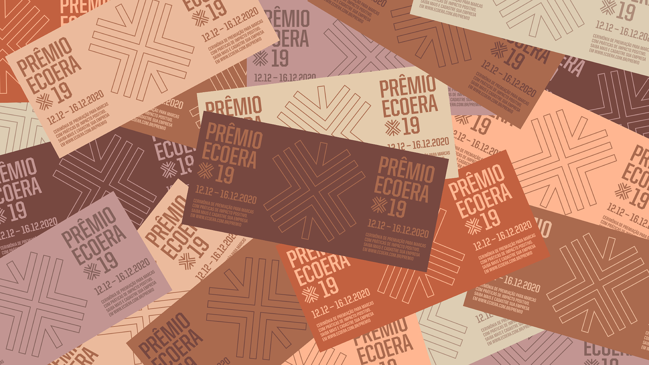
The diverse color palette allows dozens of combinations to be applied to the modular elements of identity, bringing constant renewal to the various movement’s projects.
Since its foundation, the Ecoera movement believes that design can be a powerful agent of change and that ethics and aesthetics must go hand in hand.
The visual identity created sees and translates the potential of the movement and serves as a support in finding transformative solutions. It is modular and adaptable to the most diverse contexts and needs, translating its human spirit and aligned to the new times.

CREDIT
- Agency/Creative: carme
- Article Title: Carme Creates the Branding that Support the Ecoera Movement to Keep Finding Transformative Solutions
- Organisation/Entity: Agency, Published Commercial Design
- Project Type: Identity
- Agency/Creative Country: Brazil
- Market Region: South America
- Project Deliverables: Brand Architecture, Brand Identity, Brand World, Branding, Graphic Design, Identity System, Rebranding
- Industry: Fashion
- Keywords: sustainability, fashion, visual identity, diversity, social, SDG, brazil


