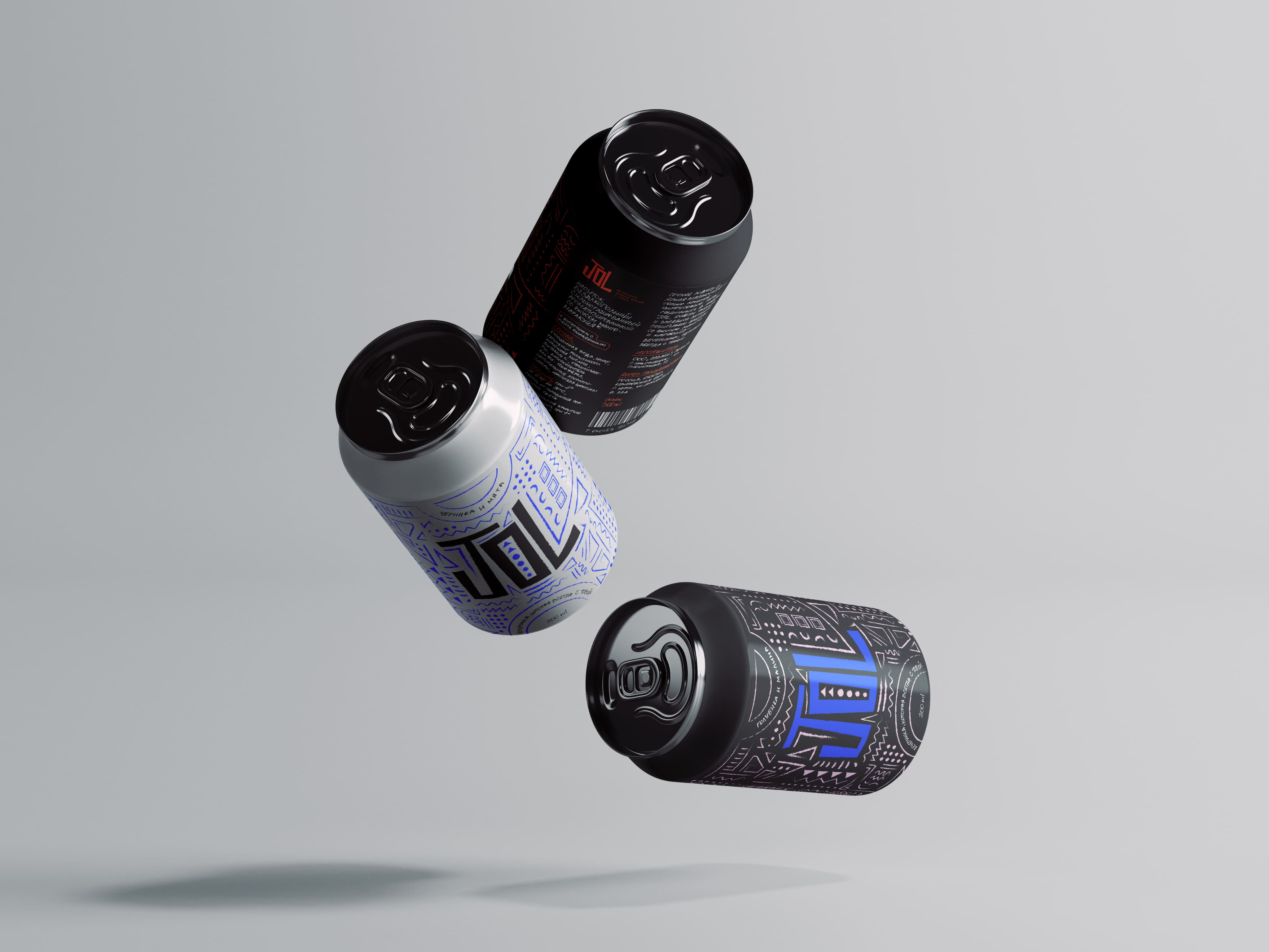
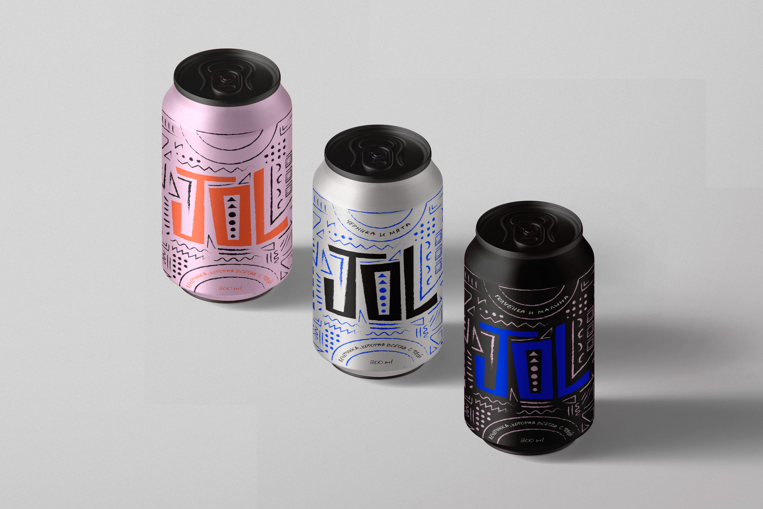
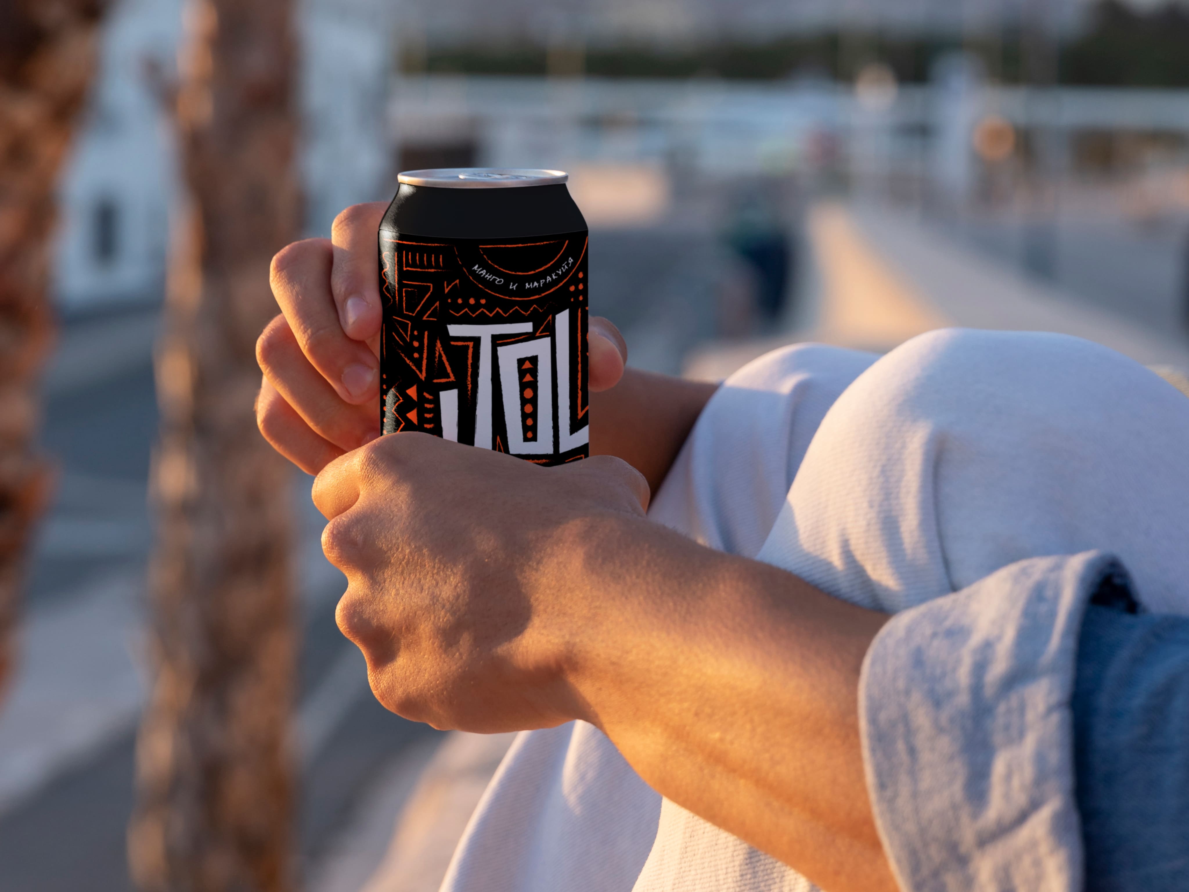
JOL is a series of drinks inspired by the hot and rhythmic parties of Africa. The naming, lettering and pattern were developed for the product, which is the basis for the visual solution of the packaging.
Naming of the product
Since the product is designed for parties and based on a visual metaphor of African culture, it was decided to use a word from one of the official languages of the Republic of South Africa, Arifkaans. In Afrikaans «Jol» means «party». It was chosen not only because of its meaning, but also because of its origin from the youth slang.
Pattern
The inspiration for the pattern was a photo of the traditional African body-paintings, usually done on holidays or joyful occasions. These were taken as the basis for the pattern of the packaging.
Typography
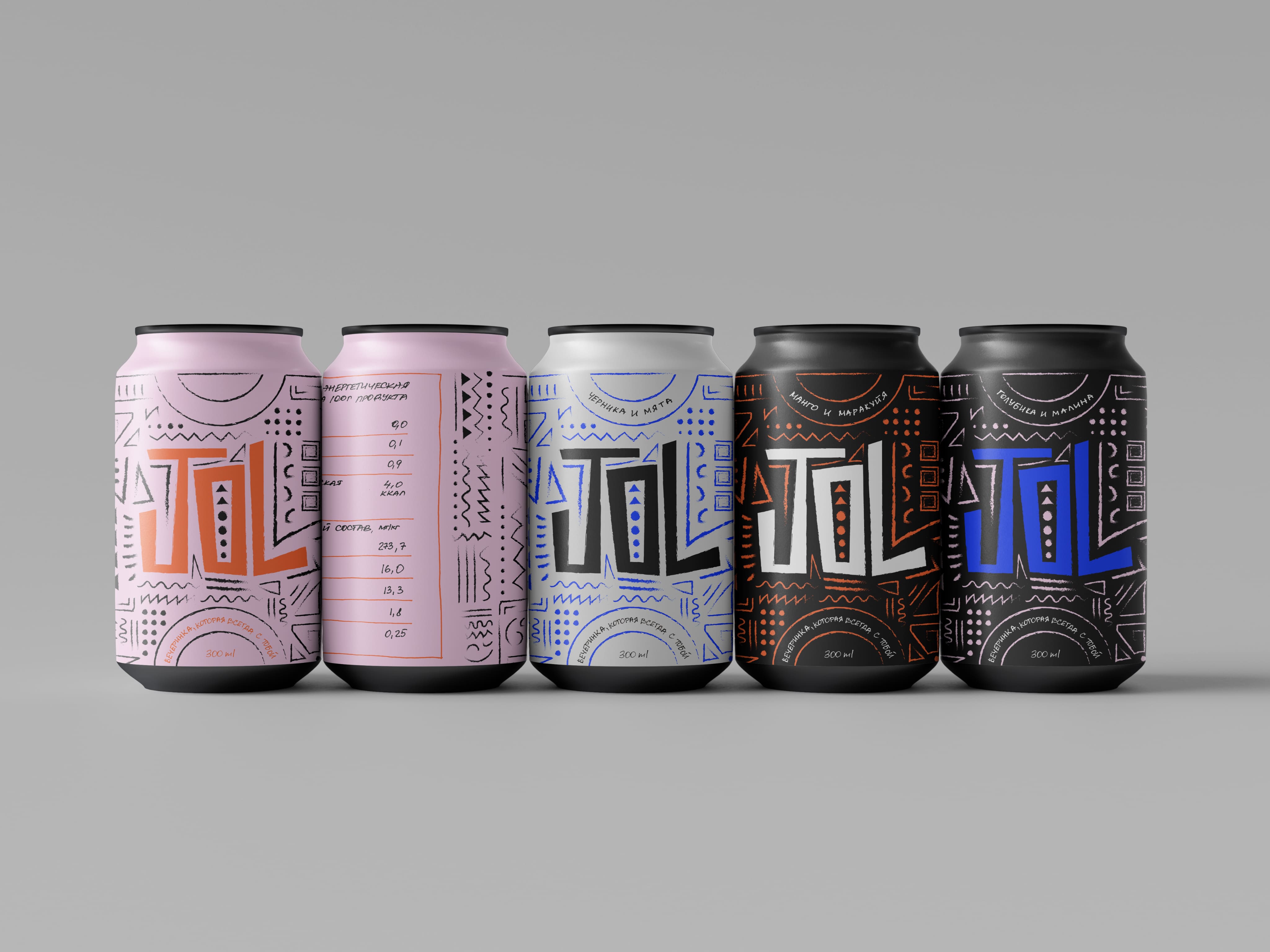
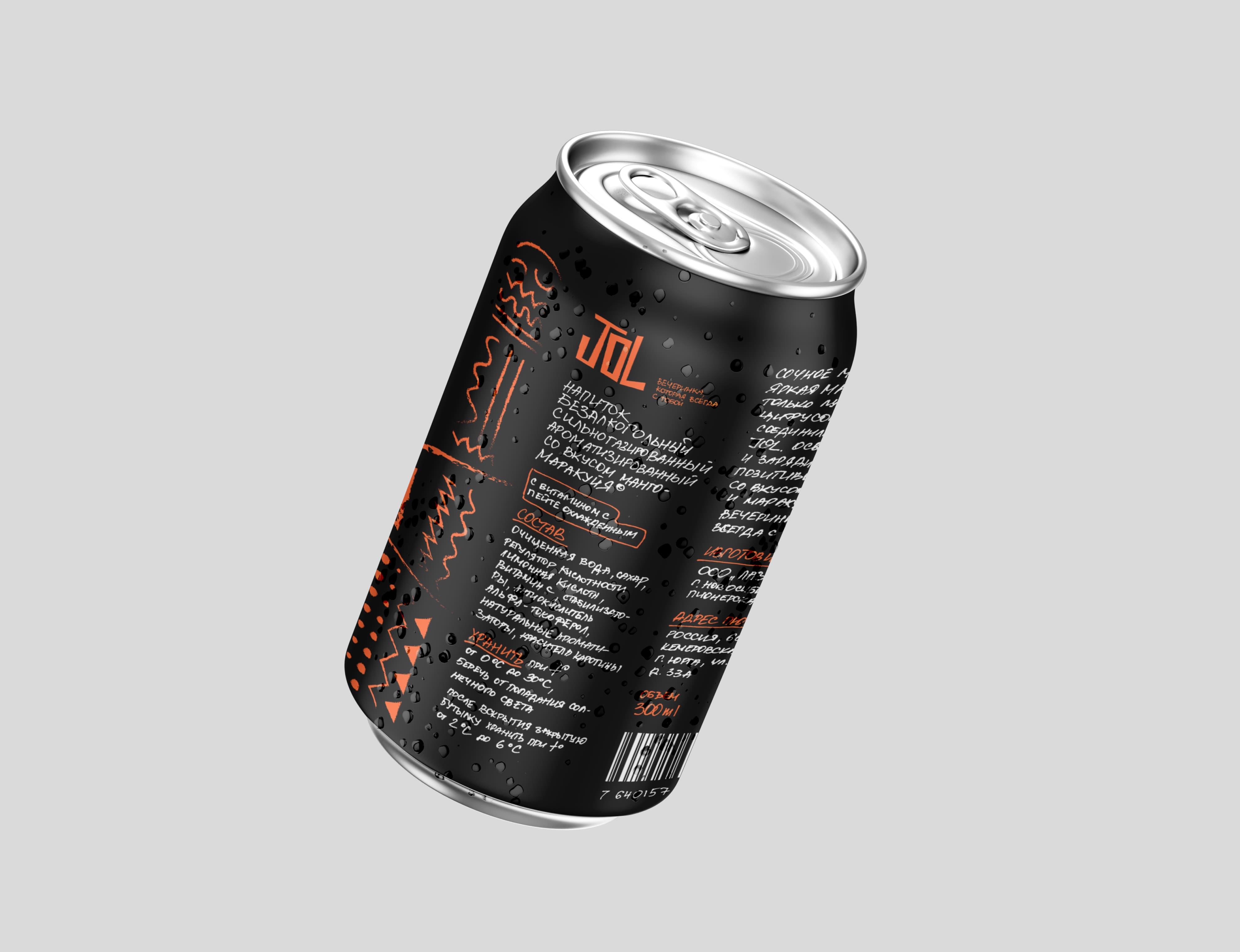
Due to the fact that youth parties are often organized out of handmade materials, somewhere at home, the whole typographic component was made «by hand», which combines with the same handmade pattern. The lettering of the header was inspired, again, by traditional African drawings, which are mostly quite angular, lively and unique.
Differentiation
Color palette was chosen as the primary means of differentiating the flavors in the lineup, which changes to match the flavor, with at least one bright, neon color in the packaging that reminds us of the party drive, so JOL is an essential drink at any hot chilling party!
CREDIT
- Agency/Creative: Veronika Potapova
- Article Title: Carbonated Beverage Packaging Design by Veronika Potapova
- Organisation/Entity: Student
- Project Type: Packaging
- Project Status: Published
- Agency/Creative Country: Russia
- Agency/Creative City: Moscow
- Market Region: Europe, Global
- Project Deliverables: Art Direction, Brand Design, Graphic Design, Illustration, Packaging Design, Pattern Design
- Format: Can
- Substrate: Metal
- Industry: Food/Beverage
- Keywords: packaging, beverage packaging, party drink, pattern design
-
Credits:
Tutor: Pavel Borisovsky


