


Carbon Neutral Fuels (CNF) is pioneering the future of sustainable aviation fuel (SAF), with a mission to make clean aviation the norm. Their previous brand identity fell short of reflecting their technical expertise, credibility, and bold ambition to transform aviation. Our challenge was to create a visual identity that embodied their pioneering role in sustainable fuel production, while inspiring confidence in airlines, investors, and industry leaders.
This project is entered into Best Visual Identity by Sector – Energy and Utilities as it demonstrates how design can reposition a business in a highly technical, rapidly evolving sector. Every element of the new identity, from logo to palette to texture, was crafted to connect CNF’s scientific innovation with its deep environmental commitment. The system balances precision with warmth, allowing the brand to stand out in an industry often defined by corporate neutrality or green clichés.
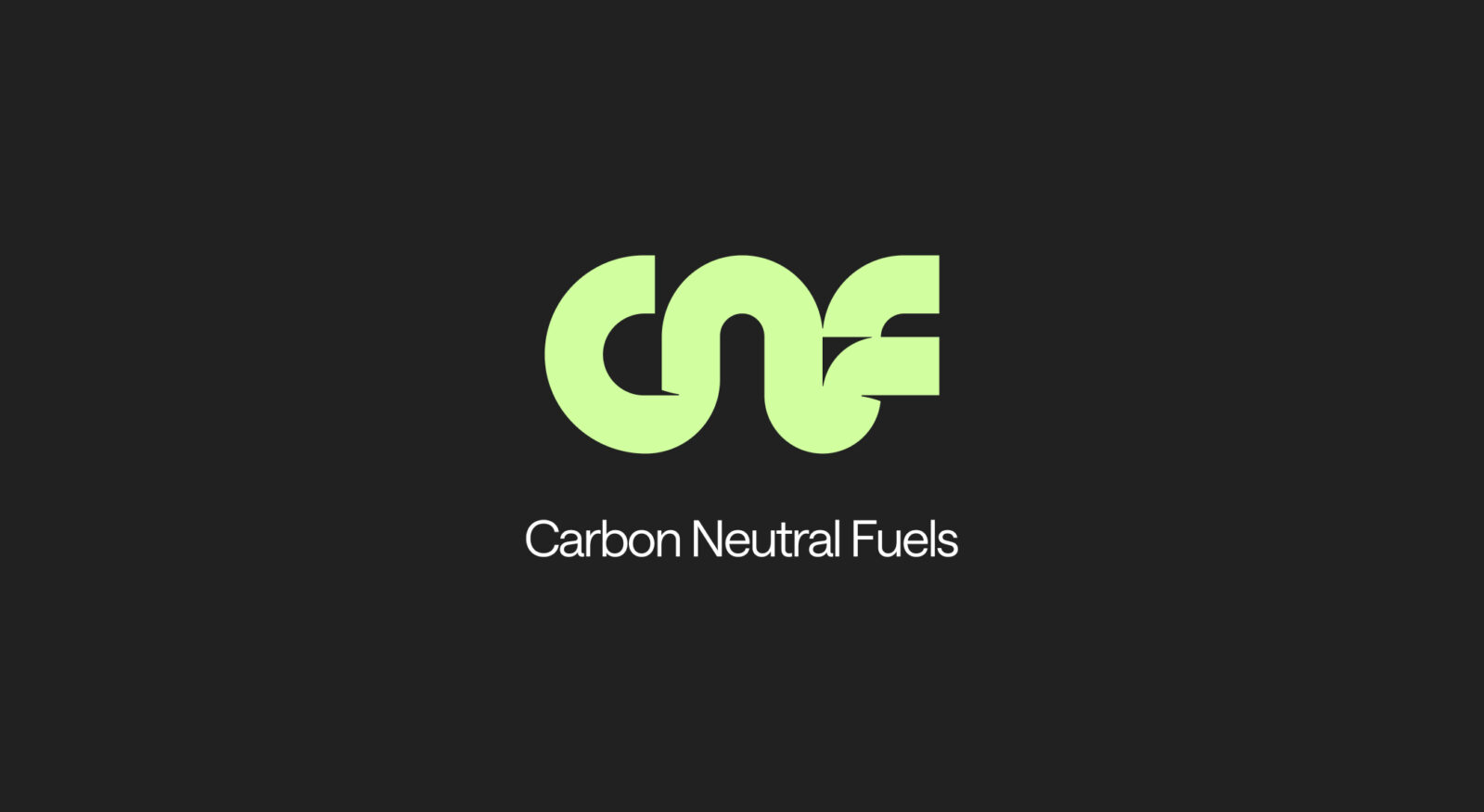
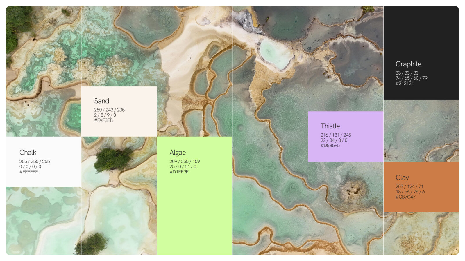
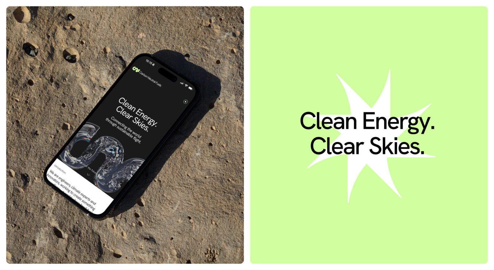
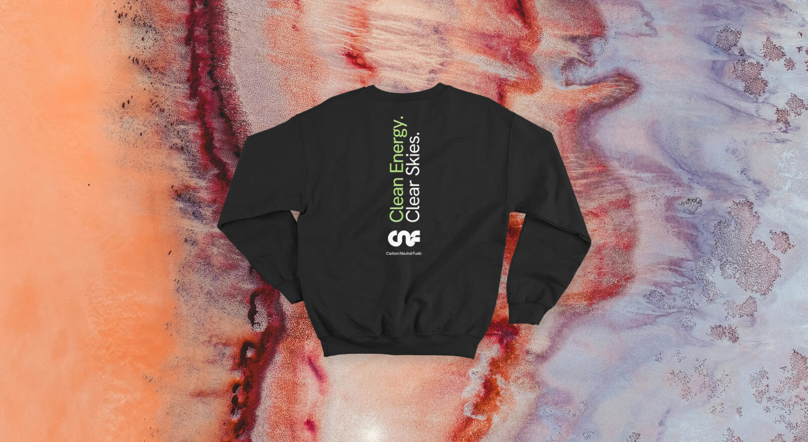
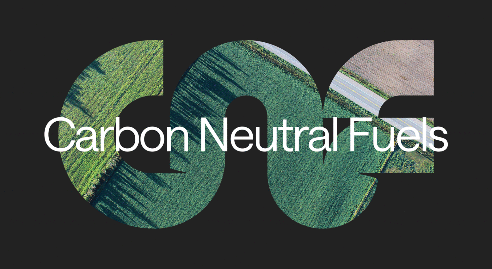
Workshops with the CNF founders uncovered a central theme of connection: between science and nature, people and planet, innovation and purpose. This guided the brand proposition and visual approach. The logo, an abstract rendering of the initials CNF, symbolises collaboration and momentum, with subtle aviation cues anchoring it in the sector. The colour palette is drawn from a plane’s-eye view of the earth, complemented by textures inspired by minerals, water, and sand. These natural elements are balanced with a high-precision treatment of the CNF mark, conveying scientific rigour.
The result is a distinctive visual identity that positions CNF as a trailblazer in sustainable fuels. It captures both credibility and inspiration, empowering the business to engage confidently with partners, investors, and the wider aviation community.
Industry Context:
The aviation sector is under immense pressure to decarbonise. With global commitments to reduce emissions and increasing scrutiny from regulators, investors, and the public, sustainable aviation fuel (SAF) is widely recognised as one of the most viable solutions for cleaner flight. Yet despite its potential, SAF has historically lacked visibility and confidence in the marketplace. Many producers lean on generic “green” branding, which risks underselling the technical sophistication and innovation required to develop truly scalable alternatives to fossil fuels.
Carbon Neutral Fuels (CNF) exists at the forefront of this shift. As a pioneering SAF producer, their mission is to make clean aviation the standard rather than the exception. But their existing identity didn’t reflect the ambition or authority of a business working to transform an entire sector. They needed a brand that could embody their vision, showcase their technical rigour, and inspire belief in their ability to lead the change.
Challenges:
The existing CNF brand identity lacked cohesion and impact. It didn’t convey their dual commitment to scientific excellence and environmental purpose, and it failed to capture the pioneering character of the company. The challenge was to create a distinctive identity that could resonate with multiple audiences:
– Airlines seeking credible SAF partners
– Investors looking for scalable solutions with strong governance
– Policy makers and industry leaders assessing SAF as part of the aviation transition
The rebrand had to position CNF as a trailblazer in the energy and utilities sector, while also appealing to the human side of their mission: protecting the planet for future generations.
Strategy:
Our starting point was to immerse ourselves in CNF’s mission and values. Through workshops with co-founders Sophie Zienkiewicz and Alasdair Lumsden, we uncovered a recurring theme of connection between people and planet, science and nature, innovation and purpose. This became the cornerstone of the new brand proposition.
The strategy was built around three objectives:
– Establish credibility – communicate CNF’s technical sophistication and industry expertise.
– Inspire confidence – create an identity that signals ambition, progress, and leadership.
– Differentiate – stand apart from generic “eco” tropes by balancing scientific rigour with environmental sensitivity.
To achieve this, we developed a visual identity system rooted in both the natural environment CNF seeks to protect and the precision of the science driving their innovation.
We also carried out extensive research into CNF’s potential investors, defining key personas and a robust wishlist for each profile. This research gave us a solid strategic foundation for our Crowdcube campaign, which not only felt impactful but helped build a distinctive and trustworthy brand. By leveraging the brand’s authentic story, we were able to engage with potential investors on a more personal level and drive impressive results.
Creativity & Innovation:
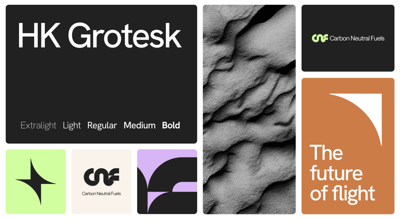
The new identity is anchored by a logo that represents CNF’s initials. Each letter is seamlessly connected, symbolising collaboration and momentum. Subtle shadowing creates the impression of an aircraft wing, while a negative-space arrow reinforces the idea of progress. These aviation cues ground the brand firmly in its sector without being literal.
The colour palette draws on a plane’s-eye view of the earth: energetic greens, earthy pigments, and warm neutrals. Each shade is named after minerals and flora, rooting the identity in the natural environment. This is paired with textures from our natural landscape; tactile reminders of what’s at stake in the climate crisis.
To balance this warmth with precision, we developed an X-ray-style treatment of the CNF mark. This visual device runs across imagery and layouts. The interplay between organic textures and technical detail creates a unique design language that feels both human and highly professional.
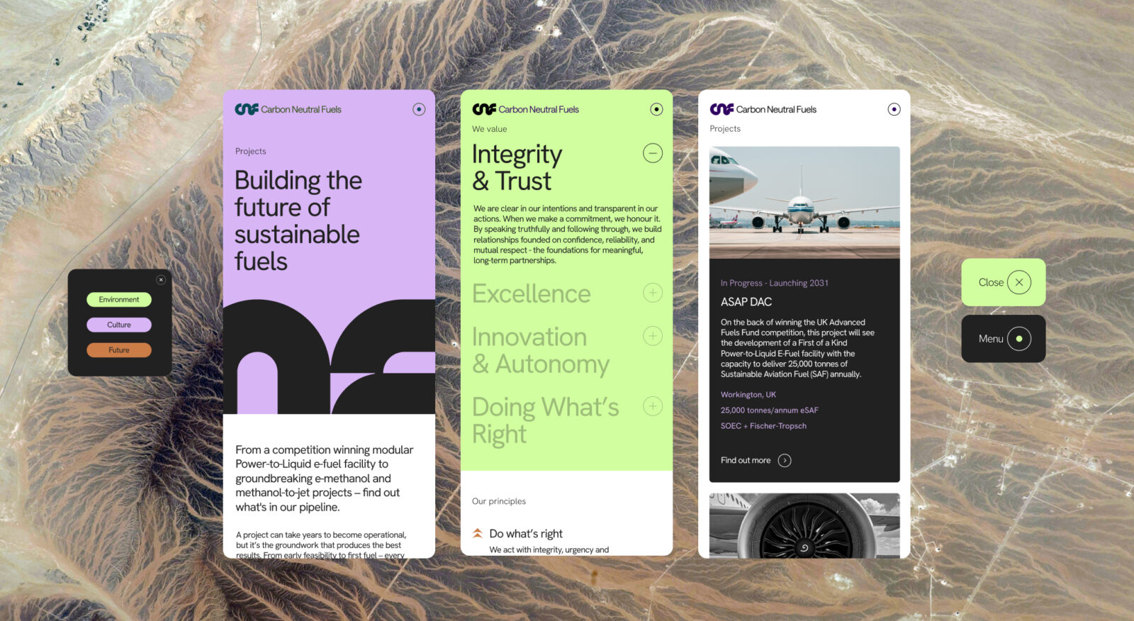
The system was designed to be comprehensive and flexible, working across presentations, digital assets, investor materials, and sector-facing communications. The identity avoids clichés while still signalling environmental purpose, giving CNF a distinctive voice in a crowded market.
Results:
The rebrand has transformed how CNF presents itself to the world. The new visual identity delivers a balance of authority and inspiration, allowing CNF to engage confidently with airlines, investors, and policymakers.
Crucially, the brand has directly supported CNF in securing investment and recognition at scale:
Clearer positioning: CNF can now communicate its role as a leader in SAF with greater clarity and conviction, giving weight to its pioneering vision.
Investor engagement: The rebrand underpinned CNF’s successful Crowdcube campaign, helping to raise over £1.2 million from 336 individual investors.
Industry recognition: CNF went on to secure £7.3 million in funding from the UK Government’s Advanced Fuels Fund Competition, a clear endorsement of their credibility and impact in the sector.
The client described the process as transformative, praising the way the brand now reflects their values and vision. As co-founder Sophie Zienkiewicz noted: “They take the time to really embed themselves into your values and ways of working, and consistently deliver the highest quality outputs.”
The rebrand has given CNF the tools to amplify their mission: to make clean aviation the standard. By aligning science with storytelling, and precision with purpose, the new visual identity has become an essential driver of confidence, investment, and partnerships – enabling CNF to take meaningful strides toward scaling sustainable fuels.
Testimonials:
“Working with the brilliant ORCA Team has been a delight! They jumped straight in and helped guide us through the rebranding process, from initial concept creation through to roll-out. They take the time to really embed themselves into your values and ways of working, and consistently deliver the highest quality outputs. I cannot recommend working with the ORCA Team enough!”
Sophie Zienkiewicz – Co-Founder, Carbon Neutral Fuels

![]()
CREDIT
- Agency/Creative: ORCA
- Article Title: Carbon Neutral Fuels Rebrand by ORCA
- Organisation/Entity: Agency
- Project Status: Published
- Agency/Creative Country: United Kingdom
- Agency/Creative City: Bristol
- Project Deliverables: Brand Guidelines, Brand Identity, Brand Mark, Brand Redesign, Brand Tone of Voice, Branding, Copywriting, Creative Direction, Design, Graphic Design, Icon Design, Logo Design, Rebranding, User Experience, Web Design
- Industry: Aerospace
- Keywords: WBDS Agency Design Awards 2025/26 , SAF Sustainable Aviation Fuel Rebrand Brand Identity Logo Design Typography Motion Graphics Website UX
-
Credits:
Founder and Creative Director, ORCA: James Ewin
Design Director, ORCA: Max Harding
Mid-Weight Designer, ORCA: Chris Rees
Client Services Director, ORCA: Laura Lancaster
Marketing Coordinator, ORCA: Mila Embury
Web Developer: Anton Astakhov
3D Animation: Pedro Sousa
Copywriting: Kendra Futcher


